
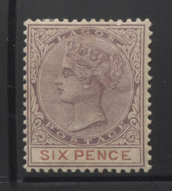
This week I move on to the next value in the 1887-1903 Crown CA issue of Lagos: the 6d lilac and mauve. This stamp was first sent to the colony on March 31, 1887, along with the others. The last printings from plate 1 were sent on August 4, 1900, which is a full year earlier than many of the other values from this issue. 86,340 stamps were printed, and 23,400 remainders were sent back to London in 1905. A good number of these would have come from the plate 2 printing, which was made in mauve and aniline carmine. This last printing of this value was, according to Gibbons, made in October 1902. However, the number produced for this printing is not known.
This is another denomination, that due to the postage rates, should have seen fairly consistent use, so it is quite possible that there may have been almost as many printings of this value as some of the other lower denominations. My initial sort of this, two years ago gave close to 40 printings, which over 54 calendar quarters is almost one per quarter, with some quarters not having any sendings. There are a fair number of shade variations, both of the head plate and the duty plate, which makes sorting the printings much easier than a value like the 4d.
Today's post will look at the printings from the first state of the plate.
Group 1 - Printings 1-10 From The First State of the Plate (Approximately March 1887 to December 1890)
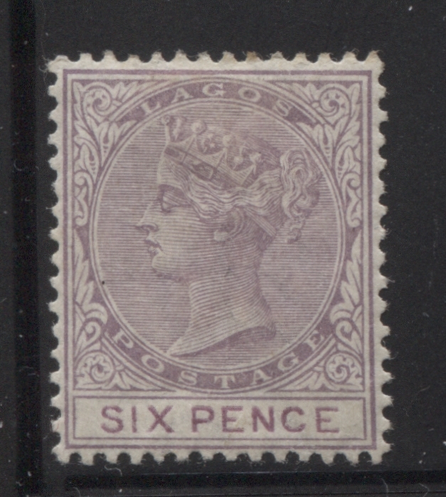
In this first group, the key characteristic is the completeness of the detail in the Queen's hair, both at the top of the head, where the lines are clear, separate and distinct, and in the hair at the back of the head, which shows clear detail, both above and below the diagonal ribbon. In this group there are plenty of shades, and there is a lovely example of the broken "S" in "Sixpence", which I encountered in earlier printings of the 6d, which proves that it is a constant flaw.
First Printing

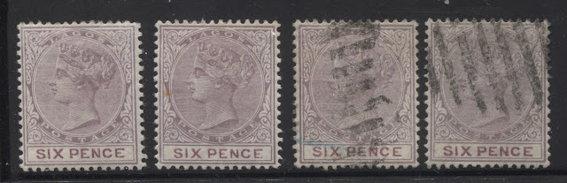
For some strange reason, this printing is the one that I seem to have the largest number of examples of. I have ten mint examples as shown in the above scan, and three used examples as shown in the scan below:

The head plate colour of this printing is a closer match to the deep dull purple, on the Gibbons colour key, but again, it is a little redder, though not as red as the first printing. The duty plate colour is closest to Gibbons maroon, but is a bit paler.
Curiously, the used examples above are all dated between April 1897 and November 1899 - well past the time that this stamp would have been current. This suggests that many of these might have been buried under supplies of more recent printings at the post offices in which they were sold, with the result that they did not see postal use until many years after they were issued.
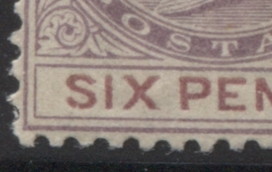
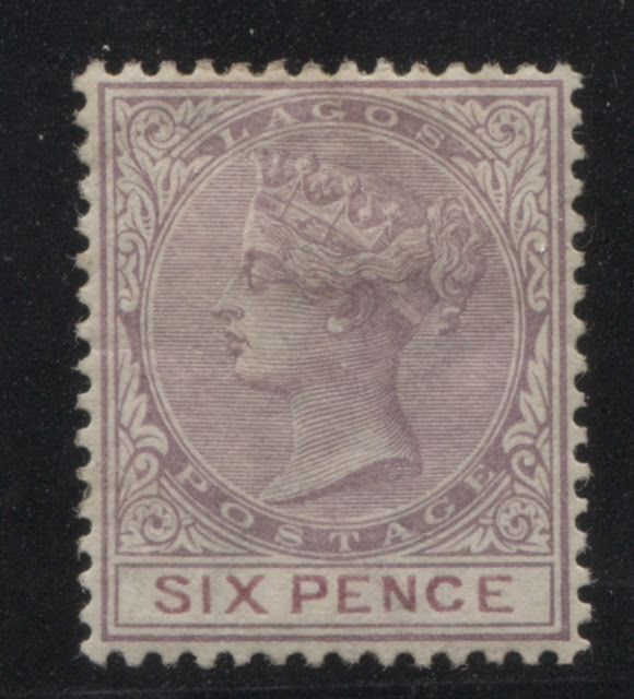
The mint stamp at the lower left above shows the "broken S in Sixpence", which is a constant flaw, in which there is a small nick in the bottom of the "S". An enlarged scan of this is shown below.
Third Printing
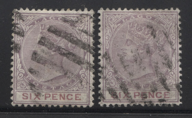
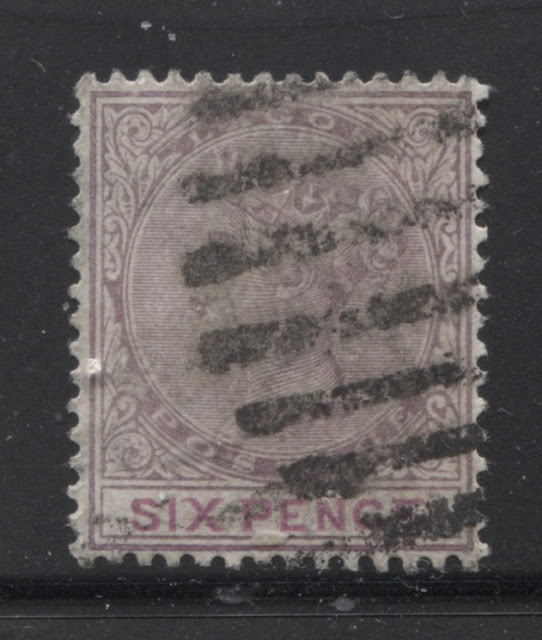
For this printing, I only have two used examples, which are both cancelled with strikes of an 8-bar oval obliterator, as shown above. The head plate shade is closest to Gibbons's slate lilac, being almost an exact match, while the duty plate colour is very close to Gibbons' dull claret, with this colour being slightly deeper, but the same overall tone.
Fourth Printing
Fifth Printing
This printing is very similar to the fourth printing. The head plate colour is basically the same as the fourth printing, being a blend of the slate lilac and the reddish lilac. But the duty plate colour is closest to Gibbons's plum shade. It illustrates quite nicely, the subtle difference between Gibbons deep purple and Gibbons plum - two colours that look almost the same. The difference is that deep purple contains just a touch more blue, and plum contains just a touch more red. I have two int examples, shown above, two used examples shown above and a block of 4 from the left side of the sheet as shown below:
 The used examples are cancelled with what appear to be strikes of a 9-bar oval obliterator, though it is difficult to be sure.
Sixth Printing

The colours of this printing are very similar to the fifth printing above, but the duty plate colour is a deeper shade of plum to the fifth printing. This is another printing for which I have only mint examples - three of them to be exact, all of which are shown above.
Seventh Printing


This is another denomination, that due to the postage rates, should have seen fairly consistent use, so it is quite possible that there may have been almost as many printings of this value as some of the other lower denominations. My initial sort of this, two years ago gave close to 40 printings, which over 54 calendar quarters is almost one per quarter, with some quarters not having any sendings. There are a fair number of shade variations, both of the head plate and the duty plate, which makes sorting the printings much easier than a value like the 4d.
Today's post will look at the printings from the first state of the plate.
Group 1 - Printings 1-10 From The First State of the Plate (Approximately March 1887 to December 1890)
In this first group, the key characteristic is the completeness of the detail in the Queen's hair, both at the top of the head, where the lines are clear, separate and distinct, and in the hair at the back of the head, which shows clear detail, both above and below the diagonal ribbon. In this group there are plenty of shades, and there is a lovely example of the broken "S" in "Sixpence", which I encountered in earlier printings of the 6d, which proves that it is a constant flaw.
First Printing

I have classified this as the first printing on account of the brown gum and the fact that the detail is clearest on this stamp. The head plate colour is closest to Gibbons's deep, dull purple, but is just a touch more reddish. The duty plate colour is almost an exact match to Gibbons's claret shade. I have only this single mint example, and no used examples.
Second Printing

For some strange reason, this printing is the one that I seem to have the largest number of examples of. I have ten mint examples as shown in the above scan, and three used examples as shown in the scan below:

The head plate colour of this printing is a closer match to the deep dull purple, on the Gibbons colour key, but again, it is a little redder, though not as red as the first printing. The duty plate colour is closest to Gibbons maroon, but is a bit paler.
Curiously, the used examples above are all dated between April 1897 and November 1899 - well past the time that this stamp would have been current. This suggests that many of these might have been buried under supplies of more recent printings at the post offices in which they were sold, with the result that they did not see postal use until many years after they were issued.
The mint stamp at the lower left above shows the "broken S in Sixpence", which is a constant flaw, in which there is a small nick in the bottom of the "S". An enlarged scan of this is shown below.

Third Printing

For this printing, I only have two used examples, which are both cancelled with strikes of an 8-bar oval obliterator, as shown above. The head plate shade is closest to Gibbons's slate lilac, being almost an exact match, while the duty plate colour is very close to Gibbons' dull claret, with this colour being slightly deeper, but the same overall tone.
Fourth Printing
This is another printing, for which I have no used examples. What makes this printing very distinct from the others is the very thin lettering in "sixpence". The frame plate colour is somewhat problematic. It is close to the both the reddish lilac and the slate lilac swatches on the Gibbons colour key. It is deeper and bluer than the reddish lilac, while being paler and redder than the slate lilac. I imagine that it is actually the colour that one would obtain by mixing equal amounts of the slate lilac and reddish lilac. The duty plate colour is closest to Gibbons's deep purple shade.
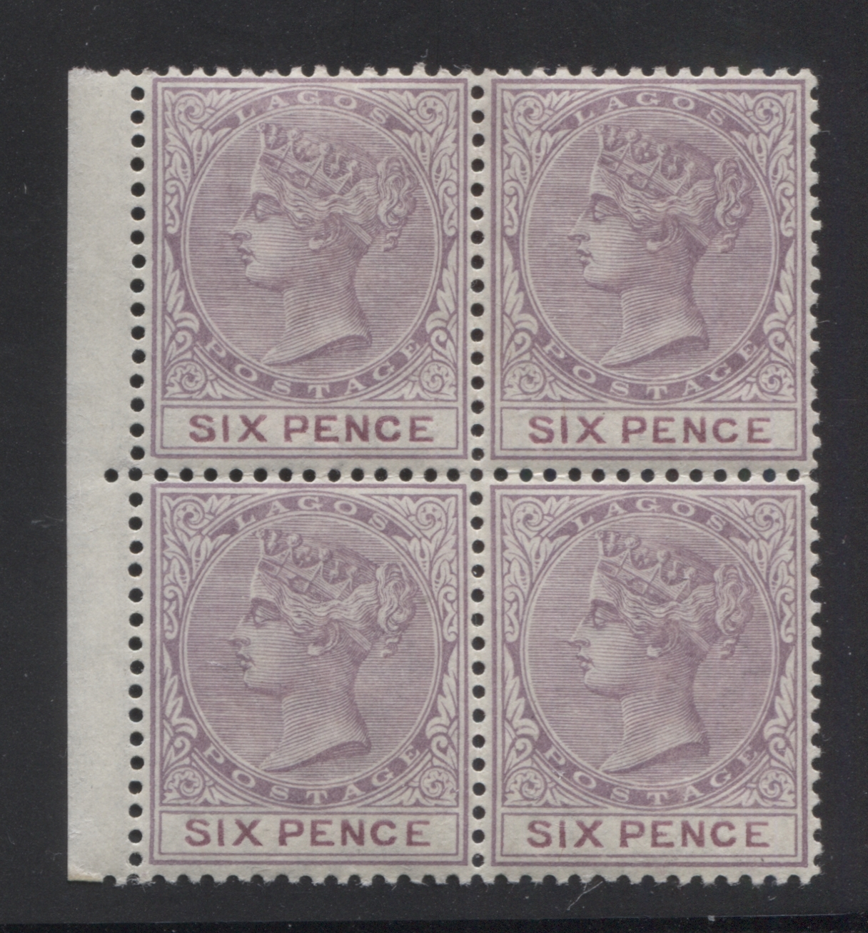
Fifth Printing

This printing is very similar to the fourth printing. The head plate colour is basically the same as the fourth printing, being a blend of the slate lilac and the reddish lilac. But the duty plate colour is closest to Gibbons's plum shade. It illustrates quite nicely, the subtle difference between Gibbons deep purple and Gibbons plum - two colours that look almost the same. The difference is that deep purple contains just a touch more blue, and plum contains just a touch more red. I have two int examples, shown above, two used examples shown above and a block of 4 from the left side of the sheet as shown below:
Sixth Printing

The colours of this printing are very similar to the fifth printing above, but the duty plate colour is a deeper shade of plum to the fifth printing. This is another printing for which I have only mint examples - three of them to be exact, all of which are shown above.
Seventh Printing

This is one of the few printings from this group for which I have no mint examples. The head plate colour is again, a blend of the reddish lilac and slate lilac as shown on the Gibbons colour key. The duty plate colour is very close to Gibbons's deep mauve, but is just a bit deeper, with a touch more purple.
Eighth Printing

The head plate colour of this printing is closest to Gibbons's reddish lilac, and the duty plate colour is almost an exact match to Gibbons's purple shade.
This is another printing for which I have no mint examples. The single used example that I have, shown above, appears to be cancelled with a strike of an 8-bar oval obliterator.
Ninth Printing

The head plate colour of this printing is closest to Gibbons's maroon, but is a bit deeper. There is a just a hint of deep dull purple to the colour. The duty plate colour is a pale version of Gibbons's plum. I have no mint examples of this printing, and only the used example, cancelled with the wide Lagos CDS, dated August 3, 1900, which suggests that this was a very late use.
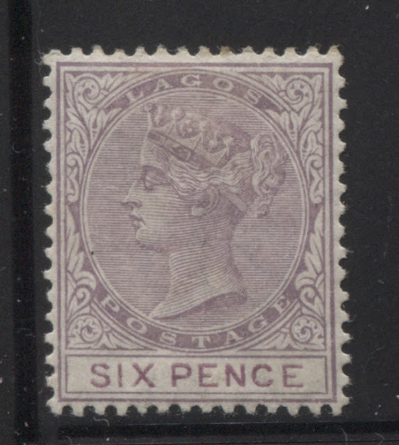
Tenth Printing

On this printing, the head plate colour is closest to Gibbons's reddish lilac, while the duty plate colour is almost an exact match to Gibbons's purple. I have no used examples, and only the sole mint example shown above.
This concludes my examination of the first ten printings of this stamp, made from the first state of the plate. Next week, I will look at the printings made from the second state of the plate.