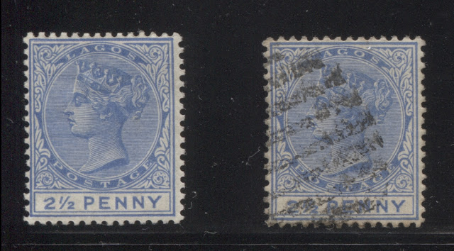
Today's post continues my examination of the printings of the 2.5d Queen Victoria keyplate definitive stamp of Lagos, which I have been working on for the past 4 weeks. To this point I have identified 21 printings, and so today's post begins with the 22nd printing, which should have been made sometime around October 1896. In addition, a few more plate flaws, which may or may not be constant will be revealed in today's post.
In the next five printings, the colours of the head plate and duty plate are both the same, and all of my examples are the type A value tablet.
Twenty Second Printing
In this printing the colour is closest to Gibbons's dull ultramarine, but lacks the powder blue undertone of dull ultramarine. To me it seems closer to what I imagine very deep cobalt to look like. It is quite a distinct shade that tends more towards blue than it does towards ultramarine. My single mint example exhibits a fairly spectacular plate flaw in that the large "2" of "21/2" is severely damaged at the top as shown below:
I do not know if this flaw is constant or not, but it certainly looks as though it might be. My single used example appears to have been canceled by an 8-bar oval obliterator.
Twenty Third Printing
Twenty Fourth Printing
Twenty Fifth Printing
Twenty Sixth Printing
Again, I do not know if this is a constant variety or not, but I have seen similar breaks in approximately the same location on other stamps from the series, so that it might very well be constant.
Twenty Seventh Printing
The colour of this printing is an almost perfect match to Gibbons's royal blue, for both the head plate and the duty plate. I have a single used example, which is type A, and appears to be canceled with an 8-bar oval obliterator.
Twenty Eighth Printing
In the next five printings, the colours of the head plate and duty plate are both the same, and all of my examples are the type A value tablet.
Twenty Second Printing
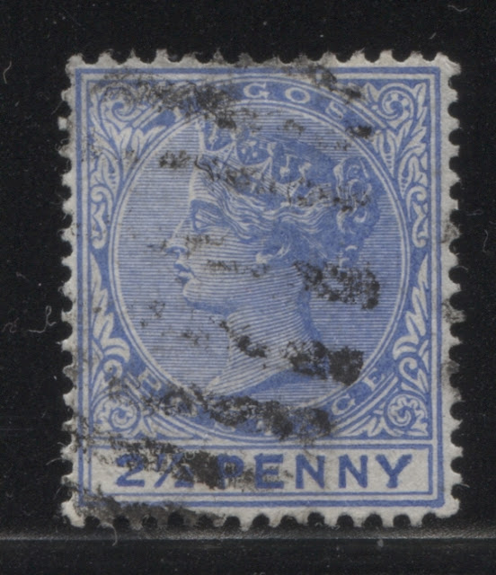
In this printing the colour is closest to Gibbons's dull ultramarine, but lacks the powder blue undertone of dull ultramarine. To me it seems closer to what I imagine very deep cobalt to look like. It is quite a distinct shade that tends more towards blue than it does towards ultramarine. My single mint example exhibits a fairly spectacular plate flaw in that the large "2" of "21/2" is severely damaged at the top as shown below:
I do not know if this flaw is constant or not, but it certainly looks as though it might be. My single used example appears to have been canceled by an 8-bar oval obliterator.
Twenty Third Printing
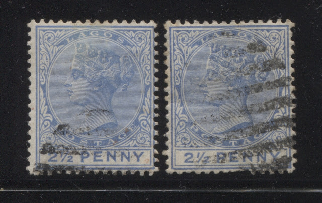
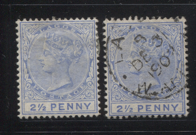
The colour on this printing is very close to Gibbons's blue, but is just a little duller. Both used examples shown here are cancelled with 8-bar oval obliterators.
Twenty Fourth Printing
The colour of this printing is a lighter version of the colour used for the 22nd printing, in my opinion. Again, this is closest to the dull ultramarine colour shown on Gibbons's colour key, but it contains slightly more blue than ultramarine, once again. I have two mint and two used examples here, both of which are cancelled with clear strikes of the thinner 9-bar oval obliterators.
Twenty Fifth Printing
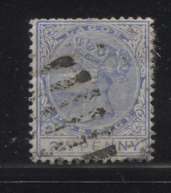
I was tempted to include this stamp with the twenty fourth printing above, but after careful consideration, I can see that the colour contained more ultramarine than blue, and is actually a pretty good match to Gibbons's dull ultramarine. I have only the one used example, and it is cancelled with what appears to be a 9-bar oval obliterator.
Twenty Sixth Printing
The colour used for this printing is a very pale version of the shade used for the twenty fourth printing above. It is closest to a very pale version of the dull ultramarine, but with a hint of cobalt. I have only the two mint examples, and five used examples. The used examples are cancelled with a mixture of both 8-bar and 9-bar oval obliterators.
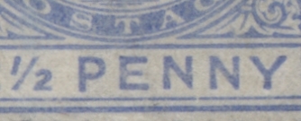
The first mint stamp above shows a distinct break of the inner frameline below the first "N" of "Penny". A close up of the break is shown below:
Again, I do not know if this is a constant variety or not, but I have seen similar breaks in approximately the same location on other stamps from the series, so that it might very well be constant.
Twenty Seventh Printing
The colour of this printing is an almost perfect match to Gibbons's royal blue, for both the head plate and the duty plate. I have a single used example, which is type A, and appears to be canceled with an 8-bar oval obliterator.
Twenty Eighth Printing
In this printing, the head plate colour is closest to ultramarine, but is slightly duller, while the duty plate colour is a slightly deeper version of the same colour. I have a single used example, which has the type B value tablet, and is cancelled with what appears to be an 8-bar oval obliterator.
Twenty Ninth Printing
The head plate colour of this printing is similar to the Gibbons' bright blue swatch, but it is just a bit duller. It is actually closer to what the dull ultramarine swatch would look like if it were paler. So I think this colour is pale dull ultramarine. The duty plate colour is a perfect match to Gibbons's dull ultramarine.
I have two mint and two used examples with type A value tablets, and one used example with a type B value tablet. The used stamps are cancelled with 9-bar oval obliterators and a Lagos CDS cancel, with a date that isn't visible.
Thirtieth Printing
Both the head plate and duty plate of this printing are closest in colour to Gibbons's cobalt swatch, but is deeper. I have one mint example, and two used examples, with all three being type A. Both used examples are canceled with 8-bar oval obliterators.
Thirty First Printing
Both the head plate and duty plate colour of this printing are closest to Gibbons's deep ultramarine. I have one mint example and five used examples, all of which are type A. This group includes an early example of the larger Lagos CDS cancel with the large dots that is dated August 1, 1898. The other cancellations are the usual mix of 8-bar and 9-bar oval obliterators.
Thirty Second Printing
The head plate colour of this printing is dull ultramarine, while the duty plate is ultramarine. I have one mint example each of the type A and type B value tablets.
Thirty Third Printing
The head plate and duty plate of this printing are the same colour, and are light ultramarine. I have three used examples of this printing, all of which are type A. One is cancelled with a 9-bar oval obliterator, one with an 8-bar oval obliterator and one with a June 16, 1901 Lagos CDS cancel. This would seem to be one of the last printings made with the original plate before being replaced with plate 2.
Thirty Fourth Printing
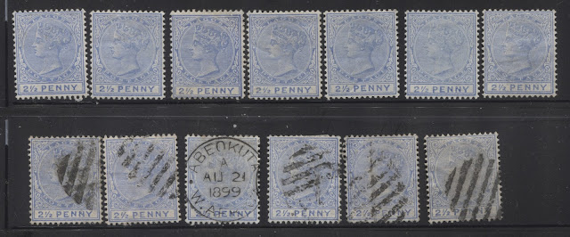
On this printing, the head plate colour is pale dull ultramarine, while the duty plate colour is dull ultramarine. I have seven mint examples and six used examples, being more than any other printing so far. All 13 stamps are type A. The cancellations include a fantastic strike of an Abeokuta CDS cancel dated August 21, 1899. All five other examples appear to be cancelled with 9-bar oval obliterators, for four of the stamps and an 8-bar oval obliterator for the first stamp on the bottom row.
Thirty Fifth Printing
Both the head and duty plate of this printing are closest to pale ultramarine. I have two mint examples and one used example, all of which are type A. The sole used example that I have is cancelled with a 9-bar oval obliterator.
Thirty Sixth Printing
The head and duty plate colour of this printing are closest to Gibbons's dull ultramarine. This single mint example is type A but is interesting in the stubby appearance of the letters and the very short "Y" in "Penny".
Thirty Seventh Printing
This is the last printing to show significant signs of plate wear. The head plate colour is closest to pale dull ultramarine, while the duty plate colour is a bit darker. I have a single mint and a single used example, canceled with a clear strike of a December 31, 1902 Lagos CDS.
This concludes my examination of the printings made prior to the replacement of plate 1 with the new plate 2, which was supposed to have occurred sometime in late 1900 or early 1901. Interestingly, we never see the degree of wear on this value, on a regular basis that we have come across on other values in the series. Right after this third state of the plate, the printings go back to having a level of detail that would be associated with the brand new plate 2, even though there is no official record of this stamp being printed by any plate other than plate 1.
Next weeks post will conclude this value with the printings thought to be from plate 2, and will start on the next value in the series that had printings going all the way back to 1887: the 2d lilac and ultramarine.
