
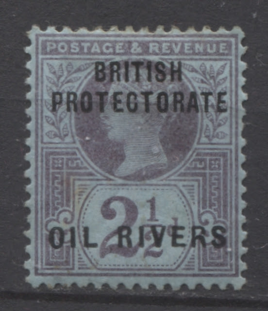
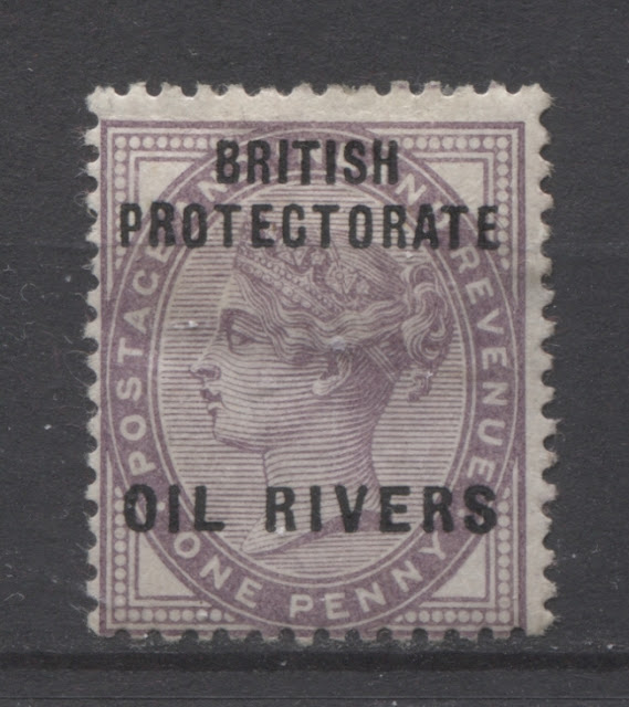
This week's post continues my exploration of the first issue of the Niger Coast Protectorate, which consisted of the overprinted stamps of Great Britain. One very interesting aspect to these issues which is a study in and of itself concerns the constant varieties that can be found in the Oil Rivers overprint that was used on the stamps. In addition to constant varieties that can be found in the letters of the overprint itself, there were also variations in the exact length of the words used in the overprint.
These differences will be the focus of today's post.
How the Overprint Was Produced and Variations in Size
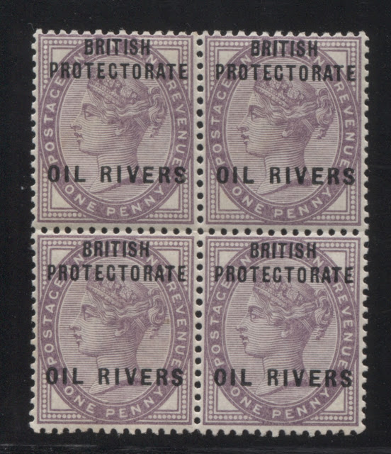
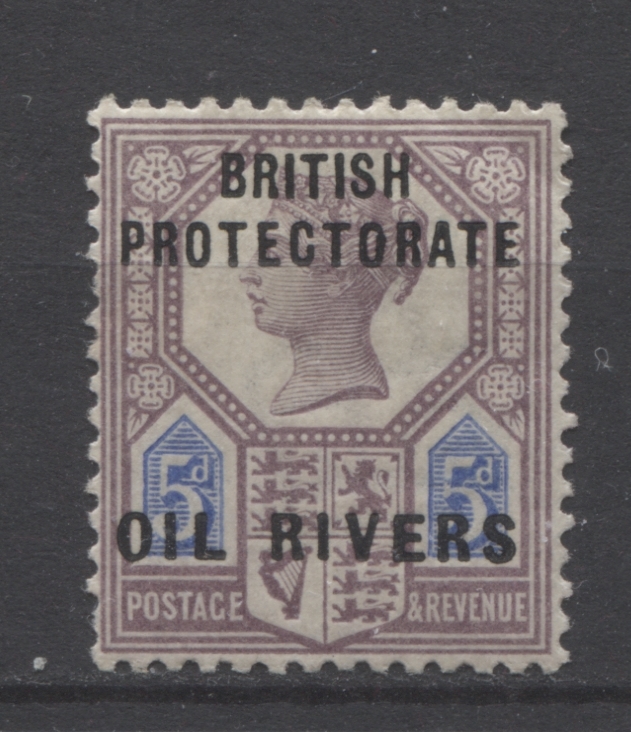
There were two plates used to overprint the stamps. Each plate had a setting of 60 overprints. The 1/2d and 1d stamps were issued in sheets of 240 stamps. So each sheet had to be run through the presses twice in order to ensure overprinting of all 240 stamps. The 2d, 2.5d ad 1/- stamps were printed in sheets of 120, so they only required one run through the presses, while the 5d stamp only required a single plate because the sheets were only 60 stamps.
There were differences in both the size of the various words in the overprint as well as the alignment of the letters, according to which column of the sheet the stamp comes from. It is thus possible to allocate single stamps to a particular column on the sheet. Then, if the overprint shows one of the constant varieties it can actually be fully plated.
The differences are as follows:

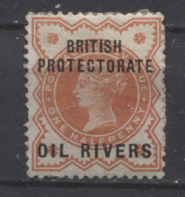
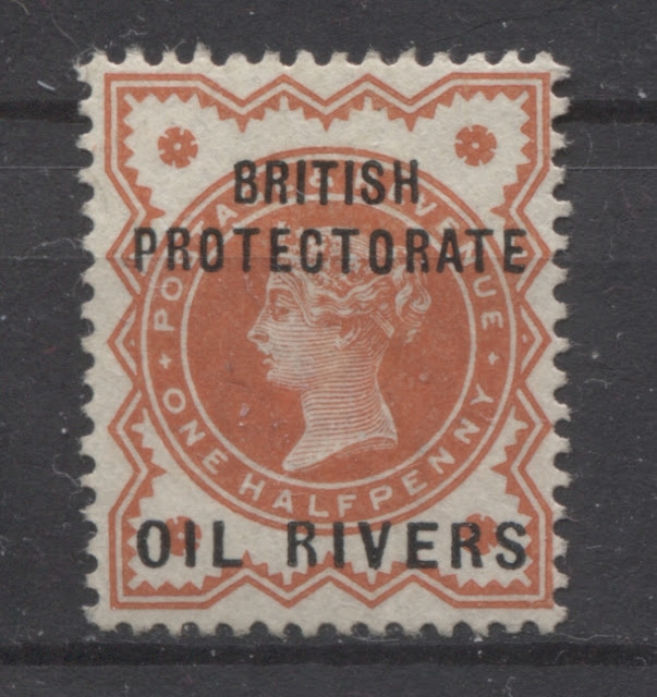
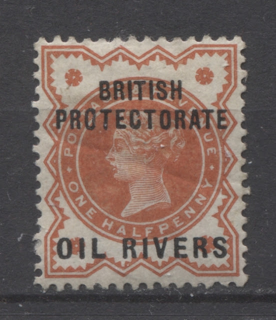
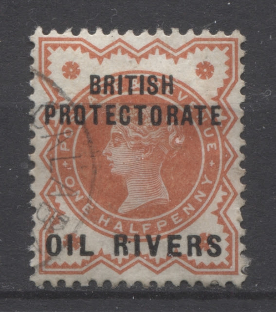
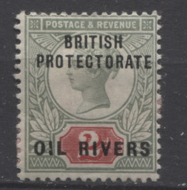
Here is an example of a stamp from either columns 5 or 11 of the sheet. The words "Oil Rivers" measure approximately 16.25 mm, and both the "B" and the "H" of "BRITISH" are raised slightly.

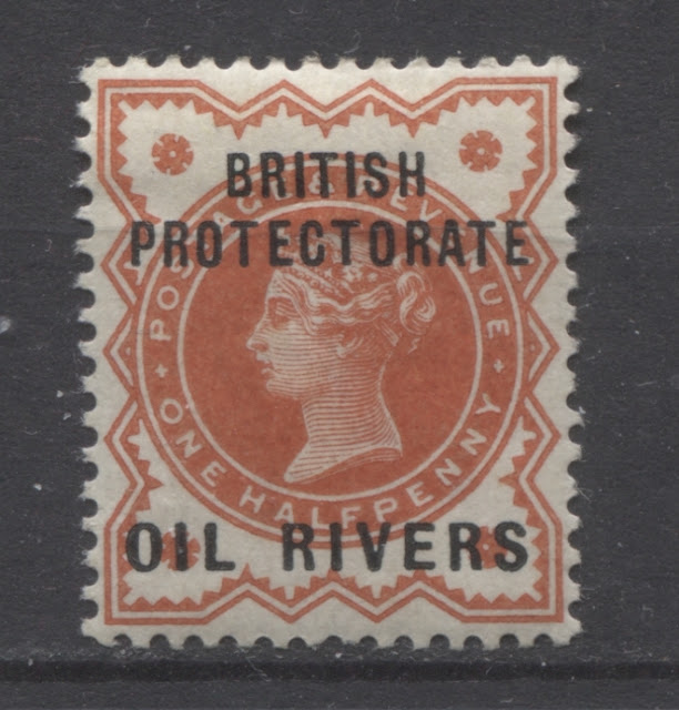
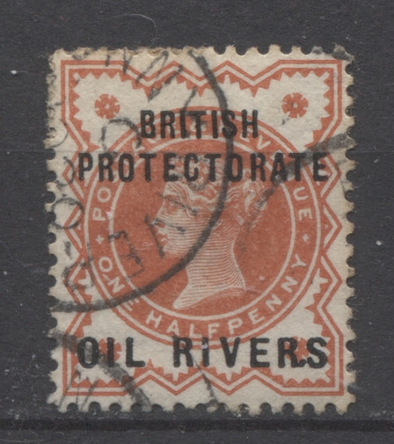
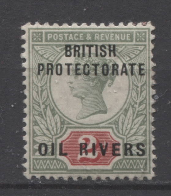
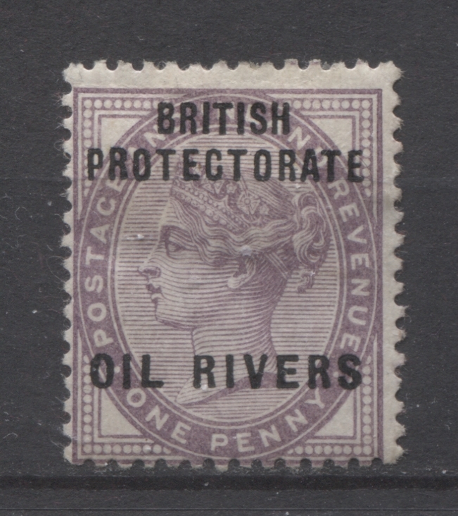
On this stamp, you can see that the "B" is level and the H is raised. So this one comes from either column 6 or column 12.
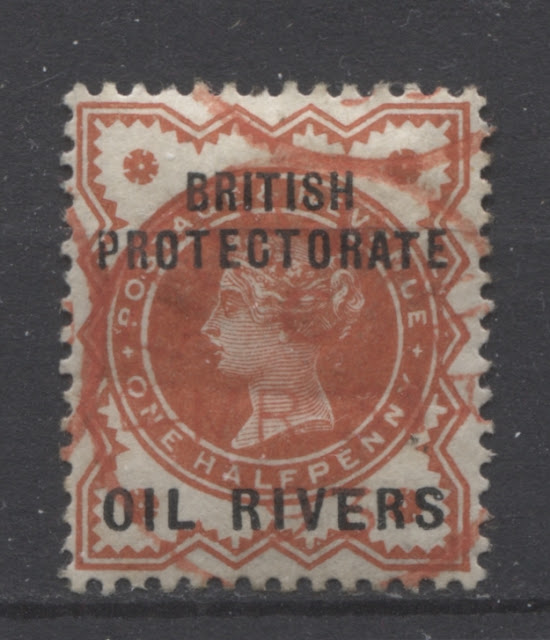
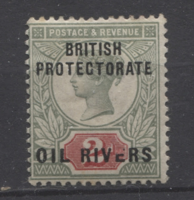
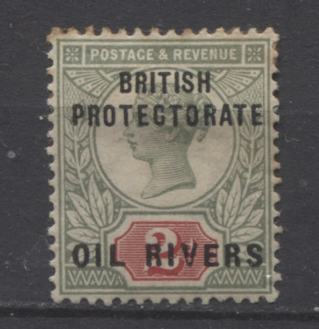
Here, the "B" is dropped and the "H" is raised. So this one comes from either columns 3 or 9.


These differences will be the focus of today's post.
How the Overprint Was Produced and Variations in Size
There were two plates used to overprint the stamps. Each plate had a setting of 60 overprints. The 1/2d and 1d stamps were issued in sheets of 240 stamps. So each sheet had to be run through the presses twice in order to ensure overprinting of all 240 stamps. The 2d, 2.5d ad 1/- stamps were printed in sheets of 120, so they only required one run through the presses, while the 5d stamp only required a single plate because the sheets were only 60 stamps.
There were differences in both the size of the various words in the overprint as well as the alignment of the letters, according to which column of the sheet the stamp comes from. It is thus possible to allocate single stamps to a particular column on the sheet. Then, if the overprint shows one of the constant varieties it can actually be fully plated.
The differences are as follows:
- The word "British" is 7.75 mm long on all columns except for columns 1 and 7 where it is 8 mm long. It is 1.75 mm high.
- The word "Protectorate" is 16.5 mm long on every column except for columns 1 and 7 where it is 16.25 mm. On columns 2 and 8 it is just barely 16.5 mm.
- The words "Oil Rivers" are 16.5 mm long on all columns except for columns 5 and 11, where they are 16.25 mm long.
- The B.H of "British" are raised on columns 1, 7, 2 and 8.
- The B is lowered and the H raised on columns 3 and 9.
- The R of "British" is slanting and the H is raised on columns 4 and 10.
- The B.H is raised only slightly on columns 5 and 11.
- The B is level and the H is raised on columns 6 and 12.
So, in sorting these stamps the logical place to start is to look at the alignment of the letters, and then look at measuring the words only when trying to distinguish between columns 1 and 7 and 2 and 8. However, there are 31 constant flaws in the overprint that are identifiable by position in the sheet, and these will be detailed next.
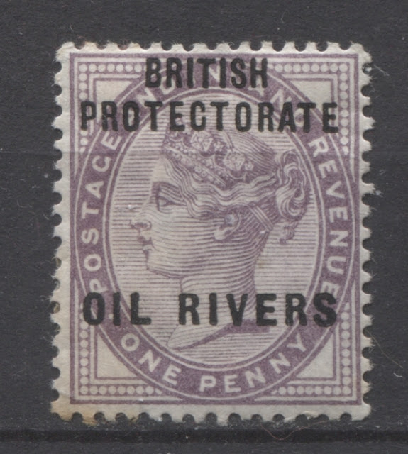
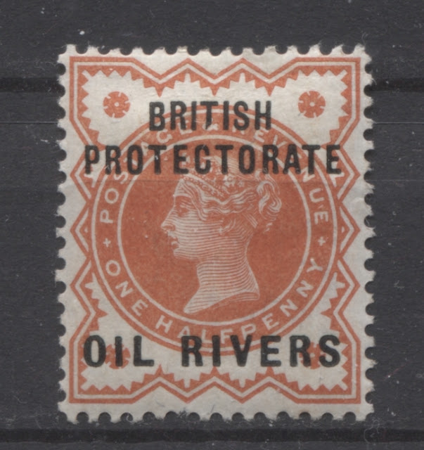
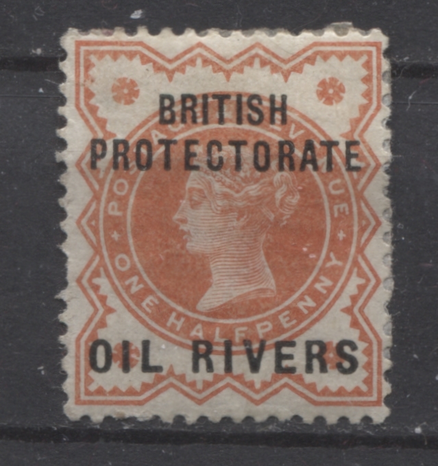
Before I get to the constant varieties of the overprint, I wanted to illustrate examples of each of the above differences as they occur on the 1/2d vermilion stamp.

Here is an example of a stamp from either columns 5 or 11 of the sheet. The words "Oil Rivers" measure approximately 16.25 mm, and both the "B" and the "H" of "BRITISH" are raised slightly.

On this stamp, you can see that the "B" is level and the H is raised. So this one comes from either column 6 or column 12.
Here, the "B" is dropped and the "H" is raised. So this one comes from either columns 3 or 9.

On this stamp the "B" and "H" are both raised and "PROTECTORATE" is barely 16.5 mm long. So this stamp comes from either columns 1 or 7.

On this stamp the "B" and "H" are both raised and the word "PROTECTORATE" is a full 16.5 mm long. This stamp must come from either columns 2 or 8 of the sheet.

Here the "R" of "BRITISH" is slanting, while the "H" is raised. So this must come from either columns 4 or 10.

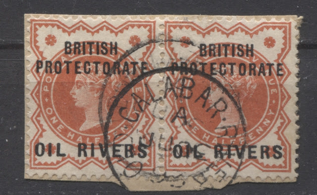
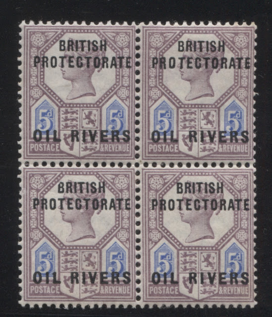
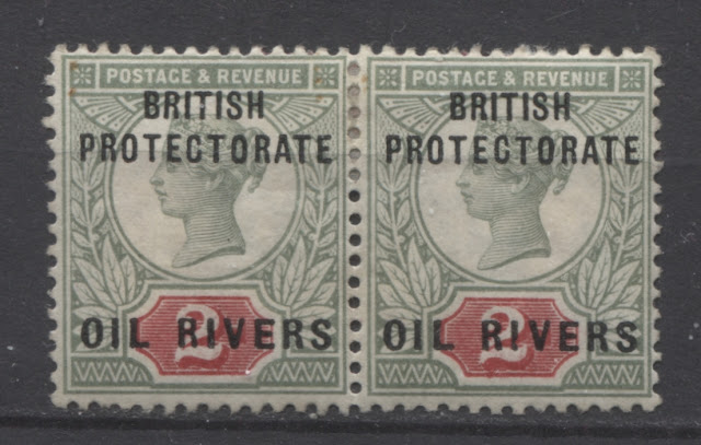
Here is a used pair showing the overprints from either columns 4 and 5 or 10 and 11.
Constant Flaws or Varieties of the Overprint Identified as to Plate Position
The London Philatelist in 1957/58 contained a listing of 31 identifiable varieties of the overprint that would allow a specialist to assign at least 31 of the 120 stamps in each sheet to a specific position on the sheet. The listing of these varieties is as follows:
- Position 3: The I of "BRITISH" is bent to the right at the base.
- Position 6: The "E" of "RIVERS" has a break below the centre stroke.
- Position 14: The "L" of "OIL" has a break bear the top.
- Position 16: The "B; of "BRITISH" has the top corner broken off and the "E" of "ATE" has a curved foot.
- Position 17: The "E" of "ATE" is raised and has a short slanting top stroke and an extra long lower stroke with a curved toe.
- Position 18: The "P" of "PROTECTORATE" is short. The "E" of "ATE" has a short rounded lower stroke.
- Position 31: The second "T" of "PROTECTORATE" is bent to the right at the base.
- Position 35: The "P" of "PROTECTORATE" has a thin loop showing signs of fracture at the centre stroke.
- Position 37: The "T" of "PROTECTORATE" has a short stroke at the top left side. The "I" of "OIL" i broken at the bottom left.
- Position 40: There are three small dots between the "R" and "I" of "Rivers". In some values the "E" of "Rivers" shows a break. The "T" of "ATE" is short and slanting.
- Position 41: The "O" of "TOR" has a break at centre left.
- Position 47: The right leg of the "R" of "BRITISH" is rounded. The "O" of "TOR" has a slight bulge at the right.
- Position 49: The first "R" of "RIVERS" has a flaw at the junction of the loop and the diagonal stroke at right. Both "I"'s of "BRITISH" are slightly larger than the "T".
- Position 52: There is a triangular break in the second "R" of "RIVERS"at the junction of the loop with the upright stroke at left.
- Position 58: There is a short lower stroke to the "L" of "Oil".
- Position 60: The "R" of "PRO" is raised and slightly larger than the other letters. It also has a thick curved stroke at the right.
- Position 61: The "T" of "PROT" has a short top stroke at right and is set slanting.
- Position 62: The "O" of PRO" is elongated and malformed at right.
- Position 64: The "O" of "OIL" has a flaw at the base at right, almost resembling a break.
- Position 65: The "O" of "TOR" has a break in the centre at left.
- Position 78: The "I" of "OIL" is larger and has a small break near the top. The first "R" of "RIVERS" has a long left hand stroke.
- Position 79: There is a break in the centre "T" of "PROTECTORATE" at the junction of the vertical stroke and right horizontal bar.
- Position 83: There is a large stop between "R.S" of "RIVERS".
- Position 85: The second "R" of "RIVERS" is broad and malformed with a clear break in the centre at loop.
- Position 95: The "P" of "PRO" is broken through the upright and top of the loop.
- Position 100: The same as position 40, except that the "T" is not slanting.
- Position 105: The "R" and "T" of "PROT" are both malformed and have long strokes. The "E" of "ATE" has a short, upturned, curved foot.
- Position 106: There is a small dot between the "RI" of "RIVERS".
- Position 112: The "E" of "RIVERS" has a gash in the lower stroke, almost severing the end.
- Position 117: The "T" of "BRITISH" has a broken foot at the right.
- Position 120: The "E" of "ATE" is raised and the "T" is short and set slanting.
The positions shown in italics are those for which I have an illustrative example, which will be shown here. Others, I will add in a subsequent update as I come across them.
Ince notes two more varieties:
- The 5d is known with badly printed R.H of "BRITISH" and "CT" of "PROTECTORATE". The HCT were printed in afterwards so that these letters are doubly struck.
- The 2d value is known with the lower right stem of the second "R" in "RIVER" missing. The second "T" of "PROTECTORATE" is mostly missing.
The varieties that I have described above now follow:
Position 3

Position 16

Position 17

Position 18

Position 40

Position 47

Position 49

Position 52
Position 60

Positions 60-61 and 70-71

Position 62

Position 78

Position 79

Position 83

Position 95

Position 100

Position 89-90 and 99-100

Position 106

Position 117
Unplated Overprint Flaws
I have found a number of other flaws on the overprint, which have not yet been assigned to a position on the sheet:

Small dot after the S of "Rivers".

Large dash under "I" of "oil"

Short "T" in "Protectorate"

Nicked "I" in "Oil"

Nicked "I" in "Rivers" on the right stamp

Rounded and thin first "R" in "Rivers"

Broken "E" in "Rivers"

Broken "B" in "British"

Damaged "V" in "Rivers

Overprint badly slanted and letters broken and weak
There are likely other flaws, which I did not notice on my first run through these. Next week I will look at the cancellations on these stamps and will add images of any additional varieties that I come across.