This is the last of my detailed posts dealing with the shades of the very popular Admiral Issue of 1911-1928. The 50c value has four major listed shades in Unitrade, which are not too difficult to distinguish, while the $1 has three. However, one of the difficulties that collectors will encounter when trying to sort their stamps is the fact that there are several sub-shades within many of the major shade groups that may lead to mis-identification for those who are not familiar with the characteristics of the major shade groups.
Like all my other posts on this topic, I will show you examples of stamps from each major Unitrade listed shade group and will then cross-reference the shade names in Unitrade, with shade names from the Stanley Gibbons colour key, modified as necessary when the shades are lighter, darker, brighter, duller, paler or deeper than the Gibbons Colour Key swatches. Unfortunately, my colour key does not have very many black swatches, so most of the names that I give for the 50c shades will be my own, or will not differ from Unitrade in the case of the silver-black shade.
The 50c Black 1912-1928
Unitrade lists four major shade groups for this stamp:
- Black brown - dry printing
- Black - wet printing
- Silver black - wet printing
- Brown black - wet printing
The name given to the most common shade, the black brown is completely wrong, as this stamp is a variant of grey-black, and is not brown at all. The black is pretty distinct, but as we shall see, it varies in both tone and intensity. The black stamps are generally from the first printings made before 1914, and will have the same paper and gum characteristics as stamps of that period. This characteristics generally are clear yellowish shiny gum and either coarse or fine vertical mesh being clearly visible in the paper. The silver black is also very distinct, but requires some experience to identify. Again, paper and gum can prove invaluable as an aid to identifying this shade because it comes from printings made in 1917. The 1917 paper has less visible mesh and has smooth cream gum, with a satin sheen. Unitrade places a 1923 date next to the brown-black shade, but in reality, this shade is a catch-all group for all the common wet printings that are neither the pure black, nor the silver black. These of course, can come from any year between 1912 and 1925.
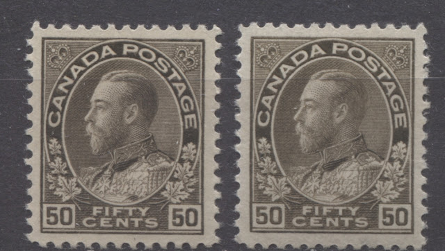
Black Brown Dry Printing Shades
The above stamps are both examples of the basic dry printing. This is the most common printing in which the mint stamps of this value are found. All of the dry printings have the re-touched frameline in the upper right spandrel, which I have discussed in a separate post: https://brixtonchrome.com/blogs/canadian-stamps-and-postal-history/the-die-types-on-the-admiral-issue As you can see, while both these stamps have a hint of brown, they are not brown overall, but are really a variation of grey black. The stamp on the left is thus brownish grey black and the stamp on the right is pale brownish grey black.
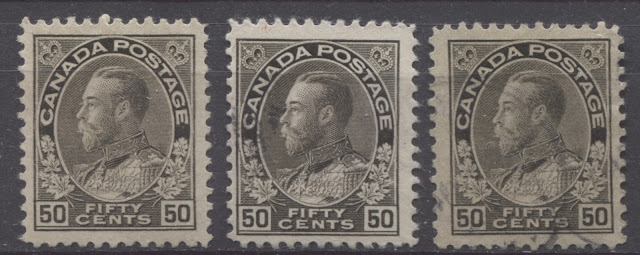
Black Wet Printing Shades
The above stamps are all examples of the Unitrade listed black shade. As you can see, there are some subtle nuances in the shade, with the first two stamps being a pure black and the third stamp being more of a charcoal shade, because of the greyish cast that it has. Lastly, the stamp on the right is a more intense black than the first two stamps.
The Silver Black Wet Printing Shade
These three stamps are all examples of the scarce silver-black shade from 1917. Hopefully you can see the clear silvery cast that this shade has.
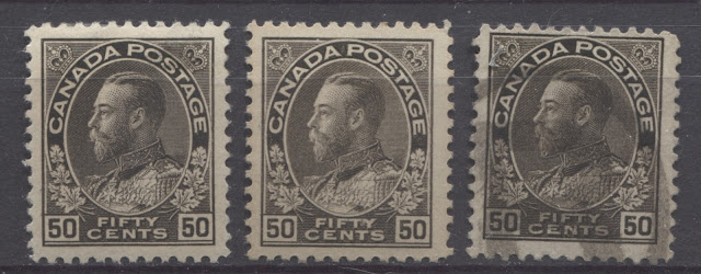
Brown-Black Wet Printing Shades
The above three stamps are all examples of the Unitrade listed brown-black shade. This is perhaps the trickiest shade because of how similar it is to the black. The key difference lies in both the intensity and the purity of the black colour. On the true black shade shown above, there is no hint of brown to the black. On the brown-black shade, there is always either a clear hint of brown, or a lot of grey to the black. In addition, the paper and gum characteristics are not consistent with the early 1912 printings. From left to right we have:
- Brown black
- Greyish brown black
- Brown black
Comparing The Shades
The scan below shows a side-by-side comparison of all four basic shade groups:
From left to right we have:
- Brownish grey black dry printing - Unitrade's black brown.
- Black
- Silver black
- Greyish brown black - Unitrade's brown black
Hopefully this will make it much easier to see the different shades. They really are quite distinct and not too difficult to identify once you are familiar with them.
The $1 Orange - 1923-1928
Unitrade lists only three shades for this stamp:
- Orange for the basic dry printing
- Deep orange for the wet printing
- Brown orange for the dry printings
This is not too difficult a stamp to sort, but most collectors will find that the dry printing is far and away the most common, with probably as many as 80% of examples they come across being dry. The wet printings when found, are usually an unmistakable, deep, rich reddish orange. As we shall see, there is really no true brown orange, but just brownish orange. The brownish tinge is fairly easy to see once you know what to look for and are familiar with the basic orange shade, but at the same time it is very easy to classify it as just the basic orange dry printing if you are not familiar with it. In addition all three of the listed shade groups have variations within them.
The Orange Dry Printing Shades
The above stamps are all examples of the basic orange shade on the dry printings. The defining characteristic of this shade is its general dullness. It is not particularly deep, nor is it bright. According to Gibbons Colour key, most of these are shades of red-orange, rather than just orange. From left to right we have:
- Red-orange
- Pale red orange - similar to the red orange, but a little less intense
- Pale orange - similar to orange, but less intense
- Light bright orange - similar to bright orange, but with a hint of white added to the colour.
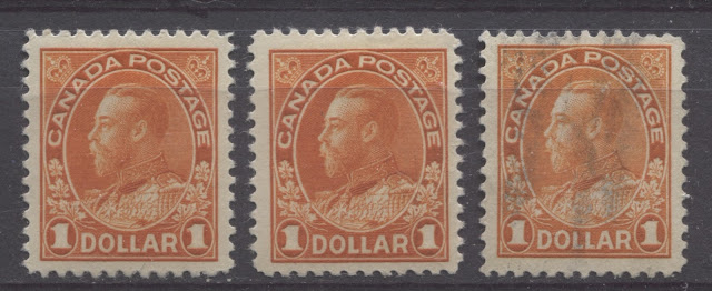
Deep Orange Wet Printing Shades
These three stamps are all examples of the Unitrade listed wet printing. The first two stamps are the same reddish orange shade that Unitrade calls deep orange, but the stamp on the right is not particularly deep, being bright orange. It is very similar to the basic orange of the dry printings above, as is only identifiable as a #122b by virtue of the fact that it is a wet printing.
The Brown Orange Dry Printing Shades
The above stamps I believe, are all examples of the brown orange dry printing. Like the orange, this group of shades is also dull, but almost always contains a definite brownish undertone. From left to right we have:
- Brownish orange - similar to orange, but with a hint of brown.
- Brownish orange - a slightly less intense example.
- Orange
- Deep dull orange - similar to dull orange, but deeper
I have included the orange shade in this group rather than the first because it is more similar to the other shades of this group than it is to the stamps in the first group, even though its name matches that of the first group.
Comparing The Shades
The scan below shows the three basic shade groups side-by-side:
From left to right:
- Red orange - dry printing
- Reddish orange - wet printing
- Brownish orange - dry printing
This hopefully should make the differences between these shades much clearer, although the difference between the first and third stamps is VERY subtle. Look at the scan for a few minutes and let your eyes adjust and relax. Eventually you will see the difference.
This now concludes my series of posts about the shades of the various stamps of the 1911-1928 Admiral Issue. I hope that you all found them informative, and hopefully they will inspire you to collect these stamps in more depth, as they can be a great deal of fun.
