Today, we get firmly into the commemoratives of Queen Elizabeth II's reign. Between 1955 and 1957, the Canadian post office released 21 commemorative stamps. The Prime Ministers series, which had been started in 1951 concludes during this period in 1955, as does the Wildlife Issue, which was begun in 1953. It has stamps featured from each of the three years, with the loon stamp of 1957 being the last one.
During this period we see the re-appearance of bi-coloured commemorative stamps, with the 1955 World Boy Scout Jamboree Issue and the 1956 Fire Prevention Issue. Also, the very first se-tenant designs appear - a trend that continues to this day, and dominates the face of Canadian stamp production. Se-tenant simply refers to two or more different stamp designs printed together on the same sheet, and it first appears during this period the the 1957 Recreation Sports Issue. The layout of the designs within the sheets is such that it is possible to collect 21 different se-tenant combinations of designs, with there being up to three identical pairs of each of the 5c skiing and 5c fishing stamps possible in each pane. My understanding is that four complete panes of 50 have to be broken up to obtain all 21 possible combinations of stamps for this issue. Needless to say collectors at the time very excitedly tried to collect as many combinations as they could, because they had never seen se-tenant designs before.
All of the issues were printed by the Canadian Bank Note Company, as before, with the smaller size stamps, including the 1957 Royal Visit Issue being printed in sheets of 400 that were divided into four post office panes of 100. The larger, horizontal format commemoratives were printed in sheets of 200 that were divided into four post office panes of 50.
Silas Robert Allen, the venerable engraver employed by the CBN continues to be heavily involved in the production of these issues, but we see, for the first time during this period, the introduction of two new names of engravers, who will become iconic throughout the 1960's" Yves Baril and John Mash. Yves was a master engraver, who would usually engrave the entire design of a stamp or background, whereas John Mash specialized in engraving the inscriptions of many of the stamps issued throughout the 1960's.
This period also saw the most diverse group of stamp designers ever. Up until this point, most Canadian stamps were designed by 1 or 2 individuals, which during the past several years had been Herman Herbert Schwartz and most recently Emanuel Otto Hahn. However, during this period, the designs were often a team effort, and no fewer than 10 individuals involved. Laurence Hyde becomes a prominent name that replaces Herman Herbert Schwartz however.
Like the previous issues, it is my opinion that these have been quite neglected by philatelists, who feel that they offer nothing of interest to the specialist. I would beg to differ though. While it is true that this period generally precedes the use of fluorescent papers, there were some noticeable changes to the stamp papers used during this period, with the heavily ribbed fibrous wove paper, giving way to a much smoother paper. Also, the very first use of the vertical ribbed paper, which was used throughout the 1960's first appears during this period on the 1955 Scout Jamboree Issue. Also, the gum employed underwent some changes going from the very thick, shiny yellowish gum to a less yellow, more grainy, matte gum on the issues starting in 1957. These differences and a good understanding of them will prove to be invaluable to any collector hoping to properly identify the printings of the Wilding Definitives that were made during this period as plate blocks were eliminated for a short period during this time. There are also a fantastic range of shades on the blue stamps, and to a lesser extent the purple stamps, as well as aniline inks being found on some of the blue stamps. Of course, First Day Covers, commercial registered and airmail covers, as well as small town cancellations are all rich fields that offer collectors who are on a limited budget a wide range of possibilities. Finally, those collectors with access to more financial resources and who wish to challenge themselves can always pursue the proof material from this period, which is all very rare and very expensive.
The Stamp Designs, Quantities, Dates of Issue, Designers and Engravers
Points of Interest
The points of interest for these stamps is much the same as for the previous commemorative issues:
Position Dots
The stamp on the left is the normal stamp, where the flames are nowhere near the "5". On the right, we have a fairly significant shift of the vermilion, resulting in the flames just touching the bottom of the "5". On the 1955 Scout Jamboree issue, significant shifts have the Scouting Emblem appearing on either of the two globes rather than in the middle of the design between the two globes.
Proof Material

To access the scanned images of an item, hover your mouse over the white rectangles on the side of the screen and you will see that the rectangle is a clickable link that will take you through to the image of the particular item in question.
First Day Covers

During this period we see the re-appearance of bi-coloured commemorative stamps, with the 1955 World Boy Scout Jamboree Issue and the 1956 Fire Prevention Issue. Also, the very first se-tenant designs appear - a trend that continues to this day, and dominates the face of Canadian stamp production. Se-tenant simply refers to two or more different stamp designs printed together on the same sheet, and it first appears during this period the the 1957 Recreation Sports Issue. The layout of the designs within the sheets is such that it is possible to collect 21 different se-tenant combinations of designs, with there being up to three identical pairs of each of the 5c skiing and 5c fishing stamps possible in each pane. My understanding is that four complete panes of 50 have to be broken up to obtain all 21 possible combinations of stamps for this issue. Needless to say collectors at the time very excitedly tried to collect as many combinations as they could, because they had never seen se-tenant designs before.
All of the issues were printed by the Canadian Bank Note Company, as before, with the smaller size stamps, including the 1957 Royal Visit Issue being printed in sheets of 400 that were divided into four post office panes of 100. The larger, horizontal format commemoratives were printed in sheets of 200 that were divided into four post office panes of 50.
Silas Robert Allen, the venerable engraver employed by the CBN continues to be heavily involved in the production of these issues, but we see, for the first time during this period, the introduction of two new names of engravers, who will become iconic throughout the 1960's" Yves Baril and John Mash. Yves was a master engraver, who would usually engrave the entire design of a stamp or background, whereas John Mash specialized in engraving the inscriptions of many of the stamps issued throughout the 1960's.
This period also saw the most diverse group of stamp designers ever. Up until this point, most Canadian stamps were designed by 1 or 2 individuals, which during the past several years had been Herman Herbert Schwartz and most recently Emanuel Otto Hahn. However, during this period, the designs were often a team effort, and no fewer than 10 individuals involved. Laurence Hyde becomes a prominent name that replaces Herman Herbert Schwartz however.
Like the previous issues, it is my opinion that these have been quite neglected by philatelists, who feel that they offer nothing of interest to the specialist. I would beg to differ though. While it is true that this period generally precedes the use of fluorescent papers, there were some noticeable changes to the stamp papers used during this period, with the heavily ribbed fibrous wove paper, giving way to a much smoother paper. Also, the very first use of the vertical ribbed paper, which was used throughout the 1960's first appears during this period on the 1955 Scout Jamboree Issue. Also, the gum employed underwent some changes going from the very thick, shiny yellowish gum to a less yellow, more grainy, matte gum on the issues starting in 1957. These differences and a good understanding of them will prove to be invaluable to any collector hoping to properly identify the printings of the Wilding Definitives that were made during this period as plate blocks were eliminated for a short period during this time. There are also a fantastic range of shades on the blue stamps, and to a lesser extent the purple stamps, as well as aniline inks being found on some of the blue stamps. Of course, First Day Covers, commercial registered and airmail covers, as well as small town cancellations are all rich fields that offer collectors who are on a limited budget a wide range of possibilities. Finally, those collectors with access to more financial resources and who wish to challenge themselves can always pursue the proof material from this period, which is all very rare and very expensive.
The Stamp Designs, Quantities, Dates of Issue, Designers and Engravers
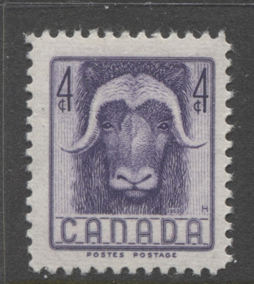
4c purple - Musk Ox.
Designer: Emanuel Otto Hahn, modeled by Herman Herbert Schwartz.
Engraver: Silas Robert Allen.
Issued: April 4, 1955.
51,200,000 stamps.
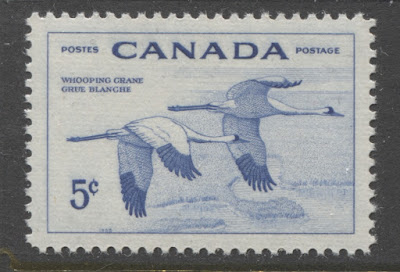
5c bright blue - Whooping Cranes in flight.
Designer: Dr. William Rowan, Professor of Zoology, University of Alberta.
Engraver: Silas Robert Allen.
Issued: April 4, 1955.
50,950,000 stamps.
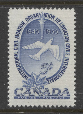
5c deep ultramarine - ICAO Emblem.
commemorating the 10th anniversary of the International Cival Aviation Organization.
Designer: Walter Lohse.
Engravers: Silas Robert Allen and Yves Baril.
Issued: June 1, 1955.
25,000,000 stamps.
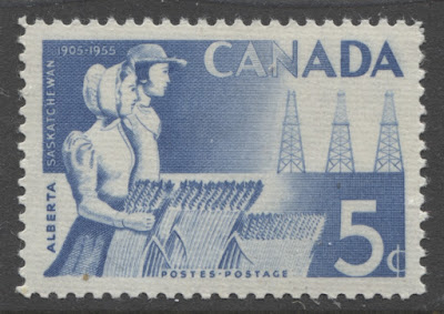
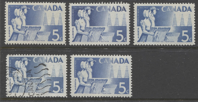
5c ultramarine - pioneer couple with wheat sheafs & oil rigs.
celebrating the 50th anniversary of Alberta & Saskatchewan as provinces.
Designer: Laurence Hyde.
Engravers: Yves Baril & John Mash.
Issued: June 30, 1955.
25,200,000 stamps.
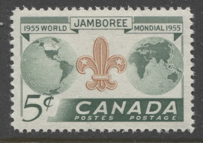
5c green and golden brown - World Scout Jamboree.
Designers: Laurence Hyde & Herman Herbert Schwartz.
Engravers: Silas Robert Allen & Yves Baril.
Issued: August 20, 1955.
51,350,000 stamps.
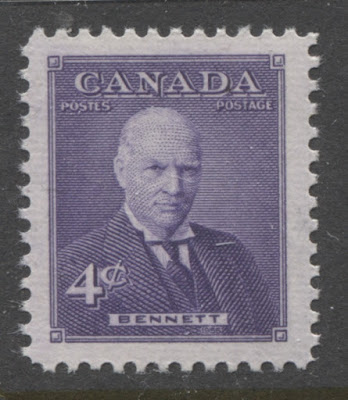
4c purple violet - Richard Bennett.
Designer: Herman Herbert Schwartz.
Engraver: Silas Robert Allen.
Issued: November 8, 1955.
49,855,000 stamps.
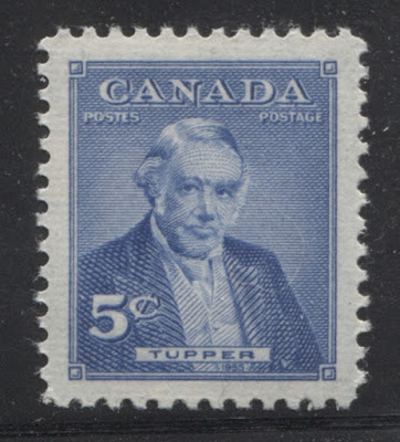
5c ultramarine - Sir Charles Tupper.
Designer: Herman Herbert Schwartz.
Engraver: Silas Robert Allen.
Issued: November 8, 1955.
50,480,000 stamps.
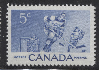
5c ultramarine - hockey players.
Designer: James Simpkins.
Engraver: Silas Robert Allen.
Issued: January 23, 1956.
30,000,000 stamps.
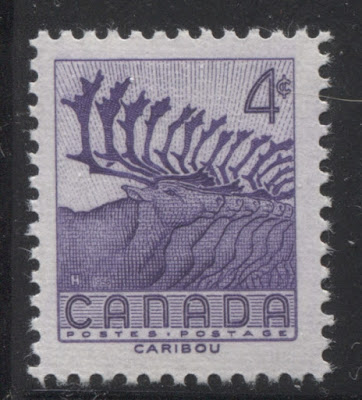
4c purple violet - caribou.
Designer: Emanuel Otto Hahn.
Engraver: Silas Robert Allen.
Issued: April 12, 1956.
50,900,000 stamps.
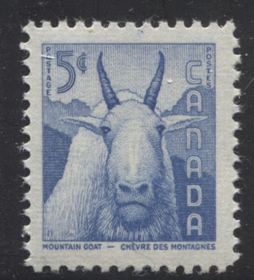
5c ultramarine - Mountain Goat.
Designer: Emanuel Otto Hahn.
Engraver - Silas Robert Allen.
Issued: April 12, 1956.
51,100,000 stamps.
5c grey and deep vermilion - house on fire issued to raise awareness of the importance of fire prevention
Designers: Arthur Donald Price and Herman Herbert Schwartz.
Engraver: Silas Robert Allen.
Issued: October 9, 1956.
50,750,000 stamps.
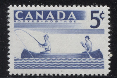
5c deep ultramarine - fishing.
Designer: Laurence Hyde.
Engraver: Silas Robert Allen.
Issued: March 7, 1957.
13,052,000 stamps.
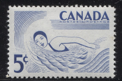
5c deep ultramarine - swimming.
Designer: Laurence Hyde.
Engraver: Yves Baril.
Issued: March 7, 1957.
13,052,000 stamps
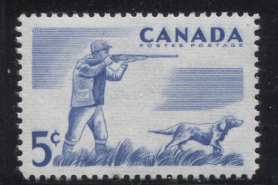
5c deep ultramarine - hunting.
Designer: Laurence Hyde.
Engraver: Yves Baril.
Issued: March 7, 1957.
12,048,000 stamps.
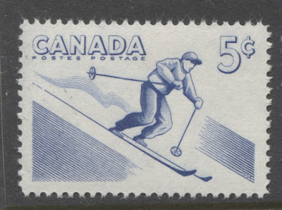
5c deep ultramarine - skiing.
Designer: Laurence Hyde.
Engraver: Silas Robert Allen.
Issued: March 7, 1957.
12,048,000 stamps.
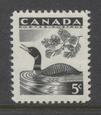
5c black - loon.
Designer: Laurence Hyde.
Engraver: John Mash.
Issued: April 10, 1957.
51,000,000 stamps.
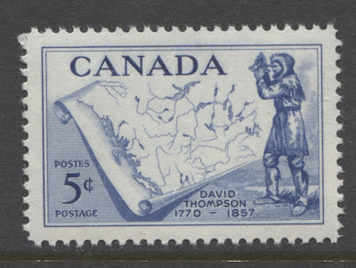
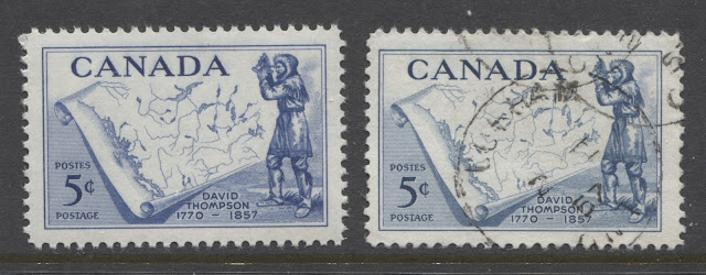
5c deep ultramarine David Thompson, explorer.
Designer: George Arthur Gundersen.
Engraver: Yves Baril.
Issued: June 5, 1957.
29,350,000 stamps.
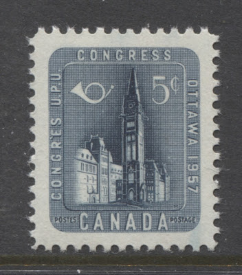
5c slate blue - Parliament Buildings.
Issued for the 14th Universal Postal Union Congress.
Designer: Carl Mangold.
Engraver: Yves Baril.
Issued: August 14, 1957.
74,700,000 stamps.
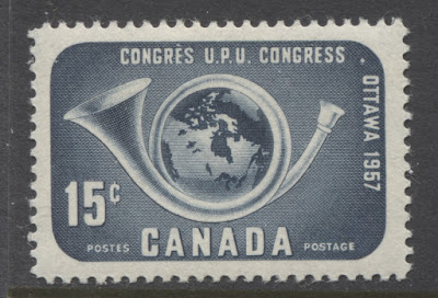
15c deep slate blue - posthorn & globe.
Designer: Carl Mangold.
Engraver: Yves Baril.
Issued: August 14, 1957.
7,000,000 stamps.
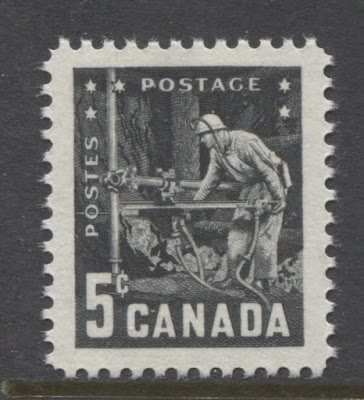
5c black - miner with drill.
Issued for the 6th Commonwealth Mining & Metallurgical Congress.
Designer: Alfred Joseph Casson.
Engraver: Yves Baril.
Issued: September 5, 1957.
25,600,000 stamps.
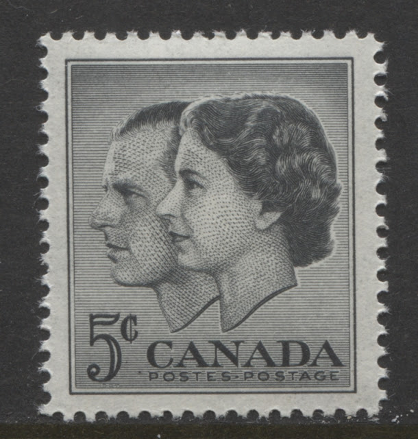
5c grey-black - Queen Elizabeth II and Prince Phillip.
Issued for the first Royal Visit of the Queen and the Prince to Canada.
Based on photographs by Yousuf Karsh.
Engraver: Yves Baril.
Issued: October 10, 1957.
51,260,000 stamps.
Points of Interest
The points of interest for these stamps is much the same as for the previous commemorative issues:
- Shade varieties
- Paper and gum varieties
- Perforation varieties
- Plate blocks
- Re-entries and plate flaws
- Colour shifts
- Proof material
- First Day Covers
The remainder of this post will discuss these aspects in greater detail.
Shade Varieties
Most all of the shade varieties that I have seen on these issues occur on the blue stamps. The basic colour for most of these is some variant of ultramarine or royal blue. However, one can find shades of dull blue that are greenish in tone, and lack all the vibrancy of ultramarine. On the other end of the scale one can find dark blues that are deeper and duller than the basic ultramarine shade. Finally, there may indeed be aniline ink varieties to be found on these as well, though to date I have not seen any.
The scans below illustrate some of the variations that I have encountered on these issues so far:
The differences in real life are more apparent than this scan shows. If you look closely though, you can see the basic ultramarine shade on the top left stamp. The stamp at the top right is the same basic tone, but is a bit deeper. The stamp in the middle contains a hint of black to the blue, and is much deeper than any of the stamps here. The stamp on the bottom centre is duller than the basic ultramarine shade, but is similar in terms of its intensity. The stamp on the left is the dull blue with the greenish undertone. When I first saw this last shade, I assumed that it was a colour changling brought about by fading. However, as we shall see, I have also found it on mint stamps, which leads me to believe that it is a legitimate ink variation.
Here with the 5c Charles Tupper stamp, the basic ultramarine shade is represented by the second stamp from the left. The stamp to it's right is a slightly greener shade, while the two stamps on either end are a deeper and duller shade.
This is one of my more dramatic groupings and the one that convinced me once and for all, that the greenish ultramarine that I was seeing is not a colour changeling. The second stamp from the left is the deep ultramarine. The stamp to it's right is deeper and slightly duller. The stamp on the left is the greenish ultramarine, while the stamp on the right is a deep, dull blue.
This is another stamp where the difference is more dramatic when viewed in the flesh. The stamp on the right has a definite greenish undertone compared to the one on the left.
Again, the stamp on the left has a hint of both green and black to the blue that is entirely missing on the left stamp.
Finally, here is the 5c David Thompson stamp, again showing the normal ultramarine and greenish ultramarine shades.
Paper and Gum Varieties
So far I have seen seven different kinds of paper on these issues. Some of these are similar to one another, but all are slightly different in some way.
The following scan shows the first three of these, as seen from the front:
The first type of paper is the strongly horizontal ribbed, vertical wove paper, which is represented by the stamp on the left. This paper has a very strongly ribbed texture on both the front and the back. Under a loupe, the surface of the paper appears corrugated and you can see occasional dark spots from where the light is coming through the thinner parts of the paper. This paper is found on most of the issues during this period, though it completely disappears by the end of 1957.
The second type is also horizontal ribbed, vertical wove, sharing very similar characteristics to the first type, except for the fact that the ribbing is much lighter and less obvious to the naked eye than on the first type. This paper is also found on most of the issues of this period, though again, it tends to disappear by the end of 1957.
The third type is a horizontal wove paper, rather than a vertical wove with a smooth surface. If you hold it up against strong backlighting, you can just make out vertical mesh in the paper. However, under a loupe, the surface appears completely smooth, if not a little porous, with some areas where the light comes through more strongly than others. This paper first appears during this period only on the 1955 Scout Jamboree Issue, and it becomes the normal paper for stamp issues by 1962.
The next scan shows the gum side of these three stamps:
Hopefully you can see that obvious ribbing on the left stamp, which is the first type of paper. The gum tends to be a light yellow, thick, shiny dextrose gum with a semi-gloss sheen. On the second type of paper, it is a bit less yellow and more cream, but has the smooth texture and semi-gloss sheen that the first type of paper has. Finally, the third stamp, which is on the third type of paper, has gum that is creamy in colour, but the texture is somewhat streaky and slightly uneven.
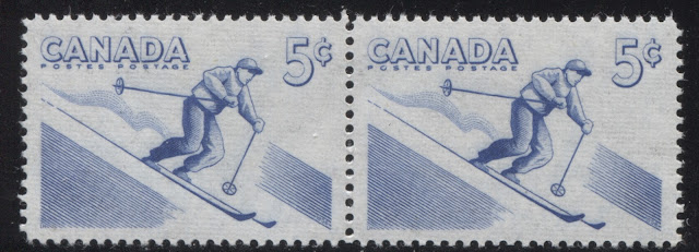
The next scan shows the fourth paper type, which is illustrated nicely by the following identical pair of the 5c skiing issue of 1957:
This is similar in all respects to paper type 1, except that it is noticebly thinner. Stamps printed on this paper will have elements of the design that will show very clearly through to the back, even when a non-aniline ink has been used, whereas stamps on paper type 1 will not show any elements of the design on the back. Here you can clearly see the horizontal ribbing, as well as the dark areas where the paper is thinner and the light is coming through.
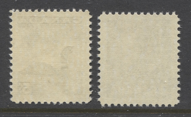
Let's take a look at the gum side:
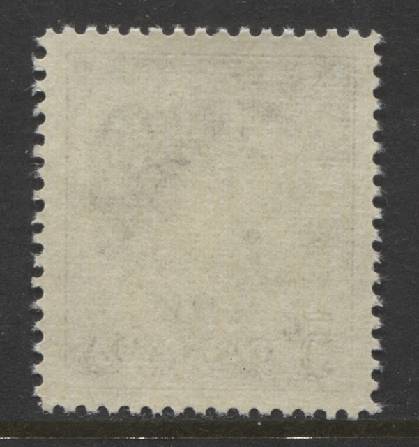
The gum on this paper type is smooth and less yellowish than the earlier issues. I have seen this paper on most issues up through 1957, through it is completely gone by the end of 1957, just like types 1 and 2.
Now, let us move on to the next two types of paper. The scan below shows these two paper types:
The stamp on the left is type 5, while the one on the right is type 6. Both types of paper are vertical wove papers and both types are completely smooth on the printed side. There is no visible ribbing, and no unevenness to the paper. Type 5 shows moderately strong horizontal ribbing on the gummed side only, while type 6 shows very light horizontal ribbing on the gummed side only. The most obvious difference between the two types lies in the gum, which is shown below:
The gum on type 5 paper first appears on the 5c loon stamp and is very distinct in that it tends to be streaky in the vertical direction, and it has a satin sheen, rather than a semi-gloss, or glossy sheen. The gum on type 6 paper is creamy, smooth and has a semi-gloss to glossy sheen.
I first noticed these papers on the last issues from 1957, though it is entirely possible that they might exist on some of the earlier issues as well. The satin gum is only found from 1957 onwards, though paper type 6 may well exist from 1955 and 1956.
The last type of paper, which I have only found on the 1957 Royal Visit Issue, is shown below:
As the scan shows, the printed surface of this paper is perfectly smooth, just like paper types 5 and 6. However, it is not of even thickness, with the result that you can see alternate light and dark spots in the margins, with the dark spots being the areas where the light is coming through the paper weave. On the back, there is very light horizontal ribbing visible. The gum is the same cream gum with a satin sheen that is found on paper type 5, as shown in the scan below:
The paper is an aspect of these issues that all the catalogues and literature have completely and utterly ignored. I'm not sure why this is, because it is very clear that there is no similarity at all between the heavily ribbed papers like type 1 and the type 6 smooth paper. Every attribute you can examine with respect to these papers is objectively different, and these differences are not difficult to see once you know what to look for. Type 3 is the only paper that is horizontally wove, whereas all the other papers are vertical wove. These differences are, in my humble opinion, every bit as important, and every bit as significant as the differences between the Duckworth papers on the Large Queens. I can well understand collectors who feel that these differences are too minute to be of interest to them. However, what I cannot understand is how philatelists who pay a lot of attention to paper differences on the Large Queens or the Small Queens can ignore the paper differences on these issues when they are so striking.
Fluorescence
During this period, as with the last, stamp paper is generally non-fluorescent or dull fluorescent. Unitrade lists no paper varieties whatsoever for any of these stamps. However, it is possible to find subtle variations in the appearance of the paper under long-wave ultraviolet light:
- Some papers give a dead, non-fluorescent violet, or light violet reaction.
- Some papers give a yellowish-cream, ivory, dull fluorescent appearance under UV.
- Some papers give a greyish or greyish white dull fluorescent appearance under UV.
- Finally, some papers give a bluish white dull fluorescent appearance under UV.
I have not done a study to determine which of these 21 stamps are found on each of the above paper types, though I am fairly confident that each of the ribbed and smooth papers probably exist with at least two different types of dull fluorescence, and also the dead, non-fluorescent reaction. You could have quite a bit of fun focusing on this aspect and trying to establish definitively which varieties exist.
Perforation Varieties
The standard catalogues including Unitrade all state that the perforation of all these issues is 12. However, in recent years, philatelists have discovered that in 1962, the CBN changed its perforating equipment from a line gauge of 11.95 to a gauge of 11.85. If you go back and examine very carefully the stamps of say the 1949-52 Postes Postage issue, you will see that they do indeed measure 12.0 exactly on an Instanta gauge. Therefore, it follows that sometime between 1950 and 1962 the standard measurement changed from 12.0 to 11.95. Usually when these kinds of changes are introduced, they are introduced gradually, so that compounds of the old perforation and the new perforation are often found. I do not know when exactly that was, but it is possible that some of these stamps may exist perf. 11.95, 11.95 x 12.0, or even 12.0 x 11.95. On the other hand, they may only exist perf. 12. To settle this, a collector with a great deal of patience and an Instanta gauge will have to carefully measure the perforations of several hundred stamps and tabulate their findings.
Plate Blocks
Most of the 21 stamps issued during this period were printed from 2 plates. However, there were a few that were printed from only a single plate:
- 4c Musk Ox - 2 plates.
- 5c Whooping Cranes - 2 plates.
- 5c ICAO - 1 plate.
- 5c Alberta and Saskatchewan - 2 plates.
- 5c Scout Jamboree - 2 plates.
- 4c Richard Bennett - 2 plates.
- 5c Sir Charles Tupper - 2 plates.
- 5c Hockey - 1 plate.
- 4c Caribou - 2 plates.
- 5c Mountain Goat - 2 plates.
- 5c Fire prevention - 1 plate.
- 5c Recreational sports - 2 plates
- 5c Loon - 1 plate
- 5c David Thompson - 1 plate.
- 5c UPU Congress - 2 plates.
- 15c UPU Congress - 1 plate.
- 5c Mining - 1 plate.
- 5c Royal Visit - 2 plates.
Thus a complete, basic set of blocks for all corners, consists of 116 different blocks. If each issue exists on 2 different papers and 2 different shades of each, you can potentially collect almost 500 different blocks. This can easily grow in scope if there are more then 2 shades of some issues, or if differences in paper thickness, texture or fluorescence are studied in detail.
Order Numbers
Throughout the period the order number continued to be printed along the left selvage of the lower left plate block. The order numbers that I have seen so far are:
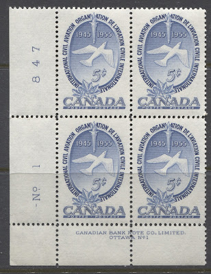
- 5c ICAO plate 1 - 847, numbers wide apart and dash to the left of "No."
- 5c Scout Jamboree, plate 2-1 - 772, numbers wide apart, no dash before "No.".
- 5c Charles Tupper, plate 2 - 853, numbers wide apart, no dash before "No."
- 5c Loon plate 1 - 1113, numbers wide apart, no dash before "No."
- 15c UPU Congress plate 1 - 1146, numbers wide apart, no dash before "No."
- 5c Royal Visit plate 2 - 1268, numbers 126 are closely spaced while the 6 & 8 are widely spaced. Again, there is no dash before "No."
Position Dots
The appearance of position dots on these issues appears, from the few blocks that I have examined so far to be on the decline. The lower left block of the 1957 Loon stamp above, the lower left plate 2 block of the 1955 Charles Tupper issue, and the lower right position of the 1957 David Thompson Issue are the only three that I have seen where a position dot appears in the selvage. The dot on both lower left blocks is located on the bottom selvage at lower right. On the lower right block of the David Thompson issue, the dot is at the lower left.
I will continue to add more information about these dots and which blocks they appear on as I study more and more examples of the stamps of this issue.
Re-Entries and Plate Flaws
Re-Entries
As was the case with the 1952-54 commemoratives, there are no known re-entries on any of these 21 stamps either. However, once again, given the very large numbers printed of each issue and the fact that only 2 plates were used for most of them, I think that there must be some re-entries out there that have yet to be discovered. Fortunately, most of these issues can still be found in full sheets, although these are getting scarcer all the time. The best way to look for these is to acquire a number of sheets and study them very carefully, looking for signs of doubling in all elements of the design, including the marginal inscriptions. Given that re-entries can occur when a plate is repaired, or otherwise re-worked, it is possible that two sheets from the same plate could differ in this respect, and so just because you examine a sheet from say plate 1 that does not show any re-entries, it does not mean that you can't find another sheet later that does show at least one. It can simply happen, if at some stage during the print run, a decision was made to strengthen some of the impressions in the sheet. So my recommendation would be to study a large number of full sheets first, and then if nothing turns up, consider studying a quantity of used bundleware and studying these carefully.
Plate Flaws
There is only one known constant variety that is currently known on these issues, and it is known as the "dot in the water" on the 5c loon stamp from 1957. The scan below shows a close-up illustration of it;
The dot appears just to the left of the third ripple in the water from the loon's neck. It occurs on position 1 of the upper left pane from plate 1.
Colour Shifts
Both bicoloured issues, being the 1955 Scout Jamboree and the 1956 Fire Prevention issues were printed in two operations, with the frame printed first, before the sheets were fed back into the presses again for the printing of the vignette. Occasionally, they were fed in considerably out of alignment with respect to the area within which the vignette was supposed to fall. The result are some dramatic shifts that can be found in the location of the vignette relative to the rest of the design. It should be noted that very minor differences (i.e. less than 0.5 mm) are common, and probably not worth collecting. However, differences greater than this can be quite significant. The scan below shows a collectible example of a colour shift on the 1956 Fire Prevention Issue:
The stamp on the left is the normal stamp, where the flames are nowhere near the "5". On the right, we have a fairly significant shift of the vermilion, resulting in the flames just touching the bottom of the "5". On the 1955 Scout Jamboree issue, significant shifts have the Scouting Emblem appearing on either of the two globes rather than in the middle of the design between the two globes.
Proof Material

The BNA Proofs website lists 18 different proof items from this period, though curiously they seem to be limited to two of the last three issues from 1957. There is no proof material listed for 1955 or 1956. I'm not sure why this is. I would guess that it is due to the fact that the only known material is likely held by the postal archives and is not known in private hands. The material listed mostly consists of artistic sketches, photographic proofs and partial proofs. There is one small die proof listed for the 5c UPU Conference issue, but not for any of the other stamps. All of the listed material is either unique, or there are only 2 of each item known. It is generally expensive, though not that expensive for how scarce it is, with most items selling in the $500-$1,000 range. The existing material can be summarized as follows;
- 1 artist's pencil sketch, and 1 artist's drawing of the 5c UPU Issue.
- 2 small hand-drawn essays of the 5c UPU issue, one on white paper and the other on yellow paper.
- 1 small die proof of the 5c UPU issue on white paper.
- 1 pencil sketch of the 15c UPU issue.
- 3 preliminary sketches of the 15c UPU issue: one as 3c, one as 5c and one as 15c.
- 1 advanced sketch of the 15c UPU, but as a 5c stamp.
- 2 complete drawings of the 15c UPU - one as a 3c stamp and one as a 5c stamp.
- 2 photographic proofs of the complete design, one signed by the artist.
- 3 proofs of the vignette of the 1957 Royal Visit issue on India paper, one having the die number.
- 1 large proof of the vignette of the 1957 Royal Visit Issue on glazed paper.
You can view all of these items, including scans by visiting the BNA Proofs website via the following link:
To access the scanned images of an item, hover your mouse over the white rectangles on the side of the screen and you will see that the rectangle is a clickable link that will take you through to the image of the particular item in question.
First Day Covers

There were a very large number of cachet makers operating during this period, many of whom produced very elaborate and beautiful hand painted cachets, like the one above. The best of these are by no means inexpensive, due to their scarcity. The cover shown above is currently for sale in the April 26, 2017 Maresch and Son auction, and is estimated to sell for $250. However, most are very affordable and as a result, you can have a lot of fun putting together a collection that will have a lot of artistic eye appeal. To give you an idea of the potential scope involved in collecting the first day covers of this period, here are some of the names of cachet makers who were active during this period:
- Nene
- Ken Boll
- JCR
- C. George
- Caneco
- Sanders
- Velvetone
- UEL
- Maple Leaf
- H&E
- Cassidy
- PentArts
- Meter Digest
- Rob Pristas
- CPO Replacement
- Grover
- Texturecraft
- Philatelic Supply
- Globe
- Regal
- Capital
- Junior III
- Essex
- Cachetcraft
- Goldie
This represents a good cross section of the cachet makers operating during this time. The cachets of course are only one aspect of first day cover collecting. Two more aspects that add scope to a collection are:
- The actual stamps affixed to the cover, and
- The cancellation.
Most people who produced first day covers during this time would, for each issue and each cachet, would prepare:
- A cover containing a single stamp,
- A cover containing a pair,
- A cover with each plate block position, and
- Sometimes a cover with a block of four, and
- In the case of a set, a combination cover containing one of each stamp.
So for an issue like, say the 1956 Wildlife Issue, that was printed with 2 plates, there would likely have existed for a particular cachet maker:
- 2 covers with singles.
- 2 covers with pairs
- 16 covers with plate blocks
- 2 covers with blocks of 4
- 1 combination cover.
So that is 23 covers! For one issue and one cachet maker. I just rattled off a list of 25 different cachet makers. So if you wanted to go about assembling a complete and comprehensive FDC collection of the commemorative issues during this period, you could potentially be looking for 23 x 25 = 575 covers for this one issue alone. For all the issues involved, you could be looking for close to 5,000 different covers - not at all an easy or trivial task.
That is just for the cachets and the stamp configurations. Then there is the issue of the cancellations. The most common cancellation is either the wavy line, or straight line slogan First Day of Issue cancellation that was used in each of the major cities, the most common of which is Ottawa. However, cachet makers would often have covers cancelled at smaller post offices as well, that would simply apply the standard CDS cancellation. So it may be possible to find each cover with several different cancellations as well. So in reality, you could potentially collect many thousands of covers for this period.
Postal History and Cancellations
With one exception, being the 15c UPU issue of 1957, these are all 4c and 5c stamps, which were designed for use on local and forwarded, single rate domestic mail. Thus plain covers bearing single usages of these stamps are nothing to get excited about, although they are an important part of a complete collection of these issues. However, if you look patiently through dealer stocks of covers from this period you will still be able to find commercial covers that are mostly on business stationery from the period that have interesting graphics and corner cards, such as advertising covers, or covers from hotels. Collecting these domestic usages from smaller towns or from post offices that are no longer open is another way that you can approach the collecting of postal history from this period.
Because these stamps were designed primarily for local use, and because definitives would have generally been used to make up the higher postage rates, the really desirable and challenging covers will be foreign airmail and foreign registered covers, where the higher rates of postage above 15c will have been paid with combinations of these commemorative stamps used in the proper period. These will not be easy to find, but with patience and access to dealer's stocks of large cover lots purchased at auction, you should be able to find some really nice usages. The best covers will be those that use the most diverse range of stamps possible, and generally used within 6-7 months of being issued.
As with all other issues I have written about these stamps are ideal for the collection of small town CDS cancels. All of them can still be bought as bundleware for very little money. The 1957 Recreational Sports issue is a little more expensive compared to the others, but still very, very cheap and represent an almost endless amount of scope, as there are probably well over 30,000 different CDS cancels that can be found during this period, which makes for a potential collection of several hundred thousand stamps, if you were able to obtain an example of all of them. For those of you who find that too daunting, you can always focus on a province, or a group of smaller towns.
This brings me to the end of my discussion of these issues from the mid-1950's. Next week I will look at the commemorative issues from 1958 through 1962, when Canada's next definitive set appears, which collectors call the Cameo Issue.
