

This week's post, as will my posts over the next several weeks will have to be made much shorter than usual due to some severe constraints on my time. Basically, I have to focus on the completion of my website, so that I can make the transition away from E-bay successfully. So, for the next several weeks I will not be able to devote an entire day to blog writing. But, I do not want to leave my readers hanging with no new material, so I have decided to continue posting, but to publish shorter than usual posts. Then, once my website is operational, I can resume the longer posts.
With that I mind, I will finish the 5c Atlantic Fishing Village stamp, by looking at the printings of the coil stamp, and then I will begin looking at the untagged sheet stamp of the 6c orange transportation design, with the sheet stamps perforated 10.
The 5c Atlantic Fishing Village Coil Stamps - Unitrade/Scott #468
This was the last of the coil stamps to be printed by the Canadian Bank Note Company (CBN) in rolls of 500 stamps, prior to the reduction of roll sizes to 100 stamps, in preparation for the introduction of the new plastic stamp dispensers in 1968. As such, it is the last coil stamp which exists with start strips, end strips and repair paste-ups, as none of these things were necessary with the smaller rolls and the manner in which they were to be dispensed.
Paper Attributes Other Than Fluorescence
Both horizontal and vertical wove papers were used to print these coil stamps. In instances where the paper is vertical wove, the stamps will tend to lie flat and will, when gum is present, curl slightly upwards in the horizontal direction. When the paper is horizontal wove, the stamps will not usually lie flat, and will curl in the vertical direction.
The picture below shows two different coil pairs, with one being on vertical wove paper, and one being on horizontal wove paper.

In all cases, the paper is a cream paper that looks decidedly off-white when viewed against a stark white background. Unlike the CBN printings of many of the sheet stamps from 1967, when the coils were issued, the paper is uncoated, so that under magnification it is possible to see loose and stray fibres on the paper surface. Generally speaking there is no visible ribbing on the gum side of these stamps. Generally, when the stamps are held up and viewed against a strong back light, it is possible to see a faint horizontal mesh pattern.
Paper Fluorescence
Unitrade lists two levels of paper fluorescence: dull fluorescent and low fluorescent with fluorescent fibres. In reality, there are really three basic levels, and several sub types of each one. The third level of fluorescence is dull fluorescent with fluorescent fibres. The brightness and quantity of these fibre inclusions varies considerably, and they will either make the paper appear fluorescent overall, or they will not change the overall perceived level of fluorescence, in which case they are still dull fluorescent.
I have found three varieties of dull fluorescent paper:

The pair at the upper right is a deep grey colour under the UV light, while the bottom single stamp is a greyish white colour. The strip on the left is an ivory colour under the UV light. None of these three papers contain any significant number of fluorescent fibres inside them. Occasionally, you might see the odd stray fibre, but it will only one, or at most two. So, for all intents and purposes there are no fibres in this paper.
The next picture shows three of the papers containing fluorescent fibres:

The precancelled strip of 4 on the left is the brightest of the three items shown here, and is in fact one of three true low fluorescent papers. It is a low fluorescent greyish white colour under the UV light and the paper contains very sparse concentrations of medium and high fluorescent fibres, as well as very few low fluorescent fibres. The pair on the right is a dull fluorescent greyish white under UV, and contains a very sparse concentration of high fluorescent fibres and very few medium and low fluorescent fibres. These fibres feature prominently on the stamp, but do not alter the overall perceived level of fluorescence. You can just make out the brightest fibres in the margin between the stamps in the pair above the Queen's head and near the upper left space between the two stamps. The lower right single stamp is a low fluorescent greyish colour under UV light, and contains very sparse concentrations of high fluorescent and hibrite fibres, as well as very few low and medium fluorescent ones.
The next picture shows two more varieties:

The precancelled strip on the right is also low fluorescent greyish white under UV, but this time there are very sparse concentrations of medium and high fluorescent fibres, and very few hibrite and low fluorescent fibres. The strip on the left is dull fluorescent greyish white, and contains very sparse concentrations of medium and high fluorescent fibres, as well as very few low fluorescent and hibrite fibres. These fibres do not alter the overall fluorescence of the paper. If you look carefully at the picture, you should just be able to see some of these fibres in the left margins of the strip.
Shades
There are several shades of the blue to be found on these coil stamps. However, I have not found the extreme indigo or bright blue shades that I found on the sheet stamps. Instead, the shades all seem to be "middle of the road" blue shades. The differences are quite subtle, but I have found four very similar shades. Here are the first two:

The next two shades are shown below:

The shades generally do not change under UV light, but merely appear darker than they do in ordinary light. Therefore, the inks used are non-transformative.
Gum
I have found two types of dextrose gum on these stamps:
- A smooth, yellowish cream gum with a semi-gloss sheen, and
- A streaky, yellowish cream gum with a semi-gloss sheen.
Perforation
These stamps were line perforated 9.4 horizontally, although all the standard catalogues round the perforation measurement up to 9.5.
Precancels
There is one documented precancel style found on these coil stamps, consisting of three pairs of thin vertical black bars as shown below:
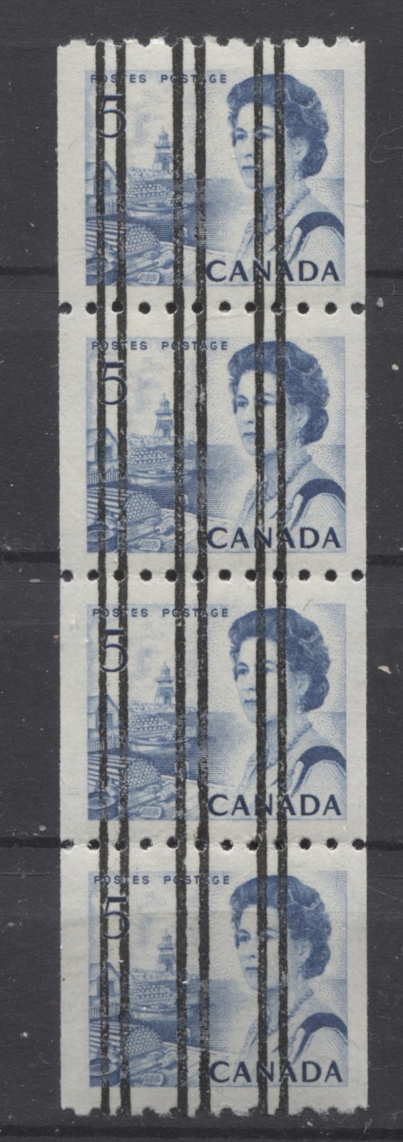
The precancels appear to exist with all forms of paper fluorescence that occur with the non-precancelled stamps. Such is likely also the case in terms of paper and gum also.
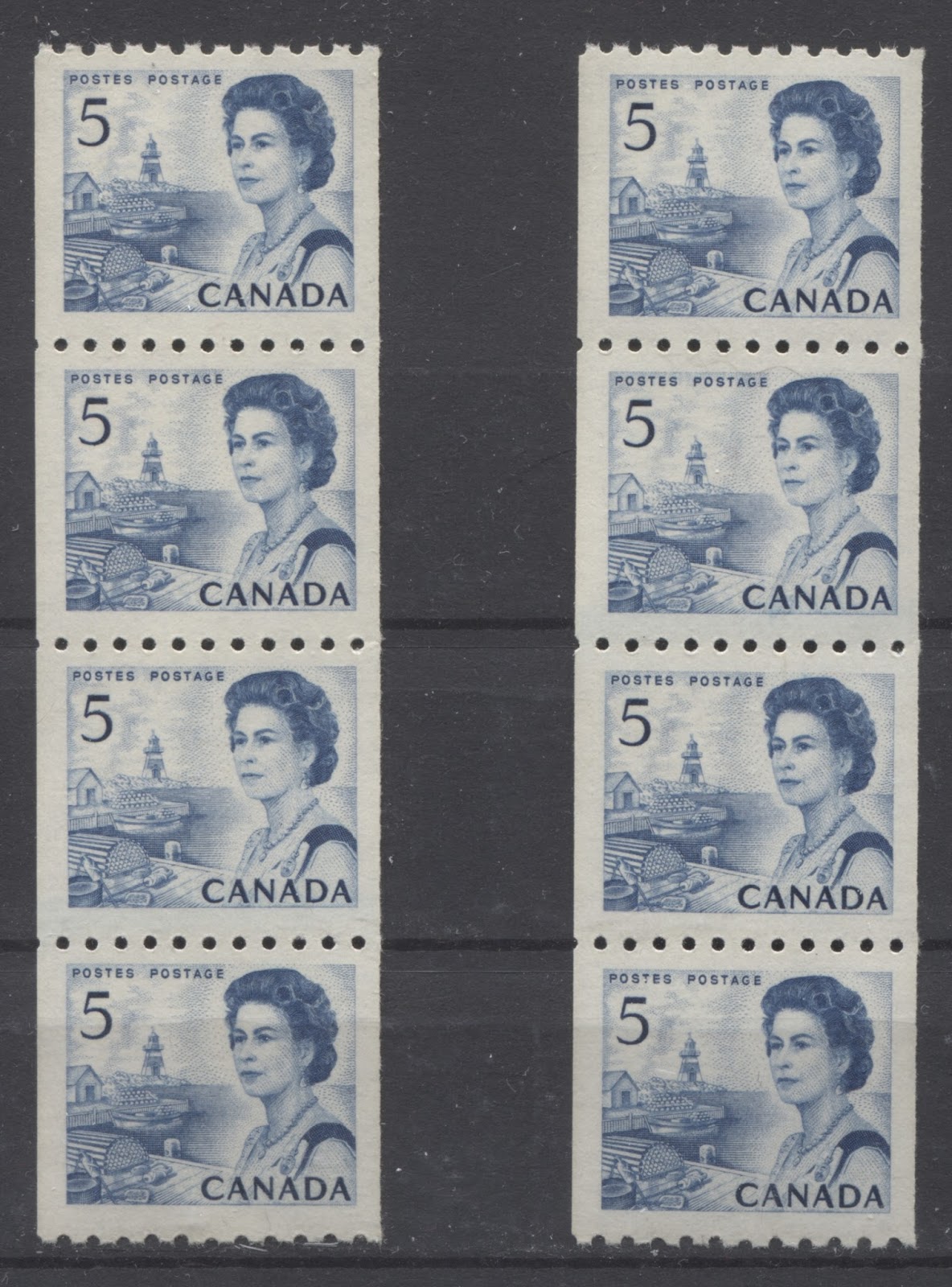
Spacing Varieties and Jumps
The normal spacing between stamps in the vertical direction on these coils is between 4 mm and 4.25 mm. Strips and pairs can be found where the spacing is either narrow (i.e. 3 mm to 3.75 mm), or wide (over 4.5 mm). An example of a wide spacing strip showing a 5 mm space between stamps is shown below, next to a regular strip with normal spacing:

The normal strip is shown on the left, whereas the wide spacing strip is shown on the right. If you compare the width of the space between stamps 1 and 2 or 3 and 4 with the space between stamps 2 and 3, you will see that the space between the second and third stamps is noticeably wider.
Much more difficult to spot on these stamps are the jump strips, mainly because the horizontal jumps are very slight and easily overlooked if you are not paying very close attention.
Below are two jump strips of 4 in which the jumps occur in different places in the strip:
In the case of the strip on the left, the jump occurs between the last two stamps, in which the bottom stamp is shifted ever so slightly to the left of the rest of the stamps in the strip. On the right strip, the jump appears in the middle, and the lower pair is slightly to the left of the upper pair. Can you see the small shift?
If not, here are some close ups to help you:


The normal strip is shown on the left. If you follow the edge of the bottom stamp upwards with your eye to the top stamp, you can see that both stamps are perfectly aligned. In contrast if you do the same thing with the right image, you can see that the two stamps are not perfectly aligned.

Here is a close up scan of the jump on the second strip. again you can see, if you look carefully, that these two stamps are not aligned.
Finally, cutting guideline strips can be found that show the cutting guideline in one of the side margins. Generally in order to see the guideline, the strip has to be very poorly centered in the horizontal direction. These are quite sought after, but unfortunately I do not have an example of one on the 5c coil that I can include here, but I will be sure to add one, when I manage to obtain one.
The 6c Orange Transportation Stamp Perf. 10 - Unitrade/Scott #459
On November 1, 1968, this stamp was issued to replace the 5c Atlantic Fishing Village stamp as the main stamp in use to pay the first class postage rate
Attributes of Paper Other Than Fluorescence
The paper used to print these stamps is generally always horizontal wove, rather than the vertical wove found on the other low values. The paper is uncoated and has a smooth, porous surface. The paper is a light cream colour when viewed against a stark white background. There are four types of paper that both share these attributes, but which differ as follows:
- One type of paper shows no ribbing on the surface, and when held up to a strong back light, a faint vertical mesh pattern is visible.
- Another type is similar, but shows faint vertical ribbing on the surface.
- A third type is a smooth paper that shows no ribbing on the face, and no mesh pattern when held up to a strong back light. It would appear that the low fluorescent papers are of this type.
- A fourth type is a buff coloured, ribbed paper that shows a strong vertical mesh pattern when viewed against a strong back light.
Paper Fluorescence
Unitrade lists only three types of paper for this stamp: non-fluorescent (NF), dull fluorescent (DF) and low fluorescent with fluorescent fibres (LF-fl). The standard stamp is listed as being on NF paper, but I have yet to see an example of this stamp on what I would consider to be truly NF paper. Instead, I believe that there are at least 5 types of DF paper as shown below:

The difference between the papers in the above picture are not as apparent as they are in real life, or as apparent as the difference between the inks. The block appears yellowish grey under UV light, and the orange ink appears deep orange brown. The top left stamp appears deep grey under UV, while the top right stamp appears grey. Both stamps appear deep orange brown under the lamp. The bottom left stamp appears violet grey and the colour of the ink is deep orange-red. The lower right stamp appears greyish white under UV, and the ink colour appears deep orange brown.
Two varieties of the low fluorescent paper with fluorescent fibres are shown below

- The block contains a low density of low fluorescent fibres, a sparse concentration of medium fluorescent fibres, a very sparse concentration of high fluorescent fibres and very few hibrite fibres. Together, these fibres make the paper appear solidly low fluorescent.
- The pair is similar, except that instead of a low density of low fluorescent fibres, there is a sparse density.
Shades
Despite the fact that Unitrade does not list any shades on this stamp, there are quite a few shade variations of the orange ink that vary in terms of intensity and brightness, as well as their appearance under UV light. Some of the inks are non-transformative, in the sense that they still appear shades of orange-red or red-orange under UV light, while others are transformative, appearing either brown orange, orange brown or bright fluorescent orange or fluorescent red.
So in looking at the shades on this stamp it makes sense to describe the shades both in normal light, as well as under UV light.
The picture below shows the first of the shades, which is the fluorescent orange ink, as listed in Unitrade. In normal light, the colour is red-orange that is neither bright, nor dull. Here is the colour under UV light when compared to a stamp with normal, non-fluorescent ink:

The fluorescent ink is the left stamp of course, and this particular one glows a very bright red-orange. The ink is also known to exist in a slightly redder orange that is less bright. Unfortunately, I do not have an example that I can show here, but will add one as soon as it becomes available.
The next two are shades of the non-fluorescent ink:

The next shade is a brighter, slightly deeper orange, and is shown below:

Notice how much brighter this colour is compared to the duller orange colour of the two stamps shown above. Under UV, this colour is a very deep orange that is neither reddish, nor brownish.
The last shade I have identified is a a deeper version of the bright orange:

This shade is similar to the one above, but there is slightly less red in the orange, and it is more intense. Under UV light it is a very deep orange, that is neither reddish, nor brownish.
GumI have noted two types of dextrose gum on these stamps:
- A light cream, smooth gum that has a glossy sheen and what appear to be horizontal brushstrokes running through it.
- A smooth, cream gum that has a fine diagonal crackly pattern.
Perforation
These stamps are comb perforated 10.0. They are the first of the sheet stamps of this series to be perforated using new comb machines, rather than line perforated.
Precancels
This stamp was produced with a precancel consisting of three pairs of horizontal bars that were printed before the stamp design was printed. But the bars look like they were printed on top of the stamp. This pprecancel is shown below:
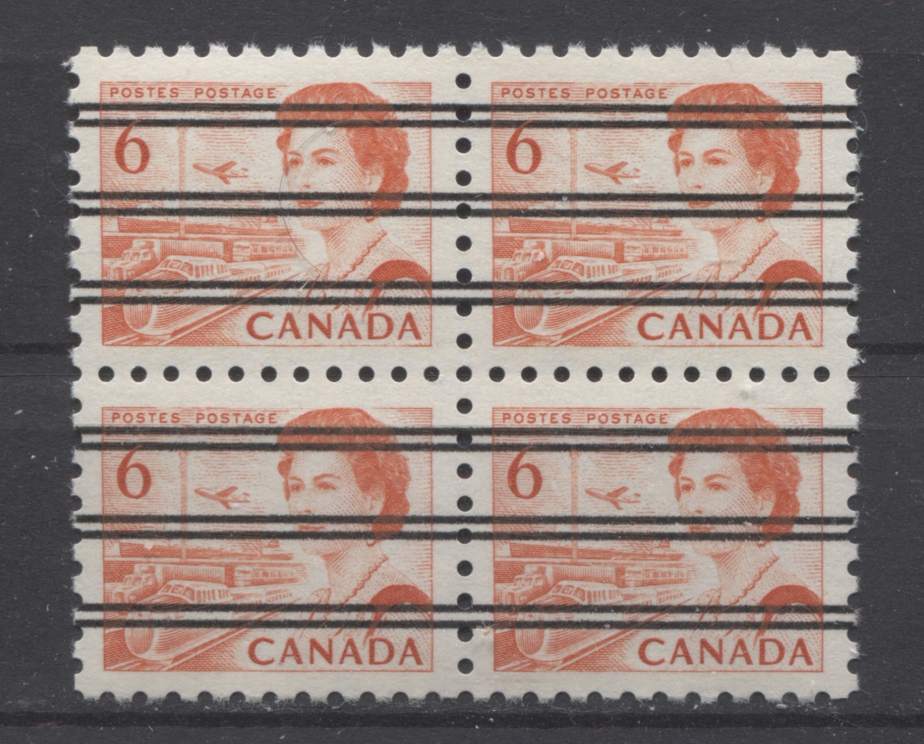
The entire cancellation measures 12 mm from the top of the top bar to the bottom of the bottom bar, and the space between the bar pairs measures 4.25 mm, which means that each bar pair is just under 1.33 mm wide.
It would appear that the precancels only exist on the dull fluorescent paper, and it can appear either greyish or violet grey under UV. The shade is usually the bright orange, that is not overly reddish.
Plate Flaws
Unitrade lists one plate flaw on this stamp, which is the "doubled C" in "Canada", which occurs on position 10 of some panes. It is quite a distinct doubling, and is quite obvious to the naked eye. Unitrade does note that almost 100 other constant flyspeck flaws are known on this stamp. Most consists of dots or specks in the margins, or other parts of the design. I do not currently have examples of these flaws in my stock, but will add examples as I identify them, so that you can see what to look for. Most of these are not particularly scarce, and are consequently only worth $2-$5 per variety.
Bringing it All Together
I have identified so far:
- Four types of paper.
- Five levels of dull fluorescent paper and two of low fluorescent.
- Six shades or types of ink.
- 2 types of gum.
- Precanceled and non-precancelled.
If the varieties can all exist in combination with one another, then it is possible to have: 4 x 7 x 6 x 2 x 2 = 672 collectible stamps. There were 2 plates used to print the non-precancelled stamps, so that there can be: 336 x 2 x 4 = 2,688 possible collectible plate blocks.
The panes were cut apart rather than perforated on both sides, so that panes from the centre of the sheet layout of six panes will have straight edges on all sides, while panes from the outer portion of the sheets will have straight edges along the inside edges and selvage along the outer edges. Because of this, there are 20 different collectible blank block positions that all appear different, depending on which edges have selvage, and which are guillotined edges. The precancels were only issued as trimmed blocks with warning strips on the sides of the sheet, so they are included in the number of collectible blank corner blocks that can be collected, which is 672 x 20 = 13,440 blocks!
This brings me to the end of this week's post. Next week, I will look at the perf. 12.5 x 12 stamp as well as the tagged sheet stamps.