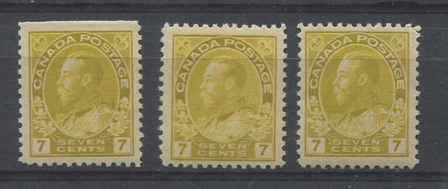
These two stamps are perhaps the most troublesome of the Admiral issue, owing in large part to the fact that there are vastly more shades than Unitrade lists, and also due to the fact that Unitrade uses the shade names "olive bistre" and "yellow ochre" for both stamps, while the shades on each are different. The result is that most collectors trying to sort their stamps attempt to slot them into the Unitrade categories by process of elimination, with the result that many stamps are incorrectly classified. In addition, many of the Unitrade shade names do not correspond to those in the Gibbons Colour Key, making classification more difficult. I believe that these two values illustrate quite nicely my earlier assertion that what Unitrade is doing in its listings is pricing groups of printings, as opposed to single shades. So knowing the dates given next to each shade is important, because positive identification of the shades will ultimately require an understanding of the papers and gum characteristics associated with each listed printing.
Again, in this post I will attempt to explain what I believe Unitrade means by their shade names and will then illustrate what these shades look like. Finally, I will cross reference these shades to the Stanley Gibbons Colour Key.
The 4c Olive Bistre
For the 4c value, Unitrade lists the following:
- Olive bistre for the wet printings
- Olive yellow for the wet printings
- Golden yellow for the wet printings
- Yellow ochre for the dry printings
The main difficulty with the Unitrade listings of this stamp is that the dry printings can be found in almost the full range of shades, not just the yellow ochre. Thus it becomes useless as a reference point for collectors seeking to properly classify their wet printings. A second problem is that these shades are not well understood to begin with, making them even harder to identify. A third problem is that the shades exist on a continuum so it can be difficult to decide whether to classify a shade as a sub-shade of olive bistre, or olive yellow.
The important thing to consider when classifying the shades is what the overall appearance of the colour is when you first see it, independently of other stamps. So for golden yellow, for example, the stamp should have a predominantly golden yellow appearance where the yellow is completely free from any bistre (brown) or olive (green). Then the olive yellows should appear predominantly greenish. Then any shade not appearing as either predominantly greenish or predominantly golden yellow, that is a wet printing will be classified as olive bistre. So in a sense, the olive bistre category becomes a bit of a catch-all, as does the yellow ochre for the dry printing.
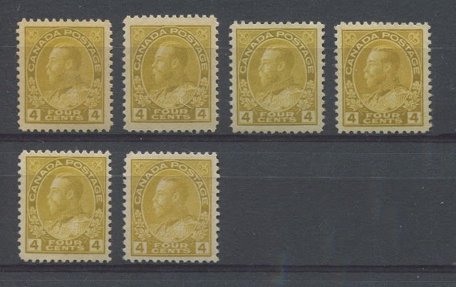
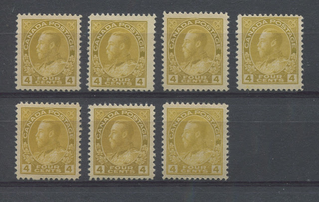
Olive Bistre Shades - Wet Printings
The above stamps are all examples of the olive bistre shade. As you can see, this shade is a muddy yellow that contains varying amounts of green or brown, but the overall appearance is neither yellow, nor green. Although they are all similar, you can see very clear differences between some of these, like the first and last stamps on each row. In terms of Gibbons Colour Key we have from left to right:
- Deep bistre yellow - similar to the bistre yellow swatch but deeper.
- Olive bistre
- Deep greenish bistre yellow - similar to the bistre yellow swatch but deeper and containing more green.
- Very deep bistre yellow - similar to the deep bistre yellow, but deeper.
- Greenish bistre yellow - similar to the deep greenish bistre yellow, but paler.
- Deep bright bistre-yellow - similar to the bistre-yellow swatch, but deeper and brighter.
So it would appear that most all of the so called olive bistre shades are actually variations of bistre yellow.
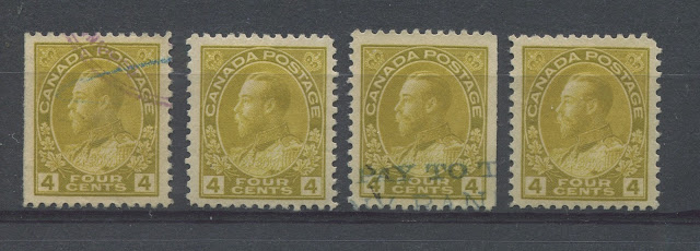
Olive Yellow Shades - Wet Printings
The above stamps are all pretty much the same shade. As you can see the colour has tipped the scales now, appearing more greenish than yellowish.It is this characteristic that I believe places it in the olive yellow category. On the Gibbons Colour Key this is closest to the olive bistre swatch, but with a strong hint of green, so greenish olive bistre.
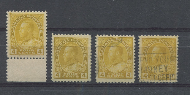
Golden Yellow Shades - Wet Printings
The above stamps are all examples of the golden yellow group. The key distinguishing characteristic is the almost complete lack of green, bistre or brown to the shade. The second stamp from the left is borderline - it is very close to olive bistre, but it is just golden enough, that I have placed it in this group. In terms of the Gibbons Colour Key, we have from left to right:
- Chrome yellow
- Greenish chrome yellow - similar to the first stamp but a little greener
- Yellow
- Yellow - just a bit different from the third stamp, but not enough to warrant a separate classification
Thus Unitrade's golden yellow is really either variations of chrome yellow or pure yellow.
Yellow Ochre Shades - Dry Printings
This group is the most extensive of all, with very few of the stamps even coming close to a true yellow ochre. Some of the shades are shown below:
As you can see there is quite a range of shades here, though some are quite similar to one another. The last stamp in the second row is a very pale bistre yellow that I have only seen four examples of. So it is at least as rare as the golden yellow in the wet printing, and yet Unitrade does not list any shade variations for the dry printings! In terms of the Stanley Gibbons Colour Key swatches, we have from left to right:
- Very deep bistre yellow - similar to the bistre yellow swatch, but much deeper.
- Deep bistre yellow - similar to the first stamp but a bit paler.
- Olive bistre - a little less yellow to this one and a bit more bistre and green.
- Yellow ochre - the only shade to match Unitrade's description.
- Deep bright bistre yellow - similar to the bistre yellow swatch, but deeper and brighter.
- Very deep bistre yellow - another example very similar to the fist stamp in the top row.
- Pale bistre yellow - similar to the bistre yellow, but paler.
Thus most of the dry printings are similar to the olive bistre group for the wet printings, being variations of bistre-yellow. However, there are some striking shades in these printings not found in the wet printings.
The 7c Yellow Ochre
Now, let us turn our attention to the 7c yellow ochre. Unitrade lists five major shades for this stamp:
- Yellow ochre - Unitrade says 1912, but I don't believe this to be correct.
- Olive bistre, from 1915 printings.
- Straw, the first printings from 1912.
- Sage green from printings made in 1914.
- Greenish yellow
The so called yellow ochre shade is easily the most common, and is usually found with the shiny cream gum normally found on wet printing stamps printed after 1918. It is for this reason, that I believe Unitrade is incorrect about the date being 1912. I have yet to find this shade on a stamp with the 1912 paper and gum. The olive bistre is reasonably close to an accurate description of the shade, though as we shall see, there is a fair bit of variation in it. However, one thing that is clear is that mint examples usually show the yellowish cream gum normally found on printings made between 1915 and 1918. The straw shade can best be described as a very pale brown but the give-away to identifying this shade is the paper and gum: the paper will usually show either coarse or fine vertical mesh and the gum will be a shiny yellowish transparent gum, that is sometimes a bit streaky. These characteristics are common to all first and early printings of the Admiral stamps and once you become familiar with them, they will be unmistakable. The sage green is problematic in the sense that it is not a true sage green. True sage green is quite dark, but nonetheless, it will be identifiable because it is the only shade to appear predominantly greenish. In addition, it has the gum and paper characteristics of the 1914 printings, which are similar to the 1912 printings: shiny yellowish transparent gum and either coarse or fine vertical mesh being readily visible in the paper. Finally, the scarcest shade, the greenish yellow is tricky. It must appear to be very greenish, without appearing to be a variation of bistre or ochre. In other words, it cannot contain any brown. There are some yellowish olive bistre shades that can be mistaken for greenish yellow, but knowing the correct gum can be helpful here. This was one of the last printings, so mint examples generally have the shiny cream gum that is common to the late wet printings made after 1918.
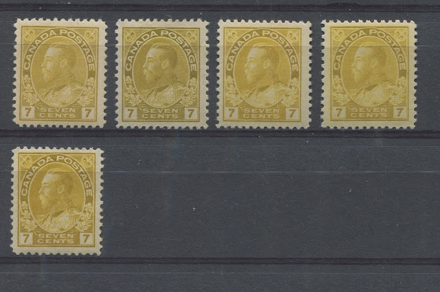
Yellow-Ochre Shades
The above stamps are all examples of Unitrade's yellow-ochre. While they do match up to what most of us would imagine yellow-ochre, to look like, none of these shades match the yellow-ochre of the Stanley Gibbons colour key. As a matter of fact, the Gibbons shades from left to right are:
- Yellow
- Deep yellow
- Pale yellow - similar to the yellow swatch, but less intense.
- Light yellow - similar to the yellow swatch but with just a hint of white added.
Many people might possibly consider the distinction between these last two shades to be overkill, and I would not be inclined to disagree. The study of shades must invariably be governed by personal preference as to how detailed one wishes to get. But clearly we can see that Unitrade's yellow ochre shades are clearly variations of yellow, similar to, but not quite the same as the golden yellow shades on the 4c value.
Olive Bistre Shades
The above are all examples of Unitrade's olive bistre. This shade group is basically too bistre or too olive to be included with the yellow-ochre group, but not sufficiently brownish or greenish to be any of the rare shades. This group illustrates nicely the problem that a novice can encounter when attempting to sort stamps into the Unitrade categories based on relative appearance. If a novice only had the above stamps, then it is not too difficult to imagine him or her classifying the first stamp as olive bistre, the second stamp as sage green, the third and fourth stamps as greenish yellow and the last stamp as yellow ochre. Based on relative differences between these stamps, those classifications would seem to be correct. However, they are not when one has actually seen what stamps from these shade groups are supposed to look like and when one is familiar with the proper paper and gum characteristics. In terms of the Gibbons Colour Key, we have from left to right in each row:
- Deep greenish yellow - similar to greenish yellow but deeper.
- Deep greenish olive bistre - similar to olive bistre, but more greenish and deeper.
- Yellowish olive bistre - similar to olive bistre, but with a lot of yellow added.
- Yellowish olive bistre - similar to the third stamp, but with a bit more green added.
- Bright olive bistre - similar to olive bistre but brighter.
So we can see that the shade name that Unitrade has adopted is for the most part accurate.
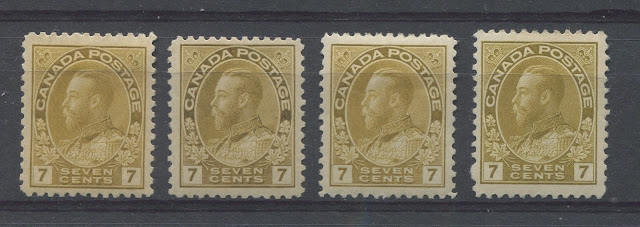
Straw Shades
The above stamps are all examples, in my opinion of the straw shade group. There are some who would classify the last stamp as olive bistre, but I would submit that it is too different from the other shades in that group to be included there. It also has the same paper and gum characteristics as the other stamps here. As we will see, these are all actually variations of either bistre or sepia according to the Stanley Gibbons Colour Key. From left to right we have:
- Pale bistre - similar to bistre but less intense.
- Pale olive sepia - similar to olive-sepia but less intense.
- Light bistre - similar to bistre, but with a touch of white added.
- Bistre
Unitrade's shade name appeals to the layperson's perception of what straw looks like, but it only works for the first and third stamps. Most people looking at stamps two and four would not classify them as "straw", even though they must clearly belong to this shade group.
Sage Green Shades
The above stamps are all examples of the Unitrade's sage green. As you can see it is the only shade to appear to be predominantly greenish, which is what identifies it as this shade. In actual reality, this is almost identical to Gibbons'pure olive bistre.
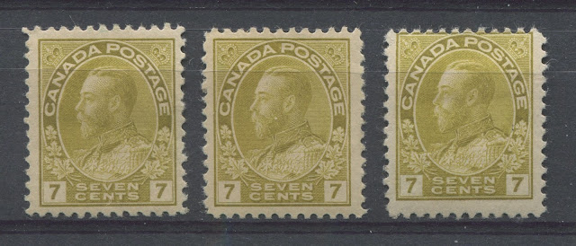
Greenish Yellow Shades
The above stamps are all examples of the greenish yellow as listed in Unitrade. Interestingly, this group is very similar to the olive-bistre group of the 4c wet printings, in that most of the shades are variations of bistre-yellow. We have from left to right as follows:
- Bistre yellow
- Light bistre yellow
- Greenish yellow
The key to distinguishing these from the cheaper olive bistre shades lies in the fact that these shades contain more green and more pure yellow, and very little bistre, whereas the olive bistre shades all contain more bistre and less green than these do. Also the gum on the olive bistre group is that of the wartime printings, being a shiny yellowish brown cream. The gum on these stamps is a lighter cream.
So there you have my interpretation of these perplexing shades. This brings us past the halfway point of my posts dealing with the shades of this issue. My remaining posts will tackle the remaining shades and values as follows:
- The blue shades on the 5c, 8c and 10c.
- The violet shades on the 5c.
- The red-brown shades on the 7c.
- The plum shades on the first 10c.
- The bistre brown shades of the last 10c.
- The olive green shades of the 20c.
- The shades of the 50c.
- The orange shades of the $1
So eight more posts in all dealing with shades. Then I can get into discussing other aspects of the Admiral stamps, such as paper and gum characteristics, re-entries, lathework, proofs, etc.
It is my hope that these posts are illustrating the immense appeal and satisfaction that can come from collecting this issue.
