
This stamp is perhaps the simplest of the Admiral issues in terms of shades, with Unitrade listing only two shades of the sheet stamps: carmine and rose-carmine, and just carmine for the coil stamps.
However, in reality, there are quite a large number of extremely subtle shades, none of which, in my opinion are carmine, as we shall see. The closest this stamp comes to carmine in my opinion is a carmine-red shade. These subtle shades may be difficult to differentiate in the scans, but I think if you look at the scans long enough, you will begin to see the differences.
I do not, at the moment, have an example of Unitrade's rose-carmine shade, but will add an example when one becomes available.
I will start with the sheet stamps, then will show the 1926 surcharges, the imperforates, and then will conclude with the coils. I will show you the different shades and then cross reference them to the Stanley Gibbons Colour Key.
The Sheet Stamp Carmine Shades
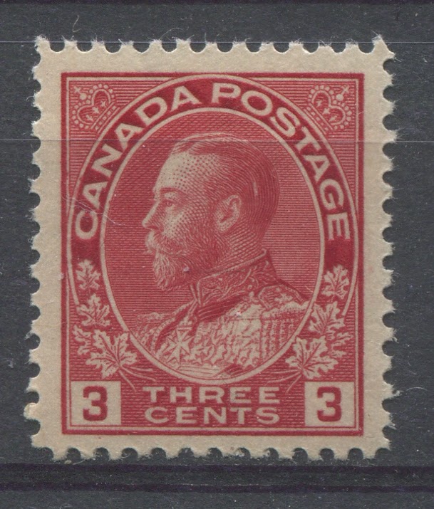
The above stamp is the carmine-red shade. You can see a distinct bluish undertone to the colour, which is characteristic of all carmine shades. This is also the die 2 printing.
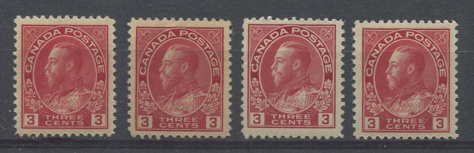
Here we have from left to right:
- Deep red - there is no bluish undertone to this shade, nor is there an orangy tone.
- Very deep rose red - similar to the deep rose red swatch, but deeper.
- Very dark rose red - similar to the very deep rose red, but here there is a hint of black added to the colour, which is absent from the second stamp.
- Deep rose red - very close to the deep rose-red swatch. You can see that this is similar to the second shade, but deeper and without the hint of black that is in the third shade.
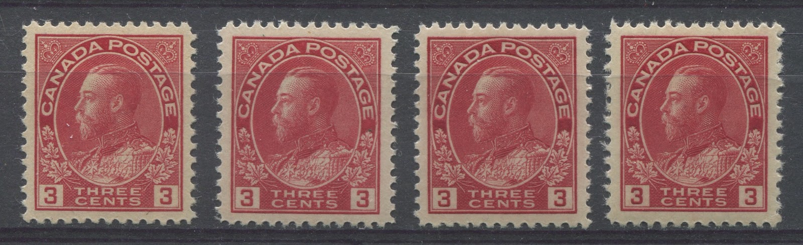
Here we have from left to right:
- Scarlet - this has an orangy tone compared to the shades in the first group above.
- Deep dull rose red - this is close to the deep rose red swatch, but is deeper and duller.
- Very dark rose red - similar to the third stamp in the first group above. See the hint of black in this shade?
- Very deep rose red - similar to the second stamp in the first group above.
So the main shades on this stamp would seem to be:
- Scarlets - those reds containing a hint of orange
- Deep reds - neither orangy or bluish
- Deep rose-reds
- Dark rose reds that contain a hint of black
- Carmine-reds - those reds with a bluish undertone.
Now, let's take a look at the imperforate issue of 1924:


All of these are the same shade: deep rose red. I do not know if the imperforate issue is found in any of the other shades, but will include examples, as I come across them.
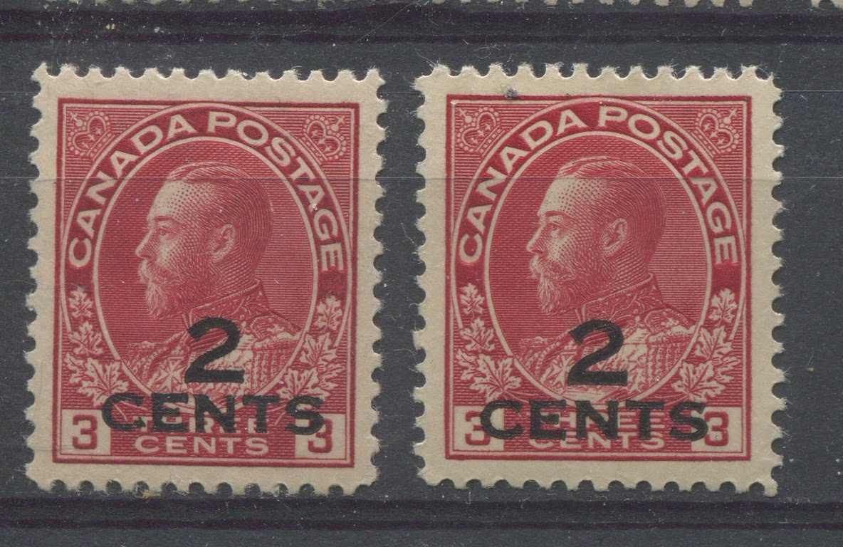
Now, lets take a look at the 1926 surcharges that were made from left over stocks of the sheet stamps:
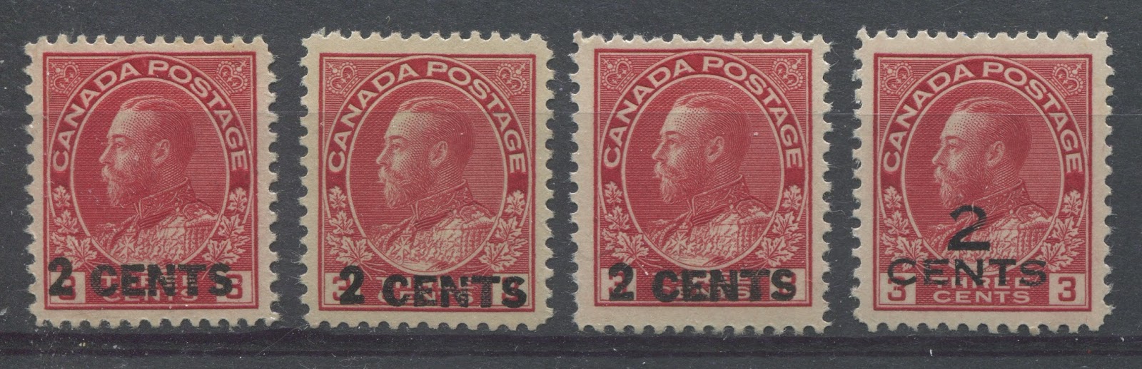
Here we have from left to right:
- Deep rose red
- Scarlet
- Light carmine red - similar to the carmine red, but lighter, containing white.
- Carmine-red
Here we have from left to right:
- Very dark rose red
- Deep rose red
So it appears that both types of surcharge exist in the deep rose red shade. However, I have only seen the other shades on one type of surcharge. Whether they all exist in each of the shades illustrated thus far, will be a matter for further study, and I will certainly include examples of other shades as I acquire them.
Now, finally let us conclude with the coil stamps perforated 8 vertically - the only format in which this stamp was issued as a coil stamp:

From left to right we have:
- Deep rose red
- Carmine-red
Again, I do not know if the coil stamps are found in the dark rose red, the scarlet shades or the deep red shades. This is a fairly scarce coil issue, so finding examples in different shades is difficult at any rate. However, I will keep my eyes open for examples in the other shades.
In conclusion, this stamp illustrates quite nicely how nothing in Canadian philately is quite as straightforward as first appears to be the case.
My next post will deal with the complicated 4c and 7c shades - the olive bistre and yellow ochre shades. In my experience this is a group of shades that causes more confusion for collectors than possibly any other in the series.