
Of all the stamps in the 1911-1928 Admiral Issue, this stamp is the most complicated in terms of the number of shades that can be found. Unitrade makes some attempt to list the broader shade groups. However, as with all carmine or dark red stamps issued before and during World War I from just about any country you care to name, there are a tremendous number of shades. The main reason why there are so many has to do with the fact that the Commonwealth countries relied on Germany for their supply of red dies. When the war broke out in 1914, these supplies were interrupted and the printers were forced to improvise and find alternate sources of dyes. It was this improvisation that led to the largest range of shade varieties in philatelic history.
Unitrade uses the general colour name, "carmine" very loosely to describe just about all the dark red stamps that Canada has issued over the years. However, in actual fact, there are very few stamps that are actually truly carmine on the Stanley Gibbons colour key. Many so called carmine stamps are actually very dark rose-reds or dark scarlets, as they lack the bluish undertone that true carmine colour usually has.
Unitrade treats the shade naming differently for the sheet stamps, coils and War Tax stamps, which complicates the picture considerably for someone trying to make sense of all these shades, especially when they have very few stamps to work with.
This post will attempt to show you what the various major shades of this stamp look like. In doing this I will show you scans of what I believe corresponds to each Unitrade named shade group and then I will cross-reference to the names in the Stanley Gibbons colour key. Unfortunately I do not have examples of some of the shades. However, I will start by showing what I do have, and will update this post regularly as my stock of these stamps continues to grow and I have more material to illustrate.
I will look first at the sheet stamps and booklet stamps, then at the coil stamps and finally, the War Tax Stamps.
Interestingly, Unitrade assigns very little premium to any of the shade differences, with their very scarce "Pink" shade being the notable exception. I think that this likely reflects the fact that little has been done to study the relative scarcity of the different shades. I'm sure there must be scarce and rare shades not listed in Unitrade besides the so called "pink". This would be an excellent and potentially rewarding research project for an ambitious philatelist looking to break ground in this area.
Despite the fact that there are not great premiums attached to most of the shades, identifying them correctly will help protect you from being fooled by fakery. Many of the coil stamps, particularly the perforated 8 horizontal issue have been widely faked by trimming and re-perforating cheap used stamps and mint booklet singles from the more common printings. To a lesser extent we see this on the other coil formats as well. Many of these fakes can be exposed for what they are merely by the fact that they are printed in a shade that does not correspond with the known shades of the genuine stamps.
The Sheet Stamps and Booklet Stamps
Sheet Stamps
Unitrade lists 8 basic shade groups for the sheet stamps as follows:
- Carmine - 1911
- Pink - 1911-1912
- Rose carmine - 1914
- Deep rose-red - 1912-1913
- Dark carmine - 1920
- Orange red - 1915
- Deep red - 1923-1925
- Red - 1917-1918
I believe that the dates given in Unitrade for the deep red must be incorrect because the 2c green, which replaced this stamp had already appeared in April 1922. So unless this was an emergency printing to cover a shortage of 2c greens, I think the correct dates are probably 1921-1922. Another notable observation is the discontinuity of dates: there is no group listed for 1916, 1919 and 1921-22. I assume that this is because the main carmine shade is intended as a "catch-all"for any shade not specifically falling into one of the listed sub-groups.
The Carmine Group
I don't actually have a sheet stamp to show you for this group. However, I do illustrate two complete booklet panes under the booklet stamps heading which are the same basic shades as the sheet stamps.
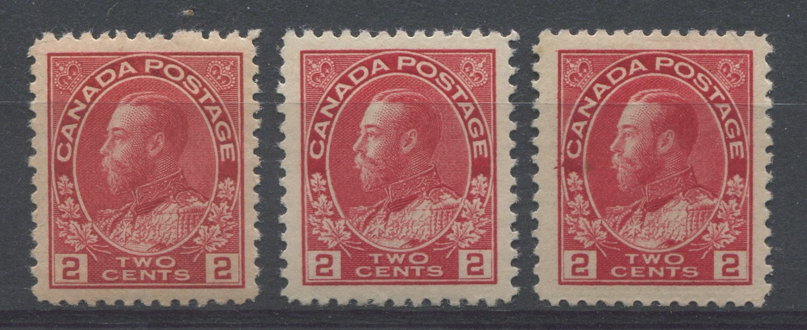
The Pink Group

The above stamp is an example of the so called Pink shade. It is very distinct - so much so that it is unmistakable. On the Gibbons Colour Key, this is closest to the rose-carmine swatch if it were made paler. It is similar to the stamp below, but the key distinguishing characteristic is how much paler it is. This is from the very earliest printings.
The Rose Carmine Group

The above stamp is an example of the rose-carmine shade group. On the Gibbons key it is closest to the rose-red swatch. This shade is also from the very earliest printings.
The Deep Rose Red Group
The above three stamps are examples of what Unitrade calls the deep rose-red shades. The stamp on the left is closest to the bright rose-red swatch on the Gibbons colour key. The next two stamps are closest to the rosine swatch on the Gibbons Key.
The Dark Carmine Group
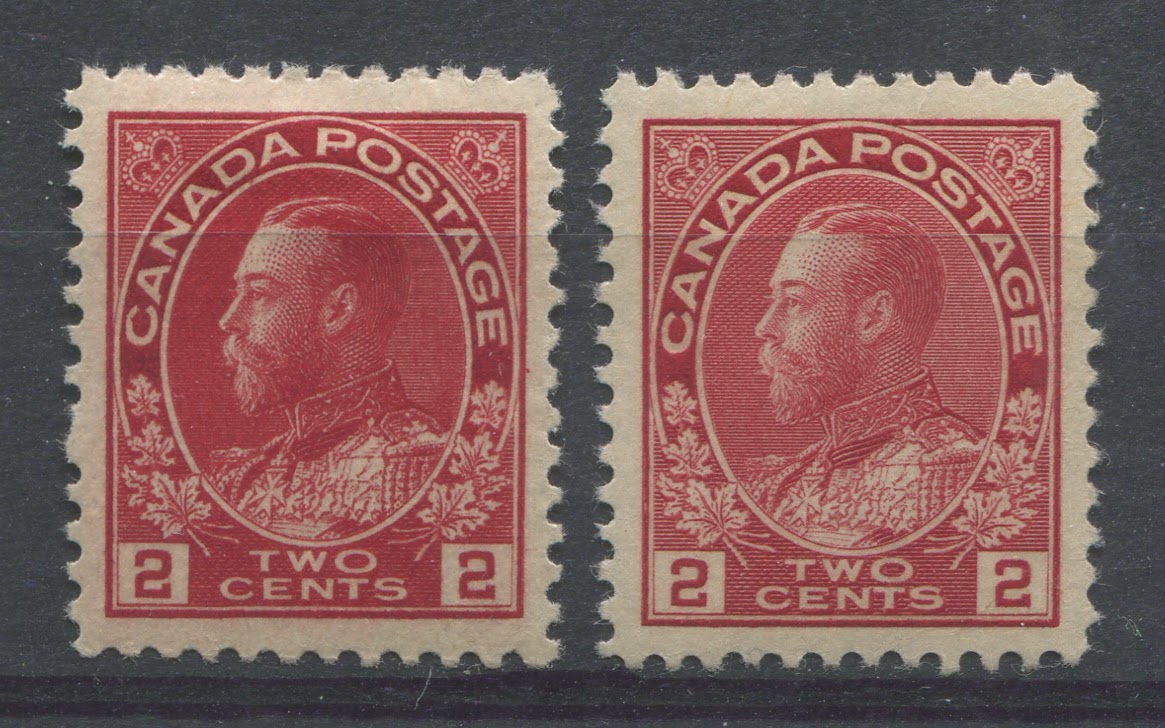
The above two stamps are examples of what I believe Unitrade calls the dark carmine group. The stamp on the left may actually be closer to what Unitrade calls carmine, but the stamp on the right for sure is in this group. The stamp on the left is closest to Gibbons' deep rose red swatch if that swatch were made slightly brighter. The stamp on the right is closest to the carmine-red swatch.
The Orange Red and Deep Red Groups
These are two of the groups for which I do not currently have an example of the shade from the sheet stamps. I will add images here in the future when I acquire one for stock.
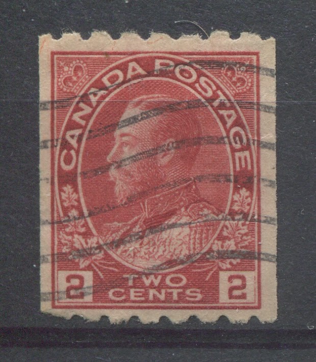
The Red Group

The above stamp is an example of what I believe falls into Unitrade's red group. It is closest to Gibbon's rosine swatch if that swatch were made a lot brighter.
The Booklet Stamps
The booklets were issued throughout the life of this stamp, so one would expect the same range of shades. However, this is not the case in practice. The common printings of these were the normal sized wet printings measuring 17.75 mm x 21.5 mm, on vertical wove paper, usually showing some fine or coarse mesh clearly on the back. Unitrade describes this only as carmine. The more expensive booklets were the squat printings measuring 18 mm x 21 mm on vertical wove, or 17.7 mm x 21.5 mm on horizontal wove paper. These were the earlier printings from before 1915, and are generally found in the early shades.
The scans below show two booklet panes from the common printing that Unitrade classifies as Carmine:

The pane on the left side is clearly a brighter shade than the one on the right. It also contains a hint of orange to the red. It is closest to Gibbons' scarlet colour swatch. The pane on the right is closest to Gibbons's deep rose red swatch.
The Coil Stamps
The 2c carmine is found in all three of the issued coil formats: perforated 8 horizontally, perforated 8 vertically and perforated 12 horizontally. In addition, there was also the experimental coil issues of 1915. I will now look at each issue individually.
Perforated 8 Horizontally
This format was experimental and appeared in 1913. It was relatively short lived, so that most genuine examples will be closest to the true carmine or rose carmine in shade. Unitrade lists this stamp only as "carmine".
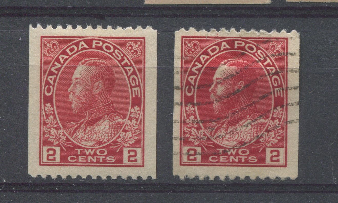
The stamp above is a genuine used example of the perforated 8 horizontal coil. It is closest to the rose-red swatch on Gibbons' colour key. It is therefore, almost identical to the sheet stamp above that was classified by Unitrade as rose-carmine. The way that you can tell this is a genuine coil is by the breaks in the outer vertical line of the right numeral box.
Nearly all fakes of this coil will be the wrong shade, being a deep bright rose-red, rosine, or scarlet shade. Most of the genuine stamps will have some bluish undertone, as does this one above.
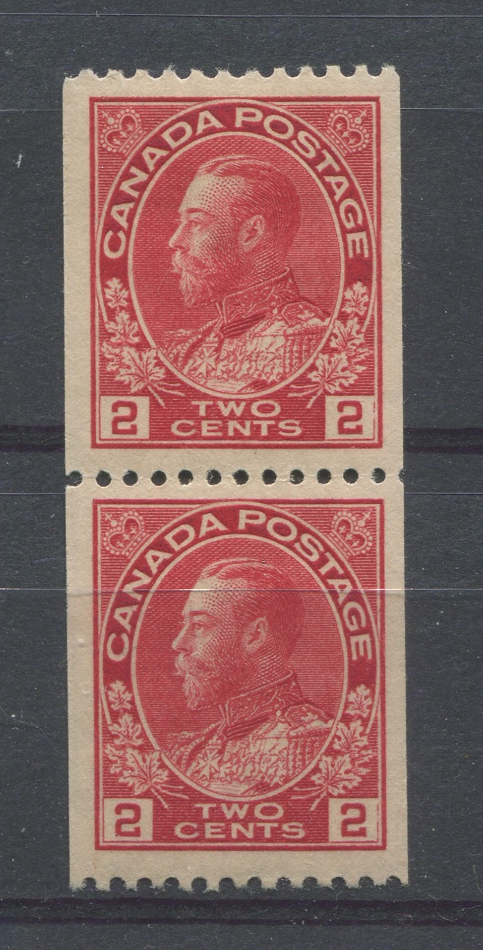
Perforated 8 Vertically
This issue format was the longest lived and covered the entire span of time during which the 2c stamp was available in this general colour. It follows therefore, that there should be more or less the same range of shades on this stamp as the sheet stamps, or at least very close to the same range of shades. Despite this, Unitrade lists only two shades: carmine and rose red.
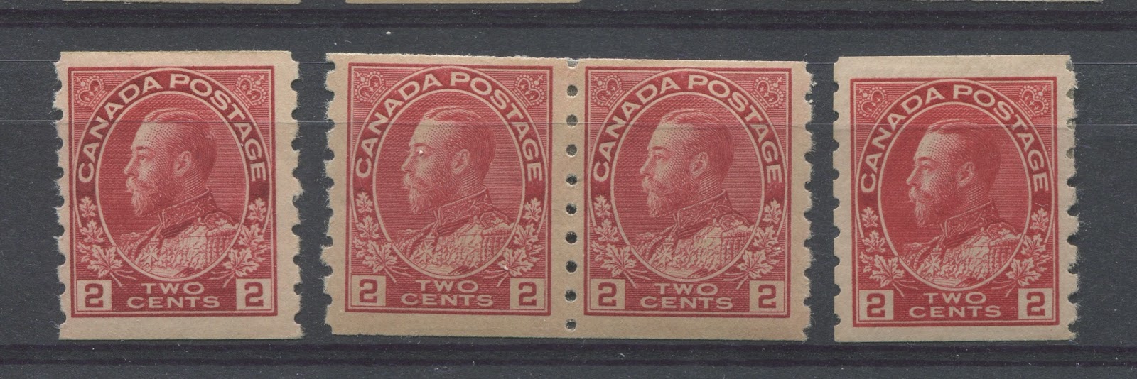
Carmine Coils

All of the stamps and coil pairs shown in the scan above correspond to what I believe Unitrade classifies as Carmine. In terms of the Gibbons colour key, moving from left to right, we have:
- Deep dull rose red - a duller version of the deep rose-red swatch.
- Deep rose red.
- Bright rosine - a brighter version of the rosine swatch.
- Deep bright rose-red - a very deep version of the bright rose-red swatch.
These shades are all similar to those of the sheet stamps that belong to Unitrade's deep rose-red group. Yet Unitrade calls these carmine.
Rose-Carmine Coils
The above stamps and coil pair all fall into what I believe Unitrade considers as rose-red. In terms of Gibbons's colour key swatches, moving from left to right we have:
- Pale carmine red - a paler version of the carmine-red swatch.
- Rose-red - again similar to the perf. 8 horizontal coil above and the sheet stamp that Unitrade classifies as rose-carmine.
- Bright rose red - This coil is actually a fake, or a genuine coil that had a straignt edge at the left side. In any event, the left perforation holes do not line up with those on the right, indicating that they were added later.
Again, though there is quite a bit of variation in this group, and in addition, these shades do not match the deep rose red group for the sheet stamps above. Instead, they are closer to what Unitrade calls rose-carmine on the sheet stamps and yet Unitrade does not list a rose-carmine shade for this coil.
Perforated 12 Horizontally
This format again was experimental. It first appeared in 1915 and was all but gone by 1920. Unitrade lists two shades for this issue: carmine and rose carmine. However, the shades of this issue are completely different from the perf. 8 horizontal coils, and yet Unitrade gives them the same shade name.
Carmine Coils
These two stamps are consistent with Unitrade's carmine booklet stamps. In term's of Gibbons' colour key we have from left to right:
- Scarlet
- Deep bright rose-red
Rose-Carmine coils
This coil pair is closest to what Unitrade calls rose-carmine, through hopefully now you can clearly see that it is not rose-carmine. In actual fact, it is closest to the bright rose-red swatch on Gibbons' colour key.
The Experimental Coil Stamps
Unfortunately I do not have any examples of these to illustrate here. However, I would note that as they appeared in 1915, during the First World War
The War Tax Stamps
The war tax stamps fall into two basic groups:
1. The 2c stamps that incorporated the actual words "War Tax"into the design. These were issued on April 15, 1915 and were in use until their replacment by the next issue below.
2. The stamps incorporating a "T" flanked by a "1" on the left and a "c" on the right. These first appeared in January 1916.
For the first issue, Unitrade lists two shades:
- Carmine
- Rose-carmine
Carmine Shades
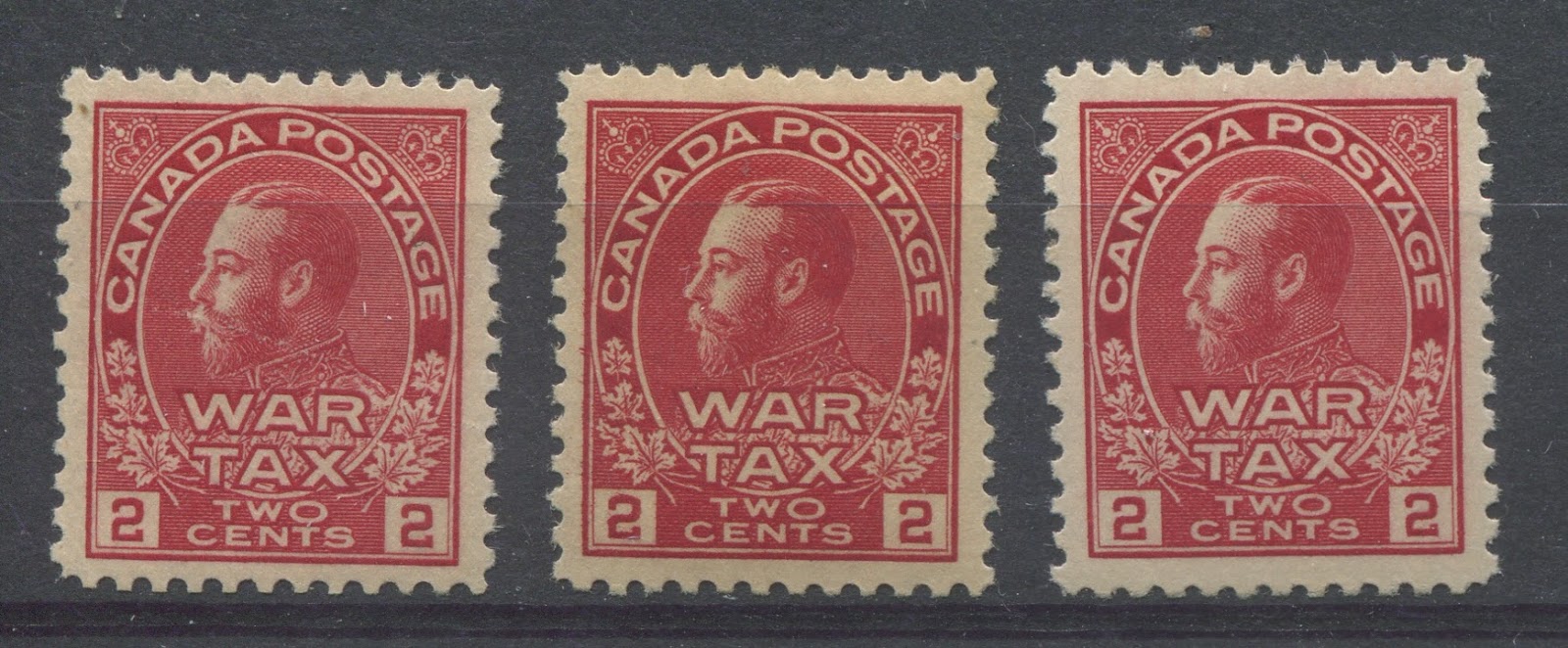
The three stamps shown above are all examples of what Unitrade refers to as the carmine shade. Only the last one on the right is consistent with the so called "carmine" of the booklet stamps. In terms of Stanley Gibbons Colour Key swatches we have from left to right:
- Deep dull rose red - a duller version of the deep rose red swatch.
- Carmine vermilion
- Scarlet
These are all pretty close to the same basic colour, and it may be difficult to see the differences in the scan above. However, the differences are pretty apparent when the stamps are examined and compared in the flesh.
Rose Carmine Shades
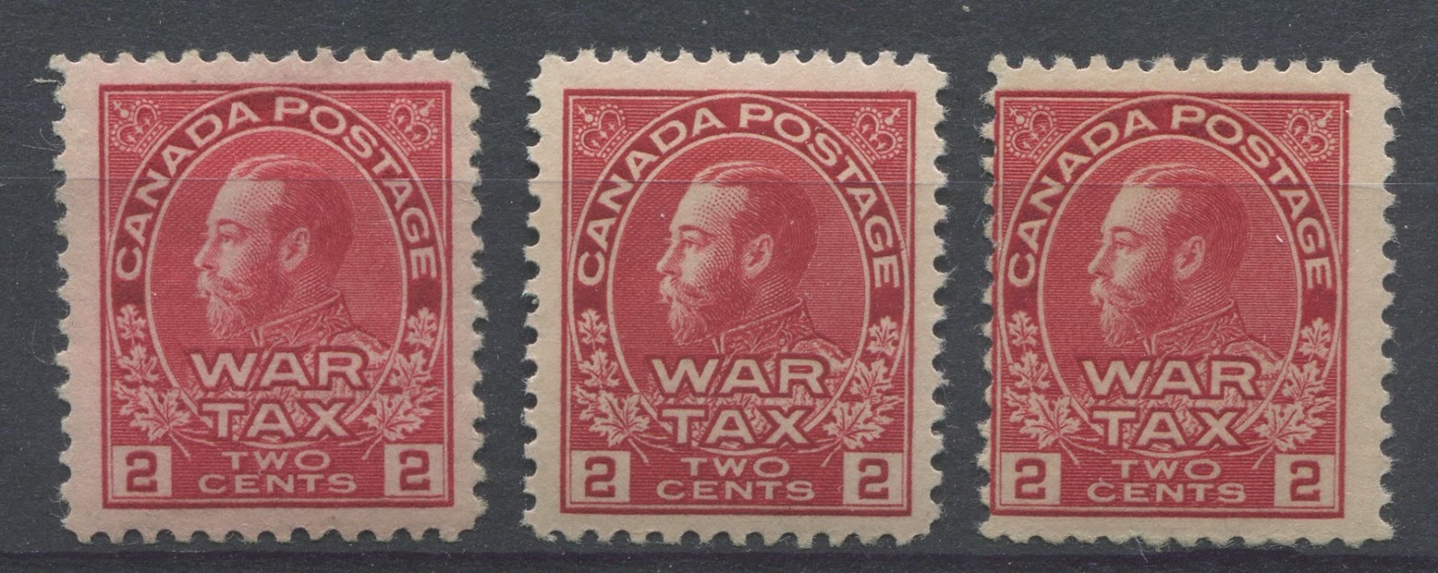
These three stamps are all examples of what I believe Unitrade classifies as rose-carmine. However, as you can see these are in no way similar to other shades that Unitrade also calls rose-carmine. In terms of the Stanley Gibbons Colour Key swatches, we have from left to right:
- Deep, bright carmine-rose - much deeper and brighter than the carmine-rose swatch.
- Rosine
- Bright rosine - just a touch brighter than the rosine shade above.
These stamps all lack the bluish undertone that rose-carmine would have. Rose carmine is predominantly carmine with a touch of rose, whereas these are predominantly rose, with a touch of carmine or vermilion.
For the second issue, Unitrade lists four basic shade groups:
- Carmine, in both dies 1 and 2, the coil and the perf 12 x 8 stamp.
- Rose-red in die 1 .
- Bright rose red in the perf. 12 x 8 stamp.
- Rose carmine on the die 1 coil stamp.
Carmine Shades

This stamp is an example of what Unitrade calls the carmine shade of this stamp. On Gibbons' Colour Key, it is closest to deep bright rose-red.

Here we have the 12 x 8 provisional issue and the coil stamp in the Die 1. Both of these are described by Unitrade as being carmine. In terms of Gibbons' Colour Key, the colours of these two stamps from left to right are:
- Scarlet
- Deep bright rose-red
Rose-Red Shades

- Bright rosine - a much brighter version of the rosine swatch.
- Deep carmine rose - a much deeper version of the carmine rose swatch.
The bright rosine is getting close to one of the shades that on the sheet stamps would fall into the orange-red group. But the true orange red shades contain a bit more orange than this shade.
Recap and Conclusion
So here you have my initial attempt to shed light on these confusing shades. I am certain that my conclusions will evolve as I examine and acquire more stamps. Hopefully, what you will be able to see from this post is that Unitrade has not been consistent in their use of colour terminology as quite often the same name is used to describe shades that are really quite different.
The key observations to take away from all this are these:
- Unitrade's carmine shades almost always lack the bluish undertone that is required for a colour to truly be called carmine. Usually these shades are some variant of scarlet, deep bright rose red, or carmine vermilion.
- Unitrade's rose carmine shows the most variation and the most inconsistency. It can vary from rose red and pale carmine-red on the one extreme, to bright rose-red, bright carmine rose, rosine, deep bright rose red and bright rosine on the other. Rosine can be thought of as a bright scarlet that contains an equal amount of rose. Scarlet in turn is a deep red that contains an almost equal amount of orange, so that it looks neither red, nor orange.
- Unitrade's red, at least on the sheet stamps is closest to a pale version of rosine.
- Despite what the Unitrade catalogue prices may say, the majority of the mint wet printing stamps on the market today are from after World War I, with the pre-war and wartime printings being much, much scarcer. This is consistent with what I have shown you here, with most of the mint stamps being some variation of scarlet or deep, bright rose red. The true rose-red shades are quite scarce and I believe, should warrant a significant premium on the coil stamps as well as the sheet stamps.