Distinguishing between the shades can get a bit confusing due in large part to the terms used by Unitrade in the catalogue and the fact that some of them are a bit misleading when you see the colours that they actually refer to. It is my hope that this post will help clear up some of the potential confusion that can arise. Unfortunately the scans do not show the differences quite as clearly as I would have liked, but hopefully if you look at the scans long enough, your eyes will adjust and you will be able to see the differences clearly.
Specialists of this issue will quickly realize that the shades tend to follow a progression and thus they are a useful clue in dating the sequence of printings. This will be explained further as I deal with each value separately below:
The 1c Green
Unitrade lists five major shade groups for this value:
1. Green
2. Deep green
3. Blue green
4. Grey green
5. Yellow green
Unfortunately there is no similarity between yellow green on this stamp and the term yellow green as used on later issues in the catalogue. In truth, all of the greens on this stamp, except for the blue greens are fairly dull shades of green. I do not unfortunately have an example of the yellow green at the moment, but it can best be described as a lighter and brighter version of the stamp shown on the extreme left above. I will add a scan of this shade when one becomes available.
The scan shows from left to right:
1. Dull green (this would be classified as green in Unitrade)
2. Deep green
3. Blue green
4. Grey green
5. Deep blue green
The grey green should always appear to be very dull and deep, and will have a clear greyish tinge. The blue greens will be dark greens with a bluish tinge as well, although the blue is not nearly as pronounced as it is on the subsequent Admiral issue. The very last printings of this stamp made in 1911 will be almost identical in shade to the first printings of the 1c Admiral however. The general progression of this colour was that it started out in 1903 as the green, dull green and yellow green and became progressively darker in 1905-1906, and then acquired its greyish tinge in 1907-1909 before finally becoming bluish in 1909-1911.
The 2c Carmine-Rose
This is another problematic stamp due to the fact that Unitrade insists on calling it carmine. In my humble opinion none of the stamps shown above, with the exception of the stamp on the left are carmine. The left hand stamp only appears as such because it has undergone severe oxidation, making it appear carmine. Further, if you compare these to all the other stamps of the 1920's through 1940's that are described as carmine, you will see that there is no comparison between these stamps and those stamps. True carmine is a deep red with a cold, bluish undertone. All of these stamps are really shades of rose. Starting with the second stamp from the left, we have:
1. Deep bright carmine-rose
2. Deep carmine-rose
3. Bright carmine-rose
4. Pale carmine-rose
This encompasses most of the shades you will find on this stamp. There are some true rose carmine shades to be found as well, and I will include scans of them when I come across them, so you can see the difference for yourself.
Unitrade only lists two shade groups for this stamp. being carmine and rose-carmine. In my opinion, this oversimplifies things, as I believe that stamps 2, 4 and 5 above are all very distinct. In any event, all the shades except the last one on the right would likely be classified as Unitrade's carmine, while the last one would be rose-carmine.
The general progression with this shade was that it generally started off pale, and then got brighter, before getting deeper and finally closer to true rose-carmine as the issue was nearing the end of its life in 1911.
The 5c Dark Blue
This value is complicated by the fact that the paper was bluish and the paper colour shows variation in addition to the ink colour. Again, Unitrade lists two colours: blue and indigo. The first two stamps above are the indigo, while the others are all blue. The difference between the indigo and the blue is distinct, but the indigo when viewed by itself would probably not be perceived by most collectors as being indigo, as it lacks the black tinge that indigo normally has as a colour. The blue shades are really all dark blues when compared with other blue stamps of the 1920's through 1940's.
Looking at the papers, you can see that the first two stamps are the same, the bottom left stamp is distinct and then the top right and bottom right stamps are the same. I describe these papers as:
1. Greenish blue (top 2 stamps)
2. Blue (top right and bottom right 2 stamps)
3. Pale greenish blue (bottom left)
This last shade, is in my opinion what Unitrade means by the "whiter paper". I have never seen a 5c stamp from this set that was on truly white paper.
In terms of progression, the early printings are pure dark blue on blue paper and then the paper becomes greenish blue, while the ink colour gets darker and tends toward indigo.
The 7c Olive Bistre
This is without a doubt the most confusing colour, not just on this set, but on the subsequent Admiral issue as well. I base this conclusion on the fact that I almost never see these stamps properly identified on e-bay or any of the other major stamp sites.
Unitrade lists four major shade groups and these are fairly representative of what exists, although I believe there are several more that could be listed as we shall see below. However their listings include:
1. Olive bistre
2. Greenish bistre
3. Yellow olive
4. Straw
Of these shades, the last one, straw is probably the easiest to distinguish. It is a very light golden brown and is shown in the scan on the extreme right. It is the last printing of this stamp and the shade cannot contain any green - it must be a definite pale golden brown colour.
The first two stamps on the left are olive-bistre and deep olive bistre. Bistre is a brownish yellow. Olive bistre is a greenish brown yellow with a more brownish than greenish tone. Although the scan doesn't show it both the yellow olive bistre and deep olive bistre shades contain distinct brown tones.
The next two stamps are greenish bistre and dull greenish bistre. This shade is very distinct in that it is definitely more green than brown.
Finally, the last three shades before the straw shade on the right are yellow olive and deep yellow olive. Remember that yellow olive is olive with a tinge of yellow. Olive, in turn is a brownish green. So in distinguishing yellow-olive from greenish bistre, it will generally come down to the question of whether or not the stamp is primarily olive, or whether it is primarily bistre. If you look at the stamps with that in mind, You can see that the three stamps at the right all lack the bistre tinge, being more green than bistre, or more yellow than bistre.
Further complicating the picture is the fact that Unitrade's listing is not complete. In addition to the listed shades, there are at least three more. The scan below shows from left to right, the deep straw, deep greenish bistre and pale sage green shades, none of which are listed in Unitrade.
The progression of the shades on this value is a bit tricky, but it would seem that it started out as greenish bistre and olive yellow, which are close to the colour of the 7c Queen Victoria Numeral issue, and then they gradually started to acquire more brown, becoming olive bistre, deep olive bistre, straw and sage-green. The straw and sage green shades would appear to be from the last printings made towards the end of 1910.
The 10c Brown Lilac
Unitrade lists only two shades of this value, being brown lilac and dull lilac. Again, I consider this to be incomplete as there are definite purple browns that are much more brown than lilac. The scan above shows from left to right:
1. Brown lilac
2. Dull brown lilac
3. Dull lilac
4. Purple brown
This colour is somewhat unstable and subject to fading when exposed to light for long periods of time so that very light and dull shades are likely colour changelings as opposed to genuine shade varieties. I am not certain of the progression on this stamp as dated used copies are quite hard to come by. However, I would expect that the brown lilac and dull lilacs are probably the later printings as these are closest in shade to the early printings of the 10c Admiral, while the purple browns are closest in shade to the 10c Queen Victoria Numeral issue.
The 20c Olive Green
Unitrade lists only two shades for this stamp: olive green and deep olive green. I believe that in addition to those two there needs to be a deep greyish olive green listed as well.
I believe that the stamp on the left is the deep greyish olive green, while the centre stamp is olive green and the stamp on the right is deep olive green. In terms of Unitrade's classification, most collectors and dealers would classify the first stamp as deep olive green and the second and third stamps as olive green. In terms of progression, it is difficult to be certain, again because dated used examples are so scarce. But the olive green shade is closest to the 20c Queen Victoria Numeral issue, while the deep greyish olive green is closest to the first printings of the 20c Admiral.
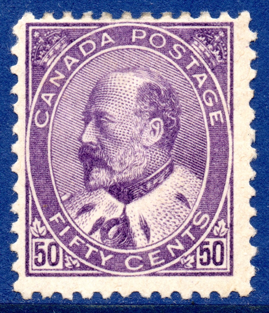
The 50c Purple


Like the 20c, Unitrade lists two varieties of this stamp: purple and deep purple. The deep purple in my opinion is usually very bright in relation to the regular shade. So in my opinion, the stamp on the right is purple, while the one on the right is deep purple.
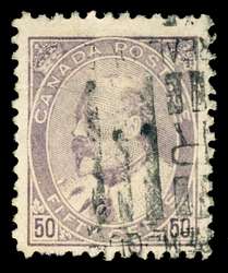
This is a very tricky colour though as it is so susceptible to fading. Most used examples of this stamp are badly faded like the one shown below:


Examples like this are common and can be regarded as little more than spacefillers.
I do not know what the progression is at all with the purple colour on this stamp as dated used examples are extremely scarce, with most used stamps being roller cancelled like the above one. Further, there was no purple stamp in the Admiral Issue that this stamp could be compared to. While the earlier Numeral issue did have a purple 2c stamp, none of the shades of that stamp are close to the 50c of this set. The 1908 Quebec Tercentenary 10c also is different in shade compared to this stamp, so it is not very useful as a reference. So I would welcome any insight that you can provide as to the progression of the shade between the stamp's appearance in late 1908 and the end of it's life in 1911.


1 comment
Hi Chris,
discussion of 50c Edward: “So in my opinion, the stamp on the right is purple, while the one on the right is deep purple.” One or the other should be the on the left.