
One thing that I did not comment on in the overview post for this issue is the perforation. From what I can see so far in working on the low values, the perforation for the low values did not vary at all, being 11.9 on all the stamps I have examined. I have not, as yet looked at the 10c, 20c and 25c values that were in use after 1963. I expect that as I study these, I will find at least some in the later perf. 12.15. I will definitely let everyone know what I find.
Paper Varieties and Gum - Overview
One of the first things that collectors of this issue will notice after they have been collecting these stamps for a while is that there are two basic types of paper, each of which has several sub-types. At the most basic level, the two types of paper are horizontal wove and vertical wove. The horizontal wove paper was used for all printings up to about 1958-1959 and appears to have been used for all printings of the 3c, as I have yet to find this value on vertical wove paper. The explanation given in the literature for the two types of paper is simply the fact that the CBN rotated the printing plates in order to switch from a 400 subject plate format to a 600 subject plate format. However from my perspective, that explanation does not tell the whole story because the characteristics of the vertical wove paper are entirely different from the horizontal wove papers. If it were merely a matter of printing direction then it would follow that I should be able to find a paper that has the exact same characteristics with the only difference being the direction of the mesh. I have not found that to be the case:
- The horizontal wove paper usually shows very strong surface ribbing on the early printings, or it is smooth on the surface, showing either no mesh when held up to the light, or horizontal mesh. The gum on these papers are usually quite yellowish and shiny being either smooth or streaky. These papers are usually 0.0045" thick.
- The vertical wove paper is the same thickness as above, but the surface of the paper is always smooth and shows no ribbing on the front. Often, you can see light vertical ribbing on the back. When you hold this paper up to the light, the mesh pattern looks different from the horizontal wove papers that are smooth on the surface. The reactions of this paper to ultraviolet light are different too. Finally the gum on these papers is less yellow and more cream coloured and is either smooth on the ribbed papers or thick and streaky on the smooth papers.
The other complicating factor that makes the study of these papers complex is the reaction of these papers under UV light. Unitrade lists these stamps on dead, dull, fluorescent, speckled fluorescent, medium fluorescent, high fluorescent and hibrite papers. My main problem with their listings is that I find their descriptions to be inconsistent with other issues and therefore confusing to collectors. I have yet to see a stamp from this issue that I would describe as being truly hibrite. Based on what I have seen the brightest paper on this issue is really little more than medium fluorescent, or maybe high fluorescent. Most of the so called fluorescent papers are really plain paper containing various amounts of low to high fluorescent fibres, which gives the fluorescent effect. As if that was not enough complexity, there are several types of dull paper that give reactions that vary from light violet, to grey, to greyish white, to ivory and finally to bluish white. None of them are bright enough to be low fluorescent, but all of them are brighter than non-fluorescent, which on this issue generally appears either brownish or violet under the light. In other words, the non-fluorescent stamps reflect back the same colour light as is shone on them. I will attempt to show these differences with some photographs that I took with my I-phone. Although the quality may not be all that good, they should still show you the differences reasonably well.
The speckled fluorescent stamps are complicated by the fact that the fluorescent fibres can be anywhere from low fluorescent to hibrite in their brightness, and the density of those fibres can vary from very, very sparse, with fewer than 10 visible fibres, to high density where there are so many that the fluorescence almost appears uniform across the stamp, only showing slight mottling where there is a lower concentration of fibres. So in describing the papers I will attempt to cross reference my descriptions with Untrade's.
The Horizontal Wove Papers
The horizontal wove papers can be further split into three groups:
- The ribbed papers that are all dull fluorescent
- The smooth papers that are generally non-fluorescent and
- The smooth papers that show varying degrees of fluorescence
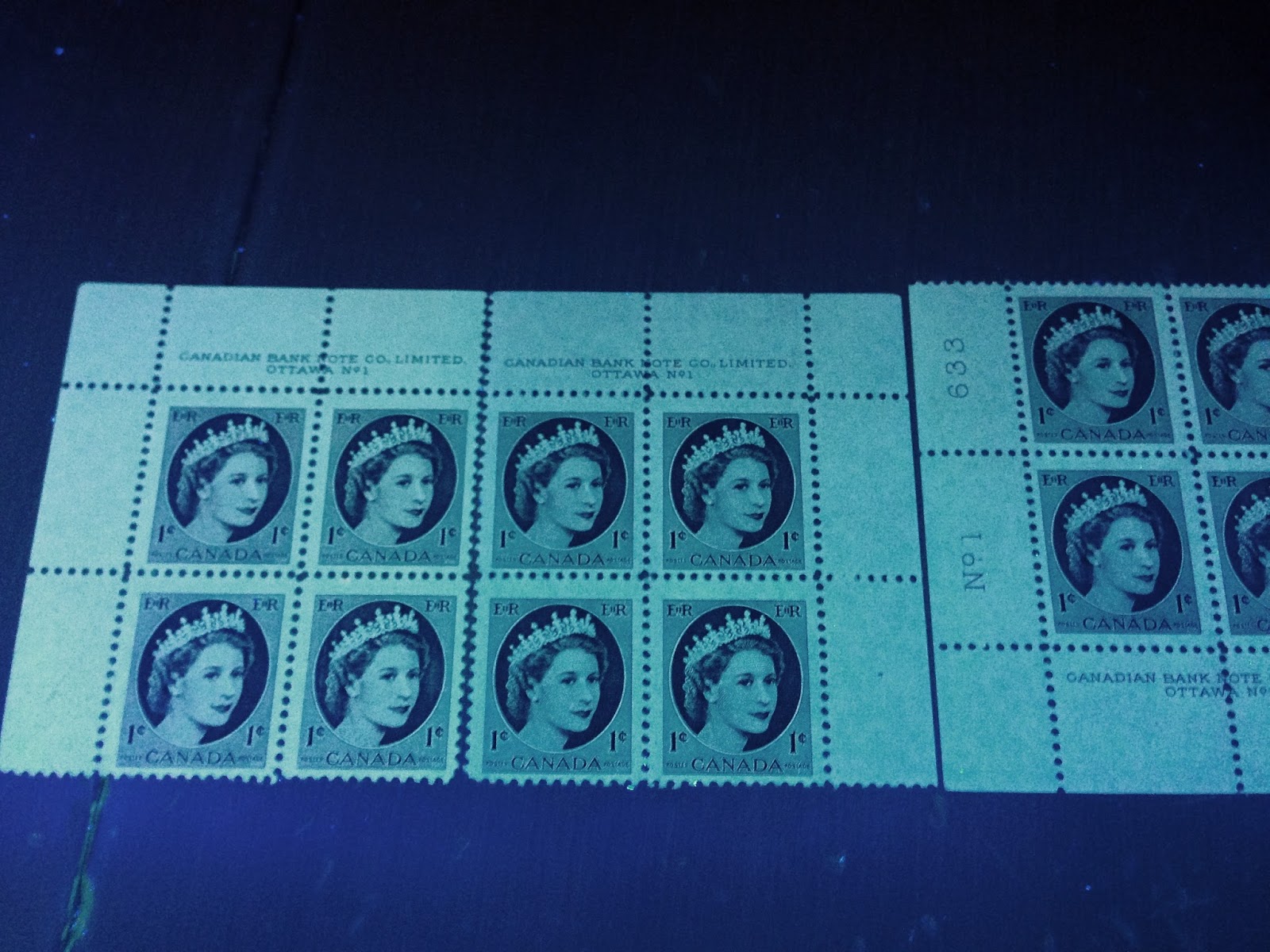
Unitrade does not differentiate at all between groups 1 and 2, calling everything in these groups dull paper. The pictures below show the difference between the non-fluorescent paper and the greyish white dull paper, and between three different types of dull paper.

As you can see there is quite a marked difference between the appearance of these two papers under the UV light, with the non-fluorescent on the right appearing violet, while the greyish white dull paper is on the left.
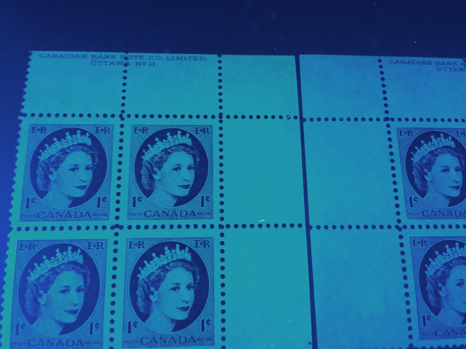
This picture is less clear, but again it shows some of the subtle differences that can be found on the plain horizontal wove papers. On the left we have the bluish white, in the centre the greyish white and on the right the ivory.
To summarize, in the first group I have found:
- Dull paper giving a bluish white reaction, usually with smooth yellow gum
- Dull paper giving a greyish white reaction, usually with somewhat streaky yellow gum
- Dull paper giving an ivory reaction, usually with smooth gum
- Dull paper giving a greyish reaction, usually with smooth gum
In the second group, I have seen:
- Non-fluorescent paper giving a violet or light violet reaction with streaky yellow gum
I don't know whether or not all types of paper and gum are found on all values, or in which shades. That is only going to be settled when a philatelist decides to dedicate himself or herself to a study of this topic. I have not seen any fluorescent papers on either of the first two groups of papers.
The third group is smooth surfaced horizontal wove that shows varying degrees of fluorescence. According to Unitrade, both the booklet stamps and the 3c value exist with varying degrees of fluorescent paper from this group. The picture below shows some of the varieties of the 3c value:

On the left is the basic greyish white plain paper. In the middle is what I think Unitrade refers to as speckled fluorescent. Although the specks are not very clear in this picture, this paper is plain greyish white with a low density of low fluorescent fibres. On the right we have what I think is Unitrade's fluorescent paper - it is a low fluorescent paper that contains a low density concentration of medium fluorescent fibres, which you can see clearly in the picture. According to Unitrade, there is a hibrite paper on this value as well as the 4c coil. I have yet to see this, but when I do, I will post a picture here.
All values of this set exist with horizontal wove paper of one type of another.
The Vertical Wove Papers
The vertical wove papers fall into five distinct groups:
- Non-fluorescent paper giving a greyish reaction and with streaky cream gum
- Dull paper giving a bluish white, ivory or greyish white reaction with streaky cream gum
- Dull paper giving bluish white, ivory or greyish white reaction and containing various concentrations of fluorescent fibres.
- As above but non-fluorescent paper.
- Fluorescent papers both containing fluorescent fibres and not containing them.
Unitrade does list groups 1 and 2, but does not distinguish between the different types within group 2. Also papers from group 3 with very, very sparse concentrations of LF fibres are really treated by Unitrade as being part of group 1 or 2 depending on whether or not the base level of fluorescence is dull or non-fluorescent. Unitrade's speckled fluorescent is likely group 3 or 4 paper with either a sparse or very sparse concentration of low fluorescent fibres. Unitrade's fluorescent paper is likely group 3 or 4 paper with either a low density of low fluorescent fibres or a sparse concentration of medium fluorescent ones. Finally, those papers that Unitrade calls medium fluorescent, high fluorescent and hibrite are likely from group 5.
The picture below shows the papers from groups 1 and 2:
On the left is the bluish white plain paper and on the right they greyish non-fluorescent paper.
The next picture shows two types of the plain paper one containing a very, very sparse concentration of low fluorescent fibres and one containing a sparse concentration:

If you look very carefully at the above picture, you can just make out a few fluorescent flecks on the left block, but the number is so few that this paper can almost be considered plain. On the right you can see a regular pattern. There is a lot of space in between the specks, which is why I refer to it as sparse. A low concentration of fibres would have twice as many visible fibres as this.
I don't have any papers from group 4 to illustrate, but I have several shots to try and illustrate some of the papers in group 5.

This first picture shows two blocks which are on low fluorescent paper, each containing a sparse concentration of low fluorescent fibres. Because the fluorescence of the fibres is very close to the ambient fluorescence of the paper you cannot clearly see them in the above picture. The block at the bottom is on a medium fluorescent paper with a low density of high fluorescent fibres, which you can see by the mottling in the block.
The top two blocks are likely what Unitrade calls fluorescent, while the bottom block is a version of Unitrade's high fluorescent paper.
The next picture shows another version of the high fluorescent paper right next to the fluorescent paper to highlight the difference:

In this picture the block on the left looks dull, but next to a true dull paper, it appears definitely fluorescent.
Finally, the picture shows the high fluorescent paper on the left and the medium fluorescent paper on the right:

The paper on the left is the same medium fluorescent paper with high fluorescent flecks, while the paper on the right is a bluish white medium fluorescent that contains no fluorescent fibres.
The papers from this last group are all very scarce to rare, which is why they all list for so much in Unitrade. What you are seeing above are the only examples that I have after going through hundreds of plate blocks from this issue. They are not anywhere near as easy to find as you might think and a detailed study of them is definitely warranted, especially on the high values, where there are no reported examples as yet.
All stamps of this issue appear to exist with vertical wove paper except for the 3c, 10c and 25c values, which I have thus far only seen on horizontal wove paper.
Shade Varieties
All the values of this set except for possibly the 6c and 15c are found with shade varieties. I will detail these for each value as I work on this set over the next two weeks. But for now I will show you what I have found for the 1c and then make some general comments on the other values:
Here are some of the shades on the 1c value:
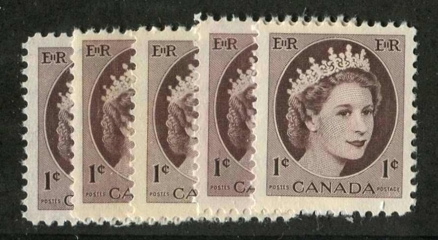
On the left we have deep violet brown and violet brown, which are the two most common shades in which the stamps on ribbed horizontal wove paper are found. The third stamp in is deep brown, which is found on the vertical wove stamps. The fourth stamp is a bright purple brown, which is found on the smooth, non-fluorescent paper from group 2 of the horizontal wove papers. The last stamp is another violet brown shade.
Not shown here are some of the other shades that can be found on the vertical wove stamps. These can be found in the original violet brown shades, as well as brown, deep brown, pale brown and chocolate brown. My scanner wasn't really cooperating with me for the picture below, which was supposed to show the brown and pale brown shades of the vertical wove stamps. If you look carefully you can still see that the block on the left is a darker colour than the block on the right:

The printings of the 2c value on horizontal wove paper generally appear to be a deeper and brighter green than the printings on vertical wove paper, which were generally lighter and often duller. There are some very light and bright shades on the vertical wove stamps. However, generally the variation found on the horizontal wove stamps lies in the intensity of the colour.
The 3c value exhibits much the same range of shades as the Karsh issue with everything from a light, bright cerise to a deep carmine rose.
The 4c value exhibits a lot of variation just like the Karsh Issue did. On the horizontal wove stamps one finds bright reddish purple, bright violet, deep violet and bluish violet. On the vertical wove stamps there is a definite shift away from warmer, redder shades to colder, more bluish shades of violet and pale violet.
The 5c blue exhibits a lot of shade variation as well. On the horizontal wove papers, I have seen light, bright blue, blue, deep violet blue and greenish blue. On the vertical wove stamps there is a definite trend toward either deep bright blue, or light bright blue.
The 10c value exhibits much the same range of shades as the 1c, since the ink is the same basic ink. It goes from purple or violet brown on the early printings and gets progressively colder and more chocolate brown as one moves to the plate 4 printings of the 1960's.
The 20c value starts off being a deep, bright green on the printings of the late 1950's and then becomes a distinctly deeper duller green on the vertical wove paper.
The early printings of the 25c value are a warmer shade of the vermilion, showing more orange, or a more yellowish cast than the later printings which are cold and flat by comparison. It's hard to explain in words, but the cold vermilion just does not give off any orange or yellow hint whatsoever.
That concludes my overview post on the shade and paper varieties. Watch for updates as I work on the values of this set over the next two weeks. Tomorrow I will look at plate blocks and tagging on this issue.