My hobby blog is bound to jump all over the place as my mood shifts. I don't generally have a lot of time to work on my stamps for pleasure, so what I feel inspired to work on changes from month to month. Back in April 2020 when I wrote my last post, it was the 1937 Coronation Issue, and now it is the '49 UPU issue. Indeed, one of the reasons why I decided to specialize in Omnibus sets is that each one holds different appeal, and if I am not feeling inspired to work on one, I can pick up another.
For the past few days I have been examining very closely two of the four common designs for this issue:
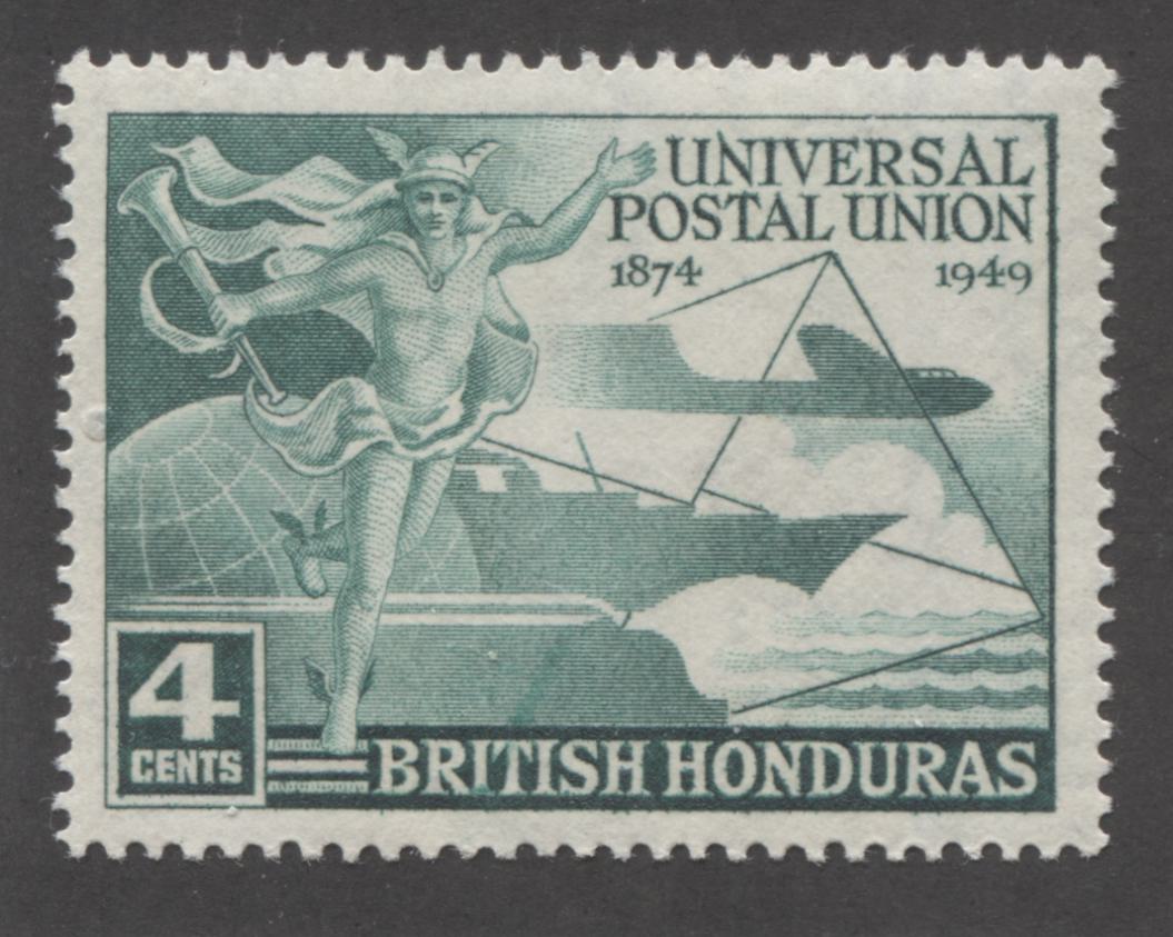
- The low value design featuring Mercury, a globe and stylized airplane.
- The mid-value design, featuring Mercury in the skies, above the world, dropping a trail of letters.

The low value UPU design by Waterlow

The mid-value UPU design by Bradbury Wilkinson
The low value design was engraved and printed by Waterlow, while the mid-value design is the work of Bradbury Wilkinson.
My starting point in examining these stamps was to look for plate flaws or differences in the design details from one stamp to the next, and then to make a note of everything I find. The idea here is to look for varieties or flaws that are constant and then to seek these out for as many of the colonies as I can. Next, I wanted to take a good look at the colours and to come up with accurate names for them, as well as to look for any discernable shades. To do this, I started by sorting each design into the approximate colour groups in which they were issued. Within each group, the stamps were then sorted by colony, in alphabetical order. Then, I used my Stanley Gibbons Colour Key to name the basic colour used for a particular group. From there, I compared each stamp in the group to the basic stamp and noted any clear variations, re-naming the shade if necessary. I will detail my findings for each of these aspects in separate posts - for now I just want to outline what I have noticed generally, as I examined the stamps.
One interesting aspect I have noticed, as I examined the Bradbury Wilkinson design, is that while nearly all the colony names are typographed into a large tablet at the base of the design, which would point to a series of master plates used for printing all the colonies, there were a few I noticed that were entirely engraved, including the colony name! The three that stand out for me are British Honduras, Cyprus and Malta. The immediate question that this raises is why? Why would BW print some of the stamps this way, but not others? My hunch is that the stamps were not printed in alphabetical order, but in all probability the stamps printed entirely by engraving were printed first, which required a separate plate for each colony. I would suspect that after a time, the realization struck that this was either too much work, too costly, or both and instead it was decided to use a master design, into which the colony name would be inserted. However, this is one mystery I would like to get to the bottom of.
Another interesting observation to come of my preliminary examination is that I believe I have potentially identified up to three different "types" of each design. Without going into too much detail now, the types have to do with differences in how complete the outlines of the letters are on the mid-value, with some being complete and strong, all the way to incomplete. There seems to exist different combinations of complete and incomplete letters, on the printings of certain colonies. On the low value design, I have noticed differences in the appearance of the button that holds Mercury's tunic together. On most stamps the button is complete, but weak on 1/4 of the oval, while on some stamps it is almost half missing and I'm fairly certain I have seen others that are a complete, strong oval.
Finally, there remains the issue of the papers used, as well as the perforations. From what I can see, the Bradbury stamps are comb perforated with a somewhat coarse gauge that measures either 11 or 11.5 - I can't quite remember which now. So, on these I would not expect to find much, if any differences. But I do think it is worth checking them carefully nonetheless. The Waterlow stamps are line perforated, and appear to be 14, or close to that. My expectation is that there will be considerable variations in this perf., and I am excited about what I might find as I check them more closely.
The papers used by each printer appear to exhibit slight differences, though I have not paid close enough attention as yet to outline them all. Both Waterlow and Bradbury productions seem to have employed vertical wove paper and both papers have the multiple crown CA watermark introduced in 1924. Gibbons lists a number of rare dandy roll varieties for a few of the colonies, like the "a" missing from "CA" or the missing "c". My suspicion is that most of these will be found to exist for more colonies than what Gibbons lists, though these will be rare. The Waterlow paper appears to be of a medium thickness, though I have found a few stamps printed on a very thin, translucent paper. The majority of the Bradbury Wilkinson stamps seem to be printed on a fairly opaque creamy paper, with no distinct mesh being visible, but I have also seen stamps that show a cross mesh pattern to the paper, so careful and methodical examination will be required for all stamps.
So, that's it. I looked at approximately half the issue, and found the variations that I have noted. I expect that when I examine the second half of the issue, being the two other designs, I will find many of the same issues.
1 comment
do you know the actual designers of the four stamps? I can’t find any names anywhere?