It is hard to believe that most of the summer has gone by since my last post in which I studied and compared the shades of blue used on the De La Rue printings of the 1935 Silver Jubilee issues. I haven't had much time to work on my collection these past two months, but recently I did take a week off and spent several hours looking at both the Waterlow printings of the blue and chestnut stamps, as well as the Bradbury Wilkinson printings. This post will deal with the Waterlow printings, of which there were many fewer shades than we find on the De La Rue printings.
What is interesting though, is the shades of blue are by and large, all variations of violet blue, whereas most of the De La Rue stamps are some variation of blue, or steel blue, with only a few stamps being variations of violet blue. The main shades that I found on the Waterlow printings for the blue ink are:
- Bright violet blue
- Very dark violet blue
- Deep dull violet blue
- Deep violet blue
- Very deep violet blue
- Dark violet blue
- Deep bright violet blue
Admittedly, the differences between these shades in most cases is extremely subtle, and you will need to compare your stamps carefully in order to separate them properly. But, you should find with a great deal of patience and care that you can sort them correctly. It should be noted that dark colours and deep colours although often used interchangeably in common parlance are not the same thing: a dark colour has black added to it, whereas a deep colour, or an intense colour is merely a more heavily saturated version of the same colour.
As a quick reminder, the colonies printed by Waterlow for the common design were:
- Barbados
- Bermuda
- Cyprus
- Leeward Islands
- Malaya Straits Settlements
- Montserrat
- Nigeria
- Nyasaland
- St. Christopher Nevis
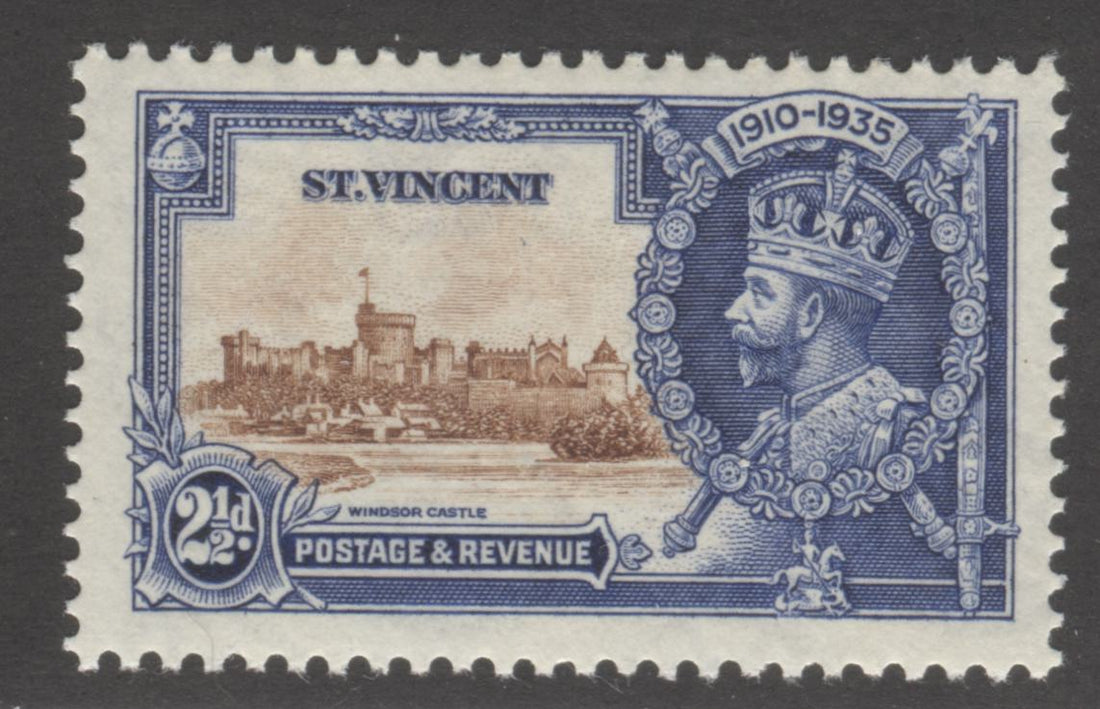
- St. Vincent
- Somaliland Protectorate
- Turks & Caicos Islands
- Virgin Islands
If we look at where these colonies are situated relative to the UK, we can see that the furthest ones from the UK are Straits Settlements and Somaliland. Thus we would expect those to have been printed first, followed by all the West Indies colonies, which is all of them except for Cyprus, Nigeria and Nyasaland. These last three are almost equally close to the UK and they are closer than the West Indies colonies, so they should have been printed and shipped last. Thus we would expect most all of the first printings and subsequent printings of the stamps of these three groupings to all be from slightly different shade groupings.
Let us take a look at each of these in turn, and then we will compare and contrast them, so you can see the differences between them more clearly:

Bright violet blue

Dark violet blue

Deep bright violet blue

Deep dull violet blue

Deep violet blue

Very dark violet blue

Very deep violet blue
Before I present the composite images which will hopefully show the shade differences more clearly, I will again explain the difference between dark and deep colours. Dark colours contain some black to the mix, which deepens the tone of the colour, whereas deep colours are simply more intense and saturated, but are the same general tone.
Now, let's focus on the portrait portion of each colour and compare and contrast them to see the differences more clearly:

Looking at the above composite, the differences between the shades should be immediately more apparent. Starting with the bright violet blue at upper left, you can see that it is clearly the brightest colour here. If we compare it to the centre colour, the deep bright violet blue, we can see that it is the same tone, but it is clearly lighter. So far, so good. The dark violet blue is clearly blackish compared to the other colours, as it should be. But, it is not quite as black as the lower left colour, the very dark violet blue. That leaves us with the last 3 colours, the deep dull violet blue, the deep violet blue and the very deep violet blue. If you look carefully you should be able to see that the colour second from the right on the top row is clearly duller than the other two shades, and that the second colour from the left on the bottom is very slightly deeper than the upper right shade.
So, there you have it. A comparison of the Waterlow shades with other Waterlow shades. Now, let's look at how some of the Waterlow colours compare to the De La Rue blues:

When you view them this way you should be able to see that the colours are all completely different from one another, even though they are all shades of blue. Also, each printer has its own specific colour palette that is different from all the other printers.
My next post will look at the blue inks used by Bradbury Wilkinson, which as we shall see are even more diverse. Finally, here is another composite that shows the comparison between several of the colours from all three printers:

How can the catalogues even call these similar?