After a long hiatus in which I didn't have any time or inclination to work on my collection, I was finally able, in the last few weeks to do some work on my collection. I was in the mood to work on the colour shades, so I chose to work on the blues and browns of the second values of the common design.
I realized quickly that I would need to tackle the colours separately, and that it would be better to tackle the De La Rue, Waterlow and Bradbury Wilkinson shades separately.
So, with that I decided to start with the blue colour of the frame. I very carefully compared all the De La Rue stamps in my collection, being up to 20 examples of each crown colony. I took one stamp, compared the stamp to my Stanley Gibbons colour key to fix a name for the colour, and then went about carefully comparing it to every other stamp in order to identify other De La Rue stamps that are the same shade.
You will find, as I did, that the best way to do this is to hold your two stamps in the 102 card a reasonable distance away from your eyes and to relax your gaze somewhat. If the two stamps are a match, you will feel that they look the same almost immediately. Don't overthink it: if you start looking at the stamps too closely, your eyes will try to see the stamps as being the same, and a lot of times you will come away believing that they are. You will also find, as you progress through and name all your colours that you may revise some of your earlier classifications. That is perfectly normal and to be expected. Working with shades is all about patience.
You may be wondering at this point: why? Why go to the trouble to sort such seemingly small differences. Well, while it is true that some of the shades are extremely similar to one another, there are some that are dramatically different, and really should be listed separately.
The main reason to look carefully at the shades is that it gives clues as to the order of the printings. Most of these sets were printed between 2 and 6 times, depending on how many stamp requisitions were received from the colonies, during the 6 months they were current. However, not all 64 crown colonies were printed at the same time. The printings were done in a specific order that took into account how long it would take supplies to reach each colony, so that for a specific unified issue date it became important to ensure that say, an issue for Gilbert & Ellice Islands, which could take 2-3 weeks to reach there by sea (they might have been flown in, as airmail was established by this time, but was expensive and not the standard), would be printed before an issue like Gibraltar, which could be sent to the colony in a day or two.
This being the case, we would expect that many, many batches of ink would have been prepared to run the required printings and that they would have been prepared on a schedule that also allowed the other stamps and printing products, such as bank notes and the like to be printed. So, given that this is likely the case, there will very likely be some colonies for which a particular shade, or group of shades predominates, and others for which some shades are not found to exist at all.
In going through all the stamps in my collection so far that were printed by De La Rue, I have found no fewer than 27 different variations of blue. Some of these, are merely differences in intensity, and those may be indicative of differences in the amount of ink applied to plates. But many are differences in tone, which can only be due to differences in the makeup of the ink, assuming of course, that none of the differences are due to fading. The 27 variations are:
- Deep, bright blue
- Deep blue
- Dark blue
- Slightly dull, deep blue
- Steel blue
- Dull steel blue
- Bright steel blue
- Deep dull blue
- Deep, bright grey-blue
- Blue
- Slightly brighter blue
- Light steel blue
- Light blackish violet blue
- Blackish violet blue
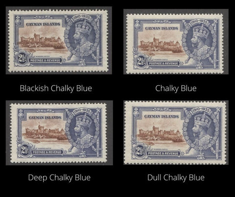
- Chalky Blue
- Dull chalky blue
- Blackish chalky blue
- Deep chalky blue
- Indigo
- Dull indigo
- Lighter blue
- Light chalky blue
- Bright indigo blue
- Light steel blue
- Pale steel blue
- Deep grey blue
- Indigo blue
The pictures that follow show these ink shades:


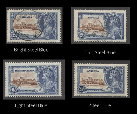
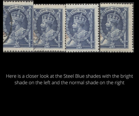

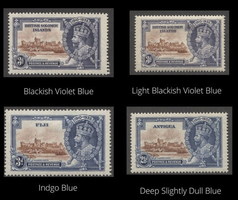


In each of the above cases, the differences become more apparent when the same portions of the design from different stamps are compared. Now, let's take a look at a collage of all the shades taken together:
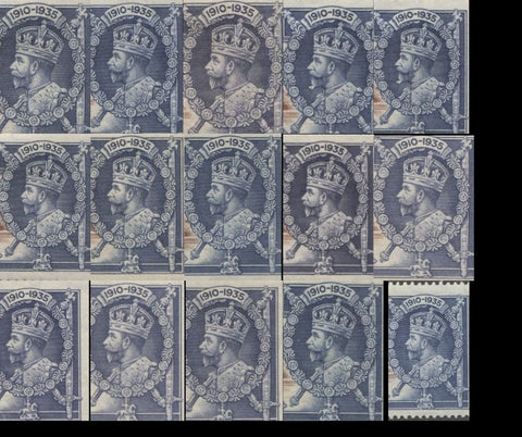
Here, in this first collage you should be able to see at least three different groups of tones of the blue. Now, for the second collage showing the last 10 shades:

Here, there are at least two groups of blue and these are clearly different from the other groups above. Some of these differences are so distinct that it is surprising that Gibbons makes no distinction between them.
The next step is to sort the brown centre shades, and then to repeat the process for the blues used on Waterlow's printings and Bradbury Wilkinson's printings.