
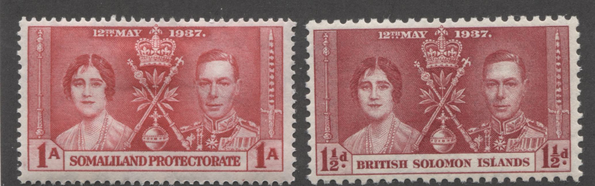
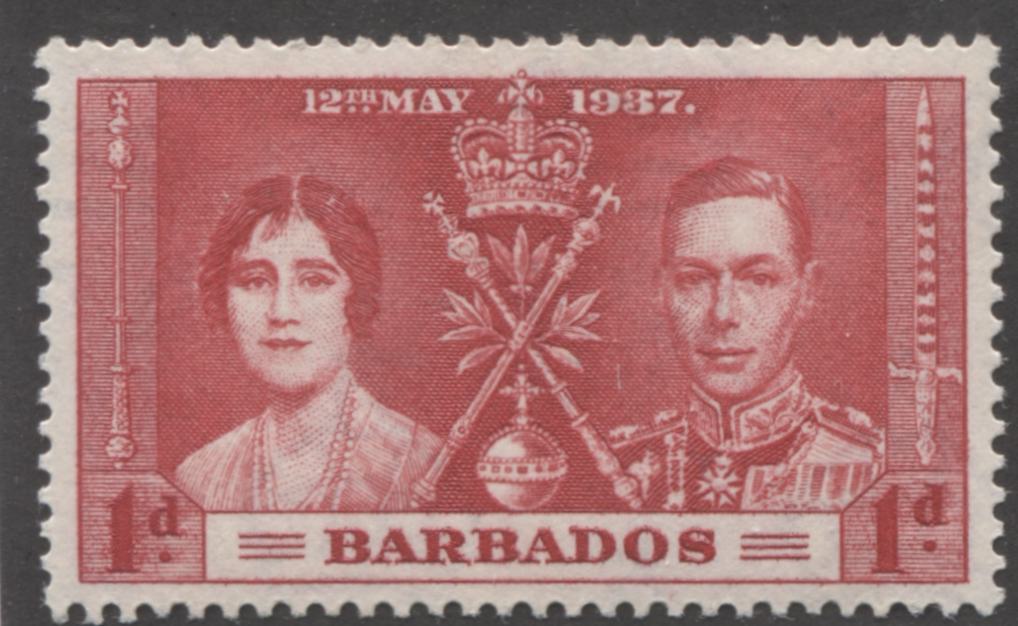
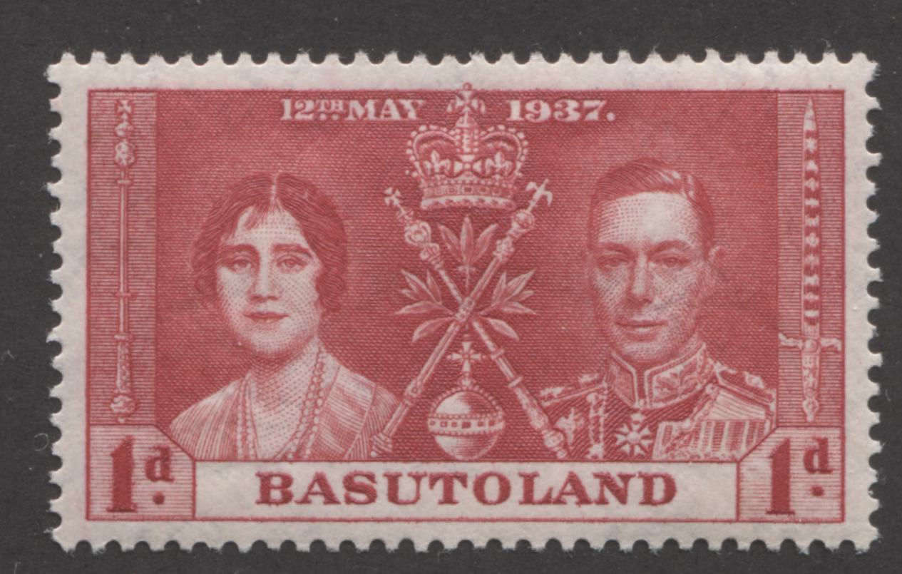
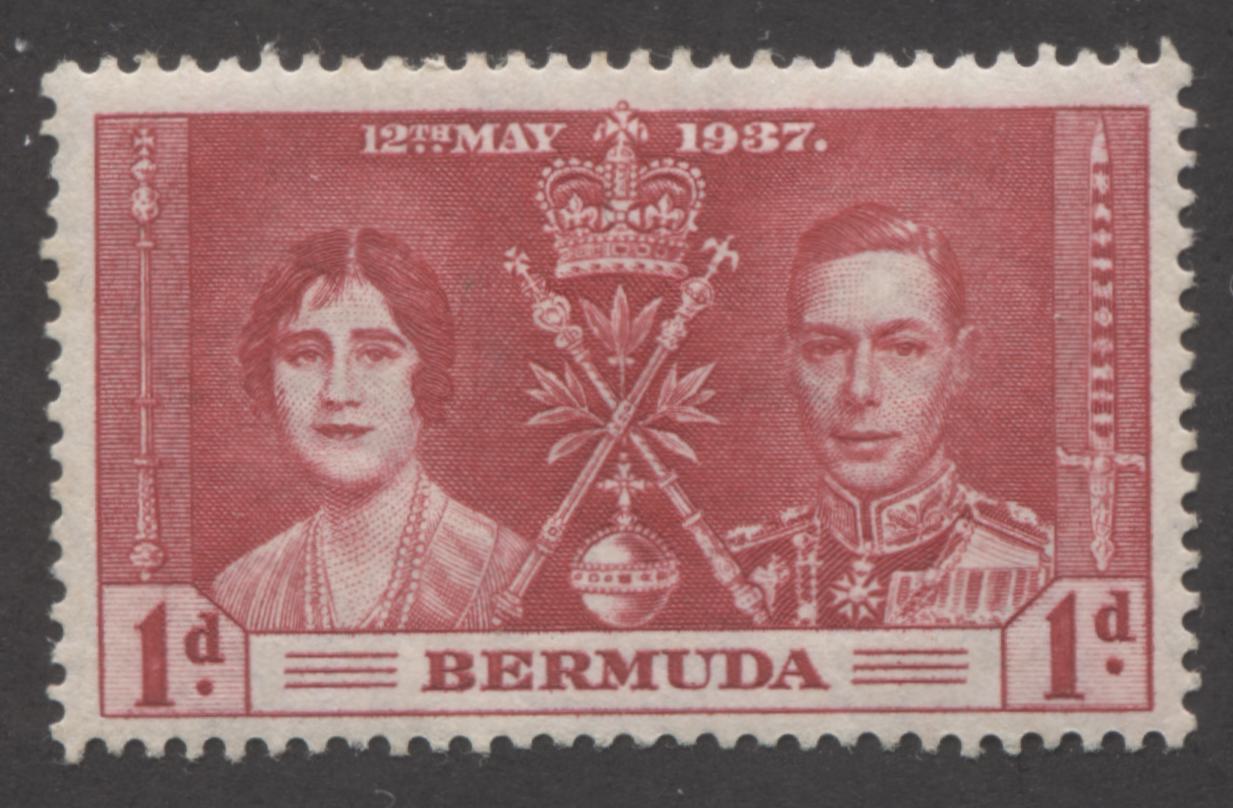
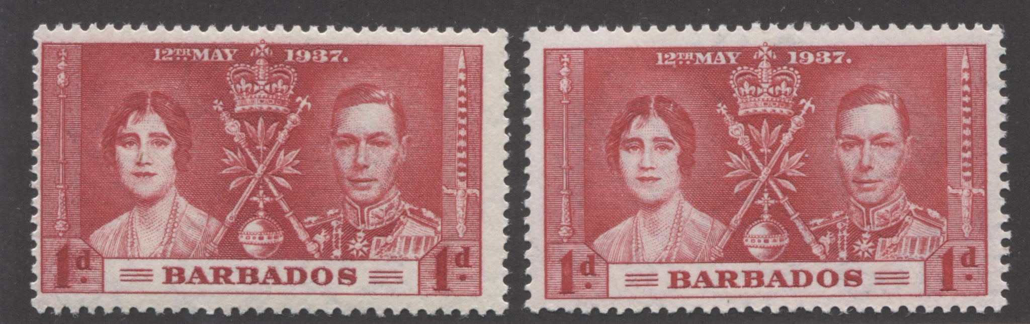
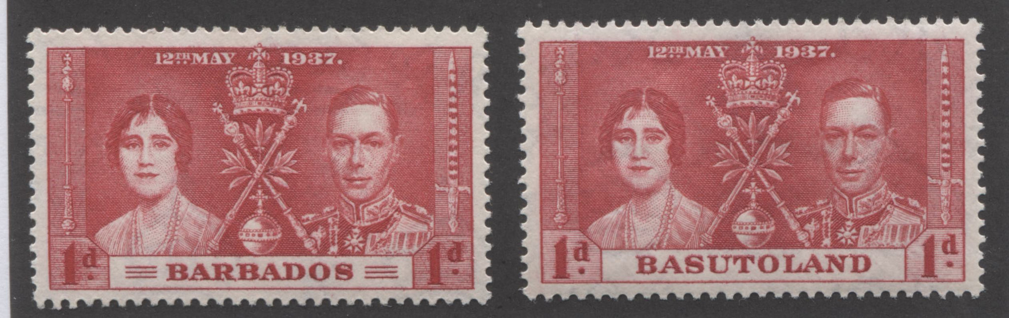
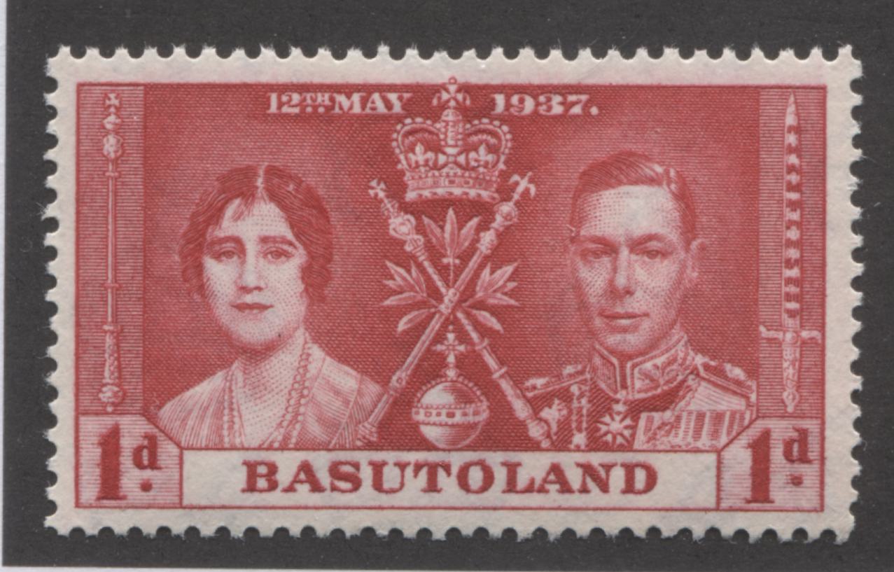
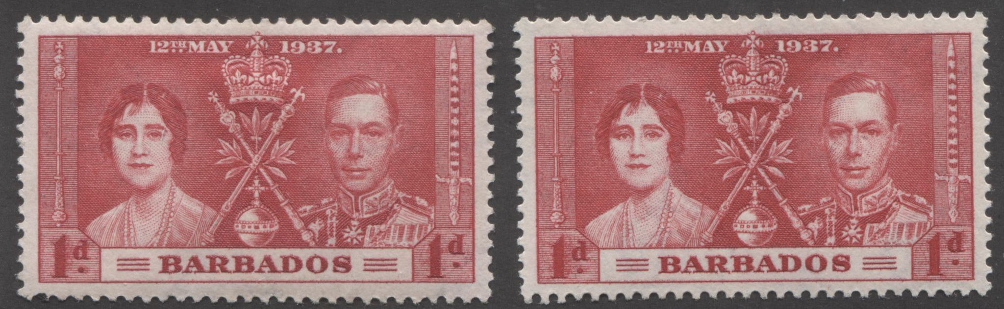
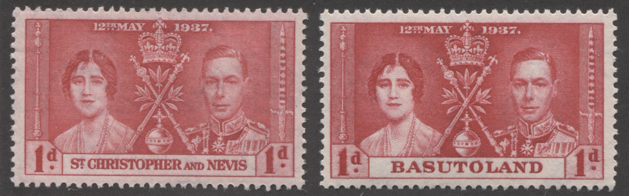
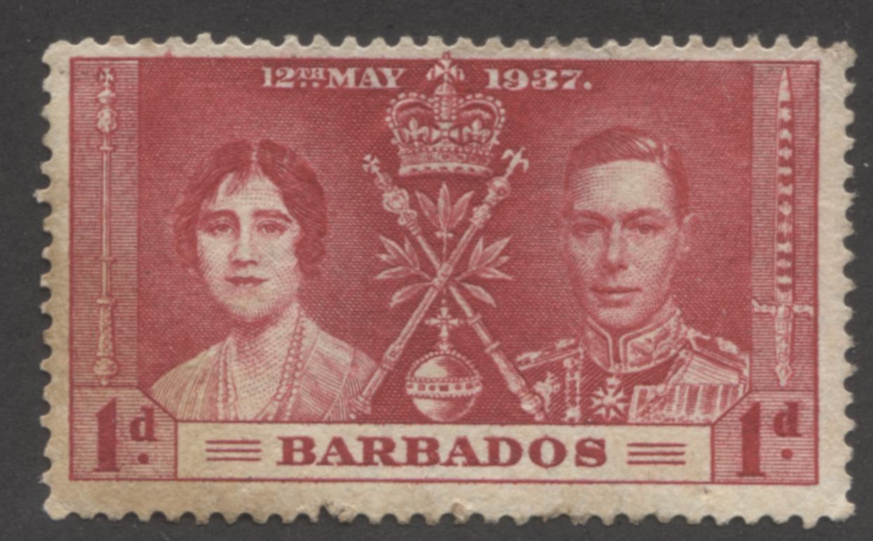
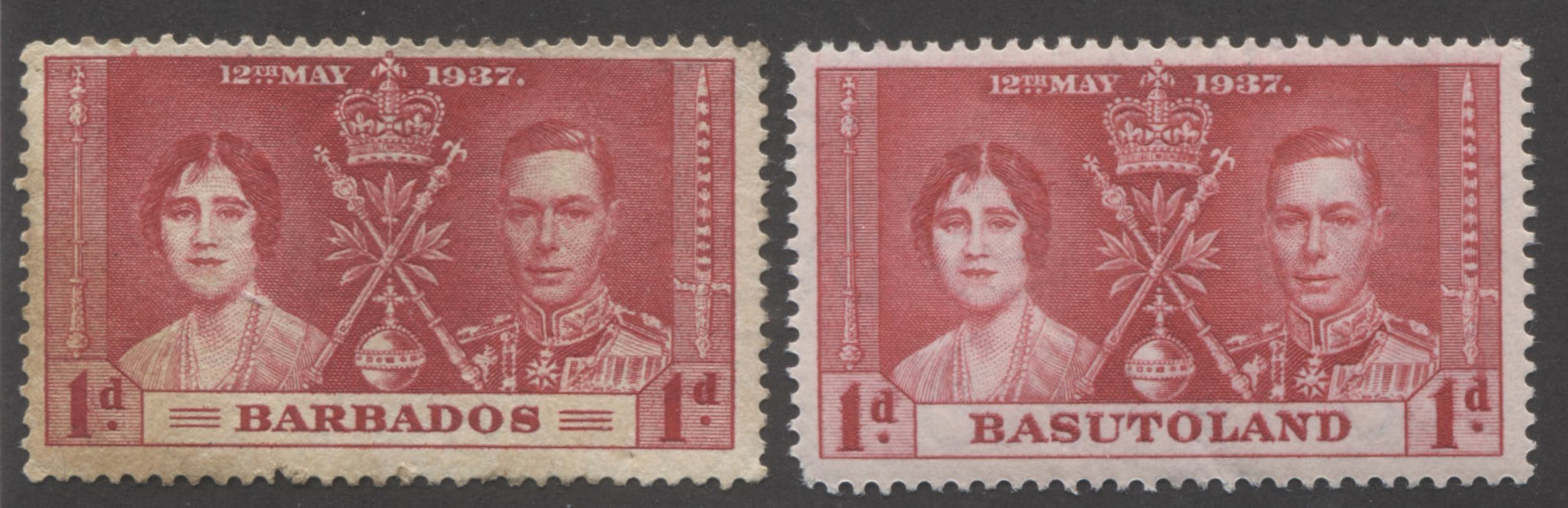
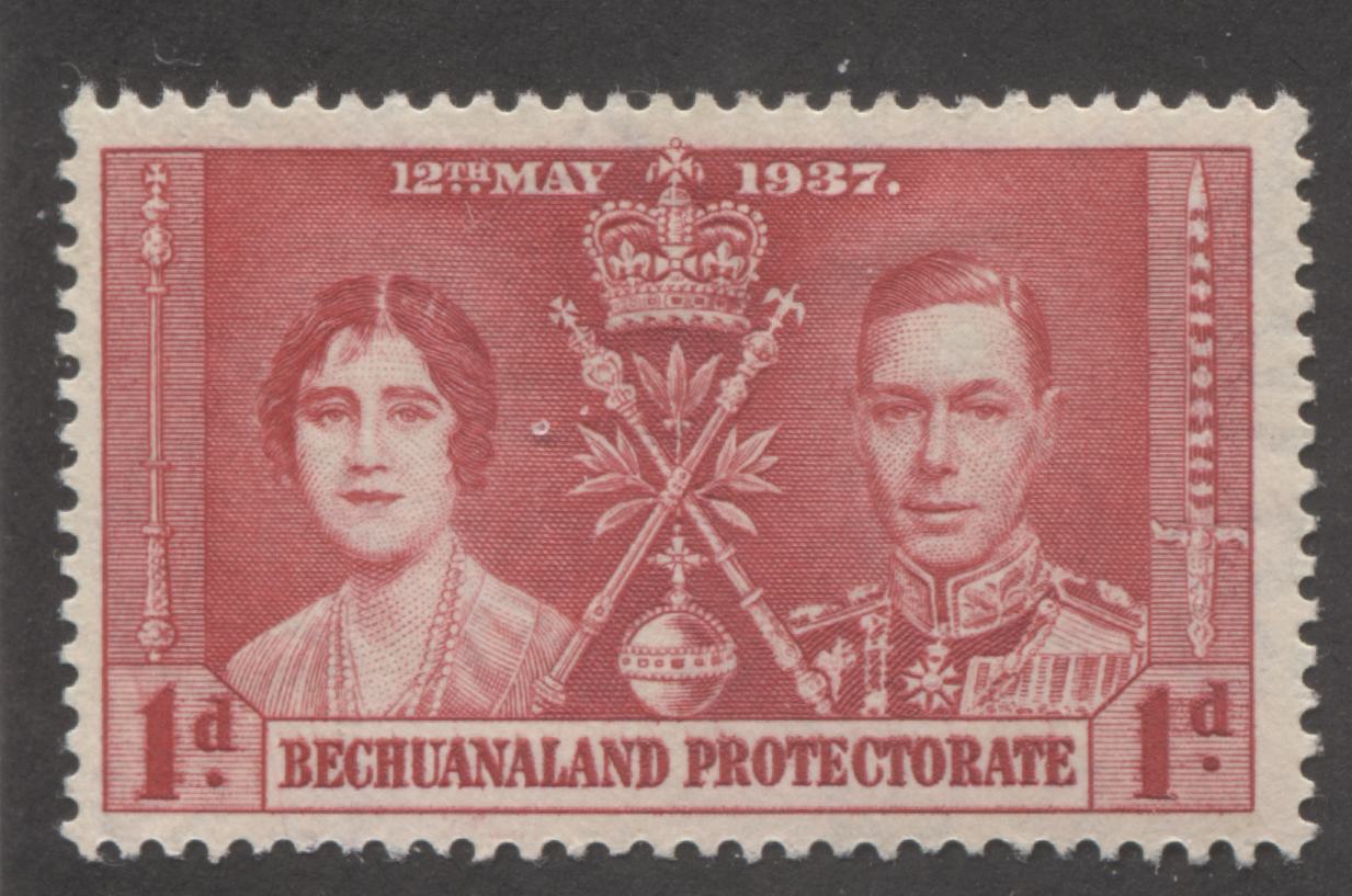
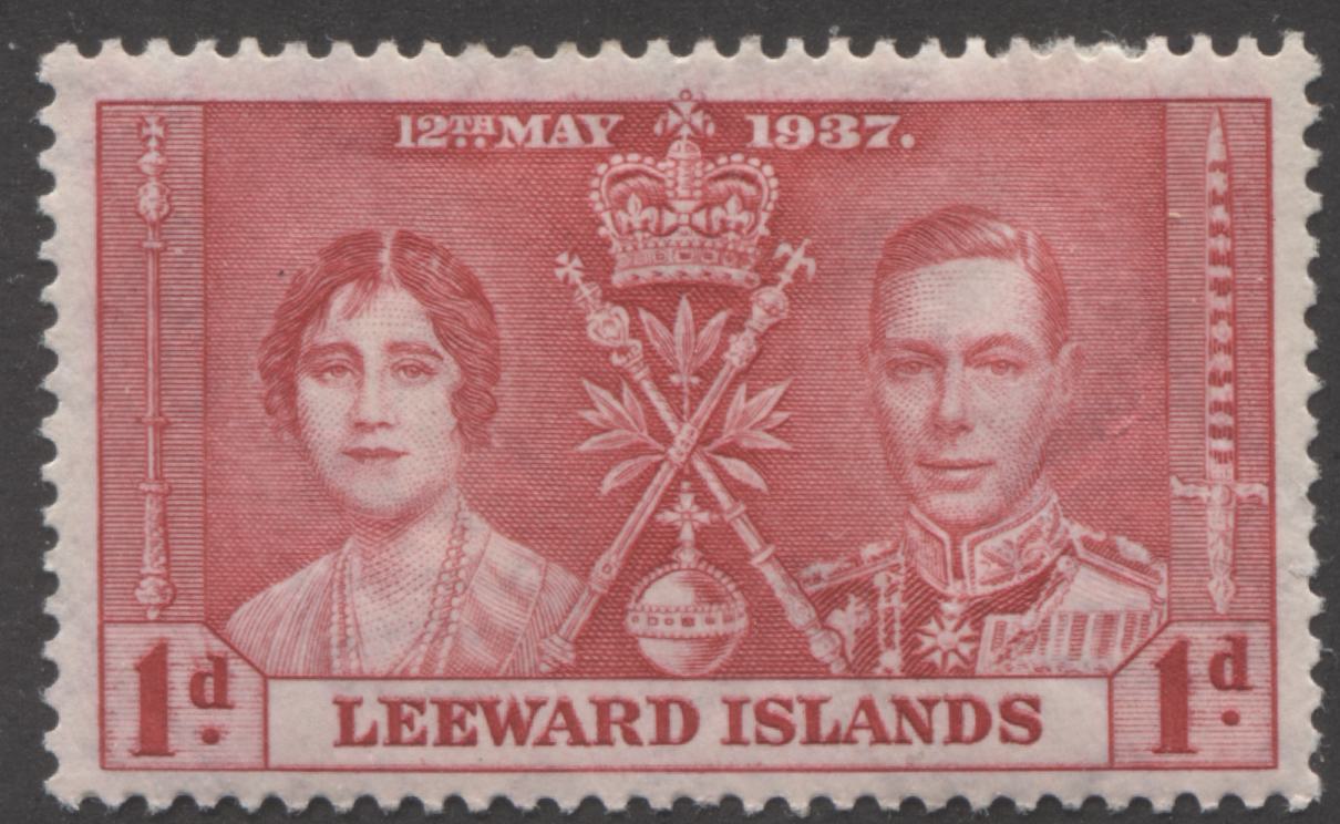
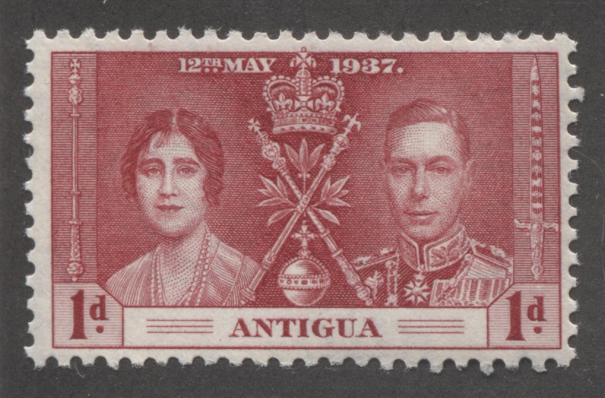
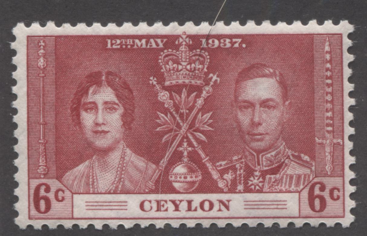
Continuing on with our study of red inks, we will look at the common design of the 1937 Coronation issue. The common design was printed by two printing firms this time: Bradbury Wilkinson and De La Rue. The red colour was used for the lowest value in each set, where that value was designated for first class mail, as required by the Universal Postal Union. Each printer used distinctly different ink that gave rise to shade groupings that were distinct. In De La Rue's case, the inks fall into the rosine, scarlet and carmine-red ends of the spectrum. Bradbury Wilkinson generally printed in shades of carmine-red for all colonies except Newfoundland which again were shades of bright rose.
De La Rue printed the designs for the following colonies:
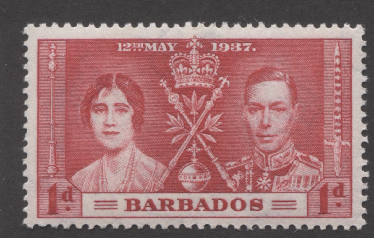
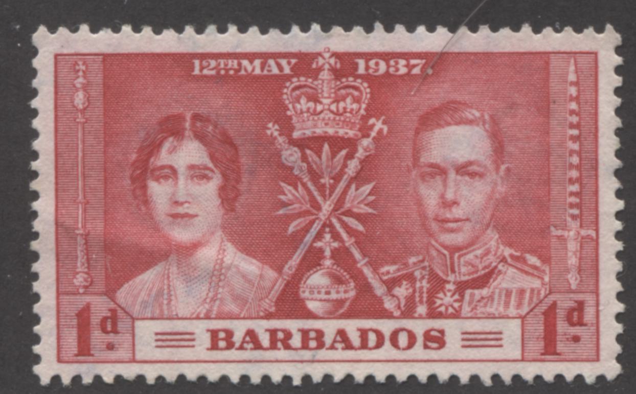
- Barbados
- Basutoland
- Bechuanaland Protectorate
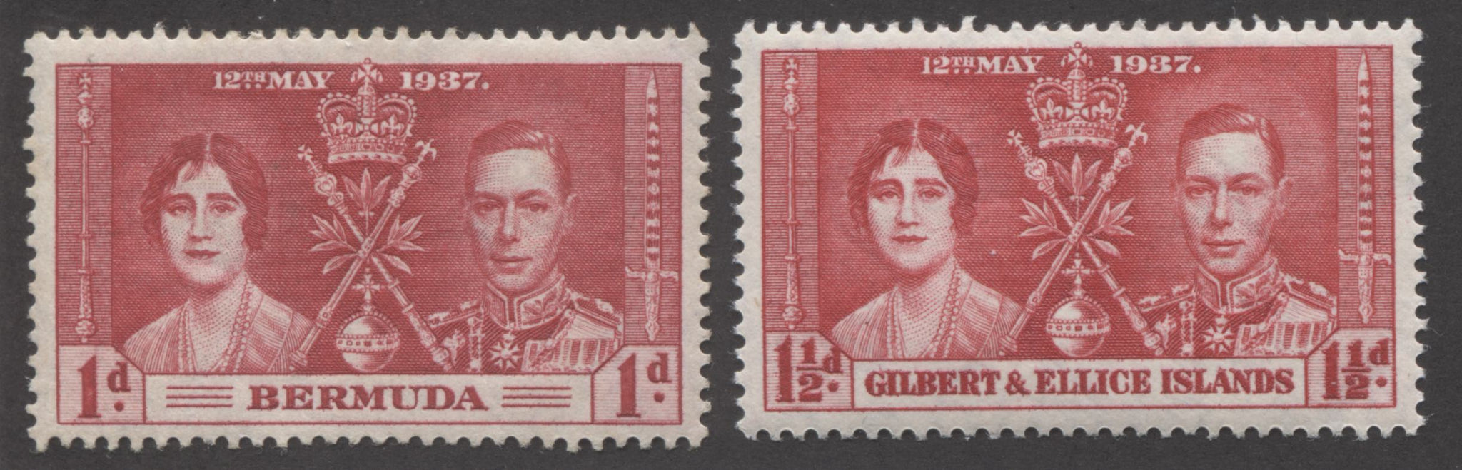
- Bermuda
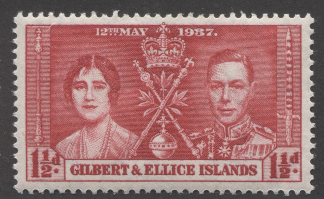
- Gilbert and Ellice Islands
- Jamaica
- Leeward Islands
- Malta
- Mauritius
- Montserrat
- St. Christopher and Nevis
- Somaliland Protectorate
Bradbury Wilkinson Printed the designs for:
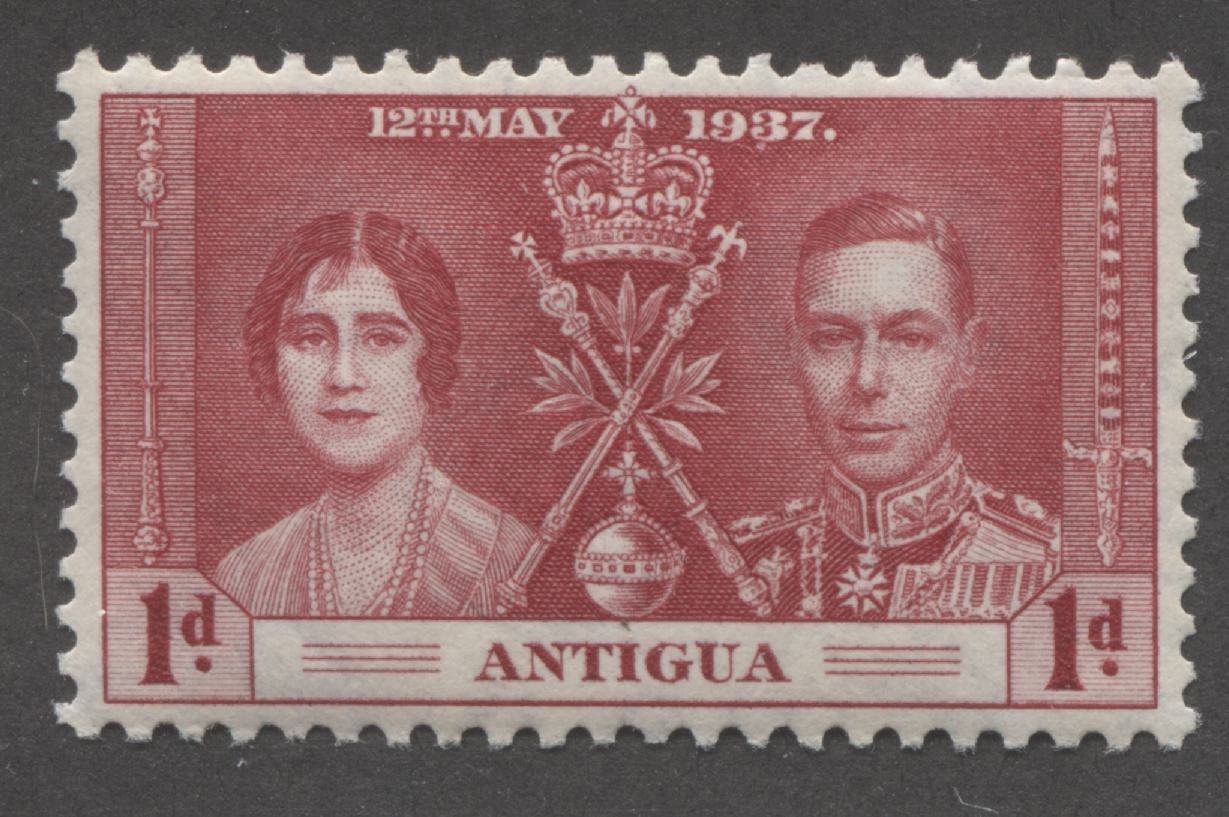
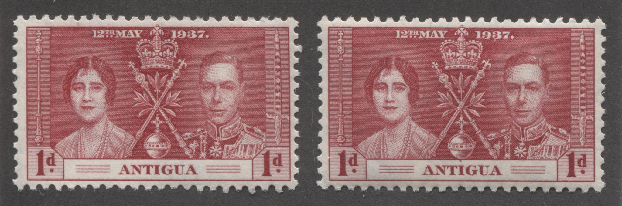
- Antigua
- British Solomon Islands
- Cayman Islands
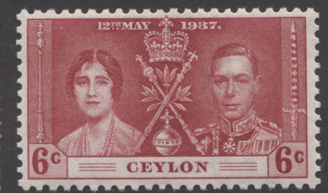
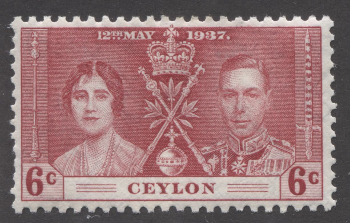
- Ceylon
- Dominica
- Falkland Islands
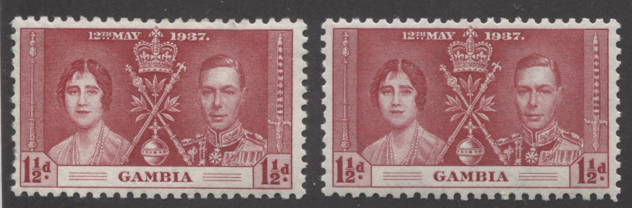
- Gambia
- Grenada
- Hong Kong
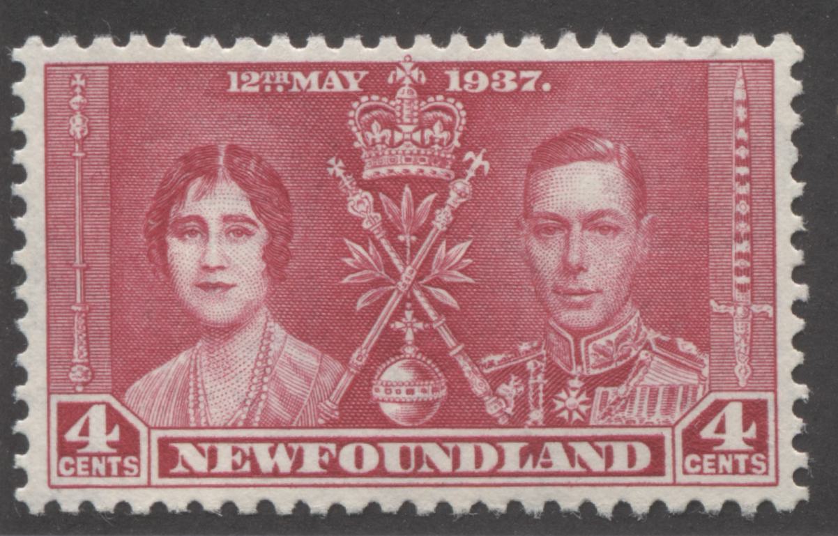
- Newfoundland
- Nigeria
- Northern Rhodesia
- St. Lucia
- St. Vincent
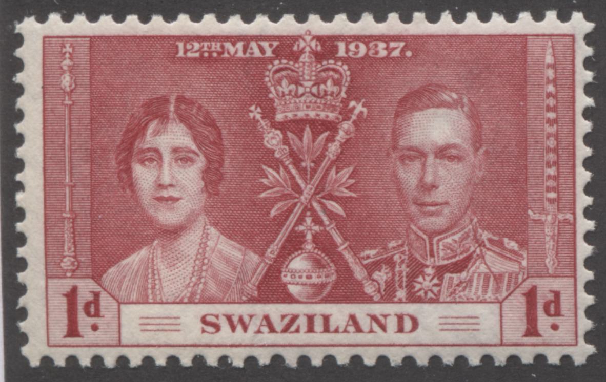
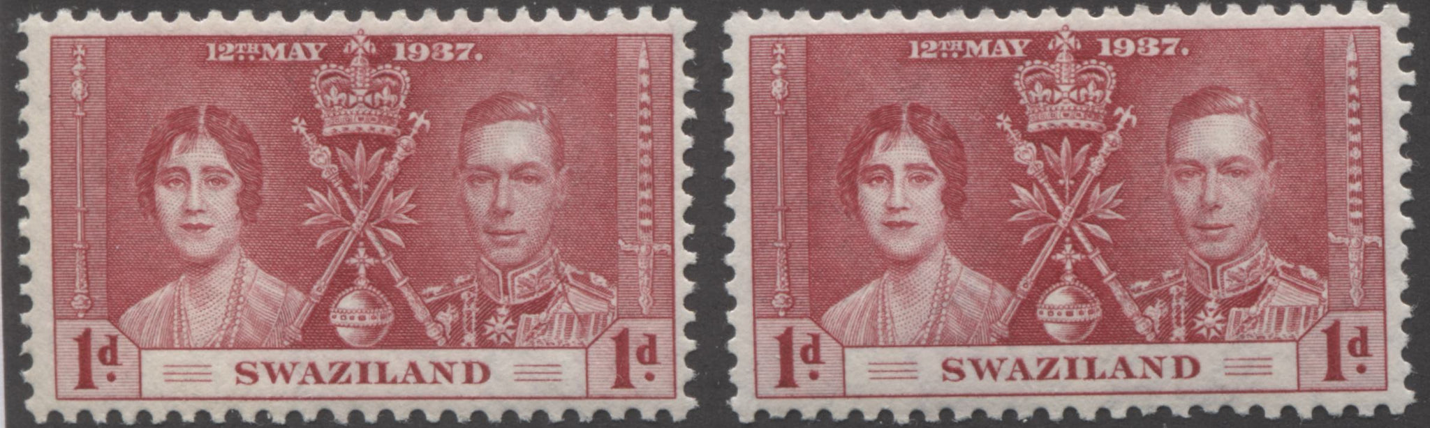
- Swaziland
- Virgin Islands
De La Rue Shades
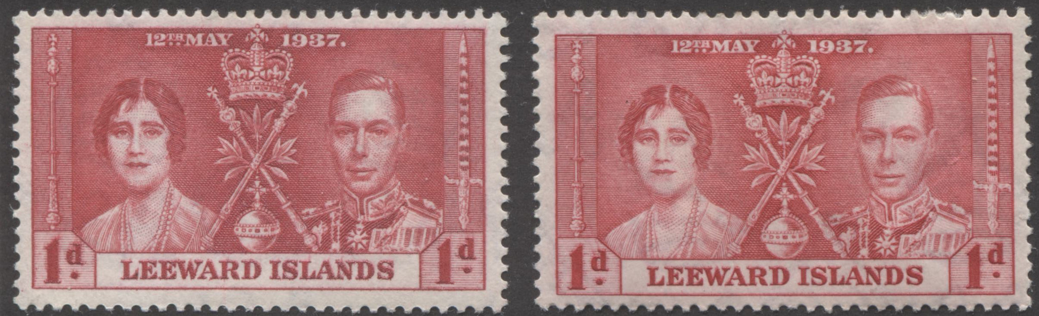
Generally speaking the shades used to print the De La Rue stamps are shades of rosine, and scarlet, using Gibbons' colour key as a reference. Occasionally we see pale and light rose carmine and bright carmine-red, but these are by no means common. Gibbons lists a very rare brown-lake shade on the Malta set, if I'm not mistaken, and I have yet to encounter this. For the scarlet and rosine shades, the individual variations may be deeper, brighter, duller or lighter than the swatches in the key, but they will be the same overall tone as these colours.
This is where sorting shades on stamps becomes tricky for most people because the difference between say, deep bright rosine and scarlet, can appear to be so slight that they wind up looking the same to many. The trick with this type of work is patience, patience and more patience. Set realistic goals: don't expect to sort 1,000 stamps in one sitting, because your eyes will get fatigued. There is an optimal amount of time to spend sorting shades, and I would say it is between 2 and 4 hours. It is enough time for your eyes to acclimatize to pick up the subtle differences, but not so much that they get fatigued. Also, be prepared to revise your shade classifications from time to time. In sorting these red shades, I had to change mine up to 3 times for some of them, as I progressed through them. This colour took me 3 weekends to fully sort for 200-300 stamps. So, don't rush and you will find it much less overwhelming than you imagined.
I found that the overlapping of stamps to illustrate the differences in shades did not work particularly well, so rather than do that I will instead present a large, high resolution scan of each shade and hopefully, the differences will be apparent as you scroll through and view them.
The first shade I want to illustrate is closest to pure scarlet on the colour key:
This shade is just a touch deeper than Gibbons' scarlet swatch, but it is not deep enough to be the deep rose red and it is definitely deeper than the bright scarlet. So, in my estimation it is just a slightly deeper and duller version of the pure scarlet shade.
The scarlet shade is also found in a slighty deeper version and then in a deep version that is deeper than the slightly deeper shade. Here is the slightly deeper scarlet:
This colour is almost identical to the scarlet above, but your eyes should tell you that it is just ever so slightly deeper in intensity. I call this the slightly deeper scarlet.
Then there is the true deep scarlet shade:
This shade is deeper still, but is the same overall tone. This takes care of the different intensities of scarlet. However the scarlet shade can be found in a brighter shade and a duller shade also.
This is the deep, bright scarlet shade. It is clearly brighter than the other scarlet shades.
Then, there is the deep dull scarlet:
This shade is not particularly deep, but it is definitely duller than the basic scarlet colour. It still has nowhere near enough carmine to be either carnine-red or a carmine shade. At the same time, it is much deeper than the dull scarlet swatch on the Gibbons colour key. Therefore, I call it the deep dull scarlet.
Then, there is a shade of scarlet that contains a definite rosy tone:
This shade isn't just lighter, it is definitely rosier than the other shades. Note there is no "rosy scarlet", or "rose scarlet" on the Gibbons colour key, so you have to use your judgement to extrapolate the shade. You will find that you will become much more comfortable doing this as you become comfortable with the differences between the basic variations of red.
This brings me to another important point when sorting shades, and that concerns the question of which portions of the design to compare to the colour key and how to compare stamps to identify shade differences. In comparing stamps to identify shade differences, I find it best to relax my gaze and compare the overall appearance of the stamps. If the shade is truly identical, then it should be impossible for you to tell them apart. However, when you are trying to name the colour shade, and are comparing a particular stamp to the colour key, it is important to focus on the portion of the design that contains the most solid colour. On this design, it is the triangle between the two portraits that contains the orb. You shouldn't compare the areas that contain shading because they contain white space and the eye tends to average that out over the colour and you will conclude that the shade is lighter than it truly is.
At this point, it is useful to show some side by side comparisons to highlight the differences between the different scarlet shades:
Here we have the deep scarlet on the left, and the deep, bright scarlet on the right.
Here we have scarlet on the left and deep dull scarlet on the right.
Finally, we have the scarlet on the left and the slightly deeper scarlet on the right.
Now we turn to the rosine shades. Rosine is a very intense and bright rose-red. It can appear at first glance to be similar to scarlet, but as your eyes acclimatize to it it becomes apparent that rosine contains more red and less vermilion than scarlet does. Like the scarlet shades, we find rosine, deep bright rosine, pale rosine and dull rosine.
Here is the basic rosine shade:
Now, let's take a quick look at a comparison of rosine and scarlet to see the difference between the two:
On the left is the deep bright rosine shade and the scarlet on the right. If you compare the the colour of the solid triangle in the middle, you should be able to see that the colour of the rosine is much closer to rose-red than the one on the right, which is much closer to vermilion than it is to rose-red.
Now that the difference between the scarlet and rosine shade is clearer, we can look at the different variations of rosine.
Here is the dull rosine:

This is the same overall tone as the rosine, but it lacks the vibrancy of the basic rosine colour. Therefore, I have named it the dull rosine.
Next we have the pale rosine next to the rosine:
The pale rosine is shown on the left, while the normal rosine is on the right.
Then we have the deep bright rosine:

This is similar to what we would imagine the deep rosine would look like, but slightly brighter.

Here we have the deep bright rosine on the left and the normal rosine on the right.
Now that we have looked at the common rosine and scarlet shades, it is time to look at the less common carmine red and rose carmine shades.
Here is the bright carmine red:
This is not a particularly good example of this stamp, but it clearly shows the difference in the colour. Carmine-red is an almost perfect blend of carmine and red. It does not look orangy at all, it has a very slight bluish undertone, but not anywhere near enough to qualify as a carmine shade.
Here are some comparisons between this colour and some of the other shades we have already examined:
Here we have the bright carmine red on the left and rosine on the right. One you see them together like this, you wonder why there are no separate catalogue listings for these differences.
Then we have dull carmine-red:
Here, you should be able to see that the overall tone is clearly a carmine-red shade, but this one lacks the vibrancy of the one above. So I call it the dull carmine-red.
Here is a side by side comparison of the dull carmine red and scarlet shades:

The dull carmine red is shown on the left, while the scarlet is shown on the right.
Here is the light rose-carmine shade:

This colour is the same overall tone as the rose-carmine swatch in the Gibbons colour key, but with the addition of white to the colour to make it lighter.
Here is the pale rose carmine shade:
Pale rose carmine is very similar to the light rose carmine, but is even less intense.
Here is a comparison of dull carmine-red and pale rose-carmine:
Dull carmine-red is on the left, while pale rose carmine is on the right.
Then we have a side by side comparison of pale rose-carmine and rosine:

Pale rose carmine is shown on the left, while the rosine is on the right.
Bradbury Wilkinson Shades
The shades of the Bradbury Wilkinson printings are a bit trickier to sort, as they are all, with the exception of Newfoundland, shades of carmine-red. There is a light carmine-red that is quite distinct but most of the variations are quite subtle. Some contain a very slight hint of brown to the colour, but others are merely deeper or brighter variations of the basic carmine-red.
Let's start with the basic carmine-red:
Here is the deep carmine-red:
This shade is very similar to the first one, but it is slightly deeper.
This shade is almost identical to the deep carmine-red, but it is just a touch brighter.
Some side by side comparisons would be in order here. Let's start with carmine red and deep bright carmine-red:
Deep bright carmine red is on the left, while the regular carmine-red is on the right. The two shades appear almost identical, but the stamp on the left is slightly brighter than the one on the right.
Then we have bright carmine-red and deep bright carmine-red:
Deep bright carmine red is shown on the left, while bright carmine-red is shown on the right.
Here is the deep brownish carmine-red:
Again, this shade is very similar to the carmine-red, but there is a very slight brownish undertone to the red.
Then we have the light, bright carmine red:
This is very similar to the bright carmine red, but is lighter.
Here is a comparison between the light bright carmine red and the bright carmine red:
The light bright carmine-red is shown on the left, while the bright carmine-red is shown on the right.
The last carmine-red shade is the very distinct light carmine-red. This is a scarce shade, and so far I have found it on the stamps of only 2 colonies, Ceylon and Northern Rhodesia. However, I am confident it must exist on the others also:
This shade is very noticeably lighter than the normal carmine-red shade.
Now, let us turn to the bright rose shades found on the Newfoundland stamps. So far I have found bright rose and deep bright rose only, though as I study the stamps I may find other variations.
Here is the bright rose shade:
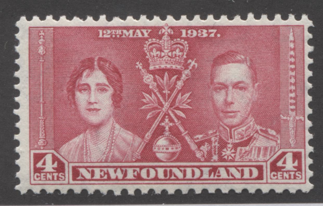
This is a little deeper than the bright rose in the Gibbons colour key, but it is the same overall tone.
Here is the deep bright rose shade:
The difference between this and the above shade is extremely slight, with this shade being every so slightly deeper.
Here is a comparison of the two shades:

The deep bright rose is on the left, while the bright rose is on the right.
Now, here is a comparison between the bright rose, and the carmine-red that was used by Bradbury Wilkinson to print the stamps of the other colonies:
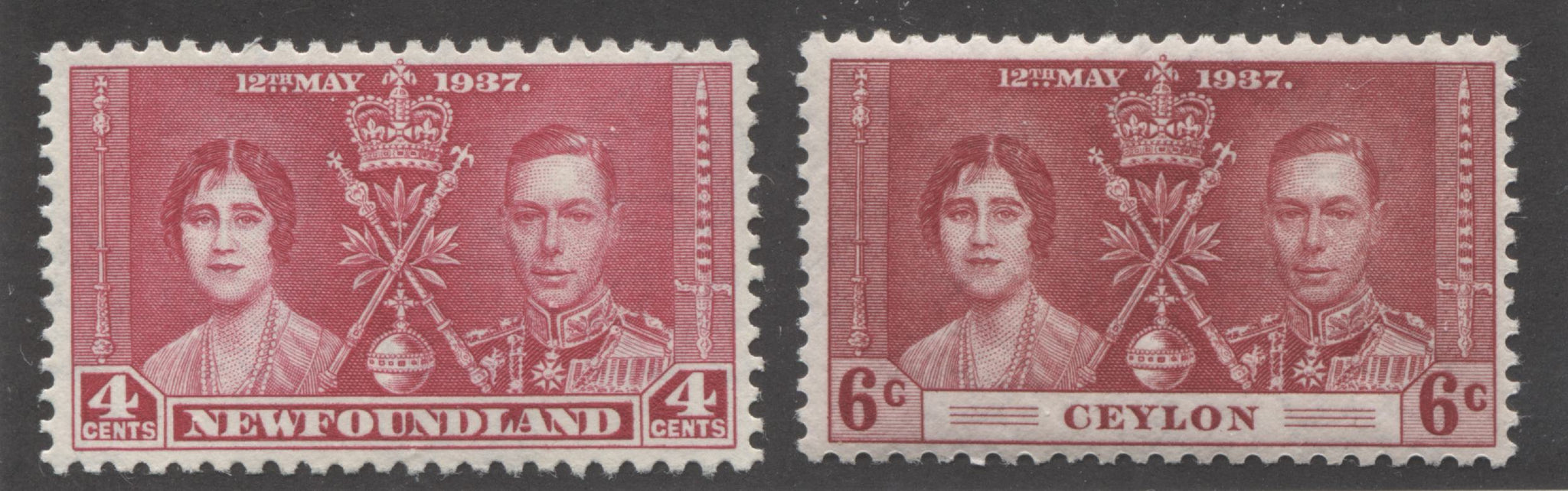
The deep bright rose is on the left and the deep carmine-red is on the right. Night and day!
This brings us to the end of my examination of the reds on the common design. So what to you think? Can you see at least some of these differences? I can appreciate that some of them will be far too subtle for many collectors, but what is significant to be is that all the shades that I have identified here can be found on several different colonies. What this suggests is that this issue was a massive effort to produce and print in time to be distributed to the Crown Agents by the original issue date contemplated for the now abdicated Edward VIII. Because the issue date was not moved forward, less than 6 months was available for the design and printing of these stamps. This stands in stark contrast to the 1935 Silver Jubilee issue. This may account for the relative lack of re-entries and plate flaws: because the stamps were printed so quickly. But it also accounts for the preponderance of shade varieties: a large number of separate printings was required to make up the requisitions received from the Crown Agents.
It is by carefully studying these shade differences across the different colonies that we can begin to identify the separate sub-printings that would have been grouped together into a single release. I have not had an opportunity to examine the printing records for either De La Rue, or Bradbury Wilkinson. However, I suspect that if I could, I would see 2 or 3 different shipments between early 1937 and 1938 for these stamps. Each of these is likely comprised of 2 or 3 different printing runs that were made to make up the required printing. All of the sudden, this set becomes much more interesting to study and it becomes clear that they key to studying this issue is the shades. Indeed, you will see as I write more about the shades of this issue, that there are significant variations in most, if not all the colours used to print the stamps of this common design.
In my next post I will look at the red shades found on the non-common designs of this issue.
8 comments
Awesome article, I read it at night about 2 weeks ago and the next morning, Lo and Behold I came upon 5 different complete Omnibus sets for sale and I bought them. Thank you for all that you do.
vPAGOExLuYcQZgh
jcNHGBafMK
pmEZIuxGFLQv
QHXsBuAdVqx