
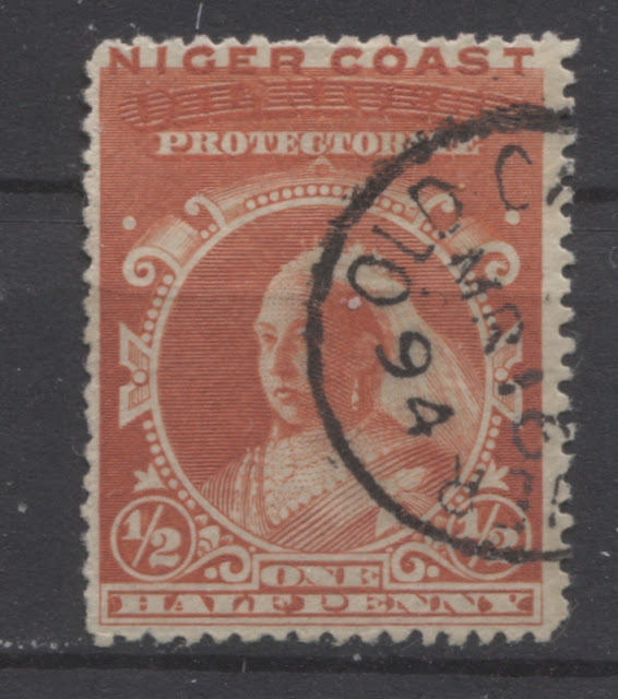
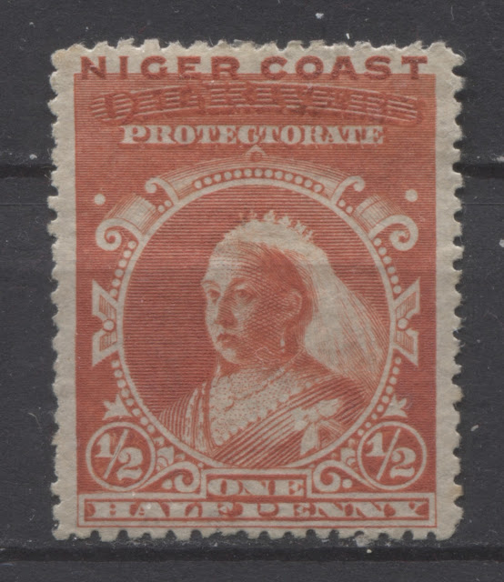
Today's post will explore the 1/2d vermilion stamp from this series in detail.
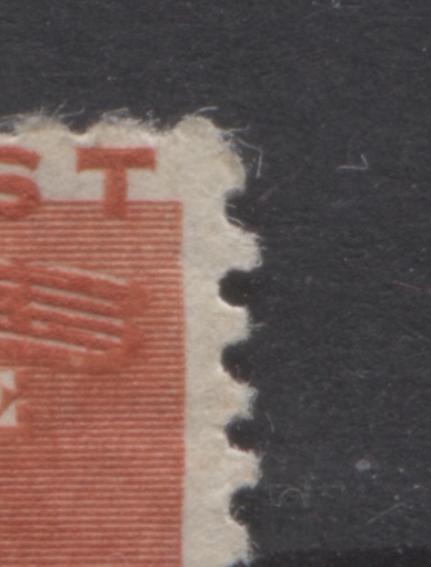
Perforations
I have found the following perforations:
The stamp on the left is a dull shade that is very close to Gibbons's red shade. The stamp on the right is closest to Gibbons's dull vermilion, but with a more orange undertone.
The stamp on the left here is also a dull vermilion shade, but it is deeper than the one shown above. The right stamp is an almost perfect match to Gibbons's orange vermilion shade, but is a hint duller than what is shown on the swatch.
The stamp on the left is very close to Gibbons's orange-red, but contains a hint of dull vermilion to the colour. It is almost like what you would expect to see if you took the dull vermilion swatches and orange-red swatches on the Gibbons colour key and combined them. The stamp on the right is closest to Gibbons's red shade, but deeper and duller.
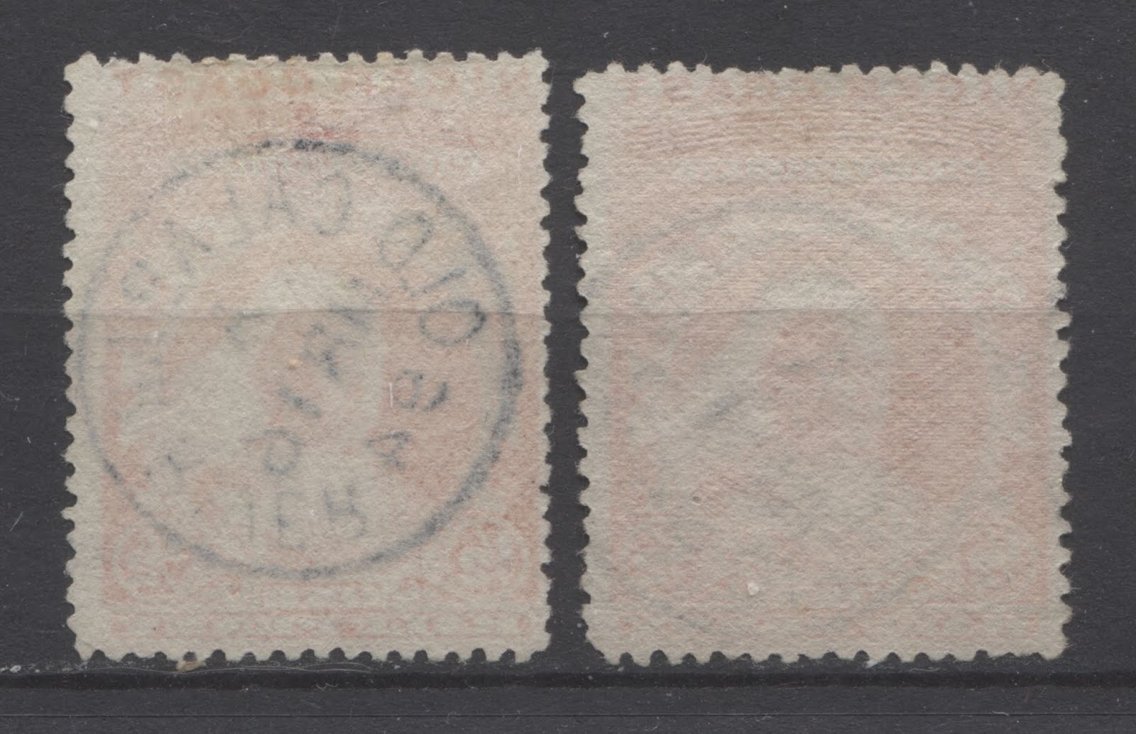
Papers
The scans below show the paper types that I have found on these stamps:
 The first two paper types that seem to occur on most of the stamps I looked at is a thin wove paper that shows a coarse mesh. The paper is found both horizontally and vertically wove. The vertical wove is on the left, while the horizontal wove is on the right.
Re-Entries and Plate Flaws
Ince and Osborne note some 17 different plate flaws and/or re-entries on this stamp. Some of the flaws are to be found on every stamp in the plate, while others are confined to selected positions from the plate.
The flaws or distinguishing characteristics that can be found on every stamp from the plate are:
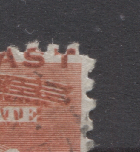
It is not a very strong line, but you can see it at the top, and then just below the centre.
The next stamp is position 6, showing the diagonal line through the right "1" and the extended vertical frameline at upper right.
Note the extension of the portrait shading lines into the white frame and the dots inside the first two pearls.

Perforations
I have found the following perforations:
- 15.1
- 15.1 x 14.5
- 13.9 x 14 x 14.15 x 14.1
- 14.1 x 14 x 14 x 13.6;14.3
- 14 x 14.25
- 14 x 14.1 x 14.1 x 14.25
- 13.9 x 14 x 14.25 x 14
- 15.1 x 14.75
- 14.1 x 14.25
- 14.1 x 14
- 13.9 x 14.1
- 15
- 15 x 14.9
- 14.7 x 14.8
- 14.5
- 14.9 x 14.7
- 13.9
- 14.5 x 13.9
- 14.9 x 14.5
- 15 x 14.4
- 14.9
- 14
- 14 x 14.1 x 13.9 x 14.25
- 14.9 x 14.6
- 15 x 14.6
- 14.4 x 14.1 x 14.1 x 14.4
- 14.1
- 14.5 x 14.1
- 14.1 x 13.9
- 14.25 x 14.1
- 14.1 x 13.75
- 14.1 x 13.75 x 14.1 x 14.1
- 14.1 x 15; 13.75
- 14.25
- 14 x 13.75
- 13.75 x 14.25
The most common of these are the perf. 15, 15 x 14.9 and 14.1. There are several where the perforation is different on more than 2 sides. There are always scarce, with usually just one example. There are two compound perforations in this the gauge changes part way down a side. So for example 14.1 x 15;13.75 means that the top and bottom are perf. 14.1, while the top part of the side margins is 15, the gauge changes to 13.75 part way down the sides. These are the scarcest of all, with only two different measurements noted and one example of each.
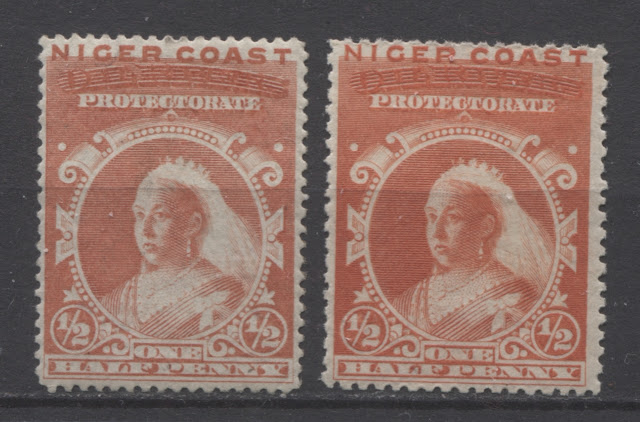
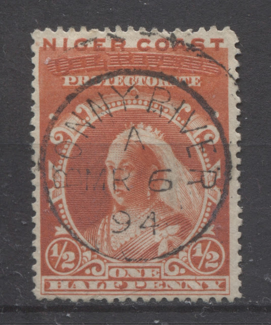
Shades
I have identified eight different shades of the ink used to print these stamps, though I would point out that some of these variations may be the result of oxidation, as the orange vermilion ink is particularly susceptible to this.
I show them in pairs, in the following scans:

The stamp on the left is a dull shade that is very close to Gibbons's red shade. The stamp on the right is closest to Gibbons's dull vermilion, but with a more orange undertone.

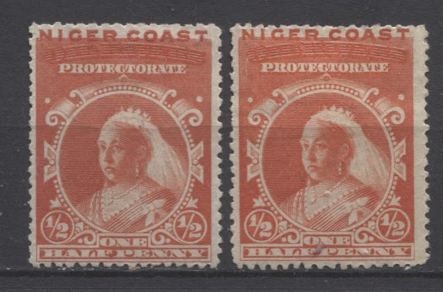
The stamp on the left here is also a dull vermilion shade, but it is deeper than the one shown above. The right stamp is an almost perfect match to Gibbons's orange vermilion shade, but is a hint duller than what is shown on the swatch.

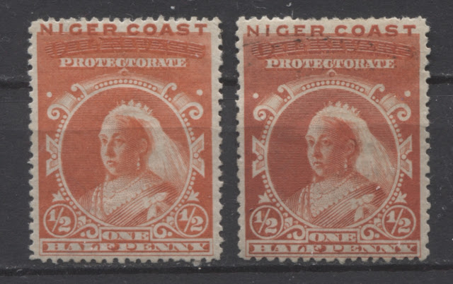
The stamp on the left is very close to Gibbons's orange-red, but contains a hint of dull vermilion to the colour. It is almost like what you would expect to see if you took the dull vermilion swatches and orange-red swatches on the Gibbons colour key and combined them. The stamp on the right is closest to Gibbons's red shade, but deeper and duller.

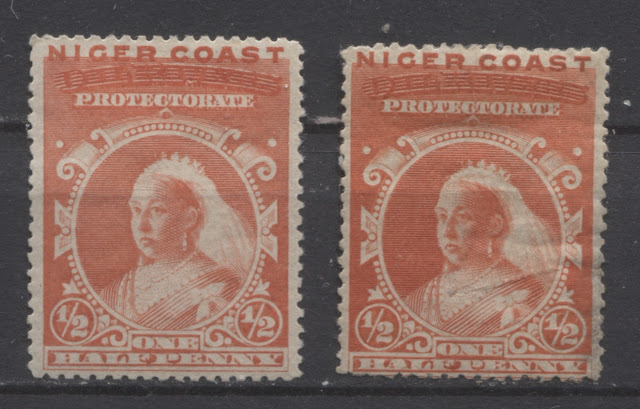
The stamp on the left is closest to Gibbons's dull vermilion shade, but paler. I would call it the pale dull vermilion. Finally, the stamp on the right is a perfect match to Gibbons's orange-red shade.
Papers
The scans below show the paper types that I have found on these stamps:
Re-Entries and Plate Flaws
Ince and Osborne note some 17 different plate flaws and/or re-entries on this stamp. Some of the flaws are to be found on every stamp in the plate, while others are confined to selected positions from the plate.
The flaws or distinguishing characteristics that can be found on every stamp from the plate are:
- A plate dot inside the curl of both 2's.
- There are only 8 circular white dots around the base of the centre oval on the left side, but nine are visible on the right.
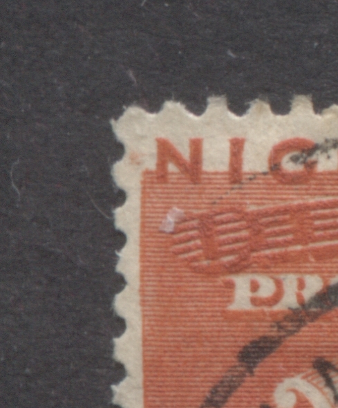
The plate flaws or characteristics that are specific to one or several positions in the sheet are as follows:
- Position 14 - The final right hand graving line of the decorative sideways "v" on the right centre of the oval extends through to the outer margin, with an additional line in the lower arm of the sideways "v".
- Positions 10, 13, 20, 30, 37, 38, 39, 42, 43, 45 and 50 - there is a single or double additional line in the outer right hand margin.
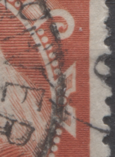
- Position 6 - A line of colour passes through the right hand fraction of 1 of "1/2d, extending through the circle to the triangular ornament above. The right hand vertical frameline extends well beyond the upper horizontal frameline.
- Position 9 - There are additional lines to the circle and frame above "one", the "P" of "Penny" is slightly distorted, the background of the centre oval overlaps slightly at lower left, there are small dots in the pearls at lower left and finally there is re-touching of lines at the top of "F" of "Half" and "P" of "Penny".
- Position 21 - A small additional frame line extends horizontally to the right from foot of "T" of "Coast", the background of centre oval overlaps slightly at the top right, and finally the horizontal shading lines in the curl of the right hand scroll overlap the scroll to the right.
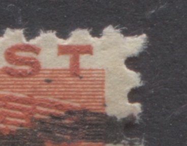
- Position 51 and 52 - There is an additional vertical stroke to the stem of the "T" of "Coast" on the left hand side, finishing short of cross-piece.
The scans below show examples of these positions.

This is one of the 11 identified positions that shows the additional line of colour in the outside right hand margin of the sideways "v" ornament at right.

It is not a very strong line, but you can see it at the top, and then just below the centre.
The next stamp is position 6, showing the diagonal line through the right "1" and the extended vertical frameline at upper right.

These two characteristics are not visible all that clearly in the above scan, but hopefully they can be seen in the two scans below, though again, they are hard to see:

Here, you can just make out the extension of the vertical frameline at UR.

Here, you can see a thin diagonal line through the "1".
The next stamp is a nice example of the Position 51 re-entry showing the distinct doubling of the left side of the "T" of "Coast":


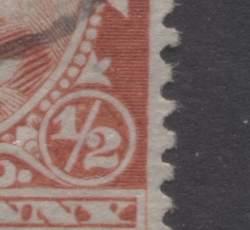
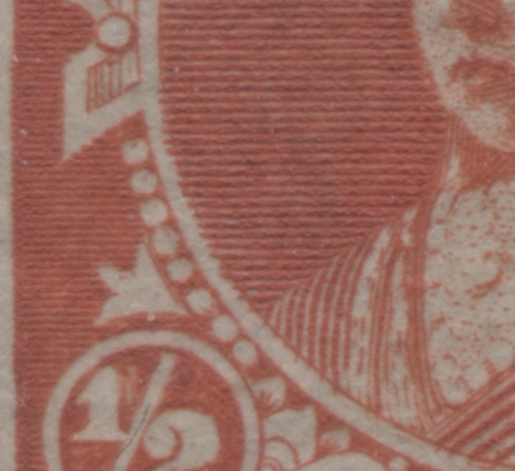
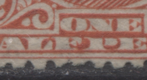
The next stamp is an example of position 9, in which there are extensions of the medalion shading lines into the oval frame, extensions of shading lines on the Queen's dress into the frame, dots inside the pearls at lower left, and retouching of the "F" of "Half" and "P" of "Penny":

If you look very carefully at the lower left of the portrait medalion, you can see the extension of the shading lines into the white frame. Similarly, you can just make out the extension of the shading lines on the dress into the white frame above one. However, the following close up scans will help show these better:

Note the extension of the portrait shading lines into the white frame and the dots inside the first two pearls.

Here you can see three shading lines extending into the white frame above "One", as well as the retouching of the "F" of "Half" and the "P" of "Penny".
So, it would seem that the only one of these for which I do not have an example is position 21.
In addition to the above plated re-entries. I have identified a few re-entries shown below, that are not plated and consequently are not mentioned by Ince and Osborne:
On this stamp, the horizontal lines of the design extend slightly into the right margin at the upper right, causing a slight bulge in the frameline at upper right:


In this close up image, you can clearly see that the outer right frameline is not straight, but you can see remnants of the original guideline which would have represented a straight frameline, had the horizontal lines not crossed it.
The next example is similar to the above, but instead of the re-entry affecting the top right side of the stamp, the area affected is at upper left.


Again, note how the horizontal lines extend beyond the vertical frameline.
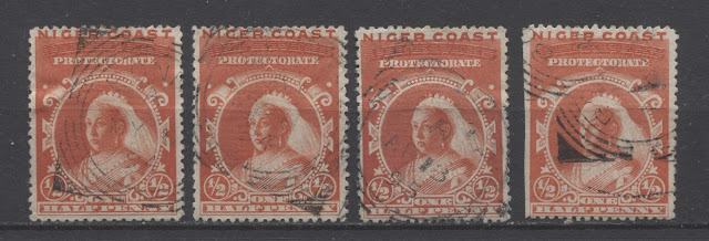
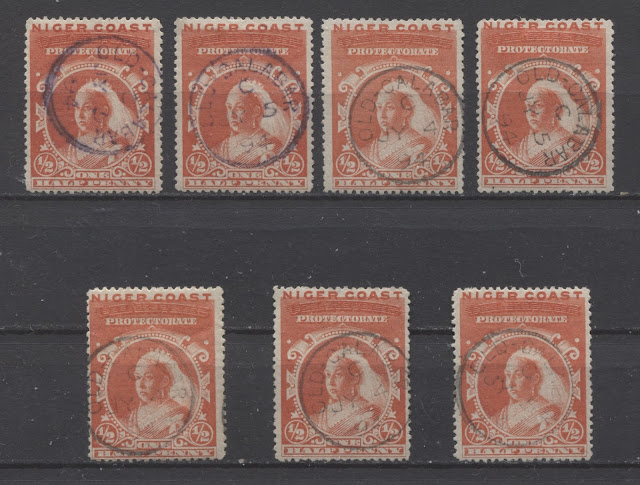
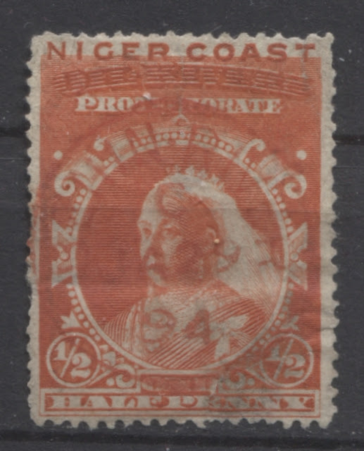
Cancellations
A wide variety of cancellations, most of which are circular date stamps can be found on these stamps. The scans that follow show the cancellations in my possession:
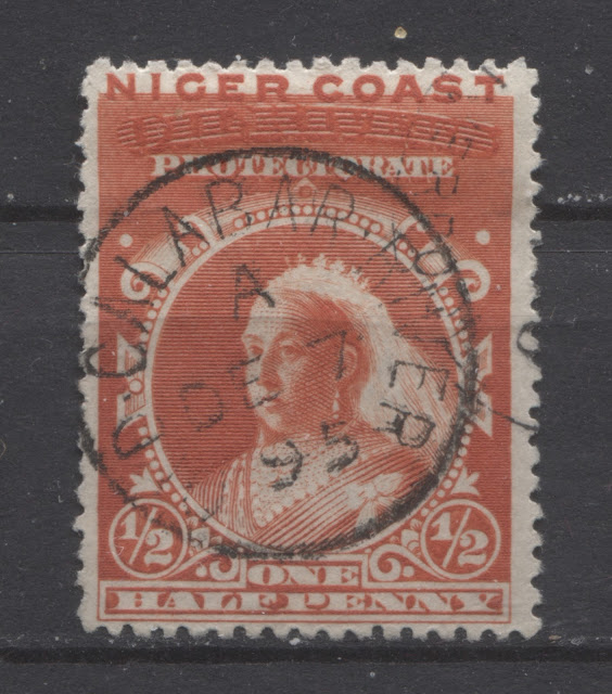
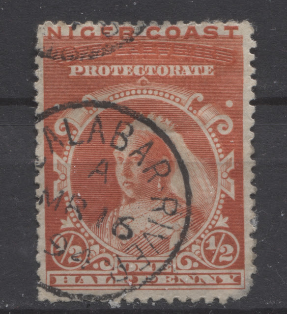
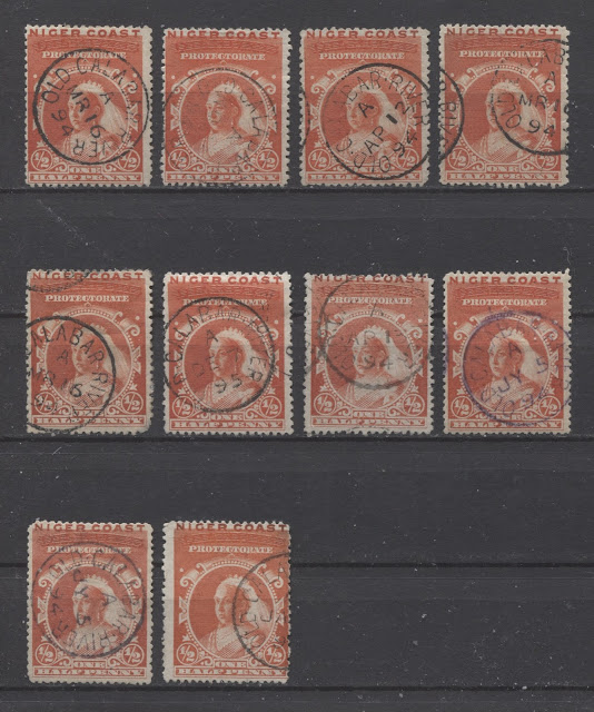
Old Calabar River
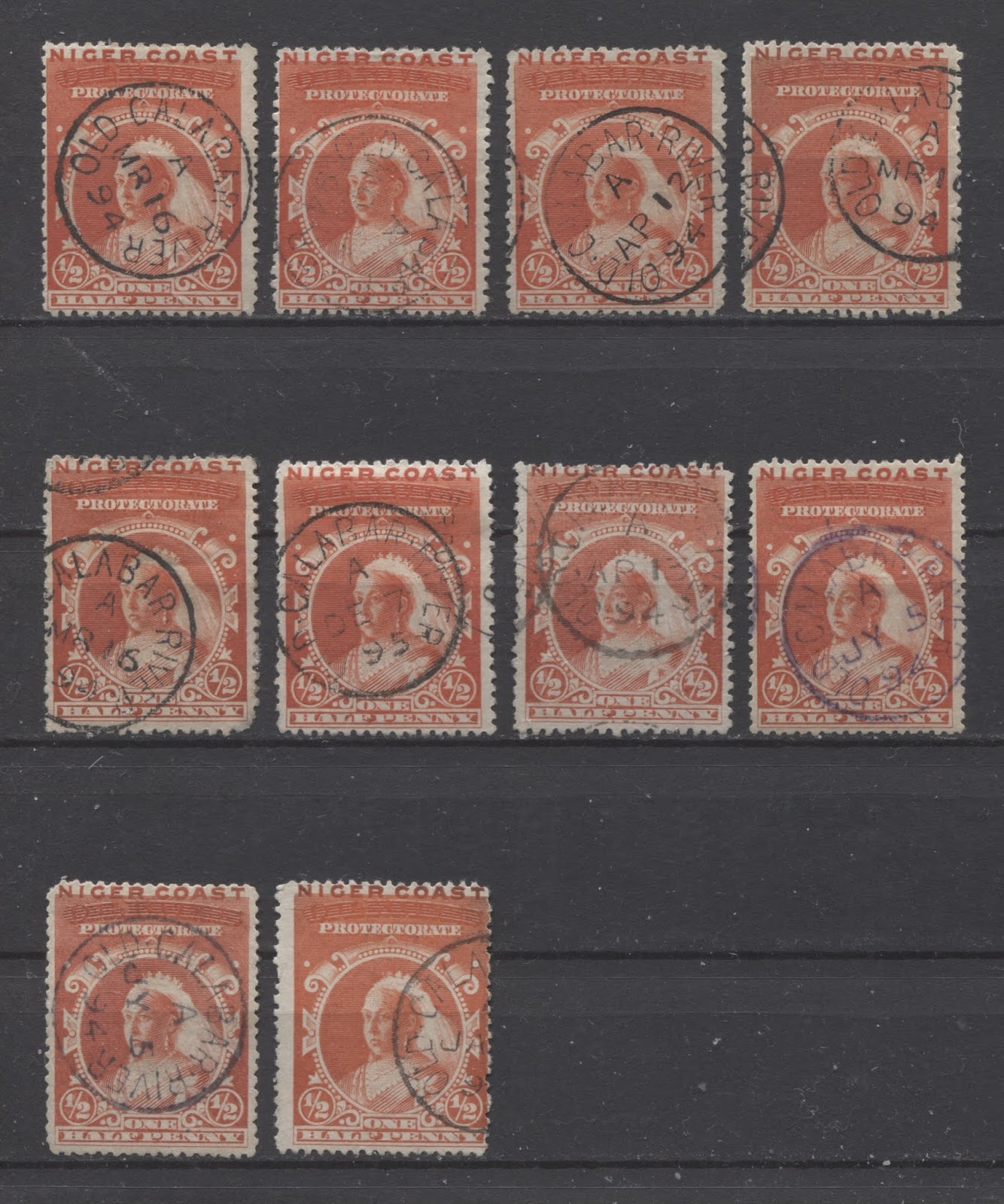
This is one of the more common cancellations found on this stamp. The 10 examples above are all dated between March 16, 1894 and December 7, 1895. The dates are contemporaneous with the issue, and are therefore unlikely to be cancelled-to-order. All are black, except for the right stamp in the second row, which is struck in violet. All are time code A.
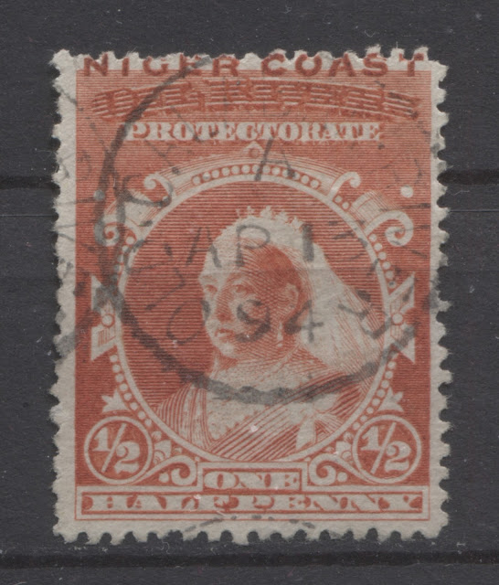
Bonny River
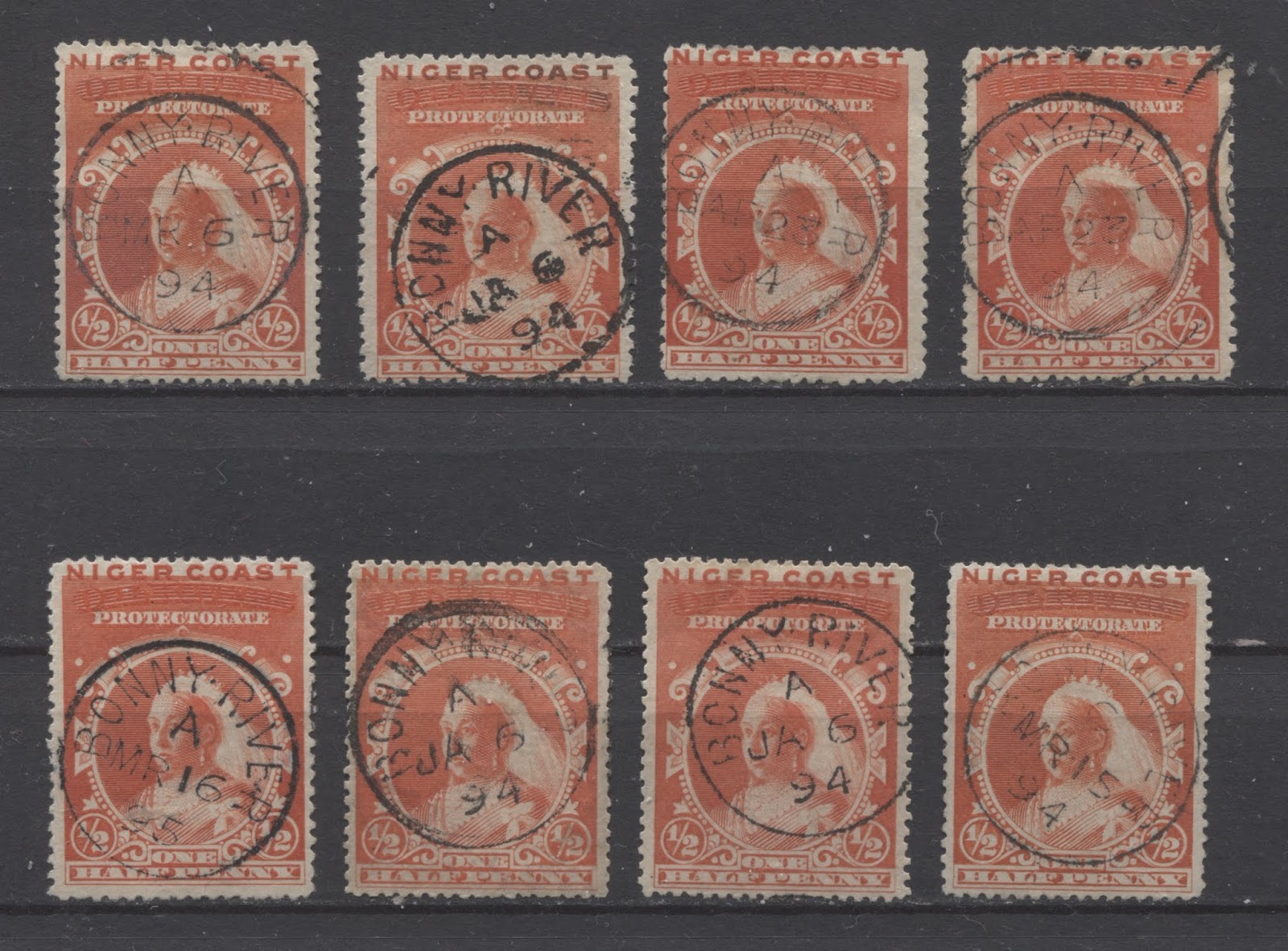
This is another fairly common cancellation. The 8 examples shown here are all dated between January 6, 1894 and March 16, 1895. Again, all are time code A.
The next scan below shows four of the squared circle postmarks for Bonny River, also with time code A:

These are all dated between May 1, 1894 and April 13, 1895.
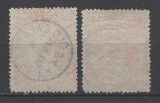
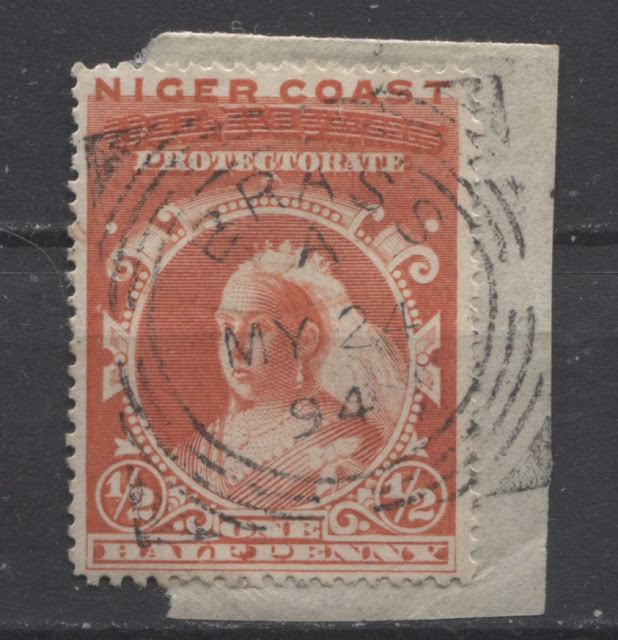
Old Calabar
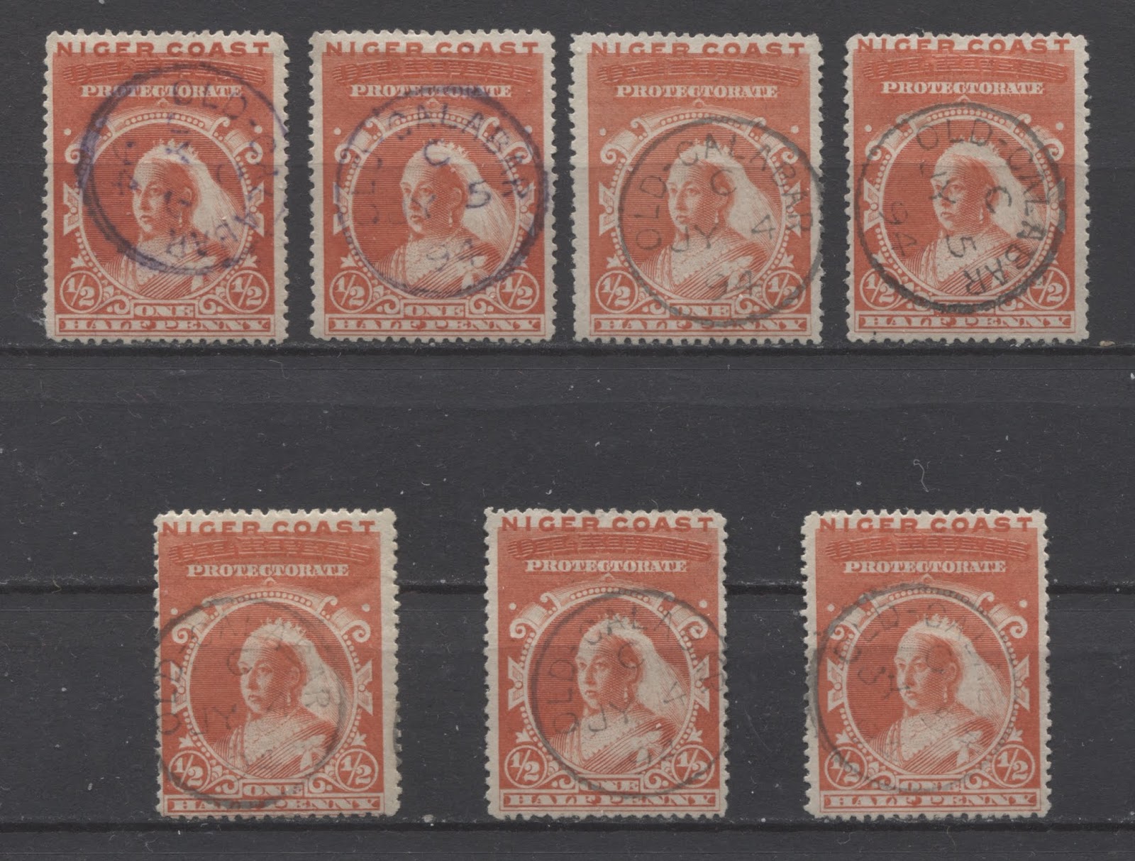
Old Calabar was the original name for Old Calabar River. It's use on these issues is generally thought to be a CTO cancel. The fact that these examples are all dated either July 4 or July 5, 1894, tends to support this notion. All of the examples shown here are time code C.
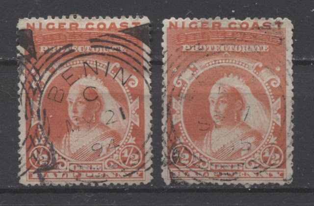
Benin River
This is one of the scarcer villages, though not as scarce as Buguma. I have one CDS cancel struck in red and two squared circle postmarks:

This one is dated January 29, 1894 and is date code C.

These are dated May 21, 1894 (time code C) and September 7, 1895 (time code A). The stamp on the left is another example of position 6.
Brass River
I have one single example of the squared circle cancellation from Brass River on piece, dated May 24, 1894:

This brings me to the end of my examination of the halfpenny vermilion from this issue. Next week, I will look at the 1d blue in detail.
1 comment
Are there any size variations of the impressions or of the stamps themselves ?