
In today's post I will finish detailing the last 11 printings of this high value definitive stamp from the third and fourth states of the plate.
Group 3: Printings 10-17 From the Third State of the Plate - 1894 to 1899
As stated many times in other posts, the third state of the plate is characterized by a lack of detail in the hair at the back of the head, especially the hair above the diagonal ribbon. There is also merging of the top three to five hairlines at the top of the head.
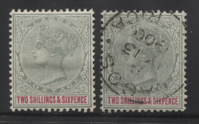
Tenth Printing
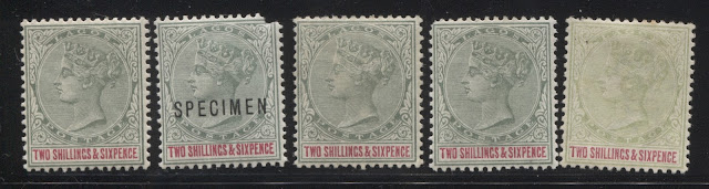
The head plate colour of this printing is close to Gibbons'd grey green, but is both brighter and contains more blue. It is also similar to Gibbons's dull blue green, but is deeper. So I would call this the deep dull blue green. The duty plate colour is closest to Gibbons deep carmine.
I have three sound mint examples, one severely faded example without gum and one damaged specimen overprint as shown above, and three postally used examples as shown below. I assigned the faded example to this printing based on the state of the plate and the fact that the deep carmine of the duty plate matched the rest of the stamps from this printing.

The three postally used examples appear to all be cancelled with the wide 9-bar oval obliterator of Ibadan. The two examples on the left have what can be considered to be full colour for used stamps, while the example on the right is faded, but not too severely.
Eleventh Printing

The head plate colour of this printing is closest to dull green on the Gibbons colour key, but is just a touch deeper. It is not deep enough to be the deep dull green however. The duty plate colour is closest to Gibbons' rose-carmine.
I have no used examples of this printing, and only the mint example shown above, which alas has two diagonal creases. However, it is an important example of this distinct duty plate shade, which is not repeated on any of the other printings.
Twelfth Printing

The head plate colour of this printing is similar to the last, but is just a little bit deeper, being closest to Gibbons's deep dull green, but paler. The duty plate colour is closest to Gibbons's carmine shade.
Thirteenth Printing

The head plate colour of this printing has a distinct bluish undertone. It has the same intensity as the dull green, but it is bluish. However, it is neither as dull, nor as deep as the Gibbons dull blue green. Therefore I could call it the dull bluish green. The duty plate colour is quite a bit deeper than the other printings, being printed in a shade closest to Gibbons's lake shade.
Fourteenth Printing

The head plate shade of this printing is very distinct, being a near perfect match to Gibbons's dull blue green. The duty plate shade is difficult. It appears to be close to Gibbons's carmine-lake at first, but it seems closer to Gibbons's deep carmine-red, as it has less of a bluish undertone than the carmine-lake. It is most similar to the lake of the thirteenth printing above, but just a bit brighter. So my final classification is to call this shade bright lake.
Fifteenth Printing

The head plate colour of this printing is a similar tone to the dull bluish green of the 13th printing above, only this colour is much, much paler. The duty plate colour is closest to Gibbons' carmine shade.
I have the lovely mint example shown here, and the used example show on the right. Again, it appears to have been cancelled with a 9-bar oval obliterator, judging from the width of the bars. The colour has been affected by exposure to water, though not too severely. I'd say this has about 50-60% of its original colour, which is not bad for a used example. I have assigned it to this printing, based on the degree of plate wear, and the duty plate colour.
Sixteenth Printing


Group 4: Printings 18-20 From the Fourth State of the Plate - 1899-1900
The defining characteristics of this state of the plate are the almost complete loss of detail in the hair at the back of the head, and merging of the hairlines above the crown to the point that only a narrow band of hairlines in the middle retain their detail. The horizontal shading lines in the band of the crown are beginning to merge together.
Eighteenth Printing

The head plate shade of this printing is closest to Gibbons's dull green, but a little deeper. It is not deep enough to be the deep dull green however. The duty plate colour of this printing is closest to Gibbons's bright carmine.
This is the printing that I have the most sound mint examples of, which makes sense, given that it is one of the last ones. The single used example on the right is cancelled with a lovely strike of a 24 mm Lagos CDS dated February 2, 1899.
Nineteenth Printing

Twentieth Printing
Group 3: Printings 10-17 From the Third State of the Plate - 1894 to 1899
As stated many times in other posts, the third state of the plate is characterized by a lack of detail in the hair at the back of the head, especially the hair above the diagonal ribbon. There is also merging of the top three to five hairlines at the top of the head.
Tenth Printing

The head plate colour of this printing is close to Gibbons'd grey green, but is both brighter and contains more blue. It is also similar to Gibbons's dull blue green, but is deeper. So I would call this the deep dull blue green. The duty plate colour is closest to Gibbons deep carmine.
I have three sound mint examples, one severely faded example without gum and one damaged specimen overprint as shown above, and three postally used examples as shown below. I assigned the faded example to this printing based on the state of the plate and the fact that the deep carmine of the duty plate matched the rest of the stamps from this printing.

The three postally used examples appear to all be cancelled with the wide 9-bar oval obliterator of Ibadan. The two examples on the left have what can be considered to be full colour for used stamps, while the example on the right is faded, but not too severely.
Eleventh Printing

The head plate colour of this printing is closest to dull green on the Gibbons colour key, but is just a touch deeper. It is not deep enough to be the deep dull green however. The duty plate colour is closest to Gibbons' rose-carmine.
I have no used examples of this printing, and only the mint example shown above, which alas has two diagonal creases. However, it is an important example of this distinct duty plate shade, which is not repeated on any of the other printings.
Twelfth Printing

The head plate colour of this printing is similar to the last, but is just a little bit deeper, being closest to Gibbons's deep dull green, but paler. The duty plate colour is closest to Gibbons's carmine shade.
Thirteenth Printing

The head plate colour of this printing has a distinct bluish undertone. It has the same intensity as the dull green, but it is bluish. However, it is neither as dull, nor as deep as the Gibbons dull blue green. Therefore I could call it the dull bluish green. The duty plate colour is quite a bit deeper than the other printings, being printed in a shade closest to Gibbons's lake shade.
Fourteenth Printing

The head plate shade of this printing is very distinct, being a near perfect match to Gibbons's dull blue green. The duty plate shade is difficult. It appears to be close to Gibbons's carmine-lake at first, but it seems closer to Gibbons's deep carmine-red, as it has less of a bluish undertone than the carmine-lake. It is most similar to the lake of the thirteenth printing above, but just a bit brighter. So my final classification is to call this shade bright lake.
Fifteenth Printing

The head plate colour of this printing is a similar tone to the dull bluish green of the 13th printing above, only this colour is much, much paler. The duty plate colour is closest to Gibbons' carmine shade.
I have the lovely mint example shown here, and the used example show on the right. Again, it appears to have been cancelled with a 9-bar oval obliterator, judging from the width of the bars. The colour has been affected by exposure to water, though not too severely. I'd say this has about 50-60% of its original colour, which is not bad for a used example. I have assigned it to this printing, based on the degree of plate wear, and the duty plate colour.
Sixteenth Printing

The head plate colour of this stamp is an almost perfect match to Gibbons's dull green. Although it is used and I considered the possibility of it being faded, the fact that the dull green is a common colour on this stamp, that there is no bluish or yellowish undertone that would result from exposure to moisture does suggest that the colour is indeed original.
The duty plate colour is the the second deepest of all the printings and is an almost perfect match to Gibbons's crimson.
What is really exciting and interesting about this used example is that it was used in Niger Coast Protectorate. The cancellation appears to be a 21 mm CDS cancellation for Opobo River, dated February 6, 1893, which is consistent with the period during which this post office had the hammer for this cancel. It would appear that one of two circumstances occurred:
- This post office did not have any 2/6d stamps and required them. The 2/6d of Niger Coast Protectorate was not issued until 1898 when the watermarked Waterlow stamps appeared. So some high values of Lagos were "borrowed" and used there, OR
- A letter bearing the 2/6d stamp which came from Lagos, was mailed aboard a ship which did not have a cancelling device on board. The letter was then processed and the cancellation applied at the Opobo River post office.
In any event, this is an extremely rare item, as it is only the second example of a Lagos stamp that I have seen with a Niger Coast Protectorate cancel, the other one being a 2.5d ultramarine from the same set.
Seventeenth Printing

The above stamp is definitely somewhat affected by exposure to water, though not severely. It has been identified as coming from a separate printing on the basis of the duty plate colour being distinct and the state of the plate that it is from. I would say though that the original colour of the head plate ink was likely a deep dull green, which has become yellowish from the exposure to water. It might be a dull green, which would be consistent with less severe fading. But without a mint example it is difficult to be certain. The duty plate colour of this printing is the deepest of all the shades being deep crimson.
This used example is also cancelled with what appears to be a 9-bar oval obliterator, although I cannot tell if it is a Lagos type, or the wider type from Ibadan.
Group 4: Printings 18-20 From the Fourth State of the Plate - 1899-1900
The defining characteristics of this state of the plate are the almost complete loss of detail in the hair at the back of the head, and merging of the hairlines above the crown to the point that only a narrow band of hairlines in the middle retain their detail. The horizontal shading lines in the band of the crown are beginning to merge together.
Eighteenth Printing

The head plate shade of this printing is closest to Gibbons's dull green, but a little deeper. It is not deep enough to be the deep dull green however. The duty plate colour of this printing is closest to Gibbons's bright carmine.
This is the printing that I have the most sound mint examples of, which makes sense, given that it is one of the last ones. The single used example on the right is cancelled with a lovely strike of a 24 mm Lagos CDS dated February 2, 1899.
Nineteenth Printing

The head plate shade of this printing is closest to the deep dull green on the Gibbons colour key, but just a bit paler and a bit bluish. The duty plate colour of this printing is also bright carmine.
Twentieth Printing

The head plate colour of this printing is closest to the Gibbons dull blue green, but is a touch paler. I would therefore call it the paler dull blue green. The duty plate colour is deep carmine.
This is a very distinct combination of shades and I am fortunate to have a lovely mint and a lovely used example. The used example shown on the right is cancelled with a lovely strike of a 24 mm Lagos CDS dated July 13, 1900.
This concludes my study of the 20 printings of this value that I have identified. Next week I will cover the 5 shilling green and blue, and the week after, the ten shilling green and brown. One final comment regarding the immense rarity of fine and very fine used examples of these high values: They are vastly undercatalogued in Gibbons, even though they are priced at more than mint. Generally, they are at least 10-15 times scarcer than their mint counterparts, and that is for examples with average, but not full original colour, and average barred oval cancellations. Examples will full original colour that is not affected by water and canceled with nice clear CDS cancellations are much, much scarcer than this: 30-50 times scarcer than mint. So consequently, their value should be much higher than what Gibbons shows. Conversely, unless the stamps are extremely faded, used examples without full original colour will still be worth 25-50% of the Gibbons value, in sharp contrast to the value of say, faded stamps from this period for Great Britain. The reason of course, is scarcity: GB stamps from the Victorian period are very common while these are very scarce. So even in poorer condition, these stamps will have some value, whereas the equivalent GB stamps would not.