Last week we looked at Fiume, which was one very difficult area that has a lot of forgeries. This week, we look at another such area, as it is offered in the auction, and that concerns the official stamps of Luxembourg. A quick look in Scott and we see the usual and rather unhelpful note to the effect that "forged overprints abound" without ever getting into how we can tell the difference between the genuine and forged overprints.
A quick look in the catalogue also reveals why these stamps are such a problem: the overprints in many cases catalogue a lot of money and are much more than the value of the unoverprinted stamps. This, of course, is a recipe for forgeries. However, not all of the overprints catalogue more than the unoverprinted stamps. So, one starting point in trying to identify the genuine overprints lies in looking for either a very inexpensive one, which is unlikely to have been forged at all, or an overprinted stamp that does NOT catalogue less as an unoverprinted stamp, because then you at least have a situation in which it simply would not make sense to forge the overprint.
All of this however assumes that you have genuine base stamps to work with. As is often the case with classic Europe, where a lot of stamps are lithographed or typographed, there are many forgeries of the basic stamps to be wary of. Fortunately there are many good books and websites, such as the stampforgeries.com website, which will help you identify which of your stamps are forgeries. These of course are very likely to have forged overprints as well, in cases where the overprinted stamps are worth much more than those without.
It is worth noting that Luxembourg was, and is a very small country and therefore the need for official stamps would have to have been quite limited. This is the reason for the rarity of many of the official stamps. Indeed on a specialized blog that I read that dealt with Luxembourg, the author stated that he was only aware of 2 covers franked with these issues. While he asserts that many stamps are forgeries, he gives no advice on how to identify them.
So, with this I will now show you how I approached the stamps that came in this collection.
The Type 1 Overprint
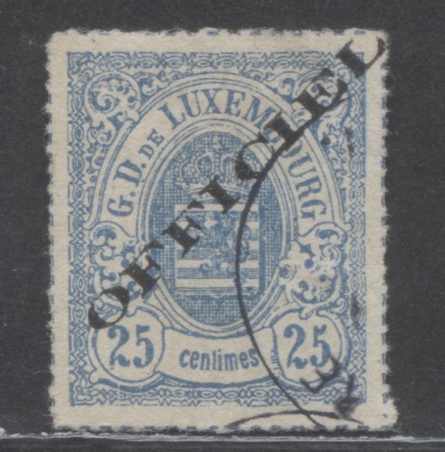
My starting point was to look for a reference point that was very unlikely to exist forged. The least expensive example I could find is Scott #O22, the Haarlem printing of the 25 centimes blue. It catalogues $2.25 mint and $2.75 used against much higher values for the unoverprinted stamp. However I didn't have one of those. So my next step was to look at my stamps and see if there was one where the catalogue value for the overprint was not higher than for the unoverprinted stamp. It turns out that O1, the very first stamp, the 1c red brown is one such stamp, cataloguing just $27.50 for mint, compared to $35 for the basic stamp. Therefore, we can be reasonably confident that this one is most likely genuine:

Having this example on hand, the next step is to study all aspects of this overprint. Measure the length and height of the overprint, look at the serifs on the letters, the thickness of the letters and the way the letters are formed. Finally, look at the ink itself, is it black or grey black? Is it matte or shiny? These clues are all important, as it is most likely that any forgery will be different in one of these aspects, as it is very difficult to produce a forgery that is indistinguishable from the genuine stamps.
In studying this overprint I have determined the following:
- The length of the overprint is 25 mm and 2 mm high.
- The "C" of the overprint is very distinct and is almost closed at the end.
- The serif on the "L" slopes up at a 45 degree angle.
- The E in this example has a break, but not all genuine overprints have this break, while others show breaks in different letters.
- The I's have complete serifs at the top and bottom.
- The inside top bars of the F's are curved on the inside.
We should find if we look at a counterfeit overprint that it will differ in some important way from the above.
So, let's look at some counterfeit overprints:

Here is the first very likely counterfeit overprint. It is #O3, the 10 centimes grey lilac, with a catalogue value of $2,400 if genuine. This is a very good forgery because the length and height of the overprint match the genuine example. Also, the "C" is nearly closed. But if you look, closely:
- The C is not quite as tall as the I, when it is the same height in the genuine.
- The slope on the serif of the "L" is not 45 degrees, but more like 20 degrees, so that the serif does not point as sharply upward as it should.
- The serifs on the first "I" of the overprint are incomplete.
Based on these differences, I concluded that this was a good forgery of this overprint.
Now' let's look at a second example:

This is another example that is close in appearance to the genuine, but the letters are just slightly too thin, despite the length and height being correct. The easiest letter to see this on is the sides of the "O", which are noticeably narrower. The letters are all out of alignment, but in addition to this they are not the same height either. Look at the "O" next to the first "F", and you can see it is clearly shorter. If you compare it to the genuine stamp you can see that on the genuine overprint, both letters should be the same height.
Now let's look at a third example:

Here we have a genuine inverted overprint on the left. This catalogues $55 mint compared to $125 for the unoverprinted stamp, so again, it is very unlikely to be a forgery. However, the used one on the right with normal overprint IS a forgery. In used condition the overprinted stamp catalogues $57.50 compared to just $8 for the unoverprinted stamp, so thee is clearly incentive, albeit a small one to forge the overprint.
This one is really easy to spot if you pay attention to how thin the letters are compared to the genuine overprint. This is particularly noticeable on the downstrokes of the "F"'s and the "I"'s. However once you see it clearly, then it is noticeable on all of them.
Before we move on to the type 2 overprint, let's look at one more genuine example:

This 25 centime blue catalogues just $11 used with no overprint, and $140 with, so there is some danger of forgery. This example measures the required 25 x 2 mm and you can see it has the required serifs on the letters. The "C" is nearly closed, as in the other example, and the letters are all the same height. The "E" is a little more closed on this example as compared to the first one, bit it is very similar to the E on the 20 centimes brown, so I think it is the same overprint. This example does have two expertising marks on the back, and while I do not know who they are, the fact that they are there seems to support the notion that this is a genuine #O6.
The Type 2 Overprint
This was considerably more difficult to deal with because the only inexpensive stamp with this overprint is the 2 centimes black with inverted overprint, which catalogues almost the same as the unoverprinted stamp. However, I do not have one. So, the best I can do is study the picture of the overprint in Scott, carefully compare the dimensions, as shown in the illustrations and compare the overprints I have to the illustration in Scott. While this isn't an ideal way to do this, in the absence of a known genuine example, it is the best we can do.
Based on my careful study of the illustrations in Scott:
- Type 1 and type 2, despite looking different, are the same overall length and height, so 25 mm x 2 mm.
- While there are serif's on the letters, the serifs on the I's are very small compared to the downstrokes.
- The opening of the "O" is very long and slender.
- The top and bottom of the "C" do not quite align. The bottom serif of the "C" projects slightly further outward than the top serif.
With these observations, let's look at one example in this week's sale that I concluded was genuine:

This example has a 25 x 2 mm overprint. The opening of the "O" is long and slender, the serifs of the "I"'s are barely visible in relation to the downstrokes and the bottom serif of the C does project slightly more forward than the top one. Also, the overall appearance matches what is illustrated in Scott.
As it turns out, all of the examples that I offered this week are genuine, so I do not have a forgery I can post here, but I will add one when I come across one.
So there you have it: a quick and dirty way to expertize these overprints. Of course, it would be best if they had certificates. However, at $50-$75 for a certificate these days it is not really worth it for most of these stamps, save for a few that catalogue $300 or more. This is a good approach to take to at least obtain some comfort that your stamps are genuine.