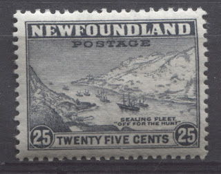
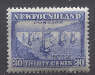
Today, I am veering off the beaten Canada path to post about Newfoundland stamps, having realized that it has been a long time since I wrote anything about Newfoundland. The issue that I will write about is the definitive issue that first appeared during King George V's reign in 1932, and was in use all the way until 1949 when Newfoundland joined confederation and became part of Canada
Only a few countries in the Commonwealth have the distinction of having issued stamps whose designs remained almost entirely unchanged from the reign of King George V to King George VI. Bermuda issued a few stamps like this, as did Ireland and New Zealand. However, Newfoundland is one of the few stand-out colonies that did this as well. Except for a few low values, whose designs were changed to portraits of the royal family members, the set remained largely unchanged through the 17 year period.
Because issue quantities of Newfoundland stamps were lower in general compared to Canadian issues of the same period, there is less scope for specialization in this issue compared to Canadian definitive sets. However, there is still plenty here to keep a specialist busy as we shall soon see.
Overview
Two printing firms were involved in the production of these stamps:
1. Perkins Bacon, the firm that produced the Penny Black, printed the stamps from 1932 until the aerial bombings of London in 1940 destroyed their printing works.
2. Waterlow and Sons Ltd., a firm that held a large number of the Commonwealth stamp printing contracts during this period, took over production of this set from 1941 onwards.
Apart from the perforation, which went from either a basic comb perforation of 13.5 or a line perforation of 14, to a line perforation of 12.5, the stamps can also be distinguished from one another by their sizes (Perkins Bacon designs are 20.4 mm wide or tall on their shortest side, while Waterlow printings measure 21.0 mm) and finally their paper and gum. All stamps of this issue were printed on paper with the Newfoundland coat of arms watermark. On the vertical designs, the normal position of this watermark is sideways, with the top of the shield pointing to the left, and the antlers of the caribou pointing upwards. A picture of this watermark is shown below:


These are just the perforation variations that are documented to exist. There may be others out there, and careful study is needed to determine whether or not there is any real significance to some of the differences like 13.4 x 13.6 or 13.5 x 13.7 for example, or whether this is just the result of inexactitude in the perforating process. However, I suspect that they are significant, and likely can be attributed to specific printings.


Only a few countries in the Commonwealth have the distinction of having issued stamps whose designs remained almost entirely unchanged from the reign of King George V to King George VI. Bermuda issued a few stamps like this, as did Ireland and New Zealand. However, Newfoundland is one of the few stand-out colonies that did this as well. Except for a few low values, whose designs were changed to portraits of the royal family members, the set remained largely unchanged through the 17 year period.
Because issue quantities of Newfoundland stamps were lower in general compared to Canadian issues of the same period, there is less scope for specialization in this issue compared to Canadian definitive sets. However, there is still plenty here to keep a specialist busy as we shall soon see.
Overview
Two printing firms were involved in the production of these stamps:
1. Perkins Bacon, the firm that produced the Penny Black, printed the stamps from 1932 until the aerial bombings of London in 1940 destroyed their printing works.
2. Waterlow and Sons Ltd., a firm that held a large number of the Commonwealth stamp printing contracts during this period, took over production of this set from 1941 onwards.
Apart from the perforation, which went from either a basic comb perforation of 13.5 or a line perforation of 14, to a line perforation of 12.5, the stamps can also be distinguished from one another by their sizes (Perkins Bacon designs are 20.4 mm wide or tall on their shortest side, while Waterlow printings measure 21.0 mm) and finally their paper and gum. All stamps of this issue were printed on paper with the Newfoundland coat of arms watermark. On the vertical designs, the normal position of this watermark is sideways, with the top of the shield pointing to the left, and the antlers of the caribou pointing upwards. A picture of this watermark is shown below:
As with other issues bearing this watermark, it is possible to find pairs or other multiples in which some stamps are watermarked, while others are not. This is because the size of the watermark was such that not every stamp in the sheet bears it.
My understanding is that these stamps were printed using plates of 400 subjects that were split into 4 sheets of 100 stamps. I have yet to see a complete sheet of any value to confirm this, but will update this post once I have. The same goes for the printing and issue quantities. Unitrade does not specify these, and I have tried to research them briefly, but was not able to locate this information as yet. However, suffice it to say at this point, that the while the quantity of stamps printed was high for Newfoundland, due to the long period of use, the overall quantities are very low compared to Canadian material from this period.
The Stamp Designs and Issue Dates
The Original Designs
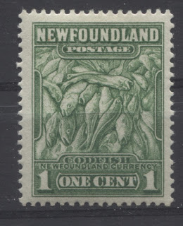
1c dark yellow green - codfish.
Issued January 2, 1932.
Replaced August 15, 1932.
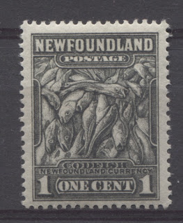
1c deep grey-black - codfish.
Issued August 15, 1932.
In use until April 1, 1949.
Waterlow printing issued September 1942.
2c carmine rose - King George V.
Issued: January 2, 1932.
Replaced: August 15, 1932.
2c green - King George V.
Issued: August 15, 1932.
Replaced: May 12, 1938.
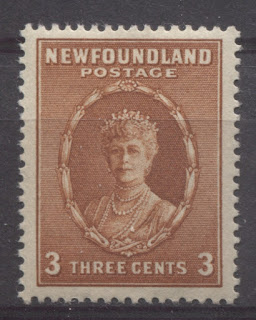
3c orange brown - Queen Mary.
Issued: January 2, 1932.
Replaced: May 12, 1938.
4c blackish lilac - Prince of Wales (Edward VIII).
Issued: January 2, 1932.
Replaced: July 21, 1934.
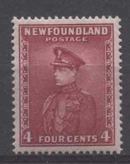
4c carmine-red - Prince of Wales.
Issued: July 21, 1934.
Replaced: May 12, 1938.
5c Deep rose lilac - caribou.
Issued: August 15, 1932.
In use until April 1, 1949.
Waterlow printing issued November 1941.
5c maroon - caribou.
Issued: January 2, 1932.
Replaced: August 15, 1932.
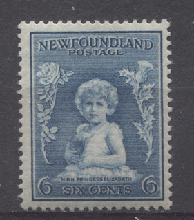
6c Prussian blue - Princess Elizabeth.
Issued: January 2, 1932.
Replaced by the 7c value.
7c red brown - Duchess of York (the Queen Mother).
Issued: August 15, 1932.
Replaced: May 12, 1938.
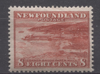
8c brownish scarlet - Corner Brook Paper Mill.
Issued: August 15, 1932.
In use until April 1, 1949.
Waterlow printing issued September 1942.
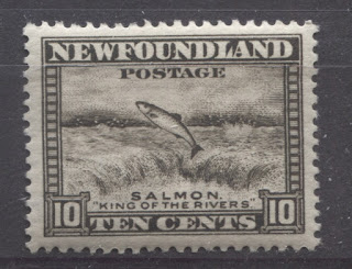
10c agate - salmon leaping falls.
Issued: January 2, 1932.
In use until April 1, 1949.
Waterlow printing issued April 1943.
14c black - Newfoundland dog.
Issued: January 2, 1932.
In use until April 1, 1949.
Waterlow printing issued January 1944.
15c claret - Northern Seal.
Issued: January 2, 1932.
In use until April 1, 1949.
Waterlow printing issued July 1943.
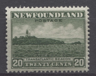
20c deep green - Cape Race.
Issued: January 2, 1932.
In use until April 1, 1949.
Waterlow printing issued January 1944.
24c deep turquoise blue - loading iron ore at Bell Island.
Issued: August 15, 1932.
In use until April 1, 1949.
Waterlow printing issued April 1943.
25c slate - sealing fleet.
Issued: January 2, 1932.
In use until April 1, 1949.
Waterlow printing issued April 1943.
30c ultramarine - "Leaving for the banks".
Issued: January 2, 1932.
Replaced by the 48c value.
48c lake brown - "Leaving for the Banks"
Issued: January 1, 1938.
In use until April 1, 1949.
Waterlow printing issued January 1943.
The Revised Designs
2c green - King George VI.
Issued: May 12, 1938.
In use until April 1, 1949.
Waterlow printing issued November 1941.
3c carmine rose - Queen Elizabeth (Queen Mother)
Issued: May 12, 1938.
In use until April 1, 1949.
Waterlow printing issued October 1941.
4c blue - Princess Elizabeth
Issued: May 12, 1938.
In use until April 1, 1949.
Waterlow printing issued October 1941.
7c deep ultramarine - Queen Mother Mary.
Issued: May 12, 1938.
In use until April 1, 1949.
Waterlow printing issued March 1943.
Points of Interest
I have already discussed the variations in the watermarks that can be collected. However, there are several other aspects that a collector wishing to specialize in this issue can build a collection on:
- Paper and gum varieties
- Shade varieties
- Perforation varieties
- Booklet panes and complete booklets
- Die type differences on the 2c and 5c
- Plate blocks and lathework pieces
- Plate flaws.
- Imperforate pairs and partially imperforate varieties.
- Proof material.
- Covers, postal history and cancellations.
- First day covers
- Offsets
I will now discuss these in more detail. I will cover the first six aspects in today's post, and then the remainder next week.
Paper and Gum Varieties
The paper used on the Perkins Bacon printings is generally a medium to thick cream wove that shows no obvious direction in the paper weave (mesh). However, the presence of the gum on mint stamps usually causes the stamps to curl such that the direction of the paper weave can readily be seen. Generally speaking, the horizontal designs will curl from top to bottom, indicating that the stamps are printed on horizontal wove paper. In contrast, the vertical designs will curl from side to side, indicating that they are on vertical wove paper.
I haven't seen any significant varieties in the paper used for the Perkins Bacon printings, though I am sure that with careful study, some differences, either in the direction of the weave, the thickness of the colour (white versus cream) will come to light.
On the Waterlow printings, the paper is thinner, softer, and usually shows either no clear mesh when the stamps are viewed against strong backlighting, or they will show a cross-hatched mesh, in which the mesh appears to run both horizontally and vertically. However, in most cases, the stamps will curl in exactly the same way as the Perkins Bacon printings when gum is present on the mint stamps.
The gum, on the other hand is an attribute in which I have seen quite significant variation. On the Perkins Bacon printings, the gum is usually a thicker, cream to deep cream gum. It can either have a crackly appearance, or it can be smooth. In addition to this, the gum can have a semi-gloss sheen, or it can appear somewhat matte, having a satin sheen. Finally, a whiter gum with a satin sheen is often seen on several values as well - usually those whose life extended past the early 1930's.
The gum on the Waterlow printings is completely different. It is generally almost completely colourless, or white, and has a very matte appearance. It often has small wrinkles or gum creases as well.
Some study will be needed to establish whether these differences in gum are correlated with specific printings, or whether they are differences that have resulted from climactic conditions or the way in which different stamps have been stored.
Shade Varieties
Many of the stamps of this issue exist with some very stark shade varieties and colour changes. For example, the first printings of the 5c caribou are a definite maroon colour, containing a definite hint of brown, compared to the lilacs and purples of the later printings that contained no brown to the colour at all. The 24c initially was printed in a definite turquoise blue shade, but later the colour was changed to an indigo which completely lacked any of the brightness or green tone to the ink of the first printings.
I have only handled a very limited number of these stamps, so that the list of shades that I have encountered on this issue, is by no means exhaustive. However, here is what I have come across so far:
- 1c yellowish green
- 1c deep yellowish green
- 1c deep grey black
- 1c grey black
- 1c pale grey black
- 2c carmine rose
- 2c deep green (both the original and revised design)
- 2c deep yellowish green
- 3c chestnut
- 3c orange-brown
- 3c deep carmine rose (revised design)
- 3c carmine-red (revised design)
- 4c blackish lilac
- 4c bright carmine
- 4c light bright carmine
- 4c light blue (revised design)
- 4c light bright blue (revised design)
- 5c maroon, die 1
- 5c deep rose lilac, die 2
- 5c deep purple, die 2
- 5c blackish lilac, die 2
- 5c deep reddish purple, die 2
- 5c blackish purple, die 2
- 5c reddish lilac, die 2
- 6c bright Prussian blue
- 6c Prussian blue
- 7c bright red brown
- 7c indigo (revised design)
- 8c brownish scarlet
- 10c agate
- 10c olive black
- 14c jet black
- 14c intense black
- 14c charcoal
- 15c deep claret
- 15c brown purple
- 15c deep brown purple
- 20c deep green
- 20c deep yellowish green
- 20c deep dull green
- 24c deep turquoise blue
- 25c indigo
- 25c slate
- 30c ultramarine
- 30c deep ultramarine
- 30c dull ultramarine
- 30c royal blue
- 48c lake brown
- 48c red brown
My colour descriptions are based on the Stanley Gibbons stamp colour key.
Perforation Varieties
The above two scans show a line perforation versus a comb perforation. Understanding the difference between the two and the ability to recognize each of these on single stamps is key to studying the stamps of this issue.
The stamp on the left is line perforated 13.3. If you look at the corners you will see that they are not uniform because the horizontal and vertical perforations do not intersect at one perfect point. Rather, they intersect randomly, often punching through one another. In contrast, the horizontal and vertical perforations of a comb perforated stamp, such as the one on the right, intersect at a perfect point, resulting in corners that are completely uniform. If you place any two comb perforated stamps on top of one another, their perforations, provided they are of the same gauge, will line up perfectly with one another on all four sides. This will not be the case with line perforated stamps, even though two stamps may come very close to lining up perfectly. Comb perforated stamps will line up perfectly with one another, every single time.
The Perkins Bacon printings are listed as being either:
- Comb 13.5, which is actually either 13.4 x 13.6, 13.6 x 13.4, 13.5 x 13.6, 13.6 x 13.5, 13.5 x 13.7, or 13.7 x 13.5, depending on whether or not the design was horizontal or vertical.
- Line 13.2, which could actually vary between 13 and 13.4.
- Line 14, which could actually vary between 13.8 and 14.2. The size of the holes also varies on several values, with either normal sized holes, or small holes.
The Waterlow printings are generally described as being either:
- Comb perf 13.5 on the first printing of the 5c only, or
- Line perf. 12.5. This from what I can see is never exactly 12.5. My Instanta gauge shows either 12.4 x 12.6 or 12.6 x 12.4, depending on whether the stamp is a horizontal or vertical design.
These are just the perforation variations that are documented to exist. There may be others out there, and careful study is needed to determine whether or not there is any real significance to some of the differences like 13.4 x 13.6 or 13.5 x 13.7 for example, or whether this is just the result of inexactitude in the perforating process. However, I suspect that they are significant, and likely can be attributed to specific printings.
Booklet Panes and Complete Booklets

The 1c, and first designs of the 2c and 3c values were issued in booklet panes of 4. These booklets contained up to three panes of some values and were sold as follows:
- 40c booklet containing 3 panes of 4 of the 2c carmine rose, and 1 pane of 4 of each of the 1c yellowish green and 3c orange brown.
- 40c booklet containing 3 panes of 4 of the 2c green die 1, and 1 pane of each of the 1c grey black and 3c orange brown. These panes are perf. 14.
- 40c booklet containing 3 panes of 4 of the 2c green die 1 or die 2, and 1 pane of each of the 1c grey black and 3c orange brown. These panes are perf. 13.5
Once the selvage of these panes is removed, it is not always possible to distinguish them from blocks of four of the line perforated stamps. The 1c yellowish green can be identified positively because the booklet stamp is always line perforated 13, whereas the line perforated sheet stamps are always 13.2 or 13.3. Similarly, the 2c carmine-rose can be identified because the booklets are either perf. 13.2 or 13.6, whereas the sheet stamps are either 13 or 13.3.The line perforated 13.2 3c orange brown stamps can be positively attributed to booklets as well, as the sheet stamps were generally either line perf. 13 or line perf. 14.
The booklet panes are all very scarce, but somewhat moderately priced in Unitrade as loose panes. Complete booklets, on the other hand, are very rare and worth several hundreds of dollars each. The above scan shows an exploded booklet, which allows the inside cover text to be shown clearly.
Die Type Differences
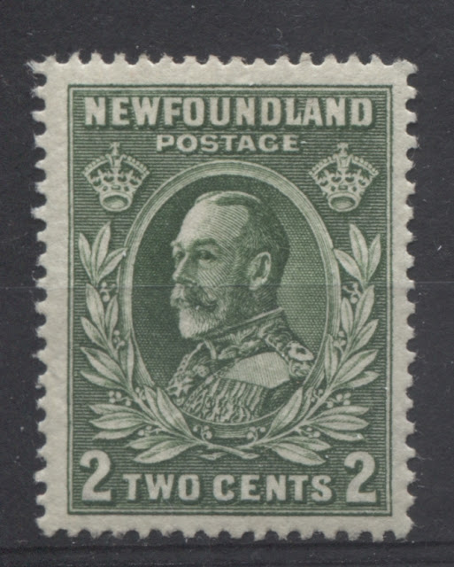
2c King George V
This is perhaps one of the most minor die type differences in all of Canadian philately. It is so difficult to spot that I am sure it is often overlooked. The difference lies inside the "O" of "Two" at about 2 O'clock. If you look there in the above scan, you can just make out a small green dot inside the "O". This is die 1 and you will see this dot any all of the 2c carmine rose stamps.
On die 2, there is no coloured dot inside the "O".
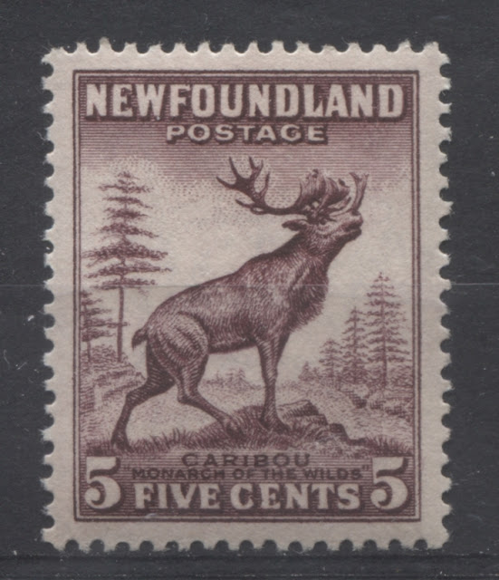
5c Caribou
This stamp is die 1. There are three characteristics to look at in identifying die 1 stamps:
- The tail appears as an almost solid mass of colour. Individual hairs are almost visible, but are not at all distinct. This one I find, is the easiest of the three characteristics to identify correctly.
- The tuft of grass that is above the left "5" ends more or less where the vertical stroke of the "5" ends, and does not extend to the left of the "5". I find this one can be bit trickier to identify properly than you might expect.
- The antlers below the "S" and the "T" of "Postage both touch the horizontal shading line immediately above them. Unitrade says that they are the same height, but that is not quite true, as they both start at different points. What they really mean is that the both terminate at a point that is the same distance from the top or bottom of the design. Although this is the most commonly cited of the three identifying characteristics, it is, in my opinion, the easiest one to mis-identify, as the difference between the antlers on dies 1 and 2 is not obvious unless you know exactly what to look for.
The above stamp is a typical die 2. In contrast:
- The tail shows very distinct and long hairs projecting downwards from it, and is much more clearly defined compared to the die 1 tail.
- The tuft of grass that is above the left "5" goes well past the 5 to the left and almost touches the left vertical frameline.
- The antlers below the "S" and the "T" of "Postage DO NOT both touch the horizontal shading line immediately above them. Only the antler below the "T" touches this line. The other antler below the "S" almost touches it, but falls short. As you can see, the height difference is not significant at all, and would be very easily misidentified by a beginner who didn't know that you need to look at whether the antlers are touching the shading line above them in deciding if they are equal in height or not. What is actually a bit more useful than the height of the antlers is their shape. On Die 1, both antlers are straight, so that the space between them appears to be an angular U-shape. One die 2, they appear slightly warped, which is apparent when you look at the U-shape between them and you notice that it appears somewhat distorted.
The Perkins Bacon printings were either die 1 or die 2, but it appears that the Waterlow printings are only found in die 1. It would be quite exciting to discover a die 2 Waterlow printing, or even a die 3, being a completely new type, having its own characteristics.
Plate Blocks and Lathework Pieces
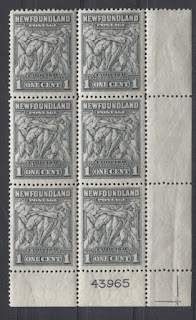
Plate blocks are not commonly seen at all, but they can be collected for both the Perkins Bacon and Waterlow printings. The Perkins Bacon printings had single digit plate numbers, whereas the Waterlow pritings all had 5-digit plate numbers. The above scan shows a lower right block of the 1c grey-black Waterlow printing from plate 43965 with the sheet cutting guidelines being visible in the selvage.
The plate numbers and positions that can be found are:
Perkins Bacon Printings
- 1c yellowish green: plates 1-2 UL.
- 1c grey-black: plates 1-2 UL, 3 UL, 4&5 UR and 6 UL.
- 2c carmine-rose: plates 1-3 UL.
- 2c green: plates 1-4 UL.
- 3c orange-brown: plates 1-3 UL.
- 4c blackish lilac: plate 1 UL.
- 4c carmine red: plates 2-3 UL.
- 5c lilac: plates 1-4 UL and 5-7 UR.
- 6c through 48c: plate 1 - not sure which position, but either UR or UL.
Revised Designs
- 2c green: plate 2 UR.
- 3c carmine rose: plate 2 UR.
- 4c light blue: plate 2 UL.
- 7c indigo: plate 1 - either UR or UL.
Waterlow Printings
All of these exist in 4 positions and many in top centre (TC) and centre left (CL) positions as well.
- 1c grey black: plates 41711 (CL), 42430 (4 positions & TC) & 43965 (4 positions).
- 2c deep green: plates 43078 (4 positions & TC), & 43968 (4 positions).
- 3c carmine red: plates 41418 (CL), 43066 (4 positions & TC) & 43967 (4 positions).
- 4c light blue: plates 41420 (CL) & blank (4 corners).
- 5c lilac: plate 43966 (4 positions).
- 8c brownish red: plate 41601 (4 positions).
- 10c agate: plate 41867 (CL), 43702 (4 positions & CL) & 43838 (4 positions & CL).
- 14c black: plate 41789 (4 positions & centre).
- 15c claret: plate 41794 (4 positions & CL).
- 20c deep green: plate 41796 (4 positions & CL).
- 24c indigo: plate 41795 (4 positions & CL)
- 25c slate: plate 41791 (4 positions & CL)
- 48c red-brown: plate 41793 (4 positions & CL)
This is a fairly large number of blocks, especially if shade and paper varieties are added.
In addition to the plate blocks, there are a number of stamps in the set that can be found with elaborate lathework patterns in the margins, like the block shown above. The values known with this lathework are the 1c, and the 5c.
This concludes my introduction to this very interesting set. Next week I will look at the remaining aspects starting with the known plate flaws and re-entries.
