
This issue was intended to replace the high value War Issue stamps in 1946. Thus a complete set of definitives technically consists of either these stamps, plus the printings of the 1c through 5c War Issue stamps from 1946 through 1949; or these stamps, plus the Postes-Postage low values from 1949-1952, depending on what year you are talking about.
The designer of the series was, once again, Herman Herbert Schwartz. The stamps were engraved by four different engravers as follows:
This was the second issue to feature airmail special delivery stamps. However, their use was not continued after this issue. I gather that this was likely because they proved to be none too popular with the public. Given the very large proportion of stamps surviving in mint condition, I believe that to be a correct assessment.
This is the first issue which exits perforated OHMS, as well as overprinted with both the O.H.M.S overprint, and the "G" overprint that replaced it. The 50c with O.H.M.S overprint is a valuable stamp, and this overprint has been widely faked. Many of the other values used with the various overprints have been faked also, so great care must be taken when purchasing these.
Starting with this issue things become a lot less complicated, in every way:

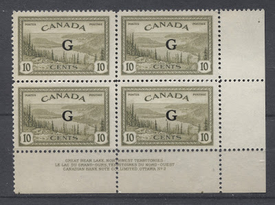
The G overprint was introduced in 1950 to replace the O.H.M.S overprint as part of the ongoing efforts to make stamp inscriptions bilingual. Like the O.H.M.S. overprint, the G overprint is found on the 10c, 14c, 20c, $1 and 7c airmail. But unlike the O.H.M.S. overprint, there is no G overprint on the 50c, as that stamp had already been replaced by the 50c oil wells stamp when this overprint was introduced. The genuine overprint, like the OHMS overprint uses similar ink, and often leaves an impression in the gum. The font is very distinct, and is known to collectors as the Casson font. Its distinguishing characteristic is that the top and bottom of the G are narrower than the sides, and there is a full horizontal cross stroke, as well as a barbed serif at the top of the G where it is open. The other characteristics are that the height and width are both 4 mm.
Both overprints have been extensively forged, especially on used stamps which are abundant and inexpensive. The early, contemporary forgeries that one often encounters were by a fellow named Andre Frodel. They are usually made in a dull black ink and the letters are either the wrong proportions, of they lack the features described here. In recent years, fakers have been forging these overprints on the less expensive values using mint sheets or plate blocks. They have done this with laser printing. The easiest way to detect these again is that the sizes will be off and the ink will appear different.
Forged Versus Genuine OHMS Overprints
The scan below illustrates just how good some of the forged overprints can be. One of the stamps has the genuine overprint, while one has the forged overprint. Can you tell which is which?
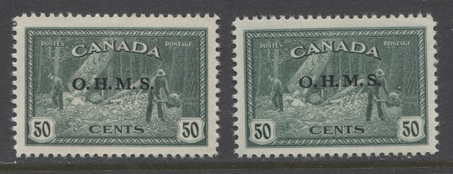 The genuine overprint is on the left, while the forgery is on the right. They are very similar in appearance, but the "O" is what gives the forgery away. It is far too thin at the top and the bottom. If you look at the periods you notice that they are not quite the same size. If you actually measure the forgery, it is only 14.5 mm wide instead of the required 15 mm, and the letters are 2 mm high instead of 2.25 mm as on the genuine overprint. I was actually fooled by this stamp as I bought it on E-bay in 2011 from a seller, thinking it was genuine. In fact, I had it listed in my store at one time until Stampboards called it out as a forgery and convinced me to take it down. However, I argued with them initially, as this overprint is so close to the genuine. But in the end, after I measured it, I realized that they were indeed correct.
The designer of the series was, once again, Herman Herbert Schwartz. The stamps were engraved by four different engravers as follows:
- The 8c was engraved by Warrell Hauck.
- The 7c, 10c, 10c secial delivery, 17c, 20c and $1 were engraved by Silas Robert Allen.
- The 14c was engraved by Arthur C Vogel.
- The 50c was engraved by Joseph Keller.
The stamps were printed by the Canadian Bank Note Company in sheets of 200, which were then guillotined into four post office panes of 50 stamps each.
This was the second issue to feature airmail special delivery stamps. However, their use was not continued after this issue. I gather that this was likely because they proved to be none too popular with the public. Given the very large proportion of stamps surviving in mint condition, I believe that to be a correct assessment.
This is the first issue which exits perforated OHMS, as well as overprinted with both the O.H.M.S overprint, and the "G" overprint that replaced it. The 50c with O.H.M.S overprint is a valuable stamp, and this overprint has been widely faked. Many of the other values used with the various overprints have been faked also, so great care must be taken when purchasing these.
Starting with this issue things become a lot less complicated, in every way:
- The number of different papers drops quite significantly to just 2 or three different varieties.
- The number of gum varieties also drops to just 2 or three different as well.
- Generally no more than 2 plates were used to print most stamps.
However, there are still enough points of interest to make this issue a very viable specialty on its own, or in combination with the low value stamps as discussed above.
The Stamp Designs, Issue Dates and Quantities Issued
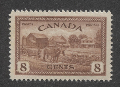


8c red brown - farm scene.
Issued: September 16, 1946
Not replaced.
15,100,000 stamps.

10c olive green - Great Bear Lake, Northwest Territories.
Issued: September 16, 1946.
Replaced by 10c Furs on October 2, 1950.
118,250,000 stamps.

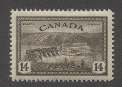
14c black brown - hydroelectric station in Quebec.
Issued: September 16, 1946.
Replaced by the 15c CAPEX stamp on September 24, 1951.
21,900,000 stamps.

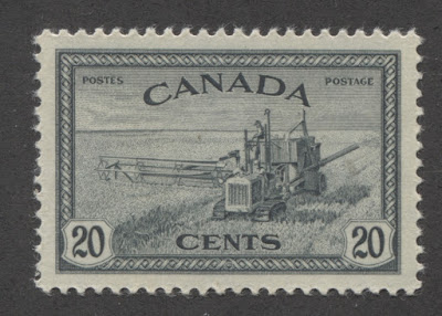
20c greenish slate - combine harvester.
Issued: September 16, 1946.
Replaced by 20c forestry products on April 2, 1952.
84,350,000 stamps.

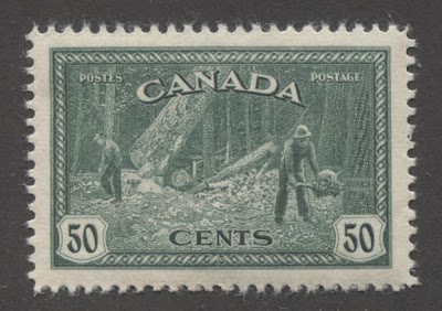
50c dark blue green - logging in British Columbia.
Issued: September 16, 1946.
Replaced by 50c oil wells stamp March 1, 1950.
13,970,000 stamps.

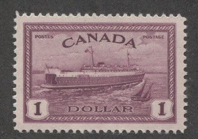
$1 deep claret - train ferry, Prince Edward Island.
Issued: September 16, 1946.
Replaced by the $1 fisheries on February 1, 1951.
15,375,000 stamps.
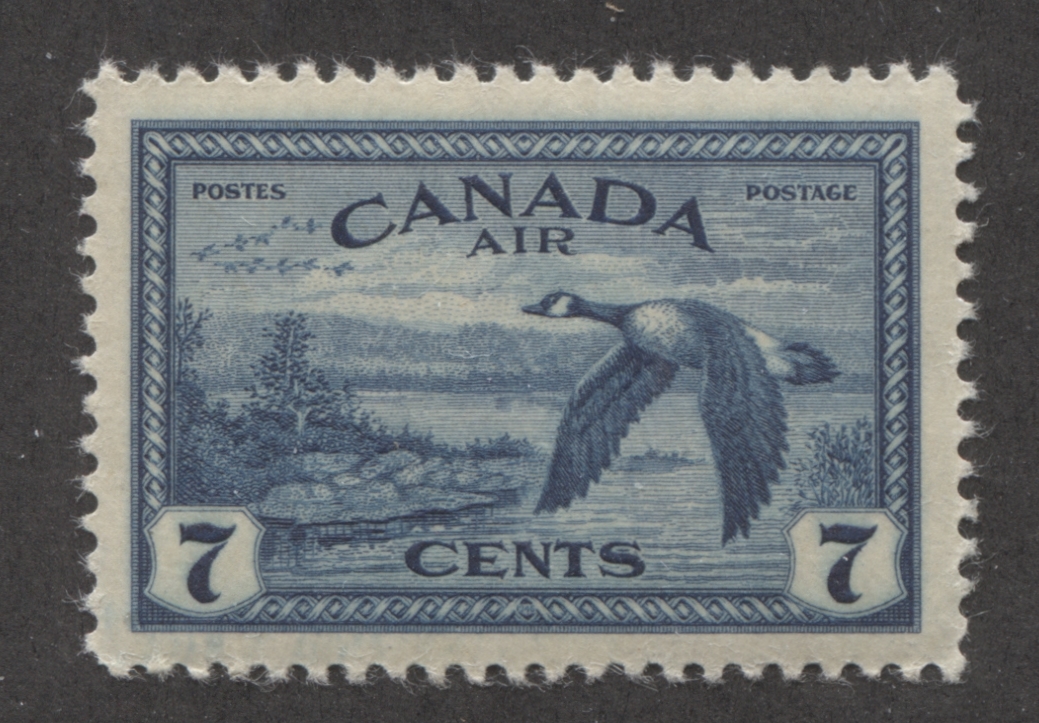
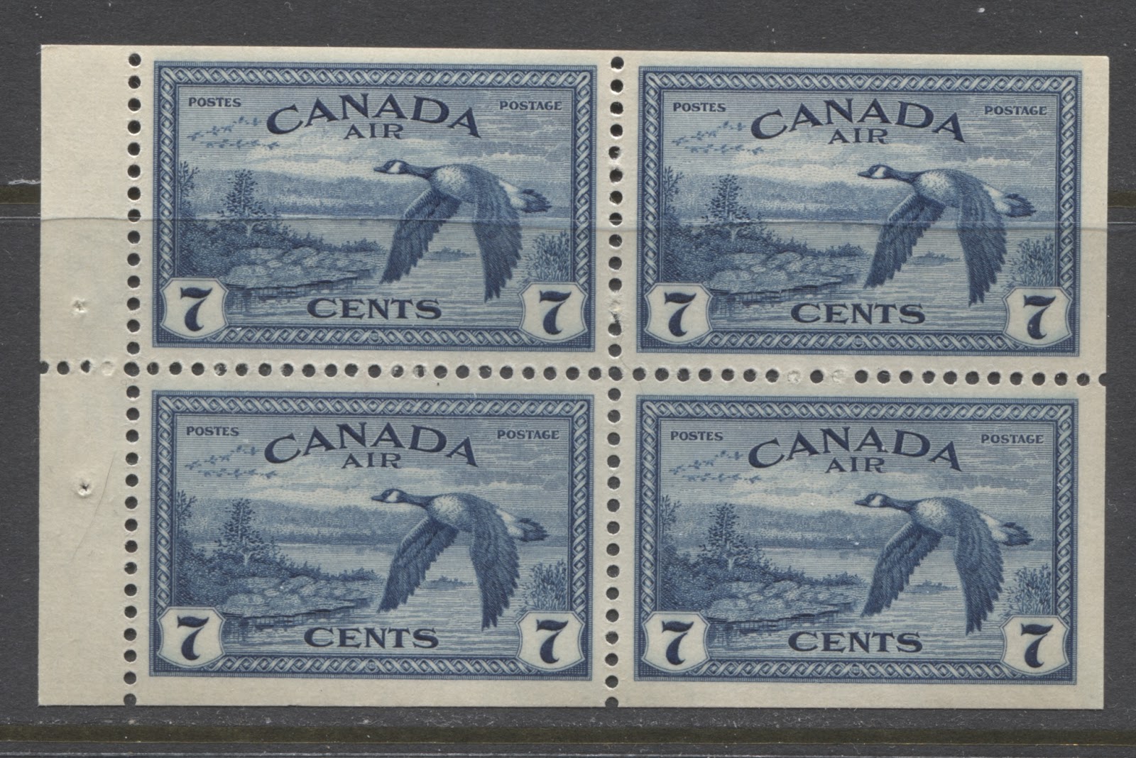
7c Prussian blue - Canada Goose.
Issued: September 16, 1946.
Replaced by 7c Canada Goose stamp issued on November 3, 1952.
72,350,000 stamps.

17c bright ultramarine D.C. 4-M Airplane over Quebec City.
Issued: September 16, 1946.
Not replaced.
1,200,000 stamps in 2 different dies.

10c deep dull green - coat of arms.
Issued: September 16, 1946.
Not replaced.
4,500,000 stamps.
Points of Interest
Despite being more limited in scope, there are still several ways that a collector can build a collection out of this issue:
- Shade varieties
- Paper and gum varieties
- Die type differences
- Plate blocks
- Booklets and booklet panes
- Re-entries
- OHMS Perfins, overprints and G overprints
- Proof material
- First day covers and postal history.
Shade Varieties
The 10c special delivery, 14c and 50c values of this series have very little in the way of shade varieties, except for some very slight variations in the intensity of the colours. However, there are some excellent shades of the $1 and at several shades of the other values.
8c Red Brown
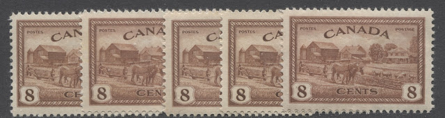
8c Red Brown

The above scan shows some of the shades commonly seen on this value. The two basic shades are a lake brown, and red-brown. The basic shades vary slightly in intensity as well. Looking at the above scan, the left stamp, third stamp from the left, and fourth stamp from the left are all shades of red-brown. The left stamp is reddish brown, the third stamp from the left is red-brown, and the fourth stamp from the left is deep reddish brown. The second stamp from the left, and the right stamp are both lake-brown, which contains a good deal more red than it does brown. Reddish brown contains more brown than red, while red-brown is a more perfect balance of the two colours.
10c Olive Green

This colour is an olive green that varies in terms of the amount of brown that is contained in the colour. If you look at the third and fourth stamps from the left, you will be able to see the difference. The third stamp from the left is the standard olive green, whereas the stamp immediately to its right contains quite a bit more brown, being closer to a brown olive.
14c Black Brown

This colour is fairly uniform, though there is some variation in the amount of black that is contained in the shade. The stamp on the right in the above scan contains just a touch more black than the one on the left.
20c Greenish Slate
The 20c is a greenish black, that varies according to whether there is more black or more slate in the colour. I have seen a pure greenish black, which seems to be from the later printings, as this value was not replaced until the 20c Newsprint Industry stamp was released in April 1952. The above scan shows some of the typical variations found, with the stamp at the extreme left having clearly more black than the one on the extreme right, which has more slate, and is more greenish. Unitrade calls this colour slate-black. But I do not think that is an accurate name, as it ignores the fact that all shades of this colour contain some green.
50c Deep Bluish Green
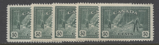 The main way in which this colour varies is both the intensity and the brightness, with the deeper versions of the colour also being slightly brighter. The middle stamp and the stamp on the right are both examples of the deeper and brighter shade, whereas the other three stamps are less intense, and slightly duller by comparison.
$1 Deep Claret
50c Deep Bluish Green

$1 Deep Claret

The $1, which Unitrade calls rose violet, is actually either a deep claret, or a brown purple that varies according to how much rose, versus how much brown is in the shade, as well as how intense it is. Like the 3c claret from the previous issue, this is a delightful colour that exhibits more variation than any other. Looking at the above scan from left to right we have: deep claret, very deep claret, brown purple, deep brown purple, brownish claret, deep brownish claret, and pale maroon. The differences can be quite slight, but as you can see from looking at the middle stamps, it can also be quite stark.
7c Prussian Blue

Unitrade simply refers to this as blue, which is not accurate, as there are a large number of shades, most of which contain either a hint of green, or a hint of grey. The above scan shows some of the many shades that can be found. On the very left, is a deep Prussian blue, that contains a definite hint of green. Then there is a deep bright blue, which you can see on the second stamp from the left, and the second stamp from the right. Finally, the steel blue, which is a deep dull blue containing a hint of grey can be seen in the middle stamp, and the stamp on the right.
17c Bright Ultramarine

This shade also exhibits quite a bit of variation, from a very bright ultramarine, as seen on the right stamp, to a deep dull ultramarine, as seen on the left stamp.
7c Prussian Blue
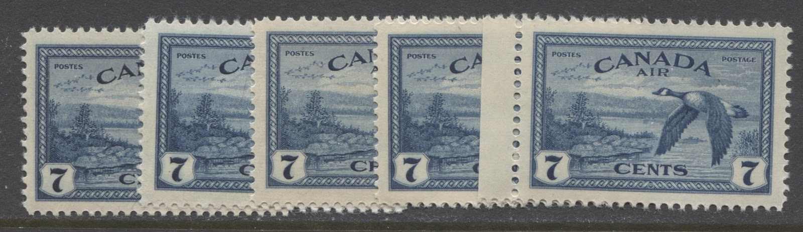
Unitrade simply refers to this as blue, which is not accurate, as there are a large number of shades, most of which contain either a hint of green, or a hint of grey. The above scan shows some of the many shades that can be found. On the very left, is a deep Prussian blue, that contains a definite hint of green. Then there is a deep bright blue, which you can see on the second stamp from the left, and the second stamp from the right. Finally, the steel blue, which is a deep dull blue containing a hint of grey can be seen in the middle stamp, and the stamp on the right.
17c Bright Ultramarine

This shade also exhibits quite a bit of variation, from a very bright ultramarine, as seen on the right stamp, to a deep dull ultramarine, as seen on the left stamp.
Paper and Gum Varieties

The paper and gum varieties are less obvious on this issue than on previous issues. However, there are still some distinct paper and gum types, which definitely warrant inclusion in any specialized collection of this issue. I have encountered at least the following:
Die Type Differences
On the 17c airmail special delivery stamp two different die types can be found:
These two types are shows on the scans below:


Initially when the stamp was released on September 16, 1946, the accent that was above the second "E" of "Express" was a circumflex, as shown in the first scan above. It was quickly brought to the attention of the authorities that this was not the correct accent to use on this word, and that a grave accent should have been used instead. The die was corrected to show a grave accent, and the stamp was re-issued on December 3, 1946 with the correct accent, as shown in the second scan. Because this was a correction of an error, there were very few first day covers produced, so that first day covers are very scarce and valuable. Also, the number of stamps issued in the corrected die is exactly three times as many in the incorrect die. Surprisingly, the Unitrade values of both stamps are very similar, for both used and mint. In reality, most stamps you will come across, will be mint. Finding nice used examples cancelled in-period, before 1949 can be quite challenging. Finally, the two scans above also show quite nicely the difference in shades between the bright ultramarine of the first printings, and the deep dull ultramarine of the later printing.


The paper and gum varieties are less obvious on this issue than on previous issues. However, there are still some distinct paper and gum types, which definitely warrant inclusion in any specialized collection of this issue. I have encountered at least the following:
- Streaky brownish cream gum, with a semi-gloss sheen, on thick vertical cream wove paper, showing no mesh, and no ribbing on either the front, or the back. This is shown on the left stamp in the first scan above.
- Smooth cream gum with a satin sheen, on thinner, crisp, vertical wove paper, showing no mesh, and no ribbing on either the front or the back. This is shown on the middle stamp of the first scan above.
- Smooth brownish cream gum with a semi-gloss sheen, on thick vertical cream wove paper, showing no mesh and no ribbing, on either the front, or the back.
- Smooth cream gum with a semi-gloss sheen on thick vertical cream wove, which shows no mesh, but does show very distinct horizontal ribbing on the gummed side. This is shown on the right stamp in the second scan above.
- Smooth cream gum with a semi-gloss sheen on thick vertical cream wove, which shows no mesh, but does show very light horizontal ribbing on the gummed side. This is shown on the left stamp in the second scan above. It is very similar to the above paper, differing only in the strength of the ribbing.
- Smooth white gum with a semi-gloss sheen on thick vertical cream wove, which shows no mesh, but does show very light horizontal ribbing on the gummed side. This is shown on the centre stamp in the second scan above. It is very similar to the above paper, except that it is white instead of cream coloured.
- Smooth cream gum with a semi-gloss sheen, on thinner, crisp, vertical wove paper, showing no mesh, and no ribbing on either the front or the back. This is shown on the third scan above.
- Streaky cream gum with a satin sheen on thick vertical wove paper showing no mesh, but showing distinct horizontal ribbing on the gum side. This is shown on the fourth scan above.
- A mottled. smooth yellowish cream gum that looks almost like it was sponged on to the paper. It has a satin sheen and is usually found on crisp vertical wove paper that shows no mesh or ribbing. I have only seen this gum on the 17c airmail special delivery stamp (usually the revised die) and the 10c special delivery stamp. It is shown in the fifth scan above.
- A smooth deep cream gum with a semi-gloss sheen on thick vertical wove paper that shows no mesh, but clear horizontal ribbing on the face. The 7c airmail with the G overprint that is shown below is an example of this paper. If you look in the selvage on this scan, you can just make out the horizontal ribbing.
These are the main varieties that I have seen, but there may be more. In addition, there is a very rare translucent ribbed paper that has been reported on the 14c and the 7c airmail stamp. The design shows clearly through the back on this scarce paper type.
I have not conducted a study to determine which shades are found with which paper and gum types, but I would expect that there may be several different shade-paper-gum types for each value. It could be a lot of fun to see how may different types there are.
Die Type Differences
On the 17c airmail special delivery stamp two different die types can be found:
- The incorrect circumflex accent above the second "E" of "Expres".
- The corrected grave accent above the second "E" of "Expres".
These two types are shows on the scans below:

Initially when the stamp was released on September 16, 1946, the accent that was above the second "E" of "Express" was a circumflex, as shown in the first scan above. It was quickly brought to the attention of the authorities that this was not the correct accent to use on this word, and that a grave accent should have been used instead. The die was corrected to show a grave accent, and the stamp was re-issued on December 3, 1946 with the correct accent, as shown in the second scan. Because this was a correction of an error, there were very few first day covers produced, so that first day covers are very scarce and valuable. Also, the number of stamps issued in the corrected die is exactly three times as many in the incorrect die. Surprisingly, the Unitrade values of both stamps are very similar, for both used and mint. In reality, most stamps you will come across, will be mint. Finding nice used examples cancelled in-period, before 1949 can be quite challenging. Finally, the two scans above also show quite nicely the difference in shades between the bright ultramarine of the first printings, and the deep dull ultramarine of the later printing.
Plate Blocks


Very few plates were used to print these stamps, with most values being printed from 2 plates, and some from just one plate. However, there are still a decent number of plate blocks required to form a complete collection, once you factor in the OHMS overprints, perfins, and G overprints:
- 8c red-brown - 2 plates, 8 blocks.
- 10c olive green - 2 plates, 8 blocks.
- 14c black brown - 1 plate, 4 blocks.
- 20c greenish slate - 2 plates, 8 blocks.
- 50c deep bluish green - 1 plate, 4 blocks.
- $1 deep claret - 1 plate, 4 blocks.
- 7c Prussian blue -2 plates, 8 blocks.
- 17c bright ultramarine - 1 plate, 4 blocks.
- 17c deep dull ultramarine - 1 plate, 4 blocks.
- 10c deep dull green - 1 plate, 4 blocks.
- 8c 4-hole OHMS perfin - 2 plates, 2 types, 16 blocks.
- 10c 4-hole OHMS perfin - 2 plates, 2 types, 16 blocks.
- 14c 4-hole OHMS perfin - 1 plate, 2 types, 8 blocks.
- 20c 4-hole OHMS perfin - 2 plates, 2 types, 16 blocks.
- 50c 4-hole OHMS perfin - 1 plate, 2 types, 8 blocks.
- $1 4-hole OHMS perfin - 1 plate, 2 types, 8 blocks.
- 7c airmail 4-hole OHMS perfin - 2 plates, 2 types, 16 blocks.
- 17c airmail special delivery 4-hole OHMS perfin - 1 plate, 2 dies, 2 types, 16 blocks
- 10c special delivery 4-hole OHMS perfin - 1 plate, 2 types, 8 blocks
- 10c OHMS overprint - 2 plates, 2 no period varieties, 10 blocks.
- 14c OHMS overprint - 1 plate, 1 no period variety, 5 blocks.
- 20c OHMS overprint - 2 plates, 2 no period varieties, 10 blocks.
- 50c OHMS overprint - 1 plate, 4 blocks.
- $1 OHMS overprint - 1 plate, 1 no period variety, 5 blocks.
- 7c airmail OHMS overprint - 2 plates, 2 no period varieties, 1 re-entry, 11 blocks.
- 10c special delivery OHMS overprint - 1 plate, 4 blocks.
- 10c G overprint - 2 plates, 8 blocks.
- 14c G overprint - 1 plate, 4 blocks.
- 20c G overprint - 2 plates, 8 blocks.
- 50c G overprint - 1 plate, 4 blocks.
- $1 G overprint - 1 plate, 4 blocks.
- 7c airmail - G overprint - 2 plates, 8 blocks.
- 10c special delivery G overprint - 1 plate, 4 blocks.
So without taking into account variations in paper, shade and gum, there are 257 different plate blocks required to form a complete collection of this issue. If you display 4 blocks on a page, then it will take almost 65 pages to display them all.
Order Numbers

Like the other issues printed by the Canadian Bank Note Company, the lower left plate blocks contain the plate number, and a printing order umber in the left selvage tab reading upwards. I have not seen enough plate blocks to be able to list all known order numbers, but here is what I have seen so far:
- 10c olive green plate 2 - 892-B.
- 14c black brown plate 1- 892-C
- 17c ultramarine plate 1 - 892-H
It appears from the three blocks that I have seen, that the order number for all the stamps of this issue is 892 with a letter to indicate the value. Based on the above, I would expect:
- The 8c to be 892-A
- The 20c to be 892-D
- The 50c to be 892-E
- The $1 to be 892-F
- The 7c airmail to be 892-G
- The 10c special delivery to be 892-I
I would appreciate it if those of you with lower left plate blocks of these values could confirm if this is the case.
Position Dots

On most issues printed by the Canadian Bank Note Company, the lower left and lower right blocks can be found with one or more coloured dots in the selvage. It is not known why these dots were placed in the selvage, but different configurations have been found. A study would be needed to determine whether or not more than one dot configuration exists for both lower left and lower right positions. If you look at the scan of the lower left block above, you can see two dots in the lower selvage tab, on either side of the inscription, and no dots on the left selvage tab. On the lower right block shown above though, there are three dots visible: two on the lower selvage tab, and one on the right tab at the top.

This scan of an upper right margin single of the 7c airmail stamp suggests that position dots are also found on some upper right blocks as well, since one dot is visible in the upper margin.
Booklets and Booklet Panes

The only stamp from this series to be issued in booklet form was the 7c Canada Goose Airmail, which appeared along with the 1c, 2c, 3c and 4c War Issue stamps in a special Christmas gift booklet that was released in 1947. The 7c airmail stamp was printed in panes of 4 stamps for inclusion in this booklet. There may be some variation in the shades, paper and gum.
The only stamp from this series to be issued in booklet form was the 7c Canada Goose Airmail, which appeared along with the 1c, 2c, 3c and 4c War Issue stamps in a special Christmas gift booklet that was released in 1947. The 7c airmail stamp was printed in panes of 4 stamps for inclusion in this booklet. There may be some variation in the shades, paper and gum.
Re-Entries
There is only one documented re-entry in this issue, though I feel that more must exist, given the very large quantity of stamps that were printed between 1946 and 1951, and the relatively low number of plates. The one documented re-entry occurs on the 7c airmail, and consists of doubling of the right outer frameline. It occurs on 5 positions of the upper right pane of plate 2: positions 14, 19, 24, 29 and 34. All of these appear slightly different, and on positions 14 and 19, the left frameline shows some doubling as well.
Curiously, Ralph Trimble, the renowned re-entry expert, does not illustrate this re-entry on his website. I am not sure why this is, given how well known it is among collectors.
OHMS Perfins, OHMS Overprints and G Overprints
OHMS Perfins
OHMS Overprint
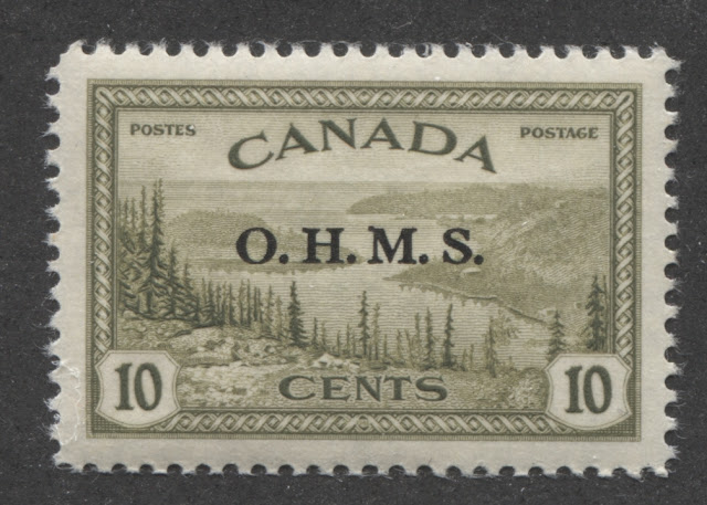 The above scan shows the black OHMS overprint that was introduced on these stamps late in 1949 to replace the perfins. It was used on the 10c, 10c special delivery, 14c, 20c, 50c, $1 and the 7c airmail stamp. The genuine overprint has the following characteristics:
G Overprint

There is only one documented re-entry in this issue, though I feel that more must exist, given the very large quantity of stamps that were printed between 1946 and 1951, and the relatively low number of plates. The one documented re-entry occurs on the 7c airmail, and consists of doubling of the right outer frameline. It occurs on 5 positions of the upper right pane of plate 2: positions 14, 19, 24, 29 and 34. All of these appear slightly different, and on positions 14 and 19, the left frameline shows some doubling as well.
Curiously, Ralph Trimble, the renowned re-entry expert, does not illustrate this re-entry on his website. I am not sure why this is, given how well known it is among collectors.
OHMS Perfins, OHMS Overprints and G Overprints
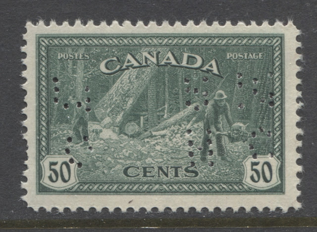
OHMS Perfins

The only perfin type in use at this point was the 4-hole type shown above. However, there were three sub-types of the 4-hole type, the second of which came into use in 1942:
- The first type, which was used until 1946, has a narrow "O", which can be difficult to identify if you are not familiar with these. However, this type can be positively identified by looking at the seventh hole from the top of the "S" and noting where it is in relation to the first and sixth holes. The first and sixth holes are aligned vertically. However, the seventh pin is not quite vertically aligned with these two pins, being just slightly off to the right of them.
- The second type, which was in use between 1942 and 1949 occurs on seven of the 10 dies used during this period. It is characterized by a wider "O", but also by the fact that the seventh hole of the "S" does line up vertically with the first and sixth holes.
- The third type is really a subset of the second type above, and was used for three of the 10 dies used from 1942-1949. It is the same as the first type, except that the "O" is wide, like the second type.
- Upright, reading from left to right.
- Upright reading from right to left.
- Inverted, reading from left to right,
- Inverted, reading from right to left (illustrated above)
- Sideways, with the OH on the right reading upwards.
- Sideways, with the OH on the right reading downwards.
- Sideways, with the OH on the left reading upwards.
- Sideways, with the OH on the left reading downwards.
OHMS Overprint
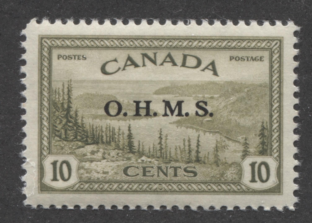
- The ink used for the overprint is a jet black that has a very slight sheen when the overprint is viewed at an angle to the light.
- It often, but not always leaves a slight impression in the gum of mint examples.
- The top and bottom of the "O" is narrower than the sides and the left vertical upstroke of the "M" is narrower than the right vertical upstroke.
- The overprint is 15 mm long, from the left side of the "O" to the right of the last period.
- The letters of the overprint are 2 1/4 mm high.
All values of this set, except the 10c special delivery, that exist with this overprint can be found with no period after the last "S". They occur on position 47 of both plates 1 and 2, for most sheets. The variety is very rarely seen on the $1.
G Overprint

The G overprint was introduced in 1950 to replace the O.H.M.S overprint as part of the ongoing efforts to make stamp inscriptions bilingual. Like the O.H.M.S. overprint, the G overprint is found on the 10c, 14c, 20c, $1 and 7c airmail. But unlike the O.H.M.S. overprint, there is no G overprint on the 50c, as that stamp had already been replaced by the 50c oil wells stamp when this overprint was introduced. The genuine overprint, like the OHMS overprint uses similar ink, and often leaves an impression in the gum. The font is very distinct, and is known to collectors as the Casson font. Its distinguishing characteristic is that the top and bottom of the G are narrower than the sides, and there is a full horizontal cross stroke, as well as a barbed serif at the top of the G where it is open. The other characteristics are that the height and width are both 4 mm.
Both overprints have been extensively forged, especially on used stamps which are abundant and inexpensive. The early, contemporary forgeries that one often encounters were by a fellow named Andre Frodel. They are usually made in a dull black ink and the letters are either the wrong proportions, of they lack the features described here. In recent years, fakers have been forging these overprints on the less expensive values using mint sheets or plate blocks. They have done this with laser printing. The easiest way to detect these again is that the sizes will be off and the ink will appear different.
Forged Versus Genuine OHMS Overprints
The scan below illustrates just how good some of the forged overprints can be. One of the stamps has the genuine overprint, while one has the forged overprint. Can you tell which is which?

Proof Material


The BNA proofs website lists just 18 items from this issue, many of which are progressive proofs. Most are very expensive compared to other material for this time period, costing upwards of $1,500-$2,000 each.
The material that exists can be summarized as follows:
You can view the material in more detail by accessing the following links:
http://www.bnaproofs.com/can-peace.html
The material that exists can be summarized as follows:
- 8 large hardened die proofs in issued colours.
- 1 stamp sized die proof in issued colours (17c airmail special delivery).
- 1 large die proof on India paper in issued colour (7c airmail).
- 1 progressive proof of the frame used on all values in green.
- 4 progressive proofs of designs without value tablets in various colours.
- 3 trial colour proofs in various colours
You can view the material in more detail by accessing the following links:
http://www.bnaproofs.com/can-peace.html
First Day Covers and Postal History

The last aspect I would like to touch on for this issue, is the postal history. These are all higher value stamps, so the vast majority of the covers that you will find them used on will be:

The last aspect I would like to touch on for this issue, is the postal history. These are all higher value stamps, so the vast majority of the covers that you will find them used on will be:
- Foreign registered covers.
- Foreign airmail covers.
- Local registered and overweight registered covers.
- Bulk mailing receipts
What would be really interesting is to find local lettermail covers that are vastly overweight, for which the required postage would have needed one of more of these stamps. However, any cover to other than the more common local, US or Western European countries will be scarce, and very much worth seeking out and collecting.
First day covers comprise another very worthwhile area, as there were a large number of private cachet makers during this period, and so there are many, many possible cachets that can be collected from this period. One of these are shown in the scan above. Most of these are not rare, and can be collected for a very reasonable price. One notable exception to this is the corrected die of the 17c airmail special delivery, which is very rare, and lists for $400 in Unitrade.
Finally, due to their size, these stamps are ideal for collecting CDS cancels from smaller post offices. With thousands of post offices in each province, the possibilities for forming a cancel collection are almost endless.
This concludes my discussion of this attractive issue. Hopefully, you can see that even if you were to collect just this issue, and not combine it with the lower values of the War Issue, or the low values of the Postes Postage issue, there is still enough material here to keep you occupied for a few decades, especially if you try to collect all the proof material.
Next week's post will look at the 1949-52 Postes Postage Issue.
1 comment
I can confirm the 8c farm scene printing order (n)umber in the left selvage tab reading upwards to be 892-A. Thanks for this really comprehensive write-up. I have a specialty side-collection of the postal history of this stamp. It did not pay any obvious rates and single frankings are elusive. The perforated OHMS version is said to have not yet been found on cover. I am looking for the regular issue 8c used on an AR card, and any cover with the OHMS version.