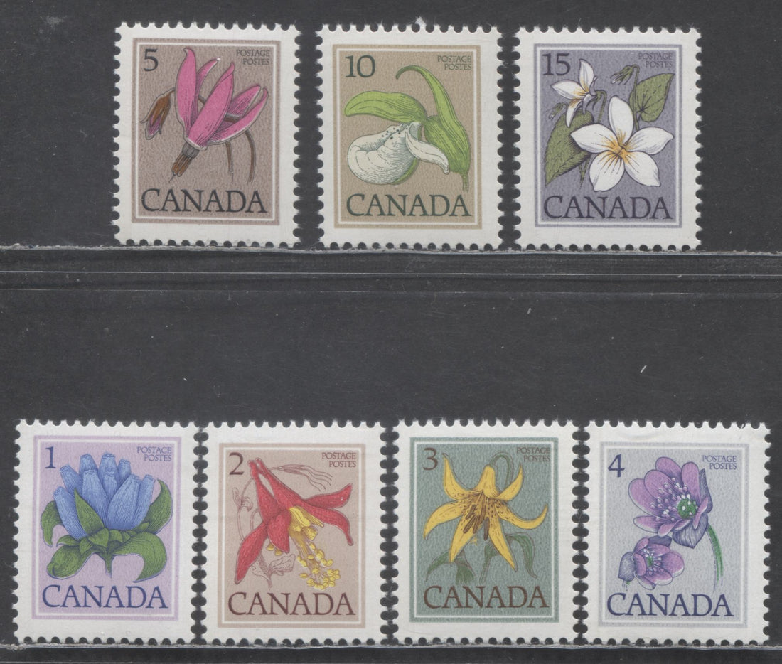
In 1977 a new definitive issue of rather attractive flower stamps appeared to replace the prime ministers stamps that had been in use since 1973. Rather disappointingly, the specialized Canadian catalogues, had, until very recently listed no varieties of these stamps at all, other than the perforation difference on the 10c, and the differences between lithography and engraving and photogravure and engraving. Then, during the past 10 years some paper varieties have been listed, including fluorescent and low fluorescent backed papers, as well as a vertically ribbed paper on the later photogravure and engraved printing of the 2c Columbine. The relative dearth of listed varieties leaves one with the distinct impression that there is little to interest the specialist in this issue.
Fortunately this is NOT the case. It turns out that there are quite a few attributes, that if studied with great care will bear fruit in this regard. The attributes are:
- The appearance of the PVA Gum.
- The paper fluorescence and colour under UV.
- Shades of colour, both in the flowers, and in the background.
- Whether the background is screened or mottled on the photogravure printings.
- The colour of the paper on the front and back.
- The appearance of the tagging.
- The texture of the paper: smooth versus vertically ribbed.
- Perforation, though this is covered in Unitrade, there are variations in the size of the holes.
- Shifts of either the engraved inscriptions, the flower colours, or both.
- Inscriptions printed twice, once albino.
- Presence of tagging flaws, such as the hook tag flaw.
- Possible double paper varieties.
I won't talk about tagging errors or double paper varieties in this post, except to say that they could potentially exist on any stamp in the set, and if they do, they would be extremely scarce to rare. I will briefly discuss each of the others.
Appearance of the PVA Gum
The PVA gum can be found in three distinctly different sheens, which will take some experience to identify, but once you become familiar with them will not present too much trouble:
- Semi-Gloss - thick and shiny, reflecting the most light when the stamp is viewed at an angle to a light source.
- Satin - medium thickness, being neither thick, nor thin and reflecting quite a bit of light, but not as much as the semi-gloss. By far the majority of stamps from this issue have this type of PVA gum.
- Eggshell - this gum is quite matte looking, and also appears thinly applied. It is a scarce type, based on my examination of many hundreds of stamps from this issue.
Paper Fluorescence
Both the lithographed and engraved and photogravure and engraved stamps will be either DF or NF on the front most of the time. Occasionally, if the fluorescence on the back is MF, it will appear LF on the front. The back fluorescence varies from NF to MF, and the colour varies from a grey, to greyish white, to bluish white. There is also a yellowish grey caused by the taggant, as well as an ivory colour. I haven't yet found HF or HB stamps, though I believe that they could exist, based on the fact that the parliament stamps are known to exist thus.Shades
Appearance of the Background on Photogravure Printings
On the photogravure printings, the vast majority of stamps have what appears to be mottled background colour. If you look closely with a loupe you can usually see traces of the screening dots under the mottled layer of ink. Occasionally though, you can find stamps that do not appear mottled, and instead appear to be entirely screened. These seem to be quite a bit scarcer than the mottled stamps.
The Colour of The Paper
The paper of the lithographed printings is usually an off-white creamy paper that is plate-glazed on the printing surface giving a glossy sheen. Ocasionally, if the plate has not been fully wiped clean prior to the glazing, some of the ink residue will tint the surface of the paper. Thus, I have found, for example, copies of the 1c where the paper has a light violet surface tint, or the 2c with a light rose tint, and so on.
The paper can also be a bright white, which looks very bright compared to the off-white paper.
On the photogravure printings the printing surface is coated in a very bright white layer of chalk, but the back can be either white or off-white. I would say white is more common at this point in the life of the issue, though both have been seen on most values.
Appearance of the Tagging
The tagging can appear different colours in normal light on the lithographed stamps, being anywhere from nearly invisible to a medium yellow, running down the sides of the stamp. The medium yellow I refer to as dark tagging. Lighter yellow is referred to as moderate tagging, and off white tagging is referred to as light tagging. The tagging on the photogravure printings that I have seen is either invisible in normal light, or it is very light. However the bands themselves are quite glossy, so the tagging can be seen quite clearly.
Paper Texture
The default for this issue is smooth paper. However, Unitrade lists a vertical ribbed paper on the photogravure printing of the 2c Western Columbine. The ribbing is usually very distinct and visible on the gummed side, but sometimes you need to view the gummed side at an oblique angle to a good light source to see it.
The existence of this paper on the 2c naturally led me to posit that the ribbed paper must, or should exist on the other values also. I'm pleased to report that I have found it on the 15c Canada Violet as well, on both precancelled and regular issue stamps.
Size of Perforation Holes
In the 1970's starting around 1973 I started to notice examples of stamps where the perforation holes are unusually large. Although difficult to see on singles, it is very obvious when viewing pairs or larger multiples. Size of holes has been a characteristic that is often covered when studying perforations on classic stamps. So, I see no reason why it should not be covered here also.
So far, I have seen variations in hole size on the lithographed and engraved printings. These are best collected as horizontal pairs, or larger blocks, so that the differences can be readily seen.
Colour Shifts
Unitrade does not list colour shifts, which may give collectors the impression that shifts are extremely common, or that there are hundreds or thousands of different ones out there. The truth is, that the vast majority of stamps were well printed, with the correct registration of colours. Consequently, I consider colour shifts to be as legitimate an aspect of study as any other.
One thing that is important in the study of shifts is to differentiate how the shift occurs: is it a shift of the engraved portion of the design? or is it the flower colour? Or a combination of the two?
Here is an example of a shift involving the flower colour:

Here, if you look at the top edge of the plant you will see that the orange spills over into the green. Normally it would be contained within the outline. The shift itself has caused white spots to appear also, as the yellow orange would normally have covered those spots, were it not for the shift.
Here is one that is caused by a shift of the engraving:

Here, the stamp colour was printed in the correct location, but the black engraving was shifted rightward. The result is that portions of the flower appear doubled.
Most of the shifts found in this issue are minor in nature, but still can be quite striking and dramatic. The first one I show on the 12c Jewelweed is minor, but the one shown above on the 5c precancel is quite major.
Doubly Printed Inscriptions, Once Albino
One some of the lithographed and engraved stamps you can find the inscriptions printed twice, where the second impression is albino. Usually, the albino impression is shifted slightly in relation to the printed impression, so that if you look carefully with a loupe, you can see the second impression of the letters of "Canada". The numerals of the demomination are not nearly as clear, and the "Postes Postage" is printed with so little pressure that the albino impression would not be visible at all.
I have so far only found this variety on the 5c and on the $1 Fundy National Park, though I would expect that it likely does exist on the other values also.
Conclusion
As you can see from the above overview, this issue, though it appears at first to be extremely simple, can be studied quite extensively, if you get into all the above aspects and study each of your stamps with a keen eye, and a good dose of patience.
2 comments
Hi Chris,
I have been interested in the florals since their inception. I would go to the downtown Winnipeg philatelic counter to buy the best centered stamps that I could find. The postal employees did not appreciate my lengthy searches. As a result however, the stamps I brought home were at least VF.
To help me appreciate the florals, I have a copy of the Environment Definitive Series 1977-1987 Second Edition Catalogue by Robin Harris.
I look forward to viewing what Brixton-Chrome will post regarding these definitive stamps.
Richard
PS I have noticed that some auction items are not finalized at their pre-determined time. I have seen extra minutes added to stamps that interested me. I hesitate to increase my bids, not knowing how many increases may be added to an item.
Don’t forget the mottled background is the other printer.
Plate blocks will show the two printers.
Mottled background is the easiest way to tell Cbn from babn.