Today, I delve into the first four commemorative issues of 1972, which comprises 7 stamps. This period sees the re-introduction of a very significant aspect of Canadian philately: the multi-year series. The multi-year series is a series of commemorative stamps that have a common theme, that is usually released over a 4 or 5 year period. The last time that Canada Post did this was in the 1950's, first with the 1951-1955 Prime Ministers Issue, and then with the 1953-1957 Wildlife Week Issue. 1972 sees the re-introduction of the multi-year commemorative series, with the 1972-1976 Indians of Canada Issues. For some reason, Unitrade and Scott group these issues together in the catalogue, while not doing this for any other multi-year series, and there have been many issued since then, right up to the present time. This has proven to be an extremely popular issuing format, with some of these sets running for in excess of 10 years.
1972 is also significant in several other respects:
- It is the year in which Winnipeg tagging is completely phased out in favour of Ottawa tagging, but not before there is a failed experiment with an unstable tagging compound, which collectors know as OP-4.
- It is the only year in which one commemorative issue, the Christmas issue, exits with both Winnipeg and Ottawa tagging.
- We see experimentation with the chalk coating on paper, with some papers having a coating that is clearly ribbed, and others having a smooth coating.
- The rate increases that had characterized the period from 1968-1971 stop, and the first postage rate stays at 8c for almost 5 years, until the end of 1976.
- On the papers we see a wide variation in the fluorescence, with almost all stamps showing different reactions on the front of the stamp, from the back of the stamp. Brownish woodpulp fibres that only show up under UV light, make their appearance on many issues from this year.
- Comb perforations replace line perforating as the main perforating method for Canadian stamps. The last issue to be line perforated is the Figure Skating issue, and the new gauge, measuring 12.0 replaces the 11.95 and 11.85 gauges that has been in use since the early 1960's.
- This is the first time that all the stamps issued have PVA gum, and for which the gum displays very little variation from one stamp to the next.
As usual, this post will examine in detail, all the physical attributes of the stamps, after I introduce the basic designs, and give some information about the issue dates, quantities, and designers.
The Designs, Issue Quantities, Designers and Printers
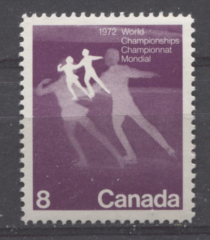
8c deep red lilac - figure skaters
Issued: March 1, 1972
Issue quantity: 25,300,000
Designed by: Design Workshop
Printed by CBN using lithography
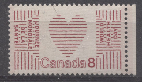
8c deep carmine-red - World Health Day
Issued: April 7, 1972
Issue quantity: 23,400,000 untagged and 5,200,000 tagged
Designed by: Joyce Wieland
Printed by the BABN by engraving
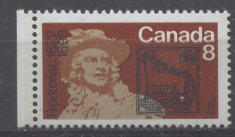
8c orange brown, beige, red-brown and dark blue - Frontenac
Issued: May 17, 1972
Issue quantity: 22,700,000 untagged and 5,400,000 tagged
Designed by: Laurent Marquart
Printed by BABN using photogravure and lithography
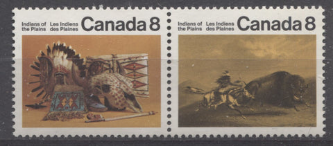
8c multicoloured - artifacts and Buffalo Chase
Issued: July 6, 1972
Issue quantity: 15,000,000 of each, including tagged and untagged
Designed by: Georges Beaupre
Printed by Ashton Potter using lithography
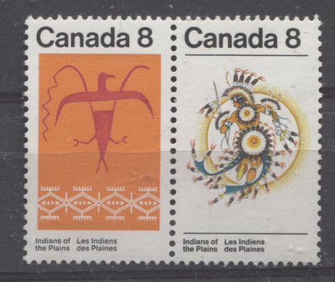
8c multicoloured - Assiniboine Thunderbird and Sun Dance
Issued: October 4, 2018
Issue quantity: 14,175,000 of each, including tagged and untagged
Designed by: Georges Beaupre
Engraved by: George Arthur Gundersen
Printed by the BABN using photogravure and engraving
Paper Characteristics Other Than Fluorescence
As was the case in prior years the stamps continue to show considerable variation in the types of paper that was used by CBN, BABN and Ashton Potter to print them. Specifically, the following types of paper are found on the stamps:
- A medium thickness, creamy white, horizontal wove paper that shows no distinct mesh pattern, even when held up to a strong back-light. The printing surface has a smooth, chalk coating that has an eggshell sheen, and shows no pores or uneven spots under magnification. This paper is found on the Figure Skating stamp and the Ashton Potter Plains Indians stamps.
- A crisp, very light creamy white, vertical wove paper that has a distinct vertical mesh pattern that is visible with good back lighting. It is uncoated on the printing surface, but the surface is burnished smooth, as can be seen under magnification. This paper is used for the majority of the World Health Day stamps. Because of this the paper usually has a pinkish tint on the printing surface, which comes from the printing ink used for the stamp, and is not inherent to the paper itself.
- A cream coloured, vertical wove paper that has very strong horizontal ribbing on the printing surface. This paper is also uncoated on the printing surface. This is the so-called plain paper that is found on some printings of the World Health Day stamp. You can see an example of the ribbing if you go back to the main picture for this stamp in the stamp designs, as I used an example on this paper for the picture.
- A medium, creamy white vertical wove paper, that has no distinct mesh pattern, even when held up to a strong back-light. The printing surface has a smooth chalk coating that has an eggshell sheen. This paper is found on the Frontenac Issue. Because the engraving on this stamp was done in dark blue ink, most examples of this stamp are on paper that appears to have a bluish tint on the surface. Upon close examination, this is seen to have been caused by improper wiping of the printing plate, rather than being inherent to the production of the paper.
- A medium, white horizontal wove paper that shows no distinct mesh pattern, even when held up to back light. The paper surface has a chalk coating that is ribbed in the vertical direction. The strength of this ribbing varies, but it can always be seen if the stamps are viewed at an angle to a light source. The ribbing will show up as vertical striations running down the face of the stamp. This paper is found on the majority of printings of the BABN Plains Indians stamps.
- A similar paper to #5 above, except that the chalk coating is smooth, with no ribbing at all. This paper is found on some printings of the BABN Plains Indians stamps. This paper is very scarce in relation to the ribbed paper (#5) above.
The scan below show examples of the bluish tinted paper on the Frontenac issue next to the non-tinted, cream paper:
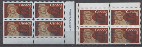
The bluish tinted paper is on the left, while the cream paper is on the right.
Paper Fluorescence
Like most of the stamps issued between 1968 and 1971, these stamps exist in a variety of different grades of fluorescence ranging from dull fluorescent to hibrite. What is normal for an issue varies of course: dull is normal for the BABN Plains Indians issue and the Frontenac Issue, while fluorescent or high fluorescent is normal for the other issues, with dull fluorescent being the scarcer type, on the World Health Day Issue.
The Figure Skating Stamp
This stamp is generally known by collectors to be printed on hibrite paper, but it is actually usually found on high fluorescent paper, through the front can be found in hibrite, medium and low fluorescent grades as well. The back of stamps is always high fluorescent with a very sparse concentration of hibrite fibres. The pictures below show these variations clearly:
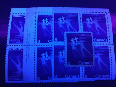
The hibrite paper appears on the left, then the high fluorescent, medium fluorescent and low fluorescent paper. For the blocks, you can see the differences most clearly in the selvage.
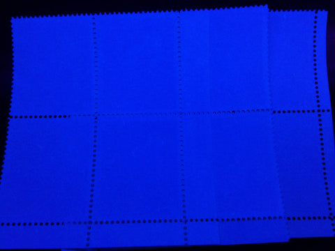
This picture shows the back of the above blocks. As you can see, the colour appears uniform across all the blocks.
The World Health Day Stamp
This stamp is listed as being either on fluorescent paper, or dull (plain) paper in Unitrade. As one might expect, there are variations within each of these two basic classifications. The dull paper is found in ivory grey, grey and greyish white variations, that contain no fluorescent fibres whatsoever. The fluorescent paper is found in subtle variations, and a true medium fluorescent paper, that is scarcer than the dull paper.
The scan below shows the three main variations of the dull paper:
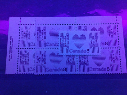
The ivory grey paper is shown on the left block, the grey is on the right block, and the stamp on top of the right block is the greyish white.
The fluorescent paper is found in two, very close varieties that differ only very slightly. The most common variety is a dull fluorescent paper that contains a medium density concentration of dull fluorescent fibres and a low density concentration of medium fluorescent fibres. The second variety appears slightly greyer, and on close examination is seen to contain sparse concentrations of slow and medium fluorescent fibres, that together make a low density concentration. A third variety is medium fluorescent bluish white, and contains a medium density concentration of low fluorescent fibres and a low density concentration of medium fluorescent fibres. The picture below shows these three types:
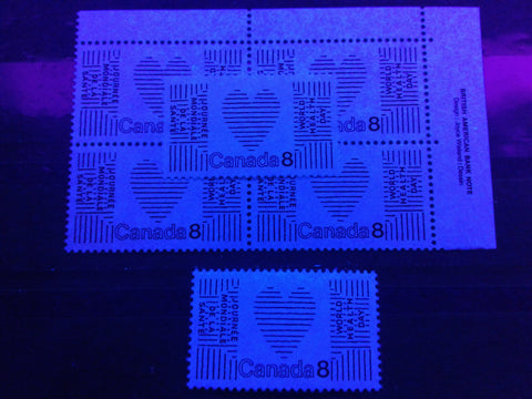
The medium fluorescent paper is shown in the single stamp at the bottom, while the common fluorescent paper is shown in the block. The stamp on top of the block is the second variety of fluorescent paper, but the difference is too subtle to be visible in this picture.
The Frontenac Stamp
Unitrade lists this stamp as existing on fluorescent paper and dull paper. The dull paper is listed as the basic stamp, while the fluorescent paper is listed as the variety. The catalogue values are the same for both, suggesting that they are equally common. In actual fact, the dull paper is much scarcer than the fluorescent paper. The fluorescent paper also comes in several different types, which appear similar on the face, but differ primarily in how they appear on the back of the stamps. The dull paper appears dull bluish grey on the front of the stamps and grey on the back. There are no obvious fluorescent fibres at first, but if you look closely with a loupe, you can see a very sparse concentration of low fluorescent fibres and a few brownish woodpulp fibres in the paper.
The pictures below show the difference in appearance between the dull paper, and the brightest fluorescent paper on which this stamp comes, as seen from both the front and back:
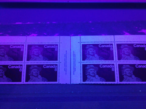
The dull paper is on the left, while the medium fluorescent paper is on the right. The medium fluorescent paper looks low fluorescent from the front, due to the deadening effect of the chalky coating. If you look closely, you can see a sparse concentration of low fluorescent fibres poking through the chalk surfacing.
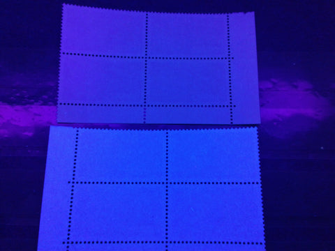
Here are the same blocks from the back. The medium fluorescent paper appears bluish white under UV and has a low density concentration of low fluorescent fibres, a sparse concentration of medium fluorescent fibres and a very sparse concentration of brownish woodpulp fibres.
In addition to the above, there are several variations of the fluorescent paper. The first of these is another medium fluorescent paper which is the same as the above, except that instead of bluish white, it appears more of an off-white under UV. The appearance on the front of the stamp is the same. The picture below shows a single on this paper, placed on top of the above block:
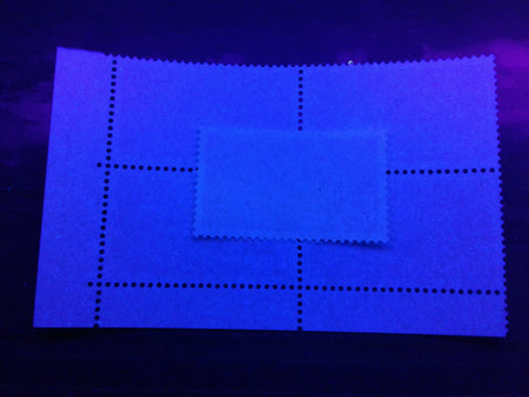
The next variant is a low fluorescent paper that appears dull fluorescent blue grey on the front, with a sparse concentration of low fluorescent fibres. On the back it appears dull fluorescent greyish, with a low density concentration of low fluorescent fibres, and a few high fluorescent fibres, and brownish woodpulp fibres. Together, these fibres make the paper appear low fluorescent overall. The pictures below show this paper next to the medium fluorescent paper on both the front and the back:
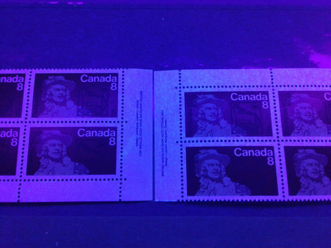
The low fluorescent paper is on the left, while the medium fluorescent paper is on the right.
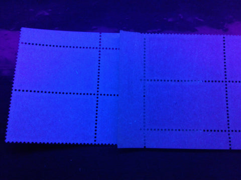
Here are the papers as seen from the back. The low fluorescent paper is on the right, while the medium fluorescent paper is on the left.
There is a second variety of low fluorescent paper that looks very similar to the above, except that it appears more off-white in colour under UV. Upon close examination, it is seen to be dull fluorescent ivory and contains a low density concentration of low fluorescent fibres, a sparse concentration of medium fluorescent fibres, and a very sparse concentration of brownish woodpulp fibres. I have not included a picture here because the difference appears too subtle to show up in a picture of this quality.
The last variety of paper is between the medium and the low fluorescent paper in terms of brightness. On the face of the stamps, it appears more or less the same as the first medium fluorescent paper shown above. On the back, it appears very similar, but it looks slightly duller. Upon close examination it is a dull fluorescent grey paper that contains a low density concentration of low fluorescent fibres, a sparse concentration of medium fluorescent fibres, and very few brownish woodpulp fibres and high fluorescent fibres. The picture below shows the difference between the appearance of this paper and the first variety of medium fluorescent paper:
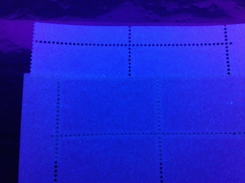
This variety of paper, which I will call fluorescent, is shown on the bottom, while the medium fluorescent paper is at the top.
The Buffalo Chase and Artifacts Stamps
These stamps are generally regarded as being printed on hibrite paper. In reality though, they exhibit a variety of fluorescence levels on both the front and back of the stamps. On the front, they are found with high fluorescent, medium fluorescent, low fluorescent and dull fluorescent reactions. The high fluorescent paper is by far the most common, and the dull fluorescent the least common. On the back, the paper is generally high fluorescent, with brownish woodpulp fibres, and medium fluorescent, with the high fluorescent being the more common type, and generally associated with all the front varieties of fluorescence, except for the dull fluorescent. Thus, the paper varieties that I have found are:
- HF/HF
- MF/HF
- LF/HF
- DF/MF
The pictures below show the differences between these types of papers:
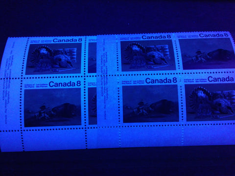
The high fluorescent paper is shown on the left, while the medium fluorescent paper is shown on the right.
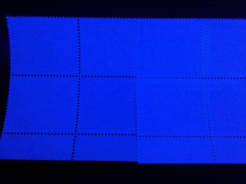
Here is the back of the above blocks, showing the high fluorescent paper. The paper contains a sparse concentration of brownish woodpulp fibres, some of which are readily visible, but most of which require a loupe to see clearly.
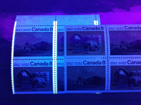
The low fluorescent paper is shown on the left, while the dull fluorescent paper is shown on the right.
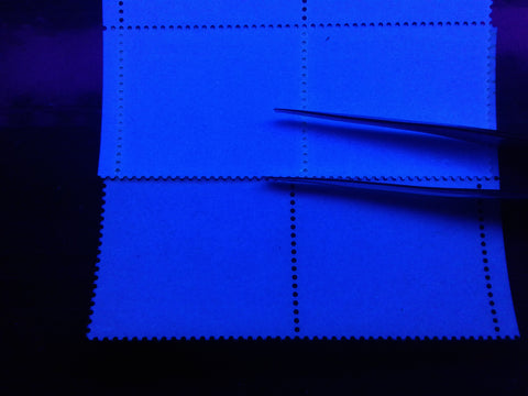
The high fluorescent paper is shown at the top, while the medium fluorescent paper is shown at the bottom. Like the high fluorescent paper, the medium fluorescent paper contains a sparse concentration of brownish woodpulp fibres as well.
The Assiniboine Thunderbird and Sun Dance Stamps
These stamps had no listed paper varieties at all until just a few years ago. Now, Unitrade lists no fewer than four variations of paper, with two being ribbed and two being being of the smooth variety. For the ribbed papers, Unitrade lists non-fluorescent and low fluorescent, while on the smooth papers Unitrade lists DF/LF and MF. These descriptions are a little confusing because all of the paper varieties give different fluorescent reactions on the front and back, and most all contain at least a few fluorescent fibres, with some also containing brownish woodpulp fibres.
The ribbed paper stamps appear generally dull fluorescent to almost non-fluorescent on the front, of all stamps, with the colour generally varying slightly from grey, to bluish grey to greyish white. On the back, the ribbed paper stamps either appear dull fluorescent, varying in colour from grey, to yellowish grey, to greyish white, or they appear low fluorescent flecked, in many different colours. However, I have not come across any stamps that can be classified as completely non-fluorescent.
The pictures below show six varieties of low fluorescent paper and three varieties of dull fluorescent paper that I have come across in my study of these stamps:
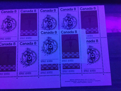
This first picture shows the appearance, from the front, of the first three varieties of the low fluorescent paper. The paper on the left is greyish under UV, the block on the right is more bluish grey, while the pair in the middle is greyish white. The grey and blue grey are how most of the stamps on ribbed paper appear under UV light.
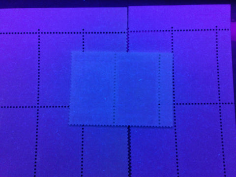
Here are the back of these stamps. As you can see the fluorescent fibres are quite visible on all of them. The block on the left appears greyish, the block on the right appears blue grey, and the pair in the middle appears greyish white. The greyish block contains sparse concentrations of low and medium fluorescent fibres, which make it appear LF overall. The bluish grey block contains a low density concentration of low fluorescent fibres and a sparse concentration of medium fluorescent fibres. This is the most common of the LF papers. The greyish white paper also contains a low density concentration of low fluorescent fibres, and a sparse concentration of medium fluorescent fibres.
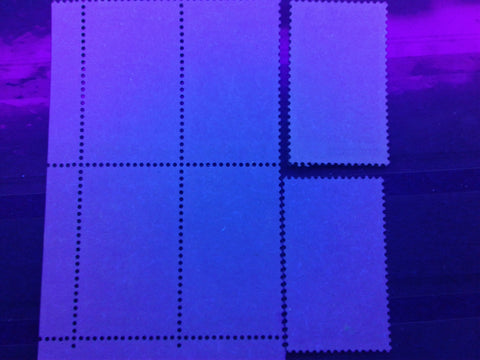
The above picture shows three more varieties of the low fluorescent paper. They appear almost identical in the picture, because they all appear greyish under UV. They differ in terms of the amount, and brightness of the fluorescent fibres contained in the paper. The block contains a sparse concentration of low fluorescent fibres and a very sparse concentration of medium fluorescent fibres. The single at the top right contains a sparse concentration of low fluorescent fibres and very few medium fluorescent fibres. The single at the bottom right contains sparse concentrations of low fluorescent fibres and medium fluorescent fibres, as well as very few high fluorescent ones.
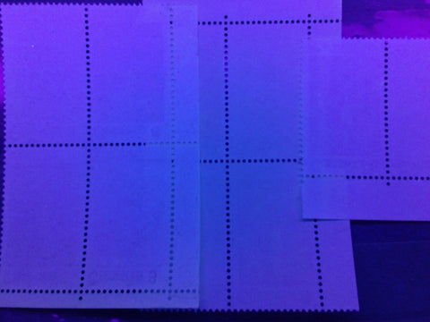
Here we have three very similar varieties of the dull fluorescent paper. What is striking about them is that they appear, at first to have no fluorescent fibres at all. The block on the left appears greyish and on close examination is seen to contain a sparse concentration of dull fluorescent fibres, a sparse concentration of brownish woodpulp fibres and very few low and medium fluorescent fibres. The block in the centre is yellowish grey, and contains no fluorescent fibres at all. The pair appears a slightly bluer grey, but also does not contain any fluorescent fibres.
In the case of the smooth papers, Unitrade lists MF or DF/MF. In practice, the MF paper only appears so on the back. On the front, it is more of a DF with LF fibres poking through the chalky coating. The pictures below show these two varieties of paper as seen from both the front and the back:
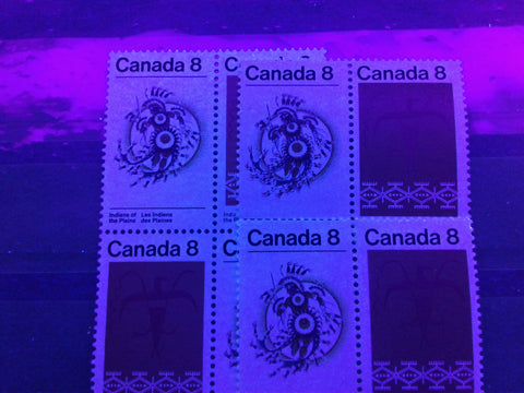
The so called medium fluorescent paper is the block on the left, while the DF/LF pairs are on the right. As you can see, the medium fluorescent paper appears just slightly brighter on the front than the dull fluorescent paper.
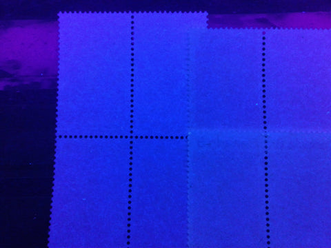
Here are the backs. As you can see the medium fluorescent paper appears a brighter bluish white compared to the pairs, which appear greyish and greyish white. The medium fluorescent paper actually contains a low density concentration of low fluorescent fibres, a sparse concentration of medium fluorescent fibres, and a very sparse concentration of high fluorescent fibres, and brownish woodpulp fibres. The pair at the top contains a low density concentration of low fluorescent fibres, a sparse concentration of medium fluorescent fibres and a very sparse concentration of brownish woodpulp fibres. Finally, the pair at the bottom right contains a low density concentration of low fluorescent fibres, and sparse concentrations of medium fluorescent fibres and brownish woodpulp fibres.
Shade Varieties
I have not come across any significant shade varieties on any of these stamps. I have noticed a very minor variation on the carmine red colour found on the World Health Day issue, in which the stamps on the ribbed, dull fluorescent paper are printed in a slightly deeper shade of carmine-red than the stamps on the fluorescent paper. I don't illustrate it here because the difference is so subtle, that it will never show up clearly, even in a high resolution scan. Other than this, I have not seen any other variations in shade. This is the first period in modern Canadian philately where the stamps exhibit almost no variation in colour.
Gum Varieties
All of the stamps in this post were printed with PVA gum. The gum generally shows very little variation at first glance. However, upon close examination, there are some subtle differences:
- The gum found on the Figure Skating stamp and the Plains Indians stamps is a light cream colour, is completely smooth, and has a satin sheen.
- The gum found on the World Health Day stamp is colourless, smooth, and has a satin sheen.
- The gum found on the Frontenac stamp is cream coloured, smooth and has a semi-gloss sheen.
Perforations
As mentioned in the introduction, all of the stamps except for the Figure Skating stamp are comb perforated. The Figure Skating stamp appears to be perforated exactly 12.0, in addition to the earlier gauges of 11.85 and 11.95 that are found on most all of the CBN stamps that were printed during the 1960's. So far, I have found stamps perforated 11.95 x 12, 11.95, 11.85 x 12, 11.85 x 11.95 and 12. That is 5 perforations. I would suspect that 11.95 x 11.85, 12 x 11.95, 12 x 11.85, and 11.85 probably exist also, which would bring the total number of perforations to 9. The perforations on this stamp extend right through the selvage on both sides of all the sheets and blocks that I examined.
All of the BABN stamps are comb perforated 12.0 x 12.5, or 12.5 x 12 for the vertical format Plains Indians stamps. I have not seen any variation at all, in terms of the measurement, on any of these stamps. The Plains Indians stamps printed by Ashton Potter are perf. 12.2 x 12.6, and again, I have not seen any variation in the measurement of the perforation, though I have seen differences in the size of the perforation holes, with some examples exhibiting holes that are almost twice the diameter of the normal holes.
One aspect of the perforations that received little, if any mention in Unitrade is the configuration of the comb perforations, in terms of whether or not the perforations extend all the way through the sheet margins, and whether or not the sheets are perforated with a single strike of the perforating comb or with multiple strikes. Examining the selvage of the sheets gives us some clues as to how the perforating was done. For example, the World Health Day issue has perforations that extend all the way through the top and bottom selvage of the sheets, but have side margins that only contain a single extension hole in each row of horizontal perforations on each side. In addition, some blocks show clear evidence that more than one pane was printed at a time, and that more than one strike of the perforator was required to fully perforate all sheets in the print layout.
Consider the following three scans showing the arrangement of perforations on three different blocks of this issue:

Here we have a lower right field stock block that shows perfect alignment of the vertical perforations that run through the bottom selvage, and which shows even spacing of the perforation holes.

Here we have a similar block, except that there is a wide gap between the first and second vertical perforations in the selvage. This suggests either an irregular spacing of the perforating pins, which is unlikely, or two separate strikes of the perforator. This would mean that this block comes from one of the upper panes in the print layout of either 4 panes of 50, or 6 panes of 50. Because all of the side margins exist with only one extension hole, it is most likely that the print layout consisted of 4 panes of 50, since if there were 6 panes, two would have to be perforated all the way through on both sides.

Here we have a lower left block that shows a clear misalignment of the vertical perforations in the selvage, and is the strongest there is that two strikes of the comb perforator was required to perforate all panes in the print layout.
Thus, it seems that the BABN stamps were printed in 4 panes of 50, and that two strikes of the comb perforator were required to perforate all sheets. The above configuration of perforation holes appears consistent on the World Health Day, Frontenac and Plains Indians stamps. Generally the World Health Day and Frontenac issues had the single extension holes in the side margins of the sheets, whereas on the Plains Indians stamps, these extension holes were in the top and bottom margins. The stamps printed by Ashton Potter had the selvage perforated all the way through, and it appears that they were perforated in a single strike. It also appears that they were printed pane by pane.
Se-Tenant Combinations
The Plains Indians Stamps were the fourth issue of Canadian stamps to be issued se-tenant, and the first, since 1970. Unlike the earlier se-tenant stamps where, it was possible to get different combinations of stamps, like identical pairs, identical strips and centre blocks, these stamps were printed checkerwise in the panes. The result is that the only combinations possible are pairs that can be horizontal or vertical. Of course the order of the stamps can vary, but there are no identical pairs or centre blocks possible. This is the format in which most all se-tenant stamps issued ever since are printed.
Plate Flaws and Other Varieties
There is only one listed constant variety on these four issues, and it occurs on the Plains Indians stamps, printed by Ashton Potter. It is called the "short N in Plains" variety. It is exactly what it suggests: the "n" in "Plains" is slightly shorter than the other letters. This variety occurs on all stamps in the top row of the sheets. This variety is illustrated in the comparative large pictures below:
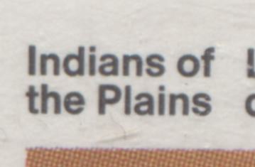
The normal "n" in "Plains". Note how the N is the same length as the other letters.
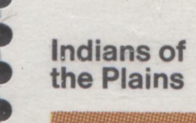
Here is the short "N". You can see it if you compare the length of the legs of the "N" to the other letters in "Plains".
I haven't really come across any other plate flaws on these issues, but I have come across some colour shifts that result in some noticeable varieties. One such variety occurs on the Sun Dance stamp, in which the orange colour that is supposed to colour the feathers has been shifted, forming what appear to be little orange flags, like shown in the scans below:
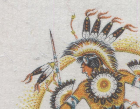
Here are the normal feathers. Notice how the orange colour has been printed on top of the black engraving to produce the feathers.
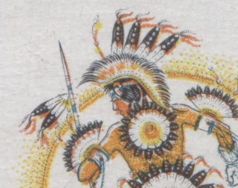
Here is the colour shift. All of the orange colour has been shifted slightly downward, and to the right, resulting in the orange being separate from the feathers, which now appear mostly black.
Unitrade does not list any of these varieties because their general policy is not to list any varieties that result from colour shifts, though they have broken this rule on a few occasions to list commonly known varieties, such as the "raised rump" variety on the 15c mountain sheep stamp from the 1972-1978 Caricature issue. However, they keep threatening to remove those listings from future editions of the catalogue. Why they have this policy remains a bit of a mystery to me, because the incidence and number of colour shifts on these issues is not very large in relation to the quantity issued. Sure, most issues printed using two different printing processes will exhibit shifts on some stamps. But it will not be the majority of stamps in the printing run. So, I personally do not see why these would be any less collectible than a shade, paper or perforation variety.
Ottawa Tagging
The World Health Day, Frontenac and Plains Indians stamps all exist with Ottawa Tagging. The tagging was applied down the vertical perforations in the sheets in bars that are 3 mm or 4 mm wide. So, most stamps have two side tagging bars that are approximately 1.5 mm or 2 mm wide, when there has been no significant perforation or tagging shifts. According to Unitrade, the World Health Day and Frontenac issues are tagged with the unstable OP-4 compound, which migrates through the stamps over time. The Plains Indians stamps are tagged with the more stable OP-2 compound. The OP-4 tagging bars were 4 mm wide, while the OP-2 tagging bars are 3 mm wide.
Under UV, the OP-4 tagging can appear either green or very light orange, depending on the printing. I find that the stamps on the duller paper tend to have green tagging, while those on fluorescent paper appear to have light orange tagging. Also, the tagging bars can fade to the point where they are almost invisible, while others can appear quite a strong colour, even after all these years. The pictures below show the two basic types of OP-4 tagging, as well as an example which has faded quite significantly:
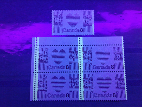
Here we have the green tagging on an upper left corner block of the World Health Day stamp on the dull paper, as well as a single stamp above. As you can see, the tagging on the single has faded almost completely, except for just under half of the right tagging bar.
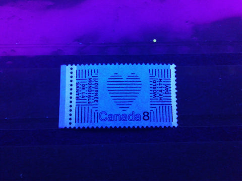
Here is an example of the light orange tagging on the same issue. I have found that generally those stamps printed on fluorescent paper appear to have light orange tagging, while those on plain paper have the greenish tagging. I have found examples on this paper where the tagging has faded completely, and can only be seen in normal light as light bands of varnish on the stamp surface.
In normal light, the tagging can be seen on many stamps as a light coating of what appears to be varnish, running down the stamp surface. On the World Health Day stamp, these bands take on a pinkish tint from the printing ink, while on the Frontenac stamp, they take on a bluish tint. However, on the Plains Indians stamps, they are generally not visible at all in normal light.
The picture below shows the migration of the tagging in both a block and a single of the World Health Day Issue:
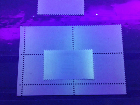
As you can see, the intensity of the migration varies from mild to heavy. It does not seem to occur with equal severity on all stamps. For example, the stamps on fluorescent paper of this issue do not generally show the above effect, but rather just have tagging bars that fade.
The spacing between the tagging bars on both the World Health Day and Frontenac issues is between 35.5 and 36 mm in the horizontal direction.
The Plains Indians stamps were tagged using the stable OP-2 tagging compound, in bars that were 3 mm wide. The colour of the bands under UV varies from pale to deep greenish yellow, as shown in the picture below:
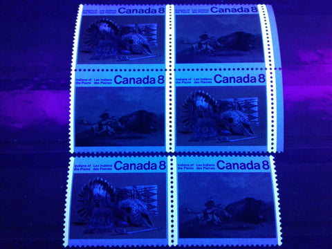
The difference in colour isn't very noticeable in the picture, but it is quite obvious in reality. The spacing between tag bars on these stamps is 32.75 mm in the horizontal direction. The spacing between the bands on the vertical format BABN plains Indians stamps is 20.75 mm horizontally.
Rose does list wide centre band and side band tagging as occurring on the BABN Plains Indians stamps, but not any of the other issues. The picture below shows an example of a shift that almost qualifies as a wide left band, but not quite, as there is just the smallest hint of tagging on the right perforations in the pair:
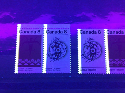
This results from the tagging bars being shifted about 1.5 mm to the right of where they should be. It is still quite a striking variety. Again, Unitrade does not list these, because they result from shifts.
Plate Blocks
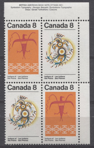
All of the stamps issued here were printed in sheets of 50 that contained an inscription block in each corner of the sheet. All of these blocks, except for the one shown above, were inscription blocks that bore no plate number. The BABN Plains Indians issue was the only one where the blocks show plate number 1. However, there is no plate #2, so for all issues, there is only 1 set of blocks possible, and of course, one can collect the field stock blocks as well, in which all the inscriptions were trimmed off, prior to distribution to the post offices. The Ottawa tagged printings do not exist in inscription blocks, but just the field stock blocks.
First Day Covers
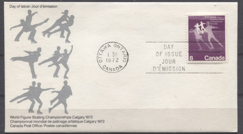
This is the second full year that Canada Post has been issuing official first day covers. So we begin to see the number of private cachet makers decrease, as they found it very difficult to compete with Canada Post. Many of the earlier cachet makers are gone by 1972, but the larger ones, such as Cole, Rose Craft, Art Craft are still producing covers. The official Canada Post covers were produced for a number of different stamp configurations including singles, pairs, blocks, and inscription blocks. I have generally found little variation in the fluorescence of the envelope stock used for these covers, though in many later issues, I have found significant variations. So, I believe it is worth checking these with your UV lamp, just as you would for any stamp.
The scan below shows the Rose Craft version of this First Day Cover:
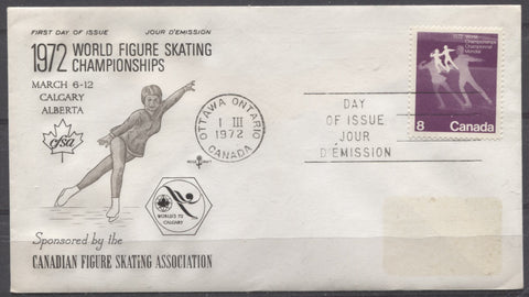
There is a small area of discolouration on the cover where the address would normally be. This is from a peel and stick label that has since fallen off.
Postal History and Cancellations
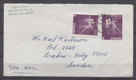
Postal history and cancellations is a nice sideline direction in which to take these stamps. By now the postal rates have become greatly simplified, as on July 1, 1971 an "all-up" international rate of 15c per ounce was introduced. This represented a rate decrease, as previously the foreign rates were quoted in half ounces. However, there were still people who remained unaware of the new rate, such as the sender of this cover above. He has marked it "sea mail" in the bottom corner as he only has 16c postage on the letter. He was intending it to be the 1 oz surface rate to Sweden, although he is actually 3c short of what that rate would have been just prior to July 1, 1971. When this cover was sent there was no distinction between "sea-mail" and airmail. So, this makes the cover more interesting than a standard 15c cover would be.
Because the rate to foreign countries at this time is 15c and all the stamps shown here are 8c, the only to find covers with the proper rate is to have a cover which is franked with one 8c stamp and 7c additional postage, which would generally be made up from lower value stamps from the Centennial Issue, i.e, a 7c, a 6c plus 1c, a 5c plus 2c, or a 4c and 3c. So there are lots of different frankings that can be collected for this basic rate.
Single usages for domestic covers can also be collected for a series of towns or provinces also, to add a bit of spice to a collection, without breaking your collecting budget.
Then, of course are all the different cancellations you can collect. The most desirable of these are of course the CDS town cancellations. These are all larger format stamps, so they tend to show the CDS cancellations very well. By now there are thousands of different CDS cancellations in use for each of the provinces. So, there is almost no limit to the number of cancellations you can collect on these. In addition to CDS cancellations, you can also collect MOON and POCON cancellations, as well as roller cancels. These aren't as popular as CDS cancellations, but they are part of the postal history of the issues, and I believe they are just as collectible, if you collect them for what they are.
One very challenging and rewarding pursuit is to look for used se-tenant pairs that are cancelled in period, or properly used on cover. As I said, because a pair is 16c and the all-up foreign letter rate is only 15c at this time, the only way you will see properly used se-tenant pairs and blocks will be to pay registration and special delivery fees, and even then in larger blocks.
This concludes my exploration of the first commemorative stamps of 1972. I will be off for Christmas next week, so there will be no post next week. But, I will be back in the New Year, with a post to cover the last Commemorative Issues of 1972. Then, I will be starting my series of posts for the 1972-1978 Caricature Issue.


1 comment
It is easy to see Canada’s shift to the left of that time. A majority of the issues involve Indians. A UN style issue and the only old guy is French. Stamps are how a country presents itself and Canada was changing.