
Today's post completes my exploration of the commemorative issues of Canada from 1971, with the last six issues of the year, comprising 9 stamps. These issues include the very last stamps to be issued with dextrine gum, being the 6c and 7c Christmas stamps.
In terms of printers, Ashton Potter was not involved with any these issues. Canadian Bank Note Company (CBN) printed all but two of them, with these two being the Paul Kane stamp and the Pierre Laporte stamp, that were printed by the British American Bank Note Company (BABN).
These are some of the last issues to use the line perforation of 11.85 or 11.95 that the CBN had used throughtout the 1960's. The very last stamp to use this perforation is the first stamp of 1972, the figure skating stamp. The BABN introduced a new perforation, in addition to the comb 12.5 x 12 perforation, with comb 12.5, which is found on the Paul Kane issue.
In terms of papers, the use of chalk-surfaced paper is now the norm, with only four of the 8 stamps being issued on ordinary paper. BABN introduces a new kind of ribbed chalk-surfaced paper, which it utilizes on a number of subsequent issues. This paper shows very distinct vertical ribbing on the chalky coating at the front of the stamp.
A spectacular foldover error, which I discovered in a collection, when I worked for Eastern Auctions, in 2003, occurs on the 6c Christmas stamp. I will describe this in full detail soon. However, I will start with a description of the basic stamps, as well as the other attributes of these stamps that are of interest.
The Stamp Designs, Issue Dates, Issue Quantities, Designers and Printers
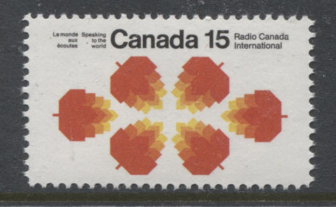
15c black, red orange and yellow
Radio Canada International
Issued: June 1, 1971
Issue quantity: 9,825,000 (tagged and untagged)
Printed by CBN using lithography
Designed by: Burton Kramer
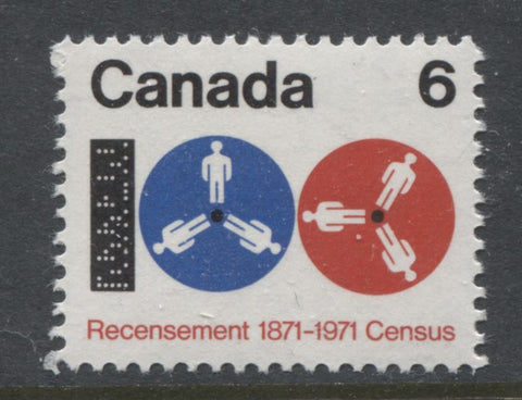
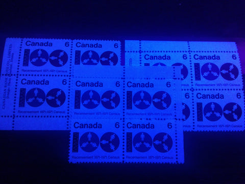
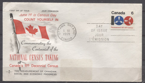
6c black, ultramarine and red
Centenary of the Canadian Census
Issued: June 1, 1971
Issue quantity: 25,200,000
Printed by CBN using lithography
Designed by: Hans Kleefield
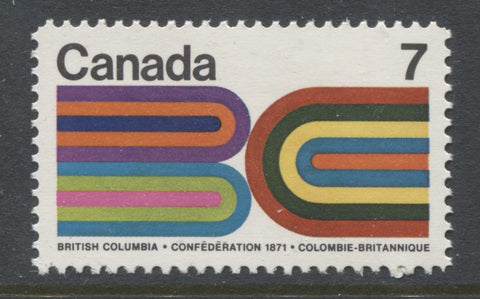
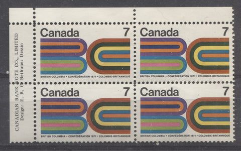
7c multicoloured
Centennial of British Columbia's entry into Confederation
Issued: July 20, 1971
Issue quantity: 30,000,000
Printed by CBN using lithography
Designed by: Edward R.C. Bethune
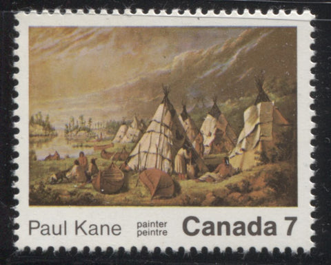
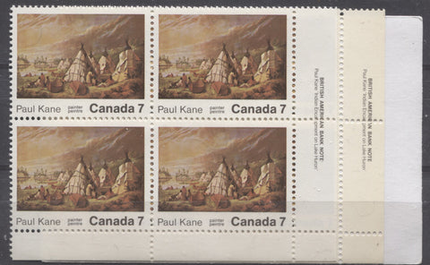
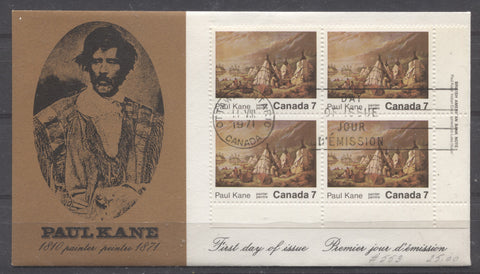
7c multicoloured
Centenary of the death of Paul Kane, painter
Issued: August 11, 1971
Issue quantity: 25,200,000
Printed by BABN using lithography
Designed by: William Rueter
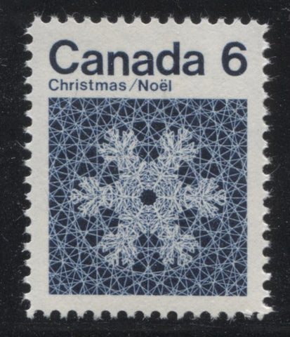
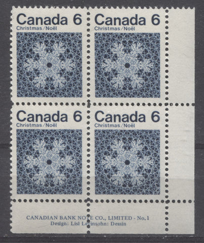
6c dark blue, snowflake
Issued: October 6, 1971
Issue quantity - untagged: 168,800,000, tagged: 7,000,000
Printed by CBN using engraving
Designed by: Lisl Levinsohn
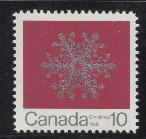
10c dark red and silver, snowflake
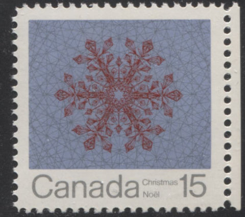
10c grey blue, deep crimson and silver, snowflake
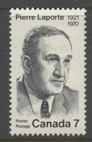
7c black, Pierre Laporte
Issued: October 20, 1971
Issue quantity: 22,790,000
Printed by BABN using engraving
Designed and engraved by: George Arthur Gundersen
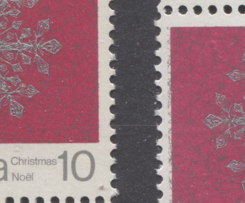
Attributes of the Paper Other Than Fluorescence
As was the case in previous periods, the paper used to print the stamps shows a wide degree of variation, in terms of all attributes, including fluorescence. Unitrade has just begun listing horizontal ribbed and smooth papers on the 10c and 15c Christmas stamps. However, it ignores the fact that those same differences can be found on the 6c and 7c stamps as well.
The different papers found on these papers can best be described as follows:
- A thicker, white, smooth vertical wove paper, that shows no mesh pattern, even when held up to a strong back light. The paper is uncoated, as can be seen under magnification. However, the paper surface has been burnished smooth. This paper is found on some printings of the Radio Canada International stamp and the Census Centenary stamp.
- An almost identical paper to #1 above, but with this paper there is a very light vertical ribbing that is often visible on the gummed side. When the stamps are held up to a strong back light, a clear vertical mesh is visible. The paper surface is lightly coated with a very thin varnish, which can be seen both under magnification, and when the stamps are viewed at an angle to the light. This paper is found on most printings of the Radio Canada International stamp and the Census Centenary stamp.
- A thick, very light cream, vertical wove paper, that shows no clear mesh pattern, even when held up to strong back light. It has a light coating of chalk on the printing surface, that is smooth and shows no pores, even under 10x magnification. This paper is found on the BC Centennial stamp.
- A medium white vertical wove paper that shows no clear mesh pattern, even when held up to strong back light. There is a light chalk coating on the printing surface, which is smooth, and shows no pores or uneven spots under magnification. This paper is found on some printings of the Paul Kane stamp.
- A medium cream vertical wove that has more or less the same attributes as #4, except for the colour, which is a clear cream colour. This paper is also found on some printings of the Paul Kane stamp.
- A smooth, cream coloured, horizontal wove paper that shows no clear mesh, until it is held up to a strong back light, when faint vertical mesh becomes visible. The paper surface is smooth, and under magnification, a very light surface coating is visible. This paper is found on some printings of the 6c and 7c Christmas stamps.
- A horizontally ribbed, cream coloured, vertical wove paper that shows clear ribbing on the gummed side, and to a lesser extent the printing surface. When held up to back light, the horizontal mesh is very clearly visible. The printing surface is smooth, and under magnification, a very light surface coating is visible. This paper is found on some printings of the 6c and 7c Christmas stamps.
- A similar paper to #6, but vertical, rather than horizontal wove. This paper is also found on some printings of the 6c and 7c Christmas stamps.
- A light cream coloured vertical wove paper that shows no clear mesh pattern, even when held up to a strong back light. The printing surface has a chalk coating that is smooth and has a satin sheen. This paper is found on some printings of the 10c and 15c Christmas stamps.
- A similar paper to #9, except that it is much closer to pure white in colour. This is also found on the majority of 10c and 15c Christmas stamps.
- A thicker, white vertical wove paper that shows very clear horizontal ribbing on both the front and back of the stamp. The printing surface has a chalk coating that is ribbed, with an eggshell sheen. This paper was used for a small portion of the printings of the 10c and 15c Christmas stamps.
- A thick, cream colored, horizontal wove paper, that shows no distinct mesh pattern, even when held up to a strong back light. The printing surface has a thick chalk coating, which shows distinct vertical ribbing, and a matte sheen. This paper is found on the Pierre Laporte stamp.
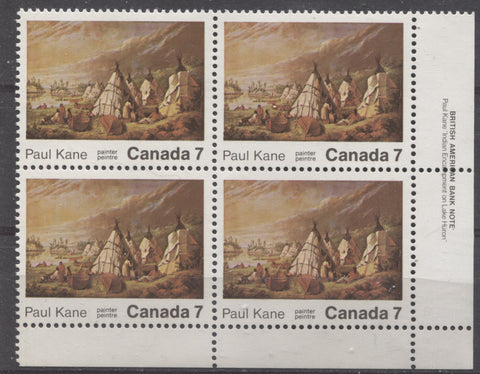
The scan below shows the difference between the cream paper and the white paper on the Paul Kane stamp:
The block to the left is the white paper, while the one to the right is printed on the cream paper. The difference is readily apparent when you compare the two selvage tabs.
Paper Fluorescence
This is the first time in the history of Canadian stamps that the standard paper used for all five issues is at least fluorescent to hibrite. The 6c Christmas is known on dull fluorescent paper, but this is quite a bit scarcer than the hibrite paper. However, there are some variations on most all of the stamps issued, which will be described and illustrated below:
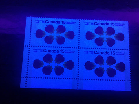
The Radio Canada International Stamp
On this stamp the paper fluorescence varies only slightly, from high fluorescent, to true hibrite. The two levels of fluorescence are shown in the picture below, though the difference does not show up anywhere near as clearly as I would like:
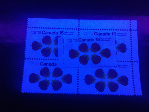
The block is printed on the true hibrite paper, whereas the single stamp on top of it is on the high fluorescent paper.
The Census Centenary Stamp
This stamp is also found on both high fluorescent and true hibrite papers, as shown in the following picture:
The block on the left, and in the foreground are printed on the high fluorescent paper, while the one on the right at the back is on the true hibrite paper.
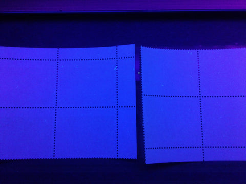
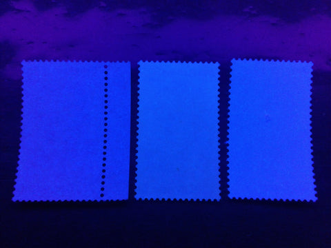
The BC Centennial Stamp
This stamp gives different fluorescence readings on the front and back of the stamp, but most collectors would probably think of it as being printed on hibrite paper. In actual fact, the front of the stamp ranges in brightness from true hibrite, to medium fluorescent, while the back is usually a low fluorescent paper with different concentrations of fluorescent fibres, or dull fluorescent, with a sparse concentration of low fluorescent fibres.
The picture below illustrates the different fluorescence levels on the front of the stamp:
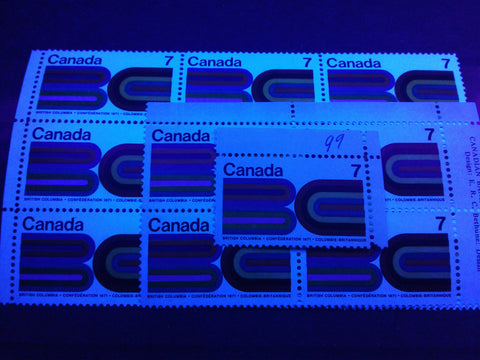
The true hibrite paper is shown by the largest block, while the upper right plate block is on the high fluorescent paper, and the upper right field stock single is on the medium fluorescent paper.
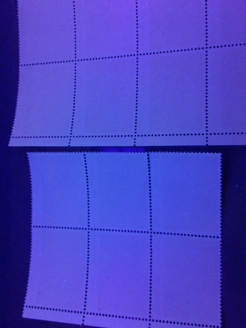
The next picture shows two varieties of paper as seen from the back:
These are both low fluorescent with fluorescent fibres. The paper of the larger block is a light blue colour under UV, while the single is a light ivory. On the block, the paper actually contains a low density concentration of low fluorescent fibres, a very sparse concentration of medium fluorescent fibres and a very few high fluorescent ones. The basic fluorescence level of the paper without these is dull fluorescent greyish white. On the single stamp, the paper contains a low density concentration of low fluorescent fibres, but nothing brighter.
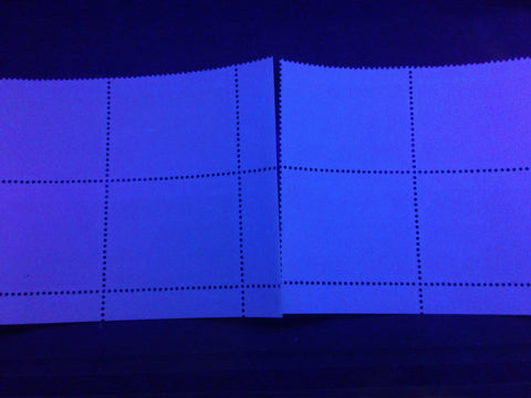
The next two pictures both show the third and fourth varieties of paper that I found, as seen from the back, but in reverse of one another:
The single stamp shown here is very similar in overall brightness level to the block that was shown in the previous picture, i.e a low fluorescent light blue. However, the concentration of fluorescent fibres is much lower. This paper has only a sparse concentration of low fluorescent fibres and very few medium fluorescent ones. The paper of the block is a brighter bluish white, being almost medium fluorescent. The paper contains a low density concentration of both low and medium fluorescent fibres, as well as 1-2 high fluorescent fibres, and very few brownish woodpulp fibres.
The next picture shows the same papers, but this time the block is on low fluorescent flecked paper, while the single is on the medium fluorescent paper:
Hopefully, the addition of both pictures should help to make the differences between these paper types clearer.
The question that arises now, is: which combinations of front fluorescence and back fluorescence are there? If all possible combinations exist, then there are 3 x 4 = 12 different varieties of fluorescence. I checked through the stamps in my stock, and it would appear that all 12 varieties of paper exist, though some are clearly scarcer than the others. In general, I would note that I had many fewer of the medium fluorescent fronts, compared to the high fluorescent and hibrite papers. With regard to the back varieties, the most common seems to be the medium fluorescent paper with the low density concentrations of low and medium fluorescent fibres.
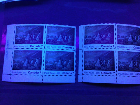
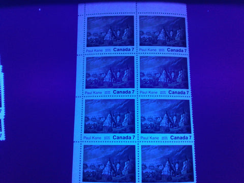
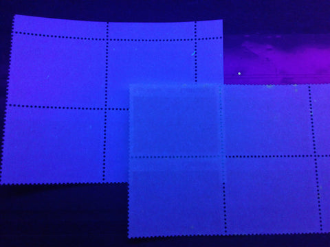
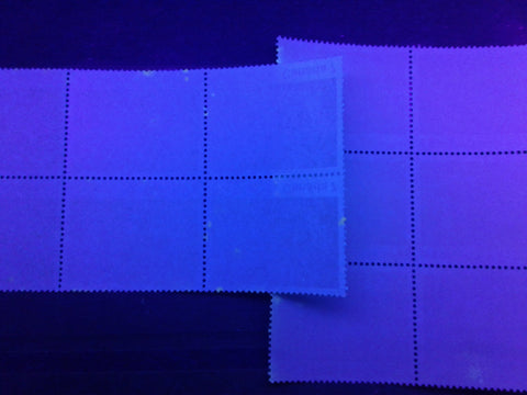
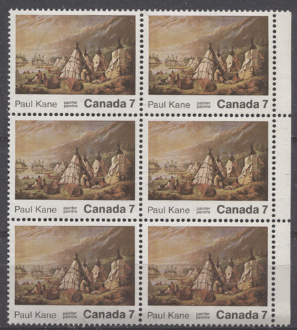
The Paul Kane Stamp
This is another stamp that shows a fair degree of variation for both the front of the stamp and the back, though most collectors would probably think of it as being on hibrite paper.
On the front of the stamp I have found the full range of variation from hibrite to dull, though I have seen many examples of blocks in which the brightness level varies within the same block. It is difficult to tell if this has been caused by exposure, or if it is the result of an uneven chemical composition of the chalk coating on the surface. However, the pictures below show the different fluorescence levels, as well as a block that shows variation within the same block:
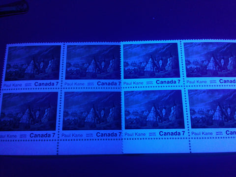
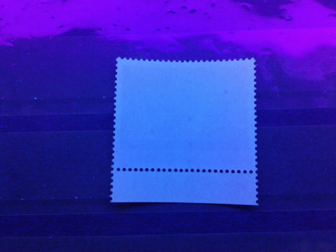
This shows the medium fluorescent paper on the left, and the hibrite paper on the right. Generally, the medium and lower fluorescence levels correspond to the cream paper, while the high fluorescent and hibrite levels tend to be associated with the white papers.
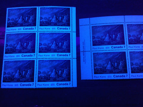
Here, the hibrite paper is shown on the left, and the high fluorescent paper on the right.
The block on the left is the high fluorescent paper, while the one on the right is the medium fluorescent paper.
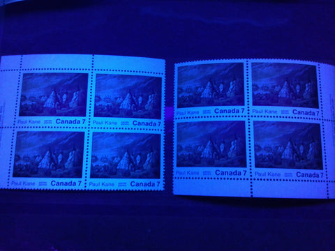
The medium fluorescent paper is shown on the right, while the low fluorescent paper is shown on the left.
The block on the left is the low fluorescent paper, while the one on the right is dull fluorescent.
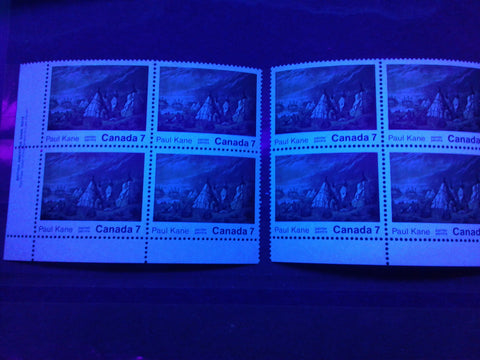
Finally, the picture below shows a block that exhibits hibrite, high and medium levels of fluorescence:
The stamps at the top of this block appear medium fluorescent under UV, and this gradually becomes brighter toward the bottom of the block until they are hibrite at the bottom.
On the back, the paper shows an equal amount of variation, though the highest level of fluorescence that I have seen is medium, and the lowest is dull fluorescent. Again, the papers generally all contain varying concentrations of fluorescent fibres. The different varieties that I have found in my examination of the stamps are shown below:
The block on the left is the medium fluorescent paper. This paper contains a low density concentration of both medium fluorescent fibres and brownish woodpulp fibres, as well as very few high fluorescent and hibrite fibres. The block on the right is on dull fluorescent greyish white paper containing a low density concentration of low fluorescent fibres, and sparse concentrations of both medium fluorescent fibres and brownish woodpulp fibres. Together, these give the overall appearance of low fluorescent paper.
The block on the left is the same low fluorescent paper shown on in the previous picture, while the block on the right is on dull fluorescent paper, containing a sparse concentration of low fluorescent fibres and brownish woodpulp fibres.
Here, on the left is the medium fluorescent paper that was illustrated in the first picture. On the right is a low fluorescent paper, which contains a low density concentration of both low fluorescent fibres and brownish woodpulp fibres, as well as very few high fluorescent and hibrite fibres.
Both of these blocks are on dull fluorescent paper. The block on the top contains a low density concentration of dull fluorescent fibres, a sparse concentration of brownish woodpulp fibres and a very sparse concentration of low fluorescent fibres. The block on the bottom is similar, but the concentration of low fluorescent fibres is sparse, rather than very sparse.
On the left is another type of low fluorescent paper, This one is low fluorescent bluish grey and contains a low density concentration of low fluorescent fibres, a few medium fluorescent and a few high fluorescent fibres. The block on the right is a medium fluorescent paper that contains low density concentrations of both low and medium fluorescent fibres.
The next variety of paper I have seen is another dull fluorescent paper, shown below:
This paper appears yellowish ivory under the UV lamp. On close examination, it is seen to contain a sparse concentration of dull fluorescent fibres and a sparse concentration of brownish woodpulp fibres.
The last two varieties of paper are also dull fluorescent:
These two varieties of paper are similar to types 5 and 6, except that they are a yellowish grey colour under the UV light instead of the usual bluish grey or greyish white. The block has a low density concentration of dull fluorescent fibres, a very sparse concentration of low fluorescent fibres and a sparse concentration of brownish woodpulp fibres. The pair is the same in terms of the fibre content, but it appears more deeply yellowish under UV than the block.
In terms of combinations of front and back fluorescence:
- For paper that is hibrite on front, I have found the first three types, i.e. medium fluorescent, low fluorescent, and dull fluorescent.
- For the paper that is high fluorescent on the front, I have found the first three types, and types 5, 6, 7 and 8 shown above.
- For the paper that is medium fluorescent on the front, I have found all varieties from the back, except for types 8, 10 and 11.
- For paper that is low fluorescent on front, I have only found the fourth type, being the low fluorescent paper with the low fluorescent fibres and brownish woodpulp fibres.
- For the paper that is dull on the face, I have only found types 10 and 11.
Clearly, this is a very complicated stamp, when both the front and back fluorescence are considered. It must be mentioned that this is the first lithographed BABN stamp to be printed on the new chalk-surfaced paper, so it is reasonable to expect that some experimentation in papers and the coatings used would have been undertaken.
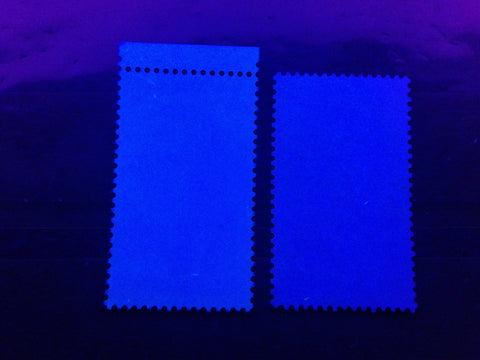
The 6c Dark Blue Christmas Stamp
This stamp is listed by Unitrade as existing on either dull fluorescent paper, or hibrite paper, with hibrite being the common type. In actual fact, it can also be found on high fluorescent paper, and most likely medium fluorescent as well. Although, I have found medium fluorescent paper on the 7c emerald, which I illustrate below, I have not yet found a similar variety on the 6c. The picture below shows the three types of paper that I have found so far:
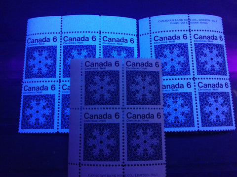
The hibrite paper is shown on the rear left block of 6, while the right rear block is the high fluorescent paper. The centre block in the foreground is the dull fluorescent greyish paper.
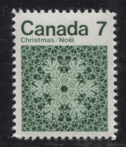
The 7c Emerald Christmas Stamp
Curiously, this stamp is not yet known to exist on the dull paper, which the 6c is found on. This is very surprising, given that the 6c and 7c were printed in very similar quantities. However, my guess is that the dull paper was an experimental paper that was introduced to try to make the tagging more visible on the Winnipeg tagged stamps, given that the brightness of the paper had a tendency to obscure and overshadow the tagging. I have found this stamp to exist on hibrite, high fluorescent and medium fluorescent paper, as shown below:
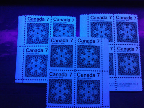
The hibrite paper is shown on the left rear block, while the high fluorescent paper is shown on the right rear block. The centre block at the front is the medium fluorescent paper.
The 10c and 15c Christmas Stamps
These stamps are also found with slightly different fluorescence levels on the front and back of the stamps, due to the chalk coating on the front. Again, most collectors would probably think of these as being on hibrite paper. The fluorescence levels found on the front of the stamps ranges from true hibrite, to high fluorescent, which is most common, down to medium fluorescent. On the back, we find two levels of fluorescence:
- High fluorescent, with very few hibrite fibres visible in the paper, and
- Medium fluorescent, with a very sparse concentration of brownish woodpulp fibres and very few hibrite fibres visible in the paper.
The high fluorescent back is normally found on the paper which is hibrite on the front, while the high fluorescent and medium fluorescent papers usually have a medium fluorescent back.
The pictures below show these different types of paper:
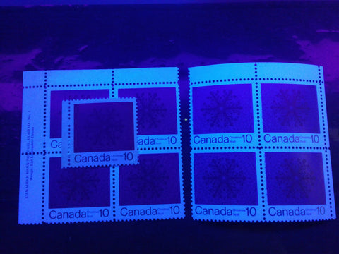
The block at the right is the true hibrite paper, while the block at the left is the high fluorescent paper. The single that lies on top of the block is printed on the medium fluorescent paper.
The medium fluorescent paper is shown on the block at the left, while the block at the right is on the high fluorescent paper.
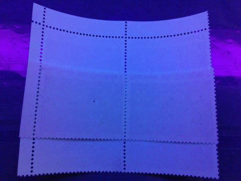
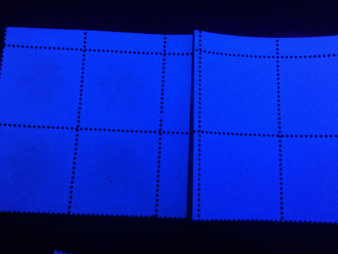
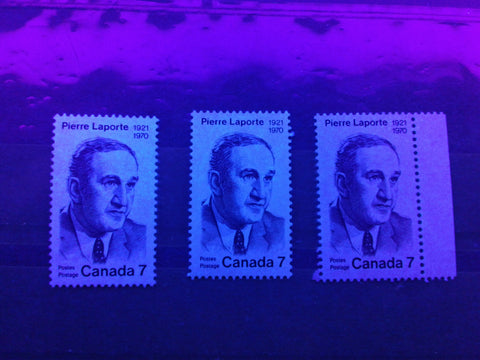
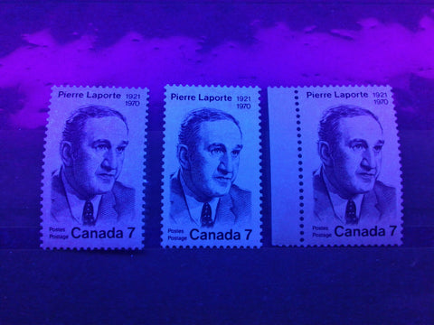
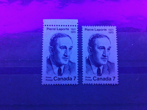
The Pierre Laporte Stamp
This last stamp of 1971 is listed by Unitrade as being either on fluorescent paper, or dull paper. In practice, the paper is generally always at least low fluorescent, but the chalk coating on the front of the stamp has a deadening effect on the fluorescence, as seen from the front. On the stamps which had low fluorescence to begin with, the front will generally appear dull, but on stamps that have a high fluorescence with fluorescent fibres, the paper will appear low fluorescent flecked. However, there are several different colours of the paper as seen from both the front and the back. I will illustrate and describe each of the paper types that I have found, first by illustrating the front, and then the back.
All three of the above stamps are variations of the so-called fluorescent paper. They all show a low density concentration of what appear to be low fluorescent fibres poking through the surface of the chalky coating. The real difference is that the left stamp looks bluish white, the middle stamp appears greyish white and the stamp at the right appears greyish blue.
The above picture shows the back of the above three stamps. Generally, the overall appearance of the stamps on the back is medium fluorescent. The left stamp is bluish white and contains a medium density concentration of both low and medium fluorescent fibres, as well as a few high fluorescent fibres. The two other stamps are a lighter white, and contain a medium density concentration of low fluorescent fibres, and a sparse concentration of medium fluorescent fibres,
Here are three more variations of the so-called fluorescent paper. These appear much duller than the first three from the front. Although all of them show fluorescent fibres from the front, they are not nearly as bright on the second two stamps, and in fact are barely noticeable. The first stamp appears bluish grey, the second stamp appears greyish white and the third stamp appears grey.
Here are the back of the above stamps, but in the reverse order. The right stamp, which is the first one in the preceding picture is medium fluorescent bluish, with a high density concentration of low fluorescent fibres, a sparse concentration of medium fluorescent fibres, and a very sparse concentration of high fluorescent fibres. The middle stamp is low fluorescent greyish white and contains a medium density concentration of low fluorescent fibres. Finally, the left stamp is dull fluorescent grey with a low density concentration of low and medium fluorescent fibres, which make the paper appear low fluorescent.
These two stamps are both variations of the so-called dull paper. The stamp on the left still shows some fluorescent fibres through the chalk coating, but the overall appearance is dull enough that it can be considered a variant of dull paper. The stamp on the right appears a dull fluorescent yellowish grey and shows no fluorescent fibres on the surface.
The above picture shows the back of these stamps, and as you can see, they are still fluorescent. The left stamp is a low fluorescent greyish white, with a medium density concentration of low fluorescent fibres. The stamp on the right is dull fluorescent bluish grey, with a low density concentration of low and medium fluorescent fibres, which reads as low fluorescent overall.
Shade Varieties
These issues show very little variation in colour. In fact, the only issue on which I have found any real variation, is the Paul Kane issue, where the clouds do show some noticeable variations as shown in the picture below:
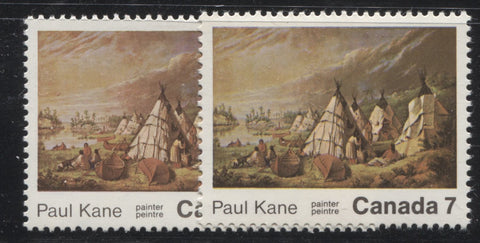
If you compare these two stamps, the overall colouring of the stamp on the right is greenish, compared to the one on the left, which appears redder.
Gum Varieties
On these issues, I have found four basic types of gum, one of which is dextrine, and the other three of which are PVA:
- A smooth and streaky colourless PVA gum that has a satin sheen and contains a regular horizontal pattern of small blemishes. This type of gum is known to collectors as the "spotty white gum", and is found on the Radio Canada International stamp and the Census Centenary stamp.
- A smooth, colourless PVA gum that has an eggshell sheen. This gum is found on the BC Centennial stamp and the Paul Kane stamp.
- Yellowish cream dextrine gum that is smooth, and has a glossy to semi-gloss sheen. This gum is found on the 6c and 7c Christmas stamps.
- A streaky yellowish cream dextrine gum that has a semi-gloss sheen. This gum is found on the 6c and 7c Christmas stamps.
- A smooth, cream coloured PVA gum that has an eggshell sheen. This gum is found on the 10c and 15c Christmas stamps.
- A smooth, cream coloured PVA gum that has a satin sheen. This gum is found on the Pierre Laporte stamp.
Perforations
The Radio Canada International, Census Centenary, BC Centennial and Christmas stamps are all listed by Unitrade as perf 12. But based on my study of all CBN printed stamps of this period, I would have expected to find the four line perforations normally found on these stamps, being: 11.85, 11.95, 11.85 x 11.95 and 11.95 x 11.85. However, on the Radio Canada International stamps that I examined, a new gauge was found: 12.0. I have not seen this gauge since the very early 1950's. It appears as though the CBN reverted to new perforating wheels which were calibrated to exactly 12.0, rather than the other four measurements.
However, my concerns were soon laid to rest when I examined the BC Centennial stamps, where I found both perf 11.85 and 11.95. So, it would appear that the four measurements normally found on the CBN stamps of this period can still be found on all these issues as well. As is usually the case with the CBN printed stamps, the sheets are perforated completely through the selvage on all sides of the sheets.
The Paul Kane stamp, which was printed by BABN exhibits a new comb perforation, which had not appeared on any issues before: comb 12.5. Unitrade quotes the measurement as 12.5 and I have verified it with my Instanta gauge. This perforation extends through the selvage of the stamps on all sides of the sheets as well. One interesting variation that does appear on these comb perforated stamps that is not mentioned in Unitrade, is a distinct difference in the width of the perforating holes, resulting from the use of different perforating pins. Generally, I have found that on many Canadian issues from this point forward, exist with regular sized perforation holes as well as large holes. The large holes are easy to recognize, due to the closer spacing of the holes and the resulting narrower perforation tips. The scans below show both types, as seen on the Paul Kane stamps:
This is a lower right corner block showing the normal sized perforation holes. If you look carefully at the block you will see that the holes are uniform, of even size and the amount of space between the holes is almost the same as the diameter of the holes themselves.
This block shows the larger perforation holes. Note how the space between the holes is much smaller than the diameter of the holes, maybe as little as half this diameter. The perforation tips on the outside of the block appear sharper as a result.
The Pierre Laporte stamp, which was printed by BABN, is comb perforated 12.5 x 12. These measurements are exact, and I have not seen any variations. The selvage of the sheets is fully perforated through at the sides. However, the top and bottom selvage is imperforate, except for a single extension hole, from the top and bottom horizontal row of perforations.
Winnipeg Tagging
In addition to the Christmas stamps, the Radio Canada International Issue was issued with Winnipeg Tagging. On the Radio Canada stamp, as well as the 7c, 10c and 15c Christmas stamps, 2-bar tagging was used. The width of the bands on these stamps was 8.5 mm. On the Radio Canada International stamp, the spacing between the bars in the horizontal direction was 30.75 mm in the outer columns of the sheet, and 31.25 mm on the other columns. On the 7c Christmas stamp, the spacing between tag bars was 15 mm. Finally on the 10c and 15c Christmas stamps the spacing of the tag bars was 21 mm.
The 6c Christmas stamp was issued with 4 mm wide centre band tagging. The spacing between tagging bars in the horizontal direction was 20 mm.
According to Rose, the 7c Christmas stamp is known to exist with 8.5 mm centre band tagging, in error, while the Radio Canada stamp is known tagged with either one wide centre band, or one wide side band.
In normal lighting conditions the tagging is normally a pale yellowish cream, and is visible to the naked eye, but is not especially dark. Under UV light, the tagging is clearly visible and glows a clear yellowish colour, with a very brief afterglow when the light is switched off.
The pictures below show the appearance of the tagging in normal light, and under UV light, on the Radio Canada International issue:
As you can see the tagging bars are clearly visible at the sides, though they are not particularly dark in colour.
Notice how much darker the tagging appears under UV light.
Constant Plate Varieties and Non-Constant Varieties
Only two issues from this period have been found with constant varieties that are listed in Unitrade: the BC Centennial Issue and the Paul Kane issue. The Radio Canada International Issue is found with the "Bug on the Leaf" variety, which is a donut flaw, and is found on the tip of the lower left leaf. Unitrade points out the fact that it is not a truly constant variety.
Unitrade lists three constant varieties on each of the BC Centennial Issue and the Paul Kane Issues, as follows:
- The extra accent between "ER", which occurs on all stamps from column 2 of the BC Centennial issue.
- The dot under the "B" of "Britannique" occurs on all stamps from column 3 of the BC Centennial Issue.
- The dot between "BR" of "British" occurs on position 35 of all panes of the BC Centennial Issue.
- The stroke on teepee variety occurs on all stamps from column 1 of the Paul Kane issue.
- The sun behind the clouds variety, is a large pinkish dot, which is found in the clouds above the teepee. It is the result of a repellex error and is found on all stamps from position 29 of the sheet.
- The burr over shoulder is found on the Indian lying down in the foreground, and occurs on all stamps from position 9.
These varieties are illustrated in the following scans:
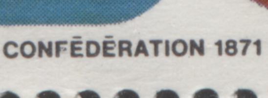
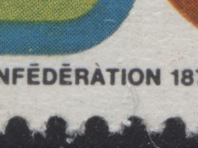
The extra accent variety on the BC Centennial stamp. This is actually a large dot that is almost attached to the second "E" of "Confederation.
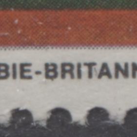
The dot under the "B" of "Britannique". As you can see, the dot is quite small, and is attached to the B. Consequently it is very easy to overlook.
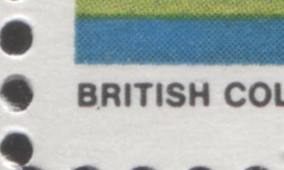
The dot under "BR" of "British". Note that this is more visible than the dot under "B" of "Britannique".
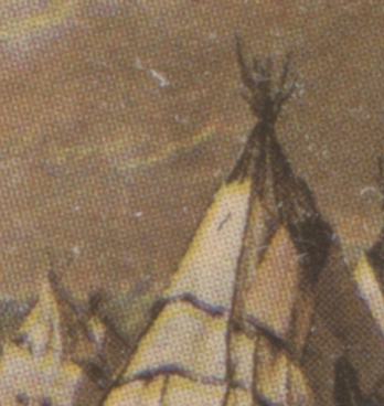
Here is a typical example of the "stroke on Teepee" variety.
Unfortunately, and quite surprisingly, I do not have an example of the "sun behind the clouds variety". Given the number of stamps that I have, I expected that I would have at least one. However, I will be sure to include a scan when one becomes available.
The "burr over shoulder: is shown below:
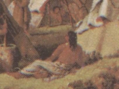
This is quite a small variety - a true flyspeck, and is very easy to miss if you don't know what to look for. As you can see, it is a very small green dot on the shoulder of the reclining Indian.
In addition to the listed varieties, I have found quite a few additional unlisted ones. I would have to complete a comprehensive study to establish whether or not these are constant, or non-constant in nature. However, I would suspect that many are probably non-constant, to semi-constant, in that they may occur on several, but not all sheets. These are illustrated and described under each of the following pictures:
On the BC Centennial stamp, I have found an example that shows a clear grave accent over the "A" of "Confederation.
On the Census Centennial stamp, I have found several instances of donut flaws, scratches and smudges on the red tape reel. Three of these are illustrated below:
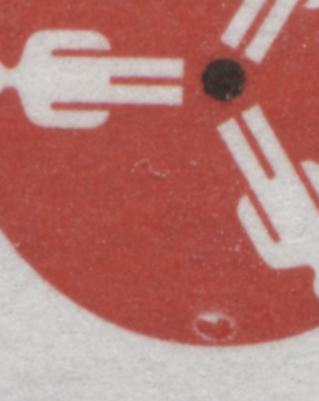
On this example, there is a clear donut flaw, just to the left of the lower man on the reel.
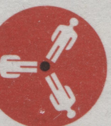
On this example there is a horizontal scratch to the left of the lower man on the reel.
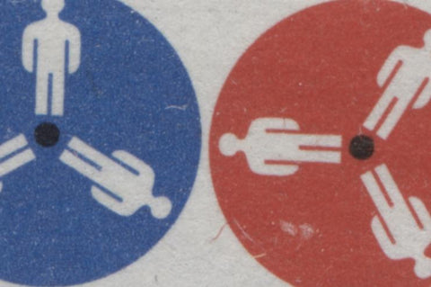
On this final example, there is a small curved scratch near the outer edge of the red reel and a smudge to its right. Also, a small scratch is visible on the blue reel. This is the only example I have seen that shows a clear scratch on the blue reel, but I would imagine that several other varieties of this type likely exist as well.
An interesting variety that results from a colour shift and occurs on the 10c Christmas stamp, and very likely on the 15c as well, involves a shift of the silver in the leftward direction, so that it protrudes about 0.5 mm beyond the red of the centre. Unitrade does not list it of course, because it results from a colour shift. Nevertheless, I believe it is worth showing here because these colour shifts are not as common as one might think, and it is quite a striking variety:
On the left is a normal 10c stamp, where the silver is contained within the red. On the right is an example of the shift, which is quite noticeable.
Errors
Until recently there were no known errors for these issues listed in any catalogue. However, in the past 12-13 years, at least three major errors have emerged, all of which involve the Christmas issue. The first two of these occur on the same multiple, which as far as I know is unique, and which I discovered in a old-time collection back in 2003, when I worked at Eastern Auctions. I am unable to procure an illustration of it, so I have to be content with describing it.
The multiple is a left sheet margin block of 8 stamps. The gummed side of two full stamps and two half stamps has become folded over onto the bottom 4 stamps. This foldover is irregularly shaped and cuts off at an angle. This foldover occurred prior to printing, so that when it was unfolded, the bottom half of stamps 5 and 6 on the block are missing the lower half of the design, and the design is entirely missing on the stamps 7 and 8. At the same time, the foldover piece contains two full stamps that are printed on the gummed side, and two partial stamps.
So, the full multiple contains:
- Two stamps that are printed on the gummed side.
- Two blank stamps, and
- Two partially printed stamps.
Unitrade does list these two errors separately, so that would suggest that the multiple has since been broken up, though Unitrade does not confirm this.
The third error surfaced about 4-5 years ago and is the 10c value, which is missing all of the silver colour. A picture of this is shown below:
As you can see, this stamp is identical, in all respects, to the issued stamp, except that the silver is missing. The perforation, paper and gum are all identical. This suggests to me that it is a true error. I have seen notes on some other websites that have identified this as a proof. While I acknowledge that this is possible - it could be a trial colour of the background, it seems unlikely to me, because of the fact that the perforation and gum are the same as the issued stamps.
Size Differences
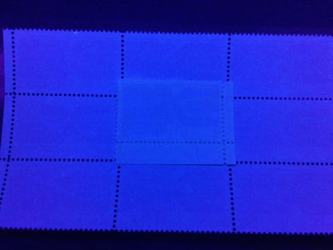
There is an interesting size difference to be found on the Radio Canada International stamp. This is the only stamp of the 8 to be printed without an outer frameline. The standard size for most stamps in the sheet is 40 mm wide. However, as noted by Unitrade, on some sheets there was a shift of the perforating wheel between the 4th and 5th columns of some sheets, resulting in some stamps that are only 38 mm wide, and others that are 42 mm wide.
Plate Blocks
The engraved Christmas stamps are the only issues for which the blocks bear plate numbers. Both the 6c and 7c exist with plate 1 and plate 2 inscriptions. The other, lithographed and engraved stamps do not bear plate numbers, but only inscriptions, as shown on the 7c BC Centennial stamp, as shown below:
In addition, all of the issues can be collected as field stock blocks as well. So, at a minimum, each stamp variety can be collected in at least 8 blocks, and 12 for the 6c and 7c Christmas stamps.
First Day Covers
The majority of first day covers one encounters for these issues are the official Canada Post covers like the one shown above. As was the case with the earlier issues of 1971, these covers can usually be found franked with:
- A single of each issue
- A block of each issue
- A plate or inscription block from each position
- A combination cover, in the case of the Christmas issue.
Each official cover has only one cachet.
In addition to the official Canada Post covers, one can still find and collect covers produced by the private cachet makers. There continue to be many fewer of these by the end of 1971, but the larger companies like Rose Craft, Art Craft, Cole and Fleetwood are quite prevalent and all have different cachets. The picture below shows an unaddressed Rose Craft first day cover of the 1971 Census Centenary Issue:
If you look carefully at the scan above, you can see a small area of discolouration where the address would normally be. This is caused by the residue from an address label, which has since fallen off.
Proof Material
The BNA Proofs website lists only two proof items from this period, which it notes are unique and which it values at between $600-$700. One item is a trial colour proof of the Pierre Laporte stamp, which looks almost like a reverse sketch of the stamp on tissue paper. The second item is a progressive proof of the Pierre Laporte stamp, with a bright blue background, as shown above.
Postal History and Cancellations
The stamps from these issues include two 15c values and one 10c value. The 15c value now represents the "all-up" foreign letter rate for the first ounce, while the 10c represents the airmail rate to the USA. So, an interesting challenge is to try and find single and double weight foreign commercial covers where the postage is paid with a single 15c stamp. These are much less common than you might think.
However, what is more challenging is to find higher value frankings that are made up from a combination of two or more lower value commemorative stamps. The more desirable covers will have the postage paid with more than one commemorative issue, rather than pairs or blocks of the same stamp, while the very best covers will have the postage paid by stamps from all different issues, such as the cover below:
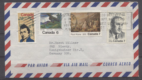
This cover, that was sent to East Germany on November 9, 1971 is franked with 26c in postage, from 4 different commemorative issues, all of which were released in 1971. The cover has been sent in an airmail envelope, but the rate is incorrect - The airmail rate at this point was 15c per full ounce. So, it would appear that this is likely an overweight cover, however, as I do not have information as to what the postage for the second weight step is, I cannot confirm for certain. However, from the cancellations and they way they are applied, I believe it is safe to conclude that this is not a philatelic cover. So, I do think that it is a commercial cover that bears a fantastic franking.
This concludes my very detailed exploration of these last issues of 1971, which have turned out to be far more complicated than they first appear. This is actually an indication of what you can expect to see throughout much of the 1970's, as the post office conducted a lot of experimentation with stamp papers and tagging. Next week I will cover the first commemorative issues of 1972.
1 comment
I wonder if the Laporte stamp was printed at BABN after being added to the stamp scedule later upon his murder. I wrote the Laporte stamp up a while ago at my site. .