Overview
Between 1963 and 1966, during the life of the Cameo definitive issue, Canada issued no fewer than 39 commemorative stamps, that in my opinion, are some of the most attractive of the modern engraved issues. Bi-colour, or in some cases, tri-colour printing has featured more prominently during this period, although most of the stamps are still monocoloured. However, the range of colours used seems to be greater, and the colours themselves are brighter than the stamps of the 1950's. This is actually one of my favourite periods in modern Canadian philately, particularly the Provincial Emblems series that was issued between 1964 and 1966. This later set was remarkable in at least two respects: (1) it was a political statement designed to emphasize the importance of Canada's unity in direct response to the growing separatist movement in Quebec, and (2) it was the first set to feature provincial flags and coats of arms. Lester Pearson was the prime minister during the period when these stamps were issued, so other themes that are connected with him, such as the importance of World Peace and the adoption of the Canadian flag feature prominently as well.
The stamps were all printed by the Canadian Bank Note Company and the larger sheet formats that were first introduced in the mid to late 1950's are continued into the entirety of this period: the larger horizontal format stamps are all printed in sheets of 300, instead of 200, with six panes of 50, while the intermediate horizontal and vertical format stamps are printed in sheets of 400, arranged into four panes of 100. Finally, the smallest horizontal and vertical format stamps were printed in sheets of 600 stamps, arranged in six panes of 100 stamps. Offset printing was used for the first time, in combination with engraving to produce the 1964-1966 Provincial Emblems series. In addition, duo-tone lithography was also used for the first time to produce the 1965 Churchill memorial issue.
In terms of designers, there were several designers who were responsible for these stamps. The most prolific two designers were:
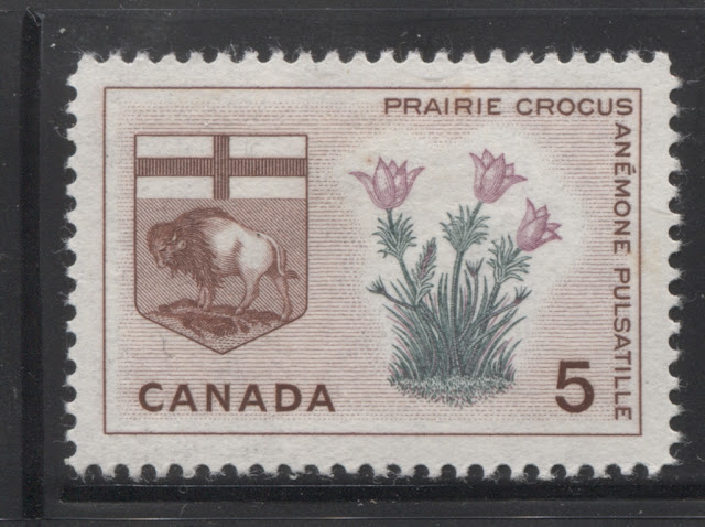
5c Red brown, lilac and dull green - Prairie Crocus and Manitoba arms.
Designer: Thomas Harvey Prosser.
Engraver: Donald J. Mitchell.
Issued: April 28, 1965.
15,820,000 stamps.
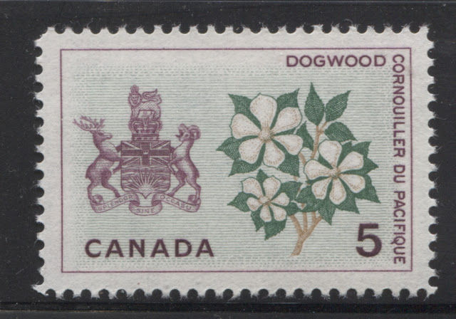
5c Lilac, green and bistre - Dogwood and British Columbia arms.
Designer: Harvey Thomas Prosser.
Engraver: Donald J. Mitchell.
Issued: April 28, 1965.
17,360,000 stamps.
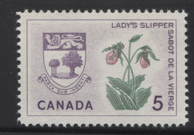
5c Violet, green and deep rose - Lady's Slipper and Prince Edward Island arms.
Designer: Harvey Thomas Prosser.
Engraver: Allan Alexander Carswell.
Issued: July 21, 1965.
26,510,000 stamps.
Between 1963 and 1966, during the life of the Cameo definitive issue, Canada issued no fewer than 39 commemorative stamps, that in my opinion, are some of the most attractive of the modern engraved issues. Bi-colour, or in some cases, tri-colour printing has featured more prominently during this period, although most of the stamps are still monocoloured. However, the range of colours used seems to be greater, and the colours themselves are brighter than the stamps of the 1950's. This is actually one of my favourite periods in modern Canadian philately, particularly the Provincial Emblems series that was issued between 1964 and 1966. This later set was remarkable in at least two respects: (1) it was a political statement designed to emphasize the importance of Canada's unity in direct response to the growing separatist movement in Quebec, and (2) it was the first set to feature provincial flags and coats of arms. Lester Pearson was the prime minister during the period when these stamps were issued, so other themes that are connected with him, such as the importance of World Peace and the adoption of the Canadian flag feature prominently as well.
The stamps were all printed by the Canadian Bank Note Company and the larger sheet formats that were first introduced in the mid to late 1950's are continued into the entirety of this period: the larger horizontal format stamps are all printed in sheets of 300, instead of 200, with six panes of 50, while the intermediate horizontal and vertical format stamps are printed in sheets of 400, arranged into four panes of 100. Finally, the smallest horizontal and vertical format stamps were printed in sheets of 600 stamps, arranged in six panes of 100 stamps. Offset printing was used for the first time, in combination with engraving to produce the 1964-1966 Provincial Emblems series. In addition, duo-tone lithography was also used for the first time to produce the 1965 Churchill memorial issue.
In terms of designers, there were several designers who were responsible for these stamps. The most prolific two designers were:
- Thomas Harvey Prosser, who designed 23 of the 39 stamps.
- Ephrim Phillip Weiss
However, other designers included:
- Bernard James Reddie, who had designed the 1961 Northern Development issue and the 1961 Pauline Johnson issue has returned to design the 1963 Postal Service issue.
- Phillips Gutkin and Associates, which had designed the 1962 Red River Settlement Issue, returned to design the 1965 Inter-Parliamentary Union Issue.
- Gerald Trottier, who had designed the 1958 La Verendrye, Champlain, Health and First Elected Assembly Issues, came back to design the 1965 National Capital Issue.
- Helena Roberta Fitzgerald, who had designed the 1959 Country Women issue, and several of the issues to the end of 1962, has returned to design the 1965 Christmas and 1966 Highway Safety Issues.
- Leendert Verhoeven, whose name appears for the first time, designed the 1966 La Salle stamp.
- Alan Pollock, who had designed the earlier high value definitives, such as the 25c Chemical and 50c Textile Industry, has designed the 1966 Atomic Research Issue.
- Paul Aleksander Pedersen, another new designer, appears on the scene with the 1966 London Conference Issue and the 1966 CPA Conference Issues.
- Geoffrey Holloway, another designer, designed the 1966 Christmas Issue.
Yves Baril and Alan Alexander Carswell are the two engravers who did almost all of the engraving of the vignettes. The lettering was usually engraved either by Donald J. Mitchell, or Gordon Mash.
In addition to a few shade varieties, there are several interesting plate varieties to be found on the Provincial Emblems issue, several fluorescent paper varieties, a few variations on the other physical attributes of the papers used and finally, the variation in the perforation gauge used that was first introduced in 1961, is also found on several of the stamps issued during this period. Thus, while the material here appears to offer no challenge at all, there is actually quite a bit of scope for someone wishing to build a specialized collection of these issues.
The Stamp Designs, Issue Dates, Designers, Engravers and Quantities Issued
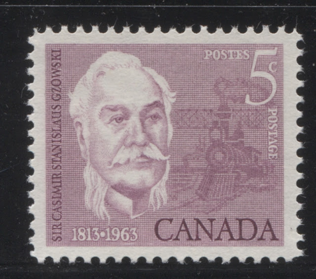
5c Rose lilac - Casimir Gzowski, Engineer, Soldier and Educator.
Designed by: Ephrum Phillip Weiss.
Engravers: Yves Baril (picture) and Donald Mitchell (lettering).
Issued: March 5, 1963.
27,820,000 stamps.
5c Deep ultramarine - Martin Frobisher, explorer.
Designed by: Ephrum Phillip Weiss.
Engravers: Yves Baril (picture) and Donald J. Mitchell (lettering).
Issued: August 21, 1963.
27,020,000 stamps.
5c Dark green and lake brown - First Overland Mail Route - 1763.
Designed by: Bernard James Reddie.
Engravers: Yves Baril (picture) and Allan Alexander Carswell (lettering).
Issued: September 25, 1963.
27,860,000 stamps.
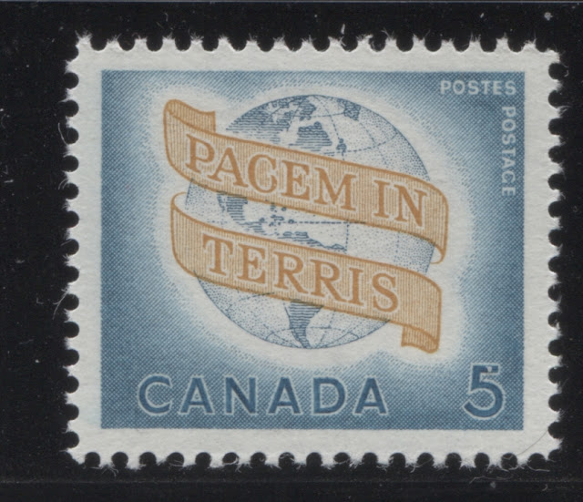
5c Greenish blue, Prussian blue and ochre - "Pacem in Terris" or "World Peace".
Designed by: Harvey Thomas Prosser.
Engraver: Allan Alexander Carswell.
Issued: April 8, 1964.
28,870,000 stamps.
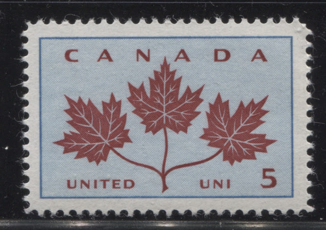
5c Light blue and carmine lake - maple leaf and unity.
Designed by Harvey Thomas Prosser.
Engravers: Yves Baril (picture) and Gordon Mash (lettering).
Issued: May 14, 1964.
36,870,000 stamps.
5c Red brown, buff and green - White Trillium & Ontario Arms.
Designed by: Harvey Thomas Prosser.
Engravers: Yves Baril (picture) and Gordon Mash (lettering).
Issued: June 30, 1964.
19,360,000 stamps.
5c Green, yellow and orange - White Garden Lily & Quebec arms.
Designed by: Harvey Thomas Prosser.
Engravers: Yves Baril (picture) and Gordon Mash (lettering).
Issued: June 30, 1964.
19,710,000 stamps.
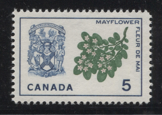
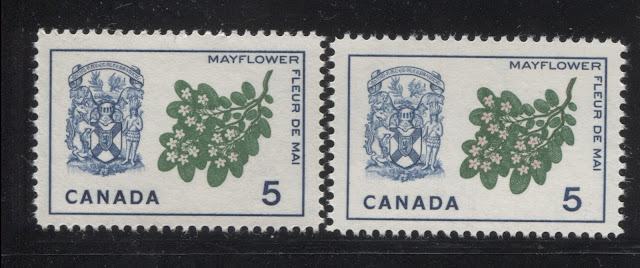
5c Blue, pink and green - Mayflower and Nova Scotia arms.
Designed by: Harvey Thomas Prosser.
Engravers: Yves Baril (picture) and Gordon Mash (lettering).
Issued: February 3, 1965.
18,360,000 stamps.
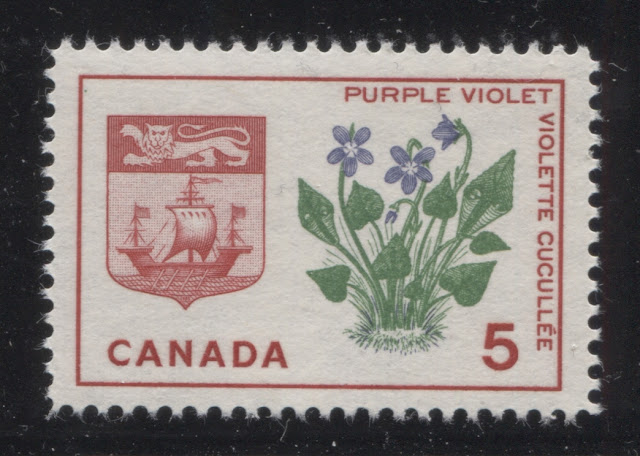
5c Carmine, green and violet - Purple Violet and New Brunswick arms.
Designed by: Harvey Thomas Prosser.
Engravers: Yves Baril (picture) and Gordon Mash (lettering).
Issued: February 3, 1965.
18,760,000 stamps.
5c Red brown, lilac and dull green - Prairie Crocus and Manitoba arms.
Designer: Thomas Harvey Prosser.
Engraver: Donald J. Mitchell.
Issued: April 28, 1965.
15,820,000 stamps.
5c Lilac, green and bistre - Dogwood and British Columbia arms.
Designer: Harvey Thomas Prosser.
Engraver: Donald J. Mitchell.
Issued: April 28, 1965.
17,360,000 stamps.
5c Violet, green and deep rose - Lady's Slipper and Prince Edward Island arms.
Designer: Harvey Thomas Prosser.
Engraver: Allan Alexander Carswell.
Issued: July 21, 1965.
26,510,000 stamps.
5c Sepia, orange and green - Prairie Lily and Saskatchewan arms.
Designer: Harvey Thomas Prosser.
Engraver: Allan Alexander Carswell.
Issued: January 19, 1966.
15,310,000 stamps.
5c Dull green, yellow and carmine - Wild Rose and Alberta arms.
Designed by: Harvey Thomas Prosser.
Engraver: Allan Alexander Carswell.
Issued: January 19, 1966.
16,160,000 stamps.
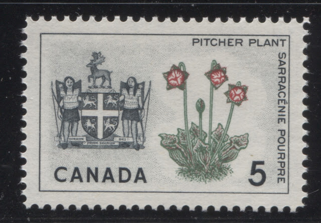
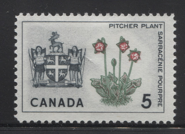
5c Black, green and carmine - Pitcher Plant and Newfoundland arms.
Designed by: Harvey Thomas Prosser.
Engravers: Yves Baril (picture) and Gordon Mash (lettering).
Issued: February 23, 1966.
25,660,000 stamps.
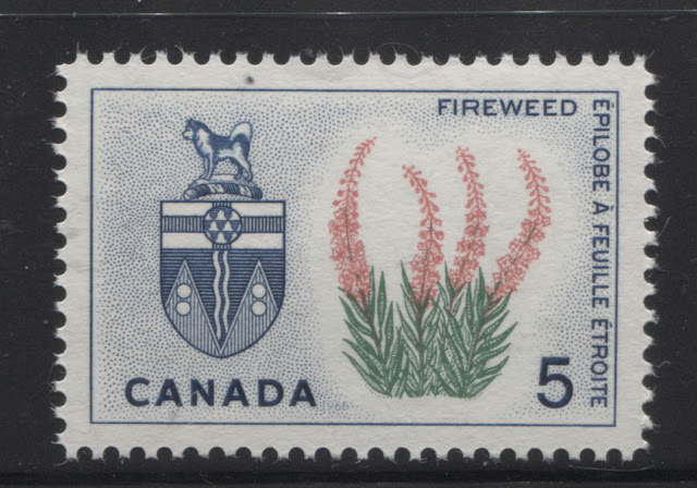
5c Dark blue, rose and green - Fireweed and Yukon arms.
Designed by: Harvey Thomas Prosser.
Engravers: Allan Alexander Carswell (picture) and Gordon Mash (lettering).
Issued: March 23, 1966.
15,110,000 stamps.
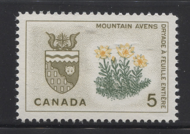
5c Bistre brown, yellow and dull green - Mountain Avens and Northwest Territories arms.
Designed by: Harvey Thomas Prosser.
Engravers: Allan Alexander Carswell (picture) and Gordon Mash (lettering).
Issued: March 23, 1966.
15,010,000 stamps.
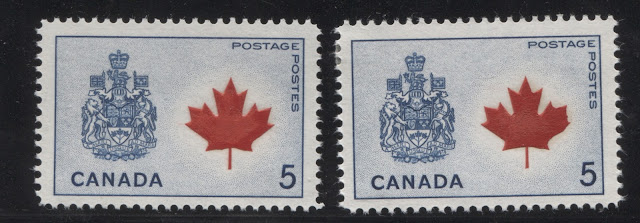
5c Dark blue and deep red - Maple Leaf and Canadian coat of arms.
Designed by: Harvey Thomas Prosser.
Engravers: Yves Baril (picture) and Allan Alexander Carswell (lettering).
Issued: June 30, 1966.
25,410,000 stamps.
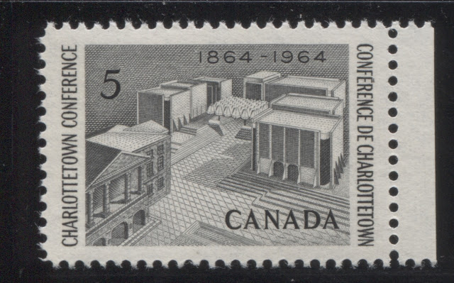
5c Grey black - Confederation Memorial - Charlottetown Conference - 1864.
Designed by: Harvey Thomas Prosser.
Engravers: Yves Baril (picture) and Donald J. Mitchell (lettering).
Issued: July 29, 1964.
29,310,000 stamps.
5c Dark brown and rose - Quebec Conference - 1864.
Designed by: Phillip Weiss.
Engravers: Yves Baril (picture) and Donald J. Mitchell (lettering).
Issued: September 9, 1964.
28,510,000 stamps.
5c Rose claret - Queen Elizabeth II - Royal Visit.
Designed by: Harvey Thomas Prosser.
Engravers: Yves Baril (picture) and Donald J. Mitchell (lettering).
Issued: October 5, 1964.
38,410,000 stamps.
3c Bright red - family and Star of Bethlehem.
Designed by: Harvey Thomas Prosser.
Engravers: Allan Alexander Carswell (picture) and Gordon Mash (lettering).
Issued: October 14, 1964.
247,200,000 untagged stamps.
10,400,000 Winnipeg tagged stamps.
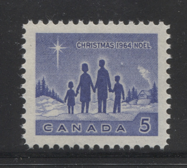
5c Bright ultramarine - family and Star of Bethlehem.
Designed by: Harvey Thomas Prosser.
Engravers: Allan Alexander Carswell (picture) and Gordon Mash (lettering).
Issued: October 14, 1964.
96,320,000 Untagged stamps.
6,200,000 Winnipeg tagged stamps.
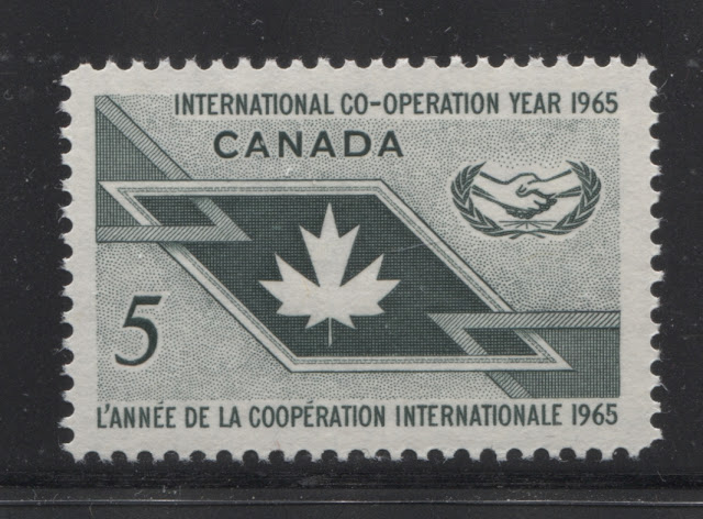
5c Slate green - International Co-operation Year Issue.
Designed by: Harvey Thomas Prosser.
Engravers: Yves Baril (picture) and Donald J Mitchell (lettering).
Issued: March 3, 1965.
26,660,000 stamps.
5c Prussian blue - Wilfred Grenfell - author and missionary.
Designed by: Harvey Thomas Prosser.
Engravers: Yves Baril (picture) and Gordon Mash (lettering).
Issued: June 9, 1965.
26,610,000 stamps.
5c Bright blue and red - adoption of the Canadian flag - 1965.
Designed by: Harvey Thomas Prosser.
Engravers: Allan Alexander Carswell (picture) and Gordon Mash (lettering).
Issued: June 30, 1965.
37,360,000 stamps.
5c Brown - Sir Winston Churchill.
Designed by: Philip Weiss, based on a portrait by Yousuf Karsh.
Issued: August 12, 1965.
35,000,000 stamps.
5c Slate green - Inter-parliamentary Union.
Designed by: Phillips-Gutkin & Associates.
Engravers: Allan Alexander Carswell (picture) and Gordon Mash (lettering).
Issued: September 8, 1965.
16,820,000 stamps.
5c Brown - centenary of Ottawa as the national capital.
Designed by: Gerald Trottier.
Engravers: Yves Baril (picture) and Gordon Mash (lettering).
Issued: September 8, 1965.
14,810,000 stamps.
3c Greyish olive - gifts from the Wise Men - 1965 Christmas.
Designed by: Helena Roberta Fitzgerald.
Engravers: Yves Baril (picture) and Donald J Mitchell (lettering).
Issued: October 13, 1965.
208,320,000 untagged stamps.
7,700,000 Winnipeg tagged stamps.
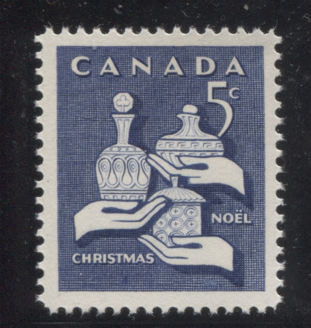
5c Violet blue - gifts from the Wise Men - 1965 Christmas
Designed by: Helena Roberta Fitzgerald.
Engravers: Yves Baril (picture) and Donald J Mitchell (lettering).
Issued: October 13, 1965.
92,920,000 untagged stamps.
4,000,000 Winnipeg tagged stamps.
5c Violet blue - Alouette II - first satellite launched in space by Canada.
Designed by: Harvey Thomas Prosser.
Engravers: Yves Baril (picture) and Donald J Mitchell (lettering).
Issued: January 5, 1966.
26,370,000 stamps.
5c Blue green - De La Salle - explorer.
Designed by: Leendert Verhoeven.
Engravers: Yves Baril (picture) and Donald J. Mitchell (lettering)
Issued: April 13, 1966.
25,160,000 stamps.
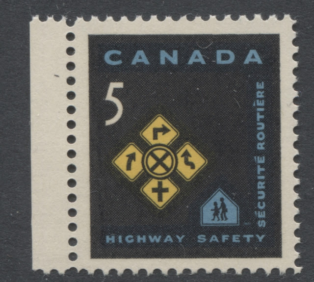
5c Black, blue and yellow - highway safety.
Designed by: Helena Roberta Fitzgerald.
Engravers: Yves Baril (picture) and Donald J. Mitchell (lettering).
Issued: May 2, 1966.
27,220,000 stamps.
5c Red brown - 1866 London Conference centenary.
Designed by: Paul Aleksander Pedersen.
Engravers: Yves Baril (picture) and Donald J Mitchell (lettering).
Issued: May 26, 1966.
25,130,000 stamps.
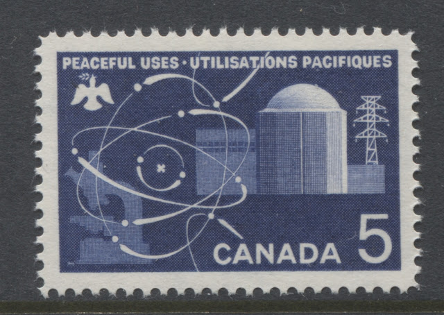
5c Deep ultramarine - atomic research issue.
Designed by: Allan L Pollock.
Engravers: Yves Baril (picture) and Donald J Mitchell (lettering).
Issued: July 27, 1966.
25,360,000 stamps.
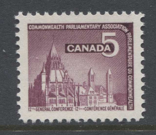
5c Plum - Commonwealth Parliamentary Association Meeting issue.
Designed by: Paul Aleksander Pedersen.
Engravers: Allan Alexander Carswell (picture) and Donald J. Mitchell (lettering).
Issued: September 8, 1966.
27,320,000 stamps.
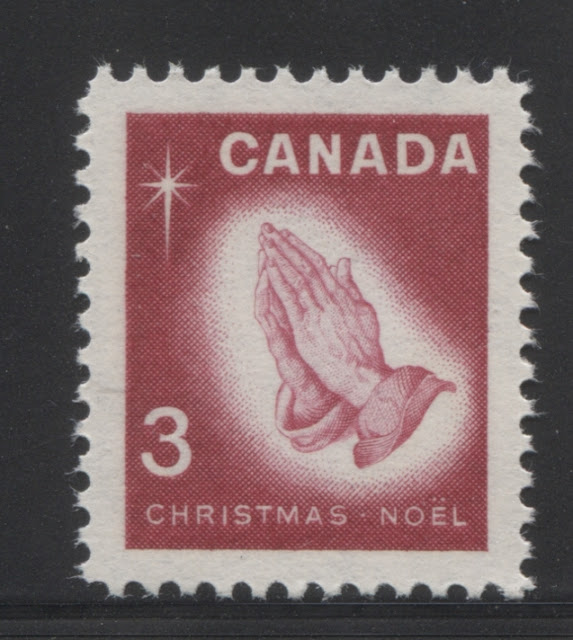
3c Deep carmine rose - Albrecht Durer's praying hands - 1966 Christmas.
Designed by: Geoffrey Holloway.
Engravers: Yves Baril (picture) and Gordon Mash (lettering).
Issued: October 12, 1966.
164,680,000 untaged stamps.
8,700,000 Winnipeg tagged stamps.
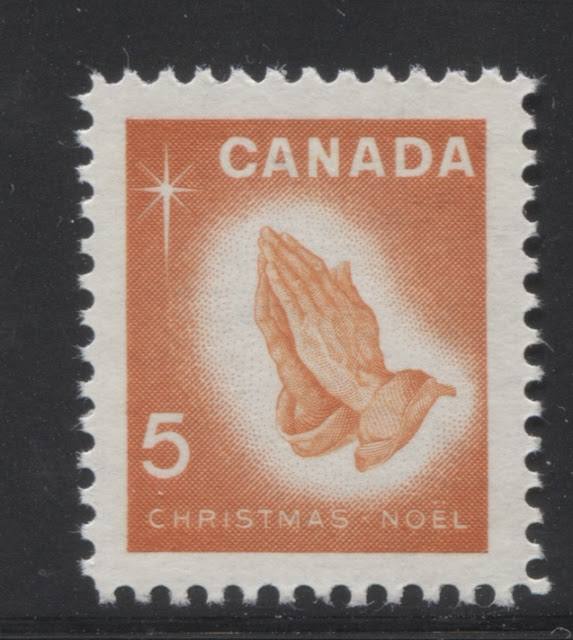
3c orange - Albrecht Durer's praying hands - 1966 Christmas.
Designed by: Geoffrey Holloway.
Engravers: Yves Baril (picture) and Gordon Mash (lettering).
Issued: October 12, 1966.
83,380,000 untaged stamps.
3,900,000 Winnipeg tagged stamps.
Points of Interest
The main points of interest for the commemorative issues of this period are:
1. Shade differences.
2. Paper varieties, including paper fluorescence.
3. Gum variations.
4. Winnipeg tagging varieties
5. Cello-paqs and miniature panes.
6. Perforation variations.
7. Aniline inks.
8. First Day Covers.
9. Constant plate varieties.
10. Cancellations and postal history.
11. Proof material.
I will now discuss each of these aspects in more detail. Please note that this post is a work in progress, as I have only just begun a detailed study of these stamps and there is still much to learn. Still, I have learned quite a lot about them so far, and this post will share that information with you.
Shade Differences
Despite no shade variations being listed in Unitrade, at all, there are actually quite a few subtle variations visible in most of the stamps issued during this period. In addition to being able to see variations in normal lighting conditions, there are also variations that only show up under long-wave ultraviolet light. I don't even pretend to assert that I have seen all that exists. However, what follows are some examples of the type of varieties that you can find with a keen eye and a little patience:
The shade variation on the Gzowski issue is quite subtle, but the colour varies in terms of how much rose there is in the rose-lilac colour versus the amount of lilac. The stamp on the left, is brighter and rosier than the one on the right, which contains more lilac.
This one might be a bit harder to see in this scan, but the light blue of the stamp on the left has a distinct greenish undertone that is completely missing from the stamp on the right. This particular stamp is one that shows quite a bit of variation in the ink colour under ultraviolet light.
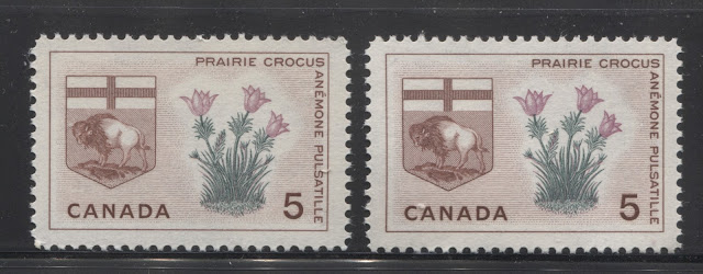
This Manitoba stamp shows very slight variations in the red brown and the lilac. Generally, the colours are both deeper and brighter in the stamp shown on the right.
Paper Varieties
Again, this is one aspect of these issues that Unitrade has only just begun to deal with, but for which there are clearly a considerable number of variations which are very worthwhile of serious study. The first of these, are variations in the reaction of the paper under ultraviolet light, otherwise known to collectors as paper fluorescence. Until the late 1980's there were no listed varieties of paper fluorescence on these issues. All of them were known to be only on what was termed "plain paper". However, in the intervening years, philatelists have found that many issues exist on paper that gives a low bluish white glow under ultraviolet light, with a number of fluorescent fibres embedded in the paper itself, that are generally brighter than the ambient fluorescence level of the paper. The brightness and number of these fibres varies considerably. I use the term sparse and very sparse to indicate instances where there are fibres visible over the entire surface of the stamp, but spread very far apart. I describe more intense concentrations of fibres as "low, medium and high density". Low density has fibres across the stamp surface, but reasonably large gaps in between fibres of 1-2 mm, so that you can clearly see all the individual fibres. On medium density, the fibres are beginning to merge together, but you can still see that there are lots of them. On high density concentrations, it almost appears as if the paper is one single bright fluorescence, but you can just see that there are a very large number of fibres that are giving the overall effect.
Unitrade does list fluorescent papers for all of the 1964-66 Emblems stamps now, at last, as well as the 1964 Christmas, and 1965 Flag issue. However, I have also found variations on the 1964 Quebec Conference Issue, 1965 ICY Issue, 1965 Grenfell Issue, and 1965 Ottawa Centenary issues.
In addition to the fluorescent papers, I have found one example of the Quebec White Garden Lily stamp on hibrite paper. It is used, but the uniformity and brightness of the paper has me convinced beyond reasonable doubt, that it is genuine and that more of these issues may exist thus, though they are extremely rare.
Finally, the plain, dull papers also come in very dull or dead varieties, that give deep brownish or deep violet reactions under ultraviolet light. I have come across these on most of the issues.
In addition, to paper fluorescence, there are also differences in the physical differences of the paper, such as:
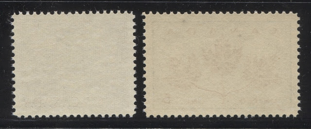
The Gzowski stamp on the left shows the very light vertical ribbing on the back that is commonly seen on the stamps of this period, and which we first saw on the 1958 Health issue. The Unity stamp on the right is printed on a vertical wove paper that shows no visible ribbing at all. As you can see there is a distinct difference in the colour of the gum as well, with the gum on the right stamp being a much deeper cream colour.
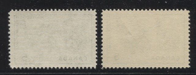
These are both examples of the Nova Scotia Emblems stamp, but they are clearly different from one another. The stamp on the left is on a much thinner paper that shows very clear vertical ribbing, while the ribbing on the right stamp is almost invisible, and the gum is a much deeper cream colour on the right stamp.
Gum Variations
I have already discussed some of the variations in the dextrine (dextrose) gum found on these issues, but there seems to be at least three types of dextrose gum found on these issues:
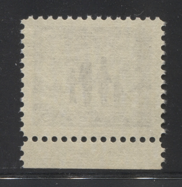
The stamp on the left is the 1966 Alouette II issue, and shows the smooth gum with the satin sheen. The second stamp from the right is the Highway Safety issue, showing the DAVAC gum. The third stamp from the left is the 1966 Atomic Research issue and shows an example of the typical streaky gum and finally the last stamp shows an example of the smooth, shiny cream gum.
Winnipeg Tagging Varieties.
The only issues from this period that exist with Winnipeg tagging are the three Christmas issues. As you can see from the issue quantities above, they are quite a lot scarcer than the regular, untagged stamps, especially in fine used condition. So, it is curious that they should list in Unitrade for prices that are so close to the other stamps.
As was the case with the Cameo issue, there was a considerable amount of experimentation done with respect to the amount of taggant to apply, as well as the width of the tag bars and the spacing between the bars. You can find examples where the tagging is so lightly applied as to be almost invisible to the naked eye, while on other stamps, it is applied so heavily that the bands appear dark yellow. Unitrade does not differentiate between any of these types of varieties, but I believe that they do have some significance. On the 1964 Christmas Issue, Unitrade does list margin pairs and blocks that show wide and narrow tagging bars side-by-side. On these, the tag bars on the outside of the pane were generally wider than those on the inside.
Cello-paqs and Miniature Panes
The 3c stamps from all three of the Christmas issues released during this period were made available to the public in Cello-paqs that consisted of two panes of 25 stamps each, for a total of 50 stamps. These sold for $1.50 each. They were made available in both untagged and Winnipeg tagged versions, with the tagged panes being quite a bit scarcer than the untagged panes.
Perforation Varieties
I wrote before, in my posts about the issues from 1960-1962 how the Canadian Bank Note Company had begun to use new perforating machines that had a gauge of 11.85 instead of the earlier 11.95 that appears to have been introduced sometime in the 1950's. According to Unitrade, it is only issues up to this point that can be found with both gauges and with compounds of both gauges. However, I have found many issues from this period that exist with up to 4 different perforations: 11.85 x 11.85, 11.95 x 11.95, 11.85 x 11.95 and 11.95 x 11.85. It does appear that by 1965, the most common perforation is 11.85 x 11.85. However, given that I have found all of these variations on the last stamps from the 1964-66 Provincial Emblems issue, which were issued in 1966, it seems as though most, if not all these stamps could potentially exist with all four measurements. I will, as I study these in more detail, update this post to include a listing of all the measurements I have found.
Aniline Inks
As was the case with the issues of the 1950's and the 5c Cameo issue, the stamps of this period that were printed with the blue inks are sometimes found with aniline ink. These are generally quite scarce, and if you look closely at them, you may see that it is not just the ink that is different, but the paper as well.
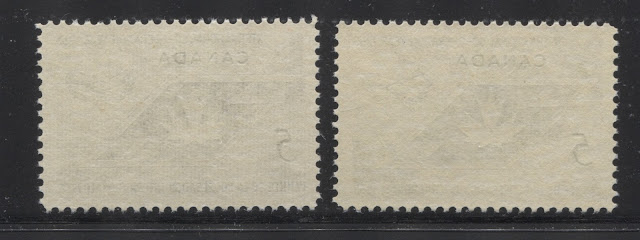
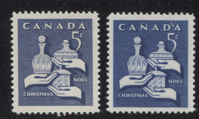
The above two scans show an example of the aniline ink on the 5c violet blue 1965 Christmas issue, from both the back and the front. When you compare the back of the normal stamp and the one printed with aniline ink, you can see that on the normal stamp, the mesh is visible in the paper, but you can't really see the design through the back. However on the stamp printed using aniline ink, you can clearly see the design through the back of the stamp. Also, the colour on the surface of the stamp appears brighter and highly suffused.
In addition to the above stamp, I have seen this variety on the 1966 Alouette II issue and the 1966 Atomic Research issue, but have yet to find it on any of the other stamps, or in any colour other than blue.
First Day Covers
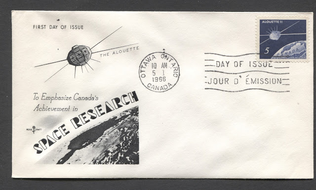
There are a very large number of first day covers that can be collected from this period. The main way in which they are usually collected is by the cachet that appears on the cover. There were a very large number of private cachet makers operating during this period, and they produced their own hand painted or thermographed cachets, many of which are highly desirable and worth quite a lot more than the standard $2 that Unitrade values the more common Art Craft or Rose Craft cachets at.
For the Art Craft Cachets, I have noted that Art Craft generally would produce a specific cachet for the issue in question, but then they would recycle a whole series of generic cachets that were used for several different issues. There were 4 or 5 of these that appeared with great regularity on all the issues. The same applies to the Rosecraft cachets. So with a single stamp cover, it is possible to have over 10 different cachets, just for Art Craft and Rose Craft alone. In fact, that with all cachet makers taken together, and with pairs and blocks on cover, it is possible to collect over 100 first day covers for each of these 39 stamps. That is close to 4000 covers!
In addition to differences in the cachet, it is possible to get the covers cancelled in different cities other than Ottawa, where the majority of them will have come from. Finally, there may be differences in the paper fluorescence of the envelopes used for the covers. This may be of interest, given that the first day covers were often a standardized item.
Constant Plate Varieties
The 1964-1966 Provincial Emblems Issue has a number of stamps for which constant plate flaws have been found. The term "constant" simply means that the variety in question is found in the same position (the same stamp) on every single pane printed. It is their constant nature that makes them interesting to philatelists. Up until very recently, only the Newfoundland stamp had any listed flaws, and it was called the "broken stamen" on the flower. However, in recent years, a larger and larger number of varieties have been discovered and are now listed in Unitrade:
1. New Brunswick with the purple flowers doubled - all positions.
2. Manitoba with a small dot on the top left tip of the middle crocus, from position 48.
3. Manitoba with the lilac flowers double printed.
4. Prince Edward Island with a small dot to the left of the upper left leaf, called "green leaf pollen" from position 37.
5. Saskatchewan with a broken leaf on the stem of the left flower, from position 9.
6. Saskatchewan with a small dot nest to the second leaf from the top on the left side of the right flower, called "green pollen" from position 25.
7. Saskatchewan with a small dot just to the left of the stem of the left flower, at the top, called "stem pollen flaw", from position 30.
8. Newfoundland with the broken stamen, of which there are four different types, from positions 13, 37, 39 or 41.
9. Newfoundland with the red double printed, from all positions.
10. Yukon, with a large dot on one of the flowers about mid-way up on the second stalk from the right. This has been nicknamed the "dropping flower blossom", and is from position 30.
12. Northwest Territories with a small green dot at the top of the middle flower. This is called the "little bee in flower" and is from position 29.
13. Canada coat of arms with the right side of the maple leaf distorted. This is called the deformed leaf, variety and is not constant.
14. A number of colour shifts result in some of the flower parts appearing to be detached from the stems. These occur on all positions of the affected sheets of course. One example is the "floating rose" on the Alberta stamp.
The 1966 La Salle issue is known with a cracked plate variety, in which there is a vertical line through the right inscription.
I only have a few examples of these varieties to illustrate here, but I will add more through updates as more of them come to my attention:
Here is an example of the "floating rose", which I believe is listed in the Darnell catalogue, but is not listed in Unitrade, because Unitirade's policy is not to list colour shifts. It results from the red being shifted upwards, and it appears as though the flowers are detached from the stems.
Here is the normal stamp that clearly shows the flowers being attached to the stems.
Cancellations and Postal History
As with all periods in Canadian philately, this one lends itself out greatly to the collecting of small town CDS postmarks. Most of the stamps from this period are the larger format horizontal stamps, which makes them very good for collecting cancels, as there is enough surface area to get the full cancellation. There are thousands of post offices in all the larger provinces, so there are literally tens of thousands of collectible stamps. These can still be purchased in bundles for very little money.
Covers also offer a very satisfying field, with many, many possibilities. The most common usages of these stamps will all be single domestic usages. However, multiple issues used on foreign airmail or registered covers are not common and will offer a patient collector a real challenge. Also, you can focus on covers from smaller towns, or from defunct towns or closed post offices.
Proof Material
The BNA proofs website does not have a single example of a proof from this time period, nor can I recall any instance of a proof from these issues being offered for sale at a public auction. It seems to me that these must exist somewhere other than the postal archives. However, it is entirely possible that none of the existing proofs are currently in private hands. However, with a patient search, you may be fortunate enough to find some.
That brings me to the end of my discussion of the pre-centennial period commemoratives. It is another example of a period in Canadian philately that seems extremely simple on the surface, but for which quite a lot of scope is possible. Next week I will begin coverage of the 1967-1973 Centennial Issue. This is an extremely complicated issue that will require a series of overview posts, followed by a separate post for each value in the set, for the low values and then a post for the high values and the coil stamps.
7. Aniline inks.
8. First Day Covers.
9. Constant plate varieties.
10. Cancellations and postal history.
11. Proof material.
I will now discuss each of these aspects in more detail. Please note that this post is a work in progress, as I have only just begun a detailed study of these stamps and there is still much to learn. Still, I have learned quite a lot about them so far, and this post will share that information with you.
Shade Differences
Despite no shade variations being listed in Unitrade, at all, there are actually quite a few subtle variations visible in most of the stamps issued during this period. In addition to being able to see variations in normal lighting conditions, there are also variations that only show up under long-wave ultraviolet light. I don't even pretend to assert that I have seen all that exists. However, what follows are some examples of the type of varieties that you can find with a keen eye and a little patience:
The shade variation on the Gzowski issue is quite subtle, but the colour varies in terms of how much rose there is in the rose-lilac colour versus the amount of lilac. The stamp on the left, is brighter and rosier than the one on the right, which contains more lilac.
On the Frobisher issue, there are some stamps which are a deeper, duller ultramarine, compared to a deep bright ultramarine. The stamp on the left is the deeper, duller shade, while the one on the right is the deep, bright shade.
This one might be a bit harder to see in this scan, but the light blue of the stamp on the left has a distinct greenish undertone that is completely missing from the stamp on the right. This particular stamp is one that shows quite a bit of variation in the ink colour under ultraviolet light.
On this Provincial Emblems issue stamp, there is some variation in the red-brown, though it is quite difficult to see in the scan. However, the variation in the intensity and brightness of the green is quite obvious.
On the Nova Scotia stamp shown above, there seems to be quite a bit of variation in the pink of the Mayflower, with almost no pink visible in the flowers on the left, while the stamp on the right shows clear pink.
This Manitoba stamp shows very slight variations in the red brown and the lilac. Generally, the colours are both deeper and brighter in the stamp shown on the right.
Again, the variation in the brightness and intensity of the green colour is hard to miss on the British Columbia stamp shown above.
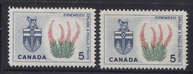
On the 1966 Yukon stamp, the main colour that shows clear variation is the rose, which is deeper on the right hand stamp.
On the 1966 Northwest Territories stamp, all three colours show some variation, though the most obvious is the green. The colours on the left hand stamp are all deeper than the colours of the stamp on the right.
Paper Varieties
Again, this is one aspect of these issues that Unitrade has only just begun to deal with, but for which there are clearly a considerable number of variations which are very worthwhile of serious study. The first of these, are variations in the reaction of the paper under ultraviolet light, otherwise known to collectors as paper fluorescence. Until the late 1980's there were no listed varieties of paper fluorescence on these issues. All of them were known to be only on what was termed "plain paper". However, in the intervening years, philatelists have found that many issues exist on paper that gives a low bluish white glow under ultraviolet light, with a number of fluorescent fibres embedded in the paper itself, that are generally brighter than the ambient fluorescence level of the paper. The brightness and number of these fibres varies considerably. I use the term sparse and very sparse to indicate instances where there are fibres visible over the entire surface of the stamp, but spread very far apart. I describe more intense concentrations of fibres as "low, medium and high density". Low density has fibres across the stamp surface, but reasonably large gaps in between fibres of 1-2 mm, so that you can clearly see all the individual fibres. On medium density, the fibres are beginning to merge together, but you can still see that there are lots of them. On high density concentrations, it almost appears as if the paper is one single bright fluorescence, but you can just see that there are a very large number of fibres that are giving the overall effect.
Unitrade does list fluorescent papers for all of the 1964-66 Emblems stamps now, at last, as well as the 1964 Christmas, and 1965 Flag issue. However, I have also found variations on the 1964 Quebec Conference Issue, 1965 ICY Issue, 1965 Grenfell Issue, and 1965 Ottawa Centenary issues.
In addition to the fluorescent papers, I have found one example of the Quebec White Garden Lily stamp on hibrite paper. It is used, but the uniformity and brightness of the paper has me convinced beyond reasonable doubt, that it is genuine and that more of these issues may exist thus, though they are extremely rare.
Finally, the plain, dull papers also come in very dull or dead varieties, that give deep brownish or deep violet reactions under ultraviolet light. I have come across these on most of the issues.
In addition, to paper fluorescence, there are also differences in the physical differences of the paper, such as:
- Thickness
- Direction of the weave and appearance of ribbing.
- The degree of surface porosity under magnification on the printed side.
The most common papers by far, are horizontal wove papers that show clear vertical ribbing on the back. The thickness of these papers and the degree to which the ribbing is visible varies considerably as well, with some thin papers showing the design clearly through the back, with clear ribbing, while other stamps barely show either the design, or the ribbing through the back. However, there are some papers that do not show this ribbing, and are actually vertical, rather than horizontal wove papers. Another paper is a vertical wove that shows horizontal ribbing, and is found on the 1964 Christmas issue and 1965 Churchill issue. Finally, some of the papers appear very porous on the surface under magnification, with many spots of uneven thickness, while other papers show very little surface porosity, as though they have been coated with some substance. Often, these papers are the ones that give the dullest reaction under ultraviolet light.
The following scans illustrate some of these differences, none of which are currently listed in Unitrade:
The Gzowski stamp on the left shows the very light vertical ribbing on the back that is commonly seen on the stamps of this period, and which we first saw on the 1958 Health issue. The Unity stamp on the right is printed on a vertical wove paper that shows no visible ribbing at all. As you can see there is a distinct difference in the colour of the gum as well, with the gum on the right stamp being a much deeper cream colour.
These are both examples of the Nova Scotia Emblems stamp, but they are clearly different from one another. The stamp on the left is on a much thinner paper that shows very clear vertical ribbing, while the ribbing on the right stamp is almost invisible, and the gum is a much deeper cream colour on the right stamp.
Here is an example of the 1964 Christmas stamp on the vertical wove paper with the horizontal ribbing. This illustrates quite nicely the fact that these differences are not merely due to the way the paper was fed into the press, because the ribbing on this, were you to rotate the stamp does not look anything like the vertical ribbing on the other stamps, which would be the case, if that were true.
These two stamps are the 1965 ICY Issue. The left stamps is the normal, horizontal wove paper with the clear vertical ribbing, while the stamp on the right is a vertical wove paper that is quite porous on the surface, and which has a dextrine gum that is quite satin in appearance, compared to the normal semi-gloss sheen.
Gum Variations
I have already discussed some of the variations in the dextrine (dextrose) gum found on these issues, but there seems to be at least three types of dextrose gum found on these issues:
- There is a streaky, off white dextrose gum that has a semi-gloss sheen, which shows uneven spots of application.
- There is a deep cream dextrose that is smooth and quite shiny in appearance.
- There is a deep cream dextrose that is smooth, but has a satin sheen rather than a semi-gloss, or glossy sheen.
In addition to the dextrine (dextrose) gum though, there was another type of gum, DAVAC, which was only every used on one more issue: the 1967 Centennial commemorative issue. This type of gum had a very light yellowish tinge, but was completely matte and invisible, so much so, that at first glance, it looks like the stamps have no gum. It has good adhesive qualities, and will not stick unless fully moistened, so its use would help prevent stamps from sticking together while stored. So the reason for its discontinuance is not entirely clear, though I suspect that has to do with the fact that it was invisible, and the public probably thought that the stamps had no gum. It was used on the 1966 Highway Safety Issue, which to my knowledge does not exist with regular dextrine gum.
The scan below shows some of these differences in gum:
The stamp on the left is the 1966 Alouette II issue, and shows the smooth gum with the satin sheen. The second stamp from the right is the Highway Safety issue, showing the DAVAC gum. The third stamp from the left is the 1966 Atomic Research issue and shows an example of the typical streaky gum and finally the last stamp shows an example of the smooth, shiny cream gum.
Winnipeg Tagging Varieties.
The only issues from this period that exist with Winnipeg tagging are the three Christmas issues. As you can see from the issue quantities above, they are quite a lot scarcer than the regular, untagged stamps, especially in fine used condition. So, it is curious that they should list in Unitrade for prices that are so close to the other stamps.
As was the case with the Cameo issue, there was a considerable amount of experimentation done with respect to the amount of taggant to apply, as well as the width of the tag bars and the spacing between the bars. You can find examples where the tagging is so lightly applied as to be almost invisible to the naked eye, while on other stamps, it is applied so heavily that the bands appear dark yellow. Unitrade does not differentiate between any of these types of varieties, but I believe that they do have some significance. On the 1964 Christmas Issue, Unitrade does list margin pairs and blocks that show wide and narrow tagging bars side-by-side. On these, the tag bars on the outside of the pane were generally wider than those on the inside.
Cello-paqs and Miniature Panes
The 3c stamps from all three of the Christmas issues released during this period were made available to the public in Cello-paqs that consisted of two panes of 25 stamps each, for a total of 50 stamps. These sold for $1.50 each. They were made available in both untagged and Winnipeg tagged versions, with the tagged panes being quite a bit scarcer than the untagged panes.
Perforation Varieties
I wrote before, in my posts about the issues from 1960-1962 how the Canadian Bank Note Company had begun to use new perforating machines that had a gauge of 11.85 instead of the earlier 11.95 that appears to have been introduced sometime in the 1950's. According to Unitrade, it is only issues up to this point that can be found with both gauges and with compounds of both gauges. However, I have found many issues from this period that exist with up to 4 different perforations: 11.85 x 11.85, 11.95 x 11.95, 11.85 x 11.95 and 11.95 x 11.85. It does appear that by 1965, the most common perforation is 11.85 x 11.85. However, given that I have found all of these variations on the last stamps from the 1964-66 Provincial Emblems issue, which were issued in 1966, it seems as though most, if not all these stamps could potentially exist with all four measurements. I will, as I study these in more detail, update this post to include a listing of all the measurements I have found.
Aniline Inks
As was the case with the issues of the 1950's and the 5c Cameo issue, the stamps of this period that were printed with the blue inks are sometimes found with aniline ink. These are generally quite scarce, and if you look closely at them, you may see that it is not just the ink that is different, but the paper as well.
The above two scans show an example of the aniline ink on the 5c violet blue 1965 Christmas issue, from both the back and the front. When you compare the back of the normal stamp and the one printed with aniline ink, you can see that on the normal stamp, the mesh is visible in the paper, but you can't really see the design through the back. However on the stamp printed using aniline ink, you can clearly see the design through the back of the stamp. Also, the colour on the surface of the stamp appears brighter and highly suffused.
In addition to the above stamp, I have seen this variety on the 1966 Alouette II issue and the 1966 Atomic Research issue, but have yet to find it on any of the other stamps, or in any colour other than blue.
First Day Covers
There are a very large number of first day covers that can be collected from this period. The main way in which they are usually collected is by the cachet that appears on the cover. There were a very large number of private cachet makers operating during this period, and they produced their own hand painted or thermographed cachets, many of which are highly desirable and worth quite a lot more than the standard $2 that Unitrade values the more common Art Craft or Rose Craft cachets at.
For the Art Craft Cachets, I have noted that Art Craft generally would produce a specific cachet for the issue in question, but then they would recycle a whole series of generic cachets that were used for several different issues. There were 4 or 5 of these that appeared with great regularity on all the issues. The same applies to the Rosecraft cachets. So with a single stamp cover, it is possible to have over 10 different cachets, just for Art Craft and Rose Craft alone. In fact, that with all cachet makers taken together, and with pairs and blocks on cover, it is possible to collect over 100 first day covers for each of these 39 stamps. That is close to 4000 covers!
In addition to differences in the cachet, it is possible to get the covers cancelled in different cities other than Ottawa, where the majority of them will have come from. Finally, there may be differences in the paper fluorescence of the envelopes used for the covers. This may be of interest, given that the first day covers were often a standardized item.
Constant Plate Varieties
The 1964-1966 Provincial Emblems Issue has a number of stamps for which constant plate flaws have been found. The term "constant" simply means that the variety in question is found in the same position (the same stamp) on every single pane printed. It is their constant nature that makes them interesting to philatelists. Up until very recently, only the Newfoundland stamp had any listed flaws, and it was called the "broken stamen" on the flower. However, in recent years, a larger and larger number of varieties have been discovered and are now listed in Unitrade:
1. New Brunswick with the purple flowers doubled - all positions.
2. Manitoba with a small dot on the top left tip of the middle crocus, from position 48.
3. Manitoba with the lilac flowers double printed.
4. Prince Edward Island with a small dot to the left of the upper left leaf, called "green leaf pollen" from position 37.
5. Saskatchewan with a broken leaf on the stem of the left flower, from position 9.
6. Saskatchewan with a small dot nest to the second leaf from the top on the left side of the right flower, called "green pollen" from position 25.
7. Saskatchewan with a small dot just to the left of the stem of the left flower, at the top, called "stem pollen flaw", from position 30.
8. Newfoundland with the broken stamen, of which there are four different types, from positions 13, 37, 39 or 41.
9. Newfoundland with the red double printed, from all positions.
10. Yukon, with a large dot on one of the flowers about mid-way up on the second stalk from the right. This has been nicknamed the "dropping flower blossom", and is from position 30.
12. Northwest Territories with a small green dot at the top of the middle flower. This is called the "little bee in flower" and is from position 29.
13. Canada coat of arms with the right side of the maple leaf distorted. This is called the deformed leaf, variety and is not constant.
14. A number of colour shifts result in some of the flower parts appearing to be detached from the stems. These occur on all positions of the affected sheets of course. One example is the "floating rose" on the Alberta stamp.
The 1966 La Salle issue is known with a cracked plate variety, in which there is a vertical line through the right inscription.
I only have a few examples of these varieties to illustrate here, but I will add more through updates as more of them come to my attention:
There is an example of the "dot on crocus" variety.
Here is an example of the "floating rose", which I believe is listed in the Darnell catalogue, but is not listed in Unitrade, because Unitirade's policy is not to list colour shifts. It results from the red being shifted upwards, and it appears as though the flowers are detached from the stems.
Here is the normal stamp that clearly shows the flowers being attached to the stems.
Here is an example of the more common of the broken stamen varieties. You can see it as a break in the angled red line at the bottom right of the flower at the right.
Here is an example of the deformed leaf variety. This is an over-inking variety. If you look at the normal stamp on the left, the lines and edges of the maple leaf are sharp and the right part of the leaf is deeply notched. On the right stamp, the deep notch at the right of the leaf is gone, and the leaf almost has a swollen look about it.
Cancellations and Postal History
As with all periods in Canadian philately, this one lends itself out greatly to the collecting of small town CDS postmarks. Most of the stamps from this period are the larger format horizontal stamps, which makes them very good for collecting cancels, as there is enough surface area to get the full cancellation. There are thousands of post offices in all the larger provinces, so there are literally tens of thousands of collectible stamps. These can still be purchased in bundles for very little money.
Covers also offer a very satisfying field, with many, many possibilities. The most common usages of these stamps will all be single domestic usages. However, multiple issues used on foreign airmail or registered covers are not common and will offer a patient collector a real challenge. Also, you can focus on covers from smaller towns, or from defunct towns or closed post offices.
Proof Material
The BNA proofs website does not have a single example of a proof from this time period, nor can I recall any instance of a proof from these issues being offered for sale at a public auction. It seems to me that these must exist somewhere other than the postal archives. However, it is entirely possible that none of the existing proofs are currently in private hands. However, with a patient search, you may be fortunate enough to find some.
That brings me to the end of my discussion of the pre-centennial period commemoratives. It is another example of a period in Canadian philately that seems extremely simple on the surface, but for which quite a lot of scope is possible. Next week I will begin coverage of the 1967-1973 Centennial Issue. This is an extremely complicated issue that will require a series of overview posts, followed by a separate post for each value in the set, for the low values and then a post for the high values and the coil stamps.
