
Today's post will explore the 25 commemorative issues that were released between 1958 and 1962. Unlike the previous period, there were no multi-year series produced. All 25 stamps were individual, stand-alone issues.
During this period we begin to see the dominance of bi-colour printing over monocolour, with 15 of the 25 issues being bicoloured. This period also features one of Canada's rarest stamps: the famous Inverted Seaway, of which a mere 400 were printed. This occurred when two full sheets were accidentally fed into the presses on the second run upside down, resulting in the famous inverted centre. It was overlooked by quality control inspection due to the very symmetrical nature of the design.
There were a few notable aspects of production that differed from previous periods as well. During this period we see the appearance of an intermediate sized stamp that is about half way between the larger, horizontal format commemoratives and the smaller stamps. It's vertical counterpart appeared with the 1957 Royal Visit issue, but the same dimensions in a horizontal format did not appear until 1958. It would prove to be a popular size for a stamp, remaining in general use until the end of 1967, when stamp sizes were changed from Imperial measurements to metric sizes. This period also saw several changes in the paper and gum used to produce the stamps, with ribbed, thick vertical wove paper giving way to a softer, horizontal wove paper that would come to dominate Canadian stamp production throughout most of the 1960's. Finally, the Canadian Bank Note Company added a new perforator to its roster of equipment during this period. This perforator had a gauge of 11.85, which was different from the 11.95 gauge that had been standard up to this point. Consequently, it is possible to find these issues with different perforations for those who are so inclined. It is during this period also that plate blocks were briefly discontinued in 1958, and when the use of order numbers was discontinued as well.
All of the issues were printed by the Canadian Bank Note Company, as before, with the smaller size and the intermediate sized stamps being printed in sheets of 400 that were divided into four post office panes of 100, up until 1962. The larger, horizontal format commemoratives were printed in sheets of 200 that were divided into four post office panes of 50. Starting in 1962, the CBN began to print the larger stamps in six panes of 50, for a total sheet size of 300. Thus, the outer four panes would contain the plate blocks, while the inner 2 panes would have very narrow, blank selvage, once the panes were cut apart.
Silas Robert Allen, the venerable engraver employed by the CBN who had figured so prominently in Canadian stamp production since the late 1920's has now been replaced by Yves Baril, who engraved many of the vignettes and both John and Gordon Mash, who engraved many of the inscriptions. Two more names make their appearance during this period into the group of engravers who worked for the Canadian Bank Note Company: Donald J Mitchell, who engraved several of the issues, and Allan Alexander Carswell, who engraved the portrait of Lord Selkirk on the 1962 Red River Settlement Issue.
This period also saw the a diverse group of of stamp designers who designed several issues, and some of whom went on to design many more of Canada's stamps. Allan Pollock, whose first stamp was the 1953 Textile Industry definitive features quite prominently during this period, as does Harvey Thomas Prosser, who went on to design many of the stamps from the 1960's. Herman Herbert Schwartz and Emmanuel Otto Hahn have left the stamp designing scene at this point, having presumably retired. Other designers who were involved in more than one stamp design included:
Like the previous issues, it is my opinion that these have been quite neglected by philatelists, who feel that they offer little of interest to the specialist. Again, I would disagree. The perforation changes offer up a very fertile field for further study, and although the first reported fluorescent papers do not appear until 1962, I believe that it may be possible that some of the earlier issues exist with this type of paper as well. Colour shifts that are other than trival are another aspect that I believe could be of interest, as multi-colour printing was in its infancy, and the shifts could potentially tell the story about some of the trials and tribulations that the CBN experienced in producing multi-colour stamps with perfectly aligned designs. As with the prior period, aniline inks can be found with many of the blue inks as well, and these are challenging to find. This period does also feature some good shades that can be found on most of the stamps up to the end of 1959. After that, there are very few shade varieties that I have come across with the 1961 Arthur Meighen stamp being really the only one I can think of, and even then the variation of the blue on this stamp is quite subtle.
Of course, with the inclusion of the inverted seaway, a specialist can challenge himself or herself with the acquisition of a mint single, a used single, a cover, or all three of these items. Also, this is the first period that we begin to see major errors cropping up regularly, and there are several other than just the Inverted Seaway that are very challenging to find, or unique, as far as anyone knows. Add in the proof material from this period, which is exceedingly rare, and you can easily form a collection that can take a lifetime to assemble.
The Stamp Designs, Quantities, Dates of Issue, Designers and Engravers

The points of interest for these stamps is much the same as for the previous commemorative issues:
Here the bistre colour does not show, much if any variation, but the red shows quite a bit of variation, with the stamp on the left having a carmine-red refinery, whereas the right stamp shows the refinery printed in a colour much closer to scarlet.
The basic colour for the blue of this issue is deep ultramarine, which is shown on the right hand stamp. That's the most common shade. However, you can find a deep violet blue that is quite scarce, and shown on the stamp in the middle. The stamp on the left is the aniline ink, which is a very bright and deep ultramarine. Again, this ink is much scarcer than the regular ultramarine, and I would expect that a mint example would be worth $20-$40 depending on condition, and used would be $5-$10. This is quite a lot more than the 10-25 cents that the regular stamps are usually worth.

If you look very carefully at the scan, you can clearly see the horizontal ribbing, but the gum looks much smoother, and not quite as yellowish. This paper and gum was used on most of the issues of this period, including:

 Looking at the back, you can see that the paper is smooth, without any visible mesh or ribbing. The gum is slightly streaky, as the scan shows, and the sheen is a satin sheen.
The sixth paper type is the visibly horizontally ribbed vertical wove paper that was so predominant during the 1950's. This paper has a clearly ribbed surface, both on the front, and on the back. The gum is much less yellowish than the gum of the 1950's and it is generally smooth, with either a satin or a semi-gloss sheen. The scan below shows the appearance of this paper from the front:
Position Dots


Careful examination of a number of the stamps in my stock has turned up a number of plate flaws. I do not know whether these are constant or not, and further study would be required to esablish their nature. However, regardless of whether they are random or constant, they are still an interesting aspect to these issues, largely because they don't occur on very many stamps. The print quality of these issues was generally very high, so you usually have to look through quite a large quantity of stamps to find even a minor design flaw. However, if you are patient enough, your patience is usually rewarded.
The scans below show some of the flaws that I have encountered on these issues so far:
Here the shift is in the vertical placement of the Indians fighting in the background. If you look at the left stamp inside the open part of the "C" of Canada, and the lower part of the "5", and you will see that:
Proof Material
To access the scanned images of an item, hover your mouse over the white rectangles on the side of the screen and you will see that the rectangle is a clickable link that will take you through to the image of the particular item in question.
In theory there should be a lot more material in existence. Because the engraving was done by Yves Baril and Donald J Mitchell, or Yves Baril and John Mash, or Gordon Mash, there should exist separate die proofs of just the vignette, or just the lettering. There would also very likely exist sketches of the same design elements. This should all exist in addition to the essays of the completed designs and die proofs of the completed designs.
First Day Covers
During this period we begin to see the dominance of bi-colour printing over monocolour, with 15 of the 25 issues being bicoloured. This period also features one of Canada's rarest stamps: the famous Inverted Seaway, of which a mere 400 were printed. This occurred when two full sheets were accidentally fed into the presses on the second run upside down, resulting in the famous inverted centre. It was overlooked by quality control inspection due to the very symmetrical nature of the design.
There were a few notable aspects of production that differed from previous periods as well. During this period we see the appearance of an intermediate sized stamp that is about half way between the larger, horizontal format commemoratives and the smaller stamps. It's vertical counterpart appeared with the 1957 Royal Visit issue, but the same dimensions in a horizontal format did not appear until 1958. It would prove to be a popular size for a stamp, remaining in general use until the end of 1967, when stamp sizes were changed from Imperial measurements to metric sizes. This period also saw several changes in the paper and gum used to produce the stamps, with ribbed, thick vertical wove paper giving way to a softer, horizontal wove paper that would come to dominate Canadian stamp production throughout most of the 1960's. Finally, the Canadian Bank Note Company added a new perforator to its roster of equipment during this period. This perforator had a gauge of 11.85, which was different from the 11.95 gauge that had been standard up to this point. Consequently, it is possible to find these issues with different perforations for those who are so inclined. It is during this period also that plate blocks were briefly discontinued in 1958, and when the use of order numbers was discontinued as well.
All of the issues were printed by the Canadian Bank Note Company, as before, with the smaller size and the intermediate sized stamps being printed in sheets of 400 that were divided into four post office panes of 100, up until 1962. The larger, horizontal format commemoratives were printed in sheets of 200 that were divided into four post office panes of 50. Starting in 1962, the CBN began to print the larger stamps in six panes of 50, for a total sheet size of 300. Thus, the outer four panes would contain the plate blocks, while the inner 2 panes would have very narrow, blank selvage, once the panes were cut apart.
Silas Robert Allen, the venerable engraver employed by the CBN who had figured so prominently in Canadian stamp production since the late 1920's has now been replaced by Yves Baril, who engraved many of the vignettes and both John and Gordon Mash, who engraved many of the inscriptions. Two more names make their appearance during this period into the group of engravers who worked for the Canadian Bank Note Company: Donald J Mitchell, who engraved several of the issues, and Allan Alexander Carswell, who engraved the portrait of Lord Selkirk on the 1962 Red River Settlement Issue.
This period also saw the a diverse group of of stamp designers who designed several issues, and some of whom went on to design many more of Canada's stamps. Allan Pollock, whose first stamp was the 1953 Textile Industry definitive features quite prominently during this period, as does Harvey Thomas Prosser, who went on to design many of the stamps from the 1960's. Herman Herbert Schwartz and Emmanuel Otto Hahn have left the stamp designing scene at this point, having presumably retired. Other designers who were involved in more than one stamp design included:
- Gerald Mathew Trottier
- Ephrum Phillip Weiss
- Helen Roberta Fitzgerald
- Bernard James Reddie
Like the previous issues, it is my opinion that these have been quite neglected by philatelists, who feel that they offer little of interest to the specialist. Again, I would disagree. The perforation changes offer up a very fertile field for further study, and although the first reported fluorescent papers do not appear until 1962, I believe that it may be possible that some of the earlier issues exist with this type of paper as well. Colour shifts that are other than trival are another aspect that I believe could be of interest, as multi-colour printing was in its infancy, and the shifts could potentially tell the story about some of the trials and tribulations that the CBN experienced in producing multi-colour stamps with perfectly aligned designs. As with the prior period, aniline inks can be found with many of the blue inks as well, and these are challenging to find. This period does also feature some good shades that can be found on most of the stamps up to the end of 1959. After that, there are very few shade varieties that I have come across with the 1961 Arthur Meighen stamp being really the only one I can think of, and even then the variation of the blue on this stamp is quite subtle.
Of course, with the inclusion of the inverted seaway, a specialist can challenge himself or herself with the acquisition of a mint single, a used single, a cover, or all three of these items. Also, this is the first period that we begin to see major errors cropping up regularly, and there are several other than just the Inverted Seaway that are very challenging to find, or unique, as far as anyone knows. Add in the proof material from this period, which is exceedingly rare, and you can easily form a collection that can take a lifetime to assemble.
The Stamp Designs, Quantities, Dates of Issue, Designers and Engravers

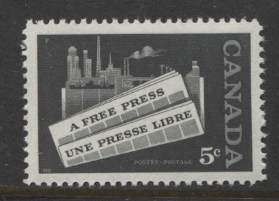
5c black - Freedom of the Press.
Designer: Allan L. Pollock.
Engraver: Unknown, but likely Yves Baril.
Issued: January 22, 1958.
15,300,000 stamps.

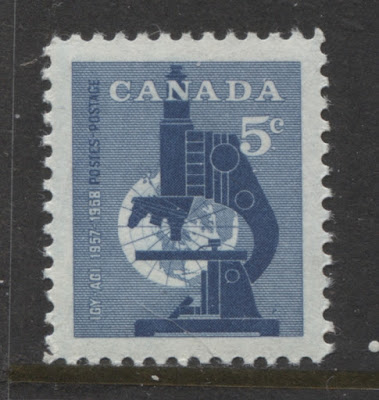
5c grey-blue - International Geophysical Year.
Designer: Allan L. Pollock.
Engraver: Unknown, but likely Yves Baril.
Issued: March 5, 1958.
25,200,000 stamps.

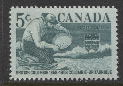
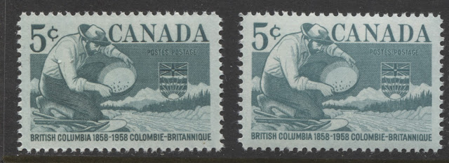
5c deep bluish green - British Columbia Centennial.
Designer: Jack Kenneth Harman.
Engraver: Yves Baril.
Issued: May 8, 1958.
20,350,000 stamps.

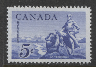
5c deep ultramarine - La Verendrye, French explorer of Western Canada.
Designer: Gerald Mathew Trottier.
Engraver: Yves Baril.
Issued: June 4, 1958.
20,320,000 stamps.

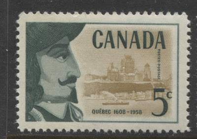
5c bottle green & bistre - Samuel Champlain and Quebec City.
Designer: Gerald Mathew Trottier.
Engravers: Yves Baril (picture) and Gordon Mash (lettering).
Issued: June 26, 1958.
19,910,000 stamps.

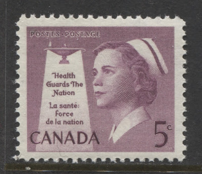
5c rose lilac - nurse in uniform.
Designer: Gerald Mathew Trottier.
Engravers: Yves Baril (picture) & John Mash (lettering).
Issued: July 30, 1958.
24,600,000 stamps.

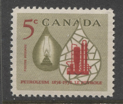
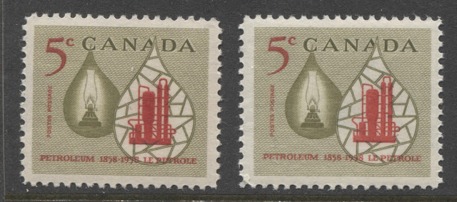
5c bistre and deep red - oil lamp and refinery.
Designer: Allan L. Pollock.
Engraver: Donald J. Mitchell.
Issued: September 10, 1958.
24,660,000 stamps.

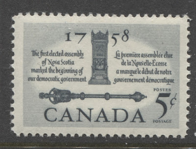
5c deep slate - mace and speakers chair - issued for First Elected Assemby.
Designer: Gerald Mathew Trottier.
Engravers: Yves Baril (picture) and John Mash (lettering)
Issued: October 2, 1958.
25,360,000 stamps.
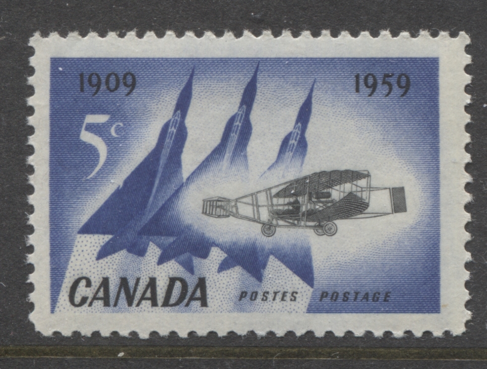
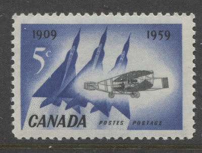
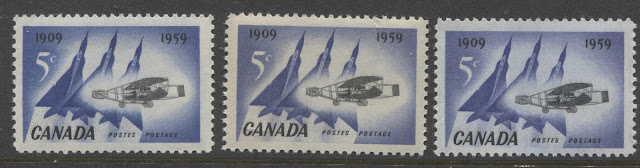
5c deep ultramarine and grey-black - 50th Anniversary of First Flight in Canada.
Designer: Harvey Thomas Prosser.
Engravers: Yves Baril (picture) and Donald J. Mitchell (lettering).
Issued: February 23, 1959.
29,760,000 stamps.

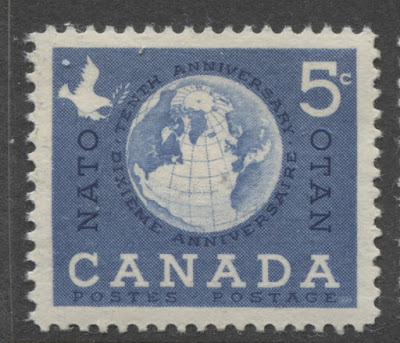
5c violet blue -10th anniversary of NATO.
Designer: Ephrum Phillip Weiss.
Engravers: Yves Baril (picture) and Donald J. Mitchell (lettering).
Issued: April 2, 1959.
32,760,000 stamps.

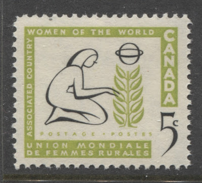
5c apple green and black - woman and tree.
Designer: Helen Roberta Fitzgerald.
Engraver: Donald J. Mitchell.
Issued: May 13, 1959.
32,200,000 stamps.

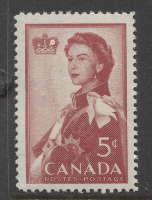
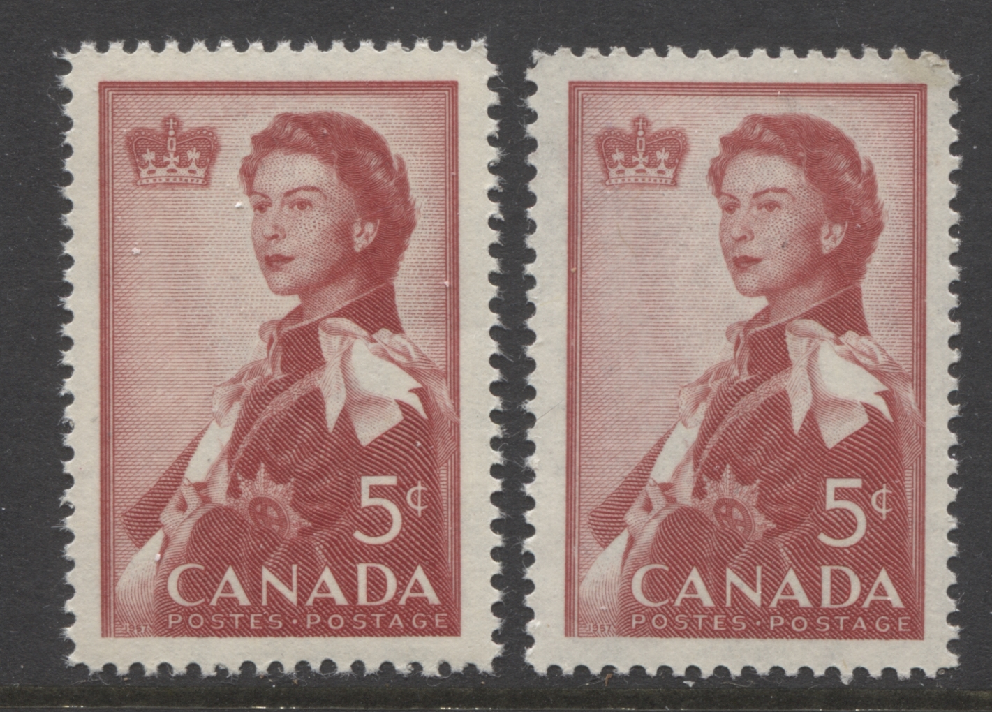
5c carmine-red - Queen Elizabeth II issued for 1959 Royal Visit.
Designer: Thomas Harvey Prosser.
Engravers: Yves Baril (picture) and John Mash (lettering).
Issued: June 18, 1959.
40,360,000 stamps.

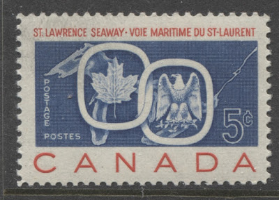
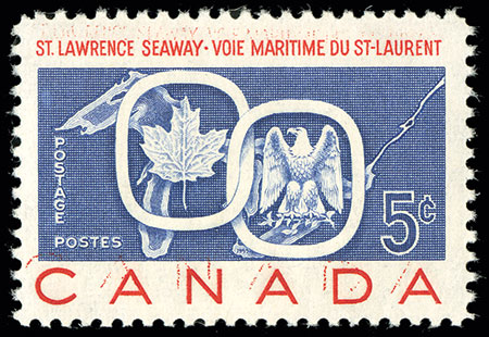
5c violet blue and carmine red - St Lawrence Seaway Opening.
Designers: Allan L. Pollock and Gerald Trottier.
Engravers: Yves Baril (picture) and Donald J. Mitchell (lettering).
Issued: June 26, 1959.
49,110,000 stamps.
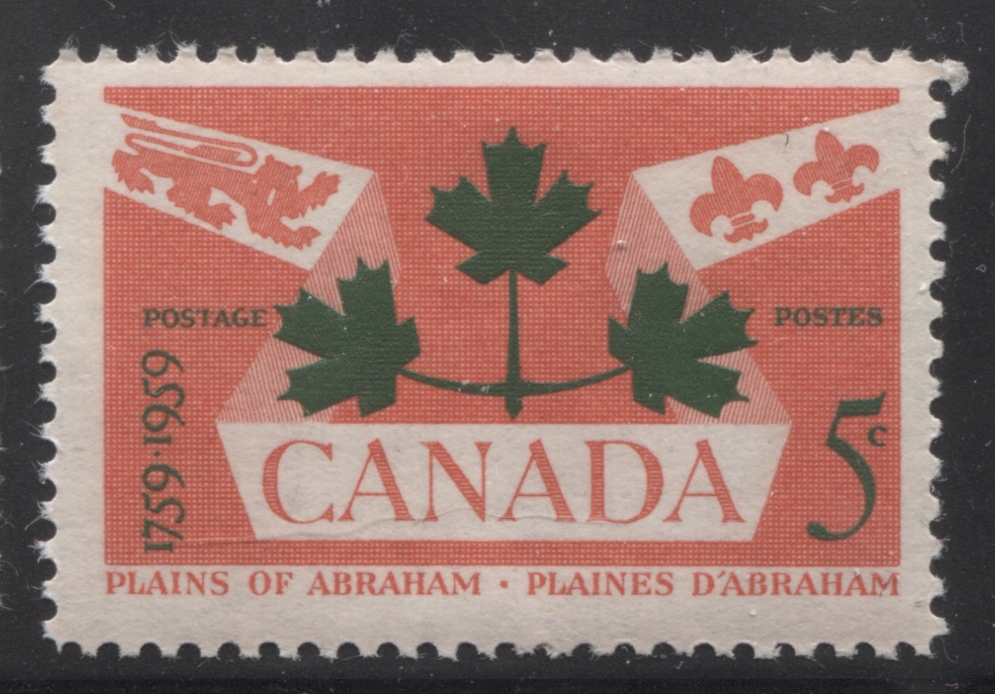
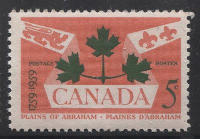
5c bright rose red and myrtle-green - Plains of Abraham.
Designer: Ephrum Phillip Weiss.
Engravers: Yves Baril (picture) and Donald J. Mitchell (lettering).
Issued: September 10, 1959.
29,240,000 stamps.

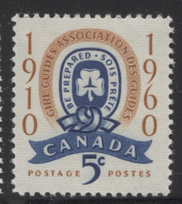
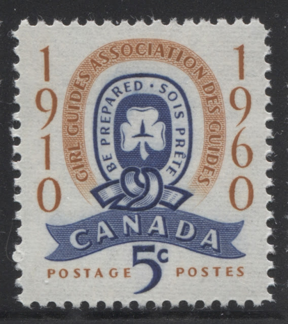
5c deep ultramarine and orange brown - 50th anniversary of girl guides.
Designer: Helen Roberta Fitzgerald.
Engraver: John Mash.
Issued: April 20, 1960.
31,360,000 stamps.

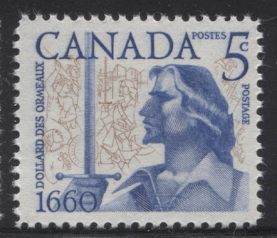
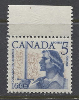
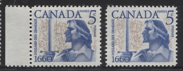
5c violet blue and bistre brown - Battle of Long Sault & Dollard des Ormeaux.
Designer: Ephrum Phillip Weiss.
Engravers: Yves Baril (picture) and Donald Mitchell (lettering).
Issued: May 19, 1960.
30,960,000 stamps.

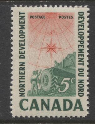
5c deep emerald green and vermilion - Northern Development.
Designer: Bernard James Reddie.
Engravers: Yves Baril (picture) and Gordon Mash (lettering).
Issued: February 8, 1961.
30,055,000 stamps.

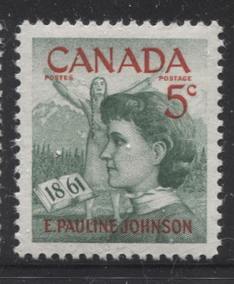
5c deep green and carmine-red - Emily Pauline Johnson.
Designer: Bernard James Reddie.
Engravers: Yves Baril (picture) and Gordon Mash (lettering).
Issued: March 10, 1961.
35,450,000 stamps.

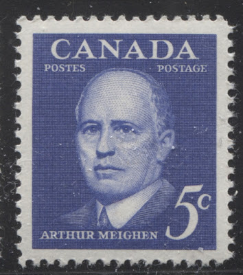
5c deep ultramarine - Arthur Meighen.
Designer: Harvey Thomas Prosser.
Engravers: Yves Baril (picture) and Donald J. Mitchell (lettering).
Issued: April 19, 1961.
30,960,000 stamps.
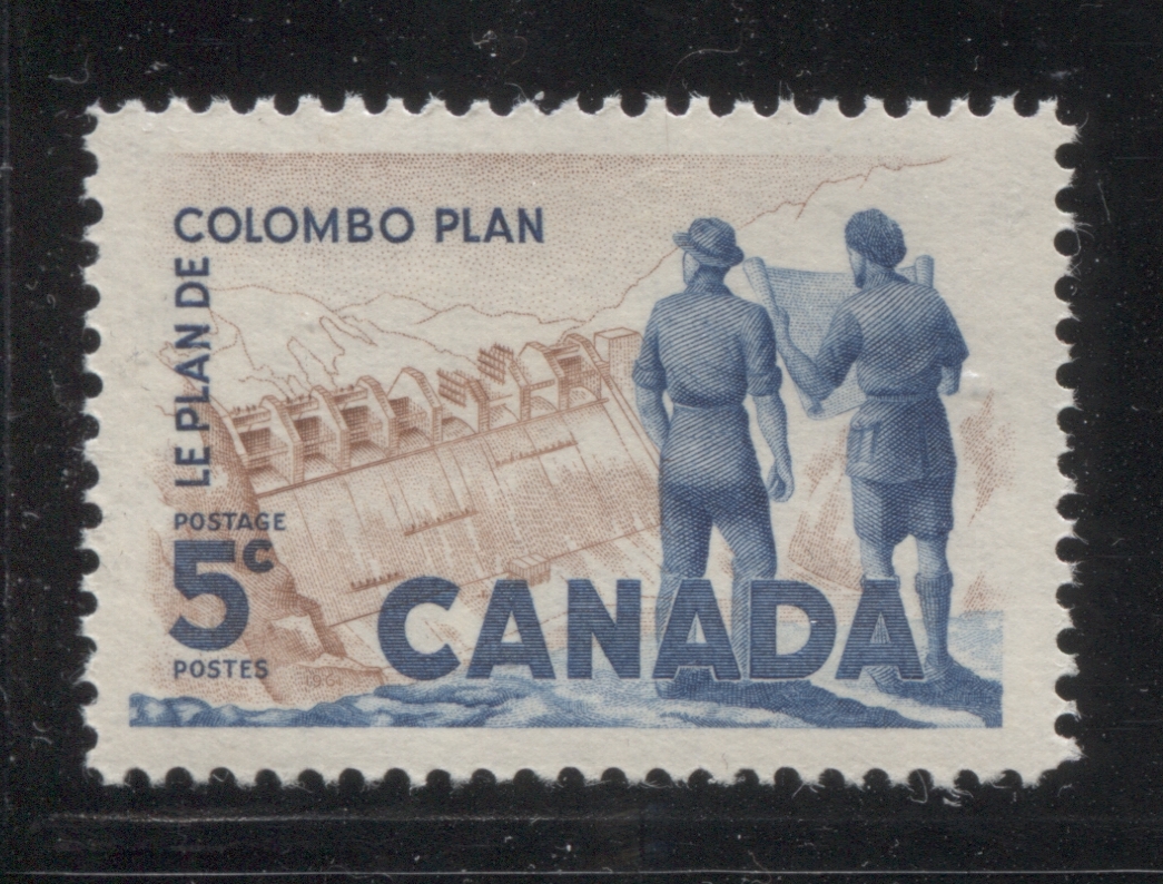
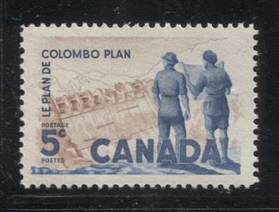
5c brown and violet blue - Colombo plan.
Designer: Bernard James Reddie.
Engravers: Yves Baril (picture) and Donald J. Mitchell (lettering)
Issued: June 28, 1961.
32,010,000.

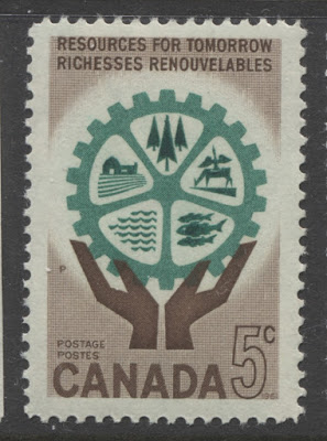
5c chocolate brown and deep emerald green - hands and cogwheel depicting resources.
Designer: Allan L. Pollock.
Engravers: Yves Baril (background), Donald J. Mitchell (rest of picture) and Gordon Mash (lettering).
Issued: October 12, 1961.
36,160,000 stamps.

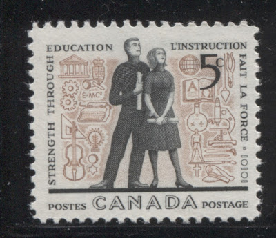
5c reddish brown and grey-black - educational symbols and students.
Designer: Helen Roberta Fitzgerald.
Engravers: Yves Baril (picture) and Donald J. Mitchell (lettering).
Issued: February 28, 1962.
33,260,000 stamps.

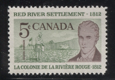
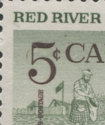
5c dull green and violet brown - Lord Selkirk and Red River Settlement.
Designer: Phillips-Gutkin & Associates.
Engravers: Yves Baril (picture except for portrait), Allan Alexander Carswell (portrait), and Gordon Mash (lettering).
Issued: May 3, 1962.
25,910,000 stamps.

5c dark blue - Jean Talon and colonists.
Designer: Ephrum Phillip Weiss.
Engravers: Yves Baril (picture) and Donald J. Mitchell (lettering).
Issued: June 13, 1962.
31,920,000 stamps.

5c black and vermilion - first BC stamp and Paliament Buildings, Victoria, BC.
Designer: Helen Roberta Fitzgerald.
Engravers: Yves Baril (picture) and Donald J. Mitchell (lettering).
Issued: August 22, 1962.
35,170,000 stamps.

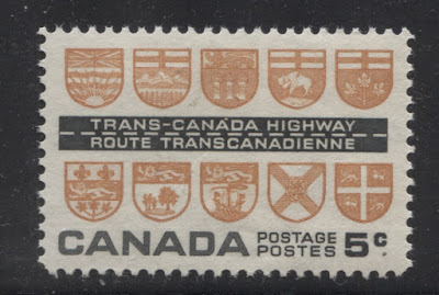
5c brown orange and black - Trans Canada Highway opening.
Designer: Allan L. Pollock.
Engravers: Yves Baril (picture) and Donald J Mitchell (lettering).
Issued: August 31, 1962.
25,570,000 stamps.
Points of InterestThe points of interest for these stamps is much the same as for the previous commemorative issues:
- Shade varieties
- Paper and gum varieties
- Perforation varieties
- Plate blocks
- Re-entries and plate flaws
- Colour shifts
- Proof material
- First Day Covers and postal history, including cancellations.
- The Inverted Seaway and other errors.
The remainder of this post will discuss these aspects in greater detail.
Shade Varieties
Most all of the shade varieties that I have seen on these issues occur on the stamps issued prior to 1960. Unlike the previous period in which the shades tended to be confined to the blue stamps, one can find shade variations for many of the other colours as well.
The scans below illustrate some of the variations that I have encountered on these issues so far:

This is the first issue that I have seen major shade variations on. I have seen more than two shades of the bluish green, but the above are the two most prominent one, which unfortunately does not appear as striking in the scan as it does in real life. The stamp on the left is a deep, solid turquoise green,m whereas the stamp on the right is a much paler, washed out bluish green. Then, in addition to this, I have seen a shade that is mid-way between these two extremes.

Here the bistre colour does not show, much if any variation, but the red shows quite a bit of variation, with the stamp on the left having a carmine-red refinery, whereas the right stamp shows the refinery printed in a colour much closer to scarlet.

The basic colour for the blue of this issue is deep ultramarine, which is shown on the right hand stamp. That's the most common shade. However, you can find a deep violet blue that is quite scarce, and shown on the stamp in the middle. The stamp on the left is the aniline ink, which is a very bright and deep ultramarine. Again, this ink is much scarcer than the regular ultramarine, and I would expect that a mint example would be worth $20-$40 depending on condition, and used would be $5-$10. This is quite a lot more than the 10-25 cents that the regular stamps are usually worth.

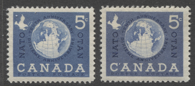
The normal colour for the NATO issue is violet blue, as shown on the stamp at right. However, it can also be found in a bright ultramarine aniline ink, which again, is scarce and worth the same as aniline examples of the other issues: $20-$40 for mint and $5-$10 for used.

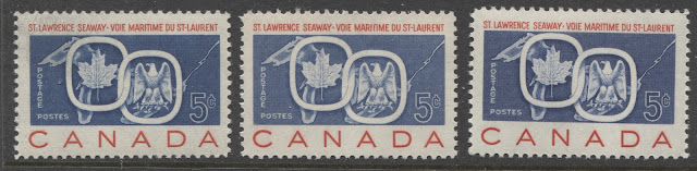
The St. Lawrence Seaway issue also shows quite a bit of variation, with most of the variety being in the shade of the centre. However, the red inscriptions show variation similar to what we saw on the 1958 petroleum industry issue, with some stamps having a red that tends towards carmine, and others having a much brighter, orangier red that tends towards scarlet. As far as the blue centres go, the basic colour is a deep violet blue, as shown on the right stamp. You can also find a much duller violet blue, as shown on the centre stamp, and on the left, we have the aniline ink, which again, is a deep, bright ultramarine. It has a value similar to the other issues with aniline ink.
This is one of the most subtle shade variations you will see. It is difficult to see if you concentrate too closely on the scan, but if allow your gaze to relax, you will begin to see that the stamp on the left is a deeper, brighter carmine-red than the stamp on the right, which appears duller and brownish by comparison.

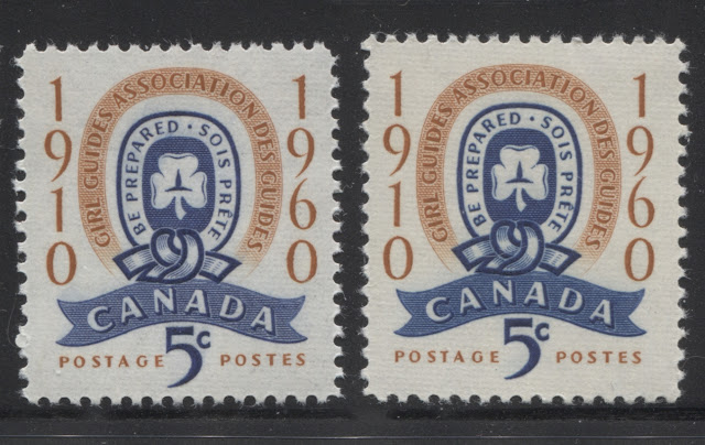
This one is hard to see in the scan, but the stamp on the right is the aniline ink, with the blue appearing much brighter than the stamp on the left. The difference is easiest to see on the ribbon containing the word "Canada". I haven't seen much variation of the orange brown frame colour as yet.
Paper and Gum Varieties
So far I have seen six different kinds of paper on these issues. Some of these are similar to one another, but all are slightly different in some way. The types are similar to those found in the previous period, but what is different in this period is the frequency with which certain types are found. For example, the visibly ribbed paper was the predominant paper prior to 1958, but it reappears here in 1960, after being more or less absent in 1958 and 1959. I have also noted that while some issues seem to exist only with one type of paper, there are several that exist with more than one type that I have seen, and that in fact, it is quite likely that most of these issues exist printed on more than one type of paper. Of course there have not been any studies conducted of which I am aware to (1) establish the existence of these paper types and (2) determine which, if any of these varieties are scarce or rare.
The following scan shows the first three of these, as seen from the back:
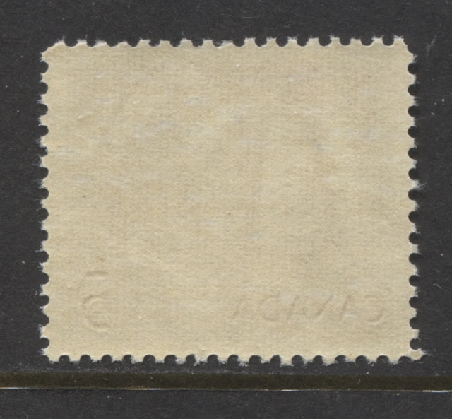
This type of paper has a perfectly smooth printing surface on the front. Under a loupe it will appear smooth, with no ribbing, and no uneven light and dark spots. However, on the back, you will be able to see clear horizontal ribbing, and gum that appears streaky, usually with vertical streaks and which has a satin sheen. I have seen this paper type primarily on the following issues:
- 1958 Free Press Issue.
- 1958 Geophysical year.
- 1958 BC Centennial.
In mid-1958, a slightly different type of vertical wove paper begain to be used, which showed slightly less obvious horizontal ribbing from the back, and smooth cream gum that usually had either a satin sheen or a semi-gloss sheen. The scan below shows this type of paper as seen from the back:

If you look very carefully at the scan, you can clearly see the horizontal ribbing, but the gum looks much smoother, and not quite as yellowish. This paper and gum was used on most of the issues of this period, including:
- 1958 La Verendrye (shown).
- 1958 Founding of Quebec.
- 1958 First Elected Assembly.
- 1959 50th Anniversary of First Flight in Canada.
- 1959 Royal Visit.
- 1959 St. Lawrence Seaway.
- 1959 Plains of Abraham.
- 1961 Northern Development.
- 1961 Emily Pauline Johnson.
- 1961 Arthur Meighen.
- 1961 Resources for Tomorrow
The third type is the horizontal wove paper that shows the vertical ribbing, which first appeared during the last period on the 1955 Scout Jamboree Issue:
This paper, like the previous two papers has a perfectly smooth printing surface, although the surface is much more porous with this paper than it is for either of the other two papers. The gum is usually smooth and quite yellowish, with a semi-gloss sheen. However, it can be somewhat streaky in appearance as well. I have seen this paper on the following issues:
- 1958 Health issue.
- 1958 Petroleum industry.
- 1959 Country women issue.
- 1962 Education issue.
- 1962 Jean Talon issue.
The fourth paper is a vertical wove paper that shows no ribbing or mesh, whatsoever, either on the front or the back. It is this type of paper on which different levels of fluorescence can be found, from dull fluorescent, to low fluorescent with varying densities of high fluorescent or hibrite fibre inclusions. Unitrade rates these either as fluorescent, medium fluorescent, high fluorescent, or hibrite, depending on how dense the fibres included in the paper are. The paper is completely smooth on the front and back, and the gum is a smooth, creamy dextrose gum with a semi-gloss sheen. The paper is less porous on the surface than the third type. The scan below shows what this paper looks like from the back:

This paper does not appear until 1960, and I have seen it on the following issues so far:
- 1960 Battle of Long Sault.
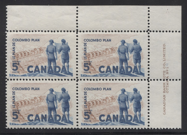
- 1961 Colombo plan.
- 1962 Red River Settlement.
- 1962 Victoria Centenary.
- 1962 Trans Canada Highway.
So far, the only issues that have known fluorescent paper varieties are the Red River Settlement and Victoria Centenary issues. On these two issues, the number of listed varieties is now up to four on each issue, up from three, in just the past couple of years. It is worth pointing out that 30 years ago there were no listed paper varieties for these two issues. So I believe that although no varieties are listed for the Battle of Long Sault, Colombo Plan and Trans Canada Highway issues, that there likely are such varieties in existence that are just waiting to be discovered.
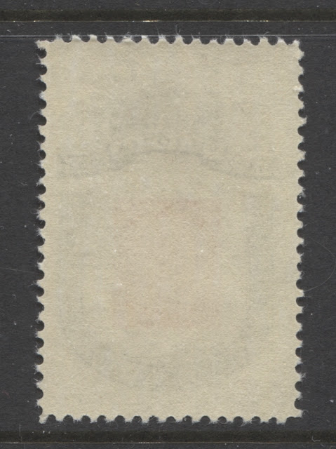
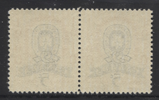
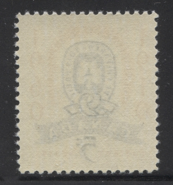
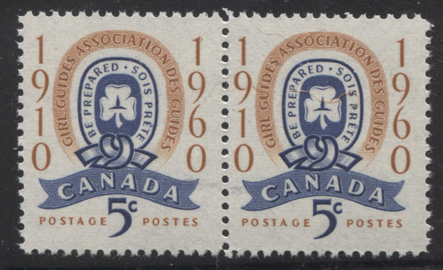
The fifth paper type is almost the same as the fourth type above, except that the gum is somewhat streaky with a satin sheen. I have only found this paper so far on the 1960 Girl Guides issue on the mint pair illustrated below:

As you can see from the scan, the printing surface of this paper is smooth, with no visible ribbing.

The sixth paper type is the visibly horizontally ribbed vertical wove paper that was so predominant during the 1950's. This paper has a clearly ribbed surface, both on the front, and on the back. The gum is much less yellowish than the gum of the 1950's and it is generally smooth, with either a satin or a semi-gloss sheen. The scan below shows the appearance of this paper from the front:

Note how clear the horizontal ribbing is on this paper compared to the last paper, which had a smooth surface. The next scan shows the appearance of this paper from the back:

So far I have only seen this paper on the following two issues, which also exist on other types of paper as well:
- 1960 Girl Guides.
- 1961 Emily Pauline Johnson.
The fact that these two issues exist on at least two different paper types opens up the possibility that the other issues may exist on more than one type as well. It is further possible that one type of paper might be quite common, while some of the others may be either scarce, or even rare. All of the sudden, the study of these issues to look for the different types becomes much more enticing.
Fluorescence
During this period, as with the last, except for the smooth, non-ribbed paper that was introduced in 1960, the stamp paper is generally non-fluorescent or dull fluorescent. Unitrade lists no paper varieties whatsoever for any of the stamps except for the 1962 Red River Settlement and Victoria Centenary issues. However, it is possible to find subtle variations in the appearance of the other papers under long-wave ultraviolet light:
- Some papers give a dead, non-fluorescent violet, or light violet reaction.
- Some papers give a yellowish-cream, ivory, dull fluorescent appearance under UV.
- Some papers give a greyish or greyish white dull fluorescent appearance under UV.
- Finally, some papers give a bluish white dull fluorescent appearance under UV.
I have not done a study to determine which of these 23 stamps are found on each of the above paper types, though I am fairly confident that each of the ribbed and smooth papers probably exist with at least two different types of dull fluorescence, and also the dead, non-fluorescent reaction. You could have quite a bit of fun focusing on this aspect and trying to establish definitively which varieties exist, in addition to the listed varieties on the 1962 Red River Settlement and Victoria Centenary issues.
Perforation Varieties
The standard catalogues including Unitrade all state that the perforation of all these issues is 12. However, in recent years, philatelists have discovered that in 1962, the CBN changed its perforating equipment from a line gauge of 11.95 to a gauge of 11.85. If you go back and examine very carefully the stamps of say the 1949-52 Postes Postage issue, you will see that they do indeed measure 12.0 exactly on an Instanta gauge. Therefore, it follows that sometime between 1950 and 1962 the standard measurement changed from 12.0 to 11.95. Usually when these kinds of changes are introduced, they are introduced gradually, so that compounds of the old perforation and the new perforation are often found. I do not know when exactly that was, but it is possible that some of these stamps may exist perf. 11.95, 11.95 x 12.0, or even 12.0 x 11.95. On the other hand, they may only exist perf. 12. To settle this, a collector with a great deal of patience and an Instanta gauge will have to carefully measure the perforations of several hundred stamps and tabulate their findings.
I have measured some of the perforations on some of these issues, though I have yet to check others. So this section will be updated, as I study these issues in more detail. However, the following perforation measurements are what I have found so far:
I have measured some of the perforations on some of these issues, though I have yet to check others. So this section will be updated, as I study these issues in more detail. However, the following perforation measurements are what I have found so far:
- 1959 Royal Visit: 11.85 x 11.85, which is strange because this shouldn't exist before 1962.
- 1961 Emily Pauline Johnson: 11.95 x 11.95; 11.85 x 11.95 and 11.85 x 11.85.
- 1961 Colombo Plan: 11.85 x 11.95.
- 1961 Resources for Tomorrow: 11.95 x 11.95; 11.95 x 11.85; and 11.85 x 11.95.
- 1962 Red River Settlement: 11.95 x 11.95.
- 1962 Jean Talon: 11.85 x 11.95.
- 1962 Victoria Centenary: 11.85 x 11.95; 11.85 x 11.85; 11.95 x 11.85 and 11.95 x 11.95.
Plate Blocks

Most of the 25 stamps issued during this period were printed from a single plates, whereas in the last period, most issues were printed from two plates. However, one issue, the 1959 Royal Visit, was printed from two plates. Thus a complete, basic set of blocks for all corners, consists of 104 different blocks. If you add the listed paper varieties, that adds another 24 blocks. However, this does not take into account the different perforation combinations, nor the potential other paper varieties discussed. If we assume that each issue can be found on two types of paper, and in two different perforations, then the number of collectible plate blocks could climb to close to 500 blocks and in reality could be even more extensive than that.
I have not seen any blocks from this period showing the order number, which leads me to conclude that the system of including printing order numbers on the selvage was discontinued at the end of 1957.
Position Dots
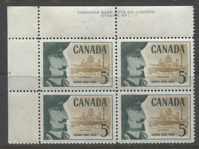
As was the case with the previous period, many of the blocks that I have seen from these issues have no position dots on them. However, there are a few that appear to have them on all four corner blocks. The above lower right block of the 1958 Quebec issue, has a position dot printed in the bistre-brown of the vignette, and located below the inscription between the "NA" of "Canadian". I have the lower left and upper left blocks of the same issue, and each of these also bears a dot as shown:
Here is the lower left position showing the dot to the right of the inscription.

Here is the upper left position showing the dot in the left margin, just to the left of the first stamp in the pane. I don't have the upper right block, but I would bet that it will show a dot in the right margin, opposite the fifth stamp in the top row.
Here is an upper margin copy of the 1960 Battle of Long Sault Issue showing a dot in the upper selvage:

I'm not sure which position this comes from - upper left or upper right, but what it does tell us is that on this issue, that dots can be found in the upper blocks, but in the top selvage above the stamps, rather than in the side selvage, as was the case on the 1958 Quebec issue.
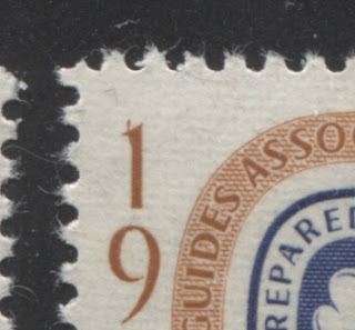
The only other issue that I have seen dots on is the 1962 Red River Settlement Issue. On these blocks, the dots are printed in the violet brown colour of the portrait, and are usually located in the side margins, opposite the stamps in the second row from the edge. In other words:
- On the upper left block, the dot appears to the left of the sixth stamp.
- On the upper right, the dot is to the right of the tenth stamp.
- On the lower left block, the dot is to the left of the 41st stamp.
- On the lower right, the dot is to the right of the 45th stamp.
However, in a number of instances, the selvage has been trimmed in such a way that the dots have been trimmed off, so it is not always possible to see them.
I will continue to add more information about these dots and which blocks they appear on as I study more and more examples of the stamps of these issues.
Re-Entries and Plate Flaws
Re-Entries
As was the case with the 1952-57 commemoratives, there are no known re-entries on any of these 25 stamps either. However, once again, given the very large numbers printed of each issue and the fact that only 1 plates was used for all except one of them, I think that there must be some re-entries out there that have yet to be discovered. Fortunately, most of these issues can still be found in full sheets, although these are getting scarcer all the time. The best way to look for these is to acquire a number of sheets and study them very carefully, looking for signs of doubling in all elements of the design, including the marginal inscriptions. Given that re-entries can occur when a plate is repaired, or otherwise re-worked, it is possible that two sheets from the same plate could differ in this respect, and so just because you examine a sheet from say plate 1 that does not show any re-entries, it does not mean that you can't find another sheet later that does show at least one. It can simply happen, if at some stage during the print run, a decision was made to strengthen some of the impressions in the sheet. So my recommendation would be to study a large number of full sheets first, and then if nothing turns up, consider studying a quantity of used bundleware and studying these carefully.
Plate Flaws
Careful examination of a number of the stamps in my stock has turned up a number of plate flaws. I do not know whether these are constant or not, and further study would be required to esablish their nature. However, regardless of whether they are random or constant, they are still an interesting aspect to these issues, largely because they don't occur on very many stamps. The print quality of these issues was generally very high, so you usually have to look through quite a large quantity of stamps to find even a minor design flaw. However, if you are patient enough, your patience is usually rewarded.
The scans below show some of the flaws that I have encountered on these issues so far:

On the 1959 Plains of Abraham issue, I have found broken letters in "Postage", most notably the "A" and the "E".

On the 1960 Girl Guides issue I have found several stray arcs or lines emanating from the design where there should not be any. In the above scan you can see a small curved line protruding from the "1" of "1910".

Here is a jagged line within the "5" of "5c".

This pair of the same issue also shows varieties on both stamps:
- On the left stamp, there is a small boomerang shaped mark protruding out from the right of the "1" of "1960".
- On the right stamp there is a small diagonal line between the "U" of "guides" and the "9" of "1910".
Based on the similarity of the nature of these varieties, I would not be surprised to find more on that issue.

This example of the 1962 Red River Settlement issue shows a large brown arc to the left of the "5". It occurred on the first stamp in one of the panes, as it was the first stamp in a vertical strip of 10 stamps.
Colour Shifts
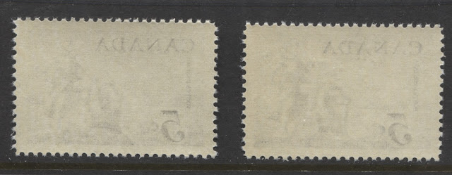
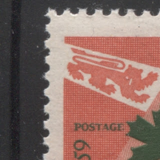
All the bicoloured issues were printed in two operations, with the frame printed first, before the sheets were fed back into the presses again for the printing of the vignette. Sometimes the vignette was printed first and then the frame. Occasionally, they were fed in considerably out of alignment with respect to the area within which the vignette was supposed to fall. The result are some dramatic shifts that can be found in the location of the vignette relative to the rest of the design. It should be noted that very minor differences (i.e. less than 0.5 mm) are common, and probably not worth collecting. However, differences greater than this can be quite significant. The scan below shows a collectible example of a colour shift on the 1960 Battle of the Long Sault Issue:

Here the shift is in the vertical placement of the Indians fighting in the background. If you look at the left stamp inside the open part of the "C" of Canada, and the lower part of the "5", and you will see that:
- The spear held by the Indian on the left does not extend into the open part of the "C" of "Canada".
- The top of the bistre-brown part of the design on the right ends in the middle of the open space at the bottom of the "5".
On the right stamp though:
- The spear held by the Indian on the left protrudes well into the open part of the "C" of "Canada".
- The bistre brown portion of the vigette on the right almost completely fills the open space at the bottom of the "5".
This difference is the result of a colour shift.
Any of the bicoloured issues can exhibit significant colour shifts, though the best known ones are those that occur on the 1960 Girl Guides Issue, and are listed in the Darnell catalogue.
Proof Material
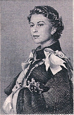
The BNA Proofs website lists 5 different proof items from this period, though curiously they seem to be limited to two of the issues from 1958 and 1959: the 1958 Geophysical Year Issue and the 1959 Royal Visit issue. There is no proof material listed for any of the other 23 issues, though I'm sure this material must exist somewhere, through it may only exist in the National Postal Museum. The material listed consists of essays and photographic proofs. All of the listed material is either unique, or there are only 2 or 3 of each item known. It is generally expensive, though not that expensive for how scarce it is, with most items selling in the $1,000-$2,500 range. The existing material can be summarized as follows;
- 1 photographic proof in black and white of the 1958 Geophysical Year issue.
- 1 small and 1 large essay of the vignette of the 1959 Royal Visit issue printed in black on India paper, as shown above.
- 1 large essay of the vignette of the 1959 Royal Visit issue, printed in blue on wove paper.
- 1 large essay of the vignette of the 1959 Royal Visit issue, printed in red on wove paper.
You can view all of these items, including scans by visiting the BNA Proofs website via the following link:
To access the scanned images of an item, hover your mouse over the white rectangles on the side of the screen and you will see that the rectangle is a clickable link that will take you through to the image of the particular item in question.
In theory there should be a lot more material in existence. Because the engraving was done by Yves Baril and Donald J Mitchell, or Yves Baril and John Mash, or Gordon Mash, there should exist separate die proofs of just the vignette, or just the lettering. There would also very likely exist sketches of the same design elements. This should all exist in addition to the essays of the completed designs and die proofs of the completed designs.
First Day Covers
There were a very large number of cachet makers operating during this period, many of whom produced very elaborate and beautiful hand painted cachets. However, most are very affordable and as a result, you can have a lot of fun putting together a collection that will have a lot of artistic eye appeal. To give you an idea of the potential scope involved in collecting the first day covers of this period, here are some of the names of cachet makers who were active during this period:
- Ken Boll
- C. George
- Caneco
- Sanders
- Velvetone
- H&E
- CPO Replacement
- Grover
- Globe
- Regal
- Capital
- Cachetcraft
- Overseas Mailer
- Middlesex
- Marguerite
- Meter Digest
- RCM
- White Rose
- Linto
- National Geographic
- Fluegel
- TriColor
- Barretts
- Schering
- Kolor Kover
- Crescent
- Ewers
This represents a good cross section of the cachet makers operating during this time. The cachets of course are only one aspect of first day cover collecting. Two more aspects that add scope to a collection are:
- The actual stamps affixed to the cover, and
- The cancellation.
Most people who produced first day covers during this time would, for each issue and each cachet, would prepare:
- A cover containing a single stamp,
- A cover containing a pair,
- A cover with each plate block position, and
- Sometimes a cover with a block of four.
So for an issue like, say the 1959 St. Lawrence Seaway Issue, that was printed with 1 plates, there would likely have existed for a particular cachet maker:
- 1 cover with a single.
- 1 covers with a pair
- 4 covers with plate blocks
- 1 covers with a block of 4
So that is 7 covers for one issue and one cachet maker. I just rattled off a list of 27 different cachet makers. So if you wanted to go about assembling a complete and comprehensive FDC collection of the commemorative issues during this period, you could potentially be looking for at least 7 x 27 = 189 covers for this one issue alone. For all the issues involved, you could be looking for close to 5,000 different covers - not at all an easy or trivial task.
That is just for the cachets and the stamp configurations. Then there is the issue of the cancellations. The most common cancellation is either the wavy line, or straight line slogan First Day of Issue cancellation that was used in each of the major cities, the most common of which is Ottawa. However, cachet makers would often have covers cancelled at smaller post offices as well, that would simply apply the standard CDS cancellation. So it may be possible to find each cover with several different cancellations as well. So in reality, you could potentially collect many thousands of covers for this period.
Postal History and Cancellations
All the stamps of this period are 5c stamps, which were designed for use on forwarded, single rate domestic mail. Thus plain covers bearing single usages of these stamps are nothing to get excited about, although they are an important part of a complete collection of these issues. However, if you look patiently through dealer stocks of covers from this period you will still be able to find commercial covers that are mostly on business stationery from the period that have interesting graphics and corner cards, such as advertising covers, or covers from hotels. Collecting these domestic usages from smaller towns or from post offices that are no longer open is another way that you can approach the collecting of postal history from this period.
Because these stamps were designed primarily for local use, and because definitives would have generally been used to make up the higher postage rates, the really desirable and challenging covers will be foreign airmail and foreign registered covers, where the higher rates of postage above 15c will have been paid with combinations of these commemorative stamps used in the proper period. These will not be easy to find, but with patience and access to dealer's stocks of large cover lots purchased at auction, you should be able to find some really nice usages. The best covers will be those that use the most diverse range of stamps possible, and generally used within 6-7 months of being issued.
As with all other issues I have written about these stamps are ideal for the collection of small town CDS cancels. All of them can still be bought as bundleware for very little money, and they represent an almost endless amount of scope, as there are probably well over 30,000 different CDS cancels that can be found during this period, which makes for a potential collection of several hundred thousand stamps, if you were able to obtain an example of all of them. For those of you who find that too daunting, you can always focus on a province, or a group of smaller towns.
The Inverted Seaway and Other Errors

This brings me to the end of my discussion of these issues. Next week I will begin a series of posts about the third definitive set that was issued during the present reign: The Cameo Issue, which first appeared toward the end of 1962 and was in use until replaced by the Centennial Issue in 1967.
The Inverted Seaway and Other Errors
Up until 1959, there had been no real instances of errors in the production of Canadian stamps. While there were many imperforates of issues to the mid 1930's, these were not really errors per se. They were, in most instances, either printer's waste that unintentionally got out to the collecting public, or they were deliberately produced and distributed, by favour, to certain government officials. However, in 1959, with the issuance of the St. Lawrence Seaway stamp that all changed. Initially when the stamp was issued in June, there were no error stamps found. It wasn't until August, 1959 that the first error stamps began to surface. It is thought that some 2,000 stamps were produced and got distributed to the post offices. However, all but 400 or so were recovered by diligent postal clerks and sent back to the Post Office Department. The scan above shows a rare block of four of the error. Charles Verge, a distinguished Canadian philatelist has expressed the opinion that the error is not a true inverted centre, because the centre vignette is printed in the correct position on the stamp relative to the vertical. Instead, be believes that red inscriptions were inverted, because the inbscription for "Canada" almost always touches the bottom of the vignette - something it does not do on the regular stamps. It is a very rare stamp, for which the provenance of most existing examples is well known. You can generally buy a mint or used example for between $6,000-$8,000 at auction, and a cover for $10,000-$12,000, even through the Unitrade values are much higher. However, at this level, the stamp or cover you buy will usually have some small defect. Premium pristine examples will tend to sell for close to their Unitrade value.
In addition to this error, another error involves doubling of the red inscriptions as shown in the following image:
This is a fairly strong example of the doubling and would be worth $1,500 or so. Much weaker examples also exist that can be bought for $200 or so.
The next issue on which an error has been documented is the 1961 Emily Pauline Johnson Issue. Two vertical imperforate pairs have been seen, one of which is missing the red engraving. It is hard to be certain as to whether or not this is a true error, or if it is just printer's waste. I looked for a scan of one example, but unfortunately I could not find one to include with this post. However, I will add one at a later date if I come across one.
Two other issues are also known with errors that resulted from fold-overs during printing. These are the 1962 Education Issue and the 1962 Jean Talon Issue. These are both unique and are worth between $2,000 and $3,000. Again, I do not have images that I can include here, but I can describe them as follows:
- On the education issue, the error comes in an upper right field stock block on which the paper in the upper right corner got folded over during the printing of the black portion of the design. The result is a stamp that has the complete brown background, but is missing most of the inscriptions at the top and right, as well as the head and shoulders of the students.
- On the Jean Talon issue, the error occurred again on an upper right field stock pair. Here, the upper right corner of the stamp folded over during printing, so that when it is opened out, the face value and "POS" of the "Postes" inscription on the right side are completely missing.
It is worth pointing out that these two errors were not known 20 years ago, having been discovered since that time. I personally discovered the 6c 1971 Christmas Snowflake foldover error in a collection from Wolfeville, NS when I worked for Gary Lyon, around 15 years ago. So I know that it is very, very likely that more of these will turn up for the other issues, lying untouched in large collections for the past 50 or so years.
This brings me to the end of my discussion of these issues. Next week I will begin a series of posts about the third definitive set that was issued during the present reign: The Cameo Issue, which first appeared toward the end of 1962 and was in use until replaced by the Centennial Issue in 1967.