Today marks the first in a series of many posts about what has become not only one of the most popular definitive issues for Canadian specialists, but in the world. It is on a par with the Machin Heads of the United Kingdom, in terms of complexity, for the six years that it was current. The Machin Heads are of course, much more extensive, having been in continuous use for 50 years now, but the Centennial Issue is remarkably complex for a series that lasted for only six years. Five to six years is the average life span of a modern definitive issue, but usually most definitive issues that run this long do not yield anywhere near the number of collectible varieties that this one does. This is one of those issues that you can collect for 40 years, and think at the end of that time that you know it inside and out, and just when you think you have discovered all that there is to discover, another aspect that you either didn't consider to be significant, or just didn't notice will surface.
Today's post will present the basic stamp designs, some background information, and will discuss in very broad terms the ways in which this issue can be approached. The remainder of the post will present an outline for the way in which I intend to address all aspects of this issue in future posts. My expectation is that full coverage of all aspects of this fascinating issue will take from 2 to three full months to complete.
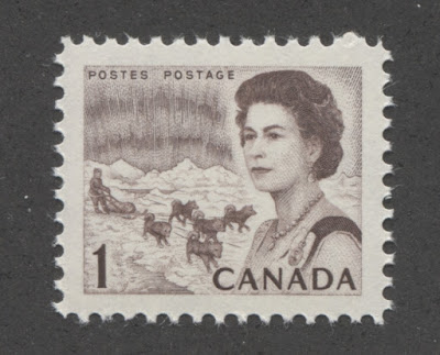
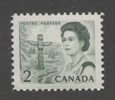
The inspiration for the designs of the issue was Canada's centennial year in 1967. The desire was to fully celebrate Canada's diversity from coast to coast, and true Canadiana. So the low values of the series were designed to show different scenes from each different region of the country, alongside Anthony Buckley's portrait of Queen Elizabeth II. For the high values, the decision was made to feature Canadian landscape paintings by the Group of Seven. There were seven artists, and seven high values. Each one depicted a landscape scene from a different part of the country. So in this way the entire series was intended to be a pictorial celebration of Canada's diversity and history. Even though the Centennial celebrations were largely over by 1968, the series was kept as the current definitive series and not replaced fully until late 1973. The next series to replace it, dubbed the Caricature and Landscape Issue began to appear in 1972, with the high values being replaced first, followed by the low values in October 1973.
There were several significant milestones in Canadian stamp production that impacted the complexity of this series:
Perforation
Prior to this issue, all Canadian stamps were line perforated. While most of the stamps of this issue were line perforated 11.85 x 11.85, the stamps printed by the British American Bank Note Company introduced comb perforations into this issue. There were two measurements that were introduced: 9.9 and 12.5 x 12. However, beyond this, there has not been much research conducted to see whether or not there were any minute gauge changes like the one that has recently been discovered for the period from 1962-1965, where the Canadian Bank Note Company switched from an 11.95 gauge to 11.85. It is entirely possible that similar changes may have occurred for the stamps of this issue.
The coil stamps came in two documented perforation measurements: 9.5 horizontally and 10 horizontally, though again, it is possible that slight variations may exist.
Plate Characteristics
Most collectors will be familiar with the three die type differences that have been identified in the mainstream literature for the 6c black. However, over the years more and more attention has been paid to studying the design characteristics in more detail, and as a result, many constant varieties have been identified on the 2c, 6c, 7c and 8c values. I believe that there probably are similar die type differences on the other values as well because I have seen stamps that show weak impressions similar to the die 1 6c, and then others where the engraving is very strong. Much more painstaking research would be required to determine whether or not there actually were different dies used for the other values.
Unitrade mentions the existence of the 33 different "totem pole eyes" on the 2c, the "airplane in the sky" on the 1c, the line through the 5c, the doubled C on the 6c orange and the extra spire on the 8c. However, there are very few constant varieties actually listed for this issue. All of these varieties have only been documented in Unitrade in the past 10 years or so. So it seems to me that there must be many more varieties out there that are waiting to be discovered on the other values. However, a detailed study of many thousands of stamps may be necessary to identify them all.
Cello-Paqs
Two stamps from this issue only, being the 4c and 5c, were issued in cello paqs that sold for $1 each. The 4c was thus printed in panes of 25 for this purpose, and the 5c was printed in panes of 20. The 5c was also issued with Winnipeg tagging in this form. Until just a few years ago, there were no listed varieties of the cello paqs. However in the past several years, Unitrade has started to give recognition to a dead paper variety on the 4c, but nothing on the 5c, even though I can confirm that the 5c too exists with dead paper. In addition to differences in paper, I have seen differences in shade, gum and the design of the cellophane packs themselves.
Coil Stamps
The coil stamps were all printed by the Canadian Bank Note Company (CBN), and as such they exhibit the same types of spacing varieties as coils printed by the CBN for other issues. However, in addition to these, I have also seen differences in paper and gum as well. A separate post to adequately address all of these varieties is definitely in order.
Booklets
The booklet stamps will be discussed under each value, but it is necessary to have an entire post devoted to the complete booklets of this issue, as there are differences in the design of the booklet covers, differences in the fluorescence of the cover stocks, and other constant varieties. The booklets can generally be split up into the non-integral, stapled booklets that were printed by the CBN, and those integral booklets that were printed by the BABN, which comprise most of the booklets of this issue.
Postal Stationery
There was a very large range of postal stationery items prepared for this issue, which can be studied in much more detail than is listed in either Unitrade or Webb. The postal stationery can be divided into two broad categories: the publicly issued products such as envelopes, postcards, flimsies, and then the private order products, many of which are extremely rare now, especially used. A separate post will definitely be required to do this aspect of the issue justice.
Postal History
Postal history for this issue also requires its own post. Three postal strikes during the life of this issue, resulted in three rate-increases between 1968 and 1972, which affects what constitutes an interesting cover. There were also new rates established during this period, and the abolition of other rates and/or services, such as third class mail. An example of a new rate was the "all up" airmail rate of 15c that was introduced in 1971. A separate post is needed to detail the rates, changes in rates, usages for the stamps and to discuss approaches that can be taken to collect the postal history of this issue.
Roadmap of Upcoming Posts
Based on the above discussion, it seems to me that a logical sequence for the remaining posts about this issue to follow is as follows:
1. The papers used to print the stamps.
2. The types of gum found on the Centennial issue.
3. Differences in the inks used to print the stamps.
4. Winnipeg tagging on the Centennial issue.
5. Ottawa tagging on the Centennial issue.
6. Perforations on the Centennial issue.
7. Plate characteristics of the stamps - die type differences.
8. Plate characteristics of the stamps - the totem pole eyes on the 2c.
9. Cylinder flaws on the 6c, 7c and 8c stamps printed by the BABN.
10. Constant plate varieties on the Centennial Issue.
11. The 1c brown Northern Lights and dogsled team stamp.
12. The 2c green totem pole and river stamp.
13. The 3c purple combine and oul rig stamp.
14. The 4c carmine red seaway lock stamp.
15. The 5c blue fishing village stamp.
Today's post will present the basic stamp designs, some background information, and will discuss in very broad terms the ways in which this issue can be approached. The remainder of the post will present an outline for the way in which I intend to address all aspects of this issue in future posts. My expectation is that full coverage of all aspects of this fascinating issue will take from 2 to three full months to complete.
The inspiration for the designs of the issue was Canada's centennial year in 1967. The desire was to fully celebrate Canada's diversity from coast to coast, and true Canadiana. So the low values of the series were designed to show different scenes from each different region of the country, alongside Anthony Buckley's portrait of Queen Elizabeth II. For the high values, the decision was made to feature Canadian landscape paintings by the Group of Seven. There were seven artists, and seven high values. Each one depicted a landscape scene from a different part of the country. So in this way the entire series was intended to be a pictorial celebration of Canada's diversity and history. Even though the Centennial celebrations were largely over by 1968, the series was kept as the current definitive series and not replaced fully until late 1973. The next series to replace it, dubbed the Caricature and Landscape Issue began to appear in 1972, with the high values being replaced first, followed by the low values in October 1973.
There were several significant milestones in Canadian stamp production that impacted the complexity of this series:
- Postal rate increases resulting from strikes, created the need for additional low values that had not been issued as part of the original set. By the time these were issued, stamp sizes were changed from Imperial measurements to metric ones, so that the new designs were slightly smaller than the original stamps.
- The introduction of multi-colour engraving by the British American Bank Note Company paved the way for the production of booklets that contained se-tenant combinations of different denominations of stamps, rather than just separate panes of stamps. It was also possible now to produce booklets in which the panes were attached to the booklet cover by their selvage tab rather than stapling several panes together between two covers. Thus, the first integral booklets were produced as part of this issue.
- The introduction and use of papers that contained whitening agents began during the life of this issue. The whiteness of the paper interfered with the optical scanning equipment that had been designed to read the Winnipeg Tagging that had been introduced in 1962, with the result that it became necessary to come up with a new way to tag stamps that would work with these new paper types. Thus Ottawa tagging was born during the life of this issue.
- Coil stamps had previously been produced in rolls of 500 stamps which were made by splicing together long strips of stamps which had been guillotined from large sheets that were printed for this purpose. However, during the life of this issue, a new method of producing coils was devised in which a sheet consisting of ten full strips of 100 stamps would be rolled up, sealed and then scored along a line between the rolls so that an entire sealed roll of 100 coils could be split off and sold.
- The abandonment of dextrose or dextrine gum as the adhesive of choice on the backs of the stamps occurred during this issue. Like many of the innovations introduced during this period, the new PVA gum was introduced in stages, taking more than one physical form before the final chemical formula that would endure to this day was decided upon.
- Both the British American Bank Note Company and the Canadian Bank Note Company were involved in the production of these stamps at the same time. This was the first issue not to be produced entirely by one printing company. Both companies used different papers, different versions of gum and different perforating equipment, which has resulted in many different perforations.
- The abandonment of the Cello-paq as an issuing format for stamps occurred during the life of this issue also, so that this is the last definitive issue to exist in the form of miniature panes of 20 or 25 stamps.
Each of these innovations is a separate topic in and of itself, and all of them give rise to many different collectible varieties.
The stamps were all engraved using a single colour. The low values, from the 1c through to the 8c eventually, were all printed in sheets of 600 which consisted of six panes of 100 stamps. The high values, which started at 8c and ended with the $1 were all printed in sheets of 300, consisting of six panes of 50 stamps each. They were all designed by Harvey Thomas Prosser and engraved by both Yves Baril, who engraved the portrait and picture, and Gordon Mash, who as always, engraved the lettering. The bulk of the issue appeared on February 8, 1967, with additional low values being issued November 1, 1968, January 7, 1970, June 30, 1971 and December 30, 1971.
Let us now take a look at the designs. Unfortunately I do not have access to the issue quantities, as they were so vast. One thing that does contribute to the complexity of this issue is the fact that these stamps were not printed in discrete print runs that had definite start dates and end dates. Rather, they were printed continuously over the six year period with two plates being used concurrently and then being retired as they wore out and replaced with new plates. The plates themselves lasted much longer than previous issues, so that the maximum number of plates used for any value was 7, with most values having 5 or fewer.
The Designs
1c brown - Northern Lights and dogsled team - Northwest Territories.
Issued: February 8, 1967.
2c green - Totem pole and river - British Columbia.
Issued: February 8, 1967.
3c purple - combine harvester, truck and oil rig - Alberta and Saskatchewan.
Issued: February 8, 1967.
4c carmine - seaway lock at St. Lawrence Seaway in Quebec.
Issued: February 8, 1967.
5c blue - Atlantic fishing village - the Maritimes.
Issued: February 8, 1967.
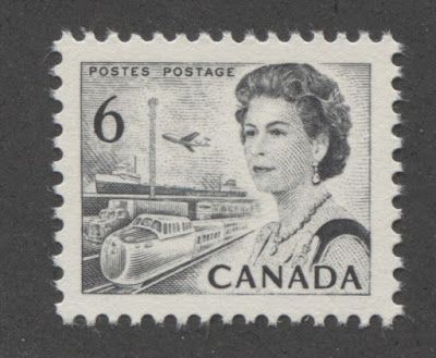
6c orange - train, trucks, ship and airplane - any major city in Canada, but most like Toronto.
Issued: November 1, 1968.
6c black - transportation, as above.
Issued: January 7, 1970.
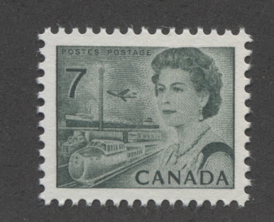
7c emerald green - transportation, as above.
Issued: June 30, 1971.
8c slate - Parliamentary Library, Ottawa.
Issued: December 30, 1971.
8c violet brown - Alaska Highway, by A.Y Jackson - representing the Yukon.
Issued: February 8, 1967.
10c olive green - Jack Pine, by Tom Thompson - representing Ontario.
Issued: February 8, 1967.
15c purple - Bylot Island by Lawren Harris - now Nunavut.
Issued: February 8, 1967.
20c dark blue - The Ferry, Quebec, by J.W. Morrice - representing Quebec.
Issued: February 8, 1967.
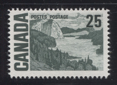
25c slate green - The Solemn Land by J.E.H Macdonald. - Algoma region, Ontario.
Issued: February 8, 1967.
50c brown orange - Summer's stores by John Ensor - represents the Prairies.
Issued: February 8, 1967.
$1 carmine red - Edmonton Oil Field by H.G. Glyde.
Issued: February 8, 1967.
So the designs taken together are supposed to represent and celebrate the diversity and vastness of Canada. The designs do a fairly good job of portraying the different regions and major industries of the country, although I notice that mining is not depicted on any of the stamps in this series, although oil and fishing are.
Usually in my posts, I discuss the different points of interest that a specialist can take a given issue in. These points are usually a combination of the ways in which the different attributes of the stamps vary, as well as the different issue formats and different ways that the basic stamps can be collected. However, this issue is so complex, that I feel in order to do it justice, I need to write four groups of posts:
1. A group of posts to go over the actual ways in which the various physical attributes of the stamps vary for the issue as a whole so that when I get into the specifics on each value of the set, you will be familiar with what I am talking about.
2. A separate post for each basic stamp in the series, so 16 posts in all. Each of these posts will examine the value in detail and will be closest to the type of posts that I usually write. It is here that I will cover aspects, such as plate blocks and plate varieties.
3. Separate posts for the complete booklets, cello paqs, coil stamps and the postal stationery, as each of these areas has their own varieties.
4. Separate posts to look at the postal history and cancellations.
In terms of the physical attributes of the stamps in this series, each and every one of them exhibits a wide range of variation across the issue. Sure there are many stamps that show little to no variation of one or more attributes, but when the entire issue is examined together, every single attribute is the basis for a specialized collection in its own right. The attributes are:
- The paper
- Gum
- Ink
- Tagging
- Perforation
- Plate characteristics.
I will now discuss these very briefly and illustrate the need for separate posts to deal adequately with each of these.
Paper
This is perhaps the aspect of this issue that is the most fun to study and has received the most attention from philatelists over the years. There are a seemingly almost infinite number of varieties of fluorescent reaction when the stamps of this issue are viewed under a long-wave ultraviolet lamp. All but the most specialized handbooks and journals limit the classification of fluorescence to just a few broad categories such as plain, low fluorescent, highbrite etc. But the reality is far more complicated than this. For starters, the two stamps with the same overall fluorescence level, can appear to be different colours under the lamp. For instance a stamp that is classified as plain, can appear bluish white, grey, or light violet under UV. Also, the paper can contain fluorescent fibres embedded into it that react differently from the majority of the paper, being usually brighter. The presence of these fibres can make the paper appear more fluorescent than it actually is. The density of these fibres can vary widely, as can the brightness of them. As a result, there can easily be dozens of different fluorescence levels for a given stamp.
However, fluorescence is not the only property of the papers that vary and you can have quite a lot of fun and challenge if you expand your horizons to include other properties of the paper used, such as:
- The direction of the paper weave, i.e. horizontal or vertical.
- The presence of any ribbing on the paper surface, either the front or the back.
- Whether or not the paper is porous on the surface or not. You need a good magnifying glass for this, but if you have one, you definitely find papers that appear to be coated and non-porous, while other ones will be quite porous on the printed surface.
I am sure that the Centennial study groups have probably examined these attributes and written about them in obscure journal articles. But very little attention is paid in the mainstream literature to these three aspects of the paper. Unitrade does list some ribbed papers on the 2c, but does not really consider any of these other properties on any other value.
Gum
Most philatelists will be aware of two major types of gum on this issue: dextrine, dextrose of DEX gum, and PVA gum. Many will also be aware of a third type of gum which Unitrade calls "spotty white gum". Beyond this, not much attention has been paid to the gum on these stamps. In reality, there are several types of dextrine gum and several different types of PVA gum. These different types all vary in terms of their colour, whether they are smooth or streaky, and their surface sheen. The "spotty white gum" in Unitrade is really a glossy and streaky type of PVA gum for instance. Many collectors may feel that these differences are too minor and too random to be collectible, or they may think that the different types can be found on the same sheets and are therefore not real differences. I have handled many sheets and large multiples of this issue and I have never come across this phenomenon where the gum varies in the sheet. It is always quite uniform in the sheets I have examined. I like to use the analogy of comparing gum to paint on a wall. We all know that paints that give different finishes are not accidental. There are different chemical formulas used to make paint and to ensure that some paints dry with a matte finish, while others will dry with a high gloss shine. I believe that the same is true of gum: a glossy gum has a different chemical makeup from a matte one, or one with a satin sheen.
Some stamps in this series only exist with dextrine gum, while others exist with only PVA gum because that is all that was in use by the time the stamps were issued. However, most exist with both types, and I suspect many different types of each, though this is an aspect of this issue that would require careful, disciplined study.
Ink
Ink is another physical attribute that has received very little attention in the philatelic literature, which is a pity, I think, because next to paper, this attribute exhibits the most variation of all the other attributes. Unitrade does list a fluorescent ink on the 6c orange, but other than that, no attention is devoted to ink at all.
Firstly, every single value of this set exhibits at least two shade varieties. Most of these are subtle at first, but as you become familiar with the colours and you work with lots of stamps, over time, they will become quite obvious to your eyes. Generally speaking, the early printings had the deepest, dullest colours, which became brighter and more intense as we move closet to 1973. This is of course, the appearance of the inks in normal light. Under long-wave ultraviolet (UV) light, it is possible to see other variations in the colours. In many cases you can have colours that are the same shade under both types of light, while having others that vary widely depending on whether you are looking under normal or UV light. Some inks completely change colour under UV. The fluorescent ink on the 6c orange is but one example. However, there are other instances. For example, many of the lighter, brighter colours, such as the orange brown of the 50c can appear black under the UV lamp, while others appear brown orange with a violet tinge, being merely the reflection of light from the lamp. The most specialized literature has considered this in quite a lot of detail, but it is not an aspect of these stamps that has received anywhere near the amount of attention that it warrants in my opinion.
Tagging
This attribute of the issue has received a large amount of attention, but again, not nearly as much as I feel it should. Most collectors who use Unitrade are aware that most stamps of the issue exist with Winnipeg tagging that is either in the form of a centre bar on values below 5c, or 2 bars on values 5c and over. Many are also aware of the fact that two types of Ottawa tagging are found on most values as well and it is here that most collectors stop.
However, there are many varieties of Winnipeg tagging that can be studied in more detail, such as:
- The width and spacing between the tagging bars.
- Error shifts of the tag bars, that result in single bar tagging when it should be two.
- The chemical makeup of the taggant, as evidenced by difference in the colour of the glow under UV light.
- The amount of taggant applied, i.e. light, moderate and heavy. This affects how obvious and dark the bands are when the stamp is viewed in normal light.
With respect to Ottawa tagging, in addition to the difference between OP-2 and OP-4 tagging, there are also differences in the colour of the tagging under UV, with some stamps showing a distinctly bright green tagging, whereas others appear very bright yellow. There are also error shifts in this type of tagging where stamps show a single centre band of tagging when they should have had two bands. Some of the specialized catalogues have identified different widths of Ottawa tagging, with 3 mm bands and 4 mm bands being two widths that have been positively identified as existing on several values. Finally, although I haven't come across this yet, there may be differences in the spacing between the tag bars.
Perforation
Prior to this issue, all Canadian stamps were line perforated. While most of the stamps of this issue were line perforated 11.85 x 11.85, the stamps printed by the British American Bank Note Company introduced comb perforations into this issue. There were two measurements that were introduced: 9.9 and 12.5 x 12. However, beyond this, there has not been much research conducted to see whether or not there were any minute gauge changes like the one that has recently been discovered for the period from 1962-1965, where the Canadian Bank Note Company switched from an 11.95 gauge to 11.85. It is entirely possible that similar changes may have occurred for the stamps of this issue.
The coil stamps came in two documented perforation measurements: 9.5 horizontally and 10 horizontally, though again, it is possible that slight variations may exist.
Plate Characteristics
Most collectors will be familiar with the three die type differences that have been identified in the mainstream literature for the 6c black. However, over the years more and more attention has been paid to studying the design characteristics in more detail, and as a result, many constant varieties have been identified on the 2c, 6c, 7c and 8c values. I believe that there probably are similar die type differences on the other values as well because I have seen stamps that show weak impressions similar to the die 1 6c, and then others where the engraving is very strong. Much more painstaking research would be required to determine whether or not there actually were different dies used for the other values.
Unitrade mentions the existence of the 33 different "totem pole eyes" on the 2c, the "airplane in the sky" on the 1c, the line through the 5c, the doubled C on the 6c orange and the extra spire on the 8c. However, there are very few constant varieties actually listed for this issue. All of these varieties have only been documented in Unitrade in the past 10 years or so. So it seems to me that there must be many more varieties out there that are waiting to be discovered on the other values. However, a detailed study of many thousands of stamps may be necessary to identify them all.
Cello-Paqs
Two stamps from this issue only, being the 4c and 5c, were issued in cello paqs that sold for $1 each. The 4c was thus printed in panes of 25 for this purpose, and the 5c was printed in panes of 20. The 5c was also issued with Winnipeg tagging in this form. Until just a few years ago, there were no listed varieties of the cello paqs. However in the past several years, Unitrade has started to give recognition to a dead paper variety on the 4c, but nothing on the 5c, even though I can confirm that the 5c too exists with dead paper. In addition to differences in paper, I have seen differences in shade, gum and the design of the cellophane packs themselves.
Coil Stamps
The coil stamps were all printed by the Canadian Bank Note Company (CBN), and as such they exhibit the same types of spacing varieties as coils printed by the CBN for other issues. However, in addition to these, I have also seen differences in paper and gum as well. A separate post to adequately address all of these varieties is definitely in order.
Booklets
The booklet stamps will be discussed under each value, but it is necessary to have an entire post devoted to the complete booklets of this issue, as there are differences in the design of the booklet covers, differences in the fluorescence of the cover stocks, and other constant varieties. The booklets can generally be split up into the non-integral, stapled booklets that were printed by the CBN, and those integral booklets that were printed by the BABN, which comprise most of the booklets of this issue.
Postal Stationery
There was a very large range of postal stationery items prepared for this issue, which can be studied in much more detail than is listed in either Unitrade or Webb. The postal stationery can be divided into two broad categories: the publicly issued products such as envelopes, postcards, flimsies, and then the private order products, many of which are extremely rare now, especially used. A separate post will definitely be required to do this aspect of the issue justice.
Postal History
Postal history for this issue also requires its own post. Three postal strikes during the life of this issue, resulted in three rate-increases between 1968 and 1972, which affects what constitutes an interesting cover. There were also new rates established during this period, and the abolition of other rates and/or services, such as third class mail. An example of a new rate was the "all up" airmail rate of 15c that was introduced in 1971. A separate post is needed to detail the rates, changes in rates, usages for the stamps and to discuss approaches that can be taken to collect the postal history of this issue.
Roadmap of Upcoming Posts
Based on the above discussion, it seems to me that a logical sequence for the remaining posts about this issue to follow is as follows:
1. The papers used to print the stamps.
2. The types of gum found on the Centennial issue.
3. Differences in the inks used to print the stamps.
4. Winnipeg tagging on the Centennial issue.
5. Ottawa tagging on the Centennial issue.
6. Perforations on the Centennial issue.
7. Plate characteristics of the stamps - die type differences.
8. Plate characteristics of the stamps - the totem pole eyes on the 2c.
9. Cylinder flaws on the 6c, 7c and 8c stamps printed by the BABN.
10. Constant plate varieties on the Centennial Issue.
11. The 1c brown Northern Lights and dogsled team stamp.
12. The 2c green totem pole and river stamp.
13. The 3c purple combine and oul rig stamp.
14. The 4c carmine red seaway lock stamp.
15. The 5c blue fishing village stamp.
16. The 6c orange transportation stamp.
17. The 6c black transportation stamp.
18. The 7c emerald green transportation stamp.
19. The 8c slate parliamentary library stamp.
20. The 8c violet brown Alaska Highway stamp.
21. The 10c olive green Jack Pine stamp.
22. The 15c purple Bylot Island stamp.
23. The 20c dark blue Ferry, Quebec stamp.
24. The 25c slate green Solemn Land stamp.
25. The 50c orange brown Summers Stores stamp.
26. The $1 carmine red Edmonton Oil Field stamp.
27. The Cello-paqs and miniature panes of the Centennial Issue.
28. The coil stamps of the Centennial issue.
29. The booklets of the centennial issue.
30. The postal stationery of the Centennial issue.
31. Postal history of the Centennial Issue.
So my plan is to write and publish 31 different posts over the next 31 weeks, all of which will deal with the stamps of this issue.
Next week's post will dive right in to a discussion of the papers used to print the stamps of this issue.
