Today's post begins a new, long series of posts which will delve into an issue, that, in my opinion, has the potential to be more rewarding and fun to collect than the 1967-1973 Centennial Issue that preceded it. When I was a kid growing up, there were almost no recognized paper varieties in Unitrade and only a few listings for perf. changes, type differences and the basic tagging differences. However, over time as the issue has gained in popularity, more and more varieties have been uncovered by specialists. Sadly though, many of these are quite scarce now, especially in corner block form, because many of these stamps were being used by collectors and dealers in the 1980's-2000's as discount postage, with the result that much of the existing supply of mint stamps has been severely depleted. In fact, there are several listed varieties in Unitrade that I have never seen at all, ever.
Today's post will serve as an overview of the issue and will outline what there is to collect and what attributes can form the basis for specialization. Then, like I did with the prior Centennial issue, my first series of posts will discuss, in detail, the various physical attributes of the stamps, as they pertain to the issue as a whole. Then, finally, I will write a post or two for each value of the series, depending on the level of complexity associated with it.
This is the first Canadian definitive set to be printed by three different printing firms: British American Bank Note Company (BABN), the Canadian Bank Note Company (CBN) and Ashton Potter. Unlike the previous Centennial Issue, which was printed by engraving only, this issue combines three different printing processes: engraving, photogravure and engraving and lithography. It was also issued in stages between 1972 and 1973, with subsequent printings of various values being issued until well into 1977. The low value sketches of the prime ministers and the Queen were issued On October 17, 1973, with the 7c value being issued on April 8, 1974, and the 10c value being issued on September 1, 1976. The mid-range values from the 10c to 50c were first issued on September 8, 1972. The first printings of the $1 and $2 were issued on March 17, 1972, so they were the first stamps to be issued. Finally, the later printings of the $1 were issued starting October 24, 1973.
David Annesley a sketch artist, designed the low value stamps, with the lettering designed by Ken Rodmell. The high values from the 10c to the $2 were designed by Reinhard Derreth after photographs by John De Visser (10c), Harry Rowed (15c), Chris Lund (20c), Ted Grant (25c) and Fred Ruggles (50c).
It is hands down, my favourite definitive issue, and the one that got me started on stamps, as I described in my background page. Without further ado, I give you the designs.
The Basic Stamp Designs
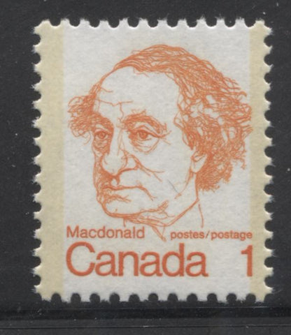
1c Orange - Sir John A. Macdonald
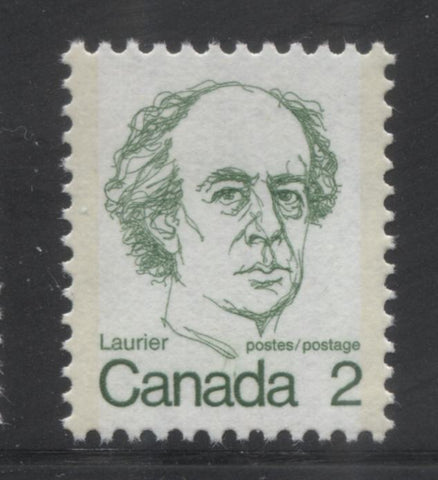
2c Green - Sir Wilfred Laurier
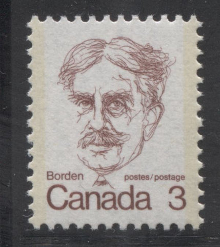
3c Purple brown - Robert Borden
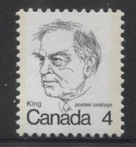
4c Blue-black - William Lyon MacKenzie King
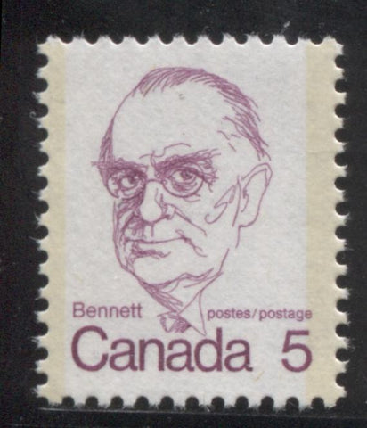
5c Rose-lilac - Richard Bedford Bennett
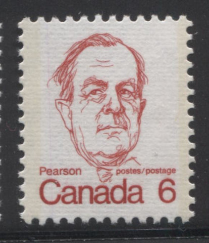
6c Scarlet - Lester Pearson
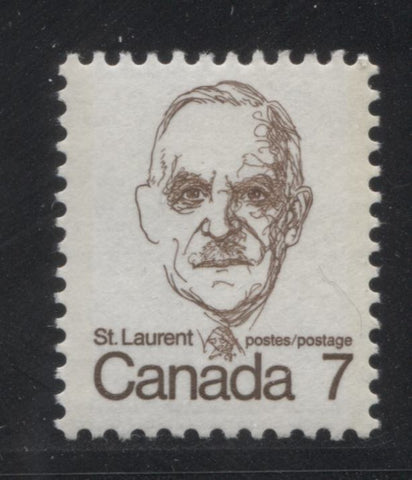
7c Sepia - Louis St. Laurent
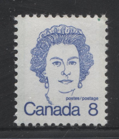
8c Ultramarine - Queen Elizabeth II
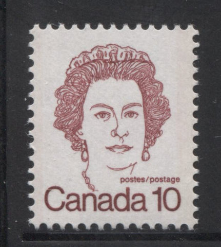
10c Carmine - Queen Elizabeth II
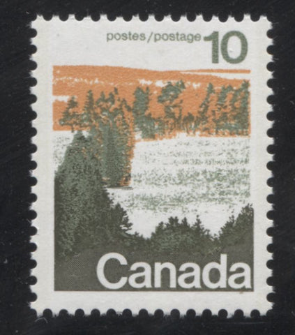
10c Orange and green - forest scene
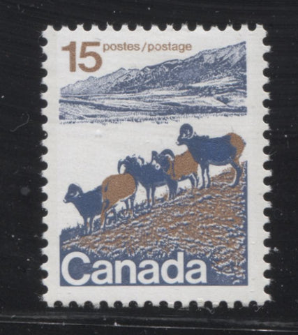
15c Brown and blue - mountain sheep
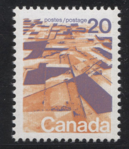
20c Deep lilac and orange - aerial view of prairies
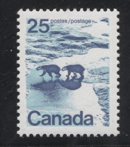
25c Azure and dark blue - polar bears
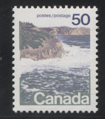
50c Grey-green, beige and blue - seashore scene
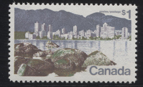
$1 Vancouver, as seen from Kittsilano - lithographed printing
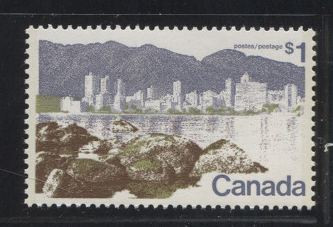
$1 Vancouver - BABN printing
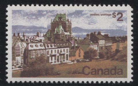
$2 Quebec City
So there you have it: very different styles of design, which may not appeal to some collectors, but I quite like them, especially the sketches of the prime ministers. Now, I will provide an overview discussion of all the ways in which a collector can specialize in this issue and drill deeper beneath the surface of the basic stamps.
Stamps That Were Printed by More Than One Printer
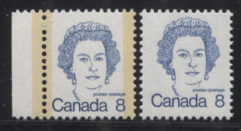
Other than the $1 Vancouver, a number of the low value stamps of this issue were printed by more than 1 printer. All of the low values were printed by the CBN. But the 1c, 2c, 6c, 8c and 10c were all printed by the BABN also in booklet form, while the sheet stamps of the 7c, 8c were printed by both BABN and CBN, while the 10c Queen sheet stamps were only printed by BABN.
The coil stamps, mid-values and high values, with the exception of the $1 were only printed by one printer: CBN for the coil stamps, BABN for the other values to the 50c and Ashton Potter for the $2.
For the low values the main differences between the BABN and CBN printings lie in the paper, the appearance of the tagging and the colour. An example of the difference between the BABN and CBN printings of the 8c Queen is shown above. Typically, the paper of the CBN printings has a slightly rougher texture, the colours appear lighter and the tagging bars are usually much more visible, although the intensity of the colour does vary, with the example shown above being one with very dark tagging. In contrast, the paper of the BABN printings appears smooth, the colours are deeper and the tagging bars are usually almost invisible. On some printings of the 8c, the ink has mixed with the taggant compound, resulting in light blue tagging bars.
Type Differences on The Mid-Range Values
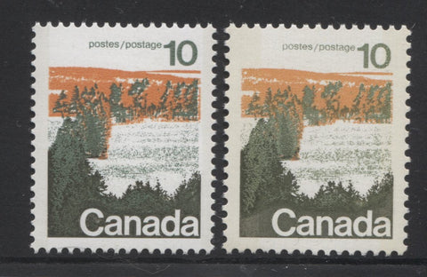
All of the mid-range values except the 20c are found to exist with two, slightly different versions of the design, that differ in small details. Typically these differences are attributable to a particular plate. The picture above shows two examples of the 10c forest stamp, with the right stamp being type 1 and the left stamp being type 2. The differences between the designs lie in the appearance of the shading around the word "Canada". On type 1 stamps, the background shading around the word Canada is clearly cross-hatched. On type 2, the shading appears solidly linked. For this stamp type 1 appears on all plate 1 printings, while type 2 appears on plates 2 and 3.
The close-up scan below shows the differences between the type 1 and type 2 designs more clearly:

I will illustrate the other type differences on the 15c, 25c and 50c in a subsequent post.
Shade Differences on The Stamps
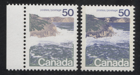
Although Unitrade does not list any of them, most stamps of this issue can be found with shade differences that range from prominent to subtle. As I mentioned in the discussion of the different printings of the low values, there are clear shade differences on stamps printed by the different firms. However, even within the printings made by a particular firm, there can be some marked shade differences. For example the booklet stamps of the 2c Laurier can be found in a bright and dull green shade. Many of the CBN printings of the 1c, 3c, 5c and 6c can be found with subtle, but discernible differences in shade. The two examples of the 50c above show a prominent difference in the shade of blue on the cliffs. I will cover the major and subtle shade differences I have found in a separate post.
Differences in Paper Colour and Texture
Like the previous Centennial issue there are some subtle variations in the paper colour and texture. Most all of these were unlisted by Unitrade until the past 20 or so years when many began to be listed. Still, there are variations that remain unlisted, such as the one shown below:
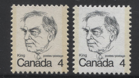
The scan shows two examples of the Mackenzie King stamp, with the normal printing shown on the right. Usually the normal paper appears dead white. However, I have found some versions printed on a paper with a light brownish rose tint, such as the example shown on the left. Also, the initial printings of the mid-values are printed on a very light cream paper, while the later printings are on a dead what paper. You can see this difference if you scroll back and look at the scan showing the two types of the 10c forest stamp again.
One difference that is listed by Unitrade now is the ribbed papers. These are listed as occurring on some printings of the 1c, 2c, 4c, 6c and 8c. For some reason no examples of the 3c and 5c are known thus, though they may exist. The ribbed paper shows distinct horizontal ribbing on the surface. An example of the 6c Pearson on ribbed paper is shown below:

Another difference that is now listed in Unitrade concerns the different textures of the chalk surfacing that is found on the 10c-50c values. The early printings were produced with a distinct vertical ribbed effect on the surfacing, and some small portion of the printings were printed with surfacing that is smooth, except for some very light horizontal striations. Finally, the very last printings of these stamps, made after 1974 had completely smooth chalk surfacing.
Differences in Paper Fluorescence Levels
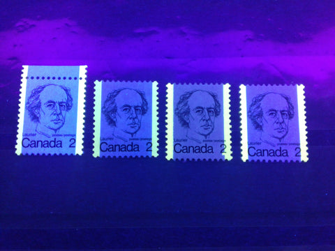
Paper fluorescence is one area in which this issue really shines in my opinion. Fluorescent papers are the norm here, as compared to the previous issue where dull paper was the norm. However, the fluorescence levels found cover the full spectrum, from non-fluorescent to hibrite. In addition, these fluorescence levels are different on both the front and the back of most stamps. While this might be expected on the mid-values and high values, where the paper is chalk-surfaced, it may surprise collectors to realize that they can be found on the low values as well, which were generally printed on uncoated paper.
Differences in Tagging
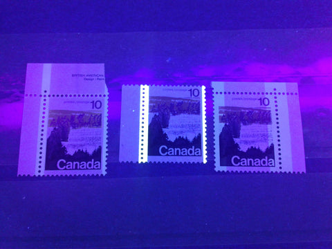
This is the first definitive issue in which all of the stamps, except the Ashton Potter printings of the $1 and $2 are tagged. Untagged examples of the values below $1 are errors and are highly sought after and scarce. Like the previous issue, the stamps can be found with a variety of different tagging formats:
- Winnipeg tagging, shown on the right above, was used on the some portion of the first printings of the 10c, 15c, 20c and 25c, even though it was in the process of being phased out by 1972.
- Ottawa Migratory OP-4 tagging, shown on the left above, was used on the majority of the first printings of the 10c, 15c, 20c, 25c and 50c.
- Ottawa OP-2 tagging, shown above centre, was used on the 1973-1974 printings of the 10c-50c values. Initially this tagging was 3 mm wide, but was switched to 4 mm tagging in late 1974. I have heard that 2 mm tagging can also be found, but I have not seen examples.
In addition to the different formats of tagging, differences can be found in the intensity of the colour under UV and in normal light, as well as the positioning of the tagging on the stamp. Two examples of 1-bar tagging errors that result from shifting of the tagging bars, relative to the sheet are shown on the 2c Laurier below:
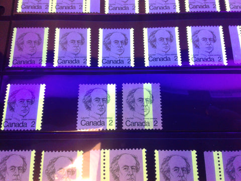
The picture above shows an example of a 1-bar right tagging error on the left, and a centre 1-bar tagging error on the right.
Perforation Differences and Anomalies
Like the previous issue, the stamps of this issue were printed using different perforations, and was the last issue to feature line perforated stamps, on the Ashton Potter printings of the $1 and $2. These are perforated 11. This was CBN's first time adopting comb perforating as well, since all the stamps they printed up to this point were line perforated 12 x 12.5, which was an entirely new gauge that they had not used before. They struggled with the process, as can be seen from the 2c pair below:
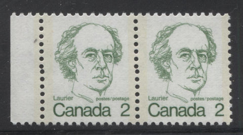
This pair shows a slight discontinuity in the vertical perforations which results from two strikes of the comb perforator not quite being properly aligned. Other examples of stamps and multiples can be found that show double punched perforations, extra large perforation holes, elliptical perforation holes and perforations that do not fully punch through the paper. These are only found on the CBN printings of the low values.
The BABN used a comb gauge of 12 x 12.5 on the booklets and 12.5 x 12 on the values from 10c-$1 that it printed from 1972 to 1976-77, when the gauge was 13.3. This later perforation is found on all sheet stamps of the 10c Queen and the last, plate 6 printing of the 8c Queen stamps.
Precancels
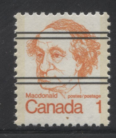
The low values of this issue printed by the CBN, except for the 4c and 7c exist precancelled with two pairs of horizontal black lines, as shown above. This is similar to the precancels found on the previous Centennial issue, except that here there are only 2 pairs of lines instead of the three pairs that are found on the Centennial Issue. Like the Centennial issue, the side margins of the precancelled sheets contain a warning telling people that these stamps are only to be used with the proper authorization.
Coil Stamps
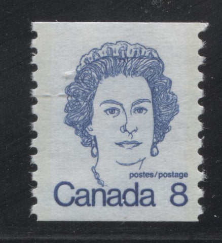
The CBN printed coil stamps for both the 8c and 10c values, and an example of the 8c stamp is shown above. The 8c coils were issued on April 10, 1974, while the 10c coils were issued on September 1, 1976, at the same time as the sheet stamps. As with all CBN coil stamps, these also exist with the usual range of wide and narrow spacing varieties, as well as jump strips. The jump strips are much more tricky to identify on these, because there is no border on the stamp design, which would make the jumps more visible.
Plate and Corner Blocks
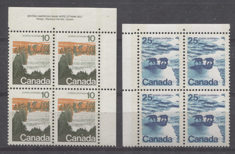
This is probably the most challenging aspect to forming a specialized collection of this issue. Most all stamps were issued with plate inscriptions like the block shown on the left, and most are found with 2-3 plate numbers, although the 8c is found with 6. However, it is now been determined that most of the scarce printings of the stamps of this issue were produced on field stock only. Thus many of the printings can only be found with blank corner blocks like the one shown on the right. Consequently, many are very scarce because until this fact came to light it was common practice for dealers to eschew field stock blocks, since they did not have inscriptions. Many were either broken up for singles, or otherwise used for postage, before anyone realized what they were.
Another interesting aspect to collecting the plate and corner blocks concerns the appearance of the selvage. On some stamps, the selvage is perforated through, while on other stamps it is either imperforate, or contains a single extension hole. Still, on others, remnants of holes can be found at the top or bottom of the upper and lower selvage tabs, which can serve as evidence that the panes were printed in a larger press sheet layout that was guillotined apart.
Booklets
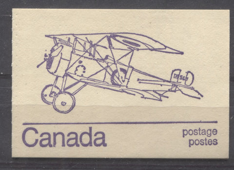
On this issue there were three basic booklets issued: a 25c booklet, a 50c booklet and a $1 booklet. These followed the most popular booklets issued during the Centennial era. Only the $1.50 booklets were discontinued. All of the booklets were integral booklets printed by BABN. On both the 50c and 25c booklets the cover designs featured aircraft, and like the very last booklets issued for the Centennial series, 10 different designs were used for each booklet. The $1 booklet featured a stylized purple and red maple leaf design on the cover.
An example of a 50c booklet is shown below:
Here is the what the inside pane of the booklet looks like:
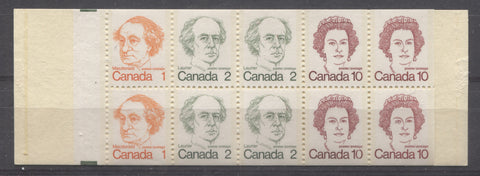
The number of basic booklet formats is much less complicated than the previous issue due largely to the fact that the method of production was not changed mid-issue and there were no postal rate increases until the end of 1976. However, which this issue lacks in basic differences, it more than makes up for in varieties. The quality control on these booklets was very, very poor, resulting in a lot of minor plate, inking and tagging varieties, as well as numerous variations in the fluorescence level and texture of both the stamp paper and cover stock.
Plate Flaws
This issue is found with a number of constant and non-constant plate flaws and varieties. Many of these are listed in Unitrade for the mid-values and the $1 Ashton Potter printing. The most famous of these is the "short dollar" flaw, which occurs on the Ashton Potter printings of the $1. This is shown below:

The left image shows the normal $ sign on the stamp. On this, the line clearly extends through both the top and bottom of the "S". On the short $ flaw, the line does not extend above the "S". A second version also shows a clear dot after the word "Postes".
The 15c, and 25c values exist with varieties that are the result of colour shifts, that are listed in Unitrade, while similar shifts on the 10c, 20c and 50c are not listed. The 50c is noted to exist with six minor constant varieties, though none of these are formally listed or illistrated in Unitrade.
The low values can also be found with a lot of minor flaws and hairline varieties that may or may not be constant. The 6c Pearson booklet stamp exists with a major re-entry, in which the word "Postage" is clearly doubled.
Sealed Post Office Packs
This is the first issue in which you can find sealed packs issued by Canada Post. These packs contained either:
- A complete set of single stamps, or
- Matched sets of plate blocks, or corner blocks of the precancels
The packs consist of a card insert bearing the Canada Post Emblem, which changed 3 times during the life of this issue, and the stamps or blocks. Not surprisingly, it is possible to find more than one type of pack for several of the stamps in the series. In addition the fluorescence of the insert cards can vary widely. This is an aspect of the philately of this issue which has not been completely explored. It is getting more and more challenging though, because many of these packs have been opened to get the blocks or single stamps. Consequently they are becoming scarcer and scarcer, with the passage of time.
First Day Covers
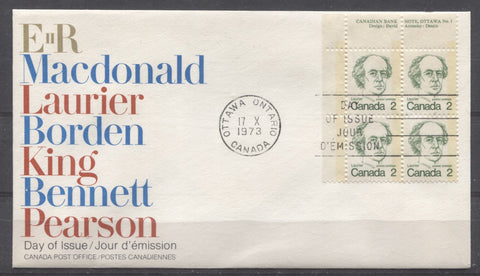
Most of the first day covers found on this issue are of the official Canada Post design shown above. Occasionally, you can find private cachets, though by now they are reasonably scarce. Canada Post used the same cachet for the original printings of the low and mid-values, and then a new cachet design when the 7c Saint Laurent and 10c Queen stamps were issued.
There are several ways that these can be collected. Firstly, they can be found franked with singles, pairs, blocks of 4 and plate blocks. Secondly, the fluorescence of the envelop stock can be found with several variations.
Postal History
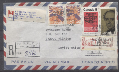
Some very nice covers can be collected for this issue, despite the fact that the rates were much simpler by the time this issue was released. However, there are still rates like third-class mail and many different special delivery rates that make the collection of these covers interesting. In addition, there are lots of commemoratives, approximately 100 or so that can be found used in combination with the stamps of this issue, like the registered airmail cover to Vilnius, USSR shown above. Finally, because this set replaced the Centennial issue gradually, you can find many covers in which the franking consists of stamps of this issue as well as the Centennial issue. Many of these covers are not nearly as common as you might expect, and so they can represent quite a rewarding challenge for the patient philatelist.
This concludes my overview of this issue. Next week I will discuss the type differences on the 15c, 25c and 50c, as well as the constant varieties that can be found on the stamps.


7 comments
Enjoyed your article. I have been preparing a presentation on the Landscape Definitives for our local stamp club focusing on the number of varieties there are for these five stamps and how difficult it can be to identify many of the varieties if one doesn’t have a UV light. I fortunately do have one. I found that MNH plate blocks that my Dad had collected in 1972 of the first printing with the OP4 tagging had produced some very interesting migration features both on the stamps as well as in the stock book they had been stored in for over 40 years. The tagging material had migrated onto the plastic/vinyl sleeves and cover sheets. My biggest problem is deciding which of the various degrees of fluorescence I have – the extremes are easier and depends which Type and Tag you have.
I have stamps from the Landscape Definitives that are Ottawa tagged, but do not have the yellow colour attributed to OP2 tagging. Rather, the tagging could be listed as white tagging. Could this be the earlier OP4 Ottawa tagging in which the yellow colour has completely migrated elsewhere (or faded away)? One of my 594-598 Unitrade set has this feature. They are all vertical weave. I also have two Plate 1 blocks (20 cent and 50 cent) which have white tagging. Unitrade does not offer an explanation for the white tagging, but a page taken from another album has a spot for “tagged with white bands” for the 25 cent. What gives???
Chris,
I have heard the term ‘field stock’ but now I am not exactly sure of its significance. Can you explain what it is, when it was used, and why. Thanks as always!
I really enjoy your analysis of the different issues.
Small study group? I’m in. I have a lot of unusual stuff that we can learn from.
The $1 Vancouver stamp has been one of my favorite Canadian issues. The image makes the city looks like a city of the future set within nature in a sustainable way. Today you will find me going though my copies of the stamp to see if I have the shading variations you pointed out.