
In late 1898, on the eve of a planned reduction in postage rates from 3c to 2c that was to take effect in the new year, the postmaster general at that time, Mr. Mullock decided to issue a commemorative design for Christmas.
Warren L. Green designed the stamp based on a map by George Robert Parkin:
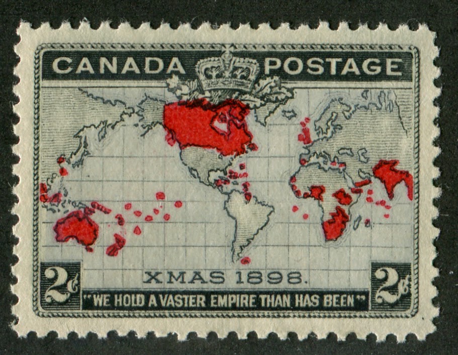
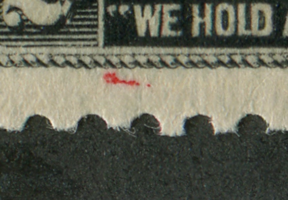
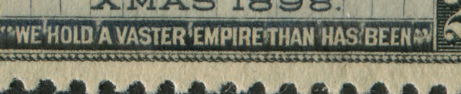
The actual map itself is based on Mercator's projection, which was drawn during the Renaissance. The theme was a celebration of the majesty of the British Empire. The member countries of the empire are shown in red and below appears the slogan "We Hold a Vaster Empire Than Has Been". Charles Skinner, who had worked on the Jubilee Issue and each of the preceding two issues, the Numeral Issue and the Maple Leaf Issue, engraved the design for this issue as well.
This issue has the distinction of being both to my knowledge, the first Christmas issue in the world, and also the first tri-coloured stamp. Also, it was one of the first stamps to employ more than one printing technique: the black portion of the design was engraved, while the ocean colour and the carmine were applied by typography. Finally, observation of the colour shifts that occur on these stamps suggest that the printing was done in three stages, not two. It appears that the black engraving was printed first, followed by the ocean colour and then finally the carmine. On some stamps, the oceans appear to be solidly inked, whereas on others, a clearly vertical lined pattern can be seen. It is not clear whether or not two different printing processes were used, or whether those stamps that appear solidly inked are just printed from worn cylinders where the lines have merged together. Again, this question could form the basis for a research project.
For some unknown reason, there were two basic colours used for the ocean: lavender and blue. It is not clear whether or not these two colours were used concurrently, or whether the lavender was used first, only to be replaced by the blue. I believe that it is likely that the lavender was used first and replaced because I have noticed that most used lavender stamps have much earlier dates (1898 and early 1899) whereas most blues are later (1899 and 1900). But conducting a formal, statistically based study of the ocean shades using used examples would settle this once and for all and could be quite interesting.
The stamps overall are not rare, as there were 19,927,500 stamps issued but there are scarce and rare varieties that a specialist can pursue, and there are no really cheap stamps from this issue. It is a good issue for someone who has a fairly limited collection budget per month, but a long time to collect. Over time, this individual could form a beautiful and valuable collection.
Pitfalls
There are not too many dangers involved in collecting these stamps. I have never come across any forgeries, re-perforated or regummed stamps. That being said, I think it is important to be aware of what the gum on this stamps typically looks like, so that you can spot possible re-gummed stamps:
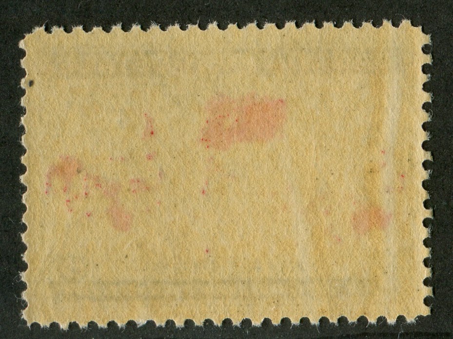
The gum is usually deep brownish to yellowish cream and has what I would call an eggshell-satin finish, It is not matte, but not excessively shiny either. As I said, pretty well every copy I have seen has this gum, so the danger posed by re-gumming is low.
Points of Interest
The main points of interest for this issue are:
1. Colour shades
2. Re-entries, retouches and plate flaws
3. Extra islands and territories
4. Imperforate pairs
5. The Muddy Water varieties
6. Plate blocks and multiples
7. Postal history
8. Cancellations
9. Die Proofs, essays and progressive proofs
10. Paper varieties
I will now discuss each of these in some detail.
Colour Shades
As stated earlier, there were two basic colours used for the ocean: lavender and blue. Older editions of the Canada Specialized catalogue going back to 1979 asserted that the actual colours were grey and blue, lavender being an accidental shade variation. I am not so convinced, as the true lavender is clearly a variant of lilac and not grey. Within each of these two groups most collectors recognize two more shade varieties: grey and deep blue. I think that there are even more shades than this. I have seen the following:
1. Deep lavender
2. Pale lavender
3. Light greenish blue
4. Light blue
5. Blue
6. Deep blue
7. Deep greyish blue
8. Pale grey
9. Grey
10. Brownish grey
From the dated cancellations that I have seen on used examples, it is my belief that the lavender was used first, found to be unsuitable and then grey was used instead. This was also found to be unsuitable and the colour was switched to blue, which got progressively deeper into 1899. until by the end of the issue it was deep blue or grey blue. These four basic ocean colours are found on the imperforate pairs, which is another reason why I believe the colour of this stamp was progressively changed over its life.
The black doesn't really vary either in shade or intensity. The carmine ink shows some variation, but in all cases it is a bright carmine. Most of the time, it appears that an aniline ink was used for the carmine, as on most stamps, the colour has suffused through to the back and can be seen very clearly. On some stamps, no clear suffusion is visible, and we can conclude that some were printed from non-aniline ink.
Re-Entries, Retouches and Plate Flaws
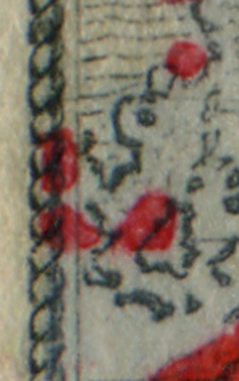
Of all the issues for early Canada, perhaps no other comes close to this one for the sheer number of re-touches and re-entries that can be found in the black portion of the design. The main areas affected by re-entries are the letters "Canada Postage", the outer lines of the cables that act as the frame, the map shading and the numeral boxes. For some reason that I do not quite understand, Unitrade only gives listing to the re-entry affecting "Canada Postage", and calls this the major re-entry. In my experience, this is the least spectacular re-entry. I find that the doubling of the map shading and the numeral boxes are the most prominent and fantastic re-entries. Some of these are illustrated below:
Here you can see if you look closely, an extra line just outside the cable.
Here you can see a double outer line at the top of the cable. There is only supposed to be one line.
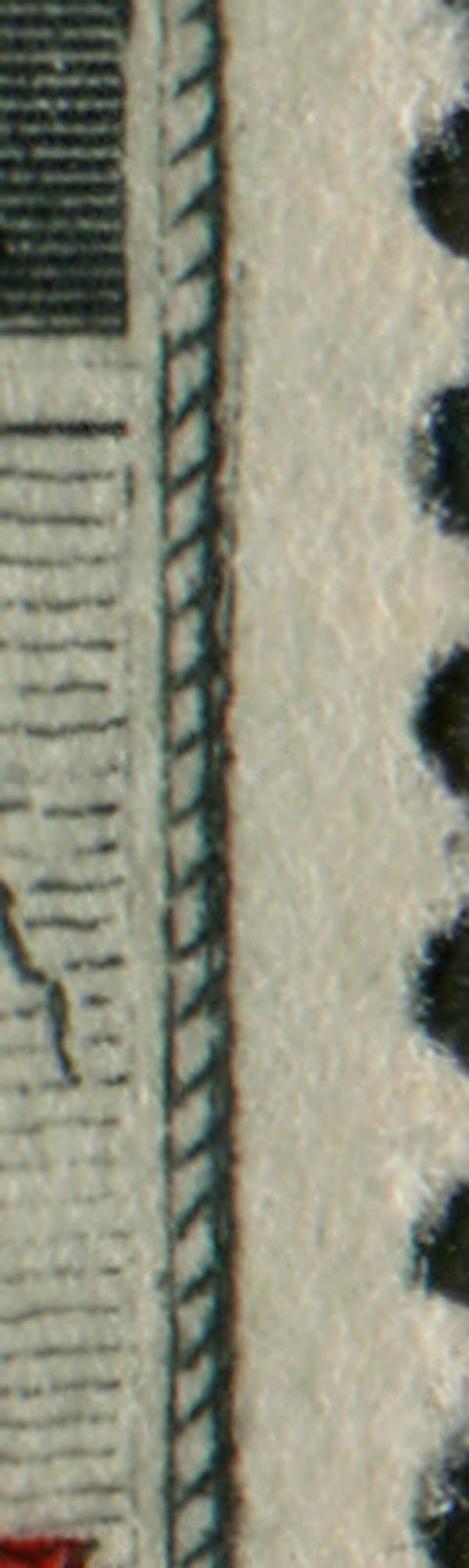
Occasionally rather than re-applying the transfer roller to re-furbish a plate, the engraver would re-touch worn parts of the design by hand using his engraving tool. This shows usually as a straight line where the line should have had curves in it. The re-touches are most commonly found on the cables surrounding the design, and appear as a straight line that lacks the kinked appearance that the cable normally has, as seen in the images below:

In both these images, if you look closely, you can see that a vertical line has been drawn into the cable that was intended to strengthen the existing frameline of the cable.
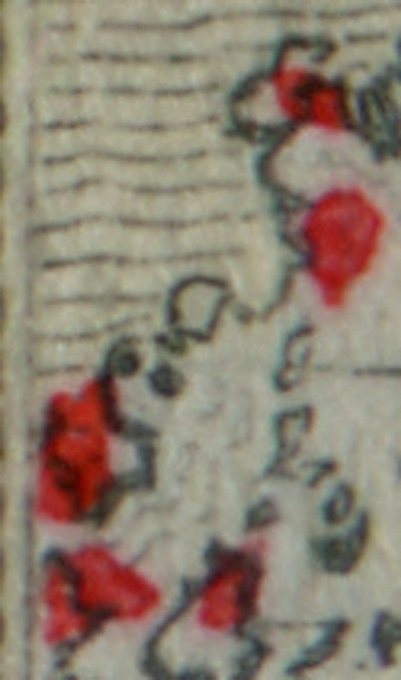
Occasionally, it is possible to find mis-placed entries on the design as well. The image below shows a stamp that has a mis-placed entry in the form of an extra island located in the bottom frameline.
Sometimes one can find stamps where parts of the black design are worn to quite a large degree, but have not been either re-entered of re-touched. The two pictures below show the weak cable at the top and the weak horizontal line under the panel containing the words "Canada Postage".
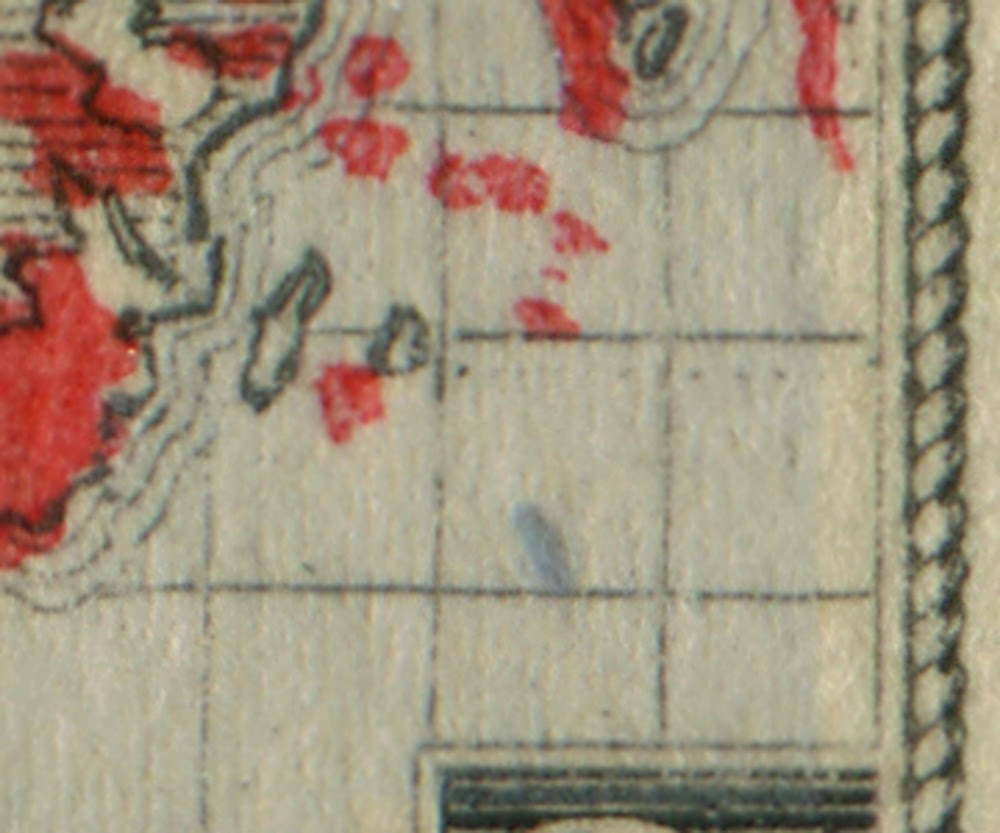
I have come across one instance where an over-inking of the lavender colour has resulted in an extra lavender coloured island just southeast of Madagascar.
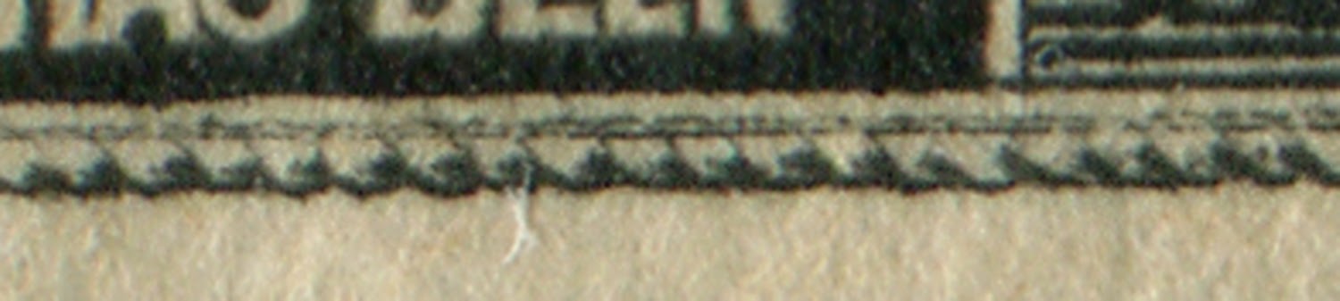
Unitrade does not list any plate flaws, but I have noted on a few stamps that there is damage to the tablet, such that there are several white accents between the words of the bottom inscription as shown below
In my mind this is a pretty spectacular variety, so I don't see how Unitrade could overlook it.
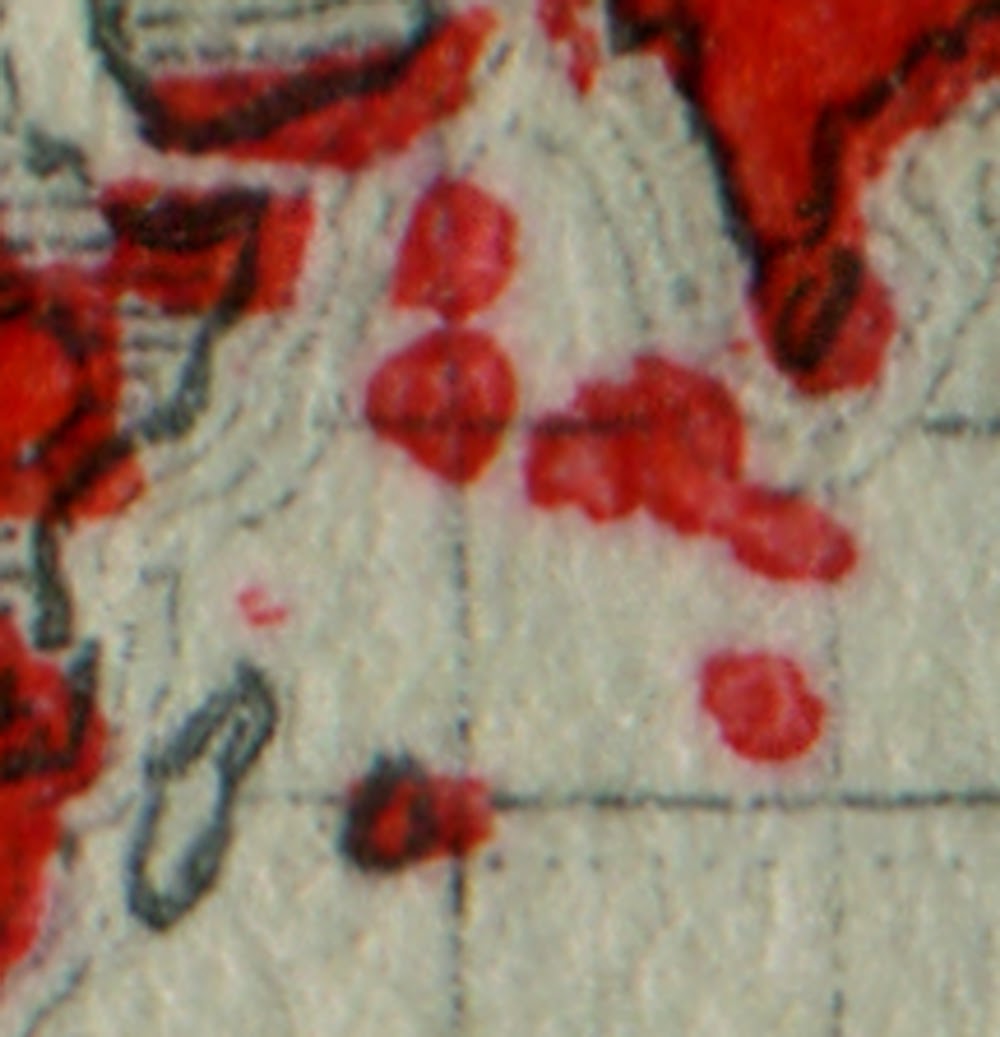
Extra Islands and Territories
The carmine was likely applied from a stencil of some sort, or from some type of rubber roller. It would appear that at first, the right amount of red was applied, resulting in clearly defined islands and territories. However, as the rollers or stencils wore, more ink was transferred, so we start to see extra large islands as well as many islands that are joined together. However, there are many instances as well where there are extra islands as well as extra territories on the continents that shouldn't be there. The noted philatelist W. Bradley has studied these varieties in detail and used them to plate the stamps of this issue to all five plates that were used. In addition, the carmine ink is often shifted, so that islands that should have received the carmine ink, like Mauritius, St. Helena, Vancouver Island and Ascension are white instead of carmine. The picture below shows an example of such a shift:
To identify the stamps that have extra islands, you need to first become familiar with each part of the design and be able to recognize what the normal islands look like. I find it is useful to break the design into sections and learn each one separately. The illustrations below show what the islands and territories on normal stamps should look like.
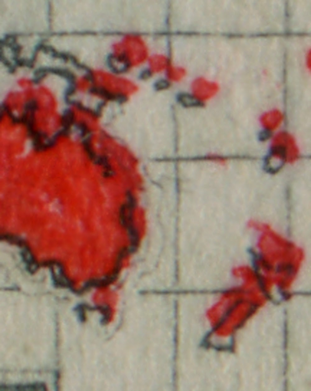
The above shows Australia, New Zealand, Papua New Guinea and the Northwest Pacific Islands. The colour is shifted upwards a bit, but clearly there are six islands other than New Zealand.
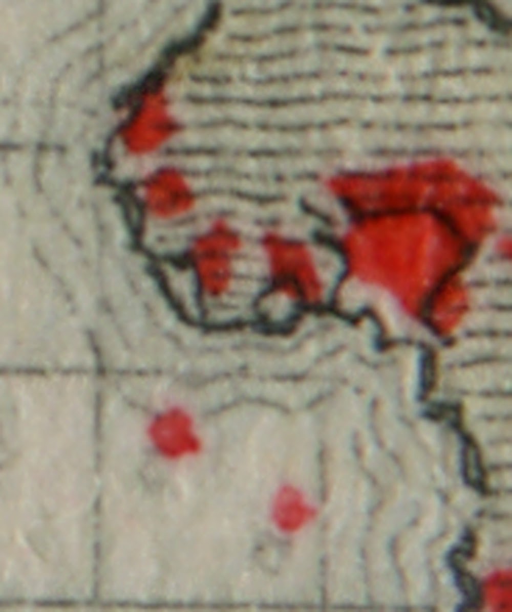
This shows normal north Central Africa and West Africa. The nothernmost island is St. Helena and the other island is Ascension Island. The largest colony on the mainland is British Central Africa, then the other four are: Niger Coast Protectorate, Sierra Leone, Gambia and Morocco.
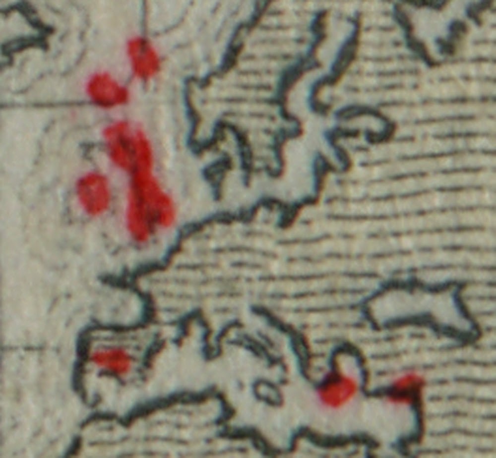
The United Kingdom and British Europe. Malta and Cyprus are off to the right. Gibraltar is at the bottom of Spain.
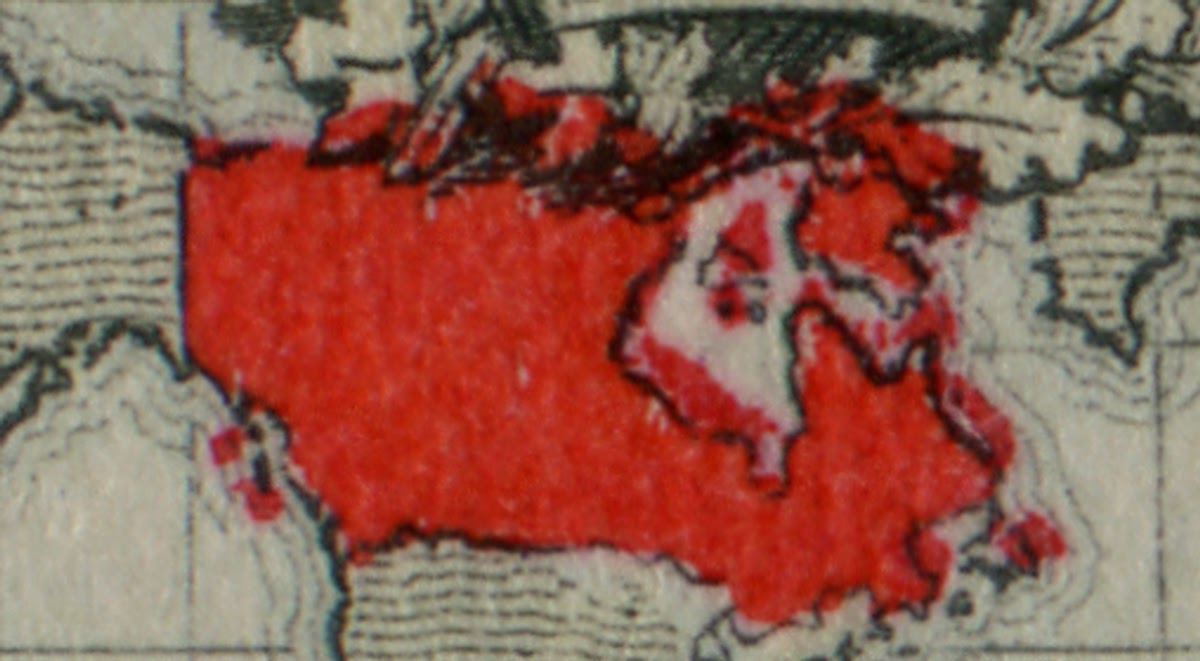
Canada, showing the Arctic islands, Baffin Island, Newfoundland and Labrador, the Gulf Islands and Vancouver Island.
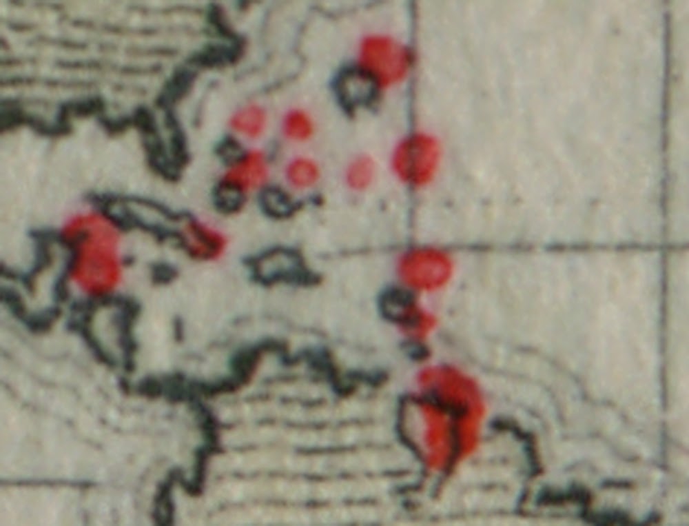
Central and South America. British Guiana is at the top of South America British Honduras and Trinidad and Tobago are over on the left. Then we have 10 other island colonies: Antigua, Bahamas, Barbados, Bermuda, Cayman Islands, Virgin Islands, Dominica, Grenada, Montserrat, and St. Kitts Nevis. There are actually 11 colonies, the eleventh being St. Lucia, but there are usually only 10 islands shown.
The Falkland Islands.
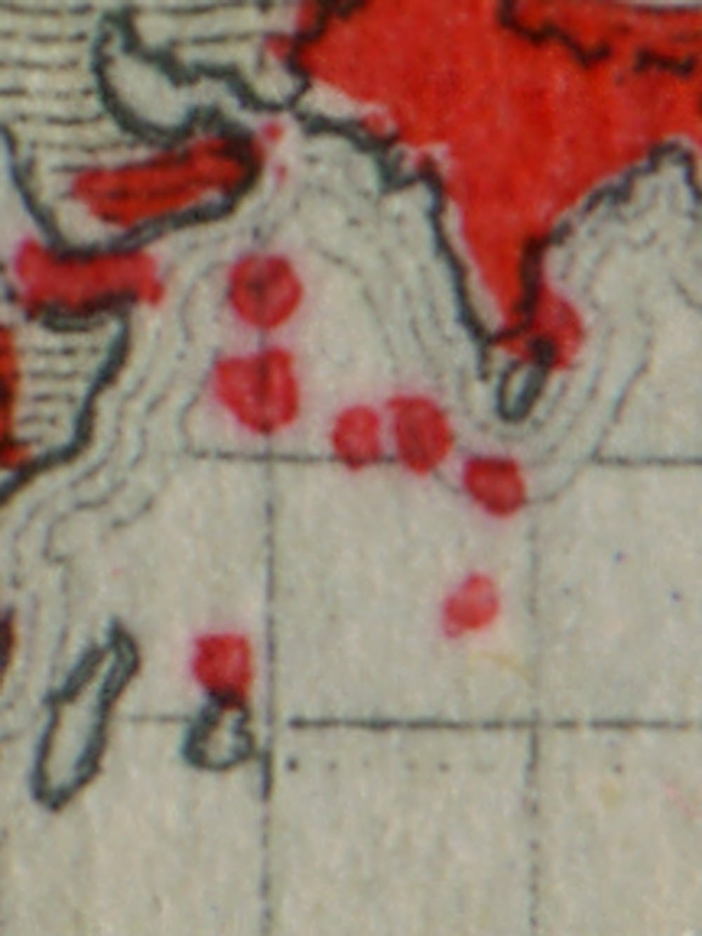
The Middle East and Indian Subcontinent. Mauritius is at the bottom. Egypt is over to the left, and then we have six island colonies for those colonies located in the Indian Ocean.
Southeast Asia just above and to the west of Australia. There are five territories shown on the map.
The South Pacific just northeast of Australia. There are normally eight islands, 4 in a rough square pattern and the others forming a boomerang shape.
Once you are familiar with these configurations you can begin looking for the extra islands:
Here we can see an extra island just north of St. Helena that is not due to any colour shift.
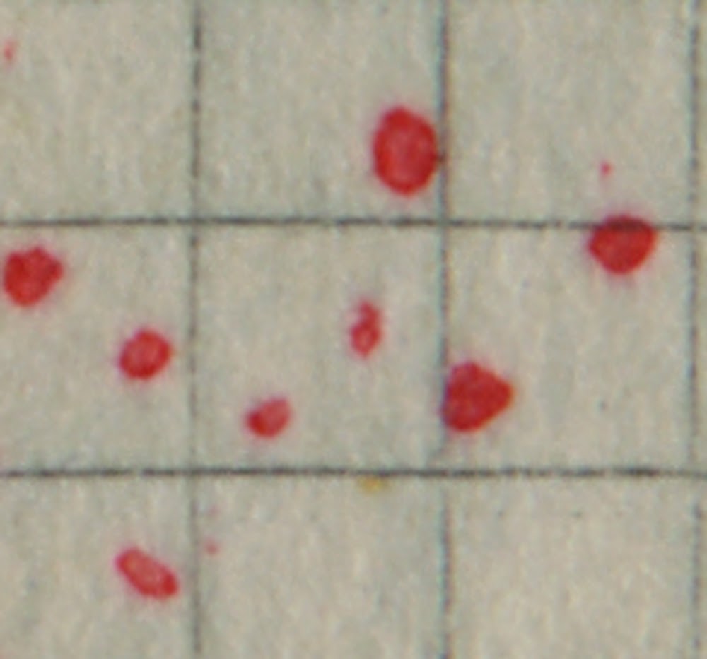
Here we can see that instead of 8 islands in the South Pacific, there are 11. The South Pacific is the most common area where we find extra islands, and the position of the islands differs in many instances.
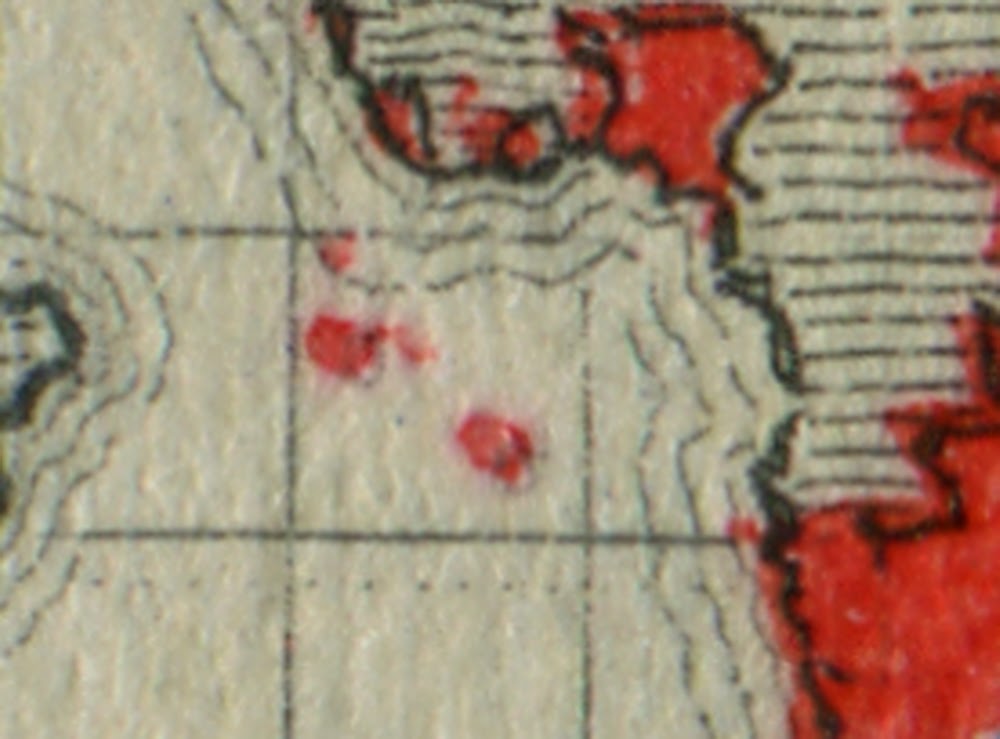
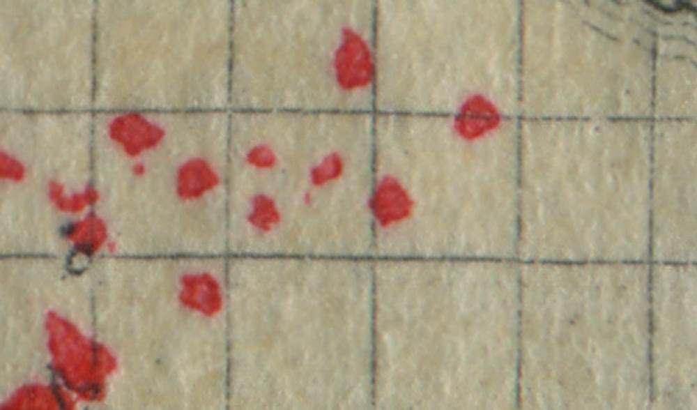
Here is another example of Africa, where instead of just Ascension and St. Helena, there are 4 islands.
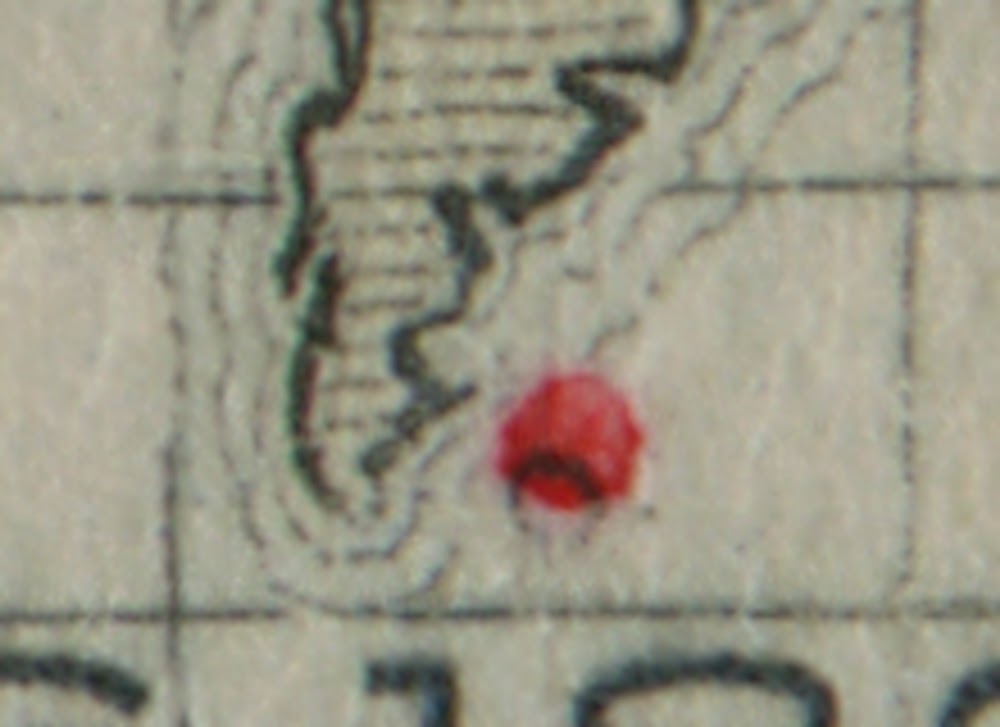
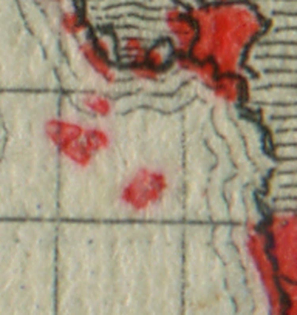
Here we clearly have an extra island just north of Madagascar.
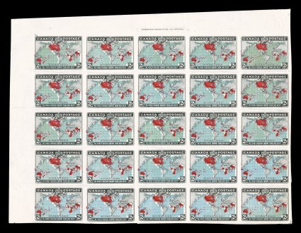
Imperforate PairsIt is thought that some 600 imperforate pairs exist. They come in all four of the basic ocean shades and all are without gum which is how they were thought to have been produced. It is not known whether one shade is scarcer than the other, although that could provide an interesting research project for someone to follow the sales of these pairs in notable auctions and start a census to determine the relative scarcity of each shade.
The stamps with blue oceans also exist in imperforate pairs that are either missing the carmine, or consist only of the black. Because these designs are incomplete, I believe these are actually progressive proofs as opposed to actual colour omitted errors. The fact that they only exist without gum supports the notion that they were never issued.
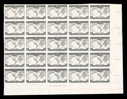
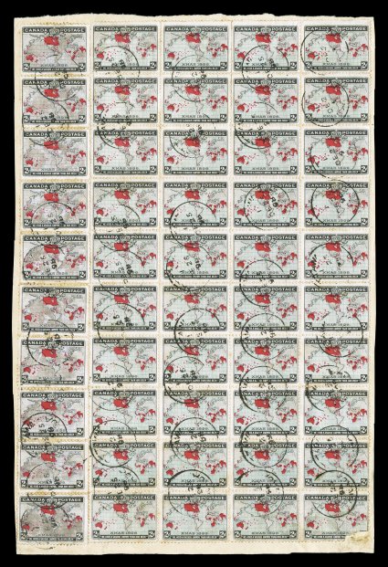
A block of 25 of the stamp in black only is shown above. This sold in a recent Spink auction for $7,500.
Muddy Oceans
Some stamps in both shades can be found with the oceans displaying a distinct brown muddy appearance. These are not genuine shade varieties because they are caused by oxidation of the ink used to print the ocean. Despite this fact, they do appear interesting, and are sought after by specialists of this issue.
Plate Blocks and Multiples
There were five plates used to print these stamps. Unitrade lists and prices plate blocks of 8 for all five plates, but does not clarify whether all plates exist in all four shades, or just one or two. The answer to this question would go a long way to settling the question as to whether all the shades were issued concurrently, in which case they should exist for all five plates, or were issued progressively as one colour replaced the others. If this is the case, then plate 5 should only exist in deep blue.
The sheets of 100 in which these stamps were printed were often folded down the middle and split to make two panes of 50. Because the plate inscription straddles the middle of the sheet, intact, unfolded plate blocks are rare and highly desirable.
Used multiples of any size are very scarce, and I cannot recall seeing any larger than a pair. Indeed any larger multiple would likely only have been used on a foreign registered letter. You should definitely purchase any that you come across, because they are not common at all.
Although exceptionally rare, it is still possible to find these stamps in full sheets:
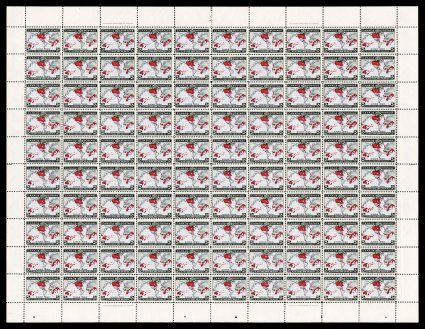
The above sheet was sold at a recent Spink sale for $3,750.
Some used multiples can be exceptionally large as well. Illustrated below is an entire half sheet of 20 that were used on a parcel wrapper.
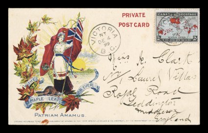
Postal History
This is a low value stamp, so that most of the postal history available will consist of local first class letters to Canada and the USA. However, this issue can be found on foreign mail, and these are very desirable.
First day covers of this issue are very rare and eagerly sought after. The official first day is December 7, but covers are known as early as December 2. As far as I know, the earliest known covers are from December 19, so a worthy challenge is to form a collection of covers used before the official date of issue on December 25. The cover below was sent on December 2 and sold for $21,000 in the same Spink sale that many other rare items featured in this post were sold.
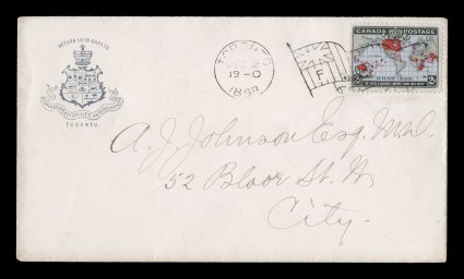
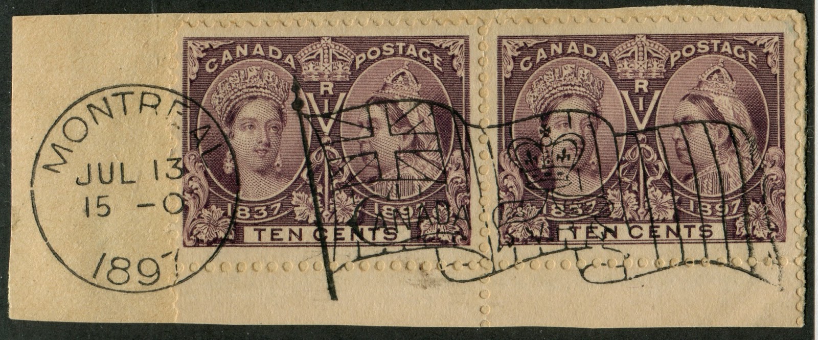
Covers also show the Bickerdike flag cancels very well and a nice collection could be formed of all the major cities in which these cancellations were employed. An example of this cancel on the 10c Jubilee Issue is shown below:
Advertising covers were still in wide use during the life of this issue, so one could focus on forming a collection of as many different advertising covers as possible.
Unusual usages would include acknowledgement of receipt forms and bulk mailing receipts. These would be quite desirable, as the stamps typically used on these types of forms are high values rather than large multiples of low value stamps.
Cancellations
Because these are larger sized horizontal format stamps, they take CDS cancels really well and you could spend your entire life collecting CDS cancels and probably never find them all. The same goes for squared circle cancellations, whose use was still very widespread at this point. Occasionally one finds some basic segmented cork cancels and it is possible that one might find the occasional fancy cancel.
Die Proofs, Essays and Progressive Proofs
I am fairly confident that I saw examples of the original artwork sketckes for the design of the issued stamp, and I know that there must be at least a large die proof in the issued colour and one in black. Again, I do not know if the proofs exist in all colours.
Some quick online research has turned up the following items:
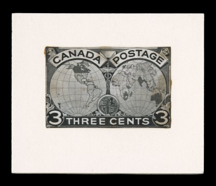
The above shows a photographic essay of a design similar to the one issued, but clearly different. The face value shown (3c) was the rate in effect when these stamps were being designed. The above essay was sold in a recent Spink sale.
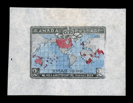
The above shows a hand coloured die essay that was sold in the same sale for $5,500.
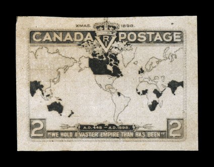
The above is the only known engraver's model essay of the design. It is a photograph of the design and as you can see if differs in several details of the design.
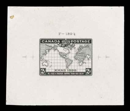
Here is one of several known large die proofs printed in black. This one sold in the same Spink sale for $7,500.
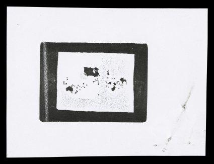
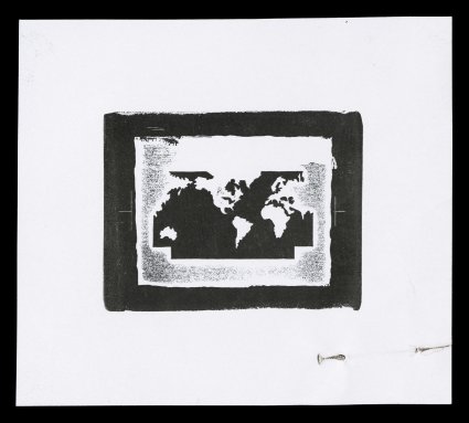
In addition to proofs of the black portion of the design, there were separate proofs made for the carmine portion of the design, and another for the ocean portion:
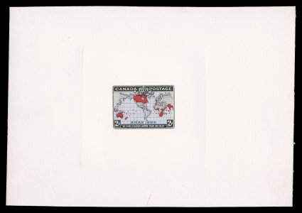
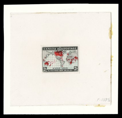
Finally, it would appear that hybrid die proofs exist in both the lavender and blue colours, which would support the notion that the colours in which these stamps were found might indeed have been issued concurrently:
In addition to the above, plate proofs in the issued colours were also produced, although Unitrade does not list them. Plate 4 in particular was never issued tocollectors and only recently, through a study of the re-entries by Ralph Trimble, did a block of 25 proofs from plate 4 come to light:
The above block contains the only known example of the position 43 major re-entry and is of the utmost rarity. It was sold for $35,000 in the same Spink sale as the other items I have illustrated here.
Paper Varieties
The paper used to print the stamps is fairly uniform. being a stout, soft vertical wove paper. I have not found any stamps on horizontal wove paper. However, I have found both toned and white varieties of the vertical wove paper. As far as thickness goes, the paper tends to have the same thickness of between 0.0035-0.004".
And that is my post about the Imperial Penny Postage Issue. As you can see there are a lot of very rare items once you get past the basic stamps. You can spend a fortune on collecting this issue and most certainly a lifetime.