
Today's post begins my examination of the second of the high values of this series: the 10c olive green stamp depicting Tom Thompson's "Jack Pine". It has the second highest number of listed varieties in Unitrade behind the 15c Bylot Island. It is the only stamp of the entire series to have appeared with the experimental "spotty white gum" that appeared at the beginning and middle of 1971.
In dealing with this value, rather than deal with all the untagged stamps first and then the tagged, I am going to split this value by the type of gum. So, today's post will examine the stamps with dextrose gum, then next week, I will look at the stamps with the spotty white gum, and then finally the following week, I will look at the stamps issued with PVA gum, in each case dealing with the tagging types and varieties that exist.
Unitrade's listings for the dextrose gum stamps are fairly simple. They now list three paper types for the untagged stamps and none at all for the Winnipeg Tagged stamps. But, as we shall see, there are far more collectible varieties to this stamp than Unitrade lists, including shade variations, paper fluorescence variations not listed, perforation variations and gum variations.
According to Unitrade, the dextrose gum stamps were first released with the basic set on February 8, 1967, and were in use until the stamps with spotty white gum appeared in December 1971. The Winnipeg tagged stamps were not issued until December 9, 1969.
Paper Characteristics Other Than Fluorescence
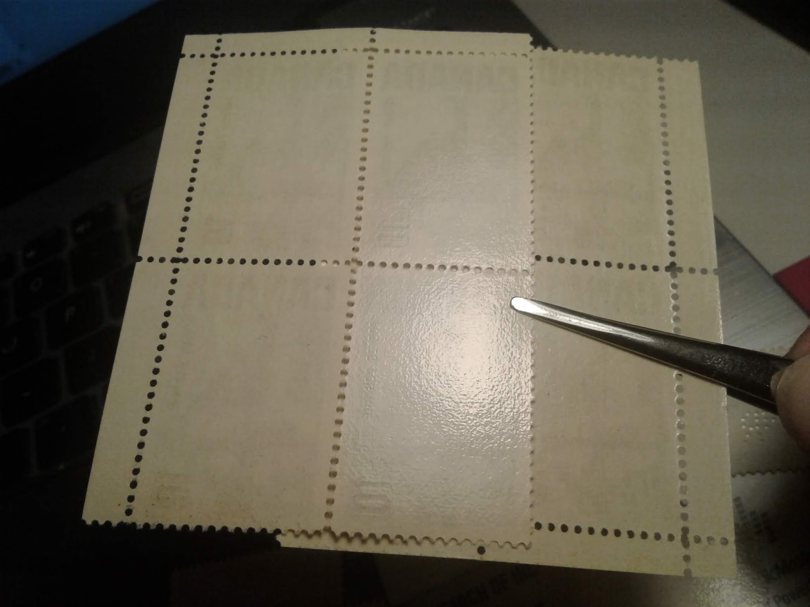
In addition to the paper fluorescence, there are other differences between the various papers that were used to print these stamps. The main differences are in the direction of the paper weave, as determined by which direction the paper bends most easily, whether or not any mesh pattern or ribbing is visible, the surface porosity of the paper, as seen under magnification, and how the paper appears when viewed against strong back-lighting.
I have noted the following paper types, ignoring the fluorescence:
Paper Fluorescence
Unitrade lists three levels of fluorescence for the untagged stamps:
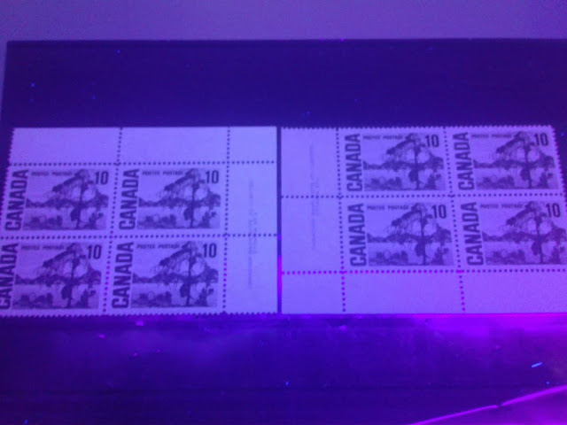
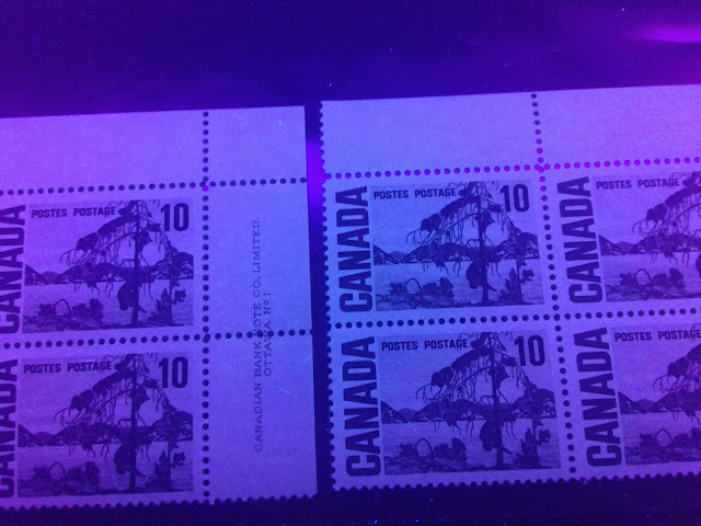
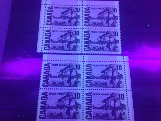
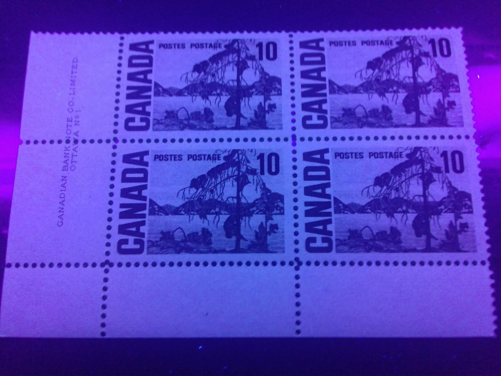
In this first picture we have a variation of the dull fluorescent paper on the left, and a variation of the non-fluorescent paper on the right. Notice how much brighter the dull fluorescent paper appears when placed next to the non-fluorescent. The non-fluorescent paper is very dark, appearing violet grey in this case. It can also be deep brown or deep violet. But, in all cases, it reflects very little if any white light.
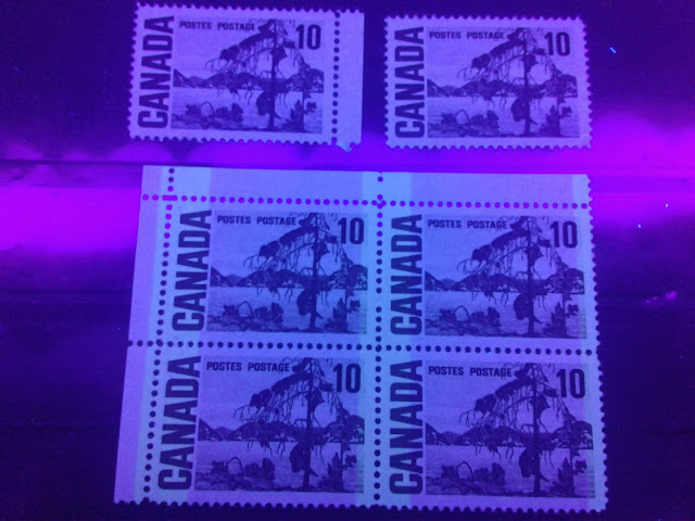
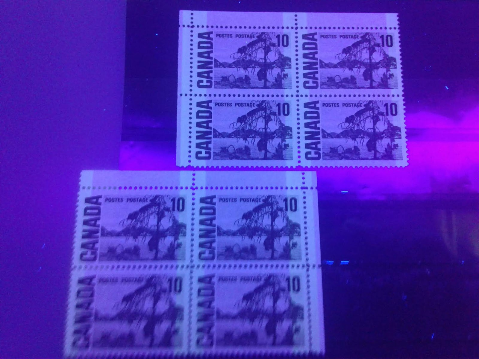
The next picture shows the difference between the low fluorescent paper and the dull fluorescent paper:

 The violet grey paper is that of the block in the picture, while the grey paper is shown by the loose stamp, that I have laid in the top right corner of the picture, to illustrate the difference between the two papers.
Low Fluorescent Papers
In studying this stamp, I have found five varieties of fluorescence that are definitely brighter than dull and can best be described as low fluorescence. All of these papers are flecked to a degree. Interestingly, three of these occur on the Winnipeg tagged stamps. The pictures below show these papers:
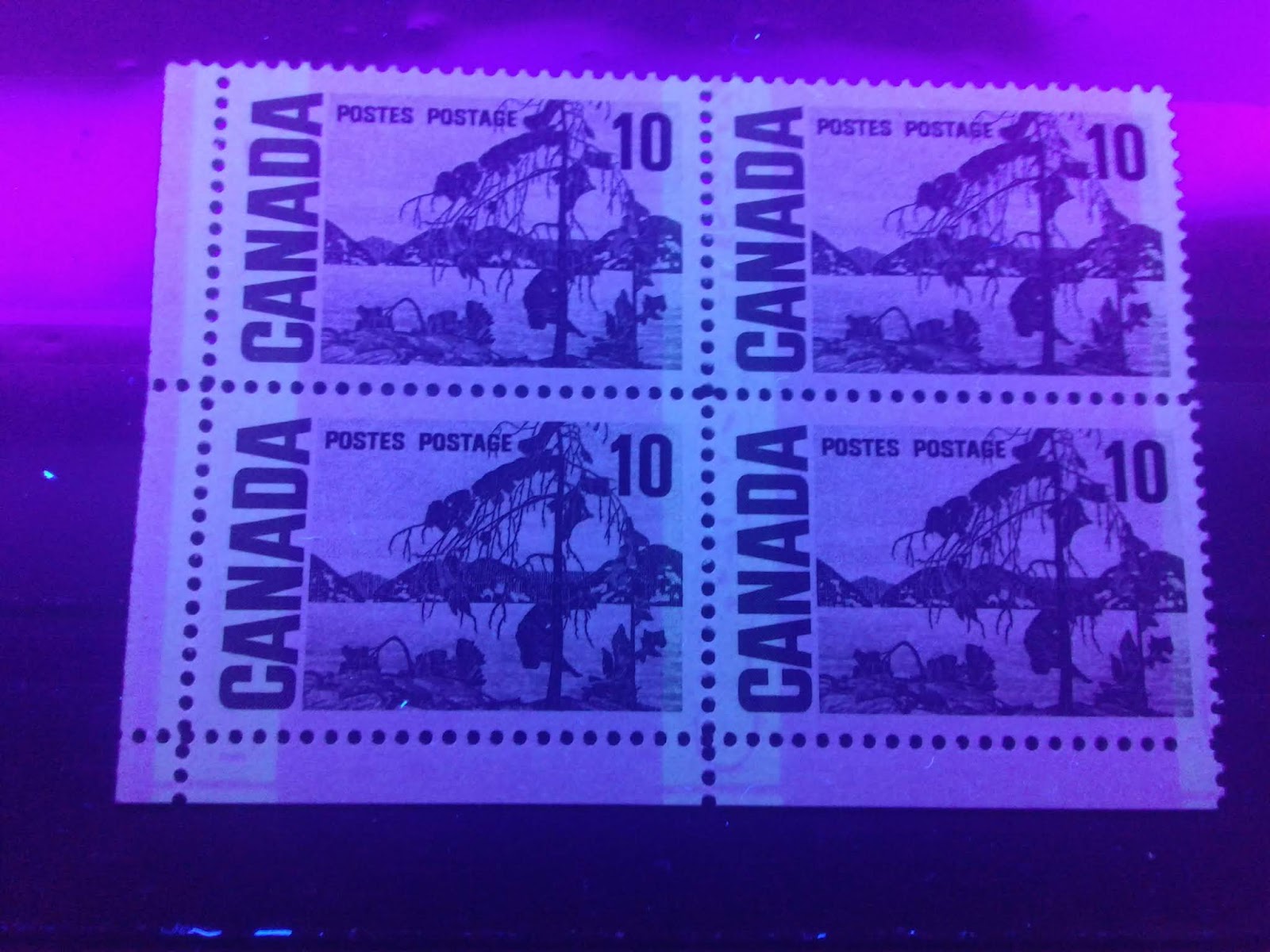
The top stamps appear low fluorescent bluish grey under UV. The left stamp contains very sparse concentrations of low, medium and high fluorescent fibres. The block appears low fluorescent greyish under UV and contains very few medium fluorescent fibres.
 The block on the right appears low fluorescent greyish and contains a very sparse concentration of low fluorescent fibres. The block on the left appears low fluorescent blue grey under UV, and contains very few low fluorescent fibres.
There is a low fluorescent paper that does not appear to contain any fluorescent fibres. The stamp below is an example:

This stamp appears low fluorescent greyish white under UV.
Dull Fluorescent Papers
There exists a staggering variety of dull fluorescent papers. The first six of these are all very dull, being close to non-fluorescent. They all contain varying concentrations of fluorescent fibres, which are not high. These may indeed be what Unitrade classifies as NF-fl paper.

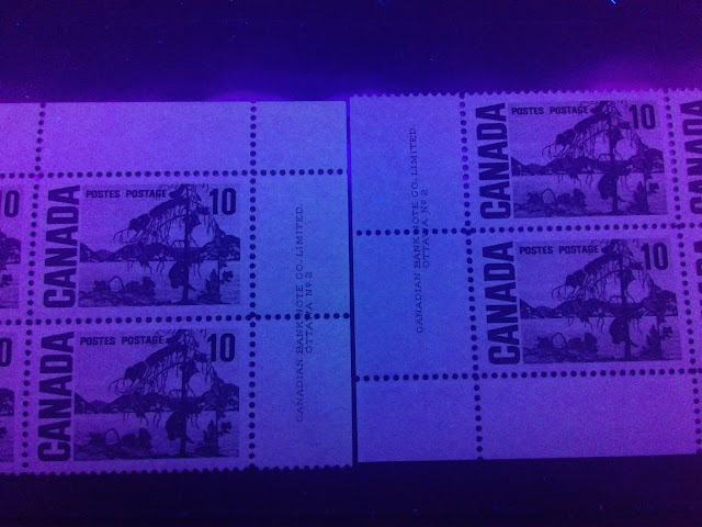
These first two blocks appear a dull fluorescent greyish colour with a yellowish undertone under UV - not quite as dark as they appear in the picture above. The block on the left contains very few medium fluorescent fibres, while the one on the right contains very few low, medium, high fluorescent and hibrite fibres. You can just see the brighter of these if you concentrate in the area of the selvage between the inscription and the word "Canada" of the lower left stamp in the block.
The block on the left is a dull fluorescent yellowish grey under UV and contains only 1-2 medium fluorescent fibres on each stamp in the block. The one on the right is more of a pure grey colour under UV and contains very few medium and high fluorescent fibres.
 Both of these blocks contain only 1-2 low and medium fluorescent fibres on each stamp. However the block on the left appears a pure grey colour under UV, while the one on the right appears grey with a hint of yellowish undertone.
The remaining variations of the dull fluorescent paper are all much less greyish and further away from the colours normally associated with non-fluorescent paper.
 These two blocks are on paper that appears dull fluorescent greyish white under UV. The block on the left contains very few low, medium and high fluorescent fibres, while the block on the right contains no fibres to speak of.

 Ivory is a creamy white colour. This paper is found without fluorescent fibres, as well as with just 1-2 low and medium fibres on each stamp, and also with very few low, medium and high fluorescent fibres.

This paper is dull fluorescent bluish white under UV and does not contain any fluorescent fibres.
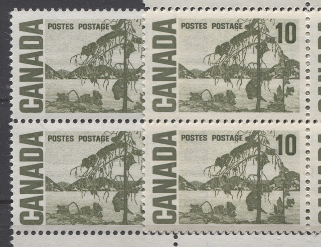
There is a very wide range of shades on this stamp, from brown olives, all the way to deep yellow greens. The colour is generally a blend of green, grey, brown and yellow. so that all the shades will result from variation in the concentrations of these component hues. Generally speaking, the earlier printings with dextrose gum tend to contain more grey and more brown in the green, while the later PVA gum printings tend to contain more yellow, more green and less of both the brown and grey.
Here are two very similar shades of olive green: the pure olive green, as shown on the Gibbons colour key, and the deep olive:
 If you compare these two blocks you can see that the colour of the bottom block is clearly deeper than the to block, which appears more yellowish and less greyish by comparison. You can see the difference in shade in all parts of the design, but I find it easiest to compare the tree and the lettering to see the difference.
The next scan shows the difference between the pure olive green shade and a slightly less deep version of the deep olive, as shown in the Gibbons colour key:
 The normal olive green is shown by the block on the left, while the deep olive shade is shown on the right. Notice how the olive green does not appear yellowish at all, but appears to be greener, while the right block appears more olive. This also shows nicely the difference in colour between the cream paper and the whiter paper.
The next shade is the pure grey olive shade, as shown on the Gibbons colour key. I have juxtaposed a block printed in this shade, with the deep olive shade above:

The deep olive is shown on the left, while the grey olive is shown on the right.
The next shade is a slightly paler version of the grey olive:
 The grey olive is shown on the left, and the paler grey olive is shown on the right.
A deep yellow green shade also exists that is a very close match to the deep yellow green on the Gibbons colour key. The scan below shows this shade next to the pale grey olive:
 The pale grey olive is shown on the left, while the deep yellow green is shown on the right.
Last, but by no means least, there is the bronze green shade:

Perforation
Unitrade gives the perforation of this stamp as 12, like the others in the series that were printed by the CBN. However, as with the other stamps of this period, there were actually two perforating machines in use that gave slightly different measurements: 11.95 and 11.85. Both were used in combination with the other, so that 4 different line perforation measurements are possible: 11.85, 11.95, 11.85 x 11.95 and 11.95 x 11.85. 11.95 appears to be the most common of these by far.
Gum
In my study of these stamps, I have found five different varieties of the dextrose gum:

Here we have the creamy gum with the high gloss sheen on top, and the yellowish cream gum with the semi-gloss sheen on the bottom.

The horizontal pair on the left has the yellowish cream streaky gum, while the vertical pair on the right has the cream coloured semi-gloss gum with the few irregular blemishes.
This picture shows the cream gum that has the semi-gloss sheen. Apart from the slight difference in sheen, this gum is a much different colour compared to the high gloss gum, which appears more yellowish.
Tagging
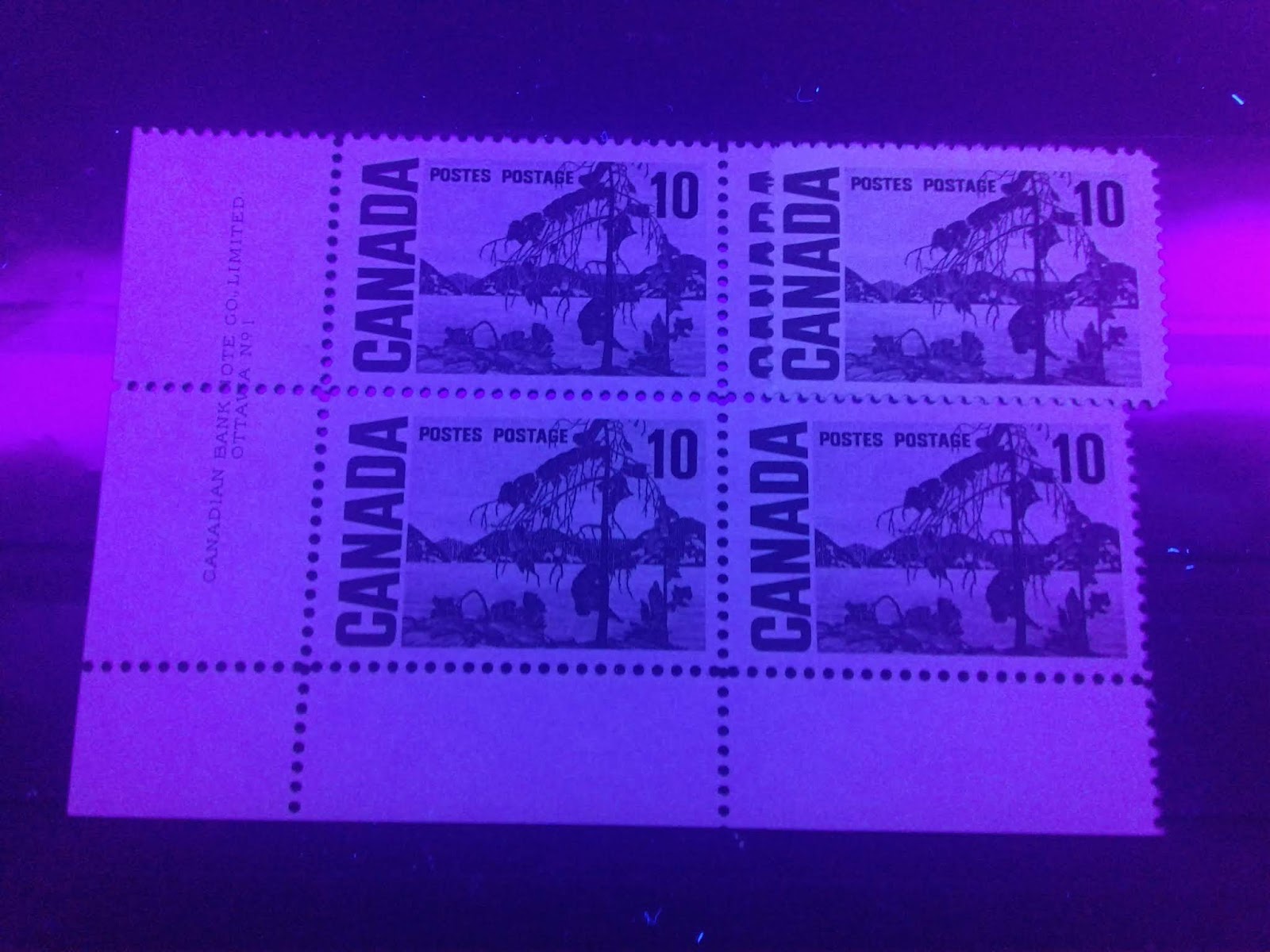
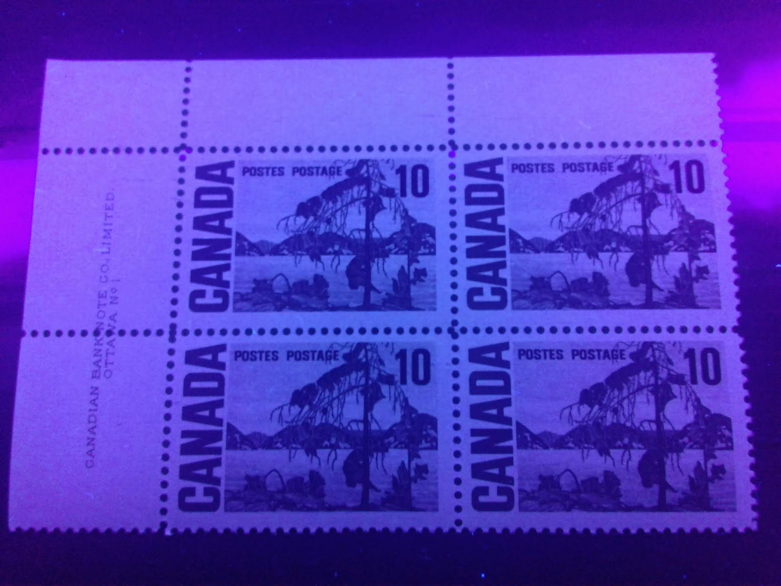
The dextrose gum stamps are only found with Winnipeg tagging. The gum had been changed to PVA by the time the General Ottawa Tagging was introduced in 1972. The tagging was applied in vertical bars down the perforations between the stamps, just as for all the other values that were tagged with 2 bars per stamp. The tagging bars are 8.5 mm wide, rather than 8 mm, and because of the size of the stamps and the width of the bars, the horizontal spacing between tagging bars across the sheet is different for the outer columns and the inner columns of the sheet. The spacing between the bars in on the left and right sides of the sheet is only 17 mm versus 18.5 mm for all the other columns in the sheet. The picture below shows the difference in these two spacing measurements:

 Here are the same blocks showing the alignment of the tagging in the inner columns.


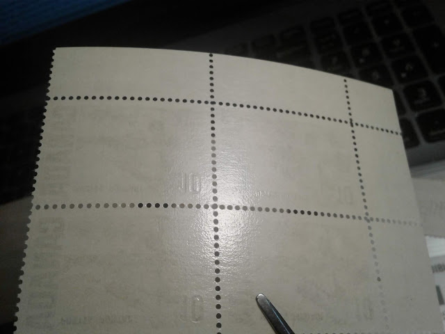
Plate Flaws
There are no major or minor plate flaws reported to exist on this stamp, which is incredible given the number printed. There are also no reported plastic flow varieties. However, I would not assume that this means these things do not exist. One has to bear in mind that the vast majority of used stamps, many of which reside in large bundleware accumulations have not been studied in this manner. So, there likely are flaws to be found and discovered out there.
Perfins
Perfins are not an aspect of this issue that I have touched on thus far, largely because I have not had any examples on hand with which to illustrate them. However, they are a separate collecting field unto themselves. A wide variety of organizations and bodies perforated their stamps in order to prevent or discourage employee theft. The scan below shows an example of an inverted CNR (Canadian National Railway) perfin on the Winnipeg tagged printing of this value:

Bringing it All Together
This has the potential to be an enormously complicated stamp because I have identified:
In dealing with this value, rather than deal with all the untagged stamps first and then the tagged, I am going to split this value by the type of gum. So, today's post will examine the stamps with dextrose gum, then next week, I will look at the stamps with the spotty white gum, and then finally the following week, I will look at the stamps issued with PVA gum, in each case dealing with the tagging types and varieties that exist.
Unitrade's listings for the dextrose gum stamps are fairly simple. They now list three paper types for the untagged stamps and none at all for the Winnipeg Tagged stamps. But, as we shall see, there are far more collectible varieties to this stamp than Unitrade lists, including shade variations, paper fluorescence variations not listed, perforation variations and gum variations.
According to Unitrade, the dextrose gum stamps were first released with the basic set on February 8, 1967, and were in use until the stamps with spotty white gum appeared in December 1971. The Winnipeg tagged stamps were not issued until December 9, 1969.
Paper Characteristics Other Than Fluorescence
In addition to the paper fluorescence, there are other differences between the various papers that were used to print these stamps. The main differences are in the direction of the paper weave, as determined by which direction the paper bends most easily, whether or not any mesh pattern or ribbing is visible, the surface porosity of the paper, as seen under magnification, and how the paper appears when viewed against strong back-lighting.
I have noted the following paper types, ignoring the fluorescence:
- A cream coloured vertical wove paper that appears to have a distinct multi-directional weave pattern, that nonetheless appears predominantly vertical when stamps and blocks are held up to a strong back light. Under magnification the paper has a smooth, finished surface, with no loose fibres and no visible porosity. On this paper, you can usually see some of the mesh pattern through the gum.
- A similar paper to #1 above, except that the mesh pattern appears predominantly horizontal when viewed against strong back light.
- A whiter, horizontal wove paper, that shows very light vertical ribbing through the gum, and a clear vertical mesh pattern when viewed through back lighting. This paper has a clear surface coating, no loose fibres or porosity on the surface.
- A cream coloured vertical wove paper that shows no ribbing at all, and no mesh pattern whatsoever, even when viewed against strong back lighting. The surface is lightly coated, but there is still some surface porosity visible under magnification.
- A thinner, whiter cream and vertical wove paper that again shows no ribbing on either the front, or the back. The design is clearly visible through the back, and when held up to strong back lighting, a mesh pattern that is both horizontal and vertical can be seen. The paper has a light surface coating that prevents loose fibres and surface porosity.
- A cream coloured horizontal wove paper that has a distinct horizontal mesh pattern when viewed against strong back lighting. The printing surface is lightly coated and no loose fibres are visible on the surface/
Paper Fluorescence
Unitrade lists three levels of fluorescence for the untagged stamps:
- Dull fluorescent
- Non-fluorescent,
- Non-fluorescent flecked
In my opinion, this list is far from complete. In addition to the above, I believe there exists a low fluorescent paper, and several variations of dull fluorescent paper that differ by their colour under UV. I have not yet seen a flecked paper on this that is truly non-fluorescent. So, my belief is that the Unitrade listing for NF/fl really should be DF/fl. Finally, it would appear that the low fluorescent paper also exists flecked as well.
I will attempt to illustrate the varieties of each level of fluorescence I have found here. But before I get into the sub-varieties of each type of paper, it makes sense to look first at the basic difference between the non-fluorescent, dull fluorescent and low fluorescent papers. The pictures below show these basic differences:

In this first picture we have a variation of the dull fluorescent paper on the left, and a variation of the non-fluorescent paper on the right. Notice how much brighter the dull fluorescent paper appears when placed next to the non-fluorescent. The non-fluorescent paper is very dark, appearing violet grey in this case. It can also be deep brown or deep violet. But, in all cases, it reflects very little if any white light.
The next picture shows the difference between the low fluorescent paper and the dull fluorescent paper:

On the left is the same block on dull fluorescent paper that was shown in the picture above. But notice how much darker it appears next to the low fluorescent block on the right.
Non-Fluorescent Papers
I have found two varieties of the non-fluorescent paper. One is a deep violet grey, while the other is more of a pure grey. The difference between the two is shown below:
Low Fluorescent Papers
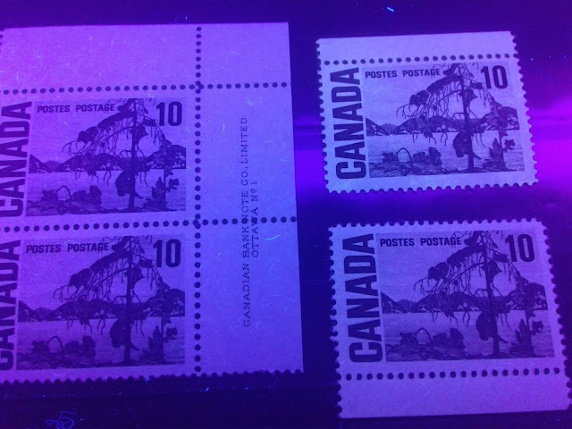
In studying this stamp, I have found five varieties of fluorescence that are definitely brighter than dull and can best be described as low fluorescence. All of these papers are flecked to a degree. Interestingly, three of these occur on the Winnipeg tagged stamps. The pictures below show these papers:

The top stamps appear low fluorescent bluish grey under UV. The left stamp contains very sparse concentrations of low, medium and high fluorescent fibres. The block appears low fluorescent greyish under UV and contains very few medium fluorescent fibres.

There is a low fluorescent paper that does not appear to contain any fluorescent fibres. The stamp below is an example:
This stamp appears low fluorescent greyish white under UV.
Dull Fluorescent Papers
There exists a staggering variety of dull fluorescent papers. The first six of these are all very dull, being close to non-fluorescent. They all contain varying concentrations of fluorescent fibres, which are not high. These may indeed be what Unitrade classifies as NF-fl paper.

These first two blocks appear a dull fluorescent greyish colour with a yellowish undertone under UV - not quite as dark as they appear in the picture above. The block on the left contains very few medium fluorescent fibres, while the one on the right contains very few low, medium, high fluorescent and hibrite fibres. You can just see the brighter of these if you concentrate in the area of the selvage between the inscription and the word "Canada" of the lower left stamp in the block.

The block on the left is a dull fluorescent yellowish grey under UV and contains only 1-2 medium fluorescent fibres on each stamp in the block. The one on the right is more of a pure grey colour under UV and contains very few medium and high fluorescent fibres.

The remaining variations of the dull fluorescent paper are all much less greyish and further away from the colours normally associated with non-fluorescent paper.

This paper can best be described as a dull fluorescent bluish, greyish white, that contains very few low, medium and high fluorescent fibres.
The next paper, the dull fluorescent ivory is distinct in the sense that it does not appear greyish under the UV light. Here is an example of the paper when it contains no fluorescent fibres:

This paper is dull fluorescent bluish white under UV and does not contain any fluorescent fibres.

The block on the left is on paper giving a dull fluorescent greyish reaction, with very few low, medium and high fluorescent fibres. Some of these are visible in the selvage tab containing the inscription. The block on the right appears as close to plain white as is possible under UV - so dull fluorescent white.

The last three variations of dull fluorescent paper that I have identified are shown above. The block is another variation of the dull fluorescent grey with yellowish undertone. This paper contains very few hibrite fibres as well as the usual very few low, medium and high fluorescent fibres. The top right stamp is the yellowish cream paper containing very few low fluorescent fibres, while the bottom right stamp is the light grey paper containing very few low fluorescent fibres.
So, in all, I have identified 25 variations of fluorescence: 2 non-fluorescent, five low fluorescent and 18 dull fluorescent. Given that this value was one of the most heavily printed in the set, I would expect that there are in fact, many more varieties than this that can be collected. I will certainly add any new examples that come to light.
ShadesThere is a very wide range of shades on this stamp, from brown olives, all the way to deep yellow greens. The colour is generally a blend of green, grey, brown and yellow. so that all the shades will result from variation in the concentrations of these component hues. Generally speaking, the earlier printings with dextrose gum tend to contain more grey and more brown in the green, while the later PVA gum printings tend to contain more yellow, more green and less of both the brown and grey.
Here are two very similar shades of olive green: the pure olive green, as shown on the Gibbons colour key, and the deep olive:

The next scan shows the difference between the pure olive green shade and a slightly less deep version of the deep olive, as shown in the Gibbons colour key:

The next shade is the pure grey olive shade, as shown on the Gibbons colour key. I have juxtaposed a block printed in this shade, with the deep olive shade above:

The deep olive is shown on the left, while the grey olive is shown on the right.
The next shade is a slightly paler version of the grey olive:

A deep yellow green shade also exists that is a very close match to the deep yellow green on the Gibbons colour key. The scan below shows this shade next to the pale grey olive:

Last, but by no means least, there is the bronze green shade:

This shade is similar to the deep olive, but is just a touch duller.
The difference between all of these shades can be difficult to see fully in these scans at first, but once you know what to look for and you spend more than a few minutes looking at each scan, your eyes will adjust, and allow you to see the differences more readily. I should point out that this group of seven shades is by no means complete. I know this because many years ago, I studied this stamp looking at dozens of bundles of used singles. In addition to the above, I also found definite brown olive and sage green shades as well, which I do not have examples of here unfortunately. However, this blog is a work in progress and I will be sure to add examples as they become available.
Generally, the differences between the shades can be understood as follows:
- Sage green, which is not often seen will be very pale and will contain the most grey. It will not contain any brown undertone.
- Brown olive will contain more brown in the colour than green.
- Grey olive and olive green contain some grey and some brown in the colour. They are not overly yellowish in themselves, but they will look yellowish compared to the deep olive and bronze green shades.
- Deep olive and bronze green both contain the most green, have no brown undertone and contain almost no grey.
It would generally appear that the deep olive and bronze green shades occur on the later printings, while the other shades occur on the earlier printings. All the inks when viewed under UV tend to become black, rather than appearing as shades of deep green.
Perforation
Unitrade gives the perforation of this stamp as 12, like the others in the series that were printed by the CBN. However, as with the other stamps of this period, there were actually two perforating machines in use that gave slightly different measurements: 11.95 and 11.85. Both were used in combination with the other, so that 4 different line perforation measurements are possible: 11.85, 11.95, 11.85 x 11.95 and 11.95 x 11.85. 11.95 appears to be the most common of these by far.
Gum
In my study of these stamps, I have found five different varieties of the dextrose gum:
- A smooth, yellowish cream gum with a semi-gloss sheen.
- A smooth, cream gum with a glossy sheen.
- A smooth, light cream gum with a semi-gloss sheen.
- A smooth, cream gum with a semi-gloss sheen and a few irregular blemishes, which I call slightly streaky.
- A smooth yellowish cream gum with a semi-gloss sheen and many, regularly placed blemishes, which I call the streaky gum.
The pictures below illustrate all five varieties:
Here we have the creamy gum with the high gloss sheen on top, and the yellowish cream gum with the semi-gloss sheen on the bottom.

The horizontal pair on the left has the yellowish cream streaky gum, while the vertical pair on the right has the cream coloured semi-gloss gum with the few irregular blemishes.

This picture shows the cream gum that has the semi-gloss sheen. Apart from the slight difference in sheen, this gum is a much different colour compared to the high gloss gum, which appears more yellowish.
Tagging
The dextrose gum stamps are only found with Winnipeg tagging. The gum had been changed to PVA by the time the General Ottawa Tagging was introduced in 1972. The tagging was applied in vertical bars down the perforations between the stamps, just as for all the other values that were tagged with 2 bars per stamp. The tagging bars are 8.5 mm wide, rather than 8 mm, and because of the size of the stamps and the width of the bars, the horizontal spacing between tagging bars across the sheet is different for the outer columns and the inner columns of the sheet. The spacing between the bars in on the left and right sides of the sheet is only 17 mm versus 18.5 mm for all the other columns in the sheet. The picture below shows the difference in these two spacing measurements:

Here I have attempted to line up the edges of the tagging bars at the left of each block. As you can see, the spacing between the tagging bars on the first row of the top block is narrower on the bottom block, but the spacing between the tagging bars in the second row of the block is wider than the same spacing on the lower block. That is because both blocks include a column from the outer edge of the sheet, so that the order of the spacings is reversed for each one:
- Upper left and lower left blocks will have the narrower spacing in the first column, and then wider spacing in the second column.
- Upper right and lower right blocks will have the narrow spacing in the outer column and the wider spacing on the inside.
The following pictures show how the spacing is consistent for the outer and inner columns of the sheet. To illustrate this I have taken two upper blocks and lined up the tagging bars of the outer columns, and have also done the same thing for the inner columns:
Here is the narrow spacing for the outer columns, which is consistent for both upper blocks, as you can see from the fact that the tagging bars line up.

The tagging bars glow a very light yellow to creamy yellow under UV light. They were applied continually down each pane, but there is a gap of about 1 mm between the top and bottom panes in the printing layout of six 50-subject panes. You can generally see this gap on the lower right and lower left blocks that come from the upper panes. The gap will generally appear in the lower selvage tabs of the blocks that come from these panes. The picture below shows an example:
Notice the very narrow gap between where the tagging bar ends and the next one begins.
On the bottom panes, the tagging bars terminate cleanly at the bottom of the stamps and do not extend too far into the selvage, if at all:

Plate Flaws
There are no major or minor plate flaws reported to exist on this stamp, which is incredible given the number printed. There are also no reported plastic flow varieties. However, I would not assume that this means these things do not exist. One has to bear in mind that the vast majority of used stamps, many of which reside in large bundleware accumulations have not been studied in this manner. So, there likely are flaws to be found and discovered out there.
Perfins
Perfins are not an aspect of this issue that I have touched on thus far, largely because I have not had any examples on hand with which to illustrate them. However, they are a separate collecting field unto themselves. A wide variety of organizations and bodies perforated their stamps in order to prevent or discourage employee theft. The scan below shows an example of an inverted CNR (Canadian National Railway) perfin on the Winnipeg tagged printing of this value:

Bringing it All Together
This has the potential to be an enormously complicated stamp because I have identified:
- Six different paper types, ignoring fluorescence.
- 25 variations of fluorescence.
- 7 shades, with more thought to exist.
- 4 different perforation measurements.
- 5 Types of gum.
- Wide and narrow tag spacing
The stamps were printed from 2 plates for the dextrose gum stamps, with a third plate being used to print the PVA gum stamps. It is probable that not every variety will exist in combination with the other varieties. However, without a separate, exhaustive study, it is not possible to know which varieties exist together and which do not. However, if we assume that each level of fluorescence only exists with one paper type, and that all the other varieties exist in combination with one another, then the number of potentially collectible stamps, assuming only 7 shades is:
25 x 7 x 4 x 5 x 3 = 10,500!
Given 2 plates and 4 corners each, this means that there could be as many as 84,000 different collectible plate blocks, and if you look for blank corners, there could be as many as 126,000 of those! These numbers are absolutely staggering. Of course, the number of actual variations is likely to be quite a bit less than this, but it will still be very large.
This takes me to the end of my first post about this value. Next week, I will look at the printings made with the so called spotty white gum, that appeared between 1971 and 1972.