
Of all the stamps in the series, this one is probably the most difficult to identify in individual stamps due largely in part to how similar the shades seem to be. Of course, once you become fully familiar with them it should be much easier for you to identify individual stamps, or to sort through large piles of used stamps.
There are three basic shade families:
- Yellow-orange, which are common
- Orange-yellow, which are also common, and
- Lemon yellow, which are scarce.
All of these shade groups are found on both the sheet stamps and in the coils, though the specific shades found will depend on whether you are dealing with a dry printing or wet printing. The booklet panes of 4 seem to be found mostly in the lemon-yellow shade group, whereas the panes of 6 tend to hail from the yellow-orange or orange-yellow shade families.
So this becomes the starting point for identification: to determine to which basic shade group your stamp belongs. Once you have classified the stamp thus, you can then determine which sub-shade your stamp actually is within each grouping.
I have seen various terms used in different catalogues over the years to describe these shades. Older Canadian catalogues prior to Unitrade and Stanley Gibbons use the term "chrome yellow". Unitrade now uses:
- Orange-yellow for the most common shade,
- Lemon yellow for the scarce wet printing shades,
- Yellow for the orange-yellow wet printing shades,
- Pale yellow for the orange-yellow dry printing shades.
I find their treatment somewhat lacking in two respects:
1. While they list all the main shades of the sheet stamps, they only list two shades for the coil stamps: orange-yellow and yellow, even though the coils exhibit more or less the same range of shade variation as the sheet stamps. Their treatment of the booklet stamps is even worse, with yellow being the only listed shade. Finally, the part perforate coil stamps are described as yellow, which is not fully consistent with the main listings of the coils, as these stamps were really just the coils before being guillotined into strips. Therefore it follows that the shades of these stamps should be the same as the coils themselves.
2. They don't seem to recognize the existence of yellow-orange as one of the predominant shade groups, or the fact that there is a difference between yellow-orange and orange-yellow. The yellow -orange is a predominately orange stamp that contains a hint of yellow. In contrast, the orange-yellow is a predominantly yellow stamp that contains a hint of orange.
This post will look at the shades in detail for:
- The sheet stamps printed by the wet method, i.e. the wet printings
- The sheet stamps printed by the dry method, i.e. the dry printings
- The coil stamps printed by the wet method and,
- The coil stamps printed by the dry method.
Sheet Stamps Printed by the Wet Method
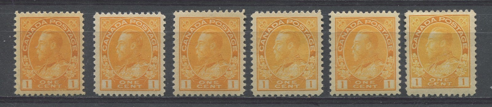
The first three stamps on the left are all from what Unitrade calls the orange-yellow group, even though when you look at the scan you can clearly see that the first and third stamps are predominantly orange, while the second stamp is predominantly yellow. The fourth and last stamp are from the lemon-yellow group, while the fifth stamp is orange-yellow from what Unitrade calls the yellow group.
In terms of Gibbons colour key names:
- The first stamp is closest to the yellow-orange swatch if that swatch were made slightly paler than it is. So pale yellow-orange it is.
- The second stamp is closest to the orange-yellow swatch if that swatch were to be made brighter than is it. So this colour is bright orange-yellow.
- The third stamp is almost a dead match for the orange-yellow colour swatch. This is without a doubt, the most common shade of the wet printing stamps and the one that you will see most of the time.
- The fourth stamp is closest to the lemon swatch if that swatch had orange added to it. So I call this shade orange-lemon.
- The fifth stamp is closest to the orange-yellow swatch on the key, but contains a bit more lemon than the second stamp.
- The last stamp is a slightly brighter and paler orange-lemon compared to the fourth stamp. However, both would be considered lemon-yellow by the Unitrade classification.
The tricky part of sorting these shades is separating the Unitrade's lemon-yellow from Unitrade's yellow. The distinction is important because the lemon yellow lists for twice as much as the yellow in VF mint, and two and a half times the price for fine. The key difference lies in assessing whether the overall shade appears yellow or not. The orange-yellow, while still a yellow shade, has a very strong hint of orange, as you can clearly see in the scan above. In contrast, if you look at the orange-lemon shades just on their own, they look mostly yellow, and that is the key to identifying them.
Sheet Stamps Printed by the Dry Method
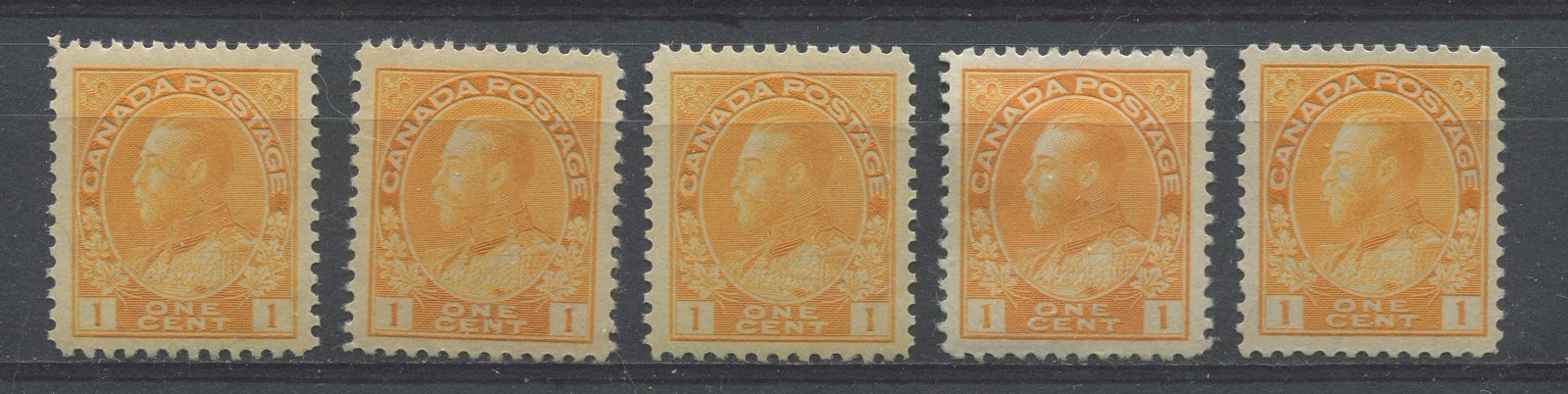
Here we have three stamps from what Unitrade refers to as orange-yellow, which is actually right on point. The fourth stamp is from Unitrade's yellow group, which is odd, as it has a very orangy appearance, while the last stamp is from Unitrade's pale yellow group.
Here the distinction is also important because the yellow and pale yellow groups both catalogue quite a bit more than the common orange-yellow shade. Identifying the yellow group is made easier by the fact that all the yellows and some pale yellows are die 1, while the both the orange-yellows and most pale yellows are die 2.
In terms of the Gibbons colour key swatches:
- The first stamp is closest to the orange-yellow swatch.
- The second stamp is similar to the first, but is a touch duller. So I call this the dull orange-yellow.
- The third stamp is also orange-yellow, but is paler than either of the first two shades. So I call this one the pale orange-yellow.
- The fourth stamp is closest to the yellow-orange swatch, but is brighter. It is the only shade which, on its own, appears to be a shade of orange, rather than a shade of yellow. Thus I call this bright-yellow orange.
- The fifth stamp is orange-yellow and paler, but it is a bit deeper than the shade of the third stamp. However, I still call this one pale orange-yellow. This stamp is a die 1 dry printing, and is basically the same shade as the pale yellow of the die 2 dry printing, which is one of the reasons why the pale yellow in die 2, as listed in Unitrade can be a bit tricky to identify.
The difficulty with the die 2 dry printing sheet stamps is that there is often very little difference in practice between the orange-yellow, as listed in Unitrade and the pale yellow. You really need to have comparison examples on hand to be able to tell them apart.
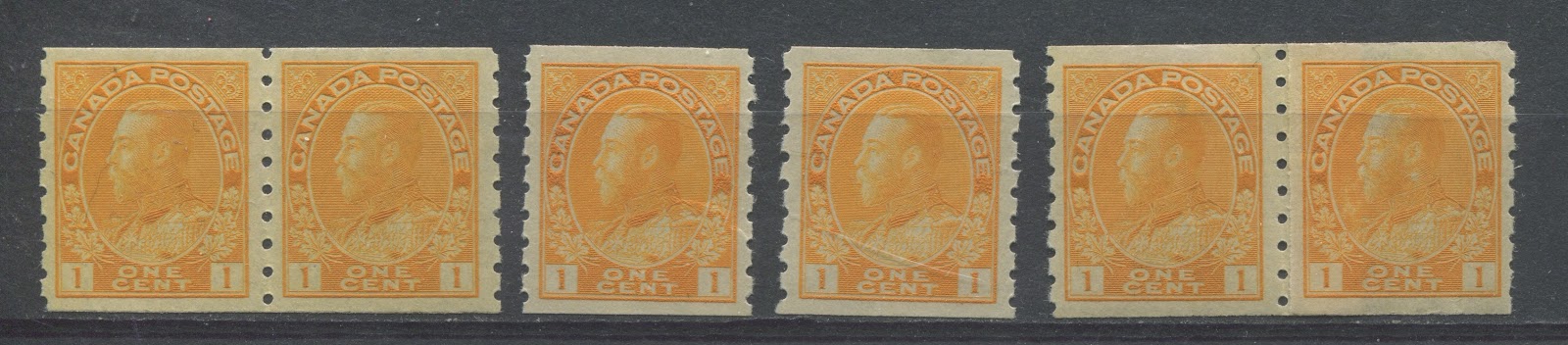
Coil Stamps Printed by the Wet Method

It is curious, but the only listed shade in Unitrade for the wet printing coil is yellow. However, as you can see from the scan above, there are at least two shades. The most commonly seen are shades of yellow-orange, where the orange predominates as it does in the first two stamps here. However, it is possible to find examples which are predominantly yellow as well as in the pair shown on the right.
In terms of Gibbons colour key swatches:
- The first stamp is closest to yellow-orange, but is both a bit paler and duller. So the pale dull yellow-orange.
- The first coil pair is closest to yellow-orange, but is slightly paler. So I call this one pale yellow-orange.
- The second coil pair is an almost exact cross between the yellow and lemon swatches on the colour key, so I call it lemon yellow.
The lemon yellow is much, much scarcer than the yellow-orange and is unmistakable once you see it. It is very similar to the common shades of the dry printing, so the key to spotting it is to look at your wet printings for a stamp that on its own looks yellow.
Coil Stamps Printed by the Dry Method
Far and away the vast majority of the coil stamps are dry printings. Unitrade lists only one shade, orange-yellow, and is found in both dies 1 and 2, with the die 1 stamps being worth almost three times as much as the more common die 2's.
As you can see from the above scan, there is a lot of uniformity in the colour, with all the stamps above being shades of yellow, all containing a hint of orange.
In terms of the Stanley Gibbons colour key swatches:
- The first coil pair is closest to the orange-yellow swatch, if that swatch were a bit paler. So pale orange-yellow it is.
- The first stamp is closest to the orange-yellow swatch, but is a both brighter and paler, so I call this the pale bright orange-yellow.
- The second stamp is closest to orange yellow and is both brighter and paler again than the coil pair on the left, with this stamp being just a touch paler than the first stamp to the left of it. However, I do not consider it enough of a difference to call it by a different name, so it is also pale bright orange-yellow.
- The second coil pair is closest to orange-yellow on the swatch.
The part perforate coils commonly collected in vertical pairs or blocks are almost always die 2 dry printings, as the die 1 wet printings are very rare. The die 2 dry printings will most likely be in the above range of shades. I have never actually seen the die 1 wet printing of this, but I would expect that it will be the same as either the pale yellow-orange or pale dull yellow-orange of the wet printings above.
There you have it - the shades of the 1c yellow Admiral issue. If you would like to see the 1c yellow Admiral stamps that I have listed, please click on the link below.
Later this week, my next post will look at the 2c carmine.