Today's post will conclude my examination of the visible shade varieties on the 1967-1973 Centennial issue
20c Dark Blue - Quebec Ferry
There are two distinct groups of shades on this value. On the stamps issued with dex gum, the shades range from a steel blue to a deep blue and finally to indigo. This last shade contains quite a lot of black, and is very dark. The stamps issued with PVA gum tend to be printed with much brighter shades of blue, with the deepest ones being close to the brightest of those with dex gum.
Dex Gum Stamps
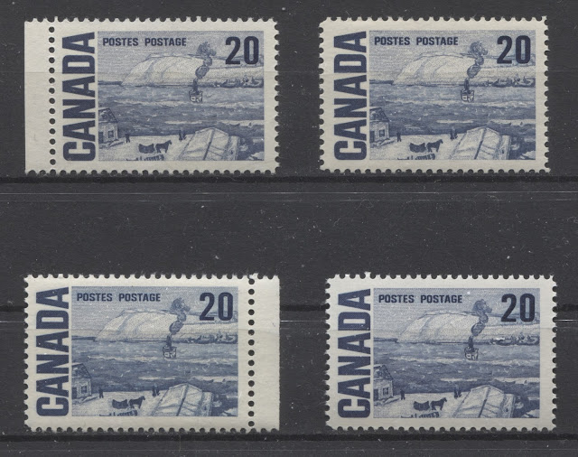
In comparing the shades on this stamp, I find the solid letters of "Canada" to give the best representation of the true colour. The top left stamp is a near perfect match to Gibbons's indigo. The stamp to the right of it is also closest to Indigo, but contains a touch less black, and is brighter.
The bottom left stamp is an almost perfect match to Gibbons's steel blue, and appears much brighter than the two stamps on the row above. Finally, the stamp to the right is very close to Gibbons's deep blue, but is just a little bit darker.
All of these stamps are printed on cream coloured vertical wove paper. The gum types vary from type 1 to types 3 and 4 dex gum.
PVA Gum Stamps
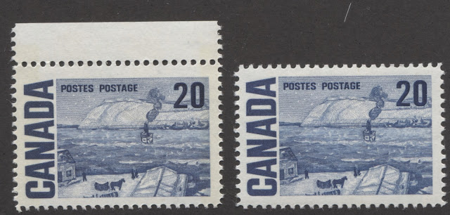
The stamp on the left is a perfect match to Gibbons's deep blue. It is Winnipeg tagged and is printed on a creamy horizontal wove paper, with eggshell PVA gum. The stamp on the right is not a match to any of Gibbons's swatches, but it is closest to the deep blue, but much brighter. I would therefore call it "deep bright blue". The example here is untagged, and printed on white vertical wove paper, with eggshell PVA gum.
To give you a better idea of the contrast between the indigo shade of the dex gum printings and the deep bright blue of the PVA gum stamps, take a look at this scan:
With all the attention given by Unitrade to shade differences on the classic period it is baffling to me that such an obvious colour difference receives no recognition whatsoever in the modern period.
25c Slate Green - Solemn Land
This is another stamp from this series which was only printed by CBN, and was only ever issued with dex gum, as the replacement stamp from the next series was first issued in early 1972. Still it is curious that there were no printings from late 1971 with PVA gum, as this would have been a reasonably heavily used stamp.
There are a surprising range of shades on this stamp, many of which are quite subtle, but some of which are quite extreme. The basic colour is bottle green or slate green, and the shades vary in terms of the amount of blue contained and the green and the amount of black. There is also variation in terms of depth and dullness.
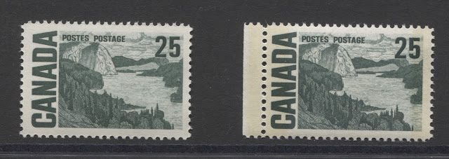
The stamp on the left is a perfect match to Gibbons's deep grey-green. This stamp is printed on cream horizontal wove paper with a clear vertical mesh and type 1 dex gum. The stamp in the middle is close to this shade, but it has a bluish tinge, and contains less grey. This stamp is on vertical wove with type 1 dex gum also. The stamp on the right is the same basic shade as the left stamp, but without the grey undertone. This stamp is printed on cream vertical wove, with type 4 dex gum.
Now, lets take a look at the second row:
The left stamp on this row is clearly much closet to blue green, than it is to slate green. It does not really match any of the swatches on Gibbons's colour key. However, it is closest to what Gibbons's dull blue green swatch would be if it were deeper. This stamp is printed on vertical wove paper with clear vertical mesh and type 4 dex gum. The right stamp is closest to the deep grey-green, but has a distinctly bluish undertone. This is the scarce Winnipeg tagged printing on hibrite paper, which is vertical wove, with clear vertical mesh and type 3 dex gum.
Now let's finish with the third row:
50c Orange Brown - Summer's Stores
This is another stamp that, at first glance, appears not to have a lot of shades, but actually has quite a number. Once again, there is a clear demarcation between the shades found on the printings with dex gum, and those found on the stamps with PVA gum. The two basic shade groupings are orange-brown and brown-orange. The PVA gum stamps and some of the dex gum stamps are shades of brown-orange, while some of the dex gum stamps are more of a brown-orange, where the shades contain more brown than orange.
I will show all the shades together on one scan, will describe the basic differences between the broad shade groups and will then look at each row up close:
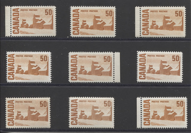
There is no brown-orange swatch on the Gibbons colour key, but the left stamp matches what I think this swatch would look like if a small amount of brown were to be added to the orange swatch. The stamps to the right are both much more orange, with the stamp in the centre being the deeper of the two. These two stamps are more of a brownish orange, which is what you would have if you took the orange swatch and added about one eighth to one quarter brown, whereas the brown orange is closer to 50% brown.
The two stamps with selvage on this row are printed on low fluorescent, vertical wove paper, with clear vertical mesh and types 1 and 3 dex gum. The middle stamp is printed on dull fluorescent, vertical wove paper with clear vertical mesh, and type 1 dex gum.
Now let's take a look at the second row:
The left stamp is a slightly deeper and browner version of the brown-orange. This stamp is printed on hibrite horizontal wove paper with clear vertical mesh and type 8 dex gum. The middle stamp is closest to Gibbons's orange-brown, but is more orange and lighter. This stamp is printed on dull fluorescent horizontal wove paper, with type 4 dex gum. The stamp on the right is a bit more orange, once again, and a bit deeper than the centre stamp. This one is printed on dead, vertical wove paper with type 1 dex gum.
Now let's move on to the third row:
The left stamp is a similar shade to the right stamp on the row above, but this one is both lighter and duller. It is printed on a dull fluorescent, horizontal wove paper with type 3 dex gum. The middle stamp has the intensity of the yellow brown on the Gibbons colour key, but the orangy tinge of Gibbons's cinnamon. I actually think that it is a fairly close match to what cinnamon would be if it were darker. This stamp is also printed on dead, horizontal wove paper with type 3 dex gum. Finally, the stamp at the bottom right is closest to the Gibbons dull orange swatch, but deeper. However, this colour contains the least amount of brown, and the most amount of orange as compared to the other eight stamps.
$1 Carmine Red - Edmonton Oilfield
Of all the high value stamps of the series, this one has the most subtle of the shade differences, and it may first appear as though there are no shade differences. However, with patience and care, it is possible to see variations in how much bluish undertone is present, versus how much scarlet there is in the shade. The dullest and most bluish shades seem to be limited to the dex gum stamps, while the brightest and most scarlet of the shades seem to be limited to those stamps issued with PVA gum. In comparing the shades of this stamp, I find that it is best to focus on the dirt road in the foreground.
Stamps With Dex Gum
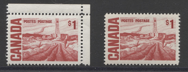
The starting point in analyzing these shades is the stamp in the middle, which is a fairly close match to Gibbons's deep rose red. The stamp to the right is very close to this, but is a closer match to Gibbons's scarlet, while the stamp on the left is closest to what would result is a little carmine were added to the deep rose red, as there is a definite bluish undertone to this shade.
To see the differences more closely, I will show two close up scans, with the first being stamps 1 and 2, and the next one being stamps 2 and 3:
Here, the bluish undertone of the left stamp is much more apparent in this scan, when compared to the stamp on the right. Both these stamps are printed on vertical wove paper with faint vertical mesh, and type 4 dex gum. The paper of the stamp on the left is dead under ultraviolet light, whereas the paper of the stamp on the right is a low fluorescent bluish white.
The scarlet stamp on the right, is clearly brighter than the deep rose red, as it is in the Gibbons colour key. The scarlet stamp is printed on dull fluorescent, horizontal wove paper, with clear vertical mesh, and type 1 dex gum.
Both stamps on the second row are a much duller shade, and both contain a strong bluish undertone, with the stamp on the right being both deeper, and duller than the one on the left. Let's take a close look at these to get a better idea of what the exact shades are:
The stamp on the right is closest to Gibbon's carmine-red, but with more scarlet and less blue that the Gibbons swatch. The stamp on the left is a slightly lighter and brighter shade, but again, it is much closer to carmine-red than it is to any other shade. Both stamps are printed on dull fluorescent, horizontal wove paper, with no visible mesh, and type 3 dex gum.
Stamps With PVA Gum
The PVA gum stamps are closest in shade to the first dex gum stamp shown above. In other words, they are closest to what deep rose red would look like if a little scarlet were added to the mix.
The stamp on the left contains just a hint more blue in the colour than the right stamp. However, both are more bluish than the deep rose red and the scarlet shades. Both are printed on white, low fluorescent, vertical wove paper with eggshell PVA gum.
This concludes my examination of the shades of the Centennial issue stamps as they appear in ordinary light. Next week, I will start looking at the shades as they appear under long-wave ultraviolet light.
20c Dark Blue - Quebec Ferry
There are two distinct groups of shades on this value. On the stamps issued with dex gum, the shades range from a steel blue to a deep blue and finally to indigo. This last shade contains quite a lot of black, and is very dark. The stamps issued with PVA gum tend to be printed with much brighter shades of blue, with the deepest ones being close to the brightest of those with dex gum.
Dex Gum Stamps
In comparing the shades on this stamp, I find the solid letters of "Canada" to give the best representation of the true colour. The top left stamp is a near perfect match to Gibbons's indigo. The stamp to the right of it is also closest to Indigo, but contains a touch less black, and is brighter.
The bottom left stamp is an almost perfect match to Gibbons's steel blue, and appears much brighter than the two stamps on the row above. Finally, the stamp to the right is very close to Gibbons's deep blue, but is just a little bit darker.
All of these stamps are printed on cream coloured vertical wove paper. The gum types vary from type 1 to types 3 and 4 dex gum.
PVA Gum Stamps
The stamp on the left is a perfect match to Gibbons's deep blue. It is Winnipeg tagged and is printed on a creamy horizontal wove paper, with eggshell PVA gum. The stamp on the right is not a match to any of Gibbons's swatches, but it is closest to the deep blue, but much brighter. I would therefore call it "deep bright blue". The example here is untagged, and printed on white vertical wove paper, with eggshell PVA gum.
To give you a better idea of the contrast between the indigo shade of the dex gum printings and the deep bright blue of the PVA gum stamps, take a look at this scan:
With all the attention given by Unitrade to shade differences on the classic period it is baffling to me that such an obvious colour difference receives no recognition whatsoever in the modern period.
25c Slate Green - Solemn Land
This is another stamp from this series which was only printed by CBN, and was only ever issued with dex gum, as the replacement stamp from the next series was first issued in early 1972. Still it is curious that there were no printings from late 1971 with PVA gum, as this would have been a reasonably heavily used stamp.
There are a surprising range of shades on this stamp, many of which are quite subtle, but some of which are quite extreme. The basic colour is bottle green or slate green, and the shades vary in terms of the amount of blue contained and the green and the amount of black. There is also variation in terms of depth and dullness.
It is a bit tricky to see the differences just from looking at this scan, due to the small size of the images. However, if you allow your eyes to adjust, you should be able to see many of the differences. For instance, on the top row, the stamp on the right is clearly darker than the other two stamps. Both stamps on the middle row are bluer then the stamps on the top row, with the stamp on the right being darker. Finally, the stamps on the bottom row all seem duller than the other stamps.
However, I will go through the shades, one row at a time, with larger scans. The entire mountain of the design is excellent for comparing shades, as I find that they show up quite easily.
So, let's take a close look at the first row:
The stamp on the left is a perfect match to Gibbons's deep grey-green. This stamp is printed on cream horizontal wove paper with a clear vertical mesh and type 1 dex gum. The stamp in the middle is close to this shade, but it has a bluish tinge, and contains less grey. This stamp is on vertical wove with type 1 dex gum also. The stamp on the right is the same basic shade as the left stamp, but without the grey undertone. This stamp is printed on cream vertical wove, with type 4 dex gum.
Now, lets take a look at the second row:
The left stamp on this row is clearly much closet to blue green, than it is to slate green. It does not really match any of the swatches on Gibbons's colour key. However, it is closest to what Gibbons's dull blue green swatch would be if it were deeper. This stamp is printed on vertical wove paper with clear vertical mesh and type 4 dex gum. The right stamp is closest to the deep grey-green, but has a distinctly bluish undertone. This is the scarce Winnipeg tagged printing on hibrite paper, which is vertical wove, with clear vertical mesh and type 3 dex gum.
Now let's finish with the third row:
The first two stamps in this row are almost the exact same shade, but if you compare them closely, the middle stamp will exhibit a slightly bluer colour. The colour is very similar to the first stamp on the second row, but both these stamps are slightly darker than that stamp. However, all of them are variations of deep dull blue green. Both the left stamp is printed on vertical wove with clear mesh and type 1 dex gum. The right stamp is both bluer and duller than these two stamps, but is still a variant of deep dull blue-green. This one is printed on horizontal wove paper with feint vertical mesh and type 3 dex gum.
50c Orange Brown - Summer's Stores
This is another stamp that, at first glance, appears not to have a lot of shades, but actually has quite a number. Once again, there is a clear demarcation between the shades found on the printings with dex gum, and those found on the stamps with PVA gum. The two basic shade groupings are orange-brown and brown-orange. The PVA gum stamps and some of the dex gum stamps are shades of brown-orange, while some of the dex gum stamps are more of a brown-orange, where the shades contain more brown than orange.
I will show all the shades together on one scan, will describe the basic differences between the broad shade groups and will then look at each row up close:
Here you can see quite clearly that the middle and right stamps of the second row, and the first two stamps of the third row are more brownish than they are orange, while the brightest, and most orange shade is in the lower right stamp, which is the PVA gum printing. The middle and right stamps of the top row are clearly also more orange than brown. Finally, the first stamps of each the first and second row are a good balance of both orange and brown. I find that the shading on the grain elevators provides a good basis for comparing the shades.
Now, let's take a close look at the first row:
There is no brown-orange swatch on the Gibbons colour key, but the left stamp matches what I think this swatch would look like if a small amount of brown were to be added to the orange swatch. The stamps to the right are both much more orange, with the stamp in the centre being the deeper of the two. These two stamps are more of a brownish orange, which is what you would have if you took the orange swatch and added about one eighth to one quarter brown, whereas the brown orange is closer to 50% brown.
The two stamps with selvage on this row are printed on low fluorescent, vertical wove paper, with clear vertical mesh and types 1 and 3 dex gum. The middle stamp is printed on dull fluorescent, vertical wove paper with clear vertical mesh, and type 1 dex gum.
Now let's take a look at the second row:
The left stamp is a slightly deeper and browner version of the brown-orange. This stamp is printed on hibrite horizontal wove paper with clear vertical mesh and type 8 dex gum. The middle stamp is closest to Gibbons's orange-brown, but is more orange and lighter. This stamp is printed on dull fluorescent horizontal wove paper, with type 4 dex gum. The stamp on the right is a bit more orange, once again, and a bit deeper than the centre stamp. This one is printed on dead, vertical wove paper with type 1 dex gum.
Now let's move on to the third row:
The left stamp is a similar shade to the right stamp on the row above, but this one is both lighter and duller. It is printed on a dull fluorescent, horizontal wove paper with type 3 dex gum. The middle stamp has the intensity of the yellow brown on the Gibbons colour key, but the orangy tinge of Gibbons's cinnamon. I actually think that it is a fairly close match to what cinnamon would be if it were darker. This stamp is also printed on dead, horizontal wove paper with type 3 dex gum. Finally, the stamp at the bottom right is closest to the Gibbons dull orange swatch, but deeper. However, this colour contains the least amount of brown, and the most amount of orange as compared to the other eight stamps.
$1 Carmine Red - Edmonton Oilfield
Of all the high value stamps of the series, this one has the most subtle of the shade differences, and it may first appear as though there are no shade differences. However, with patience and care, it is possible to see variations in how much bluish undertone is present, versus how much scarlet there is in the shade. The dullest and most bluish shades seem to be limited to the dex gum stamps, while the brightest and most scarlet of the shades seem to be limited to those stamps issued with PVA gum. In comparing the shades of this stamp, I find that it is best to focus on the dirt road in the foreground.
Stamps With Dex Gum
The starting point in analyzing these shades is the stamp in the middle, which is a fairly close match to Gibbons's deep rose red. The stamp to the right is very close to this, but is a closer match to Gibbons's scarlet, while the stamp on the left is closest to what would result is a little carmine were added to the deep rose red, as there is a definite bluish undertone to this shade.
To see the differences more closely, I will show two close up scans, with the first being stamps 1 and 2, and the next one being stamps 2 and 3:
Here, the bluish undertone of the left stamp is much more apparent in this scan, when compared to the stamp on the right. Both these stamps are printed on vertical wove paper with faint vertical mesh, and type 4 dex gum. The paper of the stamp on the left is dead under ultraviolet light, whereas the paper of the stamp on the right is a low fluorescent bluish white.
The scarlet stamp on the right, is clearly brighter than the deep rose red, as it is in the Gibbons colour key. The scarlet stamp is printed on dull fluorescent, horizontal wove paper, with clear vertical mesh, and type 1 dex gum.
Both stamps on the second row are a much duller shade, and both contain a strong bluish undertone, with the stamp on the right being both deeper, and duller than the one on the left. Let's take a close look at these to get a better idea of what the exact shades are:
The stamp on the right is closest to Gibbon's carmine-red, but with more scarlet and less blue that the Gibbons swatch. The stamp on the left is a slightly lighter and brighter shade, but again, it is much closer to carmine-red than it is to any other shade. Both stamps are printed on dull fluorescent, horizontal wove paper, with no visible mesh, and type 3 dex gum.
Stamps With PVA Gum
The PVA gum stamps are closest in shade to the first dex gum stamp shown above. In other words, they are closest to what deep rose red would look like if a little scarlet were added to the mix.
The stamp on the left contains just a hint more blue in the colour than the right stamp. However, both are more bluish than the deep rose red and the scarlet shades. Both are printed on white, low fluorescent, vertical wove paper with eggshell PVA gum.
This concludes my examination of the shades of the Centennial issue stamps as they appear in ordinary light. Next week, I will start looking at the shades as they appear under long-wave ultraviolet light.
