
Today's post will complete my discussion of the inks used on this issue as they appear under long-wave ultraviolet light. Last week's post examined up to the 15c Bylot Island. This week, I will look at the 20c through $1 values.
20c Dark Blue - The Quebec Ferry
The inks used to print this stamp are primarily non-transformative in that in most cases, the appearance of the colour under UV light is either the same as, or just a bit darker than how the colour appears under normal light. There are however, some cases in which the ink loses much of the blue and becomes either a very deep blue-black, or black under the UV light. These inks are transformative.
Non-Transformative Ink
Let's take a look at three stamps printed with non-transformative ink:
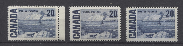
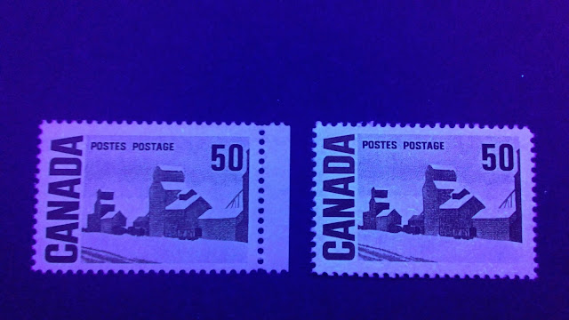
 On the left is a deep blue stamp printed on dull fluorescent, vertical wove paper, with type 4 dex gum, and on the right, a deep blue stamp on horizontal wove hibrite paper with type 4 dex gum also. Both stamps in normal light are a very clear, deep blue.
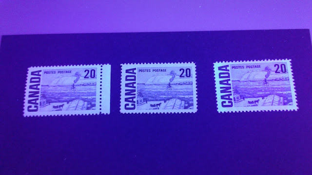
Here are the same two stamps under UV light:
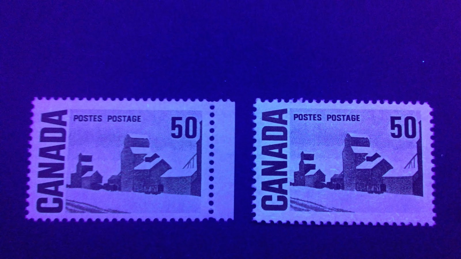
 This picture is another excellent illustration of the vast difference in appearance, between dull fluorescent paper and hibrite paper. The stamp on the left is still a little bluish, but the colour has acquired so much black that I consider it a transformative ink. The appearance of this stamp under UV is very similar to the appearance of the middle stamp in the first group above. The difference though, is that the middle stamp from the first group already looks blue black in normal light, whereas the stamp shown here looks much brighter blue. The ink of the stamp on the right, as expected, appears black, as do most stamps on hibrite paper.
25c Myrtle Green/Slate Green - The Solemn Land
From the stamps I have examined, the vast majority are printed in transformative ink which tends towards blackish green or black under UV light. A few printings were made in dull blue green which appears either darker under UV, or the same as normal light.
Non-Transformative Ink
Let's take a look at two stamps which are printed in non-transformative ink:
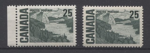 Both of these stamps are printed with dark grey-green ink that contains a hint of blue, with the stamp on the right, being slightly darker than the one on the left. Both are printed on horizontal wove, dull fluorescent paper. The stamp on the left has type 4 dex gum, while the stamp on the right has type 3 dex gum.
Here are both stamps under UV light:
 Both stamps appear blackish in this picture, but in reality, enough of the green remains in the colour that I consider this ink to be non-transformative.
Transformative Ink
Let's now look at five stamps that are printed in transformative ink:
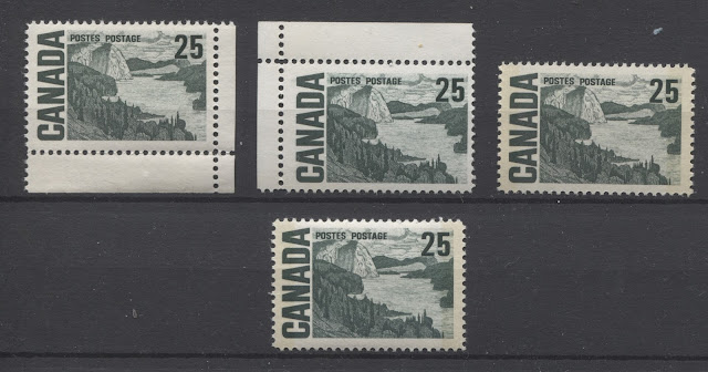
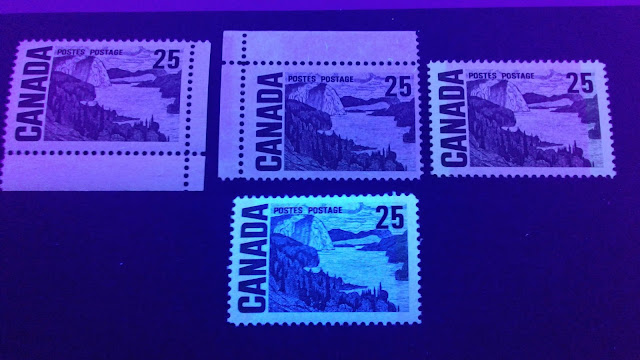 On the top three stamps, the ink almost appears black. There is still a very slight hint of green, but it has acquired so much black compared to how it appears in normal light, that I consider these inks to be transformative.
As is the case with practically all the hibrite stamps examined so far, the bottom stamp appears to have been printed from black ink.
50c Orange Brown - Summer's Stores
In terms of inks, this is one of the more interesting values in the series, because of the dramatic difference that introducing UV light makes to the appearance of most of the stamps. In ordinary light, the colour of this stamp is either a shade of brown orange (most commonly), or it is a shade or orange brown (less common). With only a few exceptions, the ink completely changes colour under UV - usually to shades of dark brown, dark red-brown or black.
Non-Transformative Ink
All of the PVA gum stamps that I have examined thus far, and a few of the dex gum printings made on dull fluorescent paper, are printed in non-transformative ink. The colour appears far, far darker than in normal light. However, enough of the orange remains visible, that the fundamental colour under UV is not any different than under ordinary light.
Here are two such stamps in ordinary light:
20c Dark Blue - The Quebec Ferry
The inks used to print this stamp are primarily non-transformative in that in most cases, the appearance of the colour under UV light is either the same as, or just a bit darker than how the colour appears under normal light. There are however, some cases in which the ink loses much of the blue and becomes either a very deep blue-black, or black under the UV light. These inks are transformative.
Non-Transformative Ink
Let's take a look at three stamps printed with non-transformative ink:
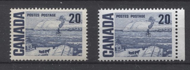
On the left we have a deep bright blue, printed on horizontal wove, low speckled fluorescent paper with type 4 dex gum. In the centre is a deep violet blue on horizontal wove, dull fluorescent paper with type 1 dex gum, and on the right, we have a bright blue Winnipeg tagged stamp on low fluorescent, horizontal wove paper with satin PVA gum.
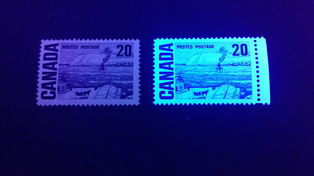
Let's take a look at them under UV light:

In this picture, all three of the stamps look very similar, but in reality, the stamp in the centre is the darkest. In all three cases, the inks appear darker than they do in normal light, but all three of them are shades of blue, which are not substantially different from the shades under normal light. This is why I have classified them as non-transformative.
All of the PVA gum stamps I have examined so far, appear to have been printed with non-transformative ink.
Transformative inks
I have only come across two examples of this stamp in the transformative ink:
Here are the same two stamps under UV light:

25c Myrtle Green/Slate Green - The Solemn Land
From the stamps I have examined, the vast majority are printed in transformative ink which tends towards blackish green or black under UV light. A few printings were made in dull blue green which appears either darker under UV, or the same as normal light.
Non-Transformative Ink
Let's take a look at two stamps which are printed in non-transformative ink:
Here are both stamps under UV light:

Transformative Ink
Let's now look at five stamps that are printed in transformative ink:
On the first row we have three deep grey green stamps, all printed on dull fluorescent paper. The paper of the left stamp is horizontal wove, whereas the centre and right stamps are on vertical wove paper. The left and centre stamps have type 4 dex gum, while the right stamp has type 1 dex gum, and is Winnipeg tagged. On the second row is a dark bluish green stamp, on vertical hibrite wove paper, Winnipeg tagged and with type 4 dex gum.
All of these five stamps contain a significant amount of green under normal light, although in the case of the top three stamps it is a very dark green containing some black.
Here are the same five stamps under UV light:

As is the case with practically all the hibrite stamps examined so far, the bottom stamp appears to have been printed from black ink.
50c Orange Brown - Summer's Stores
In terms of inks, this is one of the more interesting values in the series, because of the dramatic difference that introducing UV light makes to the appearance of most of the stamps. In ordinary light, the colour of this stamp is either a shade of brown orange (most commonly), or it is a shade or orange brown (less common). With only a few exceptions, the ink completely changes colour under UV - usually to shades of dark brown, dark red-brown or black.
Non-Transformative Ink
All of the PVA gum stamps that I have examined thus far, and a few of the dex gum printings made on dull fluorescent paper, are printed in non-transformative ink. The colour appears far, far darker than in normal light. However, enough of the orange remains visible, that the fundamental colour under UV is not any different than under ordinary light.
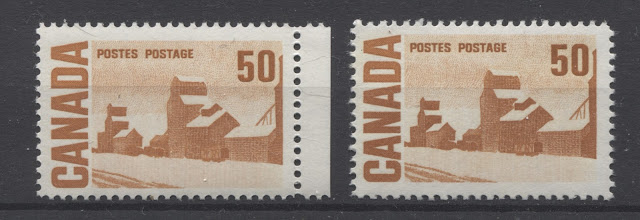
Here are two such stamps in ordinary light:
Here we have a light brown orange printed on dull fluorescent vertical wove paper with type 4 dex gum and a deeper brown orange on low fluorescent horizontal wove, with satin PVA gum.
Here they are under UV:
In this picture, both inks appear quite blackish. In reality, while they are dark, both are very clearly shades of brown orange, and hence the reason why I classify these inks as non-transformative.
Transformative Inks
Now, lets take a look at 6 stamps printed in transformative ink:

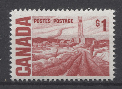
$1 Carmine Red - Edmonton Oilfield
Except for the printing on hibrite paper, all of the $1 stamps that I have examined are printed in non-transformative ink. The basic colour is deep scarlet red with a hint of carmine, and for most stamps, this colour merely appears deeper under the UV light. But in all cases, it is clear that the colour is a deep scarlet red or carmine red.
Non-Transformative Inks
Let's start with five stamps printed in non-transformative ink.
 Unfortunately, this picture obscures the differences between these stamps and makes them all appear blackish under the light. In reality the top two stamps both appear more or less the same carmine-red colour that they appear in normal light. The stamp at the top right appears much darker, but still a clear carmine-red. On the bottom row, both stamps appear carmine red, but the left stamp is a brighter colour than the right stamp. I have also examined a copy of the PVA gum printing on medium fluorescent paper and can confirm that it displays the same ink characteristics as the printings on low fluorescent paper. So I have not felt the need to illustrate it here.
Transformative Ink
 Here is an example of the bright scarlet-red on hibrite vertical wove paper, with type 4 dex gum. As expected, when examined under UV, the ink colour appears black:

Transformative Inks
Now, lets take a look at 6 stamps printed in transformative ink:
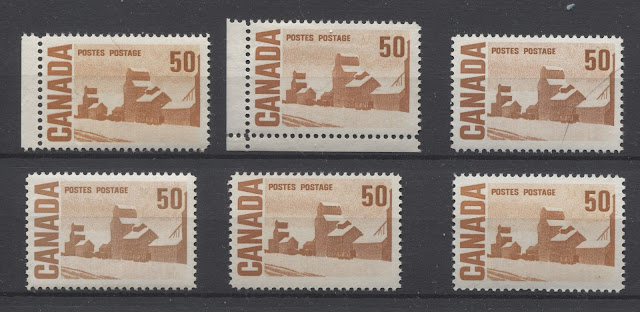
The first two stamps on the top row are both printed on low fluorescent paper, and are both the brown orange shade. Both are printed on horizontal wove paper, and the gum on the left stamp is type 4 dex, while the one in the middle is type 1 dex. The stamp on the right is a orange brown shade, and is printed on non-fluorescent vertical wove paper, with type 4 dex gum. Moving on to the second row, on the left we have a golden brown shade printed on horizontal wove, non-fluorescent paper with type 4 dex gum as well. The centre stamp is an orange brown shade on dull fluorescent, horizontal wove paper with type 4 dex gum. Finally, the stamp at lower right is a brown orange shade on hibrite vertical wove paper, with type 4 dex gum.
Now, lets take a look at them under UV:
This picture shows the differences between low fluorescent, dull fluorescent and non-fluorescent papers quite nicely. As you can see, all of the colours look dramatically different under the light. The upper right stamp is the closest to the brown orange colour, but it has become so deep that it looks more deep brown than orange, even though some orange is still coming through. The middle, top right and bottom left stamps are a very deep red brown. The middle stamp is a deep, orangy brown, which is much closer to brown than it is to orange. Finally the lower right stamp, as with most all the hibrites appears black.
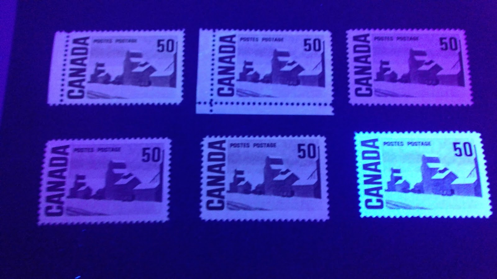
$1 Carmine Red - Edmonton Oilfield
Except for the printing on hibrite paper, all of the $1 stamps that I have examined are printed in non-transformative ink. The basic colour is deep scarlet red with a hint of carmine, and for most stamps, this colour merely appears deeper under the UV light. But in all cases, it is clear that the colour is a deep scarlet red or carmine red.
Non-Transformative Inks
Let's start with five stamps printed in non-transformative ink.
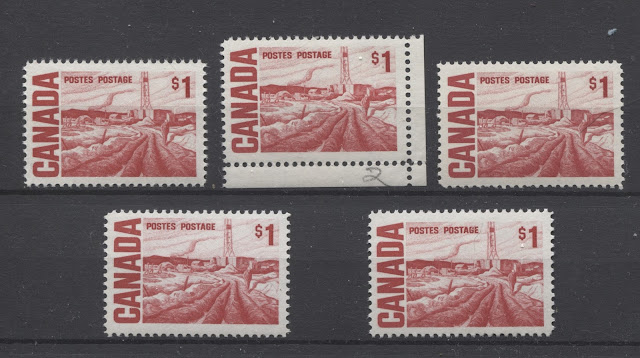
On the top row are three dex gum printings, all in the deeper, carmine-red shades. Then on the bottom row are two PVA gum printings, each in the same scarlet-red shade. The left and right dex gum stamps are both on dull fluorescent, vertical wove paper, with type 4 dex gum. The centre dex gum stamp is on low fluorescent, horizontal wove paper with type 4 dex gum. Both bottom stamps are printed on low fluorescent vertical wove paper, with satin PVA gum.
Here are those same stamps under UV light:

Transformative Ink

This concludes my examination of the inks used to print the Centennial issue stamps. Next week's post will start to examine the Winnipeg tagging that was added to some printings of the stamps made between 1967 and 1972. Unitrade only lists the basic tagging configurations, but there were variations in the intensity of the taggant coating and in the appearance of the tagging under UV, as well as the width and spacing of the tag bars themselves.