
Introduction
Any collector who buys any significant accumulation of modern material will at some time or another come across these sealed packages of inscription blocks that were produced and sold by Canada Post. The vast majority have been opened over the years, the blocks removed and the packaging thrown away. However, some have survived unopened, and these often turn up in large "postage" accumulations sold at auction. I noticed several years ago that there are no listings in Unitrade for these packs and could not understand why. I also noticed that there were differences in the styles of the cardboard inserts that were used to stiffen the packs and protect the blocks from damage.
So, I decided some years ago that I would study them and pay attention to the differences that I found. Problem was I never had enough of them at any given time to really study them. All that changed last month, when I bought several hundred at auction. I decided that I would study them and document my findings as I prepared them for resale. All I can say is WOW! What a fertile collecting field this is! As you will see in this post, there are a vast number of differences that can be collected in these packs, a number of which are very scarce and seldom encountered. This field is so replete with collectible varieties that it is very hard for me to believe that nobody has properly studied it yet, or if they have, that nothing has been included in Unitrade to capture these differences.
This post will therefore show you some of the varieties that I have found. It is by no means exhaustive though, as I am limited by whatever I have been able to examine, and so I am confident that there are other types that I haven't seen yet. So, without further ado, let's get into it.
When Did These Packs First Appear?
So, the first question that arises is when did these packs appear? The answer is, I don't know exactly. By 1974, packs with the type 1 inserts, which I will show you are found with fair regularity, but the very earliest pack I have found was for the 15c gold and multicoloured for the 1973 issue, relating to the 1976 Montreal Olympics. This pack did not have a printed insert, being just a dark red piece of cardboard. So, it would seem to me that sometime in 1973 would be the answer, though I would love to hear from anyone that has anything earlier.
What Are the Collectible Differences?
The next question that arises is what are the attributes of these packs, and how can they be studied to identify collectible differences?
The following attributes of these packs have all been seen to vary, and thus can form the basis for inclusion in a specialized collection:
- Whether or not they contain a plain, or printed insert, and if printed, what type of insert they contain.
- What the fluorescence level of the insert card is, on a scale from dull fluorescent (DF) to hibrite (HB).
- Whether the pack has been sealed once or twice on each end, and whether it is sealed on the sides versus the top and bottom.
- The overall size of the pack in relation to the blocks contained within.
- The size of the plastic baggie in relation to the pack.
- Whether or not any errors were made in producing the pack, or any improvisations or alterations were made during production, but prior to issuance.
- Whether or not the inserts show any constant printing varieties, cutting errors or cutting guidelines.
- Of course the paper fluorescence and other attributes of the inscription blocks themselves.
Other things that could be exist, but which I have not seen as yet are packs that contain the wrong blocks, or the wrong quantity, or matched sets that contain duplicates of the same positions, thus being errors, on account of their not being matched sets.
Unprinted Inserts
As I mentioned above, the first packs that I have seen and long since sold had plain cardboard inserts. In some cases, these inserts were brownish unfinished cardboard, and in others the cardboard was coloured. I can recall orange yellow and dark burgundy red being two colours that stand out, but my memory is hazy as to whether there were any others. Generally, once the printed inserts start to be used, you generally don't see unprinted inserts, with only a few exceptions, which include some sealed pairs that I bought in a collection that spanned the years from 1988 to 1989.
Basic Insert Designs - Printed Inserts
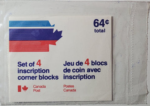
The basic printed inserts begin to appear in the packs starting in 1974, and over the years they have undergone at least seven major design changes, and several minor ones. This attribute of the packs, more than any other, forms the basis of most of the collectible varieties to be found on these. Where an issue spans the design changes made, they may exist with both and sometimes up to three basic insert types, maybe more, when the minor variations in font are factored in. What are particularly scarce and desirable, and have done very well in our auctions in the past are those packs whose insert design is well beyond the date after they were replaced by a subsequent type, and there is no reason why they should exist. The approximate periods of use are given below each type, but this information is just very roughly approximate, as I need to see many more packs to firm up the date ranges.
Type 1
Type 1 featured a speeding stylized maple leaf design in light blue, deep purple and bright red, with the old partial Canadian flag logo. It was in use from 1974 until it started to be phased out in 1976, in favour of a new design. However, I have found it as late as 1978 on some packs.
I have found three basic types of these packs, as well as packs inscribed for use with field stock, rather than philatelic stock blocks.

Type 1A - 3 colours, maple leaf logo and curved serif on "1" and cents raised.

Type 1A for field stock blocks. I am not sure if the philatelic department regularly sold field stock in packs. I don't think so, based on the low number seen. I think these were a stop-gap measure when they ran out of inscription blocks.

Type 1B - 3 colours, maple leaf logo and straight serif on "1" and cents raised.

Type 1C - similar to type 1B, value expressed with cents symbol that has line passing all the way through AND a decimal point in front of the "6'. This is the only example of this I have encountered.
Type 1A low value pack, with value expressed with a cents symbol, which has a line that passes all the way through and protrudes from both sides, but no decimal point.
Type 2
Type 2 was a short lived design that appears to have been in use for just under a year, having made an appearance in 1976 and being completely gone by the end of 1977. The partial flag logo remains, as do the three colours, though some versions have dark blue replacing the deep purple. However, the speeding maple leaf was dropped, and instead is replaced by coloured horizontal stripes. in light blue and deep purple (or deep blue on some).
For this type, I have found three sub-types that differ in terms of the colour of the widest stripe (dark blue and dark purple) and the thickness of the font.

Type 2A - light blue, red and purple on white.

Type 2A for a pack with under $1 face value, expressed with a cent symbol, rather than a decimal.

Type 2B - light blue, red and dark blue on white with new flag logo.

Type 2C - light blue, red and purple on white with new flag logo, and thicker font, with a type 2B superimposed over the top to show the difference.
Type 3
Type 3 is a much plainer design, in which only one colour is used, being dark purple against a white background, The old Canada post logo is retained, and it is set against a wide dark purple horizontal stripe. This type was in use from late 1977 to late 1979.
I have found no fewer than four sub types of this type, which differ according to whether or not "Canada Post" appears on one or two lines, and the size of the font used for the text.

Type 3A - purple on white, uniform sized text. Canada Post on one line. Larger font.

Type 3A - purple on white, uniform sized text. Canada Post on one line. Smaller font.

Type 3A for a low value pack with the value expressed using a cent sign. I think this was standard for the low value packs, but they may exist expressed with a decimal also.
Type 3B - same as 3A but with Canada Post on 2 lines instead of one. I do not currently have an example to show here.

Type 3C - purple on white, Canada Post on two lines and mixed font, with the $1 being larger than the raised cents. Text font is also thicker.
Type 4
In late 1979 the colour of the inserts was changed from dark purple to light blue, and with a few other minor font changes gives rise to no fewer than seven sub-types. This type was one of the longer lived types, being replaced in 1990. Again, the types differ according to whether Canada Post is on one or two lines, how closely spaced the font is, and the overall font size, as well as the relative sizes of the text font and the numeric font.

Type 4A - light blue on white, uniform sized, smaller font.

Type 4A - light blue on white, uniform sized, larger font, widely spaced. This, by far is the most common variation, during this period, being found on most all issues from 1979 to 1988.

Type 4A - light blue on white, uniform sized, larger font, closely spaced. This type first appears sometime in 1984.

Type 4B uniform font - blue on white, Canada Post on 2 lines with all font the same size in the text.

Type 4B mixed font - blue on white, Canada Post on 2 lines and mixed font with figures of value larger than all the remaining text.

Type 4C - blue on white, Canada Post on two lines, but no "inscription" in the text, and these were inscription blocks.

Type 4C - blue on white, Canada Post on one line, but no "corner" in the text.
Type 5
In late 1988, based on Canada Post new issue brochures that we have examined, Canada Post re-designed their logo to a speeding arrow, and for all philatelic service products, incorporated the title "Philatelic Service". However, this change does not appear to have made its way into the sealed packs until early in 1990. I had thought that Type 6 was the type to replace type 4 until a few years ago, when I discovered this very short lived type on blocks of the 1990 Norman Bethune issue. As far as I know there are no subtypes of this type, and it only appears on a few issues from 1990. There is, what appears to be a dark blue version, used for items directly from the philatelic department, which I have called type 5B.

Type 5A - appeared very briefly at the very end of 1989, with the World War II issue, and for most of in 1990. This is light blue on white.

Type 5B - dark blue on white, address of philatelic department.
Type 6
Type 6 appears in 1990 and was in use until type 7 replaces it sometime in 1998. I have found three sub-types of it, which vary according to font size and also as to whether cents are presented in decimals or with a cent symbol.

Type 6A - new logo and "Philatelic Service" in white on dark blue, denomination in decimals.

Type 6B - blue on white, new logo and "Philatelic Service", in white on dark blue, value expressed with cent symbol rather than as a decimal.

Type 6C - blue on white, new logo and "Philatelic Service", in white on dark blue, philatelic logo text small with very large text font.
Type 7
In 1998 the Philatelic Service title was dropped and the speeding arrow was incorporated into a new Canada Post logo. The colour was initially dark blue on white and this was changed to black on white sometime in early 2000. I have only found two font sizes, though the insert cards themselves are all different sizes, due to the abandonment of a standard size for Canadian commemorative stamp issues during this time.

Type 7A - dark blue on white, no barcode, large font.

Type 7B - dark blue on white, no barcode, smaller font.

Type 7C black on white, larger font, no barcode. I didn't have an example without the affixed barcode label, but it would look like this without a label.
Type 8
In early 2000 the inserts were altered to incorporate a UPC barcode. Initially, before the design could be reprinted with the barcode on the card, some of the packs issued in early 2000 had a barcode label affixed to the old type 7C pack, to effectively make them a type 8. Again, I have found them with two font sizes.

Type 8A - black on white with barcode above emblem, larger font and pack sealed at sides

Type 8B black on white with barcode above emblem, smaller font and pack sealed at top and bottom.
This type was still in use to the last issues I have had packs for, which is 2006. There may or may not have been more design changes since then. I'll have to check at the main post office next time I go in to see what the current packs look like, if they even still sell them.
Differences in the Way Packs are Sealed
The same packs can be found with the seal running along the top and bottom of the pack, and also the sides. In addition, I have come across packs that are double sealed, with an outer seal, and then an inner one that reduces the amount of room in the pack for the blocks to move around. However, these seem to be quite scarce, as the lot of several hundred that I bought included just one pack.

Type 6A sealed at the sides.

Type 6A sealed at top and bottom.
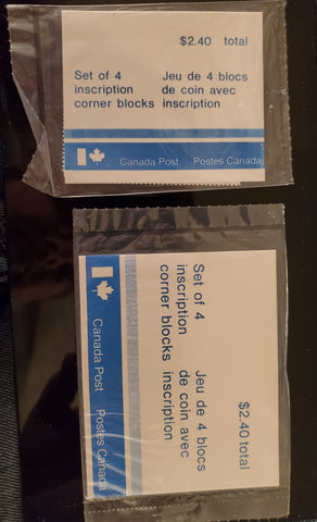
Issues That Come With More Than One Type of Pack
As I stated in the beginning of this post, many packs exist with two or more types of insert, with probable significant differences in scarcity.


Two packs of the 25c beaver definitive from 1988, with type 4B and type 6A packs. The Type 6A pack is the blocks on Coated Papers paper from 1992. The type 4B pack is the original Slater paper printing from October 1988.

3c edible berries definitive with both type 6A and 6B packs. Note how much larger the type 6A is than it needs to be for the size of the blocks.

Types 2A and 3B for the 1976 Handicapped Olympics Issue
Type 4A with large and small font types on two different sized cards for the same stamps - the 15c Christmas issue from 1980.


Type 4B small pack and type 4A larger pack with large font, both produced for the 35c Christmas stamp from 1980.


4c third issue Centennial postage due plate blocks with types 1C and 1A inserts.
Constant Varieties
Occasionally you will encounter packs whose insert cards show minor printing flaws. Often, these will be constant, which you can establish by the fact that the same flaw occurs on more than 1 pack, which indicates that they all came from the same print run. Below is one example:

Type 3A that shows small diagonal mark to right of the logo.
Cutting Guidelines
These insert cards were printed in larger sheets that were then guillotined apart. When this is done correctly, no evidence of the cutting guidelines will remain visible, as the guillotine will pass through them. However, on some insert cards, a cutting guideline can be seen, as with this example here:

32c commemorative issue showing deeper blue vertical cutting guideline inside the light blue stripe.
Improvisations Made by The Philatelic Department
Other times the philatelic department would run out of supplies required to make the packs, whether that be the blocks themselves, the baggies required to seal the packs or the inserts. When these things occurred Canada Post often improvised, making do with what was available. Insert cards were sometimes recycled when the right sized insert was not available. Alternatively some packs can be found sealed in baggies that are way oversize for the size pack they are, which tends to suggest that larger baggies were substituted for the smaller ones that ran out. Finally, when the inscription blocks themselves were not available, field stock blocks were used instead, and a different insert card was included, or if not available, the existing insert cards were physically altered by the Canada Post employee using a felt marker or ballpoint pen.
These, in my opinion are the most desirable packs, because most of them will be very scarce, since relatively few will have been produced, and fewer still will have survived.
The first type of improvisation is where the correct sized insert card was unavailable, and a smaller insert card was placed on top of a correct sized, blank card. The scans below show several examples:

Type 1A pack inserted over a blank insert

A short-lived type 5A insert inserted loose into a larger pack, with a blank insert.

A type 6 insert inserted loose into a pack with a larger blank insert
Another example of an improvisation occurs where the correct sized insert card is available, but some detail is not correct, like the barcode is missing. In this case, a label was affixed to the outside of the pack, like this example:

Black on white type 7 insert with a barcode label affixed over top of the pack to make it a type 8B, though the font on this one is even smaller. Here the label includes the logo.
Type 7C black on white large font, with barcode label affixed to the outside of the pack to turn it into a type 8A.
The scans below show two examples where field stock blocks were substituted for inscription blocks, and the insert cards amended accordingly:

$2 Olympic Stadium stamps from 1976 which were supplied in field stock, rather than inscription blocks and with the insert being hand altered to reflect this, in black felt-tipped pen.

$1 Notre Dame Cathedral stamps from 1976 which were supplied in field stock, rather than inscription blocks and with the insert being hand altered to reflect this, in blue ballpoint pen.
Errors
Several different types of errors are possible with these packs, though the most major one - the inclusion of the wrong blocks has not, as yet surfaced. The ones I have usually seen so far are miscuts involving the insert cart. These can be either horizontal or vertical miscuts. Examples are shown below:

Miscut of type 4A with normal. Note the lack of white border at bottom, and unbalanced look of the one on the left compared to the normal one on the right.

Type 4A with larger font showing vertical miscut at left, causing truncated text. This was the 37c locomotives stamp from 1984.
One interesting error that I have only found one of is one where the correct blocks and inserts are included, but are assembled the wrong way around, so that you cannot tell what is in the pack, without moving the blocks around just enough to get an edge poking out, so that you can see which issue the blocks are from:

2002 Golden Jubilee issue with the insert placed backwards, obscuring the contents of the pack
Unusual Items
In addition to packages of plate blocks, one comes across a few items here and there which are different, but not usually present in any significant quantity. These include sealed packs of singles, pairs, single blocks, full sheets, and semi-annual or quarterly packs. Quarterly packs and semi-annual packs are regularly issued, and until the late 1990's were issued in cellophane packs just like the postage due singles pack below. I don't have an example to show here, which is why I don't include a picture of one, but it is similar enough to the pack for the postage due singles that you can get a good idea of what they look like.
Full sheets were also regularly issued. But the rest of these items were likely made available only to customers who had standing orders with the Philatelic Service in Ottawa, and later in Antigonish, after 1984.

Full sealed sheet of the 1974 postal service issue.

Here is the insert for the sealed sheet, which is a type 1 style.


Type 2 style insert for 1988 mammals plate blocks with Antigonish Philatelic Centre. This is curious as type 2 style had been replaced by type 3 in 1977 and the philatelic centre moved to Antigonish in 1984. So one would expect this to be type 4 style in light blue.

A singles pack in type 2A style with the cents sign.

Type 2 style singles pack for 1988 mammals low values with Antigonish Philatelic Centre info.


Pack of singles for the 1978 postage due issue. This is closest to type 4 in terms of style, as the colour is light blue on white.

Style 3A pack of 10 corner blocks, all one position. I don't know when Canada Post started doing this or why, nor do I know when they stopped producing these packs, though all the ones I have seen are from the period from 1977 to 1978.


Sealed pair of the 1989 Archibald Lampman and Louis Frechette issue with type 2 like style Antigonish Philatelic Bureau Insert. Some other pairs that I found from 1988 had plain cardboard inserts.
Storage and Display
One reason why I think these were ignored by collectors was because until relatively recently there was no way to mount and display them. However, with the widespread variability of Vario stocksheets, that is no longer an issue. Virtually all of these, including the full sheets can be displayed on Vario pages, and this is what I would use if I were collecting these.
Scarcity
It is my belief that many of these are much, much scarcer than people realize. I see very, very few packs from before about 1977 in my travels. Most of the packs were opened and the blocks removed, and of those that have survived, many have been surprisingly mishandled by collectors who should know better, but don't, because they aren't listed and priced in the catalogues. Because of this, most collectors have placed no inherent value on a pristine, unopened pack, even though it is obvious that such a thing should be worth more than the corresponding value of the blocks inside. I just bought a collection last month which was described as being in sealed packs, but was offered in the postage section of the catalogue. Every single pack had either been cut open, or divots had been sliced out of the plastic on each side. I have no idea why. My best guess as to the reason why the collector did this is because the thought the blocks needed to "breathe", which for PVA gum blocks is sheer nonsense. But, it is amazing what even an experienced collector will do to something philatelic when no explicit value is placed on that thing. It really puts into perspective the practices that horrify most of us, that collectors were doing back in the 19th century, like using pins to mount stamps, trimming stamps to fit into album spaces and cutting valuable stamps off cover of cutting octagonal stamps to shape.
Conclusion
I hope this has been an informative post for you and that after reading it you will agree that this is a very promising area to collect. You will see the areas now in which the hunt is on to find packs that will help establish the exact dates that certain types were introduced and discontinued, as well as establishing relative scarcity data for the different types.
If you haven't already done so, I would encourage you to check out our current auction closing on January 4, 2023. Here you will find an extensive selection of these packs. You can access the auction listings here.
2 comments
Thanks so much Rob! I’d very much look forward to anything you might have from before 1974.
Good evening Chris,
What an interesting and useful article you have written on the topic of the Canada Post Office packs. My collection is small and mostly centred around the issues from the late 1960’s. Bill Longley got me going on these as a side line to my specialized collection relating to the 1968 Christmas stamps featuring Inuit Art.
Sometime after Christmas I will haul out my accumulation and send you some scans all being well.
Wishing you and your family a very Merry Christmas and a Happy New Year.
Rob McGuinness