Upon the death of King George VI on February 6, 1952 it became necessary to design a new series of stamps for the new young Queen. The result was a very tasteful and beautiful set for collectors, which remained in use for the first 15 years of her reign. The designs for the low values were based on a portrait of the Queen by Dorothy Wilding, and the high value designs featured the four main Royal castles located in each region of the country:
- Carrickfergus Castle, in Ireland.
- Caernarvon Castle, in Wales.
- Edinburgh Castle, in Scotland.
- Windsor Castle, in England.
The issue was released in two parts, with the 11/2d and 21/2d values first appearing on December 5, 1952. The remainder of the values appearing between August 1953 and January 1954. The high values were first issued in September 1955, so that for the first few years of the Queen's reign the public was still using high value stamps from the 1951 Festival of Great Britain series.
The low value stamps were printed using photogravure by Harrison and Sons Ltd., who had perfected the technique on the earlier King George VI issues. Five designs for the frame were adopted for the series, all of which feature the heraldic flowers, being the rose, thistle and shamrock:
- The 1/2d to 2d have the flowers surrounding the portrait in a circle.
- The 21/2d, 3d, 4d and 41/2d values have the initials "E R" in the upper corners and the flowers in a bunch in the lower left corner.
- The 5d through 7d have a double oval frame around the portrait, with one flower in each corner and then a daffodil in the fourth corner.
- The 8d, 9d, 10d and 11d have a sawtooth square frame around the design and then a solid oval frame around the portrait, with flowers in each corner, as with the 5d through 7d.
- The 1/-, 1/3d and 1/6d have a plain shaded frame around the design, flowers in the corners, and then the portrait is surrounded by a shaded oval, which is solid on the 1/- and 1/6d and lightly shaded on the 1/3d.
The result of the variety in designs and the use of bold and varied colours, at least to me is a very attractive set.
The paper in use for the first issue had the E 2 R and crown watermark, with the crown being the Tudor Crown. Later, between August 1955 and March 1956, the set was then re-issued with the watermark being changed to feature the St. Edward's crown rather than the Tudor Crown. The two can always be easily distinguished by the top of the crown, which is a single, flat arch on the Tudor Crown and a very pronounced double arch on the St. Edward's Crown. Then, between October 1958 and June 1959 the watermark was changed again to the multiple St. Edward's Crown.
Because the castle high values were not issued until 1955, they do not appear with Tudor Crown watermarked paper, but first appear with the St. Edward's Crown. There were actually two different printers that printed these in two main runs: Waterlow and Sons, which printed the first printings, and then De La Rue, which printed them between April and July 1958. Then, in 1959 after the paper was changed to the multiple crown watermark De La Rue did another printing on that paper. In 1963 another firm, Bradbury Wilkinson, printed the stamps on paper with the same watermark.
Starting in 1957, the post office began to experiment with ways to mechanize the mail cancelling process. Initially the solution they came up with was graphite lines printed on the back under the gum. These are an innovation that was unique to Great Britain. They were first issued on the low values to the 3d with St. Edward's Crown watermark in 1957, and then on values to the 41/2d, on multiple crown watermark paper in 1958. The graphite lines proved to be a failure, largely because the ability of the sorting machines to detect the stamps was affected by moisture and in the UK, which has a high amount of humidity, this was a problem.
So, in 1959 new experiments were conducted with phosphorescent tagging. At first, the tagging was applied to the graphite-lined issue, and this was subsequently rolled out to all values between 1960 and 1967.
Finally, the high values were again reissued in 1967 on unwatermarked paper. These were essentially the high values to the subsequent Machin head issue from 1967 until 1969 when the high value Machin Heads were issued.
This then, is the issue in a nutshell. Both Scott and Gibbons deal with the listings slightly differently in terms of numbering, but the basic listed stamps in both catalogues are:
- The full set of low values on the Tudor Crown paper.
- The full set of low values on the St. Edward's Crown Paper.
- The full set of low values, except the 11d, on multiple Crown paper.
- The castle high values on St. Edward's Crown paper. Gibbons lists both De La Rue and Waterlow printings, while Scott does not.
- The castle high values on multiple crown paper. Again, Gibbons lists both De La Rue and Bradbury Wilkinson, whereas Scott only lists the more common Bradbury Wilkinson printings.
- The castle high values on unwatermarked paper.
- The graphite lined stamps on St. Edward's Crown paper.
- The graphite lined stamps on multiple crown paper.
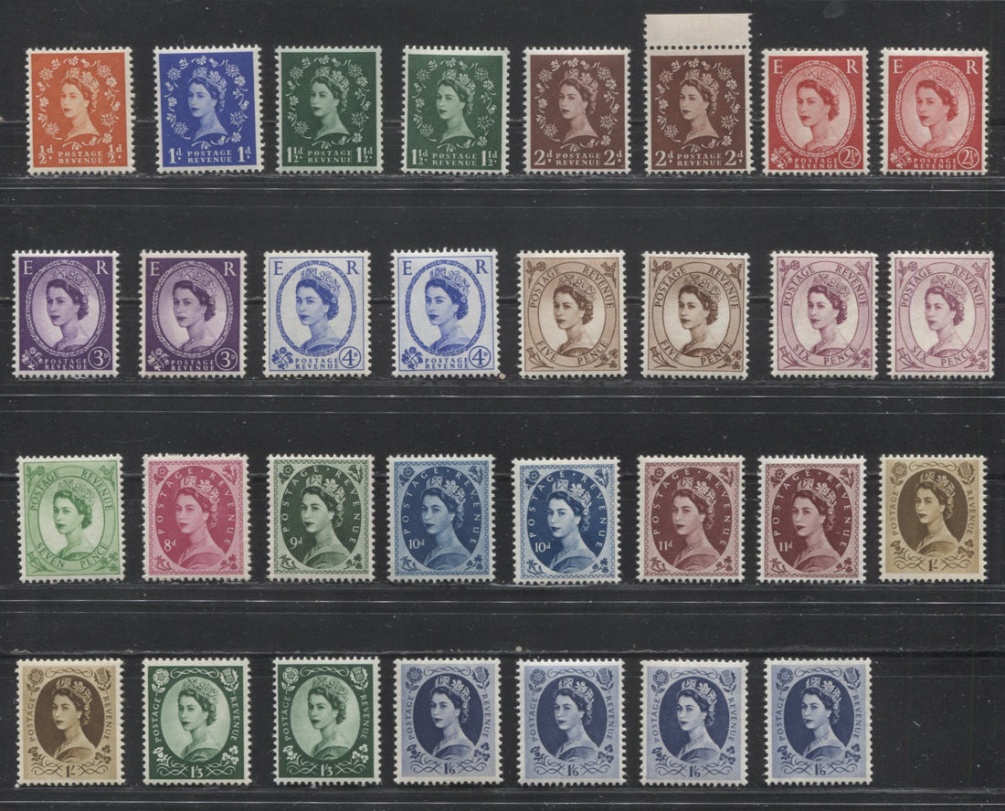
Here is a set of the low values on the Tudor Crown paper, with some extra variations, which I will discuss later.

Regional Issues
In addition to the national issues, there were also separate issues of low value stamps for Northern Ireland, Scotland, Wales, and the Channel Islands of Guernsey, Jersey and the Isle of Man. There were fewer denominations in each case, and the designs were different for each region, with the Heraldic flowers being replaced by the single flower corresponding to the region, which was the shamrock for Northern Ireland and the thistle for Scotland. Wales was represented by a dragon.
Because these issues did not appear until 1958, they are not found on either the St. Edward's Crown paper, nor are they found on the Tudor Crown paper. They are however found on the multiple crown paper, as well as on paper with no watermark, which was used during the period of the pre-decimal Machin Heads from 1967 until decimal currency was introduced in 1971.
Like their national counterparts, they were issued without tagging until 1963, when tagging was introduced to most of the values issued.
Offices Abroad and Eastern Arabia
What often gets forgotten by collectors considering this issue is the fact that it was used to produce the stamps of the Morocco Agencies and the countries in the Middle East that were under UK administration, which included:
- Bahrain
- British Postal Agencies In Eastern Arabia, also called Muscat or Oman
- Kuwait
- Qatar
Most of the values were issued in each country for the first two watermarks, and just a few on the multiple crown watermark paper. Tagging was not introduced on these, as there was no attempt made to mechanize mail sorting in these locations, nor was the UK administering any of these places by the time tagging was introduced.
Consequently, most of these countries will have one set for each of the first two watermarks, and a few values on the multiple crown paper. Morocco Agencies has a nearly complete set for the British Currency overprint on the Tudor Crown paper, and complete sets of the Tangier overprint on both Tudor Crown and St. Edward's Crown paper, with an extra set commemorating the 100th anniversary of British administration.
So, the above represents what is covered in the standard catalogues. What I want to do now is discuss some of the points of interest for a potential specialist that goes beyond what is listed in the standard catalogues. Some of these aspects are covered in the Gibbons Specialized catalogue for the pre-decimal Elizabethan issues, and some are not. What should become clear as you read on is the amount of scope that can be created for specialization. The aspects I want to discuss quickly are:
- Booklets and booklet panes
- Sideways and inverted watermarks
- Colour shades
- Cream versus white papers
- Green, blue and violet phosphors
- Other paper differences other than fluorescence
- Coil stamps
- Paper fluorescence
- Constant plate flaws
- Multipositive variations
- Re-Entries and retouches
- Cylinder numbers
- Configuration of Perforators
Booklets and Booklet Panes

Booklets were issued containing panes of most low values to the 4d for all the watermarks discussed, as well as the phosphor tagged stamps. The booklets issued in the UK were issued by denomination, with the smallest booklets being 1/- and containing panes of just 2 stamps, and then in denominations of 2/-, 2/6d, 3/-, 3/9d, 4/6d, 5/-, 6/- and 10/-. Each booklet contained a different number of panes of various stamp denominations, with various interleaving pages, which unlike Canadian booklets contained advertisements.
Another aspect of GB booklets that makes them unique is that they were generally re-issued every two to three months, and the date of reissue is noted on the cover of the booklet, creating a collectible variety of that booklet. In addition, the design of the cover was also changed three times during the life of the issue. I will get into these booklets in detail in a subsequent post, but suffice it to say for now that the booklets on sale at any given time were different, depending on the prevailing postage rates, and it is possible to reconstruct a sequence for all the booklets together over the life of the issue.
Scott and Gibbons have been somewhat inconsistent in their treatment of panes from these booklets, listing some, but not others. Gibbons and Scott both list the basic panes for each watermark, but neither catalogue lists the graphite lined panes, for example. Although the specialized Gibbons catalogue does recognize and list both inverted and upright watermarks on the booklets and panes from them, no such distinction is made in the regular Gibbons or Concise Gibbons GB catalogues, and Scott does not even mention their existence at all.
Because booklets are just another issuing format for stamps, along with coils, it follows that most of the paper varieties and tagging varieties that exist on the sheet stamps, will also be found to exist in the booklets as well. So, the addition of booklets and booklet panes to any collection of these issues will constitute a major expansion in scope.
Booklet singles can also be collected and identified by the appearance of the perforations on the edge of the stamp, when the stamp comes from one of the outer edges of the pane, or by the watermark, which can be inverted. The booklets were produced by stitching together large sheets of pane, interleaving and cover material and then using a guillotine to cut the booklets apart. The result is that the perforations on the outer edges of the booklet are either trimmed off completely, or they are full, but the ends are cut cleanly, rather than separated by tearing. So, if you examine the perforation tips carefully, you can generally always identify stamps that come from the outer edges of the booklet panes.
Sideways and Inverted Watermarks
All three watermarks an be found both sideways and inverted, as well as sideways-inverted also, on low values up to and including the 4d. For the first two issues they are only found up to the 3d however. Both Gibbons and Scott are very inconsistent in their treatment of these watermark varieties, with Scott only listing sideways watermarks. Gibbons lists both, but does not clearly indicate their significance, except in the specialized catalogue.
For the Tudor Crown, St. Edward's Crown and first printings of the multiple crown stamps the sideways watermarks are coil stamps, while the inverted watermark stamps always come from booklets. The sheets containing the panes for booklets during this period were printed in such a way that half the panes have the watermark upright and half have it inverted.
Later printings of the booklet stamps on the multiple crown paper were printed in such a way that the watermark was either sideways, or sideways inverted. The regular sideways watermark has the top of the crown pointing to the right, as seen from the back of the stamp, while the inverted watermark will have the crown pointing to the left.
Colour Shades in Visible Light and Under UV Light
All of the stamps of this issue can be found with noticeable differences in the shades of the basic colours in which they were issued. This is particularly the case with the 1/2d, 1d, 2d, 2.5d, 3d, 4d, 5d, 6d, and 7d values. Scott does not list any shade varieties whatsoever, while Gibbons lists a reddish purple and deep claret on the 6d St. Edward's Crown and an ultramarine/deep ultramarine difference on the 4d on multiple crown watermark paper.
However, it should be recognized that you can collect shade varieties on all the basic listed sets. You will find the most variety on the multiple crown watermark, and in addition to differences visible in normal light, you can also find some very notable differences in how the colours appear under long-wave ultraviolet light. For instance the 11/2d green can appear dark green under UV, but can also appear black on some stamps.
Cream Versus White Papers
In 1962 the post office announced that they were whitening the paper. So, generally speaking most all issues after that date will be found to be printed on a whiter paper, which is generally thinner, and more translucent, making the watermark more difficult to see.
It is this paper that the catalogues are pricing when they list both the tagged and untagged stamps of the multiple crown watermark. The earlier printings of these sets were on what is known as cream paper, which for all three watermarks is off-white rather than white. It takes patience, experience and careful comparison to separate stamps on cream and white papers, and the cream papers themselves do vary in how deep the cream colour is. One help to identifying them is generally that they will be non-fluorescent under long wave ultra-violet light. There are a few exceptions to this however, and studying the papers can become quite complicated.
The cream paper versions of both the tagged and untagged stamps are, in practice just as scarce as the Tudor Crown and St. Edward's Crown stamps are, and they are priced similarly in the Gibbons specialized catalogue.
According to an expert in this area that I speak to regularly, while the white papers generally did fully replace the cream paper, he has found instances of cream paper being used well after 1962.
In addition to finding these differences on the low values the high value castle stamps can also be found printed on both cream and white papers as well, for the De La Rue printings. These are only listed in Gibbons Specialized.
Green, Blue and Violet Phosphors and Method of Application
Tagging on this issue is a subject not covered in any depth by any catalogue except for Gibbons Specialized. One reason may be that it requires the use of a short-wave ultra violet light (SWUV), which is extremely dangerous to the eyes and must be used with care.
When tagging was first introduced in 1959 and until the end of 1960, the chemical taggant used gave a green reaction under SWUV. This reaction is only really visible in the 3-5 seconds after the lamp is switched off. A stamp under the light will exhibit a light greenish white glow that fades in 3-5 seconds after the lamp is switched off.
Starting in 1960, it was decided that a stronger signal was needed, and so a new chemical was introduced that gives a blue afterglow when the lamp is switched off.
Then when automatic mail sorting was introduced in addition to cancelling, a chemical was needed that would not be visible to the sorting machines, but would be visible to the cancelling machines. So, the violet phosphor came into use and has been in use ever since. The width of the bands for the violet phosphor can be either 8 mm or 9.5 mm.
Generally speaking the common phosphor type, which the catalogues base their values on is the 9.5 mm wide violet phosphor. The 1/2d value is the only exception to this where the blue phosphor is the most common type. In addition to colour under UV, the method of application can vary. Phosphor bands were applied by typography, flexography and photogravure.
The methods used to separate the different colours of phosphor and their application will be covered in another blog post.
Other Paper Differences Other Than Fluorescence
In addition to the cream versus white distinction, there are very noticeable differences in the thickness of the paper, with some stamps being found on a relatively thick paper, on which the watermark is very easy to see, and other stamps being found on thinner papers which show the designs through the back, and for which the watermarks can be quite difficult to see, even with watermark fluid. Some of the booklet stamps can be found printed on a paper that has a very distinct glazed appearance as well.
Coil Stamps


As previously mentioned, the stamps with sideways watermark are coils, but not all coils have sideways watermark. Coils were sold in rolls that deliver the stamps either horizontally or vertically. They were produced from long strips that were themselves produced by guillotining perforated sheets. So, once again, you can identify them by the appearance of the perforations at opposing sides of the stamp, or by the watermark. Stamps that come from horizontal rolls will have upright watermark, but will have trimmed perfs at top and bottom, while those that come from vertical rolls can have either upright or sideways watermark. In both cases the vertical perfs will be the ones that are trimmed.
The coil strips were then joined together by a small piece of paper pasted over the back, and perforated.
The standard catalogues list only the sideways watermarks, and even then it is not clear that what they are really listing are coil stamps. Coils with upright watermark are not listed by any catalogue, though Gibbons specialized does mention their existence and does list paste-up pairs which they call coil joins.
Paper Fluorescence

In addition to paper colour and differences in thickness, starting with the multiple crown paper, there are a lot of variations in the fluorescence when viewed under a long-wave ultraviolet light. These differences range from dull fluorescent paper that contains fluorescent fibres to paper that is almost hibrite. In the above picture the 6d tagged stamp is printed on a dull paper, while the 2d is printed on a medium fluorescent flecked paper.
Both these papers are white papers, which illustrates that paper fluorescence cannot always be used to distinguish between white and cream papers, since there are some cream papers that are mildly fluorescent, while there are some white papers which appear either dull fluorescent or non-fluorescent.
This aspect of the stamps is completely ignored even in Gibbons specialized. Why is a mystery, since the differences can be very marked indeed.
Constant Plate Flaws
Most all values of the set can be found with one or more constant plate varieties. Most of these consist of small dots or blemishes in certain parts of the design, or extra stems, or flowers joined to one another where they shouldn't be, or in the case of the 1d, missing period varieties. All are highly collectible and are listed in Gibbons Specialized.
Multipositive Variations
The photgravure process used to produce the low value stamps employs large steel drums called cylinders to print the stamps on a continuous roll of paper called a web. The cylinders are produced from multipositives and variations in these produce different visual effects on the stamps. If you compare some stamps you may notice differences in the appearance of the shading, in certain parts of the design, or in other design details. The 2.5d and 3d stamps for example exist in three different variations, called multipositives A, B and C. These are only listed in Gibbons Specialized.
Re-Entries and Retouches
This applies to the castle high value stamps. As these are printed by engraving, they can be found with re-entries and retouches to certain parts of the design. These are not listed by the standard catalogues, but are listed in the Gibbons specialized catalogue.
Cylinder Numbers

In the exact same way that we have plate numbers in Canada and other countries, the UK has cylinder numbers on its photogravure stamps. These are highly collectible, and are all listed in Gibbons specialized. They are usually collected as blocks of 6, but can sometimes also be found on booklet panes as well, and are quite sought after. Adding these to a collection of this issue expands the scope enormously.
Configuration of Perforators

The stamps of this issue are comb perforated, and the arrangement of holes in the combs varies. On this issue you can find several different configurations of the perforations, which differ in terms of how the perforations appear in the selvage of the sheets. For example, the above block shows the top selvage perforated all the way through, whereas the right selvage tab shows the horizontal perforations extend only 1 hole past the vertical ones. We call this "single extension hole" in philately.
Other varieties can be found where the selvage is completely imperforate on one side, such as on this block

Here you can see that while the top selvage is perforated through, the right selvage tab is completely imperforate.
While many of the stamps of this issue exist with only one such configuration, there are several that exist with 2 or 3 different configurations.
That's it for this overview. I hope you can see that once you bring all these different aspects to bear and extend the scope to include the overprinted issues, that you have a very fertile field for specialization. Next week I will get into how to identify some of these differences. I will cover the different phosphor types and the different printings of the castle high values.
2 comments
Thank you for this fascinating and highly informative article
Just introduced to you by a friend. I only collect GB