The Decimal Machin definitive issues of Great Britain have always been one of my favourites. Many find them boring, but I absolutely love the colours, and I find the juxtaposition of Arnold Machin's intricate and detailed plaster bust of the late Queen, and the simplicity of the minimalist background and frame design to be simply brilliant. The bust is the focal point, with little to distract the eyes, and then the "pop" of the brilliant background colours. The design is also very 1960's, which people may not appreciate if they weren't around back then to experience the minimalist modernist design aesthetic. But if you are familiar with that aesthetic and you remember that the stamps were first issued in 1967, then you can begin to understand the colour choices and appreciate the design itself.
Doing this issue justice would require at least as many detailed posts as I did for the Canadian Centennial definitives, in which I wrote some 52 posts. The complexity of this issue is rivalled by very few issues in the world. The specialized catalogue, Deegams, is a 2 volume tome. So, there is no way that I am going to even begin to cover it in detail in one post. What I want to do here is write about the general appeal of the issue, and make some general observations about the stamps themselves and the structure of the issue, as well as some suggestions as to how best to go about collecting the issue, so as to be able to navigate through the detail.
The Structure of the Issue: Regionals and National Issues
One thing that is unique to this issue is that in addition to the regular issues that were distributed throughout the UK, there were also parallel printings made and issued of stamps that incorporated the regional symbols, and which were issued within the main regions that make up the United Kingdom: Northern Ireland, Scotland, Wales and Monmouthshire and Isle of Man. Although Guernsey and Jersey are also part of the UK, they issued their own definitives. So, one thing you will have to decide at the outset is whether or not you want to collect both the National issues and the Regional ones.
The Structure of the Issue: Make-Up Stamps, High Values and Rate-Specific Values
One of the reasons why this issue seems so overwhelming is because there is literally almost a stamp for every possible face value up to and beyond one pound, and oftentimes there will be many colours for the same denomination. On the face of it, this seems nonsensical and overwhelming. But the reason for it is simply that the postage rates changed every year, and the issue was in use for so long.
If you take a step back though, with this in mind, you will start to see that the issue, at all times is basically a set of 12-18 stamps issued in new colours every year or two. The set consists of essentially three components:
- Low values whose only function was to serve as make-up stamps, and could not be used to pay any rate on their own.
- Rate-specific stamps, which were designed to be used singly to pay one of the first or second class rates that were in effect, whether that was for domestic, European or international non-European use.
- High values, whose function, once again was to pay high rates for which it was not practical to issue stamps for, such as high value parcels, bulk mailings and high value registered letters.
So, as an example, lets look at the stamps that were part of the first issue that came out between 1970 and 1972. It included the following stamps:
- 1/2p turquoise blue
- 1p crimson
- 1.5p black
- 2p myrtle green
- 2.5p magenta
- 3p ultramarine
- 3.5p olive grey
- 4p ochre-brown
- 5p pale violet
- 6p light emerald
- 7.5p pale chestnut
- 9p yellow orange and black
- 10p cerise (engraved - June 1970)
- 10p orange brown and chestnut (August 1971)
- 20p olive green (engraved)
- 50p deep ultramarine (engraved)
- 1 pound bluish black
Here, we see that the initial issue consisted of just 17 stamps. The two 10p's illustrate a concept that will prove to be critical in understanding the issue as a whole: what constitutes a make up stamp or a high value will change over time as the rates change. This is why the same face value exists in many colours sometimes - because the status of that stamp has changed. So, in the case of the 10p cerise it was the lowest high-value stamp when it was issued in June 1970. But by the time the other 10p was issued, it was now a low value stamp, so it was printed in the manner of the other low value stamps and assigned a new colour.
The stamps up to the 2p were purely make-up stamps throughout the entire issue, with the 1.5p never being reissued. The 1/2p stamp continued to be printed and issued in many forms until the 1/2p coin was abolished and withdrawn from circulation in 1985. The 1p and 2p stamps were, and have only ever been make-up stamps, which is why their basic colour has never changed throughout the life of the issue. Indeed, they are the only 2 stamps that were in continuous use throughout the life of the issue whose basic colour has not changed. To the best of my knowledge, they are also the least expensive to collect, and so if you want to really understand the complexity of this issue, specializing in these two stamps would be a good starting point for the patient and budget conscious collector.
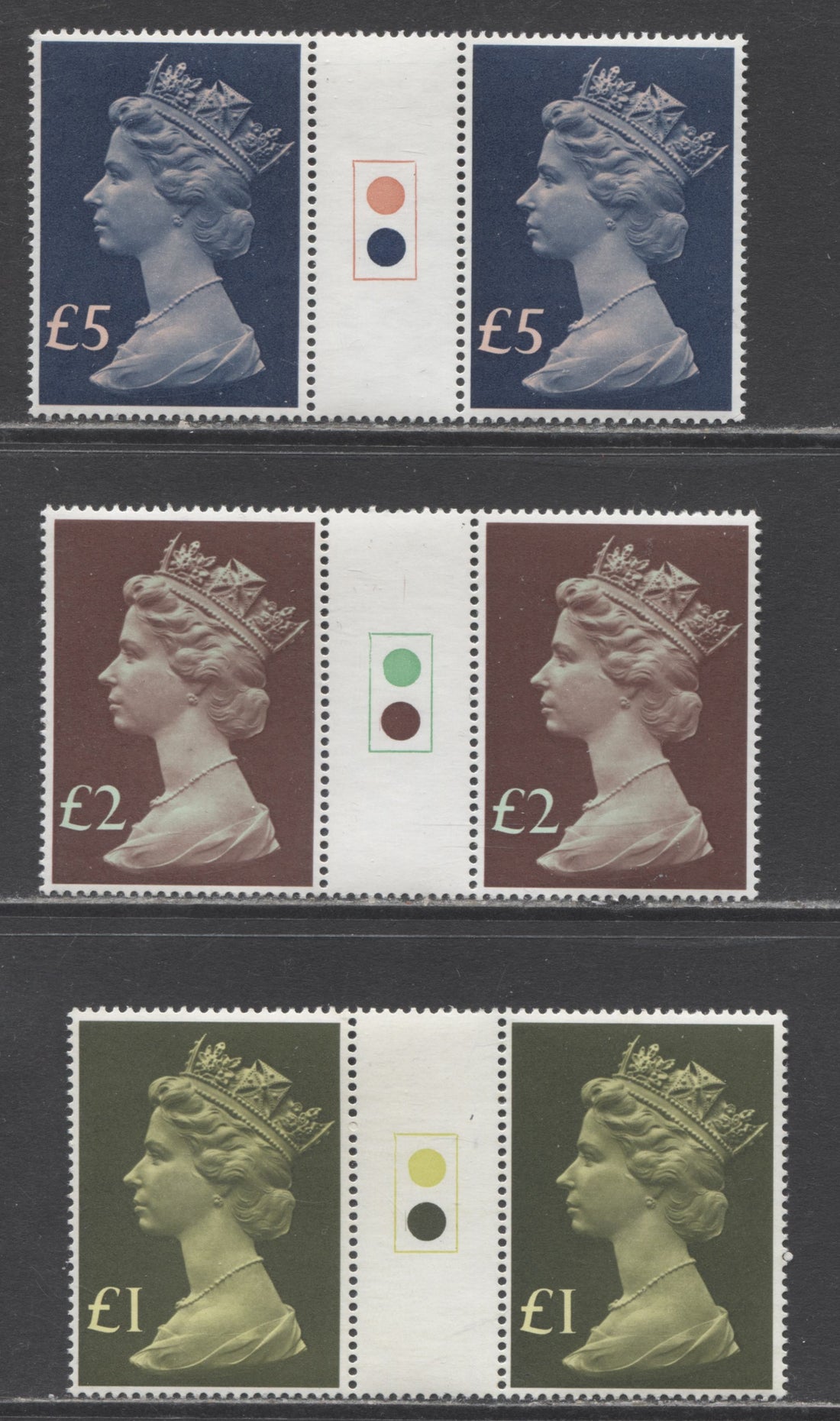
The values from 2.5p to 10p were the rate-specific stamps, while the 10p and up were the high values. In 1977, new high values were issued that start at 1 pound and go up to 5 pounds.
So the rest of the issue from 1972 to 2022 is basically going to consist of the same structure as above, with new rate-specific values being issued for new postal rates and reprints of the make-up stamps and high values.
The Structure of the Issue: Colours
Another distinguishing feature of this issue is the sheer array of mostly very bright colours, though there are a few dull ones, such as drab. One might immediately wonder if the colours have a specific meaning. I believe they do, based on the fact that the colours on all values except the high values and 1p and 2p changed throughout the life of the issue. My theory is that the colour corresponds to the rate that the stamp was issued to pay. This may or may not prove to be correct, and would require a careful study of rates to test. But, it is worth noting that the same basic colour was often used for stamps of different denominations issued over time. So, it does make sense that these may be stamps issued to cover the same basic rate of postage. Let's take an example: the 3p ultramarine. The basic ultramarine colour was used for the following stamps:
- 3p ultramarine (1971, 1973)
- 15p ultramarine (1979)
- 20.5p ultramarine (1983)
- 31p ultramarine (1990)
- 38p ultramarine (1999)
- 90p ultramarine (2009)
- 1.88 GBP dull ultramarine (2013)
- 5 GBP ultramarine (2017)
The issue dates for these are quite far apart, so they may not correspond to the same postage rates, but it is a plausible theory that they would. Organizing by basic colour is indeed one way that you could go about collecting these stamps.
Printers and Printing Methods
Until 1980 all the stamps were printed by Harrison and Sons using photogravure, with the exception of a few very limited printings of the 8p and 12p that were made by Enschede. Starting in 1982 some printings by House of Questa using lithography were issued. Since then the printing has been a complex mash-up of photogravure and lithography by many firms including:
- Questa (lithography and photogravure)
- Walsall & ISP Walsall (lithtography and photogravure)
- Harrison & Sons (photogravure)
- De La Rue (photogravure and lithography)
- Enschede (photogravure engraving and lithography)
- Cartor (lithography)
In general terms stamps printed by photogravure tend to have a matte appearance and in my opinion, except for the much later printings made in the late 2000's by lithtography, the highlights and contrasts in the bust show up very much better in stamps printed by photogravure. The lithographed stamps have a glossier appearance and in my opinion, the bust lacks contrast, having a very "flat" appearance. Also, any stamp that is perf. 14 is printed by lithography, as the standard perforation for the issue was perf. 15 x 14.
Paper Types: Original Coated Paper, Post Office Paper, Bradbury's Paper, Fluorescent Coated Paper, Phosphorized Paper, Advanced Coated Paper and Later Dull Coated Papers
Until the 2000's when the paper used to print stamps reverted to dull paper, giving no reaction under UV light, the papers used to print the Machins were all fluorescent to some extent. Generally the reaction under UV is always strongest on the face of the stamp, with HB/HF, HB/MF and HF/HF being the most common, though occasionally one does see HF/HB.
The first releases of the high and low values were on different papers, which Gibbons Specialized refers to as Original Coated Paper (OCP) and Bradbury's Paper. Bradbury's Paper was used for the high values and the OCP for the low values. The main distinguishing characteristic of these two papers compared to the later papers is the relatively creamy off-white appearance on the face, as compared to the stark, brilliant white of the later papers.
Starting in 1972, a new paper was introduced for the low values called Fluorescent Coated Paper (FCP). The name is a little misleading, because under UV this paper is only marginally brighter than the OCP. The main difference is that it is much brighter white on the face than the OCP is.
On the high values, a new brighter white paper was introduced in 1974, which is called Post Office Paper.
Phosphorized paper was first used experimentally on some 1973 printings of the 50p engraved high value, but its general use becomes commonplace starting in 1979, and it replaces the use of phosphor bands on most printings until fluorescent bands begin to appear again in the very late 1990's. Essentially phosphorized paper looks very similar to FCP, but the main difference is that the entire printing surface of stamps on phosphorized paper is matte or eggshell sheen, whereas OCP and FCP stamps have a slightly glazed appearance. The paper incorporates a phosphorescent compound into the paper coating, and so in theory it should be possible to see it under short-wave UV light, but in practical terms it is very difficult to see, because the chemical used is the same as that used for the later violet phosphors and these have a very short afterglow period of just 1 or 2 seconds after you switch the UV lamp off. Another name for this paper is Advanced Coated Paper (ACP).
Phosphor Bands and Fluorescent Bands
Until the introduction of ACP in 1979, all stamps were tagged with phosphor bands, except for some experimental printings of the 1p, 2p, and 10p, which were tagged over the entire surface of the stamp. Different configurations of phosphor bands exist for many of the stamps, and this is yet another layer of complexity to this issue:
- The default configuration is 2 side bands at left and right.
- One centre band was used for many values.
- One side band was used for many values coming from booklets.
It appears, but I am not certain of this, that the stamps with one phosphor band were issued to pay second class rates, and that the presence of one band was to alert the sorting machines to this fact, with two side bands indicating that the stamps were first class stamps. This does not explain however, why the make-up stamps were issued with both configurations. The side bands appear to have no special significance, and result from the use of one tagging bar to tag two adjacent stamps, so that one will have a left band and the other a right band. This is one aspect of the issue that Scott does not deal with, and you need at least Gibbons Concise or standard catalogue for a basic listing of all the types.
Starting in the 1990's most stamps are tagged with one or two bands that appear to be phosphor bands, but are actually fluorescent, in that they are activated by long-wave UV light. Most of the time these bands glow bright bluish white under UV, but sometimes they are bright yellow.
Gum: Gum Arabic, PVA Gum, PVAD Gum and Self Adhesives
The gum used on 99.9% of the Machins before the introduction of self-adhesives in 2009 was PVA or PVAD gum. PVAD is just PVA gum with dextrine added, which gives the gum a slightly greenish tinge. A very small number of printings of low value stamps up to the 4d exist with gum arabic. Most of these are common, but there are a few that are very, very rare and list for thousands of pounds in SG Specialized.
The initial PVA gum appears quite creamy and has what I would call and eggshell sheen. The first PVAD gum introduced in 1974 has a very bluish green colour, is streaky in appearance, and is very matte in sheen. Later, the PVAD gum takes on a lighter colour and has either an eggshell or satin sheen. Beginning in the 1990's the gum goes back to being just straight up PVA and the colour and sheen both vary, depending on which printing company is involved. I've seen some PVA gums that are quite shiny. Cartor's gum is actually dextrine and not PVA, and is very, very shiny.
Starting in 2009, all the Machins are self-adhesives. At first, the backing paper used is plain, with no underprinting. Starting in 2016, the backing paper has a light wavy "Royal Mail" underprint, whose orientiation varies. On some stamp booklets and sheets, the underprint reads downward from upper left to lower right, or upright from lower left to upper right as an example. Eventually the underprint was redesigned, so that alternating pairs of lines are inverted relative to one another. The gum on these stamps is NOT water soluable, so they are generally collected on cover or piece when used.
Perforations and Security Die Cuts
The standard perforation for all the Machins before 1980, when the first lithographed printings appeared was comb 15 x 14. The lithographed printings can be found in both this perf and perf 14, which usually appears noticeably coarser, and can usually be sorted out on sight, once you have worked with lots of these stamps and have developed a comfort level with them.
Starting in 1993, as a security measure, one elliptical hole is cut out of the perforations between the stamps and each stamp has one hole or one part hole on each vertical side. Then, in 2009, a further security measure was introduced, consisting of four U-shaped slits die cut into the stamps.
The purpose of the elliptical cuts was to combat forgery, because it would be very difficult to perforate stamps and replicate the elliptical perforation in a convincing way. The security die cuts were there to prevent people from peeling the stamps off envelopes and re-using them, as the stamp would break up if they tried. These stamps do not have water soluable gum, so they cannot be soaked either.
Typeface Styles
Several values exist with differences in both the style of the numeric font, and the width of the numerals, though not issued at the same time. These include the 3p, 10p, 26p and 75p sheet stamps with water activated gum, as well as several of the stamps with elliptical perforations. Unless you are organizing your collection by denomination, these are not really a layer of complexity, as each type will occur only in an entirely new issue of stamps, and so if you organize your collection by date of issue, you will get them all naturally as you acquire ths stamps.
Iridescent Royal Mail Overprint: Source Codes and Year Codes
The very first self-adhesive security Machins had an iridescent repeating, wavy "Royal Mail" overprint that can be found across the entire design. There is a very short issue in 2011 that does not have this overprint, and is confined to the low values, but for the most part, all Machins issued after 2009 have this overprint.
Starting in 2009 some of these overprints incorporate a source code, which indicates where the stamps originate. The code nearly always appears in the upper right of the stamps, just above the crown, where a letter of the word "Mail" is swapped out with another letter to denote that the stamp comes from: a roll, counter sheets, business sheets, custom booklets, miniature sheets, prestige booklet panes, standard booklets of 6, or booklets of 12. The letters used are A, B, C, M, P, R, S and T, so for counter sheets, the word "Mail" remains unchanged, but for business sheets it becomes "MBIL". At first, people thought that these stamps were counterfeits and were paying a lot of money for them, until more research was done and their significance was understood.
Starting in 2010, year codes were also incorporated into the overprint, in which IL of "MAIL" were swapped out for two year digits. This code generally appears to the left of the Queen's forehead.
The combinations of possible source and year codes is an extremely complex area that is still being researched. Gibbons Concise does include some tables listing all reported combinations, though other will undoubtedly be discovered in the years to come.
Adding Complexity: Booklets, Coils, Sheets, Cylinder Blocks
In addition to all the individual stamps that can be collected, you can easily add complexity and depth to a collection of Machins by collecting the booklets. coil strips of several values, full sheets and cylinder blocks. Cylinder is just another name for plate, which is used to describe stamps printed using lithography and photogravure.
Sheets are quite large and you would likely need a large Lighthouse sheet file to house them properly, and collecting full sheets will get very expensive very quickly. So what a lot of collectors will do instead is collect cylinder blocks of 6 that show the cylinder number of the printing, and in many cases the printer's inscription. Unlike Canada which had inscriptions in all four corners of sheets, British sheets usually only have the inscriptions and cylinder numbers in one location at the sides of the sheets, making it much more manageable to collect them, though you will find that a LOT of cylinders were used to print these stamps, and even a very simplified collection as far as papers, gum and phosphors are concerned will balloon into a very large collection of cylinder blocks.
I haven't verified this with the Machins, but usually the sheets and blocks will also reveal differences in the way the comb perforating was done, with some sheets or blocks having imperforate selvedge, some having perforated selvedge or having selvedge in which a single extension perf hole appears beyond the perforations of the opposing rows or columns. For all the booklets I examined the selvedge always had a single extension hole, but I imagine that varieties with different configurations of perforation do exist.
The booklets can be found with a variety of different cover fluorescences, with different postage rate information inside the covers, with and without cutting guide markings on the selvedge, and with the selvedge tabs on the right or left side of the booklets. Only the selvedge placement and postage rate differences are listed in Gibbons and most of the time these have little effect on price, but in a few cases they can make a big difference to value.
Adding Complexity: Errors
Of course, errors on this issue do exist, and are highly sought after. The main types fall into two categories: imperf pairs and stamps with the phosphor missing. Generally speaking, the phosphor bands are easy to see on these stamps by holding them at an angle to the light. But sometimes, they can be very difficult to see and you may think you have a phosphor omitted error until you put it under a short wave UV light, where with a loupe you can just make out the line where the band ends on the stamp. So you should never buy a missing phosphor stamp without first checking it carefully under a short-wave light. Also, the All Over phosphor stamps where they exist without phosphor should only be bought as marginal examples because with these you can clearly see where the All Over Phosphor ends in the sheet margins, and on genuine phosphor omitted stamps you will not see the tagging line in the sheet margins.
The errors are where your collection goes from many thousands of dollars up into the tens or hundreds of thousands of dollars.
Head Differences
On the pre-decimal issues there are subtle differences in the plaster bust that are termed Head A, Head B and Head C. These aren't found on the decimal issues, so I won't cover them here. I'll deal with them when I do a post on the pre-decimal Machin head stamps.
How to Structure a Specialized Collection
So, now that we have done an overview of the complexity that exists within the issue its time to talk about how to actually structure a collection. There are many ways to do it, and which one you opt for, will in my opinion, depend on which aspect of the issue you want to emphasize.
If you want to approach the issue from a printing differences perspective and you want to show all the aspects of complexity than collecting by face value may make the most sense. So your collection would be, for a particular denomination:
- All regular sheet stamps of that denomination.
- Cylinder blocks of that denomination.
- All booklet singles of that denomination.
- Booklet panes and complete booklets containing that denomination.
- Covers showing the different uses of the stamps
- FDC's and maximum cards containing the stamp
- Errors
All of the complexity surrounding paper, gum, regionals, phosphors, perfs etc are incorporated into each section. You simply build your collection systematically by deciding how much scope you want to include and then organizing by value.
If you want, instead to approach the issue from a postal history standpoint then what you need instead is a list of dates and postage rates, so that you can construct what a complete set looked like at each point in the timeline. Then, you collect your stamps in the same way as above, but instead of organizing by value, your stamps are organized by the categories of rates that were in effect for a particular date range. Doing it this way will have the added benefit of making the issue appear less complex, as many of the differences in paper, phosphor and gum will just be the basic stamps for that particular period.
If you want to approach the issue by colour, you could also organize your stamps into colour groupings, using the same basic structure as above. This may be best if you have a favourite colour.
Suggestions For Approaching A Specialized Collection
Unless you have developed a comfort level with the different types of gum and paper used on this issue and you intend to collect the whole issue, you might find it easier to begin with the rate-specific values first, that only exist in a few printings each, and study these to become familiar with the differences. Then you can begin to tackle the very complicated values like the 1/2p, 1p and 2p that were in use for a very long time. On the other hand, because the 1p and 2p values are not expensive you may wish to start with these and use what you learn from these to help you identify your other stamps. The only difficulty with this approach is that you may find it hard to lay your hands on a large quantity of mint 1p and 2p stamps unless you approach dealers in the UK. Many will have traded these stamps in now for barcode stamps now that they have been demonitized, and can no longer be used for postage.
Conclusion
Hopefully after reading this post you will see that there are many ways to approach the collecting of this issue in a way that will make it less daunting. I also hope that you will see that although they were common stamps, now that the Queen's reign has ended, there is a need to study and document these stamps for posterity and the enjoyment of future generations.
2 comments
Good information!
Très intéressant de voir la complexité d’une émission de timbres