The most significant innovation to ever enter the postal system was the introduction of a way to separate stamps without cutting them, without question. To the best of my knowledge, the first country to experiment with perforating was Great Britain, and they were definitely the first country to issue perforated stamps. The official year that the penny red was perforated for the general public was 1854. However, experimental printings of the earlier imperforate stamps were used, on a limited basis by a fellow named Archer, to produce perforated stamps between 1850 and 1853, and these were released in three tranches to the public in the United Kingdom between those dates, mainly to test reaction to perforated stamps and to determine if perforating the stamps was worthwhile. The reaction by the public was overwhelmingly positive, and so the perforated Penny Reds came into being.
In many ways these stamps are far more interesting and potentially lucrative to collect than the imperforate issues, due to a number of factors. They are certainly way more complicated than the imperforate stamps. Gibbons Specialized lists no fewer than 13 basic "C" numbers for these stamps, and collectors may legitimately wonder why there were so many. There is a seemingly confusing maze of paper, shade and watermark changes, not to mention reversions to earlier perfs. or shades that are out of place to the general progression of things, and may not make sense to a beginning collector. But the key to understanding the reason for, and therefore the significance of these differences lies in understanding that most of them were motivated either by a need to improve profitability of the printing contract by lowering cost, or by practical considerations. Discussing these considerations will do much to explain the different variations listed in Gibbons.
Practical Considerations
The first practical consideration that comes into play is that the early perf. 16 proved to be too fine a perf, and sheets had a tendency to fall apart too easily when handled by postal clerks. So, it was quickly replaced by perf. 14, which resulted in sheets that were more resilient. That makes sense, but it begs the question as to why there were so many instances where both perf. 14 and 16 were used concurrently, and one instance in 1857, where the perf. 16 reappears very briefly. In the last case, the reason for the reappearance of the perf. 16 in 1857 briefly is that Perkin's Bacon was constructing a new Napier perforating machine and while this was happening it became necessary to send the perforating combs gauging 14 in for maintenance. Obviously, perforating had to continue, and so the old perf. 16 combs were brought back into service for a very short period of time. In the case of both large and small crown watermarks existing with both perf. 14 and 16, if you look closely at the listings in Gibbons, paying attention to the dates, it becomes apparent that this was a transitional replacement in the sense that it took time to obtain enough machines capable of perforating at 14 gauge to meet the production requirements. In actual fact, it took about a year for perf. 14 to completely replace 16. So, that is the reason why both watermarks exist perf. 16 and 14.
The second practical consideration is that there must have been some dissatisfaction with the appearance of the die 1 stamps, because a completely new series of plates, starting with #1 were made, starting in 1855. As I point out in my last post the die 2 profile is superior to die 1, in terms of how much detail is visible in the portrait. Die 2 shows a lot more detail, very clearly, while the die 1 head often appears "white", because the detail is faint. So, this explains why new dies were introduced, and like the introduction of the new perforation, it took some time to make enough new plates to replace the old die 1 plates. So this is why both die 1 and die 2 exist with both perf. 14 and 16.
The third practical consideration concerns the change from small crown to large crown watermark. I am not exactly sure why the watermark was changed, but I think it was a security measure. In looking at a large number of imperforate stamps these past few weeks it has stuck me how difficult it is much of the time to clearly see the small crown watermark without dipping the stamp in fluid. I was usually just trying to check for inverted watermarks, but even with backlighting I found it very difficult much of the time to see the watermark. You have to remember that back in 1855 people in the UK were reading by gas light and candlelight, not powerful 60 and 100 watt incandescent lights. So, if I had trouble seeing them, then it is pretty reasonable to assume that most postal clerks would not be able to see the watermark by gaslight or candlelight. The large crown watermark is a far more visible watermark, and while it may not always be clear without fluid, it can almost always be seen readily, without it, except for printings on very thick paper, which were rare anyway.
The change in watermark occurred after the introduction of die 2, which is why die 1 is only found with the small crown watermark. Now, there was one instance after alphabet III was introduced where a small amount of leftover small crown paper was used to produce the stamps, resulting in die 2 stamps, perf. 14 with the small crown watermark.
So, I think that the transition from small crown to large crown watermark, and the transition from perf. 16 and 14 were phased in at more or less the same time, and so because of this, both watermarks can be found with both perf. 14 and 16.
The number of plates used to print these stamps is much lower than was the case for the imperforate stamps. Those went from plates 1b to plate 177, whereas all of these stamps, issued over a period of 10 years, were produced from just 125 plates, being 54 plates for the die 1 printings (155-204, plus R1-R6) and 71 plates for the die 2 printings (1-68 and R15-R17). The reason for this reduction in number is that the plates lasted much longer once prussiate of potash was eliminated from the ink recipe. More will be discussed on this point under the topic of financial considerations. However, it is worth noting that a fairly high number of these plates are rare, compared with the number of plates used to print the imperforates. For those earlier issues, only 3 or 4 are rare, with the rest being more or less the same scarcity, except possibly the black plates, which are all a little better. In contrast, well over 20 of these plates catalogue over 300 GBP per stamp with many being 4,000-9000 GBP. So, while most collectors know all about the rare plate 77 for the later penny reds with letters in all corners, most collectors are unaware of the fact that there are many rarities hidden among the more common stamps of these issues.
Finally, just as the plates wore, so did the type that was used to stamp the corner letters into the corner squares of each subject of the plate, and it became necessary to produce new dies for stamping. This is the reason for the existence of the different alphabets. If you look at them from a distance, they don't seem that much different. It is only after you compare them carefully that you can readily see the differences. Alphabet III was merely introduced in 1856, as the alphabet II plates became too worn to continue using. There is one instance in 1862 where printings from reserve plates 15 and 16, were released, and these are alphabet II. These are only alphabet II because those plates were made up when the earlier alphabet II plates were made, and they were held in reserve, only being put into production when absolutely needed. Alphabet IV came into being when a decision was made to try hand engraving the letters into the corners instead of punching them. This was done for plates 50 and 51. However, given that there were 68 plates, and plates 52-68 have the punched alphabet III letters, it is clear that this experiment was not a success, in the sense that it was not cheaper or more efficient to engrave them by hand, and so it was not continued.
So, the practical considerations account for the differences in perf, watermark and the lower number of plates found. This leaves us with the differences in shades and the difference in paper colour (bluish versus cream versus white), which are explained, not by practical considerations, but rather financial ones.
Financial Considerations
Twice during the life of the printing contract held by Perkins Bacon there was pressure on them to reduce their price. The first time was in 1851 when Henry Archer was trying to win the contract with his perforation trials. The second time was in 1856, when De La Rue put in a competitive tender that forced Perkins Bacon to reduce their price by 25% to 75% of the 1851 price. This was because surface printing was much less expensive than engraving. Ultimately, De La Rue would prove to be too competitive to PB and they would eventually lose the contract in 1880. However, before this happened, PB started looking for ways to reduce their costs, while still fulfilling the contract requirements.
The starting point for this was the formula for the ink. In 1856 the ink used by PB was vegetable based, which was of a higher quality and more expensive than mineral based inks, which they were also using for other contracts they had on other applications. The post office contract had specified vegetable based ink, and so this was what was used. Vegetable based ink is more stable and does not either oxidize easily, nor does it easily fade. This is why you won't usually find faded or oxidized examples of the red brown shades. Most of the early shades, being the red browns, brick reds, plums and yellow browns come about due to variations in the proportion of red to black in the ink, as well as the effect of the bluing of the paper.
The most expensive ingredient of this ink was the prussiate of potash, which was responsible for turning the paper blue. As stated above, it was also caustic, causing the plates to wear quickly. So PB could significantly reduce cost if it could eliminate this ingredient from the ink, both directly through lower ink cost, and indirectly, by having to produce fewer plates to produce the stamps.
So, starting in 1856 experiments were undertaken to at first reduce, and then eliminate the prussiate of potash from the ink. Examples can be found that show only a very uneven, patchy bluing, or hardly any bluing at all. These examples are those first printings undertaken with the reduced prussiate of potash. Gibbons does not list these separately, but instead includes a footnote in with their alphabet III printings on blued paper, indicating their existence, with a minimum price for each. Then, after the prussiate of potash had been eliminated entirely there is a group of printings in red brown, on cream tinted paper. These are on the same paper as before, but it appears creamy because of the way the pigments in the red-brown ink react with the paper. This are listed in Gibbons specialized as C8A. Some of the printings produced appear as outstanding shades of orange-red or orange brown, and Gibbons groups these with the C9 listings.
In addition to eliminating the prussiate of potash, which would only reduce the cost over time, PB conducted experiments with the ink to save them money immediately. To do this they began thinning the ink with different quantities of oil. This results in the colour becoming red, and eventually rose. The initial red printings on cream tinted paper are listed by Gibbons as C9.
The March 1857 Fire
On the night of March 11-12, 1857 a fire at the company's Fleet St. premises destroyed a month worth of stock, but did not destroy the rest of the plant. So, the company was able to resume production quickly after setting up temporary premises at Saville St,, just off the Strand. They ran the presses 24/7 to try to recoup the lost production and build up new stock. These circumstances presented an opportunity to continue these experiments with the ink.
During this time between March and June 1857, the ink was thinned with ever larger quantities of oil, making the ink a paler and paler rose. Eventually towards the end of this time the vegetable based ink is switched for mineral based ink, in a shade of pale rose red. Because the ink formula was changed to a mineral based ink, the pigments in the ink no longer reacted with the paper, and no longer produced the creamy hue, and so the paper now appears white.
As this ink develops, it becomes the standard rose-red and deep rose red that collectors think of when they think of Penny Reds. There is a better rose-pink shade which appears towards the end of 1863. Both the pale rose red and rose pink shades are scarcer and more desirable, but they can be tricky to identify correctly, because the rose-red ink is susceptible to fading with exposure to sunlight. The only ways to tell the difference between faded stamps and the genuine shades is experience, and making sure that the colour is even across the surface of the stamp. Any stamp that has light and dark spots is likely faded.
So, these considerations account for the differences that can be found in the catalogued varieties. The table below gives a summary of the varieties, in terms of the perforation, watermark, die, paper, main shades and alphabets, as well as plates.
| SG # and Paper | Main Shade(s) | Watermark | Perf | Alphabet | Die | Plates |
| C1 - Blued Paper |
Red Brown (1) Orange Red (5) Yellow Brown (2) Plum (4) Brick red (3) |
SC | 16 | II | 1 | 155, 157, 162-204, R1-R2 |
| CE1 - Blued Paper | Red Brown | SC | 16 | I | 1 | 92-94, 96-101, 105, 107, 108, 111 and 116 |
| C2 - Blued Paper |
Red Brown (1) Orange Red (5) Yellow Brown (2) Plum (4) Brick red (3) |
SC | 14 | II | 1 | 194-198, 200-204, R1-R2 |
| C3 - Blued Paper |
Red Brown (1) Deep red Brown (2) Dull Orange Brown (3) Brown Rose (4) Yellow Brown (5) Brick Red (6)
|
SC | 14 | II | 2 | 1-21 |
| C4 - Blued Paper |
Red Brown (1)
Brown Rose (4) Yellow Brown (2) Brick Red (3) Dull Orange Brown (5) |
SC | 16 | II | 2 | 1-15 |
| C5 - Blued Paper |
Red Brown (1) Very Deep Red Brown (2) |
LC - Ty 1 | 16 | II | 2 | 1-2, 4-15 |
| C6 - Blued Paper |
Red Brown (1) Brown Rose (4) Yellow Brown (2) Plum (3) Dull Orange Brown (5) |
LC - Ty 1 | 14 | II | 2 | 1-21 |
| C7 - Blued Paper |
Red Brown (1) Deep Red Brown (2) |
SC | 14 | III | 2 | 22-27 |
| C8 - Blued Paper |
Red Brown (1) Brick red (2) Plum (3) Brown Rose (4) Orange Brown (5) Deep Claret (6) Orange Brown (7) Purple Brown (8) Pale red (9) |
LC - Ty 1 | 14 | III | 2 | 22-38, 40, 42-48 |
| C8A - Cream Tinted Paper | Red Brown | LC - Ty 1 | 14 | III | 2 | 23-26, 28, 30, 27, 31, 33-38, 40, 42-46 |
| C9 - Cream Tinted to White Paper |
Orange Brown (1) Red Orange (2) Pale Red (3) Bright Red (4) Dull Red (5) |
LC - Ty 1 | 14 | III | 2 | 27-38, 40, 42-48 |
| C9A - Cream Tinted to White Paper |
Pale Rose (1) Rose (2) Rose-red (3) |
LC - Ty 1 | 14 | III | 2 | 27, 31, 34, 36-38, 40, 43-44, 47, 49, 52, 53, 55 |
| C10 - White Paper |
Rose-Red (1) Deep Rose Red (2) Pale Rose Red (3) Rose Pink (4) |
LC - Ty 1 and 2 | 14 | III | 2 | 27, 33-34, 36-39, 41-52, 55-68, R17 |
| C11 | Rose Red | LC - Ty 1 | 16 | III | 2 | 27, 34, 36-38, 42-52, 55-60 |
| C12 |
Rose Red (1) & (3) Pale Rose Red (2) and (4) |
LC Ty 1 & 2 | 14 | IV | 2 | 50 and 51 |
| C13 |
Rose Red (1) & (3) Pale Rose Red (2) and (4) |
LC Ty 1 & 2 | 14 | II | 2 | R15 and R16 |
As you can see, just getting one of each stamp in the table in VF or fine condition is quite a task. VF examples, at least the way North American collectors would recognize them are almost non-existent. The reason for this is that the space between impressions on the plate was generally between 1/2 mm and 1 mm, just was was the case with the imperfs. But there is an important difference here: the width of the perforation holes. Just the holes themselves take up about 1/2 mm on their own. So less than 1/4 mm of margin is generally all that is left after the perforations have passed through the space between the stamps, and that is not very much at all. It generally means that the best stamps will look balanced, but will have perforations touching the design on one or more sides, while fine stamps will be lightly cut into on one or 2 sides. VG examples will be more severely cut into that would usually be the case on stamps of other countries. So, you need to take this into account when deciding what level of quality you wish to pursue for your collection.
Distinguishing The Shades
Generally this does require some experience, as all of the shade names given in Gibbons generally cover groups of shades that all show some variation. Particularly tricky ones are the plum, deep red brown and purple brown, as the plum is very rare , and the other two can often be mistaken for plum. Orange red is not really orange in the way you would imagine. It is more of a very bright red with an orangy hue. Yellow brown isn't really very yellow. it is more of a brown without the red undertone.
The rose red shades of the later printings will all have a purple undertone or a lake undertone. Pale rose red will have this undertone, but the shades will appear milky or paler. Rose, pale rose and rose-pink will not have this undertone. Rose-pink is a later shade that appeared in 1863, after the switchover from large crown watermark paper with type 2 crown that lacks the two points in the lower arch. So, any type 1 paper with those points cannot be the rose-pink shade. It has to be either pale rose red or a faded colour changeling.
On Stampboards there is a useful thread where the main poster goes through and shows you the different shade groups. His names are close to what is shown in the table, but do not match entirely, as the Gibbons listings have been re-written since these posts were published and the names have been changed. But I still find it useful for getting an idea of how the shades should look. You can access that post here.
Distinguishing the Alphabets
Although Gibbons gives illustrations of the letters in each alphabet, I find these charts very difficult to apply to single stamps in order to make a positive identification. I have found that the best way to distinguish these is to sort your stamps into each row, i.e. all the A-letter stamps, all the B's, all the C's etc. Then start to compare them. Once you do this, the differences will become very quickly apparent:
- Generally none of these will be alphabet I except for a few of the perf 16's on small crown paper. But where you do have them they should be fairly easy to spot because Alphabet 1 letters are usually smaller and narrower than alphabet II letters.
- Alphabet II letters are generally broader and larger than alphabet I and they are broader and shorter than alphabet III characters.
- Alphabet III letters are tall and slender. C's are generally almost closed. Q's have tails that are nearly horizontal. J's are rounded and have no ball at the end. Gothic K's are always alphabet III. Gothic K's have strokes that are at a less steep angle than the other K's. G's have very short crossbars. Those are the obvious ones.
- Alphabet IV letters are the trickiest to identify, because they are hand engraved, which means they are all different from one another. What this does mean though is that any stamp lettered AA, BB, CC will generally have letters that do not match, whereas they will on any of the other alphabets. Generally the letters are tall like alphabet III, but they are broader. J's are especially distinct, with some having large balls at the end, and square feet. C's are usually wide open. Q's have more vertical tails. G's have long cross bars. The best way to identify most is getting to know alphabet III really well and then anything that is close, but doesn't quite fit and isn't alphabet II is pro9bably alphabet IV.
The other thing you will find is that having two different letters on most stamps helps immensely, because difficult letters like M, I, E can often be identified by the presence of another letter that is much easier to classify.
Plating the Stamps
Plating the stamps is a very painstaking exercise and there really aren't a lot of plating aids in Gibbons they way there are for the imperforate plates prior to plate 100. Unless your stamp has a specific constant variety or re-entry that is listed in Gibbons, you are going to need to compare your stamp the images of the imprimatur sheets that are online, OR you will need the detaining plating books that list the measurements for the placement of the corner letters within the corner squares. There is actually a plastic gauge, much like an Instanta perforation gauge that you can use to get exact measurements for each stamp, which you can then look up in the plating books to get the exact plate. It is tricky to use properly and the books themselves are very expensive.
Alternatively you can access the actual imprimatur sheets for every single plate online here. Visual comparison with your eyes is time consuming, but for many positions the placement of the letters is distinct enough that you can make a positive identification. There are stamps missing from every single sheet, and those are the imprimatur singles that you find every now and then on the market. For these positions and for some sheets where the placement is too similar to distinguish with your eyes alone, you will either need the plating books, or you will need to right click, save the image and open it up on your editing software and enlarge it. There is likely image comparison software you can use that take a scan of your stamp and overlay it on a copy of the saved image and tell you if it is a match. You could, with a little investment of time, build a library of comparison images for all available positions in the 20 or 21 very expensive plates and save these on a portable hard drive. There will be close to 4500 images, so it is still a ton of work, but with the right software the task becomes manageable.
Collecting Re-Entries and Varieties
Gibbons lists a fairly large number of re-entries and constant varieties for every major C number. It is easy to get the impression that these are common, because Gibbons doesn't attach much of a premium to them. But nothing could be further from the truth. In examining over 1,000 stamps so far I think I found something like a dozen varieties, 2 of which were listed re-entries, 1 of which was a listed constant variety and the others were all unlisted. So they are very worthwhile to pursue, but it will take a long time to find them all, I would expect.
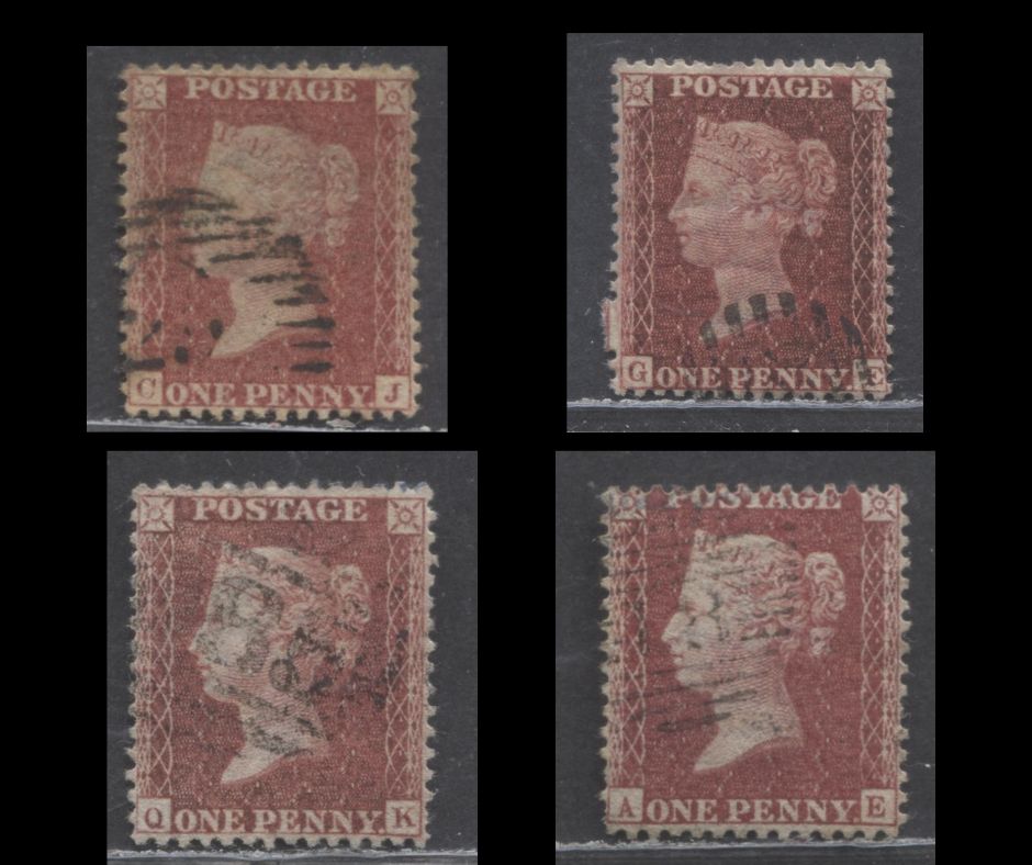
Collecting Cancels

This is one of the best ways to collect these I think, as the cancels are usually quite well struck and readable and there are so many cancels to collect.
There is a book you can access online called "The Postmarks of the British Isles From 1840" that will list the towns that correspond to each of the numbered cancels. You can access a free online copy here. Cancellations are generally organized under the following groups:
- London district cancels. Above is one of the many different types.
- England and Wales - the barred numerals with curved lines bounding the numerals.
- Ireland - numbers within a diamond grid
- Scotland - numbers within parallel lines, with stars on each side of the number.
This is the reference I used to classify the cancels offered in our auctions and it is quick to look up items. It also lists all the colonial postmarks, many of which are very rare. So, again this is an area that offers a lot of promise, because most collectors tend to eschew heavily cancelled stamps in favour of lightly cancelled ones. But a bold, clear cancel is desirable to a collector of cancels.
So, I think this is a good place to conclude this post, at least for now. As I sort the rose-red and pale rose shades I will likely gain some more insights, and as I become aware of new information I will add them to this post. Hopefully this gives you a good roadmap of these issues, as well as some online resources you can access to help you identify and organize your stamps.
8 comments
Very informative article. Would request if this articles be sent on my email so as to fecilitate me taking a print out?
Very informative article. Would request if this articles be sent on my email so as to fecilitate me taking a print out?
That is a great question! My answer to that is that you would probably need the dimensions of the displacement from the corner boxes for the corner letters of those specific positions, if the better known plating books have them. Presumably someone who has owned those imprimatur singles, as at one time or another taken these measurements and jotted them down somewhere. If they haven’t, then there really isn’t any way to tie those specific positions to those plates with certainty, though by establishing that they aren’t a match for the positions that are in the existing sheets, you may be able to at least narrow them to a group of plates.
Re missing imprimatur stamps. How can you tell which plate a missing imprimatur stamp comes from, particularly the A-row stamps which seem to be the most commonly removed?
I have sum nice examples