This week's post gets into what in my opinion is a captivating and challenging area of classic philately: that of the embossed and surface printed issues of Great Britain that cover Queen Victoria's reign from 1847 to 1901. Despite the large print quantity of stamps from this country, finding nice used and mint examples is quite challenging. This area offers much to interest the specialist, from plate numbers that are readily identifiable, shades, paper differences, watermark differences and a plethora of cancels, including those of many of the British Colonies, before those colonies issued stamps of their own.
I will begin with an overview of these issues in which I will discuss how to tell the difference between them at a glance, and provide an outline of what a basic collection looks like, and then I will get into a detailed discussion of the various attributes of ink, paper, and watermark that are found on these stamps, give you tips on how to properly identifying them, make some remarks on certificates of authenticity and conclude with some practical tips on how to collect this area in a way that will allow you to enjoy it, while staying within your collecting budget.
The Embossed Issues
The first issues of higher value, that were intended to pay foreign postage rates were the embossed issues, printed at Somerset House. They were almost identical to the postal stationery in use at the time, with two important differences:
- The 6d stamps were watermarked "VR" in sans-serif capital letters spaced wide apart.
- Both the 10d and 1/- were produced with a pair of silk threads running through the stamps. These threads were normally 5 mm apart. There are instances where they were misplaced, and in those cases the spacing differs.
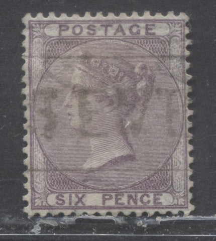
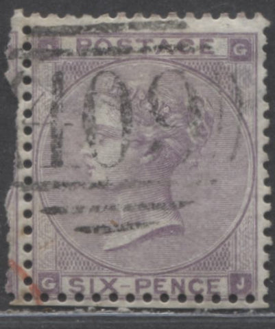
The scans below show the overall appearance of these stamps.
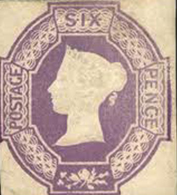
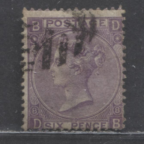
The 6d lilac, purple or violet.
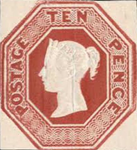
The 10d red brown.
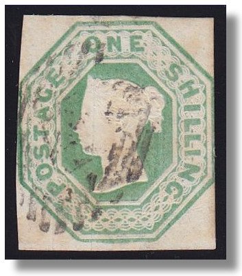
The 1/- green, deep green or pale green.
Most all of the postal stationery indicta at the time, with the exception of certain 6d pieces had clearly visible numbers incorporated into the design. On the issued stamps, as you can see, there were no numbers visible. Below the bust, there were die numbers and William Wyon's initials stamped into the design, but much of the time they can be difficult to read, particularly if the cancels obscure them on used stamps.
The stamps generally exhibit a fair range of shades, and Gibbons lists at least three on all of them. The 6d shows the largest amount of variation in this respect, with the colour being various shades of purple, violet and lilac.
These stamps were hand impressed onto the sheets, one impression at a time, and as a result they can often overlap slightly. The implication to this is that examples with four margins are very difficult to find. This is the reason why they list for as much as they do in the catalogues. 2 and 3 margin examples can be had for much less than the catalogue prices, but still in the low hundreds of dollars each. Most stamps were actually cut to shape at the time by those who did not know better, and one has to be careful not to confuse rebacked stamps, or those that have had margins added after the fact with genuine 4 margin examples.
Overview of the Surface Printed Issues
The main way in which Gibbons classifies these issues is to divide them into two periods:
- Those that were issued prior to 1880.
- Those that were issued between 1880 and 1881.
The Issues Prior to 1880 are usually named according to the type of letters that are found in the corners, and then further by the watermarks. The issues from 1880 onwards are named by issue, with each issue having its own unique name.
The pre-1880 issues can be broken down into:
- No Corner Letters
- Small White Corner Letters
- Large White Corner Letters
- Large Coloured Corner Letters
The first two groups have only one possible watermark for each value, and so the watermark is not used in classifying them. Of course, as we shall see, almost all watermarks can be found inverted, and these are both rare and sought after by specialists.
Large white letters can be further broken down into:
- Those watermarked "Emblems" or "Rose, Thistle and Shamrock"
- Those watermarked "Spray of Rose.
Large coloured letters can be further broken down into:
- Those watermarked Spray of Rose.
- Those watermarked Imperial Crown.
The post-1880 issues can be broken down into four sets, as follows:
- The 1880-1881 Issue Inscribed "Postage".
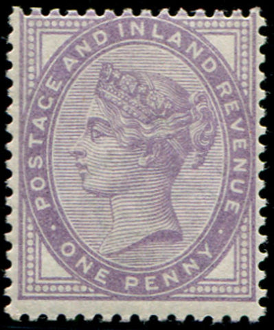
- The 1881-1901 1d Postage & Inland Revenue Lilac issue.
- The 1883-1884 Lilac and Green issue.
- The 1887-1901 Jubilee Issue.
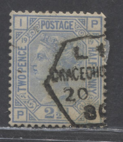
Below are representative examples of the designs of each issue:
No corner letters 6d
Small white letters 6d
Large white corner letters 3d

Large colored corner letters 2.5d

The 1880-1881 Postage issue 1.5d

The 1883-1884 Lilac and green issue 4d

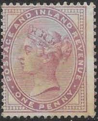
The 1880-1901 1d Postage and Inland Revenue lilac issue

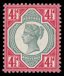
The 1887-1901 Jubilee issue
The table below provides a broad overview of the values that were issued as part of each set. It should be noted that multiple plates were used for most stamps, but these are not listed in the table for now, as the main purpose of this table is to give you an overview of the denominations themselves.
| Value | No Letters | Sm. White |
Lg. White Emblems or Garter |
Lg. White SOR MX Anchor |
Large Coloured SOR, Anchor, Orb Garter |
Large Coloured IC |
1880-1881 | 1883-1884 | 1887-1901 |
| 1/2d |
|
|
|
||||||
| 1d |
|
||||||||
| 1.5d |
|
|
|
||||||
| 2d |
|
|
|
||||||
| 2.5d |
|
|
|
|
|||||
| 3d |
|
|
|
|
|
|
|
||
| 4d |
|
|
|
|
|
|
|
||
| 4.5d |
|
||||||||
| 5d |
|
|
|
||||||
| 6d |
|
|
|
|
|
|
|
|
|
| 8d |
|
||||||||
| 9d |
|
|
|
|
|
||||
| 10d |
|
|
|
||||||
| 1/- |
|
|
|
|
|
|
|
|
|
| 2/- |
|
||||||||
| 2/6d |
|
||||||||
| 5/- |
|
|
|||||||
| 10/- |
|
|
|||||||
| 1 Pound |
|
|
|
||||||
| 5 Pounds |
|
The 6d lilac stamp with large white corner letters was issued both with a hyphen between "six" and "pence" and without one. The one with hyphen is the earlier issue, and the later printings were all without hyphen. Later in 1872 the design of the 6d was altered, where the medallion frame was swapped for a hexagon and the colour was changed from mauve to chestnut, and then finally to grey in 1873.
The 2.5d value with large white letters was first issued in rosy mauve and was watermarked with small anchor. The watermarked was then changed to orb in 1876, and then the colour was changed to blue in 1880.
The 1/- was green until 1880 when the colour was changed to orange-brown. This was for those printings with spray of rose watermark.
The high values from the 5/- to one pound were first issued on paper with Maltese Cross watermark in 1867. Later in 1882 this was changed to paper watermarked with large anchor. This is when the 5 pound orange was issued, as it is only known with large anchor watermark.
The stamps watermarked imperial crown included two curious surcharges. Both were printed in lilac with a red surcharge. One was a 3d on 3d and the other was a 6d on 6d. The curious part is why they were issued at all, when the surcharge matches the actual denomination of the stamps. The only reason I can think of is because the lilac colour was the same for both, and the surcharges were to make the distinction between the values clear.
The 1880-1881 postage issue basically replaces all the Perkins Bacon line engraved stamps, plus it adds a new value, the 5d, which did not exist in the earlier issues.
The 1d lilac postage and inland revenue stamp serves as the generic one penny stamp for the remainder of Queen Victoria's reign. Because of this, and the fact that it was in use for 20 years, it is an incredibly common stamp. That being said, there are a few scarcer varieties, being the die 1, the bluish paper and the bluish lilac shade. It appears at the same time as the 1880-1881 issue, or just afterwards, replacing the venetian red stamp. So, it is not shown in the table.
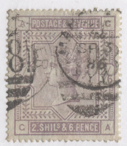
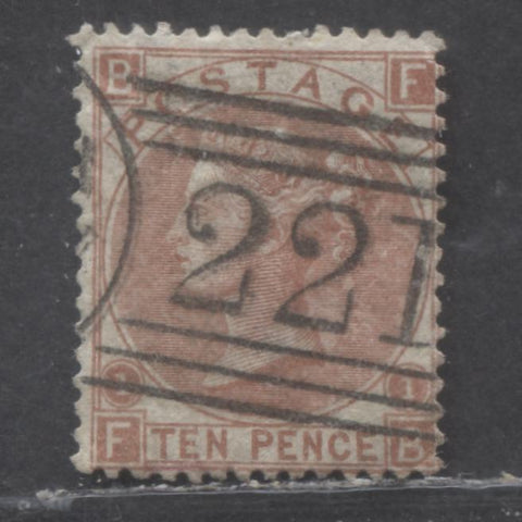
The high values with large coloured letters are issued only on paper watermarked with large anchor for the values below the pound and on both paper watermarked three orbs and three imperial crowns for the one pound. The paper for the first printings of the 2/6d to 10/- values prior to 1884 was bluish, and thereafter was white.
The 4.5d, 8d and 10d values prior to 1887 appear to have been issued for very short-lived rates, as they were not repeated across the various issues.
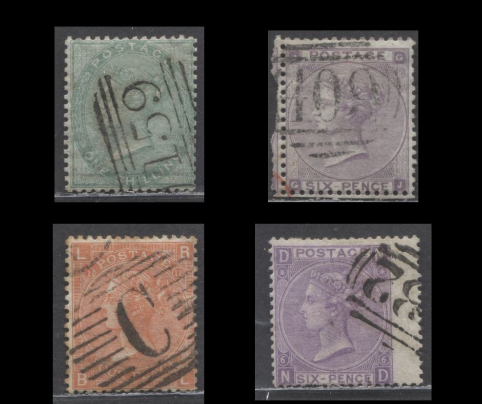
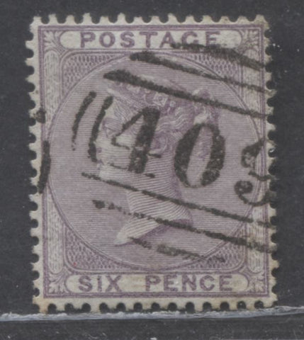
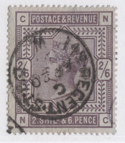
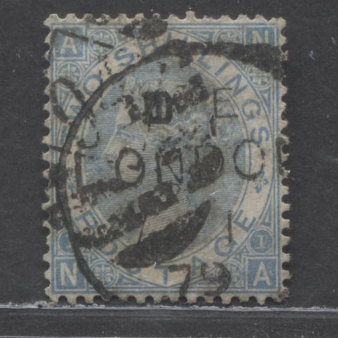
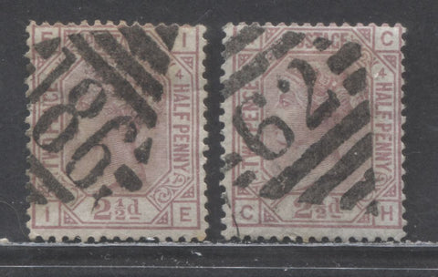
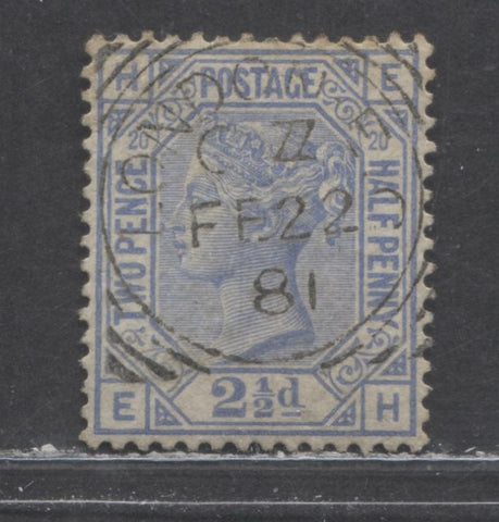
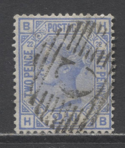
Condition - The Scarcity of Fine Used Stamps
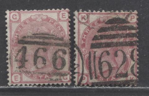
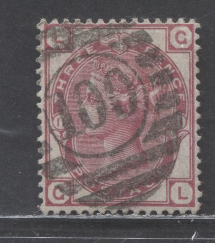
One aspect to collecting these stamps is how difficult it is to find nice quality used stamps. Anyone with a passing familiarity of these issues realizes very quickly that cancellations on Great Britain stamps are much heavier than they are on other issues of the British Commonwealth and the stamps of many other countries. This lies in large part due to the postal regulations of the time, as well as the design of the cancellations. As many collectors are aware, most postal hammers of the 19th century are simple circular date stamps, with some being duplex cancellers that consisted of a killer portion and a circular date stamp portion. Most countries did not have strict regulations governing how these cancellations were to be applied, with the result that CDS cancels are not rare for most countries, although they are less common than the heavier killer duplexes.
However, in the UK the regulations were strict. First of all, all cancelling hammers up to 1880 were duplex types. The regulations required the postal clerk cancelling the mail to apply the cancel so that the killer is on the stamp, and the CDS portion would fall on the envelope to be read by the mail clerk. In addition to this it is quite common to find the cancels double and triple struck, so that the design if often almost completely obliterated on many stamps. The fact that the stamps are surface printed rather than engraved, also means that there is little to no relief to break up the ink of cancel. Instead the stamp becomes quite absorbent for the cancellation ink.
The three stamps below show you what typical, average quality examples of stamps from this period look like when the regulations were being followed:
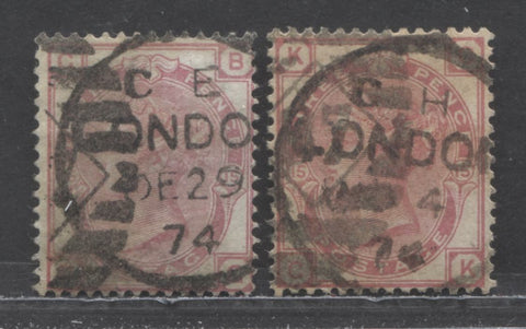
Here we have both the CDS and the killer applied to the stamp. This would very likely occur where these stamps were part of a larger multiple, like a block or a strip.
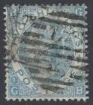
The stamp below shows a typical parcel cancel on a 1/- green from the 1887-1901 Jubilee issue:
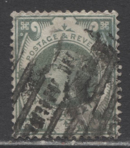
As you can see if you look closely, this cancel has been stuck at least twice, which is why it looks so unattractive. When struck clearly, just once, these cancels can look quite attractive, even if they are heavier than what most collectors of other issues would be accustomed to. It is only when they are struck 2 or three times that they become really quite unattractive. Unfortunately though, what you see above is what the average quality looks like.
So, in grading stamps of this period it becomes necessary to take this into account. Centering on these stamps was also not good, due to the fact that most issues had just 1 mm between impressions, and half this distance was taken up by the perforations. So, these two factors both mean that stamps that would generally only be considered fine for many other countries will be VF when discussing these issues, and stamps that would only be VG for other countries would be fine here.
Below are some examples of the various quality grades other than average:
Extremely fine. Here the centering is mathematical, the colour is original and the cancellation is both light, and clearly struck. This is the grade that Gibbons is referencing when it attaches premiums to well centered and lightly used.
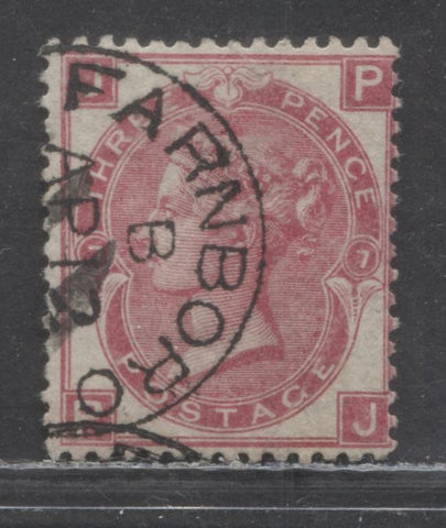
Very fine. Note the centering and clearly struck numeral cancellation. It is not perfect centering, but the perfs are not into the design at any point. The cancel is of moderate intensity, but is crisp, and clearly struck. This is the baseline quality that Gibbons is pricing in their catalogues.
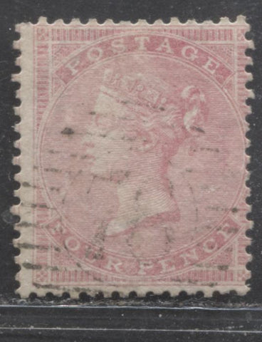
This 4d rose is fine. Although in slightly at the right, it is not significantly in, and the margin on the left shows you that you are only working with about 1 mm between impressions. The cancellation is light and the colour is good. For most other countries this would be VG because of the centering, but for these issues it is fine.

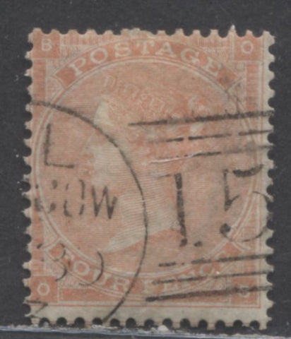
This is also fine. The perfs are just in at the bottom, though again not significantly. The #6 London district cancel is moderate and struck clearly. it is only covering just under half the design, so it is not considered heavy.
This stamp would be graded as fine by many dealers also because the cancel is light. I would conservatively grade this as VG-F, because the perfs cut into the design slightly on 2 sides.

This one I would also grade as VG-F. It is close to VG, but if you look closely at the perfs, they are touching the outer frameline on the bottom and are just ever so slightly in on the left. If the perfs were cutting in just a little more I would have graded it as VG, but as it stands I grade it as VG-F.

This one is VG. In terms of centering it is still fine because the perfs are just touching the outer frameline on the bottom, and just in at the left. The cancellation is actually triple struck, but each strike is not too heavy, so although the overall cancel is heavy, it is not as bad as the examples shown at the beginning, so we lower the grade 1 level from fine to VG.
Good used would be similar to the above, but would look like the examples shown at the beginning of the section. Fair examples would usually have some kind of small fault in addition to a heavyish cancel.
Gibbons prices are for VF as shown in the second example, with the first being of premium quality. Fine can generally be found for one half to one third of Gibbons, depending on how close it is to VG. In the UK they tend to use the term "good" to refer to what I call VG here. What I am calling "good" would usually be called "average" by dealers in the UK.
Paper - Variations in Thickness
One thing that Gibbons Concise does list for some issues is a thick paper. The thick paper is a premium variety that is fairly scarce compared to the normal paper, and so because of this it is important to be able to identify it correctly.
Normally the watermark should be readily visible from the back of the stamp, without the aid of watermark fluid when you are looking at the normal paper. The scan below shows a pair of the 6d lilac with emblems watermark on the normal paper:

Here you can clearly see the four heraldic emblems on each stamp. The watermark of course would be clearer in fluid, but without fluid you can clearly identify which watermark it is.
Now, here is the same stamp on thick paper:
You can't see the watermark at all unless you immerse it in watermark fluid. Backlighting will enable you to see that it has a watermark, but the watermark itself will not be clear. This is how you can identify the thick paper.
The thick paper is listed in Gibbons for the following issues:
- 4d rose carmine, watermarked large garter on glazed paper.
- 6d lilac no corner letters.
- 1/- green, no corner letters.
- 3d pale carmine rose, small white letters.
- 6d lilac, small white letters, with and without hairlines.
- 9d straw with small white letters.
- 1/- green with small white letters.
- 3d rose with large white letters, watermarked emblems.
- 6d lilac large white letters, watermarked emblems.
- 9d straw large white letters, watermarked emblems.
- 1/- green large white letters, watermarked emblems.
Paper - Glazed Papers
The very first printings of the 4d without corner letters as well as the last ones, with large garter watermark can be found on glazed paper, with a shiny surface coating. On the earlier printing with small garter, the paper is highly blued. On the large garter watermark it is white.
It is difficult to show what glazing looks like in a scan, but the example below is an example.
Bluish, Azure and White Papers
One of the better groups of premium stamps from these issues are those printed on some version of bluish paper. Gibbons uses two different terms to refer to papers that are both essentially bluish, although to a different degree.
These papers are problematic for collectors to identify, except where they are obvious, and generally they are only obvious on the early printings of the 4d with no corner letters. Here, the bluing looks very much like that found on the Perkins Bacon line engraved stamps. The main problem in identifying most of them is that they don't really look blue in the truest sense. Because of this they can be very easily overlooked by collectors are being dirtier versions of the common white paper.
Other than the 4d's the first group of stamps to be found on blued paper are the azure paper printings of the 6d and 1/- without corner letters. These have a very, very lightly blued appearance when compared to the normal white paper, as shown by the scans below:
This is the azure paper. Note the very light blue undertone. It will be easy to identify if you placed the stamp on a sheet of very white paper. But on its own it would be very easy to overlook.
Now, let's look at the more common white paper:

Here there is no bluish undertone whatsoever.
The next group after these are the first high values and then the 2.5d rosy mauve with anchor watermark. The bluing on these stamps is similar to the next group, so I will discuss those now and use them to illustrate the blued paper of 1882-1884.
Here is a 2/6d lilac on what I am fairly sure is blued paper:
As you can see, this really doesn't look that bluish, but more of a grey. However, it is clearly not white when you compare it to a typical white paper stamp. To illustrate the difference, I have chosen a 3d with wing margin to compare with the above stamp.

As you can see this is clearly white compared to the first stamp. Now, let's look at another example from the later deep lilac printing:
This one looks slightly more bluish, and against the white background it is clearly bluish. But when I looked at this stamp on its own I almost identified it as the common white paper.
As a practical matter, most of the expertising services in the UK will not issue unqualified certificates of authenticity on used examples of these paper varieties, unless it can be shown by a dated cancellation that they cannot be the more common white paper. Generally for these high values, this date would be before 1884. This is not to say that a blued paper with a date after that is obviously fake, but it does cast doubt on it. It is reasonably easy to place stamps in a weak ink solution in an attempt to dye the paper. However such fakes will generally be either too blue, or not blue enough. So, my advice to collectors here is not to allow the lack of certificate to bother them too much, provided that the bluing looks similar to the above examples.
The bluish paper is found on the following issues:
- 2.5d rosy mauve with anchor watermark.
- The 5/- through 5 pounds with large white letters and anchor watermark.
- The 1d die 2 postage and inland revenue lilac.
- The 2/6d, 5/- and 10/- with large coloured letters.
Inks - Singly Fugitive and Doubly Fugitive Inks
Up until 1883 the inks employed by De La Rue were singly fugitive, which means that they are soluble in mineral based solvents. They can be safely soaked, but certain inks such as the ultramarine or blue used on the 2.5d had a tendency to react with the cancellation ink, causing the areas of the stamp near the cancellations to fade.
Starting with the Lilac and Green issue in 1883 and continuing on to the 1887-1901 Jubilee issue, all green and lilac (or violet, or purple) inks were doubly fugitive, which means that they are water-soluable. This essentially means that they will fade if they are soaked in water. As a result nearly all of the stamps you find from these issues that are used will be faded to a greater or lesser extent.
Recognizing fading has occurred is usually, but not always easy. It generally requires you to know how the ink is supposed to appear in its natural state. The purple, lilac or violet inks are generally always dull, with a slate undertone in their natural state, and the greens are a dull green. As the inks get exposed to small amounts of water, the purples get brighter and as do the green inks. The purple inks become redder and the green inks become a bluish green. As the fading continues the green becomes more and more yellowish, until at the most extreme end of the scale it is a greenish yellow. At the extreme end of fading the purple just looks faded and washed out.
The two stamps below from the Jubilee issue show the difference between original colour and a severely faded example:

The stamp on the left is severely faded, though it does retain enough colour that it could still be graded as good. The stamp on the right shows the original dull green colour.
Identifying the Better Shades
There are many shades to be found in these issues on practically every value. Most of these are of only none or only modest premium value in Gibbons. However there are a select number of stamps which can be found with shades that are very rare and valuable in their own right.
These shades are:
- The 2/- cobalt and 2/- milky blue with spray of rose watermark.
- The 1d bluish lilac postage and inland revenue die 2.
- The 10/- cobalt on bluish and white paper.
- The 3d purple on orange paper Jubilee issue.
- The 4.5d dull green and deep, bright carmine Jubilee issue.
- The 10d dull purple and deep, dull carmine Jubilee issue.
The confusing thing about identifying these correctly is that the swatches in the Gibbons colour key for these shades do not match those of the actual stamps. Cobalt, in the Gibbons colour key is shown as a very pale blue, whereas in actuality it is a fairly deep blue more akin to what deep ultramarine on the colour key looks like. There are no swatches in the colour key for deep, bright carmine or deep dull carmine, nor is there one for bluish lilac. So, it becomes necessary to look at actual examples that other UK dealers are selling to get a feel for how these shades should look.
Here is the milky blue on the 2/-:
Although not especially clear, the scan below shows the less expensive and more common dull blue:
As you can see, when you compare the dull blue to the milky blue it has a greenish undertone. The milky blue still has a pure blue appearance, though it is very pale.
Moving on, here is an example of the rare cobalt shade on the 10/- with coloured letters:

As you can see this is a fairly deep blue. On the Gibbons colour key it would be closest to either the royal blue or deep ultramarine swatches.

Here is the more common ultramarine. No comparison whatsoever. The difference is sufficiently stark that once you see a genuine cobalt, you should be able to identify it on sight the next time you see it, though it may not be as deep as the one shown above. However, it will have the same overall tone.
Now, let's look at the 1d lilac postage and inland revenue issue. Here is the typical lilac shade:

Here is the bluish lilac:
As you can see there is a milky quality to the colour, and an overall bluish undertone. Again, this is not a stamp you should have any difficulty identifying once you have committed this image to memory.
Now, we move on to the better shades of the Jubilee issue, with the 3d purple on orange paper, nest to a typical lemon paper:


The lemon paper can be found much deeper than the stamp on the right, but it won't look anything like the orange paper on the left.
Then there is the carmine and deep bright carmine frame shade on the 4.5d:

The stamp on the left is the regular carmine shade, while the one on the right is the deep, bright carmine. The difference is fairly obvious once you see the deep bright shade.
Lastly, there is the deep, dull carmine shade on the 10d:

On this stamp the brighter carmine on the right is the regular shade. The one on the left is the deep, dull carmine. The basic shade can vary quite a bit, but in all cases, it is brighter than the dull shade.
Dies
There are two stamps in these issues that were issued with different die type differences: the 1d lilac postage and inland revenue issue and the 5d Jubilee issue.
Here are the two dies of the 1d lilac:
On the left is die 1, while the pair on the right is the common die 2. The differences lie in the number of white dots that occupy each corner frameline. On die 1 there are 14 dots and on die 2 there are 16 dots. Die 1 was the first printing, issued in 1881 and replaced by die 2 in either 1884 or 1886. As a result, die 1 stamps are genuinely scarce in either mint or used condition.
Now let's look at the 5d Jubilee. Here the difference lies in the appearance of the left value tablet. Specifically the difference lies in what is to to the right of the "d". On die 1, there are square dots between the "d" and the right of the tablet. On die 2, there are vertical dashes or lines, rather than square dots.


Die 1 is on the right, while die 2 is on the left.
Watermarks
A number of watermarks are found on these issues, with some designs being found with two or three different watermarks. These watermarks are:
- Small garter.
- Medium garter.
- Large garter.
- Emblems, otherwise known as rose, thistle and shamrock.
- Spray of rose.
- Small anchor.
- Maltese cross.
- Orb.
- Large anchor
- Imperial crown.
Virtually all of these watermarks can be found inverted and are listed in Gibbons. With only a couple of exceptions, the most notable one being the 4d vermilion with large garter watermark and a few others, all of these varieties are very rare and list in Gibbons for hundreds or thousands of pounds each.
The emblems watermark exists in two error versions. On one there are three roses and a shamrock and on the other there are three roses and a thistle. This error watermark can be found on:
- The 6d lilac without corner letters
- 3d rose with small white letters.
- The 6d lilac with small white letters, both with and without hairlines.
- The 9d straw with small white letters.
- The 1/- green with small white letters.
- The 3d, 6d, 9d and 1/- with large white letters.
In all cases these errors are worth in the low thousands up to 9,000 GBP for used, with most not being priced mint.
Identifying these is not too difficult, except for the medium garter, which is very similar to the large garter. However, there are differences, that once you know what to look for, make identifying it easy.
The following scans show each of the watermarks except for the Maltese Cross, which I did not have an example of:

Small garter. Note that there are only three pairs of 2 lines defining sections of the garter. Both the medium and large garters will show lines dividing them into multiple sections.
Medium garter. Here there are multiple lines inside the garter dividing it into sections, but there are also clear points on each line in the middle of the line. These are not present on the large garter.
The large garter. This is split into multiple sections like the medium garter, but as you can see there are no points in the middle of the lines that break the garter up into sections.
Emblems.
Spray of rose.
Small anchor. It is difficult to see, but the head of the anchor is the "V" near the centre.
Orb.
Large anchor.

Imperial crown.
Plate Numbers
For the majority of these issues prior to 1880, the plate number can be found incorporated right into the design. This starts with the stamps having large white letters. The stamps with no corner letters have no plate number, as do the stamps with small white corner letters. However, the stamps with small white letters that come from plate 4 for the 4d and 6d can be found with fine diagonal white lines crossing the corners of the letter square. These are known as hairlines.
An example of a 6d lilac from plate 4 with these hairlines is shown below:
Centering and Margins
As stated in the notes under condition, I said that it is very difficult to find well centered stamps because the spacing between impressions on the plate was generally not much more than 1 mm. To see this clearly and thus fully appreciate it, it is necessary to look at a poorly centered example that shows the frameline of the adjacent stamp, so that you can see exactly how much space we have to work with here. The scan below shows a 6d lilac with large white letters:
On this example you can just see the bottom margin of the stamp above, and can thus see the full width of the top margin. Without measuring it, I can say that this is about 1 mm. If this were an imperforate stamp half this distance would be a good sized margin. But a scissor cut is of negligible width, whereas a row of perforations will take up close to half that distance, leaving only about 1/2 mm in total for margins. This is very tight, and accounts for the reason why many stamps with perfs touching the outer framelines are still often graded as fine or VF by many British dealers.
Gum
The gum on these issues follows the usual pattern found on all De La Rue issues of the British Commonwealth. Gum prior to 1880 is thin, colourless and matte in its appearance. It does not become shiny and thicker until after 1880. So stamps before this date, with shiny, thick or glossy gum are very likely to be regummed.
The Abnormals - The Great Rarities of this Area
Perhaps the greatest rarities of the surface printed issues are the so called abnormals. These arose because De La Rue's established practice when they produced a plate was to print six sheets right away. One of these sheets would be sent to Somerset House and the other five would usually be issued. However, in some cases, the plate was either not placed into general production, or there was a change in watermark or colour, and so the issued stamps are exceedingly rare.
The stamps below are examples of some abnormals:
3d from plate 3 with white dots added under the central ornaments
9d Bistre with hairlines from plate 3

6d Pale Buff plate 13, watermarked Spray of Rose
1/- purple, plate 14 with imperial crown watermark
Most all of these list for four figures in Gibbons each.
The other abnormals listed in Gibbons that are not illustrated here are:
- 9d straw, large white corner letters from plate 5.
- 6d mauve without hyphen, watermark spray of rose from plate 10.
- 10d red brown watermark spray of rose plate 2.
- 2/- blue, watermark spray of rose from plate 3.
- 2/- brown, watermark spray of rose.
- 6d chestnut, spray of rose watermark from plate 10.
- 1/- green, spray of rose watermark from plate 14.
- 4d vermilion, large garter watermark from plate 16.
- 8d purple brown, watermarked large garter.
- 1d venetian red with orb watermark, instead of imperial crown.
This totals up to 14 stamps. At an average of 20,000 GBP per stamp, you would need a small fortune just to acquire them all. For most of these fewer than 50 examples of each are known to exist.
Cancellations - United Kingdom
One area that is both realistic and fun in collecting these issues are the cancellations. There are a very large number of different types of London and town barred grids. I only illustrate a representative sample of the cancels here.
Generally, speaking the cancels can be organized into 4 groups:
- England and Wales cancels.
- Scotland cancels.
- Irish cancels.
- London district cancels
- CDS cancels and
- Squared circle cancels
It should be noted that the CDS cancels are just the other half of all the barred numeral duplex cancels.
The scan below show representative types of each cancel:
England and Wales.
Scotland
Ireland - Dublin and Belfast
London district killer

CDS cancel
Squared circle cancel for London
Hexagonal cancel from the 1880's
Cancellations - Foreign Usages
Another interesting way to collect these issues is to look for the foreign usages of these stamps, which can be identified by the postmarks. Various postmarks with A, B, C, D, E, F and G prefixes were assigned to the post offices in various colonies for use before they had their own stamps. However, it is important to realize that most of these cancels are actually post offices in the UK.
The most common ones to collect are Constantinople in the Ottoman empire and Malta cancels, which are A25. Examples of these are shown below:
Constantinople

Malta
The cancellations to watch for here are as follows:
- A01 - Kingston, Jamaica
- A02 - Antigua
- A03 - Demerara, British Guiana
- A04 - Berbice, British Guiana
- A05 - Bahamas
- A06 - British Honduras
- A07 - Dominica
- A08 - Montserrat
- A09 - Nevis
- A10 - St. Vincent
- A11 - St. Lucia
- A12 - St. Kitts
- A13 - Tortola, Virgin Islands
- A14 - Tobago
- A15 - Grenada
- A18 - Antigua
- A25 - Malta
- A26 - Gibraltar
- A27-A78 - Various towns in Jamacia
- A80-A99 - Mailboats
- B01 - Alexandria, Egyot
- B02 - Suez, Egypt
- B03, B12, B57, B57 - Mailboats
- B32 - Buenos Aires - Argentina
- B53 - Mauritius
- B62 - Hong Kong
- B64 - Seychelles
- C - Constantinople
- C28 - Montevideo, Uruguay
- C30 - Valparaiso, Chile
- C35 - Panama
- C36 - Arica, Peru
- C37 - Caldera, Chile
- C38 - Callao, Peru
- C39 - Cobija, Chile
- C40 - Coquimbo, Chile
- C41 - Guayaquil, Ecuador
- C42 - Islay, Peru
- C43 - Payta, Peru
- C51 - St. Thomas, West Indies
- C56 or C65 - Carthagena, Columbia
- C57 - Greytown, Nicaragua
- C58 - Havana, Cuba
- C59 - Jacmel, Cuba
- C60 - La Guaira, Venezuela
- C61 - Puerto, Rico
- C62 - Santa Martha, Colombia
- C63 - Tampico, Mexico
- C79 - Mailboats
- C81 - Bahia, Brazil
- C82 - Pernambuco, Brazil
- C83 - Rio de Janiero, Brazil
- C86 - Puerto Plata, Dominican Republic
- C87 - St. Domingo, Dominican Republic
- C88 - St. Jago de Cuba, Dominican Republic
- D22 - Cuidad Bolivar
- D26 - Mailboats
- D65 - Pisagua, Peru
- D74 - Pisco, Peru
- D87 - Iquique, Peru
- E53 - Port Au Prince, Haiti
- E88 - Colon, Columbia
- F69 - Savanilla, Colombia
- F83 - Arroyo, Puerto Rico
- F84 - Aguadilla, Puerto Rico
- F85 - Mayaguez, Puerto Rico
- F87 - Smyrna, British Levant
- F88 - Ponce, Puerto Rico
- G - Gibraltar
- M - Malta
- S - Stamboul, British Levant
- G06 - Beirut, British Levant
- G36 - Arica, Peru
- 124
- 247 - Fernando Po
- 582 - Naguabo, Puerto Rico
- 942 - Cyprus
- 969 - Cyprus
- 974 - Cyprus
- 975 - Cyprus
- 981 - Cyprus
- 982 - Cyprus
Specimen Overprints
Most all of the stamps exist with up to 10 different types of specimen overprints, though individual stamps will not generally exist with every type. These were produced for distribution to member nations of the Universal Postal Union. The number produced will generally correspond to the number required for distribution, which would seldom be more than 200-400 stamps. As new member nations joined the UPU it may have been necessary to overprint and distribute additional stamps and this may be the reason as to why certain stamps may be found with more than one type of overprint.
The pictures below show some of the types of overprint that can be found:
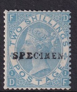

The types all appear different from one another and all are very different from the standard, plate printed overprints that were applied to the British Colonial stamps when the Crown Agents was in charge of distribution. This is likely because most all of these issues up to 1880 pre-date the Crown Agents' involvement in stamp distribution.
Imperfs

Also very rare are the imperforate stamps which generally came from the imprimatur sheets. They tend to list in the 4,000-25,000 pound range, and are always mint.
Gibbons lists imperfs of the following:
- 3d rose with small white letters and white dots below ornaments.
- 4d pale red with small white letters and hairlines.
- 6d lilac with small white letters and hairlines.
- 1/- deep green with small white letters.
- 4d vermillion, large white letters, with emblems watermark.
- 6d lilac, large white letters, with emblems watermark.
- 1/- large white letters (imperf between), with emblems watermark.
- 3d rose, large white letters, spray of rose watermark.
- 6d lilac, with hyphen, spray of rose watermark, large white letters.
- 6d mauve without hyphen, spray of rose watermark, large white letters.
- 9d straw, large white letters, spray of rose watermark.
- 10d red brown, large white letters, spray of rose watermark.
- 1/- green, large white letters, spray of rose watermark (and imperf between pair)
- 2/- deep blue, large white letters, spray of rose watermark.
- 2/- pale blue, large white letters, spray of rose watermark.
- 2/- brown, large white letters, spray of rose watermark.
- 6d grey, large white letters, spray of rose watermark.
- 5/- rose, large white letters, Maltese Cross watermark.
- 2.5d rosy mauve, anchor watermark.
- 4d grey brown with large garter watermark.
- 1/2d green, 1880-1881 Postage issue.
- 1d venetian red, 1880-1881 Postage issue.
- 5d indigo, 1880-1881 Postage issue.
- 1d lilac/mauve, 1881-1900 Postage and Inland Revenue (imperf pair and imperf three sides pair).
- All the Lilac and Green issue except the 9d.
- 1/2d vermilion Jubilee issue.
- 1/2d blue green Jubilee issue.
- 2.5d purple on blue Jubilee issue.
- 3d purple on yellow Jubilee Issue
- 4d green and purple brown Jubilee issue.
- 10d dull purple and carmine Jubilee issue.
Back Adverts
The only stamp from these issues to exist with back advertising, similar to the 1890's issues of New Zealand is the 1d lilac postage and inland revenue design, which can be found with the words "Pears Soap" printed on the back in orange, blue or mauve.
Wing Margins

The stamps were printed in two panes that were each separated by vertical gutters. From 1880 onward, sheets were perforated at each end of these gutters, so that stamps had margins of roughly equal size all around. However, prior to 1880 these gutters were perforated only down the middle, by a single row of holes. This meant that stamps on either side would have an extra wide margin at the left or right, depending on which pane they were from.
Until very recently, wing margins were considered less desirable, with the result that many were trimmed and reperforated. These can generally be spotted by the corner letters. Stamps that should have wing margins are:
- All stamps watermarked emblems that have the letters D, E, H or I in the southeast corner.
- All stamps with spray of rose watermark that have the letters D, E, H or I in the southeast corner.
- 4d and 8d stamps with garter watermark that have the letters F or G in the southeast corner.
- All stamps without corner letters.
Generally any lettered stamp above that does not have a wing margin is very likely reperforated.
Conclusions
There is considerable complexity to these issues, though the issues prior to 1880 are very different and distinct from those that followed. Of course there are also the departmental officials, which I have not even touched on here. There are a large number of very rare items for those collectors of means who wish to challenge themselves to the limit.
Mint, unless you start after 1880 is probably well out of range of most collectors, and even putting together a basic collection of very fine used stamps would be a real challenge for most collectors. Myself, I would collect one fine to very fine used example of each basic Gibbons Concise number as my starting point, along with all plates. That's every major corner letter, and all listed plates and shades. That's quite a challenge on its own. But by focusing on used that eliminates most of the very expensive imprimaturs and many of the abnormals. I'd start there and see where my efforts take me. I wouldn't worry too much about trying to get VF for every stamp, and I wouldn't worry about centering. I'd focus instead on fresh colour and moderate, but clear cancellations.
3 comments
Outstanding information, as expected once again. This is a great guide and reference for those delving into this vast and varied world of philately. It should also be considered that the Victorian era was a time for trial and error, which led to correction, revision, and, quite often, repair to these plates, creating states that will be different from the original imprimatur pane of issue that, fortunately, was kept and recorded. A note regarding imprimatur issues. These were removed from the 1st pane and presented to dignitaries and the Crown. They are very crisp, clean, and often of a deeper, more intense shade than those of the regular production run.
Thanks so much! I agree. It was the country I was most interested in when I was much younger. Though it seems to be less popular now compared to what I remember in 1990. Buy, that may just be my perception. I am glad you enjoyed the post though.
VERY interesting comments and information! Its a good help, i m a GB stamp collector for 35 years now, and whát a great country to collect! Especially QV